Howdy, folks! Gabriel Rodríguez-Watson here, ready to wrangle some color into your dining room. Now, I’ve seen my fair share of dining spaces, from cozy ranch house nooks to grand hacienda halls, and let me tell you, the right paint can turn even the most ho-hum room into a showstopper. So saddle up, because we’re about to embark on a color-filled journey that’ll have your dining room looking as inviting as a warm desert sunset.
Understanding Color Theory
Before we dive into the nitty-gritty, let’s talk color theory. It’s like learning the basic steps before you hit the dance floor – once you’ve got ’em down, you can really start to groove.
Basics of Color Theory
Picture this: you’re out on the range, and you’ve got your primary colors – red, blue, and yellow. These are your trail bosses, the colors you can’t make by mixing others. Now, when these primary colors decide to do-si-do, they create secondary colors. It’s like watching a desert bloom after a spring rain – suddenly, you’ve got purples, greens, and oranges popping up all over.

The color wheel is like a cowboy’s lasso – a tool that helps you wrangle these colors into harmonious combinations. It’s as handy as a Swiss Army knife when you’re planning your dining room color schemes.
Warm vs Cool Colors
Now, let’s talk temperature. Warm colors – your reds, oranges, and yellows – are like a crackling campfire on a chilly night. They make a space feel cozy and inviting, perfect for those long, leisurely family dinners. Cool colors, on the other hand – your blues, greens, and purples – are like a refreshing dip in a mountain stream. They bring a sense of calm and tranquility to your dining space.
Complementary Colors
Complementary colors are like two cowboys facing off in a friendly duel – they’re opposites, but they bring out the best in each other. Red and green, blue and orange – these pairings create a visual pow that’ll make your dining room pop like a firework on the Fourth of July.
Color Psychology
Colors aren’t just pretty to look at – they can affect your mood faster than a rattlesnake strike. Yellow can brighten your spirits quicker than a sunflower blooming in spring, while blue can calm you down like a gentle prairie breeze. When you’re choosing colors for your dining room, think about the kind of atmosphere you want to create. Are you aiming for a lively space for boisterous family gatherings, or a tranquil retreat for intimate dinners?

Choosing the Right Paint
Alright, partners, now that we’ve got the basics down, let’s mosey on over to choosing the right paint. This is where the rubber meets the road – or in our case, where the brush meets the wall.
Light vs Dark Colors
Choosing between light and dark colors is like deciding between a white Stetson or a black one – both have their merits. Light colors can make your dining room feel as spacious as the open prairie, reflecting light and creating an airy atmosphere. Dark colors, on the other hand, can wrap around you like a cozy blanket on a cool desert night.
When you’re dealing with a smaller space, light colors can be your best friend. They’re the best paint for small dining rooms, opening up the space like a window to the great outdoors. But don’t count out those darker hues – in a larger room, they can create an intimate atmosphere that’s perfect for those candlelit dinners.
Bold Color Options
Now, if you’re feeling as adventurous as a rodeo rider, why not consider a bold color? A deep red or a vibrant green can transform your dining room faster than a tumbleweed in a dust storm. It’s like adding a dash of hot sauce to your favorite chili – it might be strong, but boy, does it pack a punch!

But remember, partners, balance is key. You don’t want your bold color to buck you off like an untamed bronco. Pair it with neutral accents to keep things grounded. It’s like matching a statement belt buckle with a simple shirt – you want the eye-catching elements to shine without overwhelming the whole outfit.
Neutral Color Choices
For those of you who prefer your excitement on the trail rather than on your walls, neutral colors are as reliable as a well-trained horse. Soft grays, warm beiges, and subtle taupes are like the steady rhythm of a horse’s hooves – comforting and timeless.
The beauty of neutrals is their flexibility. They’re like a good pair of boots – they go with everything. You can easily switch up your decor without having to repaint, which is mighty convenient when you’re struck by the urge to redecorate.
Dining Room Style Considerations
Now that we’ve covered the basics of color, let’s talk about how to match your paint to your dining room’s style. It’s like pairing the right hat with your favorite boots – when it all comes together, it’s pure magic.

Traditional Style Colors
If your dining room is as classic as a vintage Cadillac, you’ll want colors that reflect that timeless elegance. Think deep, rich hues like burgundy, forest green, or navy blue. These colors are like a fine aged whiskey – smooth, sophisticated, and full of character.
For a traditional look that’s as inviting as a home-cooked meal, try pairing darker walls with lighter trim. It’s like framing a beautiful landscape – it draws the eye and adds depth to your space.
Modern Style Colors
For those of you with a modern streak, your color palette should be as clean and crisp as a freshly ironed shirt. Stick to neutral tones like whites, grays, and beiges. These colors are like a blank canvas, allowing your furniture and decor to take center stage.
If you want to add a pop of color, choose one bold hue as an accent. It’s like adding a bright bandana to a simple outfit – it catches the eye without overwhelming the overall look.
Eclectic Style Colors
Now, if your style is as varied as the landscape of the American West, you might be leaning towards an eclectic look. This is where you can really let your creativity run wild, like a mustang on the open plain.

Don’t be afraid to mix and match colors that speak to you. Combining bright oranges with deep blues, or soft pastels with dark charcoals can create a dining room that’s as unique as a fingerprint. Just remember to tie it all together with a few unifying elements, like consistent wood tones or metallic accents.
Paint Finishes and Their Impact
Choosing the right paint finish is like selecting the perfect saddle – it’s all about finding the right balance between style and function.
Matte Finish
A matte finish is like a well-worn leather jacket – it’s got a soft, velvety look that absorbs light rather than reflecting it. It’s great for hiding imperfections, making it perfect for older walls that might have a few stories to tell.
The downside? It can be a bit tricky to clean, so it might not be the best choice if you’ve got little cowpokes who tend to leave their mark on the walls.
Satin Finish
Satin finish is the Goldilocks of paint finishes – not too shiny, not too flat, but just right. It’s got a subtle sheen that adds a touch of elegance to your walls, like the gentle glow of a lantern in the evening.

This finish is tougher than a Texas longhorn, making it easy to clean and perfect for high-traffic areas. If your dining room sees more action than a saloon on Saturday night, satin might be your best bet.
Glossy Finish
A glossy finish is like the sheen on a brand-new pickup truck – it’s shiny, it’s eye-catching, and it sure makes a statement. This finish reflects light like a mirror, which can make your dining room feel brighter and more spacious.
Keep in mind, though, that a glossy finish will show every imperfection like a sore thumb on a guitar player. If you’re going for glossy, make sure your walls are smoother than a freshly paved highway.
Practical Tips for Painting
Alright, partners, now that we’ve covered the theory, let’s roll up our sleeves and get down to the nitty-gritty of painting your dining room.
Preparing the Room
Preparation is key, folks. It’s like getting your horse and gear ready before a long ride – take the time to do it right, and the rest of your journey will be smooth sailing.
Start by giving your walls a good cleaning. Use a damp cloth to wipe away any dust or dirt – you want your paint to stick to the wall, not the grime. If your walls have any battle scars, now’s the time to patch them up. Fill in any holes or cracks with spackle, and sand them down smoother than a calf’s ear once they’re dry.

Don’t forget to protect your furniture and floors. Move everything to the center of the room and cover it with drop cloths. It’s like putting on your rain slicker before a storm – a little protection goes a long way.
Tools You Need
Having the right tools for the job is as important as having a good horse on a cattle drive. Here’s what you’ll need:
- Brushes for cutting in around edges and details
- Rollers for covering large areas quickly
- Painter’s tape for clean lines
- Paint trays
- Drop cloths
- Sandpaper
- Spackle and putty knife for repairs
Invest in quality tools – they’re like a good pair of boots. They might cost a bit more upfront, but they’ll serve you well for years to come.
Application Techniques
When it comes to applying paint, slow and steady wins the race. Start by cutting in around the edges with a brush, then use your roller for the large areas. Work in small sections, and keep a wet edge to avoid lap marks.

Remember, multiple thin coats are better than one thick one. It’s like building a campfire – you start small and add layers, rather than throwing on one big log. Allow each coat to dry completely before adding the next one.
Inspirational Examples
Now, let’s take a gander at some dining rooms that really hit the mark. These examples are like the prize stallions at a county fair – they’re sure to inspire you.
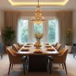
Classic Dining Rooms
Picture a dining room with walls painted a deep, rich burgundy. Paired with crisp white trim and a grand mahogany table, it’s as timeless as a western sunset. Or imagine soft cream walls accented with navy blue curtains and chair cushions – it’s like a perfectly tailored suit, elegant and refined.
Contemporary Dining Rooms
For a modern look, consider a dining room with sleek gray walls and white trim. Add pops of color with bright artwork or colorful dishes. It’s clean and fresh, like the first snowfall on the mountains.
Another contemporary option is to go bold with one accent wall. Picture three walls in a soft taupe, with one wall in a vibrant teal. It’s unexpected and exciting, like stumbling upon a hidden oasis in the desert.

Bold and Unique Designs
For those of you with a wild streak, why not try something really daring? Imagine a dining room with black walls, white trim, and gold accents. It’s dramatic and luxurious, like a starry night sky.
Or consider a vibrant yellow paired with crisp white. It’s as cheerful as a field of sunflowers, sure to brighten up even the dreariest day.
Expert Tips
Before we ride off into the sunset, let me share a few expert tips I’ve picked up along the trail.
Avoid Common Mistakes
First off, always test your paint colors before committing. What looks great on a tiny swatch might overwhelm you on a large wall. It’s like trying on a hat – you’ve got to see how it looks on you before you buy it.
Don’t skimp on the prep work. I know it’s tempting to jump right in, but taking the time to properly clean and prime your walls will save you a heap of trouble down the road.

And remember, when it comes to bold colors, a little goes a long way. Using them as accents rather than all-over color can create a balanced look that won’t tire your eyes faster than a bucking bronco.
Professional Advice
If you’re feeling overwhelmed, don’t be afraid to call in the cavalry. A color consultant or interior designer can offer valuable insights and save you from costly mistakes. It’s like having a seasoned trail guide – they know the terrain and can help you avoid the pitfalls.
DIY vs Hiring Professionals
Deciding whether to DIY or hire professionals is like choosing between cooking your own chili or heading to the local diner. DIY can save you some cash, but it takes time and elbow grease. Hiring professionals might cost more, but they bring expertise and efficiency to the table.
Consider the complexity of the job and your own skill level. If you’re dealing with high ceilings or intricate trim work, it might be worth calling in the pros. But for a straightforward paint job, rolling up your sleeves and doing it yourself can be mighty satisfying.

Additional Resources
Before we part ways, let me point you towards some additional resources that’ll help you on your color journey.
Paint Samples Guide
Testing paint samples is crucial. It’s like trying on boots – you wouldn’t buy a pair without walking around in them first. Apply large swatches of your chosen colors and live with them for a few days. See how they look in different lights and at different times of day.
Paint Quantity Calculation
Figuring out how much paint you need is as important as making sure you’ve got enough water for a long ride. Measure your room carefully, and don’t forget to account for windows and doors. As a rule of thumb, one gallon covers about 350 square feet with one coat. Always buy a little extra – it’s better to have too much than to run short in the middle of your project.
Where to Purchase Paint
You’ve got plenty of options when it comes to buying paint. Home improvement stores offer a wide selection, while specialty paint stores can provide expert advice. Don’t overlook your local hardware store – they often have great service and might even remember your name.

Closing Thoughts
Well, folks, we’ve covered a lot of ground today. Choosing the perfect paint for your dining room is like finding the right horse – it takes time and consideration, but when you find the right match, it’s pure magic.
Remember, your dining room is more than just four walls – it’s where memories are made, where stories are shared, and where life happens. The right paint can set the stage for all those special moments, creating a warm and inviting atmosphere that’ll make folks want to linger long after the dishes are cleared.
So go on, take these tips and tricks, and create a dining room that’s as unique and welcoming as you are. And remember, if you ever need a hand or some advice, I’m always here, ready to help you wrangle those colors into submission. Happy painting, partners!