You know what people always ask me? It’s not about hydroponics or how to keep fungus gnats away from their fiddle-leaf fig. It’s, “Remi, my bedroom just feels… off. I have nice furniture, but I still toss and turn. What am I doing wrong?” They expect a complex answer, maybe something about Feng Shui or expensive bedding.
But my answer is almost always the same: Look at your walls. We spend so much time thinking about our homes as static collections of stuff, but they aren’t. They’re living, breathing ecosystems that we are a part of. And the paint on your walls is like the sky in that ecosystem. It dictates the light, the mood, the very air you breathe. Getting it right isn’t about picking a trendy color from a magazine. It’s about creating an environment that actively recharges you, so you can wake up ready to grow—whether that’s your career, your family, or the basil on your windowsill.
Foundations & Strategic Planning for Your Bedroom Oasis
Before you even think about cracking open a can of paint, we need to lay the groundwork. This isn’t the boring part; it’s the most important part. This is where we stop treating paint like a decorative afterthought and start seeing it as a powerful tool for building your personal habitat. Get this right, and everything else falls into place.
1. Prioritize Mood: Choose Paint for a Sleep Sanctuary
Forget color trends. Seriously. The single most important question is: How do you want to feel in this room? Your bedroom has one primary job: to be a sanctuary for rest and restoration. The color on your walls is the first and last thing you see every day, and it has a profound effect on your nervous system and your ability to sleep. It’s not just woo-woo; it’s biology. Cool, calming colors can literally help lower your heart rate.
The noise you need to ignore is the endless scroll of “color of the year” announcements. What actually matters is tuning into what your body needs. For 99% of people, that means soft, muted colors inspired by nature—think gentle blues, hazy greens, and earthy grays that signal to your brain that it’s time to power down. And here’s the real talk: insist on zero-VOC or low-VOC paint. Why would you curate a perfect, calming mood only to have your walls off-gas chemicals while you sleep? That’s like building a beautiful organic garden and then spraying it with poison. It makes no sense.
Your first step isn’t just picking a color; it’s choosing a vibe that helps your body find its natural rhythm for sleep.
2. Assess Room Lighting: Influence Color Perception Deeply
Light is the life force of any ecosystem, and your bedroom is no different. The same can of paint will look completely different in a bright, south-facing room versus a cool, north-facing one. Ignoring your room’s unique light is the fastest way to end up with a color you hate. That “calm, earthy beige” you loved at the store can turn into a sad, muddy gray in a room that doesn’t get direct sun.
So, here’s what you do. Spend a full day just observing. Where does the light come from? Is it warm and direct, or cool and ambient? And don’t just think about sunlight. What about your lamps? Most people use bulbs that are way too cool (blue-white), which is great for a workshop but terrible for winding down. For a bedroom, you want warm-toned light (around 2700K) to create a cozy, candle-lit feeling in the evening. This supports your natural circadian rhythm instead of fighting it.
Lighting isn’t just about seeing the color; it’s about how the interplay of light and color makes you feel throughout the day.
3. Factor in Room Size: Expand Small Spaces Visually
Can we please bust a myth? Everyone says you have to paint a small room white to make it feel bigger. It’s just not true. What actually makes a small space feel bigger is reducing contrast and blurring the edges. It’s an optical illusion, and there are way more interesting ways to do it than just slapping on builder’s white.
Light, cool colors like sky blue or soft sage green naturally recede, which can make walls feel further away. But the real shortcut is to create a seamless envelope. Paint the walls, the trim, and even the ceiling in very similar shades, or even the same color. When your eye doesn’t have a stark white line to stop at where the wall meets the ceiling, the room suddenly feels taller and more expansive. I once had a client with a tiny urban bedroom that felt like a shoebox. We painted the walls and trim a soft, misty gray and the ceiling a slightly lighter version, and it was transformative. It felt like a little cloud.
Don’t be afraid of color in a small space; just be smart about how you use it to trick the eye.
4. Harmonize with Existing Decor: Ensure Cohesive Flow
Think of your room like a garden bed. You wouldn’t just throw random plants in and hope for the best, right? You practice companion planting—putting things together that help each other thrive. Your paint color needs to be a good companion to your existing furniture, floors, and textiles. The number one mistake I see is people ignoring the undertones of what they already own.
I learned this the hard way in my first apartment. I had this beautiful warm oak floor and bought a super trendy “greige” paint. On the chip, it looked like a perfect neutral. On the walls? It looked purple. A sad, dingy, purple. Because the greige had cool undertones that were fighting a war with the warm yellow/orange undertones in my floor. The whole room felt discordant. What matters isn’t matching; it’s harmony. Hold your paint samples right up against your wood furniture, your headboard, your rug. Do they feel like they belong in the same family?
A great shortcut is the 60-30-10 rule. Let 60% of your room be your dominant color (walls), 30% a secondary (furniture/bedding), and 10% an accent. It’s a simple recipe for a balanced ecosystem.
5. Leverage Color Psychology: Evoke Desired Emotions
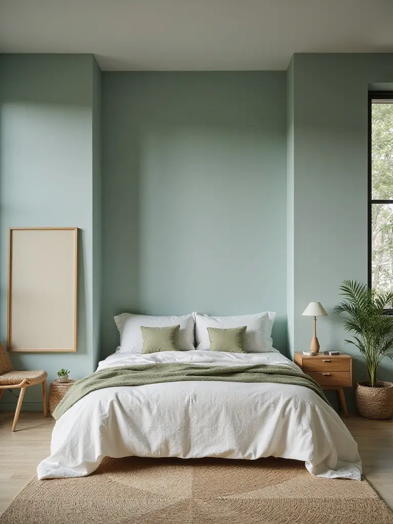
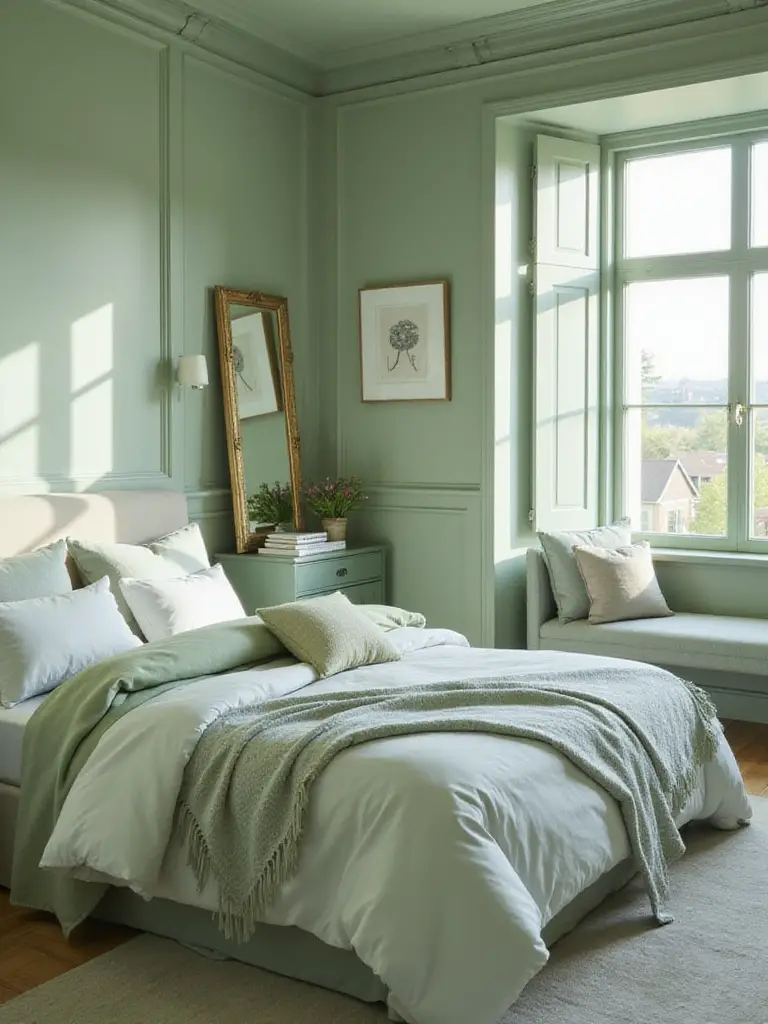
This goes way beyond “blue is calming.” Your relationship with color is personal, but there are some universal truths rooted in how our brains evolved. We’re wired to find nature restorative. Why do greens and blues feel peaceful? Because for millennia, they meant water and foliage—life, safety, and abundance. That’s biophilia, the innate human instinct to connect with nature.
Instead of just thinking about a color, think about a place. Do you want your bedroom to feel like a misty morning on the coast? A warm, sun-drenched terracotta patio? A quiet, deep forest? Picking an environment as your inspiration gives you a whole palette to work with and connects your room to a feeling that’s already hardwired in you for relaxation. Don’t just pick a color; pick a destination for your mind to travel to when you’re there.
Your bedroom walls can be a direct portal to the calming power of the natural world, even in the middle of a bustling city.
6. Sample Swatch Testing: Validate Colors Under Varying Light
This is my biggest pet peeve. Please, I am begging you, stop trying to choose a color from a tiny one-inch square of paper. It’s impossible. It’s like trying to imagine a forest by looking at a single leaf. Those little chips are printed with ink, not paint, and they can’t possibly show you how a color will change with the light in your space.
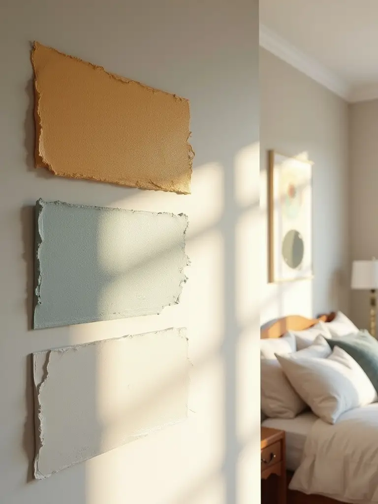
Here’s the shortcut you absolutely must take: buy peel-and-stick samples. They are large swatches of real paint you can move around the room. Stick one on the wall that gets bright morning light and another on the dark wall by your closet. Look at them in the morning, in the afternoon, and at night with your lamps on. A color can shift dramatically, revealing weird undertones you never saw coming. Spending $20 on a few samples can save you from a $500 repainting mistake and a whole lot of frustration.
It’s the single most important, non-negotiable step in the whole process. Don’t skip it.
7. Select Paint Finish: Optimize Durability and Sheen
Choosing the finish—or sheen—is about balancing aesthetics and practicality. In a bedroom, you want a soft, livable feel, not a shiny, sterile one. High-gloss finishes are for high-traffic areas you need to scrub constantly. For bedroom walls, a flat or matte finish is beautiful; it absorbs light and creates a velvety, immersive feeling. But traditional flat paint is delicate and scuffs if you so much as look at it wrong.
The happy medium for most adult bedrooms is an eggshell or satin finish. It has a very subtle glow that gives the color a bit of life without being shiny, and it’s durable enough that you can wipe off the occasional smudge. The real game-changer, though, is the new generation of washable matte paints. Many brands now offer flat paints that are formulated to be scrubbable. You get that rich, sophisticated, no-sheen look with the durability you need for a living space.
From a sustainability standpoint, choosing a durable paint means you won’t have to repaint as often, which saves resources, money, and time.
Classic & Creative Color Applications for Impact
Okay, planning is done. You’ve found your mood, assessed your light, and picked a finish. Now for the fun part: putting that color on the walls in a way that feels intentional and beautiful. This is where we go beyond just painting four walls and start using color as a design tool to build character.
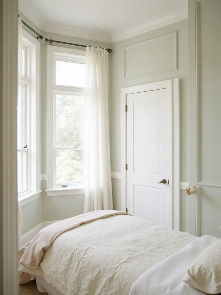
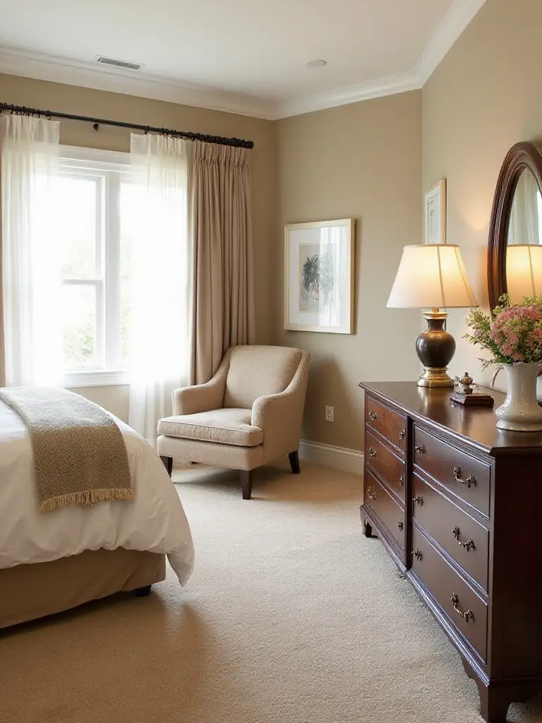
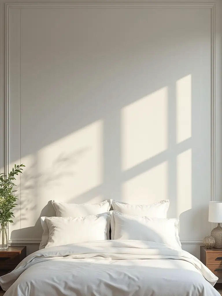
8. Embrace Neutral Tones: Achieve Timeless Sophistication
Neutrals have a bad rap for being “boring,” and that’s just lazy thinking. A good neutral is like rich, healthy soil. It’s the foundation that allows everything else—your art, your plants, your favorite quilt—to thrive and be the star of the show. A complex neutral, like a soft gray with a hint of green or a warm white that feels like sheep’s wool, provides a calm, versatile backdrop that you’ll love for years.
The key to a neutral room that feels cozy and not sterile is texture. Think of a forest in winter. It’s all neutrals—browns, grays, whites—but it’s fascinating because of the texture of the bark, the softness of the snow, the crispness of the leaves. In your room, that means layering chunky knit blankets, linen curtains, a soft wool rug, and warm wood tones. A well-done neutral room is a masterclass in subtlety and calm, a perfect canvas for a peaceful life.
These tones create a space that breathes and allows you the flexibility to change your style without having to repaint every two years.
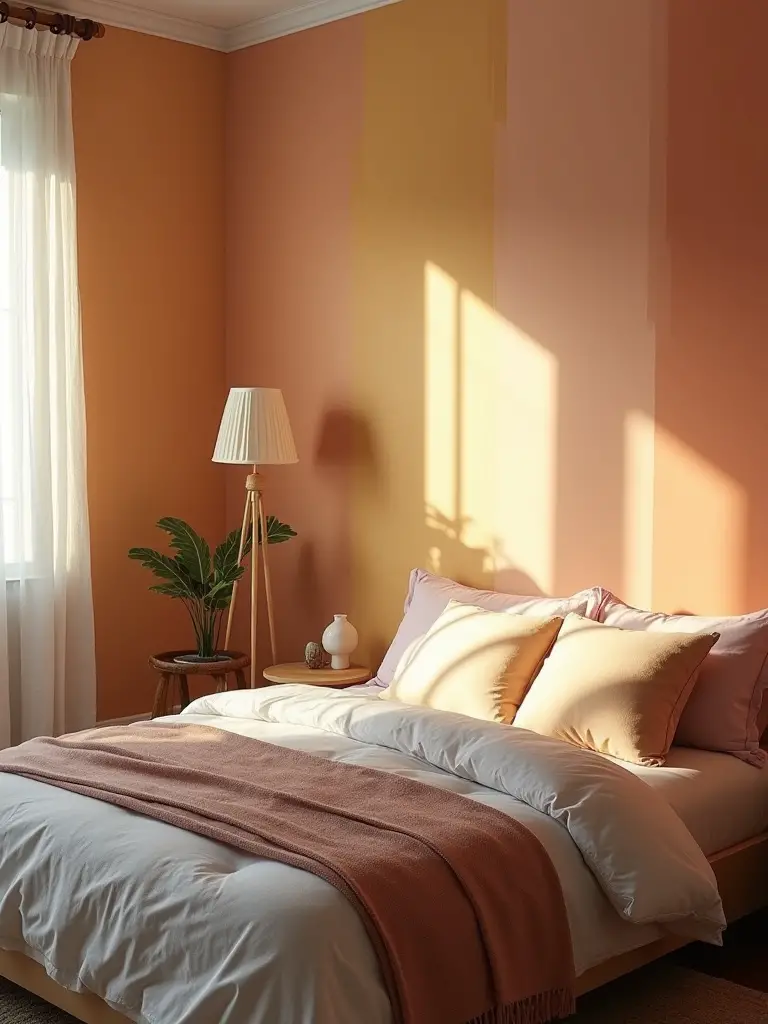
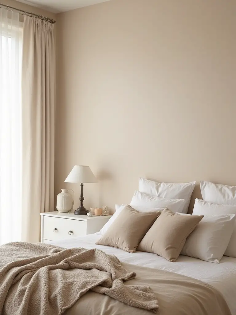
9. Incorporate Warm Hues: Foster Cozy, Inviting Retreats
Warm colors are the color of welcome. Think of sun-baked terracotta, a golden hour glow, or the soft brown of rich soil. These colors feel like a hug. They make a space feel physically and emotionally warmer, more intimate, and more nurturing. For a bedroom, you don’t need a fiery red or a bright orange; that can be too stimulating. Instead, think about the muted, earthy end of the warm spectrum.
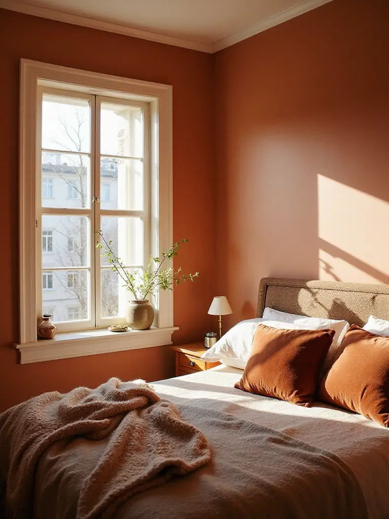
I love using colors like dusty rose, soft ochre, or a warm caramel. They feel incredibly grounding and safe. To keep it from feeling heavy, balance a warm wall color with lots of natural materials. Think creamy linen bedding, light wood furniture, and plenty of plants. One of my favorite projects was a client’s bedroom that we painted a soft, earthy terracotta. Paired with her collection of houseplants, it felt like a little greenhouse oasis, a perfect escape from the gray city outside.
A warm palette makes a room feel held and protected, the perfect environment to rest and recharge in.
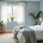
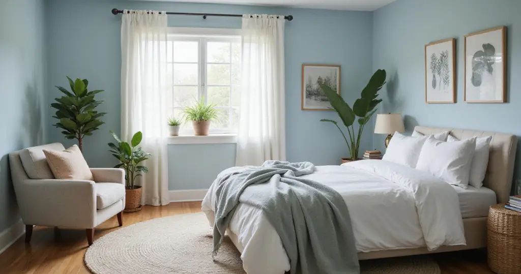
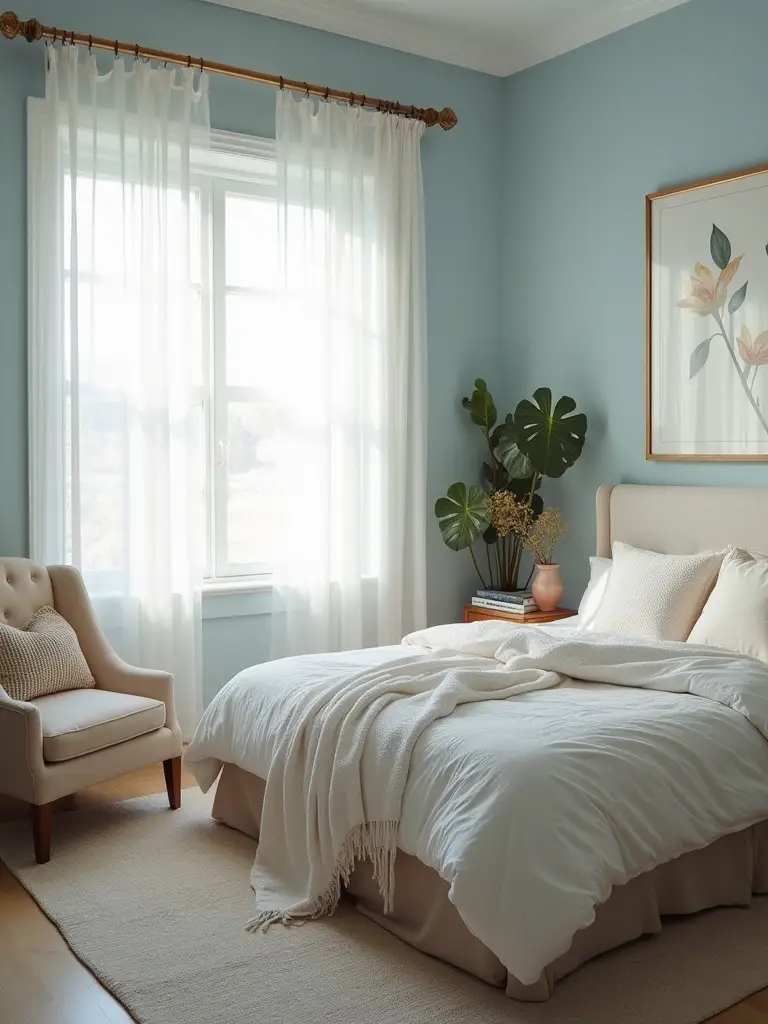
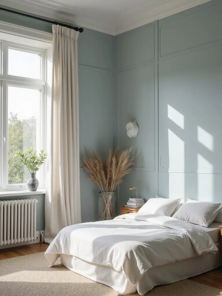
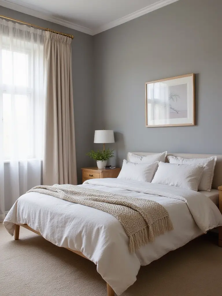
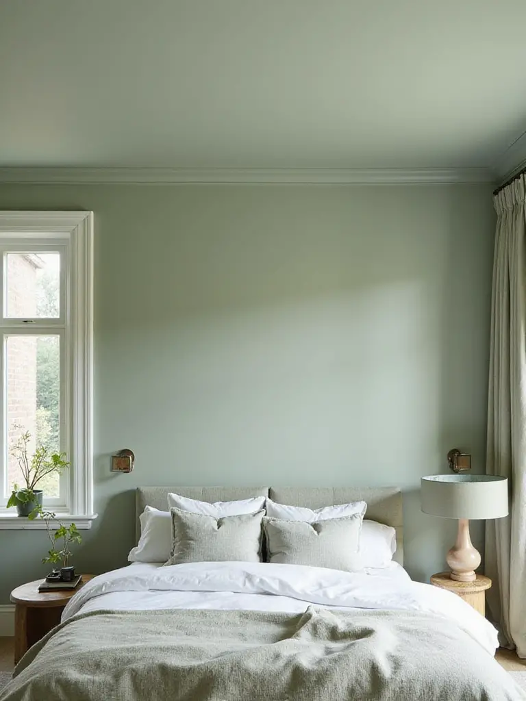
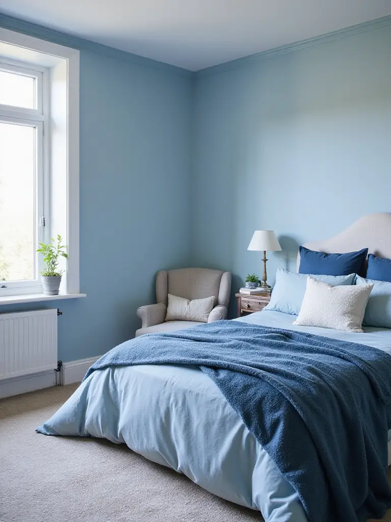
10. Adopt Cool Shades: Promote Calmness and Relaxation
Cool colors are the antidote to a stressful day. Blues, greens, and soft, cool grays are the colors of nature’s biggest calming agents: the sky and the water. They are expansive and serene, and their ability to lower our heart rate is scientifically backed. When you use them in a bedroom, you are essentially prescribing yourself a dose of tranquility.
The secret is to keep them from feeling cold. A room painted entirely in a stark, cool blue can feel a bit chilly and clinical. The solution is to warm it up with texture and natural materials. Pair a soft sage green wall with a warm oak bedframe, or a dusty blue with brass lamps and a cozy wool rug. I advised a client who wanted a blue room to use Sherwin-Williams’ “Sea Salt,” a magical color that’s a perfect chameleon between green, blue, and gray. We paired it with white oak and linen, and the room became his go-to space to decompress.
Cool tones create a restful atmosphere that encourages deep breathing and a quiet mind.
11. Design a Feature Wall: Create Instant Visual Interest
If painting a whole room a bold color feels like too much of a commitment, a feature wall is your answer. It’s a low-risk, high-reward way to add a serious dose of personality and depth to your room. Typically, the best wall for this is the one behind your headboard, as it anchors the bed and creates a natural focal point for the room’s main purpose: rest.
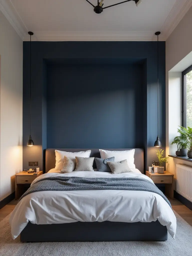
But a feature wall doesn’t just have to be a different color. This is a great place to play with texture! Think about a wall of reclaimed wood, a beautiful grasscloth wallpaper, or a soft, moody limewash finish. A deep, saturated color—like a forest green or a dark navy—on just one wall can create an incredible sense of depth, making the room feel more expansive and dynamic. It’s a focused burst of energy that elevates the entire space.
Think of it as the one statement piece of jewelry that completes an outfit.
12. Explore Monochromatic Schemes: Add Depth with Single Hues
A monochromatic room is one of the most sophisticated, calming ways to design a space, but people often get it wrong. It doesn’t mean painting everything the exact same color. It means choosing one base hue and then using its various tints, tones, and shades to build a layered, harmonious world. Imagine all the different shades of green on a single fern—that’s the idea.
The key to making a single-color scheme work is to lean heavily on different sheens and textures. For example, you could paint the walls in a flat, soft sage green, the trim in a slightly deeper sage with a satin finish, and bring in velvet pillows in a rich olive green. The subtle variations create depth and interest without any visual jarring. It’s incredibly restful for the eye because there are no harsh contrasts to process.
This approach creates a seamless, immersive environment that feels like being wrapped in your favorite color.
13. Utilize Two-Tone Walls: Add Dimension with Color Blocking
A two-tone wall, often with a darker color on the bottom and a lighter one on top, is a classic trick for a reason. It adds architectural interest to a room that might not have any. It can make a ceiling feel higher and a space feel more grounded. I love this technique because it reminds me of the horizon line in a landscape—the connection between the earth and the sky.
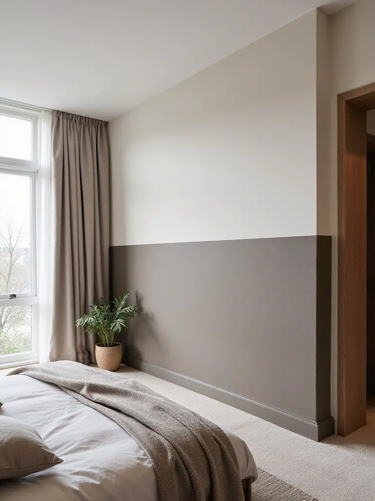
Don’t just split the wall in half. The most pleasing look is usually achieved with a one-third to two-thirds ratio. Using a darker, earthier tone on the bottom third of the wall grounds the furniture and makes the space feel solid and secure. The real pro trick for getting a perfectly crisp line is this: after you’ve put up your painter’s tape, paint over the edge of the tape with the first color. Let it dry. This seals the edge, so when you paint the second color, none of it can bleed underneath. You’ll get a flawless line every time.
It’s a simple paint trick that gives a room a custom, thoughtfully designed feel.
14. Complement Existing Woodwork: Select Harmonious Trim Colors
Please don’t fight with your woodwork. If you have beautiful, unpainted wood trim, doors, or floors, that is a dominant color in your room. Treating it like an afterthought is a huge mistake. The classic mistake is pairing warm, golden-toned oak with a stark, cool white trim. The white makes the oak look yellowish and dated, and the oak makes the white look harsh and cheap. They bring out the worst in each other.
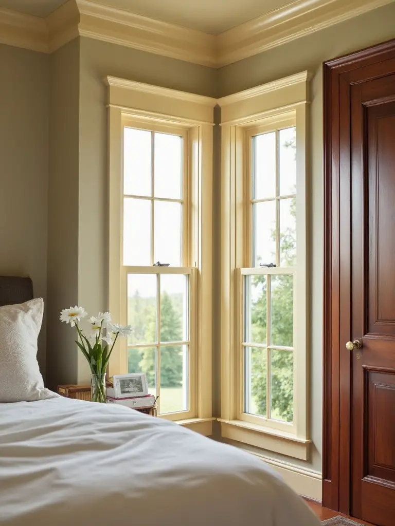
Instead, look for the undertones in your wood and choose a wall or trim color that harmonizes. With that same golden oak, a creamy, warm off-white will feel much more cohesive and expensive. If you have dark, rich cherry or mahogany with red undertones, a soft, warm gray or a deep, earthy green can be stunning. You are trying to create a family of colors that feel like they belong together.
Honoring the natural materials already in your home is the first step to creating a space that feels authentic and integrated.
15. Paint the Ceiling Strategically: Elevate Room Height Perceptibly
We call the ceiling the “fifth wall,” and it’s probably the most neglected surface in a house. Most people just slap on some flat white and call it a day, but you’re missing a huge opportunity! Painting your ceiling a color other than white can have a massive impact. To make a low ceiling feel higher, paint it a crisp white or a color that is a few shades lighter than your walls. This makes it visually recede.
But for a truly sophisticated and cozy effect, especially in a bedroom with average or high ceilings, try painting the ceiling the same color as the walls. I know it sounds crazy, but doing this erases the boundaries of the room. It creates a continuous, enveloping feeling—like being inside a beautiful jewelry box. It’s particularly powerful with darker, moodier colors, turning the room into the ultimate cocoon for sleep.
Don’t ignore that fifth wall. It’s a blank canvas with so much potential to shape the feeling of your room.
Advanced Techniques & Bespoke Finishes for Unique Flair
Ready to get a little more adventurous? If you want your bedroom to feel less like a page from a catalog and more like a true expression of you, these techniques are where the magic happens. This is about adding layers, personality, and that unique flair that makes a space truly yours.
16. Experiment with Dark Shades: Create Intimate, Dramatic Ambiance
I need to shout this from the rooftops: DARK COLORS DO NOT AUTOMATICALLY MAKE A ROOM FEEL SMALL. It is the biggest lie in interior design. A deep, dark color on the walls of a small room can actually make it feel bigger because the corners and edges disappear. The walls recede into what feels like an infinite, velvety space. It is the ultimate trick for creating a dramatic, intimate, and unbelievably cozy room.
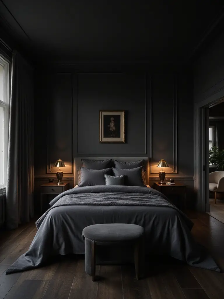
Think about a deep forest green, a moody charcoal gray, or a rich navy blue. These colors are perfect for bedrooms because they absorb light, which helps minimize visual distraction and encourages sleep. The key is to use a flat or matte finish to really lean into that soft, light-absorbing quality. Then, balance the darkness with light-colored bedding, a plush rug, and warm, layered lighting from lamps. It creates a space that feels like a protective embrace, a perfect escape from the bright chaos of the outside world.
It’s a bold move, but it pays off with an incredibly chic and restorative sanctuary.
17. Apply Metallic Accents: Introduce Glamour and Sparkle
A little bit of sparkle can bring a room to life. But I’m not talking about glitter paint. I mean a subtle, sophisticated use of metallic finishes that catch the light, like the glint of mica in a rock or sunlight on water. Using a metallic paint for a subtle stenciled pattern, on the back of a bookshelf, or even on the ceiling can add a touch of glamour and luxury.
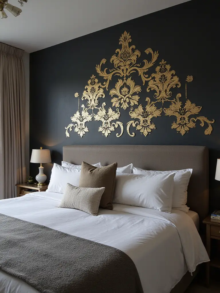
The trick is to use it sparingly and with intention. A full wall of metallic paint can be a bit much, but a tone-on-tone damask stencil in a soft gold over a creamy wall can be stunningly elegant. Warm metallics like gold, brass, and copper add warmth and a touch of history, while cool metallics like silver and pewter feel more modern and sleek. The way they play with your lamplight in the evening can add a dynamic, almost magical quality to the room.
It’s like adding a single, perfect piece of jewelry to your space—a small detail that elevates everything.
18. Integrate Analogous Colors: Craft Harmonious, Rich Palettes
This sounds technical, but it’s an idea pulled directly from nature. Analogous colors are colors that sit right next to each other on the color wheel—like blue, blue-green, and green. Think of a hillside covered in different types of foliage, or the subtle shift of colors in a sunset. Because they are neighbors, they have an inherent harmony that is incredibly pleasing and restful to the eye.
Creating a bedroom with an analogous palette is a fantastic way to use multiple colors without it feeling busy or chaotic. You could have walls in a soft, dusty blue, bedding in a deep teal, and accent pillows in a rich moss green. The look is layered, rich, and sophisticated, but because the colors are all related, the overall effect is deeply calming. It’s the visual equivalent of listening to a beautiful symphony.
This is a surefire recipe for a palette that feels both complex and incredibly serene.
19. Define Zones with Paint: Structure Open-Plan Bedrooms Effectively
For those of us living in apartments, studios, or open-plan homes, creating a sense of separation is key to our sanity. You don’t want to feel like you’re sleeping in your office. Paint is the cheapest and most effective way to create “zones” without putting up walls. You can visually carve out a sleeping nook, a small desk area, or a reading corner just by using color.
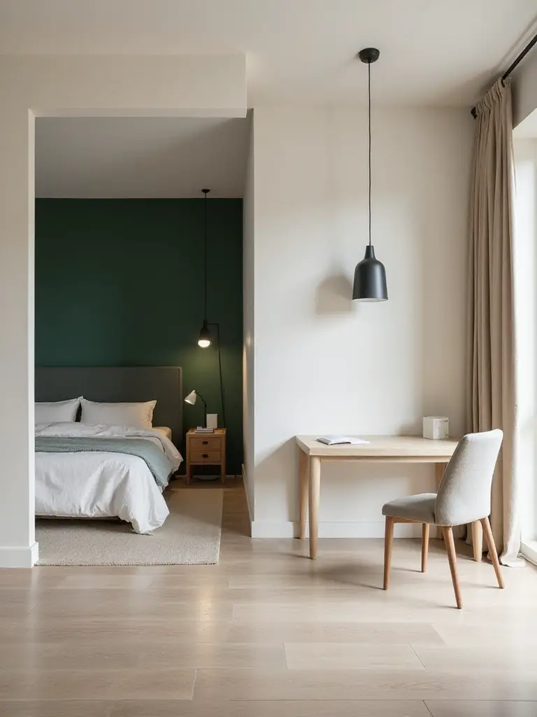
Paint the wall behind your bed and maybe wrap it around one adjacent corner in a deep, calming color. This creates a visual “canopy” that feels like a distinct room within a room. Or, paint a recessed alcove a contrasting color to turn it into an intentional reading spot. This isn’t just a design trick; it’s good for your brain. Creating a visually distinct sleep zone helps signal to your mind that when you’re in that space, it’s time to rest, which can lead to better sleep hygiene.
It’s about making your space work harder for you, creating multi-functional harmony in a single room.
20. Employ Subtle Patterns: Add Sophistication Without Clutter
Sometimes you want more interest than a solid color, but you don’t want the busyness of a bold wallpaper. The solution is a subtle, painted pattern. My favorite way to do this is with a tone-on-tone effect. You paint the wall in a flat or matte finish, then use the exact same color in a higher sheen, like satin, to paint a simple pattern like wide vertical stripes or a geometric stencil.
The result is incredibly chic. The pattern is almost invisible when you look straight at the wall, but as you move through the room and the light changes, it reveals itself with a soft shimmer. It adds depth, texture, and a custom-designed feel without adding any clutter or visual noise. It’s the kind of quiet detail that makes a room feel special and thoughtfully put together.
This technique delivers a huge dose of sophistication with a whisper, not a shout.
21. Select Biophilic Colors: Connect Space with Nature
We’ve finally arrived at my absolute passion. Biophilia is the idea that humans have an innate need to connect with nature. Using biophilic colors in your bedroom is one of the most powerful things you can do for your well-being. It’s about creating an indoor habitat that mirrors the restorative qualities of the outdoor world. Ditch the artificial-feeling colors and embrace the palette of the earth.
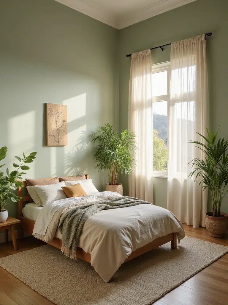
Think of the entire spectrum of nature: the soft grays of river stones, the deep browns of fertile soil, the myriad greens of a forest canopy, the calming blues of a clear sky or deep ocean. When you paint your walls in these hues, you are tapping into a primal sense of calm. Pair a sage green wall with natural wood furniture, linen bedding, and, of course, actual living plants, and you’ve created a space that doesn’t just look good—it actively nurtures you.
This isn’t a trend; it’s a wellness strategy. It’s about designing a room that helps you feel more grounded, calm, and alive.
22. Enhance Small Nooks: Add Personality with Contrasting Hues
Every room has them—those little forgotten spaces. A recessed bookshelf, the inside of a closet, a small alcove by a window. These are golden opportunities! Painting these small nooks in a bold, contrasting, or unexpectedly deep color is like discovering a secret garden. It’s a delightful surprise that adds layers of personality to your room.
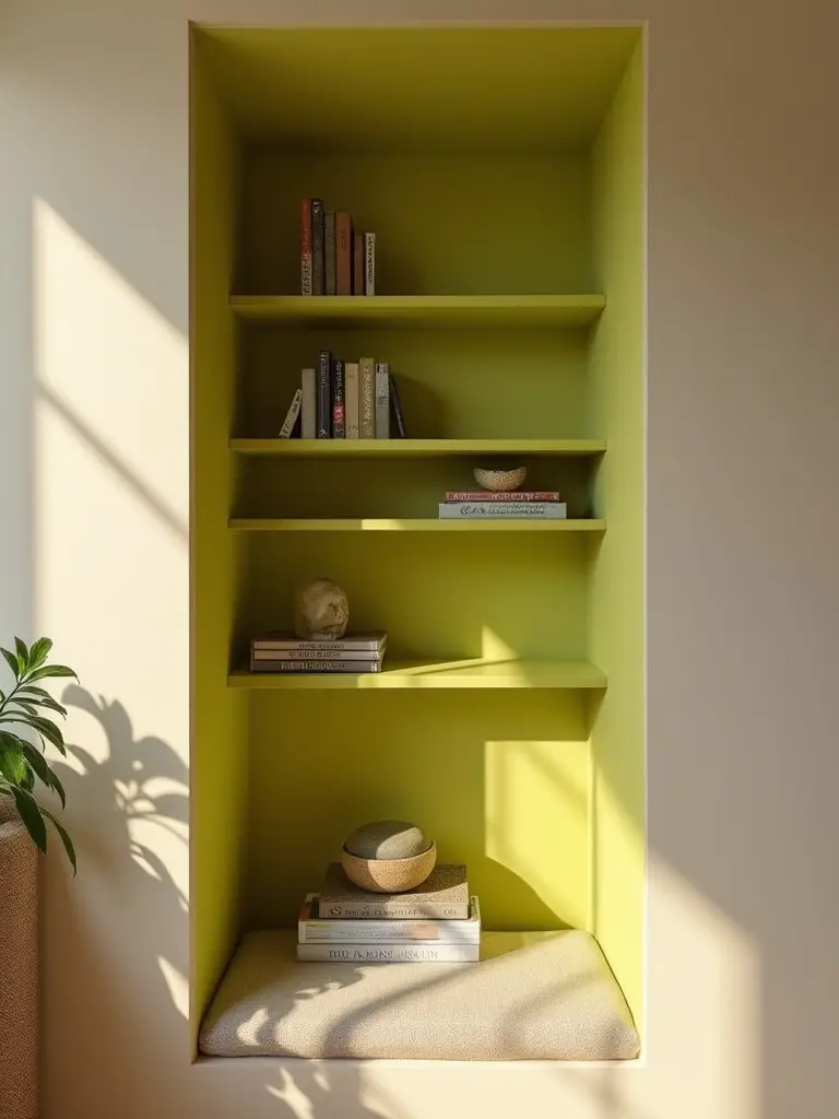
Imagine a calm, neutral bedroom, and when you open the closet, the back wall is painted a vibrant, joyful yellow. Or a reading nook painted a deep, inky navy that makes you want to curl up with a book. It’s a low-cost, low-risk way to be daring with color. If you hate it, it’s only a small area to repaint. But when you get it right, it adds a spark of character and charm that makes the entire room feel more considered and unique.
These are the little moments of design joy that turn a house into a home.
Conclusion
Your bedroom isn’t just a room; it’s the root system for your life. It’s where you rest, recharge, and heal so you can face the world. The color on your walls is a fundamental part of that ecosystem, a silent partner in your well-being. By choosing colors that are not just beautiful but are also supportive of your mood, in tune with your light, and connected to the natural world, you are practicing a form of self-care that will pay you back every single night.
So take these ideas, trust your instincts, and don’t be afraid to experiment. Grab those samples and start the journey. You have the power to cultivate a space that is more than just four walls—you can grow a true sanctuary, a personal retreat that feeds your soul and helps you wake up ready for whatever comes next. Now go on, dip that brush and create the haven you deserve.