Howdy, folks! Gabriel Rodríguez-Watson here, ready to lasso in some color wisdom for your dining room. You know, choosing the right dining room furniture and paint combination is like finding the perfect dance partner at a hoedown – when you get it right, it’s pure magic. But when it’s off, well, let’s just say it can be as awkward as a cactus in a cornfield.
I’ve seen my fair share of dining rooms that could make a roadrunner stop in its tracks – and not in a good way. But don’t you worry, partner? By the time we’re done here, you’ll be wrangling those colors like a pro, creating a space that’s as warm and inviting as a crackling campfire under the desert stars.
So, saddle up, and let’s move on through the Wild West of color theory, wood tones, and fabric matching. We’ll wrangle those unruly hues and corral them into a dining room that’s as harmonious as a well-tuned guitar at a fireside singalong. Ready to paint the town (or at least your dining room) red… or blue… or whatever color tickles your fancy? Let’s ride!

Understanding Color Theory
Picture this: you’re standing in front of a magnificent Sonoran Desert sunset. The sky’s ablaze with a palette that’d make even the most seasoned artist tip their hat in respect. That, my friends, is Mother Nature’s very own color wheel, and it’s the key to unlocking the mysteries of color theory.
Basics of Color Wheel
Now, let’s break it down simpler than a chuck wagon cook’s recipe. We’ve got our primary colors – red, blue, and yellow. These are the building blocks, the foundation of our color corral, if you will. Mix ’em up, and you get your secondary colors: green, orange, and purple. Feeling fancy? Throw a primary and a secondary color together, and voila! You’ve got yourself a tertiary color.
But here’s where it gets as interesting as a rattlesnake in your boot – warm colors like red and yellow can fire up a room faster than a chili pepper, while cool colors like blue and green can calm things down quicker than a desert night.
Complementary Colors
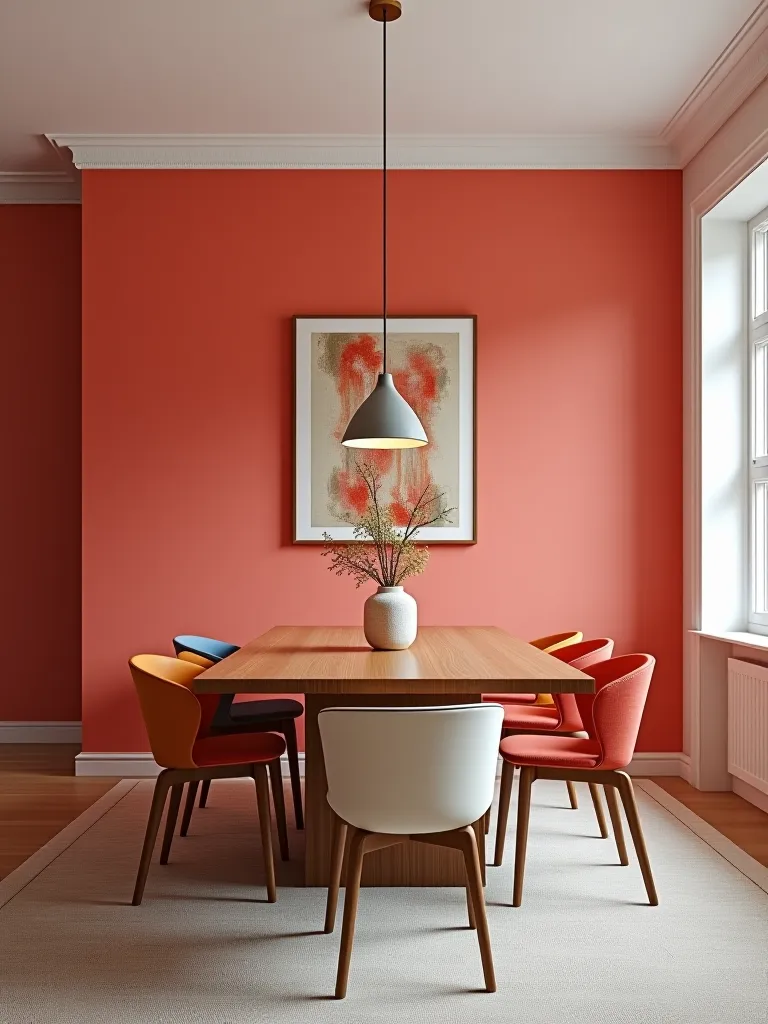
Ever notice how a red cardinal looks even more striking perched on a green pine? That’s complementary colors at work, partner. These colors sit opposite each other on the color wheel, creating a contrast more dramatic than a Texas-tall tale. Pairing blue with orange or red with green in your dining room can create an energy that’ll have your guests more excited than a prospector striking gold.

Analogous Colors
Now, if you’re looking for something smoother than a well-worn saddle, analogous colors might be your trail to follow. These colors nestle up next to each other on the color wheel like a litter of coyote pups. Think blue, blue-green, and green for a look as serene as a mountain stream. Or, if you’re feeling sunny, try yellow, yellow-orange, and orange to bring in warmth that rivals an Arizona afternoon.
Matching Paint to Wood Tones
Alright, buckaroos, let’s talk about marrying your paint to those beautiful wood tones. It’s a dance as delicate as a tumbleweed in a gentle breeze, but get it right, and your dining room will sing sweeter than a meadowlark at dawn.
Light Wood Tones
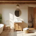
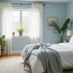
Light woods like pine and oak are as bright and cheerful as a spring day in the high country. These woods are like a blank canvas, ready for your artistic touch. For these sunny woods, think soft and easy on the eyes. Pastel blues or creamy whites can complement them like a clear sky over an open prairie. These combos will have your dining room feeling as spacious and inviting as the great outdoors.
Medium Wood Tones
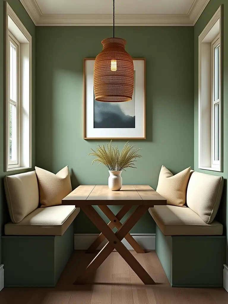
Moving on to medium woods like cherry and walnut – these beauties are as rich and warm as a mug of cowboy coffee by the campfire. They’ve got character, like the lines on an old rancher’s face. Pair them with colors that have some backbone – sage green or a warm beige can stand up to these woods without overshadowing them. It’s all about creating a room that feels as cozy and inviting as a well-worn leather armchair.
Dark Wood Tones
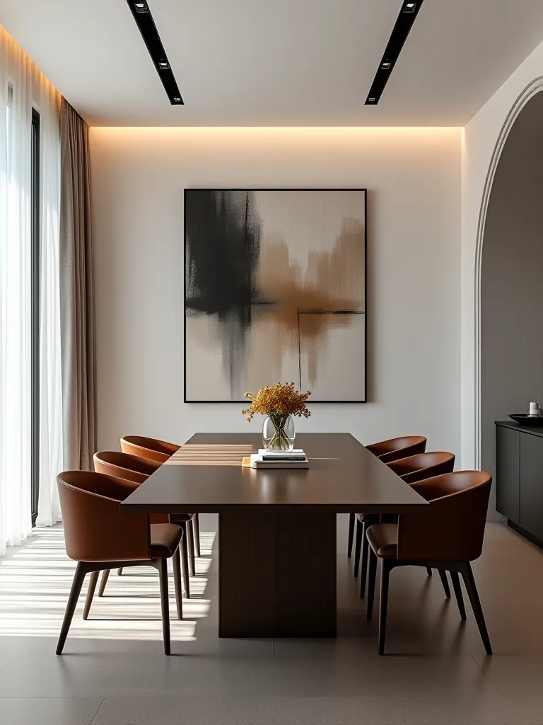
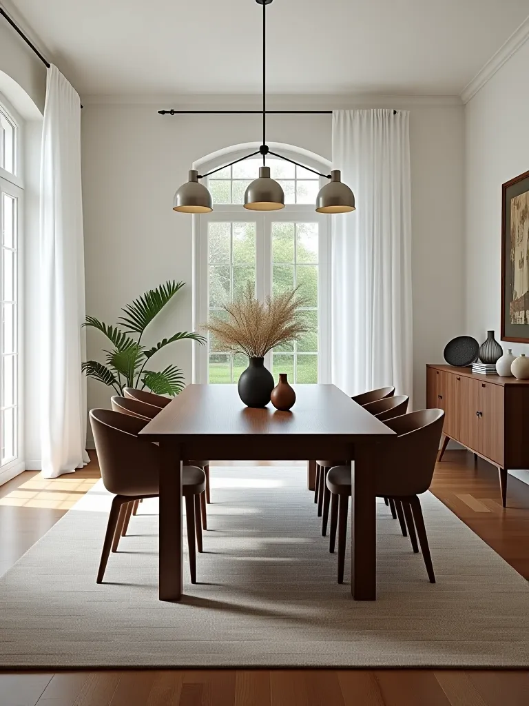
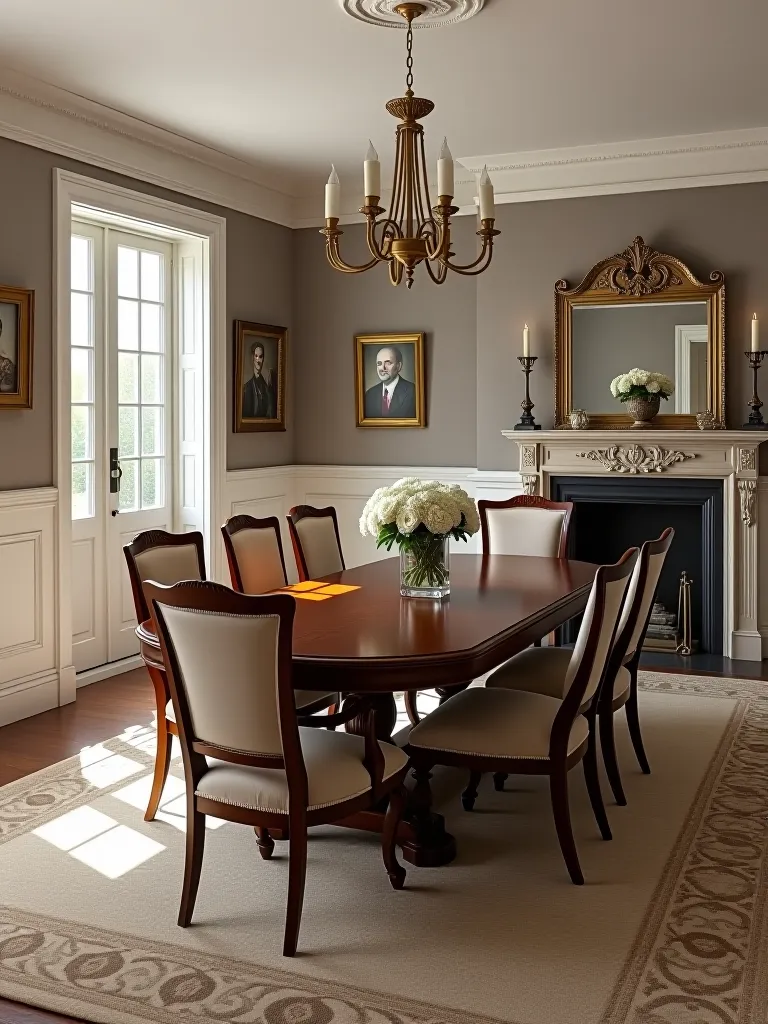
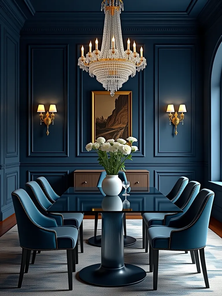
Now, for those deep, dark woods like mahogany and ebony – these are the strong, silent types of the wood world. They’ve got more gravitas than a judge’s gavel, and they deserve colors that can match their intensity. Think deep jewel tones, partner. A navy blue or forest green can complement these dark woods like stars in the night sky. The result? A dining room with more sophistication than a cattle baron’s mansion.
Coordinating with Upholstery Fabrics
Alright, folks, let’s wrangle in those fabric choices. Picking the right upholstery is like choosing the perfect bandana – it’s gotta look good and serve a purpose. Let’s see how we can lasso these fabrics into our color scheme.
Neutral Fabrics
Neutral fabrics are like the trusty mule of the design world – they’re versatile and reliable, and they get the job done without much fuss. We’re talking about your beiges, grays, and creams here. These fabrics are as adaptable as a chameleon in a color factory. Pair them with soft whites or light taupes on the walls, and you’ve got yourself a dining room as timeless and elegant as a vintage silver belt buckle.
Bold Fabrics
Now, for those of you with a bit more giddy-up in your step, bold fabrics might be your rodeo. These are your reds, blues, and patterns that are busier than a one-armed paper hanger. But be careful there, partner – you don’t want your dining room looking like it got into a fight with a box of crayons and lost. Balance these bold beauties with softer, more muted wall colors. It’s like pairing a flashy rodeo shirt with a simple pair of jeans – it just works.
Patterned Fabrics
Patterned fabrics can add more interest to your room than a poker game at high noon. Whether you’re partial to florals, stripes, or something that looks like a rattlesnake got loose with a paintbrush, these fabrics can tie a room together. The trick is to pick out one of the colors in the pattern for your walls. It’s like finding the harmony in a cowboy’s ballad – when you hit the right note, everything just falls into place.
Creating Effective Color Schemes
Now that we’ve got our colors sorted out like cattle at a roundup, let’s talk about putting them all together in a way that’ll make your dining room sing sweeter than a cowboy’s guitar at sunset.
Monochromatic Schemes
A monochromatic color scheme is like a lone cowboy riding off into the sunset – simple, but boy, does it make an impact. We’re talking about using different shades and tints of a single color here, folks. Imagine a dining room decked out in various blues, from a deep navy to a soft sky blue. It’s as soothing as a cool desert night and creates a space more harmonious than a well-tuned fiddle.
For those interested in exploring different styles, check out our guide on eclectic dining room paint ideas to spice things up even more.
Contrasting Schemes
Now, if you’re feeling a bit more adventurous than a bronco at its first rodeo, you might want to try a contrasting color scheme. This is where we pair colors that are as different as a cactus and a tumbleweed, but when done right, they create a look that’s more striking than a lightning bolt in a clear sky. Think dark furniture against lighter walls, like a deep red wall playing off white or cream furniture. It’s a look that’ll have your guests’ jaws dropping faster than a cowboy of a bucking bull.
Subtle Color Statements
For those of you who prefer your colors as understated as a whisper on the prairie wind, subtle color statements might be your trail to follow. We’re talking about soft, muted colors that enhance your dining room’s charm without screaming for attention like a rooster at dawn. Consider pastel shades like soft gray or pale lavender for your walls. It’s like adding a touch of color to the desert landscape – subtle, but breathtaking in its own right.
Tips for a Cohesive Look
Alright, partners, we’re in the home stretch now. Let’s talk about tying all these elements together like a perfectly knotted lasso.
Balancing Colors
Balancing colors in your dining room is as crucial as keeping your balance on a spirited stallion. You want to create a sense of unity that’s as harmonious as a well-rehearsed cowboy band. Start with your main color – that’s your lead singer. Then bring in one or two supporting colors to back it up, like a good bass and drum. A good rule of thumb is the 60-30-10 rule: 60% main color, 30% secondary color, and 10% accent. Follow this, and your dining room will be more put-together than a cowboy’s kit before a long cattle drive.
Using Accent Colors
Accent colors are like the spurs on your boots – they add that extra bit of flair that makes all the difference. These bold hues can be introduced through accessories like cushions, table runners, or artwork. Use them to draw the eye to your dining room’s best features, like that beautiful oak table or the antique light fixture you picked up at the flea market. The right accent color can energize your space more than a double shot of espresso at the chuck wagon.
Considering Room Lighting
Now, don’t forget about lighting, folks. It’s as important to your color scheme as water is to a desert bloom. Natural light changes throughout the day like the shifting shadows on a canyon wall, and it can make your colors look as different as night and day. And don’t get me started on artificial lighting – it can change your carefully chosen paint color faster than a chameleon on a mood ring.
Always test your paint samples in different lights before you commit. It’s like trying on a new hat – you want to make sure it looks good in all conditions. Warm tones can make a bright room feel cozy, while cooler shades can open up a dimmer space like a breath of fresh mountain air.
For more insights on how colors can affect the mood of your dining room, take a gander at our article on dining room color psychology.
Closing Thoughts
Well, folks, we’ve corralled quite a few ideas here today. From understanding the basics of color theory to matching paint with wood tones and fabrics, we’ve covered more ground than a tumbleweed in a windstorm. Remember, creating the perfect dining room is like breaking in a new pair of boots – it takes time, patience, and a willingness to try different things until you find what fits just right.
Now it’s your turn to take the reins and start experimenting. Don’t be afraid to trust your instincts – after all, your dining room should be a reflection of you, as unique as your brand. So go ahead, partner. Grab that paintbrush and saddle up for a color adventure. Your perfect dining room is just over the next hill, waiting to be discovered.
And remember, if you ever feel lost in the Wild West of interior design, just think of old Gabriel here. I’ll be cheering you on from my porch, sipping on a cool glass of lemonade and admiring the sunset colors that inspired it all. Happy painting, y’all!
Frequently Asked Questions
How do I choose the right paint color for my dining room?
Well, partner, choosing the right paint color is like picking the perfect horse – you’ve got to consider all the factors. Start by taking a good look at your existing furniture and decor. Then, mosey on over to a color wheel and find some complementary shades that catch your eye. But don’t pull the trigger just yet! Test those colors on your wall first. Watch how they change from dawn to dusk, like the shifting colors of a desert landscape. You want a color that looks good in all lights, not just high noon.
What wood tones work best with certain paint colors?
It’s all about finding that perfect harmony, like a well-tuned guitar. Warm wood tones, rich as a good cup of coffee, pair beautifully with earthy colors like terracotta or olive green. They’ll make your dining room feel as cozy as a campfire on a cool night. For those cooler wood tones, like ash or maple, try pairing them with blues and grays. It’ll be as refreshing as a dip in a mountain stream. But remember, always test your combinations before you commit – it’s like trying on a new pair of boots before a long ride.
Can I match my dining room furniture to the wall color?
Sure thing, you can match your furniture to your walls like a cowboy matches his hat to his boots. It can create a look as seamless as the horizon at sunset. But don’t be afraid to mix it up a little, either. Sometimes, a bit of contrast can add more interest to your room than a rodeo coming to town. The key is to find a balance that feels right to you, like a perfectly balanced saddle.
What upholstery fabrics should I consider for my dining room?
When it comes to upholstery, you want something as tough as old leather but as pretty as a desert flower. Natural fibers like linen or cotton are versatile, like a good ranch hand. They can dress up or down depending on the occasion. If you’re feeling bold, patterns can add more personality to your room than a herd of painted ponies. Just make sure they play nice with your other elements, like a well-trained cutting horse working with its rider.
How do I create an effective color scheme for my dining room?
Creating a color scheme is like planning a cattle drive – you need a clear direction and a good strategy. Start with your base color for the walls, like choosing your trail. Then, pick two or three accent colors from your furniture or decor. These are like your trusty companions on the ride. Stick to colors that are neighborly on the color wheel, or go for a bold contrast if you’re feeling adventurous. The goal is to have a dining room that feels as harmonious as a well-played country ballad.
What are some tips for achieving a cohesive look in my dining room?
Achieving a cohesive look is like orchestrating a perfect roundup. First, use a consistent color palette throughout, like a well-coordinated team of cowboys. Then, incorporate similar materials and textures across your furniture and decor. It’s like making sure all your gear matches before a big ride. Lastly, keep your accessories minimal, like a cowboy who only carries what he needs. This way, you’ll express your style without making your dining room look as cluttered as a general store on delivery day.
Should I consider lighting when choosing paint colors?
Absolutely, partner! Considering lighting when choosing paint colors is as important as checking the weather before a long ride. Lighting can change the look of your colors faster than a chameleon in a crayon factory. Test your paint samples under all kinds of lighting – natural light, your overhead fixtures, and even table lamps. You want to make sure your chosen color looks good at all times of day, from the first light of dawn to the last flicker of your evening candles. After all, you don’t want your carefully chosen color to look as out of place as a penguin in the desert once the sun goes down!