The kitchen is where meals are made, families gather, and memories are created. As the most dominant visual element, your kitchen cabinet colors play a monumental role in defining the space’s style and mood. Whether you dream of a bright retreat or a dramatic hub, the color you choose can orchestrate a complete transformation.
Diving into kitchen cabinet colors can feel overwhelming with so many options. From timeless neutrals that offer versatility to bold hues that make powerful statements, each color tells a different story. Let me guide you through 23 stunning cabinet color ideas that can revitalize your kitchen without requiring a complete renovation.
The inspiration for this collection struck when I noticed how dramatically different the same kitchen layout could feel with just a change of cabinet color. Let’s explore options that will help your space reflect your unique personality.
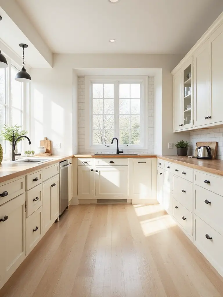
1. Timeless Appeal: Why White Cabinets Remain a Favorite
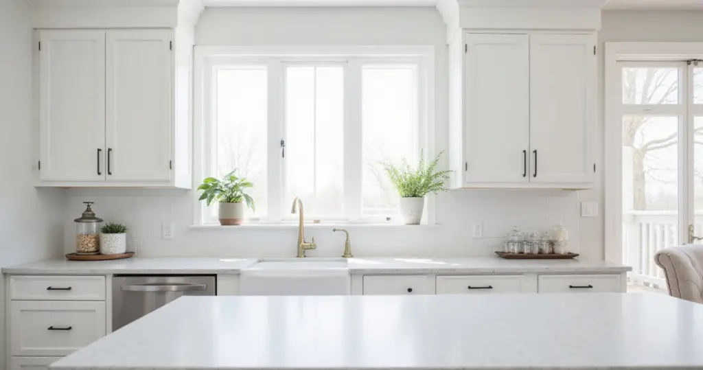
White cabinets possess a unique ability to transcend fleeting trends. Their neutrality makes them incredibly versatile, serving as a blank canvas that complements virtually any design style. They don’t clash with evolving choices in countertops, backsplashes, or hardware, allowing you to update other elements without replacing cabinets. This adaptability ensures they remain relevant across different eras and personal tastes.
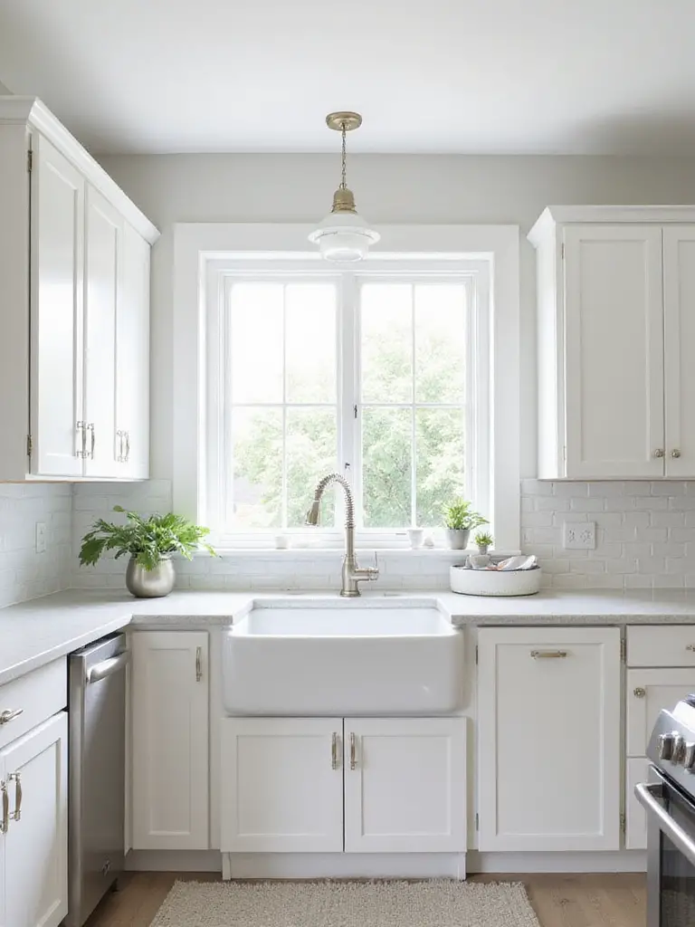
White naturally reflects light rather than absorbing it. In kitchens that can sometimes feel enclosed or lack ample natural light, white helps maximize illumination within the space. For smaller kitchens, white cabinets create an illusion of greater size and depth, making the area feel less cramped and more airy. The result is a kitchen that feels inviting, spacious, and full of light.
Pair white cabinets with a contrasting island color (like navy or black) to create a striking focal point while maintaining overall brightness. The unexpected pairing that always works is white perimeter cabinets with a wood-toned island that adds warmth.
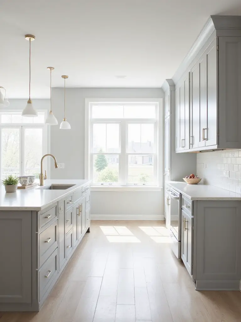
2. The Versatile Neutrals: Exploring Light Gray Cabinets
Light gray sits between white and black, acting as a sophisticated backdrop that doesn’t impose a strong color identity. Its neutrality allows it to pair effortlessly with a vast spectrum of colors, from vibrant hues to natural wood finishes. It adapts to various design styles, from ultra-modern to rustic, providing a sense of calm while allowing other kitchen elements to shine.
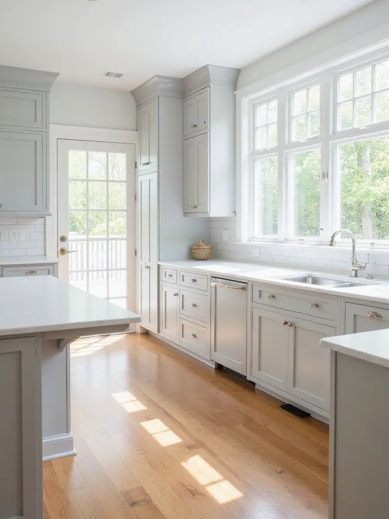
Light gray cabinets fit beautifully into multiple design aesthetics. They enhance Modern and Contemporary designs with their clean appearance, bridge the gap in Transitional kitchens, and brighten Scandinavian spaces. Like white, lighter colors reflect light rather than absorbing it, making a kitchen feel brighter and more open.
The magic of this piece lies in its chameleon-like ability to shift personality based on your accessories and hardware choices. Warm metals like brass create a different feel than sleek chrome or matte black – giving you flexibility to refresh your look without changing your kitchen cabinet colors.
3. Adding Depth and Drama: The Allure of Charcoal Gray
Charcoal gray offers a sophisticated alternative to black or standard gray. It adds significant depth and visual weight, creating a grounded and luxurious feel. Unlike stark black, charcoal often has subtle undertones (blue, green, brown) that add complexity and prevent the space from feeling overly harsh. It acts as a strong anchor, making lighter elements pop.
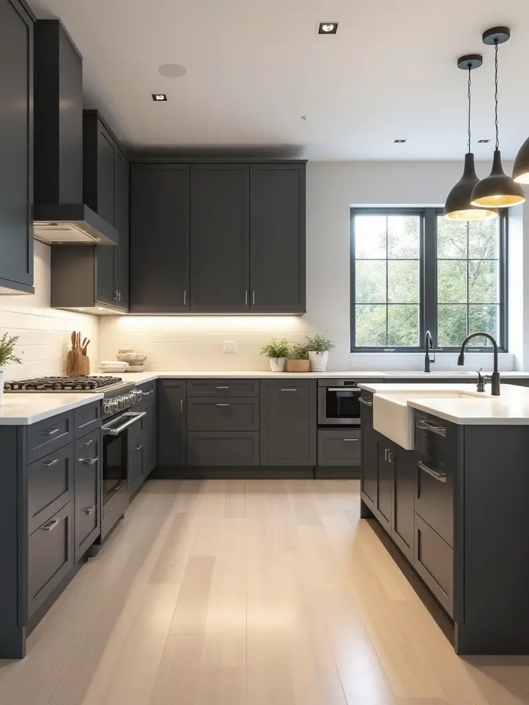
This deep neutral pairs beautifully with various elements. For countertops, white marble or quartz with subtle veining creates beautiful contrast. Backsplashes can range from classic white subway tile to bold patterns. Metallic hardware in brass, brushed nickel, or matte black provides elegant accents, while natural wood elements add warmth and prevent the space from feeling cold.
After months of sourcing and curation, we’ve found charcoal gray works particularly well in kitchens with ample natural light. The depth creates a cozy atmosphere without making the space feel smaller.
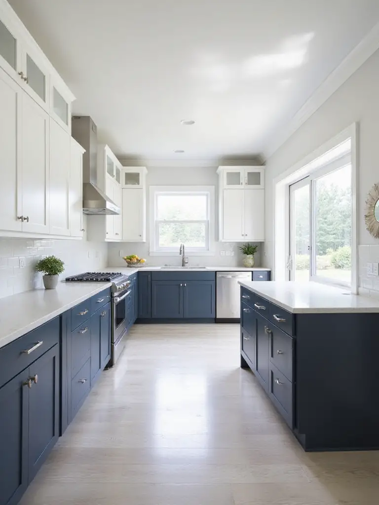
4. A Touch of Sophistication: Going Bold with Navy Blue
Navy blue offers a perfect balance between being a bold color and a sophisticated neutral. It’s deeper and more grounded than lighter blues, evoking feelings of trust and elegance. Unlike black, which can sometimes feel too heavy, navy provides depth without overwhelming the space. It acts as a strong focal point, instantly elevating the perceived value of the kitchen.
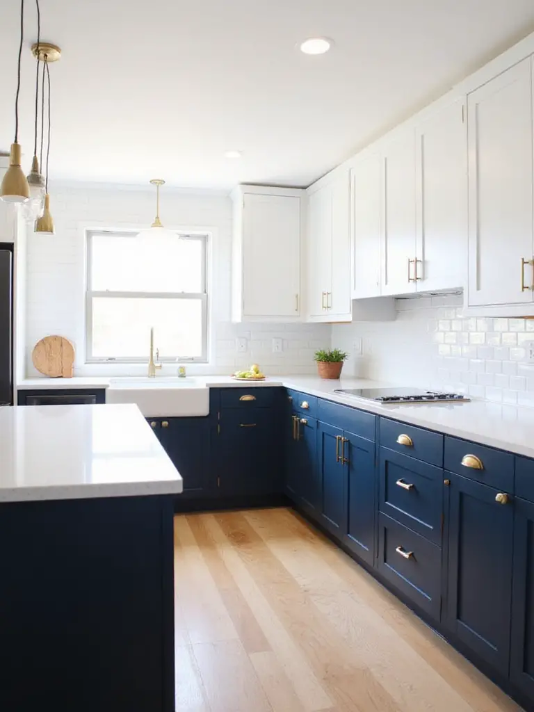
This versatile hue pairs beautifully with a wide range of materials. For countertops, white quartz or marble creates a crisp contrast, while warm butcher block adds texture. Hardware choices define the style: brass adds luxury, brushed nickel provides a modern feel, and matte black offers contemporary edge. Wall colors can range from crisp white for a nautical look to light grey or even blush pink for bolder statements.
The craftsmanship in this collection tells a story of balance – navy kitchen cabinet colors are bold enough to make a statement but neutral enough to have staying power. This combination ensures your investment will feel fresh for years to come.
5. Chic and Modern: Embracing Black Kitchen Cabinets
Black cabinets offer a bold, sophisticated look that instantly elevates a kitchen’s style. They provide a strong focal point and create a sense of depth and luxury. Black is incredibly versatile, pairing well with a wide range of materials and colors, making it suitable for various modern design aesthetics, from minimalist to industrial chic.
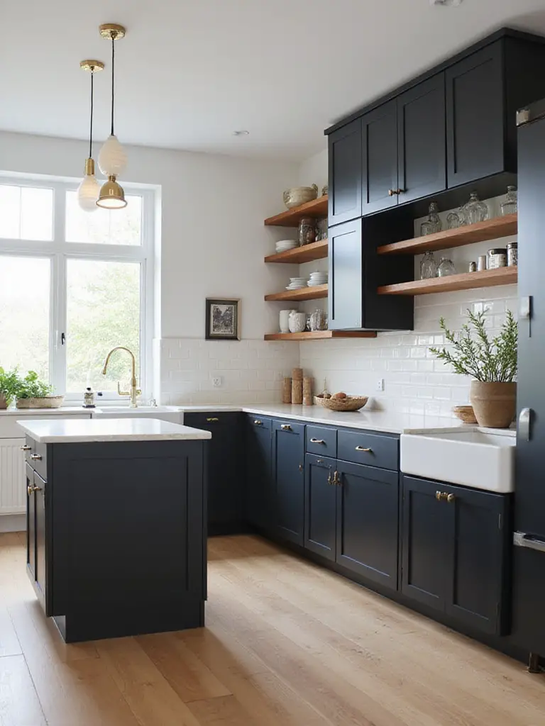
While stunning, practical considerations exist. They can show dust and fingerprints more readily than lighter colors, particularly on high-gloss finishes. Adequate lighting is essential to prevent the kitchen from feeling too dark, especially in smaller spaces. Careful selection of countertops, backsplashes, and flooring is needed to balance the darkness and ensure the room feels inviting.
“Black kitchen cabinet colors create a dramatic backdrop that makes everything else in the space – from brass hardware to marble countertops – look more luxurious by contrast.” – Interior designer observation
What makes this design special is the way black cabinets can transform even the most basic kitchen layout into something that looks custom and high-end. The color itself does much of the design heavy lifting.
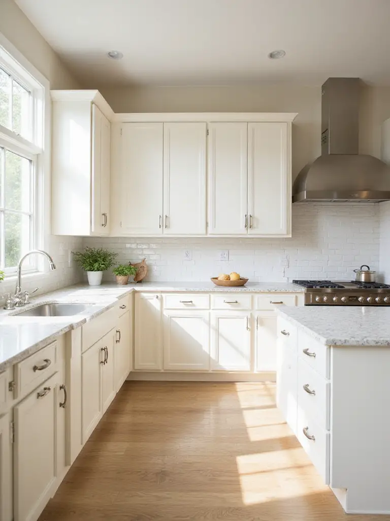
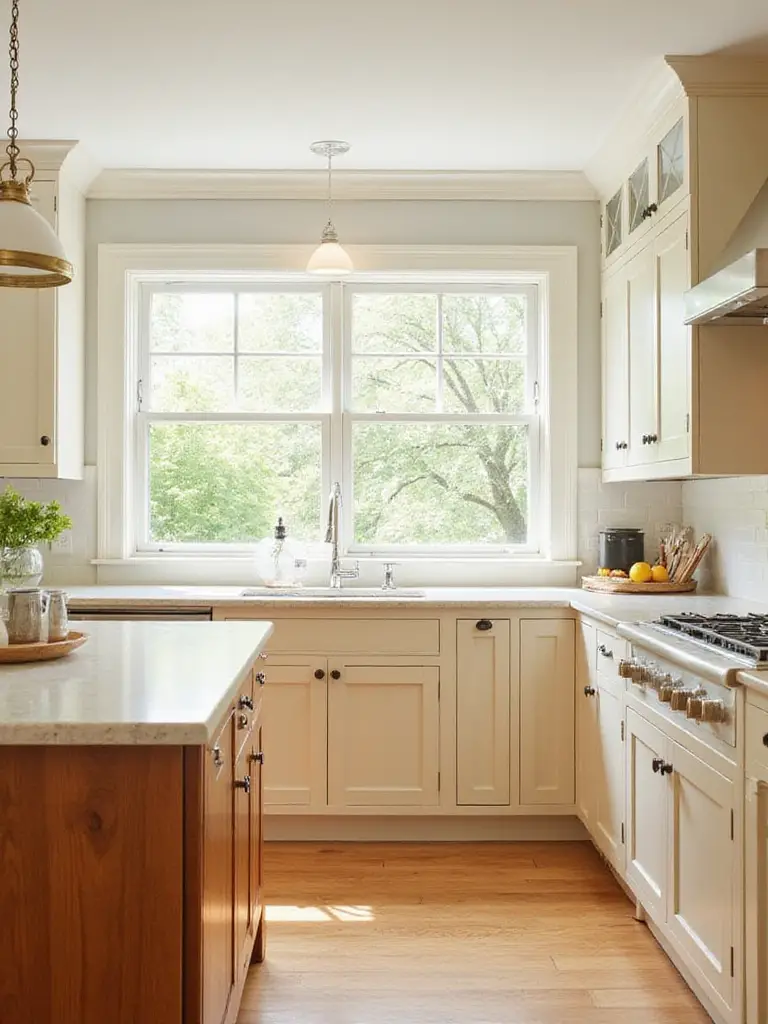
6. Soft & Inviting: Cream and Off-White Cabinet Ideas
Cream and off-white offer distinct advantages over stark white for kitchen cabinets. They introduce subtle warmth that pure white often lacks, creating a more inviting atmosphere. This warmth makes a kitchen feel cozier and less sterile, without sacrificing brightness. Off-whites are incredibly versatile and forgiving, pairing beautifully with a wider range of materials and color palettes. They also tend to show minor scuffs less prominently than pure white.
Pairing other elements with cream cabinets defines the kitchen’s overall style. For countertops, consider warm-toned quartz or granite with flecks of brown or gold, or classic butcher block for a natural feel. Backsplashes can range from timeless subway tile to textured stone. Hardware offers contrast: matte black, oil-rubbed bronze, or antique brass provide definition, while brushed nickel offers a cleaner look.
The unexpected environmental benefit comes from cream kitchen cabinet colors’ longevity – they don’t show yellowing over time the way bright whites can, which means they might need replacing less frequently. This subtle advantage makes them a smart choice for long-term sustainability.
7. Bringing Nature In: The Beauty of Light Oak Cabinets
Light oak cabinets are experiencing a resurgence primarily due to their ability to bring warmth, nature, and authenticity into the home. In an era where homeowners seek connection to the outdoors, light oak offers a beautiful balance. Its subtle grain provides texture without being busy, and the light tone reflects light, making kitchens feel brighter and spacious. Modern light oak finishes often feature a clear coat or very light stain, preserving the natural color and character.
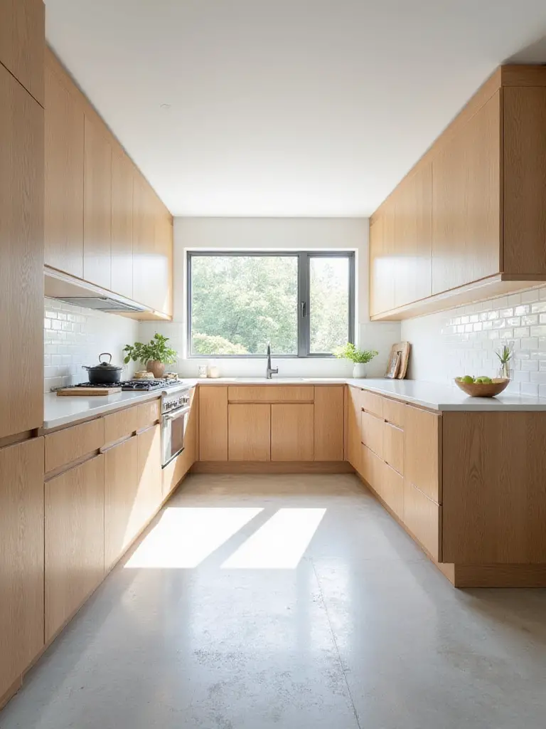
These cabinets adapt to numerous design styles. They are cornerstones of Scandinavian design, emphasizing simplicity and natural materials. They fit beautifully into Japandi, Mid-Century Modern, and Organic Modern styles. For a more traditional look, light oak can be paired with classic hardware and countertop materials.
The inspiration for this collection struck when I noticed how many homeowners were seeking ways to bring natural elements into their homes. Light oak kitchen cabinet colors create an instant connection to nature while maintaining a bright, contemporary feel that works in almost any space.
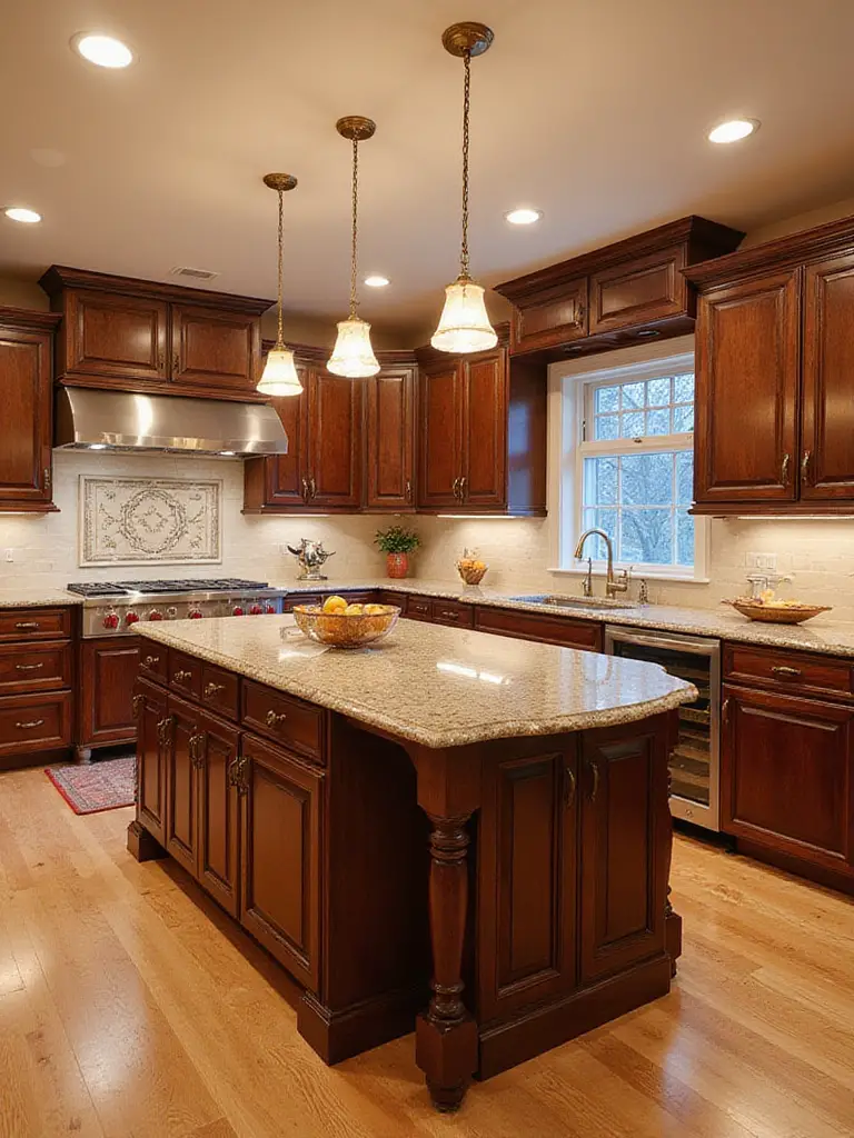
8. Richness and Warmth: Designing with Walnut Cabinetry
Walnut wood is highly prized for kitchen cabinetry due to its inherent beauty and durability. Its most defining feature is its rich, deep brown color, which can range from lighter reddish-brown to dark chocolate, often with streaks of lighter sapwood. The grain pattern is typically straight but can sometimes be irregular, adding unique visual interest. Walnut is dense and durable, lending a sense of sophistication and timeless elegance to a kitchen.
These cabinets complement a range of design styles. For a classic look, pair walnut with cream countertops and backsplashes, adding brass hardware for warmth. In modern designs, walnut shines when contrasted with crisp whites, cool grays, or black elements, often paired with sleek hardware and minimalist countertops. Mid-century modern style is a natural fit, utilizing walnut’s inherent warmth and clean lines.
The artisan collective that creates these pieces often speaks of walnut’s unique properties – how it darkens and develops character over time, unlike many other woods that fade. This natural aging process means walnut kitchen cabinet colors actually improve with age, developing a deeper patina that tells the story of your home.
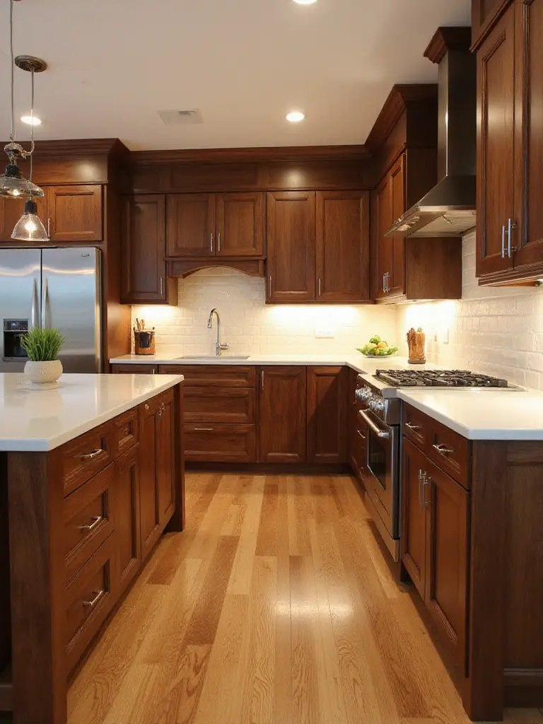
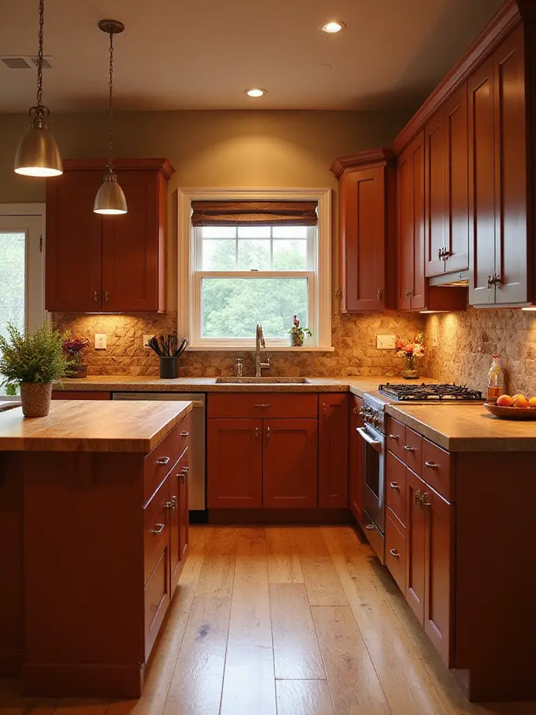
9. Classic Elegance: The Appeal of Dark Cherry Cabinets
Dark cherry cabinets are renowned for their rich, warm tones, typically ranging from deep reddish-brown to a very dark, almost black hue. The wood grain is fine and relatively uniform, giving cabinets a smooth, luxurious appearance. While natural cherry starts lighter and darkens over time, ‘dark cherry’ usually refers to a specific stain applied to achieve that deep, sophisticated color from the outset.
These cabinets are most commonly associated with traditional, classic, and formal kitchen styles. Their rich color and detailed door profiles lend themselves to these aesthetics. However, they can integrate into transitional designs when paired with cleaner lines, modern hardware, and contrasting materials like stainless steel. A very dark cherry finish with sleek doors and minimalist hardware can even work in contemporary spaces.
If you’ve struggled with similar rooms before, dark cherry might be your solution for creating a kitchen that feels both timeless and warm. The subtle richness of these kitchen cabinet colors provides depth that flat paint colors simply cannot match.
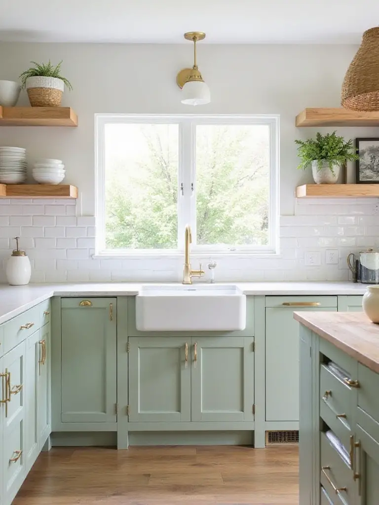
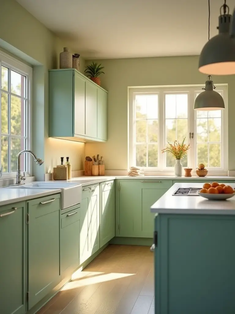
10. Naturally Refreshing: Using Sage Green for Cabinets
Sage green brings a sense of nature, tranquility, and freshness into the kitchen. It’s a soft, muted green with grey undertones, making it incredibly versatile and less overwhelming than brighter greens. It evokes feelings of calm, creating a welcoming atmosphere in a space often associated with activity. Its connection to the natural world helps ground the design while providing a refreshing alternative to traditional neutrals.
This versatile hue pairs beautifully with a wide range of colors:
- For a natural, earthy look: wood tones, creamy whites, beige
- For a contemporary feel: crisp whites, black accents, grey
- For warmth or contrast: blush pink, terracotta, muted blues
- For added sophistication: brass, brushed gold, or matte black hardware
The environmental story behind this piece began with observations of how certain colors can affect mood and wellbeing. Sage green kitchen cabinet colors create spaces that feel noticeably calmer and more connected to nature, even in urban environments without garden access.
11. Calming Spaces: Creating Serenity with Soft Blue Cabinets
Soft blue is inherently linked to nature – the sky and ocean – which are associated with tranquility and relaxation. In color psychology, blue has a calming effect, reducing stress and promoting serenity. Using soft blue on kitchen cabinets can transform a busy space into a more peaceful retreat. Unlike bolder colors, soft blues are subtle and non-intrusive, creating a gentle backdrop that encourages a calm atmosphere.
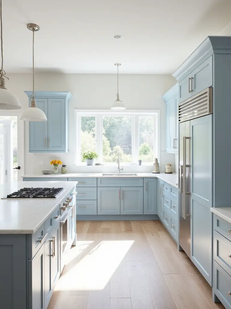
These cabinets fit beautifully into several design styles. They’re natural for Coastal or Hamptons styles, evoking beachside tranquility when paired with whites and natural wood. For Modern Farmhouse, soft blue combines with shiplap and butcher block for a fresh yet classic feel. They also work in Traditional kitchens, offering a subtle pop against classic elements like subway tile.
Running your hand across this material reveals more than just color – there’s an emotional quality to soft blue kitchen cabinet colors that transforms the energy of a space. The subtle shift from utilitarian cooking space to nurturing gathering place is remarkable and worth experiencing firsthand.
12. Deep and Luxurious: The Statement of Forest Green
Forest green is a rich, saturated hue found abundantly in nature, evoking feelings of stability and sophistication. Its depth adds gravitas and luxury, moving beyond typical neutrals. Unlike brighter greens, the ‘forest’ shade is muted and earthy, making it feel grounded rather than trendy. Its deep tone absorbs light in a way that adds visual weight and a sense of quality to cabinets.
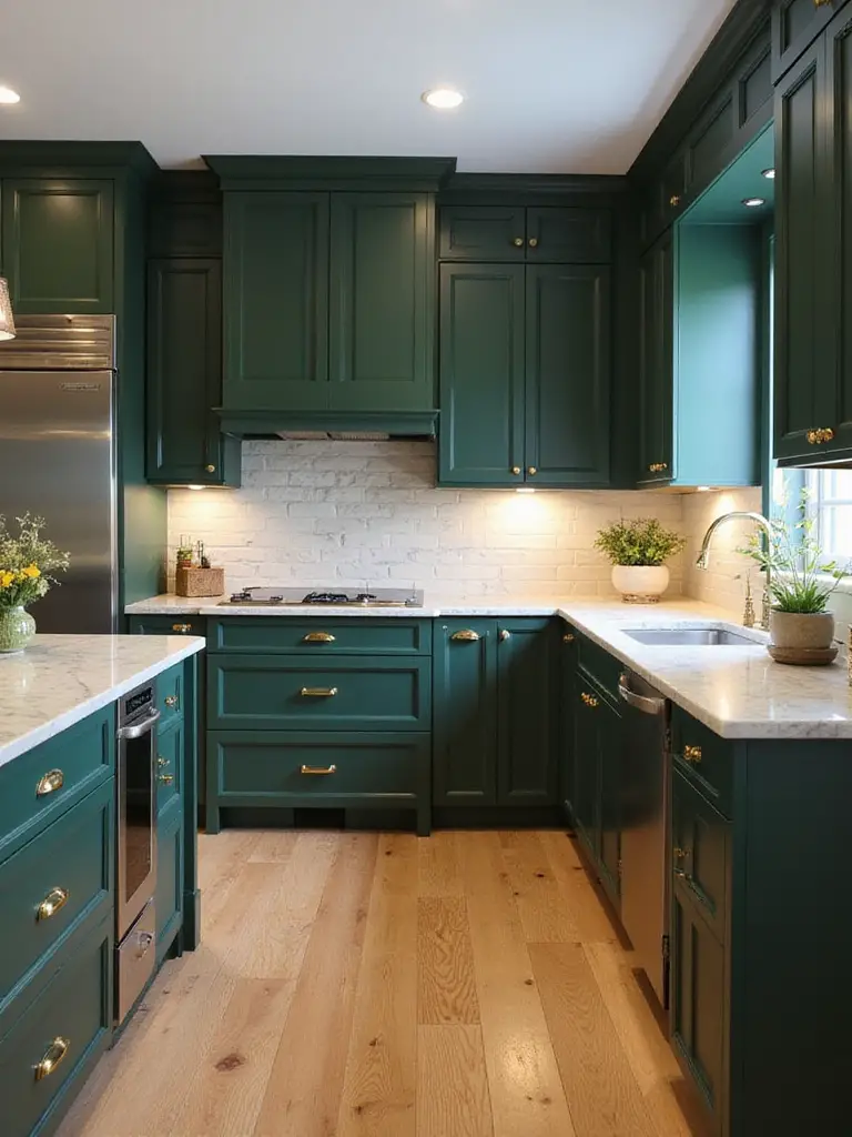
This versatile color works across several design styles. It’s natural for Traditional and Transitional kitchens, bringing classic elegance. It shines in Modern designs, providing a bold pop of color with an organic feel. For Farmhouse styles, it connects the interior to outdoors. Forest green pairs beautifully with natural wood tones, brass hardware, and warm neutrals like cream or terracotta.
The designer’s secret here is to balance forest green kitchen cabinet colors with plenty of light elements – whether through white countertops, open shelving, or strategic lighting. This creates depth without darkness and sophistication without heaviness.
13. Earthy Tones: Exploring Terracotta or Clay Cabinet Colors
Terracotta and clay colors range from dusty pink-beiges to richer reddish-oranges. These colors are deeply rooted in nature, evoking the warmth of baked earth and natural pottery. Using them brings a grounding, cozy feel to the kitchen. They feel organic and can create a space that’s both sophisticated and comfortably lived-in, moving away from sterile whites toward warmer, more personal palettes.
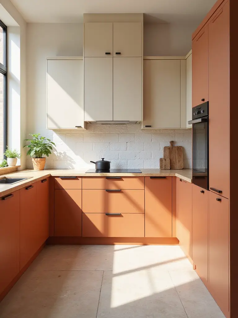
These earthy tones complement various design styles. They work beautifully in Mediterranean, Southwestern, Rustic, and Bohemian kitchens. For contemporary spaces, they fit into Modern Organic or Japandi styles when paired with clean lines and natural materials. They pair exceptionally well with other neutrals like warm whites, creams, and deep browns. Natural wood enhances the organic feel, while deep greens, blues, and metallic accents add sophistication.
When clients ask us about balancing style with comfort, terracotta and clay kitchen cabinet colors often provide the perfect solution. They create spaces that feel designed but not precious – kitchens meant to be lived in rather than just admired.
14. Sunny Disposition: Adding Warmth with Yellow or Gold Tones
Yellow and gold tones infuse a space with warmth, energy, and cheerfulness. Yellow is associated with sunshine and optimism, making a kitchen feel bright and inviting. Gold adds elegance and sophistication. These colors make a kitchen feel less sterile than pure white or grey, creating a cozy atmosphere that encourages gathering.
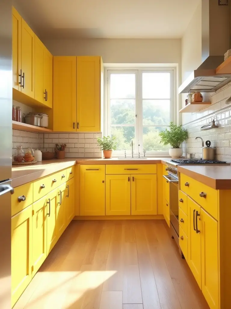
For cabinets, softer, more muted shades tend to be more successful than bright primaries. Think buttery yellows, creamy yellows, mustard, ochre, or sophisticated saffron. Muted gold tones or shades with hints of brown provide warmth without overwhelming. Very bright or neon yellows should generally be avoided on large surfaces, as they can be jarring and quickly look dated.
“Yellow kitchen spaces actually encourage conversation and appetite – there’s a reason so many classic diners used yellow in their color schemes.” – Color psychology research finding
The tactile experience changes the entire room’s energy with these warmer kitchen cabinet colors – the space simply feels more welcoming and alive, particularly in northern exposures that might otherwise feel cool or stark.
15. Pretty in Pink? Using Dusty Rose or Blush Cabinet Colors
Dusty rose and blush offer a unique blend of warmth and sophistication that moves away from traditional neutrals while remaining versatile. These muted shades feel mature and less overtly ‘girly’ than brighter pinks. They introduce calm and comfort into the kitchen space. In a design landscape dominated by whites and grays, blush provides a fresh, gentle pop of color that feels modern and inviting.
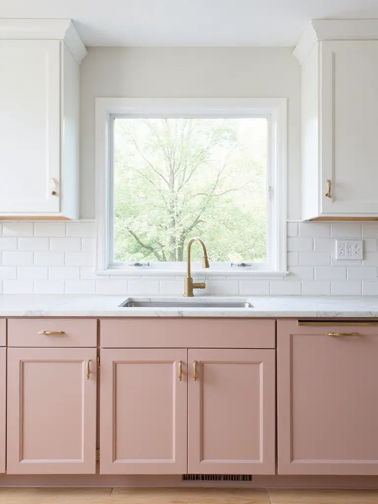
These subtle pinks adapt across several design styles. They fit into Modern designs, adding an unexpected element to clean lines. In Scandinavian kitchens, they enhance the light, airy feel. They bring vintage charm to Transitional or Art Deco-inspired spaces, especially with brass hardware. For Bohemian styles, they offer a gentle base for layering textures and colors.
The maker’s journey from apprentice to master influenced how we understand these delicate hues. Blush kitchen cabinet colors require precision in mixing and application – too pink and they become childish, too beige and they lose their character. The perfect balance creates something truly special.
16. The Best of Both Worlds: Mastering Two-Tone Cabinets
Two-tone kitchen cabinets use two different colors or finishes within the same design. This trend has surged in popularity because it breaks away from the monolithic look of single-color cabinets, adding visual interest and personality. It allows homeowners to incorporate multiple styles, create focal points, and leverage the psychological effects of different colors.
Popular methods for applying two-tone designs include:
- Upper vs. Lower: Typically using lighter colors on upper cabinets and darker colors on lowers to create balance
- Island as Accent: Painting the kitchen island a different color to create a focal point
- Perimeter vs. Island: Main cabinets around walls in one color, island in another
- Specific Zones: Using different colors for designated areas like a hutch or coffee bar
The interplay between the colors creates a dynamic that single-color kitchens simply cannot achieve. Two-tone kitchen cabinet colors also allow you to incorporate trending colors in a way that’s easier to update later if needed.
17. Making a Small Kitchen Feel Bigger with Light Colors
Light colors reflect rather than absorb light, making spaces appear brighter and more open. Dark colors tend to absorb light, making walls and cabinets seem closer. By using light colors on cabinets, the visual boundaries recede, creating an illusion of expanded space – particularly beneficial in compact kitchens.
While white is classic for maximizing space, other light colors are also effective. Popular choices include off-whites, light gray, pale blues, soft greens, and light beige. The key is choosing colors with a high Light Reflectance Value (LRV). To maximize the effect, pair light cabinets with light countertops and backsplashes. Using similar light colors on walls and trim further blurs boundaries.
The challenge of awkward spaces becomes easier when you understand how light kitchen cabinet colors can visually expand even the most challenging layouts. Small kitchens with minimal natural light particularly benefit from this optical illusion of spaciousness.
18. Creating a Cozy Kitchen with Warm Cabinet Hues
Warm colors encompass deep reds, oranges, yellows, earthy browns, creamy beiges, and certain greens and grays with yellow or red undertones. Examples include terracotta, mustard, burnt orange, chocolate brown, and olive green. These colors evoke feelings associated with sunlight, fire, and natural wood – elements linked to warmth and security. Psychologically, warm colors are perceived as advancing or embracing, making spaces feel more intimate.
Balancing warm cabinet colors prevents the kitchen from feeling heavy. Pair warm cabinets with neutral walls like soft whites or light taupes. Countertops and flooring in natural materials like wood, butcher block, or earthy-toned granite work beautifully. Lighting is crucial – opt for warm-toned LED bulbs (around 2700K) for ambient and task lighting.
As morning light filters through, the texture creates a golden glow on warm-toned cabinets that simply doesn’t happen with cooler colors. This natural enhancement throughout the day is one reason warm kitchen cabinet colors remain perpetually popular in homes where the kitchen serves as the heart of family life.
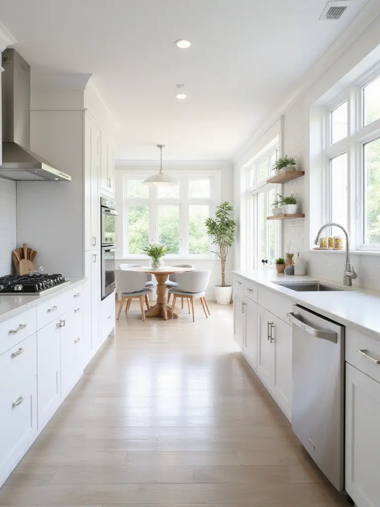
19. The Foundation of Style: Why Neutral Colors Reign Supreme
Neutral kitchen cabinet colors like whites, creams, greys, and greiges offer unparalleled versatility. They serve as a blank canvas, allowing homeowners to easily change other elements without replacing cabinets. This adaptability makes them suitable for various design styles, from modern to traditional. Their timeless appeal means they’re less likely to date, ensuring long-term satisfaction and potentially higher resale value.
Lighter neutrals are highly reflective, bouncing light around the room to make kitchens feel brighter and more spacious. In smaller kitchens, neutral cabinets visually expand the space. Even in larger kitchens, they contribute to an airy atmosphere, creating a calming environment.
The sustainable journey of this material involves fewer replacements over time. Since neutral kitchen cabinet colors don’t fall victim to passing trends, they typically have a longer useful life before homeowners feel compelled to replace them – an often overlooked environmental benefit.
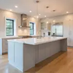
20. Sleek and Minimalist: Cabinet Colors for Modern Kitchens
The core palettes for sleek, minimalist kitchens revolve around sophisticated neutrals: crisp whites, various grays (from light silver to deep charcoal), and bold blacks (often matte). These colors create a clean, uncluttered look that emphasizes form and function. They serve as a quiet backdrop, allowing architecture, materials, and design quality to take center stage.
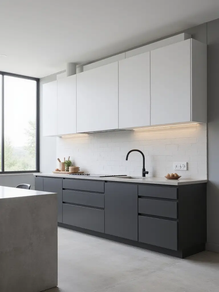
These neutrals reduce visual noise and distraction, providing calm, order, and spaciousness – hallmarks of minimalism. White reflects light, making spaces feel larger; gray offers sophistication; black provides depth while maintaining clean edges. To prevent sterility, designers incorporate warmer elements like natural wood, textured backsplashes, or metallic accents.
Beyond aesthetics, the ecological impact matters because minimalist kitchen cabinet colors tend to have staying power. Their timeless quality means less frequent replacement, reducing the environmental impact of manufacturing and disposal over time.
21. Rooted in Tradition: Classic Cabinet Color Choices
Colors earn the ‘classic’ label in kitchen design due to their timeless appeal, versatility, and historical prevalence. They transcend trends, offering permanence and sophistication. Colors like white, cream, beige, and natural wood work across various design styles. Their popularity links to their ability to create bright, clean, and welcoming atmospheres. Unlike bold colors that quickly date, classics provide a reliable foundation that remains stylish for decades.
The most enduring classic cabinet colors include:
- White: The quintessential classic, offering brightness, cleanliness, and spaciousness
- Cream or Off-White: A softer, warmer alternative to stark white
- Beige or Greige: Offering warmth and depth as versatile neutrals
- Natural Wood Tones: Showcasing the inherent beauty and grain of wood
Unlike conventional options, this approach reduces the risk of design regret. Classic kitchen cabinet colors have already stood the test of time, proving their staying power through decades of changing trends.
22. The Lighting Effect: How Light Changes Your Cabinet Color
Natural light changes dramatically throughout the day and seasons. Morning light tends to be cooler, making cool-toned cabinets appear brighter while muting warm tones. Midday sun reveals colors most accurately. Evening light enhances warm cabinet colors and dulls cool ones. The direction and amount of natural light also significantly impact perception.
Artificial lighting has color temperature measured in Kelvin (K). Lower values (2700K-3000K) produce ‘warm’ light with yellow/orange tints, enhancing warm cabinet colors like creams and yellows. Higher values (4000K-5000K) produce ‘cool’ light that makes cool-toned cabinets pop. The Color Rendering Index (CRI) also affects how accurately colors appear.
The ambiance evolves throughout the day as natural light plays across your kitchen cabinet colors. This dynamic quality means the same color can create different moods from morning to evening – an often overlooked but magical aspect of thoughtful color selection.
23. Considering Resale Value When Choosing Cabinet Color
For maximizing resale value, neutral cabinet colors are safest and most popular. White, off-white, cream, light gray, and ‘greige’ top the list. These appeal to the widest range of potential buyers because they feel clean and provide a versatile backdrop for various styles. They make kitchens feel larger and more open – a significant selling point. While light neutrals dominate, medium-tone natural wood finishes in classic styles can also appeal.
If resale is a primary concern, avoid highly personal, bold, or trendy colors for permanent fixtures like cabinets. While you might love bright red or sunshine yellow, these colors have a smaller potential buyer pool. They can be polarizing and make it harder for buyers to envision themselves in the space. Colors strongly associated with past decades can make kitchens feel dated.
While trendy, this element has staying power because it satisfies both personal expression and market demands. The most successful kitchen cabinet colors for resale strike this delicate balance between current preferences and timeless appeal.
Conclusion: Finding Your Perfect Kitchen Cabinet Color
Choosing the right kitchen cabinet colors is a significant decision that impacts the look, feel, and value of your home. From classic whites and warm woods to sophisticated navy and refreshing sage, the possibilities are vast and exciting. Consider your personal style, natural light, desired mood, and even potential resale value.
By exploring these 23 stunning ideas and practical tips, you’re well-positioned to select the perfect hue for your kitchen transformation. Whether you choose a subtle refresh or bold change, the right cabinet color sets the stage for countless meals, conversations, and cherished moments in your home’s heart. Your dream kitchen awaits – let color lead the way!