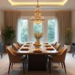
You know what people always ask me? They have this perfectly good kitchen, maybe a little dated, a little tired, and they think they need to rip it all out and spend a fortune to love it again. They see these glossy magazine kitchens and feel like theirs is a lost cause. I used to think that way, too. Before I started designing spaces, I was just a painter staring at my own drab, beige kitchen, feeling completely uninspired in the one room that should be bubbling with creativity.
The thing is, paint is the most powerful and transformative tool we have. It’s like switching from charcoal to oil paints—it changes everything about how you see and interact with the canvas. Your kitchen isn’t a lost cause; it’s a blank canvas. And I’m going to show you how to be the artist. Forget the corporate-speak and the overwhelming “inspiration” that just makes you feel bad. Let’s talk about what actually works, what’s just noise, and how to make your kitchen feel like you.
Foundation & Planning: Your Creative Brief
Before an artist touches a canvas, they do the prep work. They mix their colors, understand the light, and have a vision. This is that part. Getting this right is the difference between a masterpiece and a frustrating mess you have to paint over. Don’t skip this.
1. Evaluate Existing Elements: Work with Your Canvas
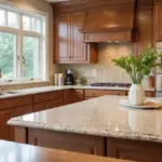
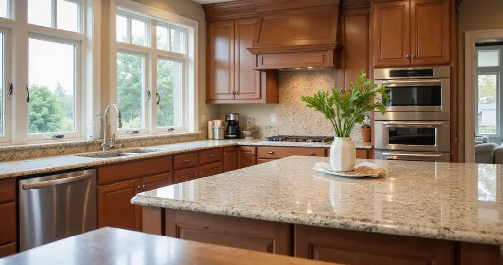
Everyone gets so excited about picking a wall color that they completely ignore the most expensive things in the room: their countertops and cabinets. That granite you inherited? The oak cabinets you’re not ready to replace? That’s not a bug; it’s a feature. It’s your starting point. You can’t fight it. You have to work with it. The paint is the supporting actor, and its job is to make your countertops and cabinets look like intentional, brilliant stars.
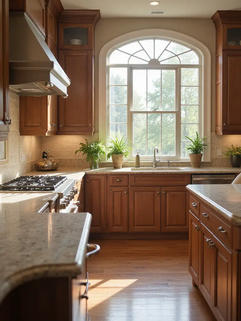
I once watched a client almost choose a trendy cool gray paint for a kitchen with beautiful, warm-toned cherry cabinets and a speckled granite countertop. In the store, the gray looked perfect. On her wall? It turned a sad, muddy purple next to the warm wood. We saved it at the last minute by finding a warm greige that actually picked up one of the secondary colors in the granite. It pulled the whole room together instantly. The shortcut here is to find the least flexible thing in your kitchen—usually the countertop—and pull a minor color from it for your walls. Let the diva dictate the color scheme.
Between us, this is where most DIY projects go wrong—fighting the undertones. But once you embrace your starting point, the next step is about bringing it to life.
2. Harness Natural Light: See Your Colors Truly
To an artist, light is everything. It’s the difference between a flat sketch and a dimensional painting. It’s the same in your kitchen. The “perfect” color on a paint chip can look wildly different depending on whether your window faces north (cool, consistent light) or south (bright, warm light). A cool gray in a north-facing kitchen can feel like a prison, while a warm white can make it feel airy and bright. This isn’t just about making the room look bigger; it’s about making it feel alive.
People get obsessed with finding a “bright white,” but that’s not always the answer. A client had a small, north-facing kitchen that felt like a cave. She was convinced stark white was the solution. Instead, we used a creamy, warm off-white. The warmth in the paint balanced the cool northern light, and the whole space just lit up. It felt twice as big and a thousand times more welcoming. The BS idea is that any light color will make a room brighter. The reality is that the undertone of your paint has to jive with the temperature of your light. Pro tip: higher sheen finishes like satin or semi-gloss will bounce more light around than a flat or matte paint, giving you an extra boost of brightness.
Now that we’ve covered the physics of light, let’s get into the soul of it: the feeling.
3. Master Color Psychology: Set the Kitchen’s Vibe
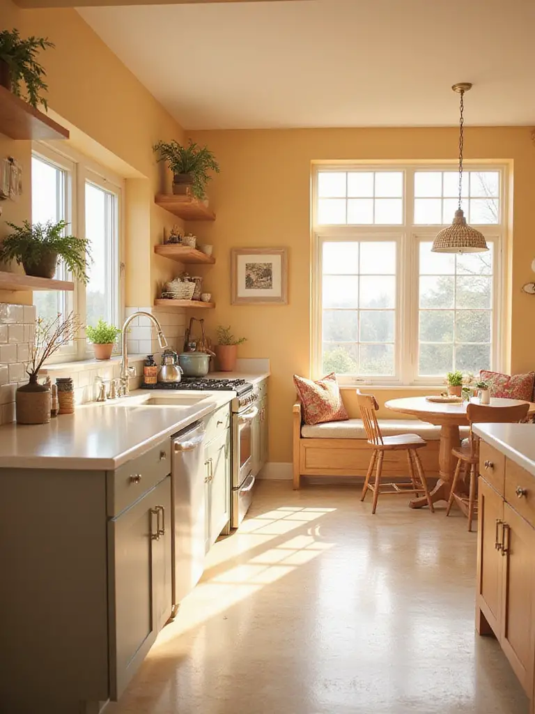
Color is emotion. As an artist, you learn this on day one. Red is energy, blue is calm, yellow is optimistic. You can use this to your advantage in the kitchen. What do you want to feel when you’re in there? Do you want a calm, serene sanctuary for baking and quiet morning coffees? Then think about soft greens and blues. Or is your kitchen command central for chaotic family dinners and lively parties? Then maybe you need a pop of energizing yellow or a warm, inviting terracotta.
The mistake people make is going all-in on one feeling. A client wanted a super “energetic” kitchen and painted the whole thing a fiery red. It looked amazing for about a week, and then it just felt… exhausting. The shortcut is the 60-30-10 rule. 60% of your room is your main, dominant color (usually walls). 30% is a secondary color (maybe cabinets or an accent wall). 10% is your accent pop (stools, a vase, your KitchenAid mixer). This gives you the feeling you want without letting it overwhelm the space. It adds depth and looks professionally designed, not one-note.
With your mood in mind, it’s time for the single most important step in this whole process.
4. Utilize Paint Swatches: The Truth on Your Wall
Can we talk about how everyone gets this wrong? A tiny 2-inch paint chip from the hardware store is a lie. It’s a suggestion, an idea, a whisper of a color. It is not the truth. The only way to know the truth is to see a big sample of it on your own wall, in your own light, next to your own stuff. This single step will save you more money and heartache than any other tip I can give you.
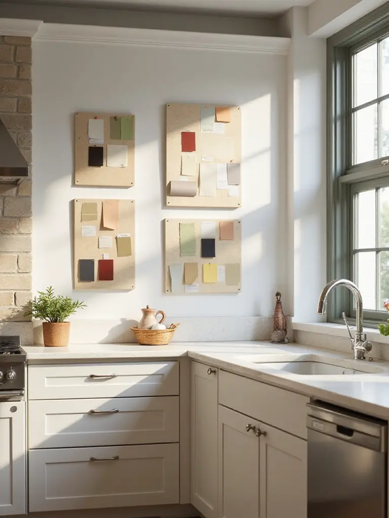
I learned this the hard way, in my own first apartment. I picked a beautiful, sophisticated “greige.” On the chip, it was perfect. On my wall? It went straight-up pink under my weird apartment lighting. I had to live with a Pepto-Bismol-tinted living room for a year because I was too broke to repaint. Never again. Now, I tell everyone: get sample pots. Paint them on big poster boards, at least 2×2 feet. Move them around the room throughout the day. See how the color looks in the morning sun, in the afternoon shade, and under your artificial lights at night. This is how you avoid expensive mistakes.
And once you’ve found the perfect color for your kitchen, we need to think about how it talks to its neighbors.
5. Understand Room Flow: Connect to the Rest of Your Home
In most modern homes, especially those with open floor plans, the kitchen doesn’t exist in a vacuum. It flows right into the dining area or living room. Treating your kitchen as a separate color island is a rookie mistake. It makes the whole space feel choppy and smaller. You want to create a cohesive story, where one room flows gracefully into the next. The colors don’t have to match, but they have to be in conversation with each other.
The trick I use is called the ‘Pull & Expand’ Method. Look at the adjoining room—say, your living room. Find a secondary color in it. Maybe it’s in the rug, a piece of art, or some throw pillows. Pull that color out and make it a major player in your kitchen. For instance, if your living room has a rug with a bit of slate blue, consider that for your kitchen island or lower cabinets. It creates an invisible thread that ties the two spaces together, making your entire home feel larger and more intentional. It’s the difference between a collection of rooms and a home.
Mastering Kitchen Color Palettes & Combinations
Okay, the planning is done. Now for the fun part—the actual painting! This is where we go from theory to practice, creating visual interest and injecting your personality into the heart of your home.
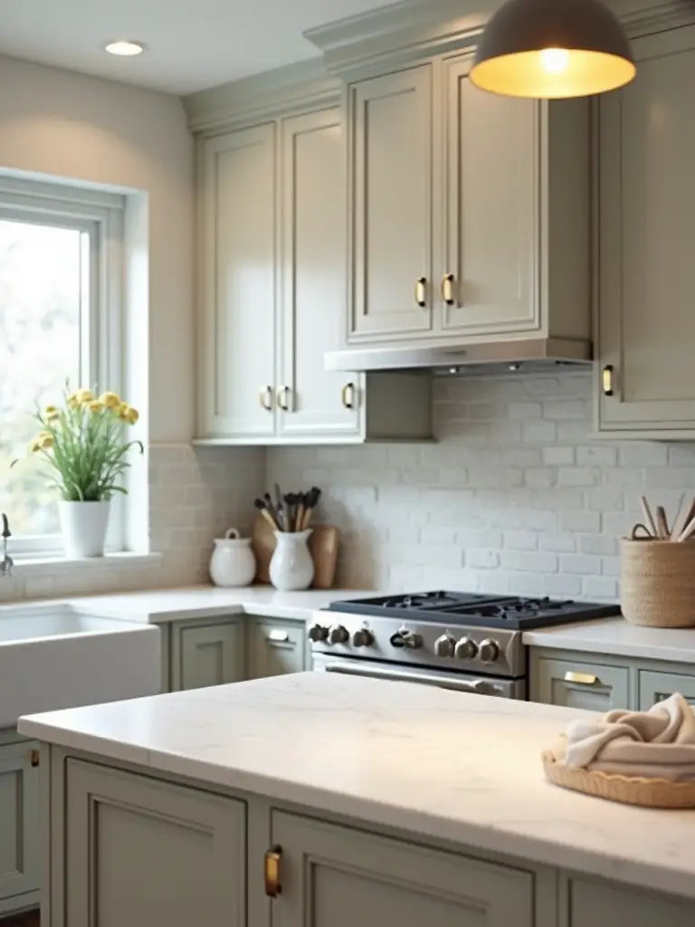
6. Embrace Two-Tone Cabinets: The Ultimate Artist’s Trick
Two-tone cabinets are so popular for a reason, and it’s not just a trend. It’s a classic artist’s composition trick. Using a darker, heavier color for the lower cabinets grounds the space. It gives it weight and stability. Then, using a lighter color for the uppers draws the eye upward, making the ceiling feel higher and the room feel more open. It’s an optical illusion that adds instant sophistication and depth.
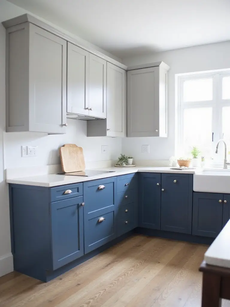
I did this in a client’s narrow galley kitchen that felt like a tunnel. We painted the bottom cabinets a deep, moody charcoal and the uppers a soft, light-reflecting gray. The effect was immediate. The kitchen instantly felt wider and more architectural. The key is to make sure both colors share a similar undertone (both warm or both cool) so they feel related, not like they just met. To tie it all together, use the same hardware on both. This creates a cohesive look that feels custom and expensive.
Now, if two tones feel too bold, let’s talk about the most timeless look of all.
7. Explore Nuanced Whites: An Artist’s Appreciation
Anyone who says “white is just white” has never been in an art supply store. There’s Titanium White (cool, opaque), Zinc White (cool, translucent), Flake White (warm, creamy)… they all do different things. The same is true for your kitchen paint. The world of whites is vast and subtle. Finding the right white—one with the perfect warm or cool undertone for your space—is the secret to a kitchen that feels bright and airy without being cold and sterile.
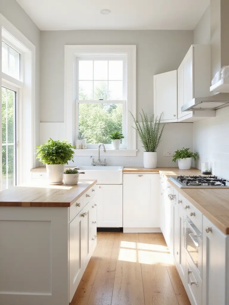
My go-to trick is to hold a white paint chip up to a plain piece of printer paper. Suddenly, you’ll see its true undertones. Does it look yellowish? Bluish? Pinkish? A warm white (like Benjamin Moore’s Swiss Coffee) can save a cool, north-facing room from feeling stark. A crisp, neutral white (like Sherwin-Williams’ Pure White) is a versatile backdrop for a room with lots of natural light. Forget finding the perfect white; find your perfect white. And please, test it on a big swatch first.
From the quiet elegance of white, let’s swing to the other end of the spectrum.
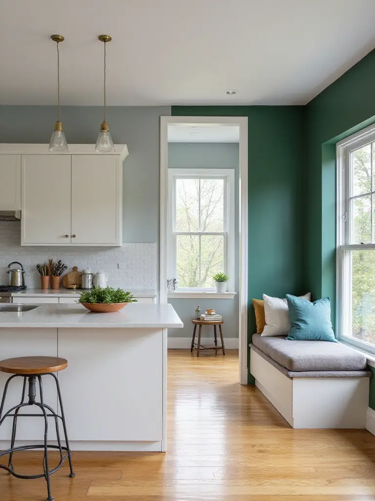
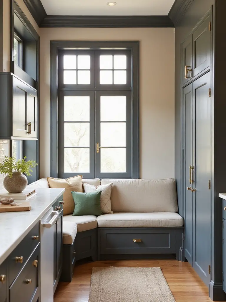
8. Introduce Bold Accent Walls: Your Kitchen’s Focal Point
Every painting needs a focal point—a place where the eye naturally lands. An accent wall is the easiest way to create one in your kitchen. But for the love of all that is holy, be strategic about it. Don’t just pick a random wall and slap some bold color on it. Choose a wall that deserves the attention: the wall behind your stove, a wall with open shelving, or the wall that frames your little breakfast nook.
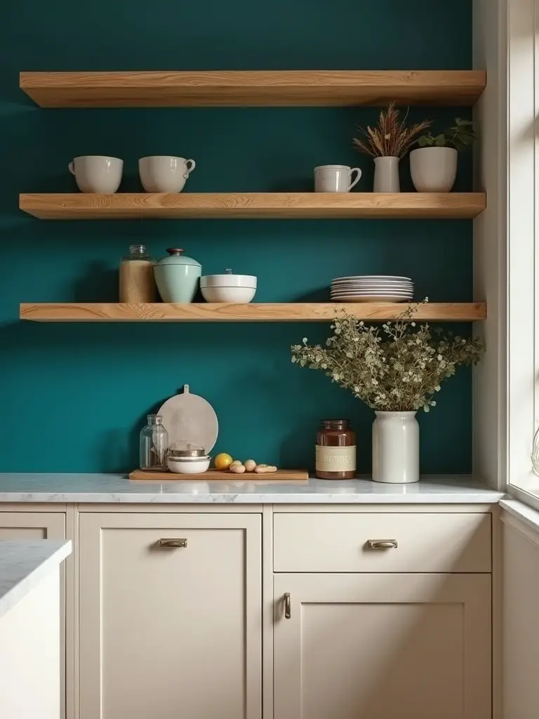
A client had a very clean, all-white modern kitchen in a condo. It was beautiful but a little sterile. We painted the short wall at the end of the kitchen—the one with floating wood shelves—a deep, moody teal. It instantly transformed the space. The shelves and everything on them popped, the wall receded (making the room feel deeper), and the whole kitchen suddenly had a sophisticated, personal vibe. An accent wall isn’t just about color; it’s about adding architectural interest and drama where there was none.
Next, let’s explore how a whole palette of color can change the mood.
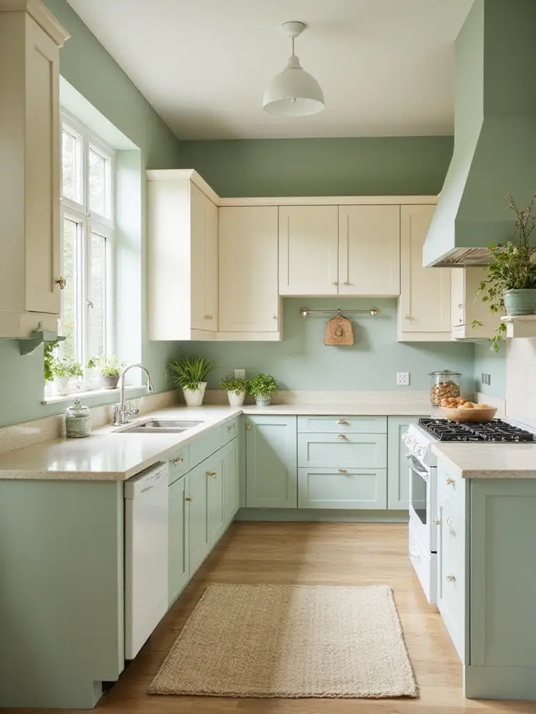
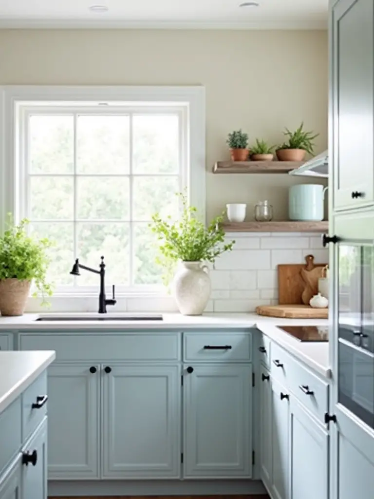
9. Calming Cool Tones: Creating Space and Serenity
In painting, cool colors like blues, greens, and violets visually recede. They feel like they are moving away from you. This is an incredibly powerful tool in a small kitchen. Painting the walls in a soft, cool tone—a pale sage green or a light slate blue—can make the space feel significantly larger, calmer, and more airy. It’s like pushing the walls back without actually moving them.
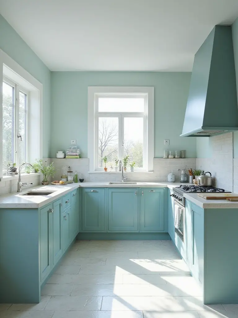
The risk with cool tones is that the kitchen can end up feeling sterile or cold, like a doctor’s office. The secret is to balance them with warmth. I always bring in warm accents against cool walls: natural wood cutting boards, brass or copper hardware, a worn terra cotta pot with herbs, warm-toned lighting. This combination of cool and warm creates a beautiful, balanced tension. It gives you that serene, expansive feeling without sacrificing the soul and coziness that a kitchen needs.
But what if you’re craving coziness from the start?
10. Warm Earthy Neutrals: The Ultimate Cozy-Up
If cool tones are about creating space, warm earthy neutrals are about creating a hug. Think of the colors in an artist’s landscape palette: creamy off-whites, warm greiges, soft terracottas, and muted olive greens. These colors are grounding and deeply comforting. They make a kitchen feel instantly inviting, like a place you want to linger with a cup of tea or a glass of wine.
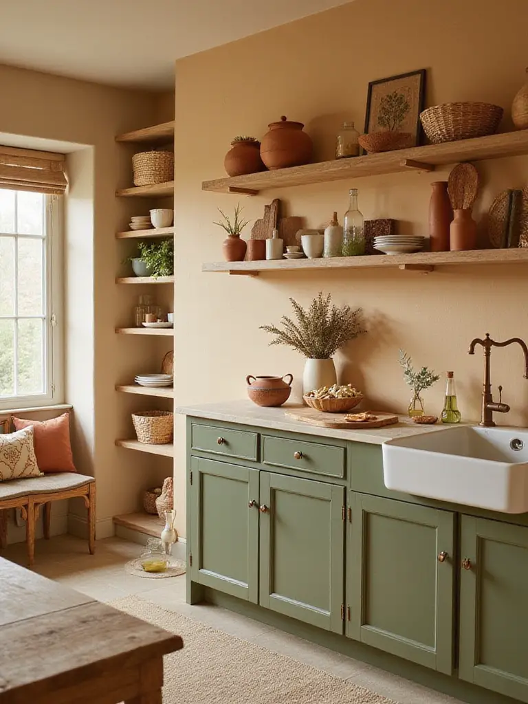
The pitfall here is that an all-neutral space can feel flat or, let’s be honest, boring. The secret to making warm neutrals sing is texture. Think of a slab of raw, unfinished wood, the nubby texture of a linen dish towel, the soft sheen of brushed bronze cabinet pulls, a ceramic vase with a matte glaze. When you layer different textures within a warm, neutral palette, you create a space that is rich, sophisticated, and anything but boring. It’s a sensory experience.
Beyond Walls: Details, Finishes, and Artist’s Touches
The big color choices are important, but it’s the details that elevate a kitchen from “nice” to “wow.” Just like an artist signs their painting, these finishing touches are your signature.
11. Choose Optimal Finishes: The Practical Part of the Painting
This is the least sexy part of the process, but it’s one of the most important. The finish of your paint—matte, eggshell, satin, semi-gloss—is a functional choice. Your kitchen is a workshop. It gets splattered with spaghetti sauce and grease. You need surfaces you can wipe down without scrubbing the paint off. Using a matte paint on your kitchen cabinets is a crime against your future self.
Here’s the simple breakdown: For walls, go with at least an eggshell or satin finish. It has a slight sheen that makes it wipeable. For cabinets, trim, and doors—anything that takes a beating—you need semi-gloss or even high-gloss. These finishes are tough as nails. A lot of brands now make “kitchen & bath” paints that have mildew-resistant additives and extra durability. Use them. I once had to help a friend repaint his entire kitchen because he used a trendy, chalky matte paint everywhere. It looked great for a month, then every fingerprint and splatter became a permanent part of the decor. Don’t be that friend.
Once you have your durable finish, let’s get creative with it.
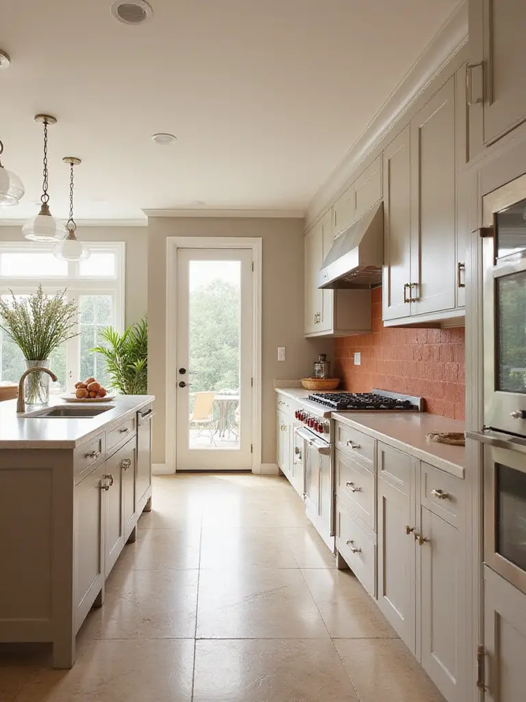
12. Integrate Paint with Backsplashes: Blur the Lines
A sophisticated design trick is to make the transition between your backsplash and your wall disappear. If you have a white subway tile backsplash, don’t just paint the wall above it a random color. Find a paint color that exactly matches the white of the tile. Take a tile to the paint store and get it color-matched. When you paint the surrounding walls in that same shade, the hard line at the top of the backsplash vanishes.
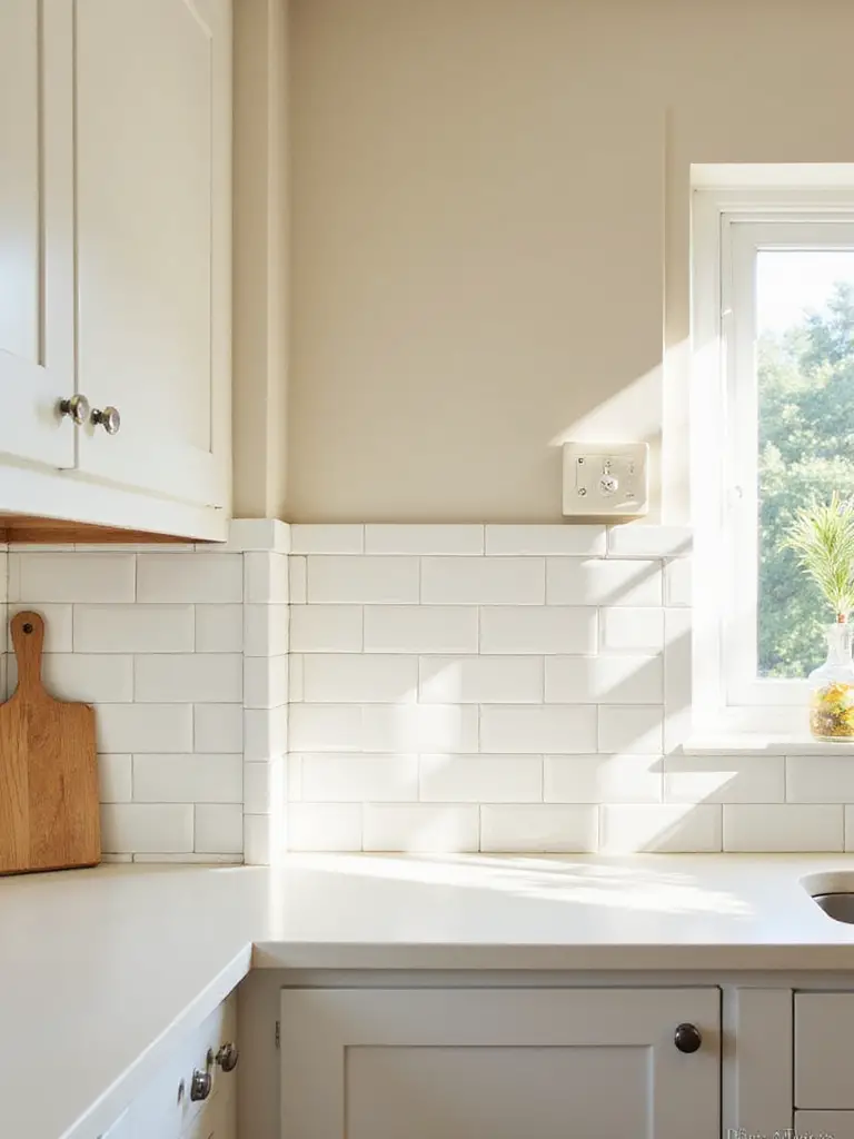
This little bit of magic makes the whole space feel more seamless, integrated, and expansive. It draws the eye up without interruption. The result is a clean, custom look that feels incredibly high-end. It’s a subtle thing, but it’s the kind of detail that separates a good design from a great one. It shows you were thinking about the whole composition, not just individual parts.
Speaking of individual parts, let’s talk about the biggest one.
13. Refresh Cabinetry: The Most Impactful DIY
Painting your existing kitchen cabinets is, without a doubt, the single most transformative thing you can do on a budget. It’s a lot of work, but the payoff is huge. You can take dated, tired honey oak cabinets and make them look like a brand new, custom kitchen for the cost of paint and some elbow grease. But if you cut corners, it will look like a DIY disaster.
The absolute, non-negotiable secret to a professional-looking finish is prep work. You have to clean the cabinets with a degreaser, sand them so the primer can stick, and then use a high-quality bonding primer. I’m serious. If you skip any of these steps, your paint will peel and chip. And here’s the shortcut you wished you knew earlier: rent an HVLP (High Volume Low Pressure) paint sprayer. For a few bucks a day, you can get a perfectly smooth, factory-like finish with zero brush marks. It’s a total game-changer.
While you’re at it, consider making one part of your cabinetry extra special.
14. Transform Your Kitchen Island: The Centerpiece Sculpture
If your kitchen has an island, it’s begging to be a focal point. Painting it a contrasting color is like placing a beautiful sculpture in the center of your gallery. It anchors the whole room, adds a massive dose of personality, and helps define the space in an open-concept layout. This is your chance to be bold with a color you might not want on all your walls. A deep navy, a rich forest green, even a moody charcoal can look stunning.
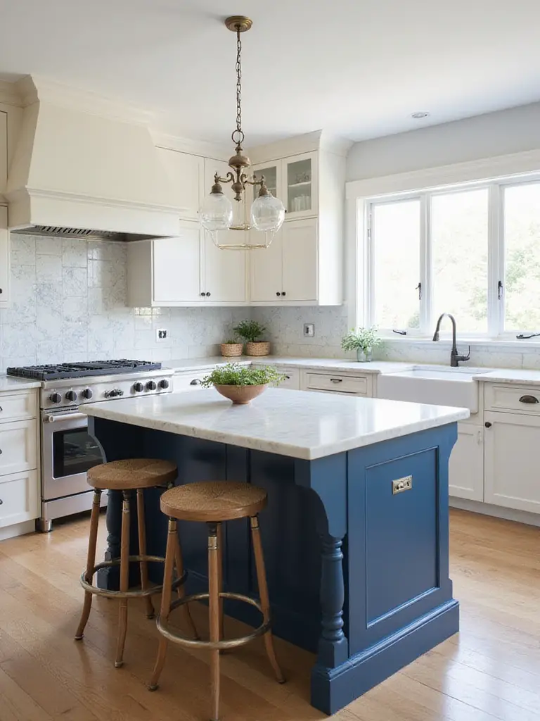
I had a client with a massive, all-white kitchen that felt a bit endless and bland. We painted just the island in a deep, warm green and swapped the hardware for brushed brass. It was transformative. The island became the heart of the home, a warm, inviting centerpiece that grounded the entire space. It went from a sea of white to a sophisticated room with a clear, beautiful focus. Just remember to use a durable, scrubbable paint finish here—islands take a lot of abuse.
And it’s not just big pieces that deserve attention.
15. Maximize Open Shelving Appeal: Curate Your Still Lifes
Open shelving isn’t just for storage; it’s for display. Think of your shelves as frames for little still-life paintings made of your favorite mugs, bowls, and cookbooks. The wall behind those shelves is the canvas. Don’t let it be an afterthought! Painting the wall behind your open shelves a contrasting color is a brilliant, low-commitment way to add a pop of personality and depth.
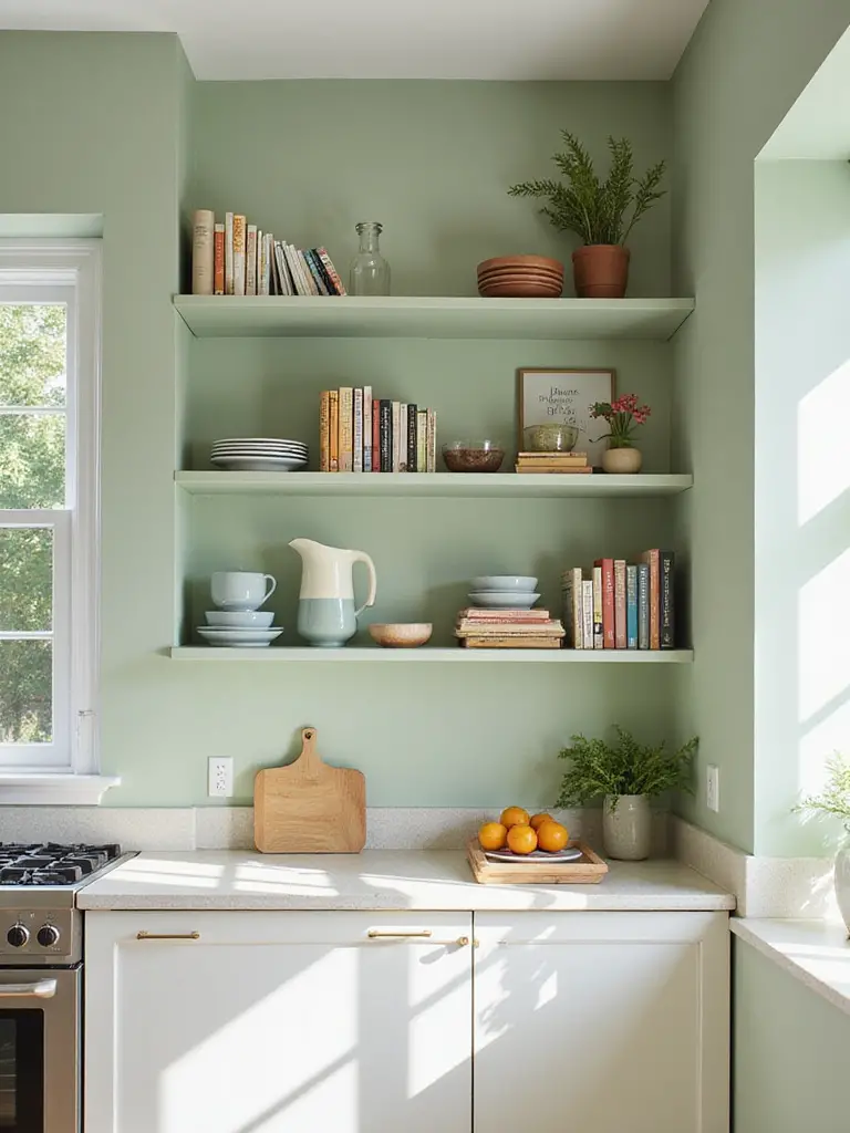
I love the “Fifth Wall” strategy for this. Treat the back of a recessed shelving nook or bookshelf like an accent wall. A deep, dark color will make your light-colored dishes pop. A bright, sunny color can bring life to a dark corner. I once painted the back of a small shelving unit in a tiny apartment kitchen a glossy, butter-yellow. It became a joyful little moment, a focal point that made the whole kitchen feel more personal and intentionally designed.
Creative & Advanced Kitchen Paint Applications
Alright, you’ve mastered the fundamentals. Now let’s get weird. These are the advanced techniques that really show you’re thinking like an artist, using paint to manipulate space and add custom details that make your kitchen truly one-of-a-kind.
16. Ceiling as Fifth Wall: The Unexpected Canvas
Everyone forgets about the ceiling. It’s just this big, blank, white space overhead. What a waste of a perfectly good canvas! Painting your kitchen ceiling is a bold move that can have a huge impact. A light, airy blue can make a low ceiling feel higher. A dark, moody color like charcoal or deep navy in a room with high ceilings can create a dramatic, cozy, and incredibly sophisticated vibe.
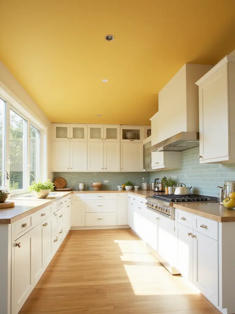
A client with a big, open-plan space felt like her kitchen was a bit lost. It had high ceilings, but it lacked definition. We painted the ceiling over just the kitchen area a deep charcoal. It instantly defined the “kitchen zone,” made the white cabinets pop, and gave the room a sense of intimacy and architectural gravity it was missing. The biggest tip here: use a flat or matte finish. A glossy ceiling will show every single imperfection and create a distracting glare.
From the ceiling, let’s move to a wall you can actually draw on.
17. Functional Chalkboard Walls: Your Evolving Masterpiece
A chalkboard wall is more than a novelty; it’s a living, breathing piece of art in your kitchen. It’s a place for grocery lists, weekly menus, inspirational quotes, or a canvas for your kids’ masterpieces. It brings an element of interactive, low-stakes creativity right into the heart of your home. You can paint a whole wall, the side of a pantry, or just a section to create a designated message center.
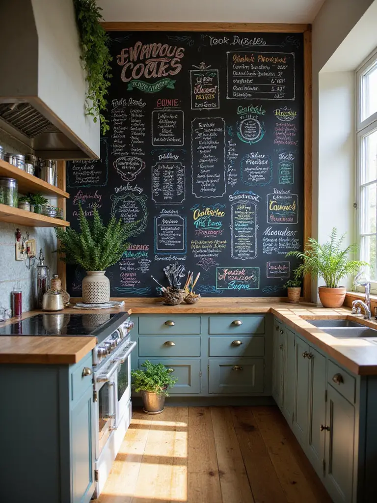
The absolute must-do pro tip that nobody tells you: once the chalkboard paint has fully cured (read the can, it usually takes a few days!), you have to “season” it. Take a piece of chalk, turn it on its side, and rub it over the entire surface. Then erase it all. This initial layer of chalk dust prevents the “ghosting” of your first words, so you don’t have a faint “Buy Milk” permanently etched into your beautiful new wall.
Next, let’s use paint to build walls where there are none.
18. Define Zones with Color: Invisible Architecture
In an open-concept space where your kitchen flows into your dining nook, paint is the cheapest and most effective way to create “rooms without walls.” By painting the dining nook a different, complementary color from the main kitchen area, you create a psychological boundary. The space instantly feels more organized, intentional, and purposeful. The nook becomes its own cozy destination, separate from the bustling workspace of the kitchen.
For example, in a long, rectangular room, you could have a light gray kitchen that flows into a dining area defined by a deep, earthy green on the walls around the table. The shift in color signals a shift in function and mood. For a more subtle take, you can use two different shades from the same color strip—a lighter one for the main area and a darker one for the nook. It adds depth and definition without a hard contrast. It’s like creating an invisible wall with just a paintbrush.
From creating zones, let’s zoom in on the tiniest details.
19. Stencil or Hand-Painted Accents: The Artisan’s Signature
If you really want your kitchen to be unique, add a detail that no one else has. Stenciling a pattern onto your backsplash (a million times cheaper than tile!), painting a delicate design on your cabinet doors, or adding a hand-painted border around a doorway infuses your space with true custom character. This is your chance to add a touch of whimsy, elegance, or graphic punch that reflects your personal style.
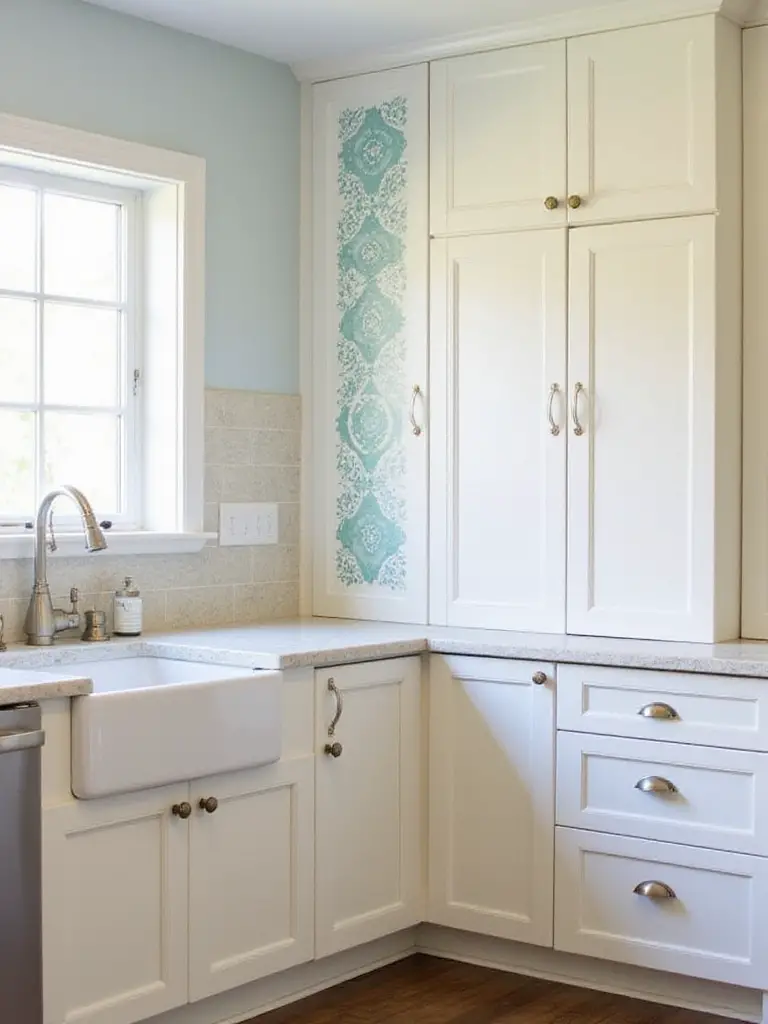
I had a client who was terrified of pattern, but her kitchen felt bland. We found a simple, modern geometric stencil and, using a color just a few shades darker than her wall color, we created a subtle pattern on her backsplash area. It gave her the visual interest of tile without the cost or commitment. The key here is to use a “dry brush” technique—very little paint on your brush or sponge—to avoid the paint bleeding under the stencil. And always, always seal your masterpiece with a clear, durable topcoat to protect it from kitchen grime.
Finally, let’s talk about the final frame for your artwork.
20. Add Contrast to Trim and Doors: Frame Your Composition
Think of your kitchen’s trim—the baseboards, the window casings, the door frames—as the picture frame for your entire design. Most people just paint it white out of habit. But painting it a contrasting color is a power move. Dark trim, like a deep charcoal or black, against light walls can make the entire space feel more architectural and grounded. It defines the edges of the room and makes your windows and doors pop as features.
A fantastic, sophisticated look is to paint the kitchen side of a door (like your pantry door) a bold, contrasting color, while leaving the other side that faces the hallway neutral. It creates this wonderful moment of surprise and frames the view into your beautiful kitchen. This one detail can make a standard builder-grade kitchen look like a custom-designed space. It’s the final brushstroke that says, “I’m done, and it’s perfect.”
Conclusion: Your Kitchen, Your Canvas
So there you have it. The secret to transforming your kitchen isn’t about demolition; it’s about vision. It’s about looking at your space with an artist’s eye—seeing the light, understanding the color, and appreciating the composition. By being thoughtful about your foundations and creative with your application, paint becomes your most powerful tool for change.
Your kitchen is waiting for you. It’s not just a room for cooking; it’s the creative core of your home. So grab a paintbrush, test some swatches, and don’t be afraid to make a bold move. Trust your instincts, embrace the process, and get ready to create a space that doesn’t just work for you, but truly inspires you. Now go make some art.