The kitchen island is arguably the heart of the modern home. It’s where meals are prepped, homework is done, coffee is sipped, and conversations flow. More than just a functional workspace, it’s a central design element that can anchor the entire room’s aesthetic. Choosing the right kitchen island color is a pivotal decision that can dramatically impact the space’s mood, style, and perceived size.
Whether you’re dreaming of a serene sanctuary, a bold statement piece, or a warm gathering spot, the color you choose for your island holds immense power. Forget settling for the same color as your perimeter cabinets; the island offers a unique opportunity to introduce personality and flair. Let’s explore 22 inspiring kitchen island colors, examining why they work, what styles they complement, and how they can transform your kitchen into the space you’ve always envisioned.
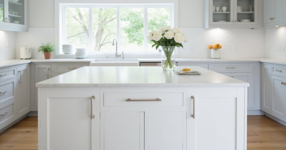
1. The Ever-Popular Crisp White
White is a perennial favorite for kitchen islands, and for good reason. This timeless and versatile color creates a sense of spaciousness and brightness, making even smaller kitchens feel larger and more open. White reflects light effectively, enhancing the overall illumination of the space while acting as a neutral backdrop that allows other colors and design elements to shine. This neutrality makes it easy to coordinate with various cabinet colors, countertop materials, and hardware finishes.
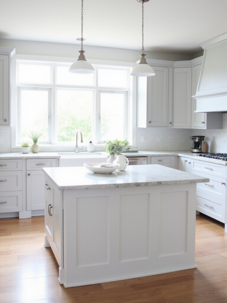
Beyond just “crisp white,” there’s a spectrum of whites to consider:
- Bright White – For a stark, modern look
- Off-White/Creamy White – For a warmer, softer feel with yellow or beige undertones
- Antique White – With a slightly aged appearance, adding character and charm
“The magic of this piece lies in its ability to make your kitchen feel instantly larger and brighter, while providing the perfect canvas for your personal style to shine through.”
Moving from the bright and airy feel of white, let’s explore the dramatic impact of its opposite: black.
2. Bold & Sophisticated Black
For those seeking a dramatic and sophisticated statement, black is an unparalleled choice for a kitchen island. Black islands are incredibly versatile, lending themselves well to a variety of kitchen styles – from modern and minimalist to traditional farmhouse settings, where they create a striking contrast with lighter cabinetry and rustic elements. Consider the overall color palette and material choices in your kitchen to determine the best shade and finish of black for your island.
In smaller kitchens, black requires careful consideration. To avoid making the room feel cramped, consider using a lighter shade of black, such as charcoal or off-black, and ensure ample natural and artificial lighting to prevent the island from absorbing too much light. Opt for a smaller island size and consider incorporating open shelving or glass-front cabinets to maintain a sense of openness. Pairing the black island with lighter countertops and backsplashes will also help balance the visual weight.
The unexpected environmental benefit comes from black’s timeless appeal – a color choice that won’t feel dated, meaning less likelihood of future renovations and waste.
3. The Versatility of Grey Shades
Grey has become the go-to neutral for many designers and homeowners, offering a sophisticated alternative to beige or white. Its popularity stems from its inherent neutrality and adaptability. Grey acts as a sophisticated backdrop, allowing other elements in the kitchen – countertops, backsplashes, appliances, and decor – to take center stage. It’s also incredibly versatile, working well with both warm and cool color palettes, and complementing a wide range of design styles, from modern minimalist to rustic farmhouse.
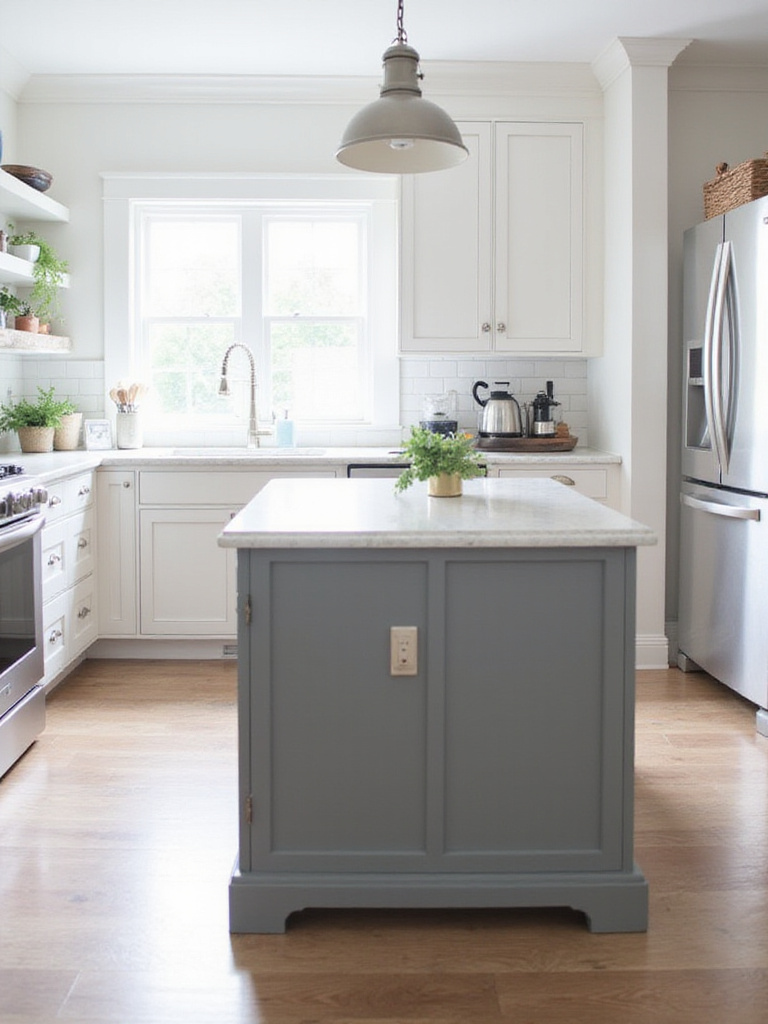
The spectrum of greys is vast, offering numerous options for kitchen islands:
- Light greys (dove, cloud) – Create an airy and spacious feel, ideal for smaller kitchens
- Mid-tone greys (charcoal, slate) – Add depth and drama without being overwhelming
- Dark greys (iron, graphite) – Create a striking statement
- Greige (grey + beige) – Offers a warmer, more inviting alternative
What makes grey particularly appealing is how it pairs with various materials and finishes. For a modern look, consider pairing a grey island with stainless steel appliances, quartz countertops, and sleek hardware. For a more rustic feel, opt for butcher block countertops, wood accents, and brushed nickel hardware.
The interplay between the colors creates a layered, sophisticated look when you use different shades of grey on the island cabinetry and surrounding kitchen cabinets.
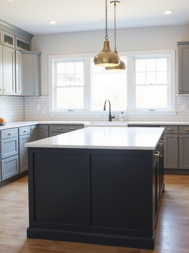
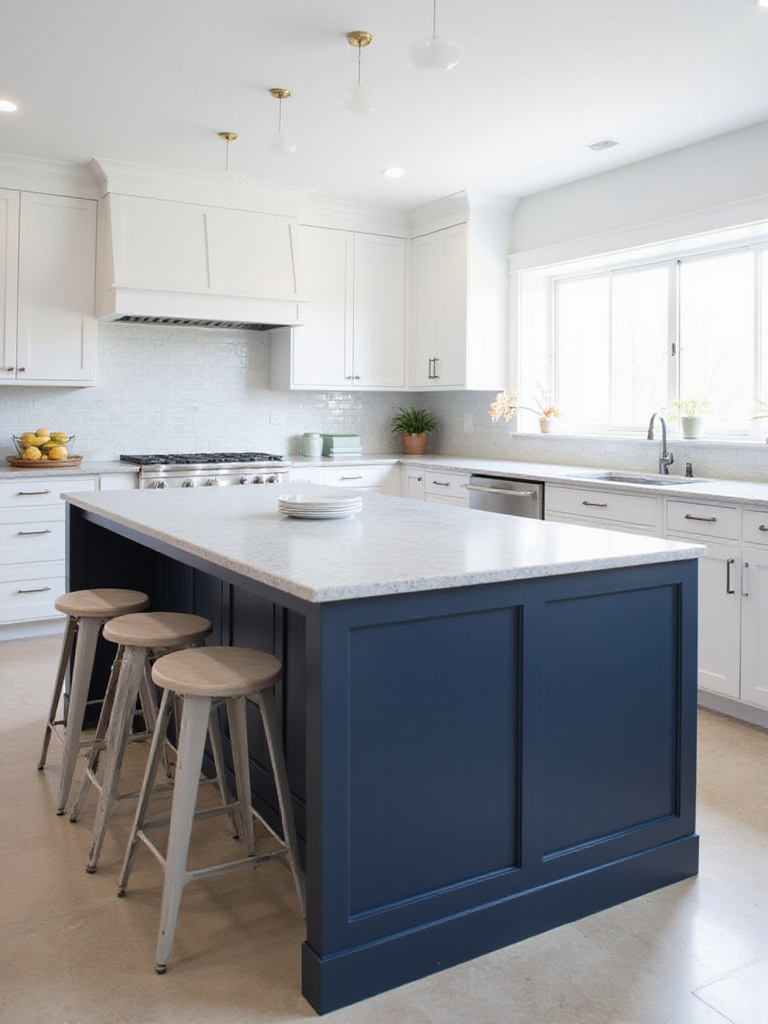
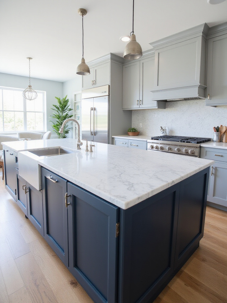
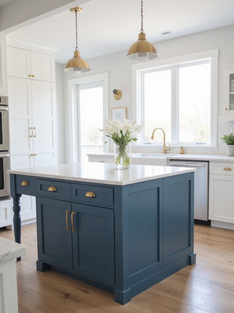
4. Deep and Dramatic Navy Blue
Navy blue offers a sophisticated and timeless appeal, bringing depth and richness to the kitchen. It’s a versatile color that can complement various design styles, from traditional to modern. Navy blue provides a bold statement without being overly trendy, ensuring a lasting and elegant look. It also hides smudges and minor imperfections better than lighter colors, making it a practical choice for a high-traffic area like a kitchen island.
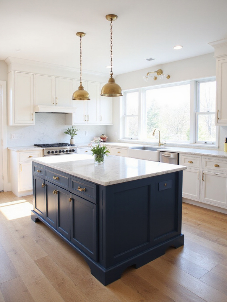
Navy blue pairs beautifully with:
- Crisp white cabinets and countertops for a classic contrast
- Natural wood tones, such as light oak or walnut, for warmth
- Metallic accents like brass or copper hardware and lighting fixtures
- Light-colored marble, granite, or quartz countertops with subtle veining
While true navy is a classic choice, don’t be afraid to explore variations. For more drama, consider a very dark, almost black navy. For a softer, more coastal vibe, lighter, slightly dusty navy blues can create a beautiful effect.
The designer’s secret here is to balance navy’s depth with lighter elements elsewhere in the kitchen, creating a harmonious space that feels both grounded and airy.
5. Earthy & Calming Sage Green
Sage green brings a sense of tranquility and connection to nature into the kitchen. Its calming effect stems from its association with the natural world – a muted, desaturated green that evokes feelings of peace and growth. Unlike brighter greens, sage is gentle on the eyes and promotes a sense of relaxation in a space often filled with activity and potential stress.
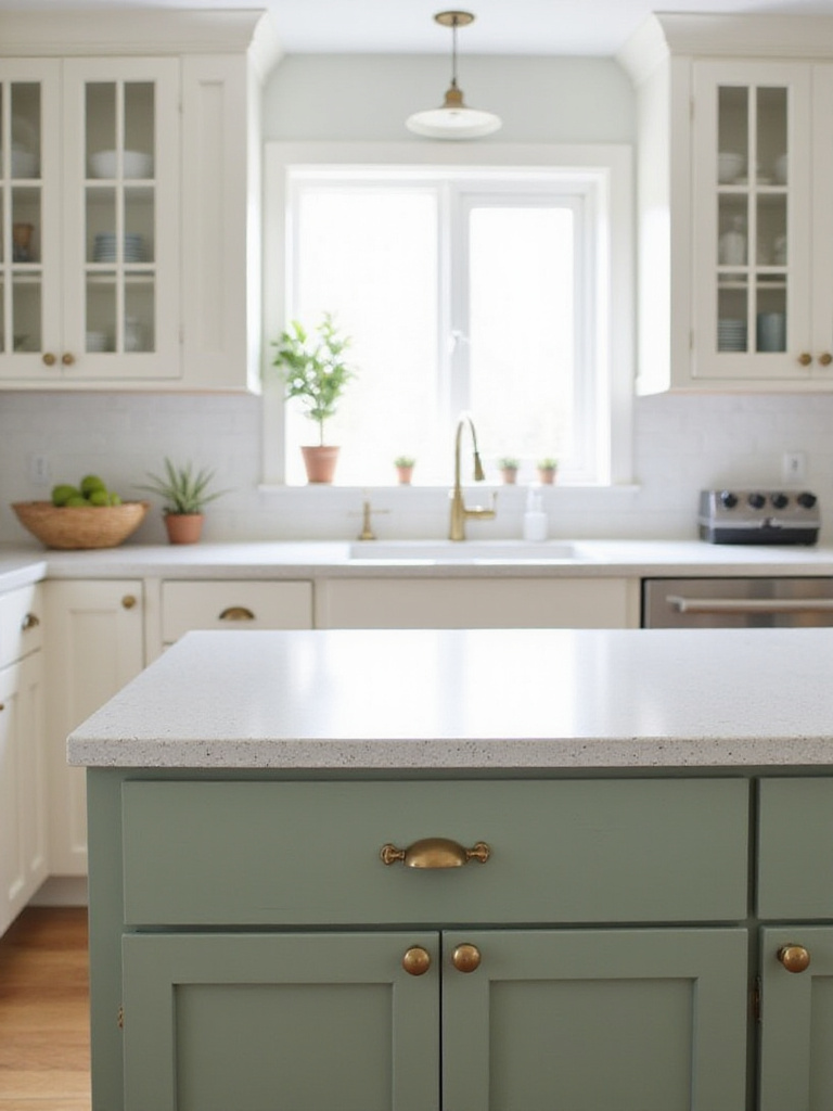
This versatile green works well across numerous kitchen styles:
- Farmhouse kitchens – Adding a touch of rustic charm
- Modern kitchens – Bringing a soft, organic element to sleek lines
- Cottagecore and traditional designs – Enhancing the cozy, timeless feel
- Contemporary spaces – Offering a fresh alternative to standard neutrals
Sage green especially pairs well with natural wood tones, stone countertops, and brass or copper hardware. The balance it strikes between being a color with personality while remaining subtle enough to work as a neutral makes it particularly versatile for kitchen island colors.
The craftsmanship reveals itself in details like how sage green changes throughout the day, sometimes appearing more grey in morning light and more green in the warm glow of evening.
6. A Pop of Vibrant Emerald Green
For those who want their kitchen island to be a true showstopper, vibrant emerald green delivers. This bold yet sophisticated choice injects life and personality into the kitchen, bringing a touch of nature indoors while creating a refreshing and inviting atmosphere. Emerald green is surprisingly versatile, complementing both cool and warm color palettes, and pairing well with various materials like wood, metal, and stone.
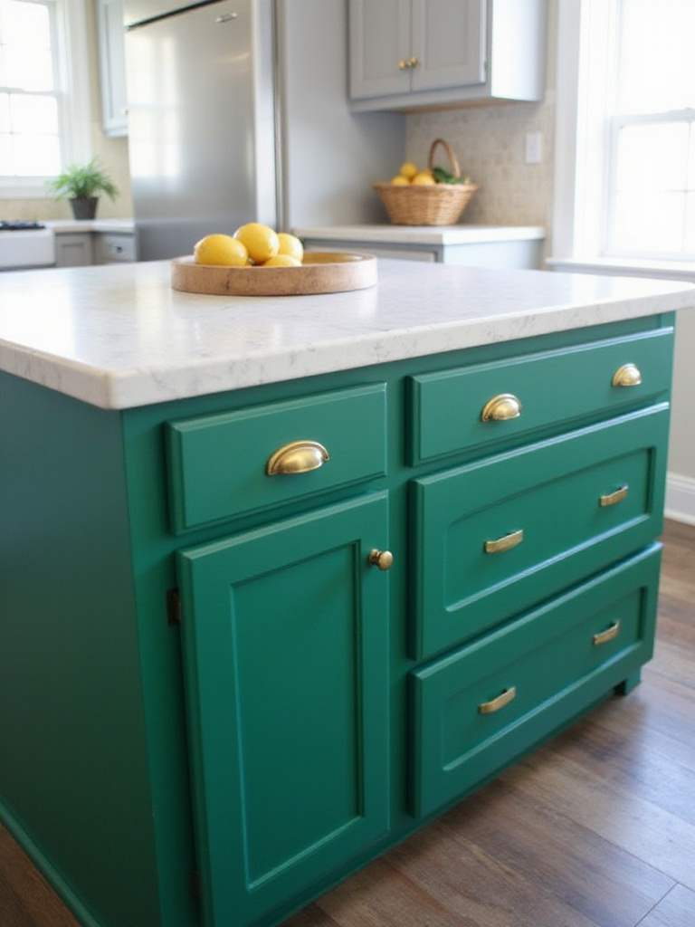
Emerald green can be incorporated into a variety of design styles:
- Modern kitchens – Adding richness and depth
- Transitional designs – Bridging traditional and contemporary elements
- Eclectic or bohemian styles – Pairing with other vibrant colors and textures
For color combinations, emerald green pairs beautifully with white or cream cabinets and countertops for a classic look. Gold or brass hardware adds a touch of luxury, while natural wood tones such as oak or walnut complement the green beautifully. For a bolder approach, try pairing emerald with black or navy blue.
The revival of this classic form comes with a twist – today’s emerald green kitchen islands often feature modern lines and simplified details that keep them from feeling overly ornate or dated.
7. Rich & Warm Burgundy
Burgundy, a deep red-purple hue, brings a sense of luxury, warmth, and sophistication to a kitchen. It acts as a focal point, grounding the space and adding visual interest. Its richness complements both light and dark countertops and cabinet colors, offering versatility in design. The warm undertones make the kitchen feel inviting and cozy, especially appealing in larger, more modern kitchens where a touch of traditional elegance is desired.
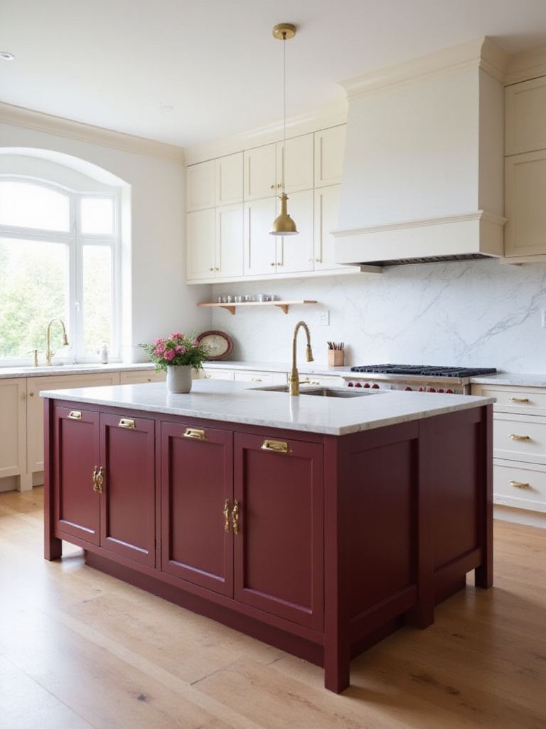
This rich color enhances several kitchen styles:
- Traditional and farmhouse kitchens – Enhancing warmth and character
- Transitional kitchens – Bridging classic and modern elements
- Modern or contemporary designs – Adding a surprising pop of color and visual depth
When working with burgundy, consider pairing it with natural wood elements, brass hardware, or stone countertops. The deep, rich tone creates a sense of luxury while remaining approachable – a perfect balance for the heart of the home.
If you’ve struggled with similar rooms before, burgundy might be the unexpected solution – it’s a color that manages to be both bold and timeless, making it less likely to feel dated than trendy alternatives.
8. Bright & Cheerful Sunny Yellow
A sunny yellow kitchen island instantly injects a feeling of happiness, optimism, and energy into the space. It evokes a sense of warmth and welcomes guests, creating a cheerful and inviting atmosphere. Yellow is a particularly great choice for kitchens that need a pick-me-up or those that lack natural light, as it can help brighten even the darkest corners.
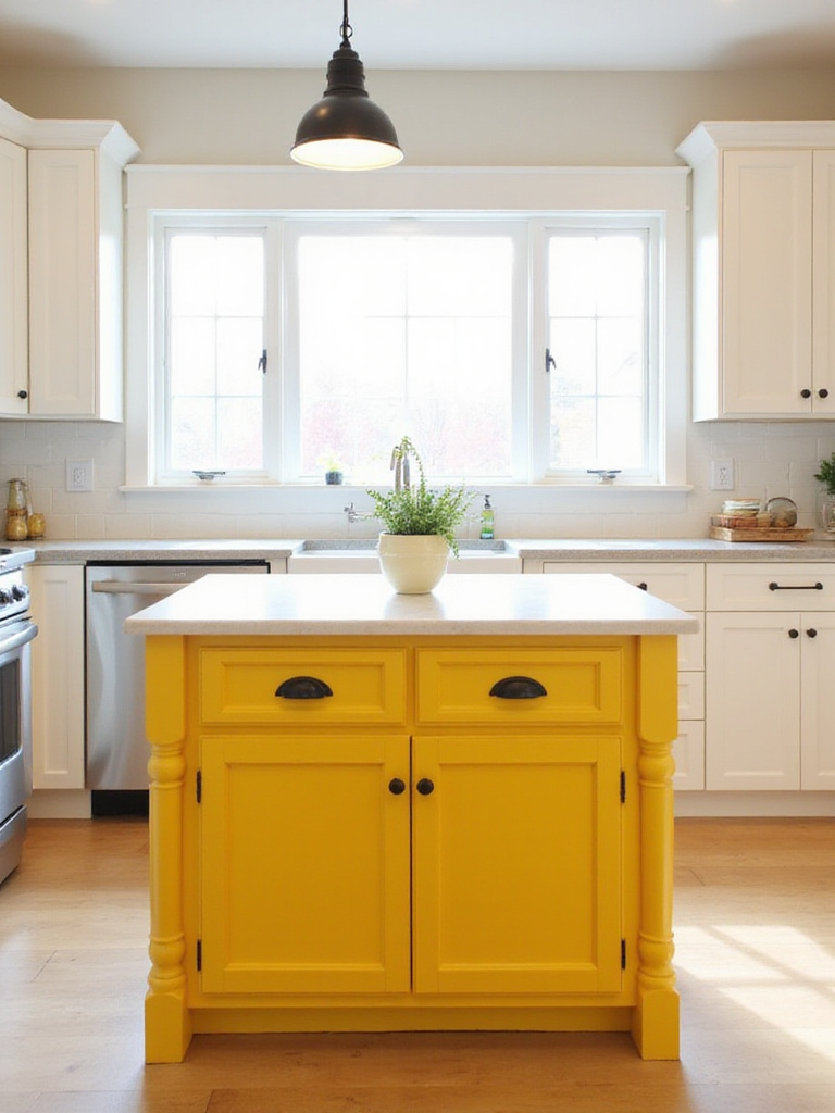
Yellow is surprisingly versatile across kitchen styles:
- Farmhouse, cottage, and retro kitchens – Adding vintage charm
- Modern and contemporary designs – Creating a bold statement piece
- Scandinavian-inspired spaces – Bringing warmth to minimal designs
When building a color palette around a yellow island, consider classic pairings with white or cream for a clean look, or grey for a more sophisticated contrast. Blue, especially navy or teal, creates a vibrant and complementary combination that feels fresh and dynamic.
The unexpected pairing that always works is yellow with natural wood tones – the warmth of both elements creates a harmonious look that feels both contemporary and timeless.
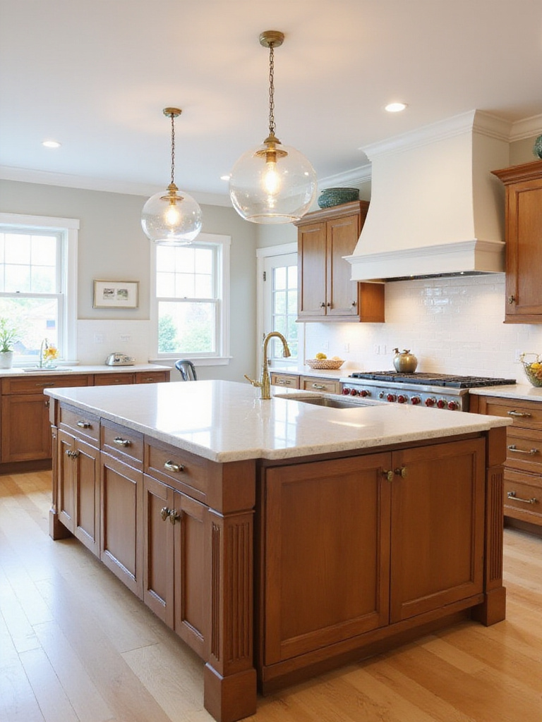
9. The Timeless Appeal of Natural Wood
Natural wood islands offer a warmth and authenticity that is hard to replicate with paint. Wood possesses an inherent beauty that transcends fleeting trends, creating a sense of comfort and connection to nature in the kitchen. The variations in grain, color, and knots make each wood island unique, adding character and preventing it from feeling sterile or dated. Furthermore, wood is incredibly versatile, complementing a wide range of kitchen styles from rustic farmhouse to sleek modern designs.
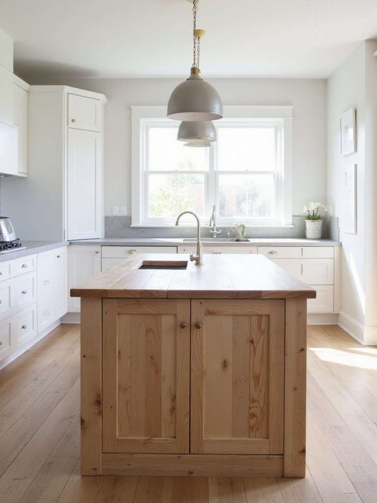
Several wood types are popular for kitchen islands, each offering distinct aesthetics:
- Maple – Light colored and exceptionally durable
- Oak – Features a prominent grain and excellent durability
- Cherry – Reddish-brown that darkens beautifully with age
- Walnut – Dark and luxurious with rich variation
- Reclaimed Wood – Rustic character with eco-friendly benefits
- Pine – Softer, more affordable with a casual feel
There are many ways to showcase the beauty of natural wood in your kitchen island design: as a solid wood island, a wood island top, wood paneling or accents, a butcher block top, a live edge feature, or thoughtful wood details that add warmth to another base material.
The artisan collective that creates these pieces often works with sustainable forestry practices, ensuring your beautiful wood island also represents responsible environmental stewardship.
10. Soft & Inviting Cream or Beige
Cream and beige are incredibly versatile and timeless neutrals that create a warm and inviting atmosphere in the kitchen. They offer a sense of calm and sophistication, blending seamlessly with a variety of design styles. Their neutral nature makes them easy to pair with other colors and materials, allowing for flexibility in decorating and accessorizing the space. They also reflect light well, making the kitchen feel brighter and more spacious.
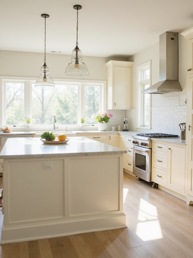
These neutrals adapt beautifully to various design styles:
- Traditional kitchens – Creating a classic and elegant look
- Farmhouse kitchens – Adding warmth and rustic charm
- Transitional kitchens – Providing a bridge between traditional and modern elements
- Contemporary kitchens – Softening the overall look
- Coastal or Hamptons-style kitchens – Creating a light and airy feel
The subtle texture created by cream or beige kitchen island colors can add dimension to your space, especially when you choose a paint with a slight texture or a finish that highlights the cabinet details.
The tactile experience changes the entire room’s energy when you pair these soft neutrals with contrasting elements like a dark granite countertop or rich wood accents, creating a balanced space that feels both sophisticated and welcoming.
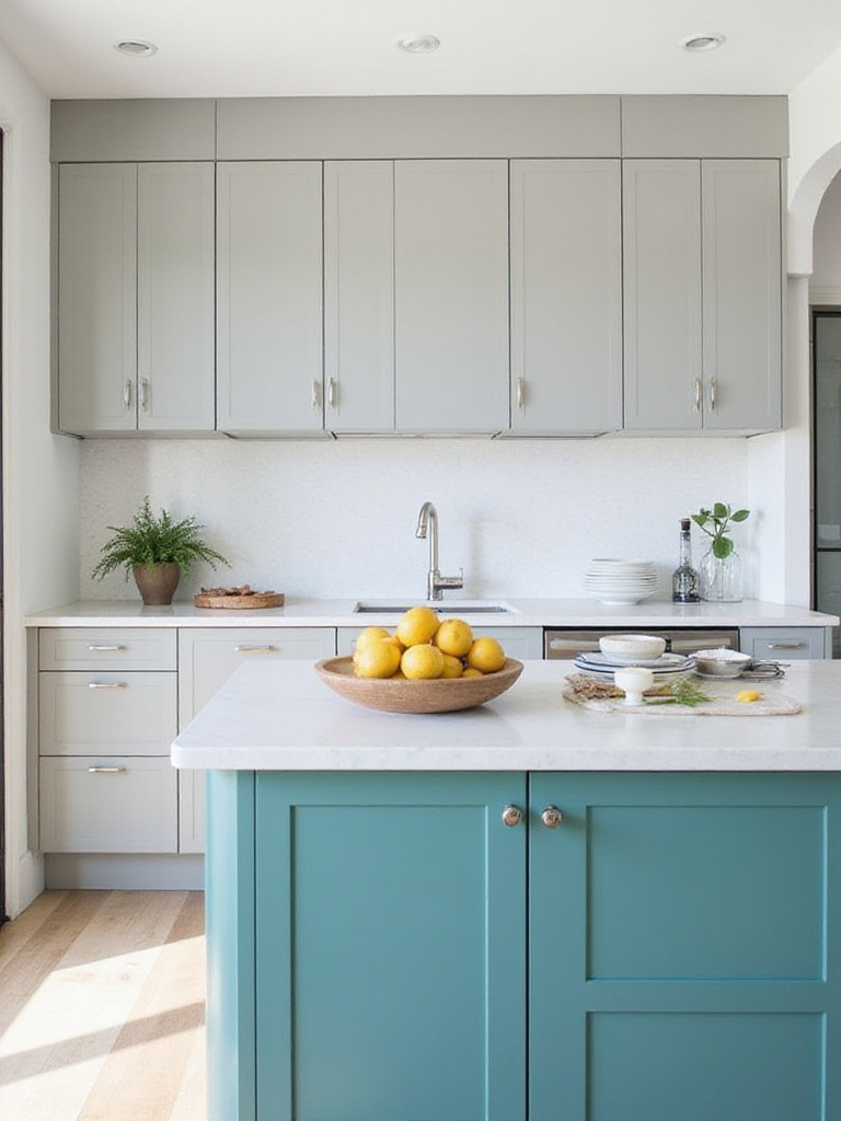
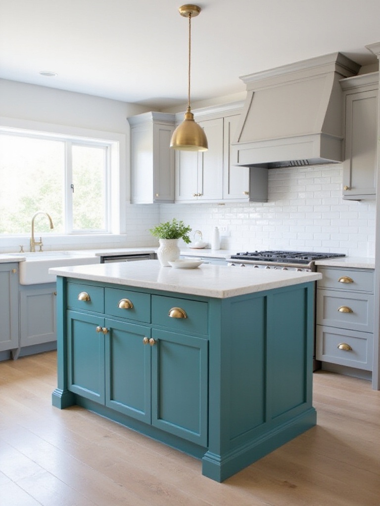
11. Creating Contrast with Color
Introducing contrast through your kitchen island color is a powerful design tool. Contrast introduces visual interest, defines spaces, and prevents a kitchen from feeling monotonous. The island, often a focal point, is an ideal place to inject contrast. By using a color different from the surrounding cabinetry, you can highlight the island’s architectural details, define its function, and add a dynamic element to the overall design.
The best color combinations for creating contrast depend on your kitchen style:
- Modern look – Dark grey or navy island with white or light grey cabinetry
- Classic approach – Black island with cream or off-white cabinets
- Warmer palette – Deep teal or olive green island against natural wood cabinetry
- Bold statement – Vibrant red or cobalt blue against a neutral backdrop
Balance is key when working with contrast. If you opt for a bold island color, consider using it sparingly in other areas of the kitchen. Neutralize the surrounding elements with softer tones and consider the size of the kitchen – smaller kitchens benefit from lighter, less saturated contrasting colors.
While designed for the living room, we’ve seen creative uses of contrast principles in kitchen spaces where the island becomes the room’s jewelry piece rather than just a functional element.
12. Matching Your Existing Cabinets
Matching your kitchen island color to your existing cabinetry creates a sense of cohesion and harmony. This approach is particularly effective in smaller kitchens where visual consistency helps the space feel larger and less cluttered. It also works well in more traditional or formal kitchen designs where a unified aesthetic is desired. If your existing cabinets are a classic color or material (like white, natural wood, or a neutral gray), matching the island can provide a timeless and sophisticated result.
While cohesive, matching can sometimes present challenges:
- It might lead to a monotonous design if the kitchen lacks other interesting elements
- It could be a missed opportunity to introduce a pop of color or visual interest
- If existing cabinets are already bold or dark, matching might overwhelm the space
To ensure an exact match, provide a sample of your existing cabinet color to the paint store or cabinet maker. This can be a drawer front, a door, or even a small piece of trim. They can use color-matching technology to create a paint formula that is virtually identical. Be sure to specify the sheen level as well for a truly unified look.
When clients ask us about balancing style with comfort, sometimes the answer is the simplicity of matching elements – creating a backdrop that allows your life and accessories to provide the personality.
13. Stylish Two-Tone Island Designs
Beyond simply contrasting the island with the perimeter cabinets, a two-tone approach on the island itself offers another layer of design complexity and visual interest. Two-tone kitchen islands are popular because they add visual interest, create a focal point, and allow for greater design flexibility. They can break up the monotony of a single color scheme, highlight specific architectural features, and complement existing cabinetry.
Popular color combinations for two-tone islands include:
- White/Light Gray & Dark Gray/Navy Blue – A classic pairing
- Neutral (Beige/Cream) & Natural Wood Tone – For warmth and texture
- Bold Color (Emerald Green/Teal) & White/Light Gray – For a vibrant statement
- Black & White – For a timeless, graphic look
- Different Shades of the Same Color – For a subtle, sophisticated effect
Consider the existing color palette of your kitchen when choosing your two-tone colors. The combination should feel intentional rather than random, with colors that complement each other and the surrounding space.
The silhouette draws inspiration from traditional furniture pieces when you design a two-tone island with a furniture-like base in one color and a contrasting top section, creating a custom look that elevates the entire kitchen.
14. Adding an Unexpected Color Pop
Sometimes, the most impactful design choice is the one you don’t see coming. An unexpected color pop on a kitchen island can transform a kitchen from ordinary to extraordinary. It injects personality, creates a focal point, and adds visual interest. It’s a relatively low-risk way to experiment with color, as the island is a contained element that can be easily repainted if desired.
When choosing an unexpected color pop, consider:
- The existing color palette of your kitchen – while ‘unexpected,’ the color should still harmonize
- Complementary colors, analogous colors, or a carefully chosen contrasting hue
- The undertones of your existing cabinets, countertops, and backsplash
- The amount of natural light in your kitchen
Kitchen island colors that make surprising yet successful statements include vibrant teal in an otherwise neutral white kitchen, a sunny yellow against grey cabinetry, or a rich plum paired with natural wood tones.
The inspiration for this collection struck when designers began treating kitchen islands less as utilitarian workspaces and more as furniture pieces with their own personality and design language.
15. Cool & Serene Blue Tones
Beyond the drama of navy, other shades of blue offer a cool, serene vibe perfect for a kitchen island. Blue evokes feelings of calmness, serenity, and stability, making it a welcoming and relaxing color for a kitchen space. It also offers a wide range of shades, from light and airy to deep and dramatic, allowing for versatility in matching different kitchen styles.
Popular blue shades for kitchen island colors include:
- Light Blue/Sky Blue – For a coastal, airy feel
- Gray-Blue/Dusty Blue – For subtle elegance
- Robin’s Egg Blue – For a vintage vibe
- Denim Blue – For a casual, approachable feel
Blue kitchen islands are incredibly versatile and can complement a variety of design styles, from coastal and farmhouse to modern, traditional, and Scandinavian. The key is selecting the right shade of blue to match your kitchen’s overall aesthetic and the mood you want to create.
Look closely and you’ll notice the subtle texture of blue tones changing throughout the day – lighter and brighter in morning sunlight, deeper and more complex in evening lamp light, creating a living color that responds to your home’s natural rhythms.
16. Lively Teal or Aqua Accents
Teal and aqua, both variations of blue-green, offer a refreshing and vibrant energy to kitchens. As accent colors for kitchen islands, they inject personality and prevent the space from feeling sterile or overly neutral. Their inherent calmness provides a soothing contrast to warmer tones, while their vibrancy creates a focal point that draws the eye.
These colors are particularly suited to certain aesthetics:
- Coastal kitchens – Amplifying the nautical theme
- Modern kitchens – Adding a pop of color against sleek backdrops
- Mid-century modern – Evoking a retro vibe
- Eclectic kitchens – Contributing to the playful aesthetic
When working with teal or aqua, consider pairing them with complementary materials like warm woods, white countertops, or brass hardware. These combinations help balance the coolness of the color with elements that add warmth and texture to the space.
The sustainable journey of this material involves fewer toxic pigments than many traditional paint colors, making teal and aqua not just beautiful choices but often more environmentally friendly options for your kitchen island colors.
17. Cozy & Grounding Brown Shades
Brown kitchen islands offer a sense of stability and warmth, connecting the space to nature. Brown shades evoke a sense of earth and stability, creating a comforting atmosphere in the kitchen. They are inherently warm and inviting while being versatile enough to pair well with various countertop materials, hardware finishes, and overall kitchen styles. The neutrality of many brown tones allows them to be grounding, anchoring the space and preventing it from feeling too sterile or cold.
The range of brown offers options for different moods:
- Light tans and beiges – For a soft, subtle warmth
- Medium browns like walnut or oak – For classic, natural appeal
- Rich chocolate browns – For depth and sophistication
- Deep espresso tones – For drama and contrast
Consider the undertones of your chosen brown – some lean more reddish, while others have yellow, gray, or even purple undertones. These subtle differences can significantly impact how the color interacts with other elements in your kitchen.
Even in smaller spaces, here’s how this works: pair a brown island with lighter perimeter cabinets and ensure good lighting to create a focal point that grounds the space without overwhelming it.
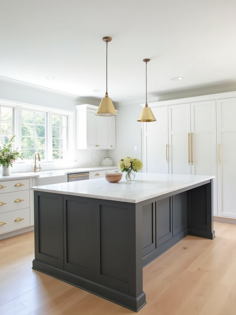
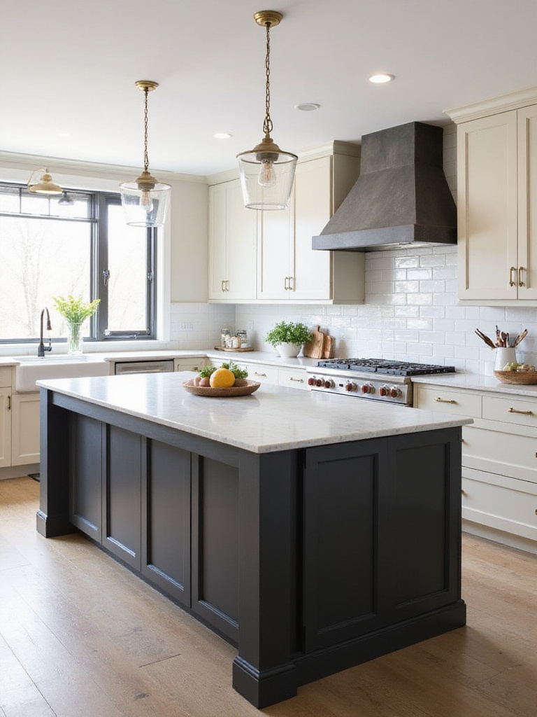
18. The Elegance of Charcoal Grey
Charcoal grey provides a sophisticated and modern alternative to black or lighter greys for kitchen island colors. It offers a versatile aesthetic that works well with a variety of design styles, from modern and minimalist to traditional and farmhouse. It’s also excellent at concealing smudges and fingerprints compared to lighter colors, making it a practical choice for a high-traffic area like a kitchen island.
Charcoal grey adapts well to different aesthetics:
- Modern and contemporary kitchens – Complementing sleek lines and stainless steel
- Transitional spaces – Bridging traditional and contemporary elements
- Farmhouse or rustic kitchens – Pairing with natural wood tones and distressed finishes
- Industrial-style kitchens – Enhancing the urban, edgy feel
As a neutral backdrop, charcoal grey pairs beautifully with crisp white cabinets, warm wood tones, metallics like brushed gold or copper, and pops of color such as teal or mustard yellow.
The mood shifts dramatically when you add charcoal grey to your kitchen – creating a sophisticated backdrop that makes everything from colorful dishware to copper pots stand out with newfound elegance.
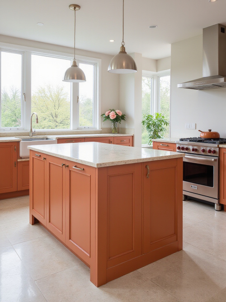
19. Warm & Unique Terracotta or Coral
For a kitchen island that truly stands out with warmth and personality, consider terracotta or coral. These colors offer a departure from the often-seen neutrals and blues, bringing warmth, earthiness, and a touch of the unexpected to the kitchen. Terracotta grounds the space and evokes rustic charm, while coral injects personality and a cheerful, optimistic vibe. Both colors are relatively uncommon for kitchen islands, making them a statement choice that reflects individuality.
These warm hues require thoughtful pairing across various design styles:
- Terracotta – Thrives in Mediterranean, Tuscan, Southwestern, and rustic kitchens
- Coral – Complements coastal, bohemian, eclectic, and even modern kitchens
While beautiful, these colors should be carefully considered. Their warmth can be overwhelming in small kitchens or spaces with limited natural light. It’s also important to ensure the color complements the existing kitchen palette by considering the undertones and intensity.
The cultural heritage preserved in each piece includes centuries of architectural tradition, where terracotta and coral tones have adorned Mediterranean homes, bringing the warmth of sun-baked clay and desert sunsets into modern living spaces.
20. Deep & Muted Olive Green
Deep and muted olive green offers a sophisticated and earthy feel that brings a touch of nature indoors. It’s a versatile color that complements a wide range of kitchen styles, from traditional to modern farmhouse. Its muted nature means it’s not overpowering, providing a calming and grounding presence. It also hides everyday wear and tear better than lighter colors, making it practical for busy kitchen islands.
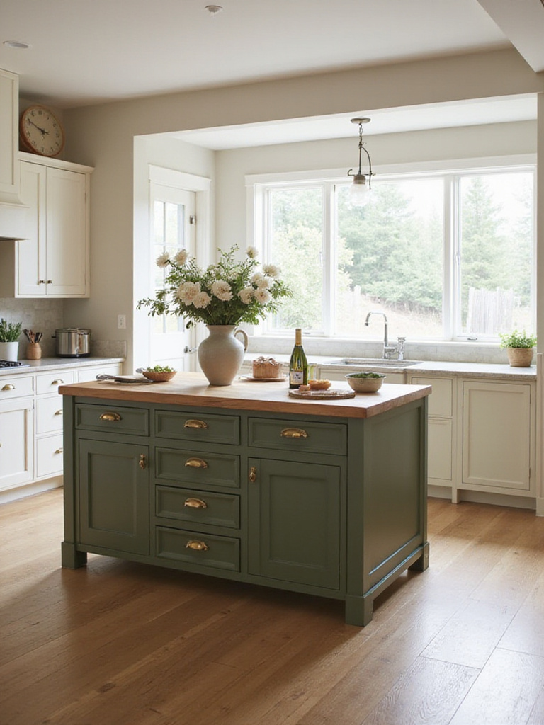
This shade of green is surprisingly adaptable to various design styles:
- Farmhouse kitchens – Lending a rustic element
- Transitional spaces – Bridging traditional and contemporary
- Modern kitchens – Adding warmth to prevent sterility
- Mediterranean designs – Complementing terracotta and natural stones
- Scandinavian-inspired spaces – Adding depth to minimal designs
When choosing a specific shade of deep olive green, consider the amount of natural light in your kitchen. A darker shade might work well in a bright space, while a lighter, more muted version may be better for a kitchen with less natural light.
The artisans behind these designs began with studies of natural olive groves and forest understories, capturing the complex, muted greens that create such a sense of peace and groundedness in natural settings.
21. Playful Pastel Touches
Pastel colors can inject a sense of fun, softness, and vintage charm into a kitchen island. These gentle hues work incredibly well in kitchens with a vintage, farmhouse, or modern aesthetic. They complement the clean lines of modern design by adding a touch of unexpected softness, while in farmhouse and vintage kitchens, they enhance the inherent charm and warmth.
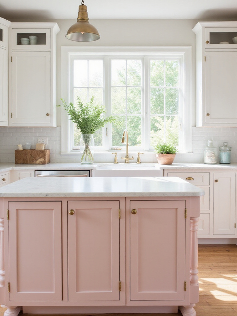
The key with pastels is to keep them sophisticated, not childish:
- Balance the sweetness with grounding elements like neutral countertops
- Add hardware in metallic finishes (brass, copper, or brushed nickel)
- Incorporate natural wood accents for warmth and texture
- Use the pastel as an accent rather than the dominant color
- Consider muted or dusty pastels for a more sophisticated look
Currently trending pastel kitchen island colors include soft pinks (blush, rose quartz), mint greens, powder blues, and lavender. Each brings its own character while maintaining that gentle, uplifting quality that makes pastels so appealing.
The finishing touch that elevates the entire look is often contrasting hardware – matte black against a soft pink, aged brass with mint green, or brushed nickel with powder blue creates a sophisticated balance between playful and refined.
22. Embracing Dark & Moody Hues
Beyond black and charcoal, a range of deep, saturated colors can create a dramatic and sophisticated kitchen island. Dark and moody hues, like deep blues, forest greens, and rich burgundies, add a touch of sophistication, drama, and depth to a kitchen. They create a focal point and ground the space while evoking a sense of warmth and intimacy, making the kitchen feel more inviting and cozy.
Using dark colors effectively requires careful planning:
- Ensure adequate natural and artificial lighting (dark colors absorb light)
- Balance with lighter surrounding elements (countertops, backsplash, wall colors)
- Consider the size of the kitchen (dark colors can work in both large and small spaces if balanced properly)
- Choose complementary materials that enhance rather than compete with the dark tones
Dark and moody kitchen island colors work exceptionally well in modern, contemporary, and even some traditional designs, where they can add unexpected depth and character.
As morning light filters through, the texture creates subtle variations in these dark tones, revealing hidden depths and nuances that flat, lighter colors simply cannot achieve – making your kitchen island a living element that changes throughout the day.
Conclusion
The kitchen island stands as both the functional and aesthetic heart of your kitchen, and choosing the perfect color for this central element offers a wonderful opportunity to express your personal style. From timeless whites and blacks to bold emeralds and navies, from earthy sages and olives to playful pastels, the spectrum of kitchen island colors is vast and full of possibility.
As you consider these 22 inspiring options, remember to factor in your existing elements – cabinets, countertops, flooring, and overall style. Don’t be afraid to test samples, consider unexpected choices, and select a color that truly resonates with you. The right kitchen island color can transform your space, creating a warm, inviting atmosphere where daily routines become cherished rituals and gatherings become memorable celebrations. Your kitchen island isn’t just a workspace – it’s the canvas upon which your home’s heart is painted.