Hey there, retro-future enthusiasts! Remi Zhao-Campbell here, ready to take you on a groovy journey through the world of dining room lighting and paint. Picture this: it’s 1962, and you’ve just invited the Jetsons over for dinner. Your dining room needs to be the bee’s knees, the cat’s pajamas, and totally out of this world—all at the same time. How do you pull it off? Simple! By mastering the art of harmonizing your lighting and paint choices.
In this guide, we’ll explore how to transform your dining space into a true atomic-age masterpiece that would make even George Jetson jealous. We’ll dive into the nitty-gritty of how different light sources can make your paint pop or flop, and I’ll share some of my favorite tips and tricks for creating a dining room that’s both far-out and functional. So, grab your favorite boomerang chair, pour yourself a tall glass of Tang, and let’s blast off into the world of dining room design!
Key Takeaways
- Light it up, baby! Different types of lighting can make your paint colors sing or sink faster than you can say “Beam me up, Scotty!”
- Don’t be a square—always test your paint colors before committing. It’s like taking your potential color on a first date to see if you click.
- Play matchmaker with your lighting and paint colors. Warm lights and cool colors? That’s a recipe for a design disaster!
- Patience is a virtue, daddy-o. Multiple coats and proper drying time are the secret sauce for a smooth, professional finish.
- Set the mood, man! Your paint color can make your dining room feel groovier than a lava lamp or cooler than the flip side of a pillow.
- Remember, your furniture and decor are part of the band too. Make sure your paint color plays nicely with the rest of the ensemble.

How Lighting Affects Paint
Listen up, cats and kittens! Before we dive into the nitty-gritty, let’s rap about how lighting can make or break your dining room’s vibe. It’s like a mood ring for your walls—change the light, and suddenly your carefully chosen “Harvest Gold” looks more like “Murky Mustard.” Let’s break it down:
Natural Light Impact
Dig this, daddy-o: Mother Nature’s got her spotlight, and it’s a real game-changer. Here’s the 411:
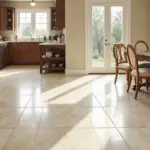
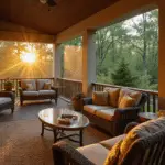
- Sunlight’s the original Instagram filter. Bright rays can make your colors pop like a fresh vinyl record, while cloudy days might leave them looking flatter than week-old soda.
- Direction matters more than a compass at a Boy Scout jamboree. East-facing rooms get the warm morning glow, perfect for your “Avocado Green” walls.
- Seasons change, and so does your room’s look. Winter light’s cooler than a polar bear’s toenails, while summer sun’s hotter than a jalapeño milkshake.
(Fun fact: Did you know that the first color TV broadcast was in 1951? Talk about a revolution in home decor!)

Artificial Light Impact
Now, let’s flip the switch on man-made illumination. It’s like choosing between vinyl, 8-track, or cassette—each one’s got its unique sound, or in this case, look:
- LED lights are the new kids on the block, showing colors truer than a Boy Scout’s promise.
- Incandescent bulbs? They’re like a cozy sweater for your walls, adding a warm, vintage glow.
- Fluorescent lights can be trickier than a game of three-card monte, sometimes washing out colors faster than you can say “disco.”
Remember, the brightness of your bulbs can make your walls shout or whisper. It’s all about finding that Goldilocks zone—not too bright, not too dim, but juuuust right.
Light Direction Influence
Alright, cool cats, let’s talk about direction—and I don’t mean the latest boy band. The way light hits your walls can change your room’s tune faster than flipping a 45:
- North-facing rooms are like the James Dean of Lighting—cool and moody. They can make warm colors play hard to get.
- South-facing spaces? They’re the beach party of rooms, soaking up warm, bright light that makes colors want to do the twist.
- East and West? They’re like Jekyll and Hyde. East rooms get that soft, dewy morning light, while west-facing spaces bask in the golden oldies of sunset.

Testing Paint Colors
Alright, hip cats, it’s time to put on your lab coats and channel your inner mad scientist. Testing paint colors is like auditioning backup singers for your dining room’s hit single. You’ve gotta make sure they can harmonize with your space’s natural rhythm. Let’s break it down:
Sample Swatches
First things first, we’re gonna start with some sample swatches. It’s like getting a taste of the new soda flavor before buying a whole six-pack:
- Slap those swatches on different walls like you’re papering your room with color confetti. This lets you see how they jive with your space’s unique groove.
- Size matters, daddy-o! Bigger swatches give you a better peek at the future than a crystal ball. They’re like a movie trailer for your walls.
- Check ’em out under different lighting conditions. It’s like seeing your date in both candlelight and broad daylight—you want to make sure they look good in all scenarios!

Different Times of Day
Now, we’re gonna play timekeeper. Your paint colors need to look fly from sunup to sundown:
- Morning light’s like a gentle wake-up call. Does your color greet the day with a cheerful “Good morning, sunshine!” or a grumpy “Five more minutes”?
- High noon’s the real test. It’s when colors show their true stripes, no hiding behind mood lighting here!
- The evening’s when things get romantic. Does your color set the mood for dinner parties, or does it make your guests lose their appetite?
Keep a little notebook handy, like a color detective. Jot down how each shade shifts throughout the day. It’s like keeping tabs on a chameleon—you want to know all its tricks!
Artificial Lighting Tests
When the sun goes down, that’s when the real party starts. Time to see how your colors boogie under artificial lights:
- Play DJ with your lighting. Mix it up with table lamps, overhead lights, and maybe even some groovy-colored bulbs.
- Dimmers are your new best friend. They’re like a volume knob for your walls. Turn ’em up, turn ’em down, and see how your colors respond.
- Don’t forget about movie night! How does your paint look in the soft glow of your TV? You don’t want it stealing the show during your favorite flicks.

Remember, testing your paint is like taking it out for a test drive. You wouldn’t buy a car without kicking the tires, so don’t commit to color without putting it through its paces!
Choosing the Right Colors
Alright, cool cats, now that we’ve jived about testing, let’s rap about picking the perfect hue for your dining room digs. It’s like choosing the right vinyl for your turntable—you want something that’ll keep the party groovin’ all night long. So, let’s break it down and paint your dining room with some serious style!
Warm vs Cool Tones
First up, we’ve got to decide: are we going for a cozy jazz club vibe or a sleek, modern lounge feel? It’s all about the temperature, baby:
- Warm tones are like a bear hug for your walls. We’re talking reds, oranges, and yellows that’ll make your dining room feel cozier than a sock hop in a sweater factory. These shades play nice with wooden furniture and warm decor, perfect for those family pot roast dinners.
- Cool tones, on the other hand, are smoother than a fresh jar of Brylcreem. Blues, greens, and purples can turn your dining space into a calm oasis faster than you can say “Chill out, daddy-o.” They’re the cat’s pajamas for modern or minimalist styles.
Remember, choosing between warm and cool is like picking between rock ‘n’ roll and jazz—there’s no wrong answer, just different vibes!

Matching Existing Lighting
Now, let’s talk about playing matchmaker with your paint and lighting. It’s like pairing the right shoes with your zoot suit—everything’s gotta jive:
- Warm lights are like a cozy fireplace—they’ll make warm paint colors sing like Sinatra. But pair ’em with cool colors, and you might end up with a look that’s more “off-key karaoke” than “smooth jazz.”
- Cool lights, like those hip LED bulbs, can make cool colors pop like bubble gum. But use ’em with warm shades, and your walls might look more washed out than your dad’s old jeans.
The key is harmony, baby. You want your lights and paint to be like Martin and Lewis—a perfect comedic duo that brings out the best in each other.
Neutral Color Options
Last but not least, let’s chat about neutrals. These are the Swiss Army knives of the color world—versatile, reliable, and always in style:
- Beige, gray, and white are like the backup singers of the paint world. They let your funky furniture and far-out accessories take center stage.
- Going neutral doesn’t mean boring, Jack! Add some pizzazz with bold accent pieces or statement lighting. It’s like wearing a classic suit with a wild tie—business in the front, party in the back!
- The best part? Neutrals are timeless. They’re like the little black dress of interior design—always in fashion, no matter what decade you’re grooving in.

And hey, if you’re feeling adventurous, why not try dining room zoning with paint? It’s a far-out way to define spaces in open-plan living!
Remember, choosing colors is like picking your favorite milkshake flavor—it’s all about personal taste. So trust your gut, have fun, and don’t be afraid to express your unique style. After all, your dining room should be as cool and quirky as you are!
Tips for Best Results
Alright, hip cats, we’re in the home stretch now! You’ve picked your colors, you’ve tested them out, and you’re ready to turn your dining room into a bona fide retro-futuristic masterpiece. But before you start slinging paint like Jackson Pollock at a spin art party, let’s rap about some tips to make sure your results are cooler than the flip side of the pillow.
Use Multiple Light Sources
Listen up, daddy-o, ’cause this is important: lighting your dining room is like composing a symphony. You need different instruments to create a full, rich sound. In lighting terms, we’re talking about layering:
- Overhead lighting: This is your percussion section, setting the base beat for your room. A groovy chandelier or some recessed lights can set the tone.
- Task lighting: Think of this as your brass section, focused and bright. A sleek lamp over the dining table makes sure you can see your TV dinner tray.
- Accent lighting: Here’s your string section, adding depth and drama. Use it to highlight your prized lava lamp collection or that far-out abstract painting.

By combining these light sources, you’re creating a lighting mix tape that would make even Thomas Edison snap his fingers in approval. Plus, it lets you adjust the mood faster than you can say “dim the lights and cue the romantic music.”
Consider Bulb Types
Now, let’s talk about the real MVPs of the lighting world: bulbs. Choosing the right bulb is like picking the perfect record for your turntable. You’ve got options, baby:
- Incandescent bulbs: The classic crooners of the lighting world. They give off a warm, vintage glow that’s perfect for creating that cozy, “Leave It to Beaver” vibe.
- LED bulbs: These are the new kids on the block, cooler than a polar bear’s toenails. They come in a variety of color temperatures, so you can fine-tune your lighting like a hi-fi stereo system.
- Halogen bulbs: The jazz improvisers of lighting. They give off a bright, white light that’s great for task lighting or highlighting specific areas.
Remember, the color temperature of your bulbs (measured in Kelvins) can make your paint colors sing or sink faster than the Titanic. Warmer bulbs (2700K-3000K) are like a cozy sweater for your walls, while cooler bulbs (3500K-4100K) can make your space feel more modern than the Jetsons’ pad.

Consult a Lighting Expert
Now, I know what you’re thinking: “Remi, baby, I’ve got this handled!” And maybe you do you cool cat. But sometimes, even the Rat Pack needed a little help from their friends. That’s where lighting experts come in:
- These cats know their stuff. They can help you create a lighting plan that’s more harmonious than the Beach Boys on a good day.
- They can suggest fixtures that’ll make your dining room look like it belongs in a swanky Hollywood Hills mansion.
- Plus, they know all the technical jazz about wattage, lumens, and color rendering index (CRI) that’ll make your head spin faster than a 45 on a turntable.
Remember, consulting an expert doesn’t mean you’re not hip to the jive. It just means you’re smart enough to know when to call in the pros. After all, even Frank Sinatra didn’t arrange his music!
So there you have it, cool cats and kittens. Follow these tips, and your dining room will look sharper than a tack in no time. Now go forth and paint with the confidence of Elvis strutting on stage!

Closing Thoughts
Well, gang, we’ve come to the end of our groovy journey through the world of dining room lighting and paint. We’ve covered more ground than a ’57 Chevy on a cross-country road trip, and I hope you’re feeling as charged up as a fresh set of batteries in a lava lamp!
Remember, creating the perfect dining room is like mixing the ultimate cocktail—it’s all about finding the right balance. You’ve got the tools now to make your space sing louder than a jukebox on Saturday night. So don’t be afraid to experiment, to try new things, and to let your personality shine through brighter than a disco ball.
Maybe you’ll go for a cool, calm blue that makes your dining room feel like an oasis of tranquility. Or perhaps you’ll opt for a warm, vibrant orange that turns every meal into a celebration. Whatever you choose, make sure it’s a reflection of you and your unique style. After all, your home should be as one-of-a-kind as a custom-built hot rod!
And hey, if you hit a bump in the road, don’t sweat it! Rome wasn’t built in a day, and neither was the perfect dining room. Take your time, trust your instincts, and remember—there’s no such thing as a mistake, just a happy little accident (as our pal Bob Ross would say).
So what are you waiting for, cool cats? Grab those paint brushes, fire up those light fixtures, and let’s turn your dining room into a space that’s more happening than a sock hop on a Friday night! And if you need a little extra inspiration, don’t forget to check out our other dining room painting tips and tricks. They’re guaranteed to get your creative juices flowing faster than a strawberry milkshake!

Now go forth and create a dining room that’s so fly, it’ll have the whole neighborhood talking. And remember, in the immortal words of that groovy cat Frank Sinatra, “The best is yet to come!” So keep on painting, keep on lighting, and keep on being your fabulous, far-out self!
Frequently Asked Questions
How does lighting affect paint color in a dining room?
Well, daddy-o, lighting is like a mood ring for your walls! Different light sources can make your paint color change its tune faster than a chameleon at a disco. Natural light, incandescent bulbs, and those hip new LEDs each cast their special glow, making your carefully chosen shade look warmer, cooler, or somewhere in between. It’s all about finding that perfect harmony between your paint and your lighting, like pairing the right wine with your TV dinner!
What should I consider when testing paint colors?
Testing paint colors is like taking your potential date to meet the parents—you want to see how they perform under different conditions! Always slap those sample swatches right on your dining room walls, baby. Check ’em out at different times of day, under natural light and your grooviest lamps. It’s like a 24-hour screen test for your walls! And don’t forget to see how they jive with your existing furniture and decor. You want a color that plays nice with the whole band, not a prima donna that clashes with your grandma’s china cabinet!
How do I choose the right paint color for my dining room?
Choosing the right paint color is like picking the perfect song for your first dance—it sets the tone for everything! Consider your dining room’s size (is it cozier than a drive-in movie backseat or more spacious than a roller disco?), the quality of light it gets (sunny side up or mood lighting central?), and your existing decor (are we talking “Mad Men” chic or “Brady Bunch” casual?).

Don’t forget to think about the vibe you’re going for. Want a dining room that’s cooler than a cucumber in a gin fizz? Go for some sleek, cool tones. Aiming for a space that’s warmer than a fresh apple pie? Cozy up with some toasty hues. And if you’re stuck, neutral colors are like the little black dress of the paint world—they go with everything!
Can I use dark colors in a small dining room?
Can you use dark colors in a small dining room? Does Elvis wear blue suede shoes? Of course, you can, daddy-o! Dark colors in a small space can be as bold and beautiful as a vintage Cadillac. They add depth and sophistication faster than you can say “Pass the mashed potatoes.”
The trick is balance, like keeping your cool at a sock hop. Pair those dark walls with plenty of light-colored accents and good lighting. It’s like wearing a dark suit with a crisp white shirt—sharp and classy! Just make sure you’ve got enough wattage to keep things bright, or your guests might think they’ve stumbled into a film noir instead of dinner!
What are some tips for achieving the best results when painting?
Listen up, cool cats, ’cause this is important! Achieving the best results is all about prep work and patience. It’s like building a hot rod—you gotta do it right if you want it to purr:
- Prep your walls like you’re preparing for a big date. Clean ’em up, smooth out any rough spots, and don’t forget to prime!
- Use quality paint. It’s like buying good vinyl—you get what you pay for.
- Apply multiple thin coats. It’s the secret to a finish smoother than a fresh jar of peanut butter.
- Let each coat dry properly. Patience is a virtue, daddy-o!
- Ventilate like you’re airing out the joint after a wild party. Good airflow helps the paint dry evenly and keeps you from getting loopier than a Looney Tunes marathon.
Should I consider the mood I want to create in my dining room?
Does a bear dance in the woods? Of course, you should consider the mood, baby! Your dining room is like the stage for your domestic performances, from intimate dinners for two to rowdy family reunions. The color you choose sets the scene faster than a quick-change artist.
Want a dining room that’s cozier than a bear hug? Warm colors like reds and oranges will make your space feel more intimate than a drive-in movie. Looking for a cool, calm vibe for your late-night snacking? Blues and greens can make your dining room more relaxing than a lazy Sunday afternoon.
Remember, it’s all about what makes you and your guests feel groovy. Whether you’re hosting a swinging cocktail party or a casual TV dinner night, your paint color should set the perfect mood for your shindig!
How often should I repaint my dining room?
Well, hipster, that depends on how often you like to change your tune! Generally speaking, repainting every 5-7 years is a good rule of thumb, like changing the oil in your cherry red convertible. But hey, if you’re the type who likes to switch things up more often than you change your socks, go for it!
Keep an eye out for signs that your walls need a fresh coat, like fading (is your “Harvest Gold” looking more like “Faded Dandelion”?), scuffs (has your wall been moonlighting as a bumper car?), or if you’re just plain tired of the color (did that “Avocado Green” go from fab to drab?).
Remember, repainting your dining room is like giving your space a facelift without the Hollywood price tag. So if you’re feeling the itch to switch, don’t be afraid to grab that paintbrush and start grooving to a new color tune!
And there you have it, cool cats! Your guide to creating a dining room that’s cooler than the other side of the pillow. Now go forth and paint with the confidence of the Fonz giving a thumbs up!

