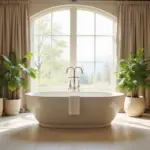
Picture this: You’re standing in your bedroom, paintbrush in hand, surrounded by a sea of color swatches. The walls are a blank canvas, ready to be transformed into your sanctuary. But with so many options, how do you choose the perfect bedroom paint colors to create your dream oasis?
As someone who grew up in a home where every wall told a story through its hues, I’ve learned that selecting the right paint color is more than just picking a pretty shade. It’s about creating an atmosphere, expressing your personality, and even influencing your mood and sleep quality. That’s why I’m thrilled to share my expertise and guide you through the colorful journey of transforming your bedroom into a haven that reflects your unique style and promotes relaxation.
In this comprehensive guide, we’ll explore the psychology of color, dive into popular choices, and discover how to express your style through paint. We’ll also tackle practical tips to ensure you make the best decision for your space. So, grab your favorite cozy blanket, and let’s embark on this colorful adventure together!

Key Takeaways
Before we dive into the vibrant world of bedroom paint colors, let’s highlight some key points to keep in mind:
- Room size, lighting, and existing furniture play crucial roles in your color choice. For instance, light colors can make a small room feel more spacious, while dark hues add warmth and coziness to larger spaces.
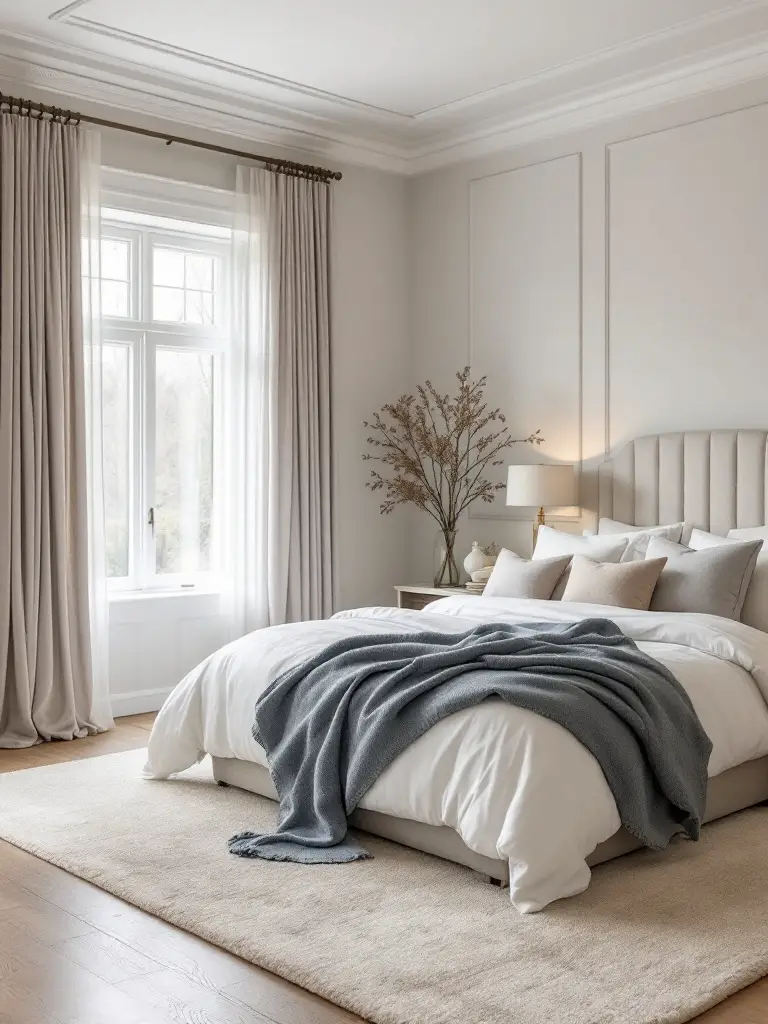
- Soft, neutral tones like light gray or beige are popular for creating a calming atmosphere. These versatile shades can easily adapt to various decor styles and personal preferences.
- For a relaxing space, consider colors that promote tranquility, such as blues and greens. These hues have been shown to reduce stress and improve sleep quality.
- Your bedroom is your sanctuary, so choose colors that reflect your style and make you feel comfortable and happy. Don’t be afraid to express yourself!
- Always test paint samples on your walls and observe them at different times of the day. The way colors change with lighting can be surprising!
- Don’t forget about the finish! Matte finishes can create a cozy feel, while satin finishes add a bit of shine and are easier to clean.
Remember, choosing bedroom paint colors is a personal journey. What works for one person might not work for another. The key is to find colors that resonate with you and create the atmosphere you desire in your sleep space.
Factors to Consider
When it comes to choosing bedroom paint colors, there’s more to consider than just your favorite shade. Let’s explore the key factors that can make or break your bedroom’s ambiance.

Mood and Ambiance
Have you ever walked into a room and instantly felt calm, energized, or even a bit moody? That’s the power of color psychology at work! As someone who’s designed countless bedrooms, I can tell you that the colors you choose can significantly impact how you feel in your space.
Cool colors like soft blues and greens are known for their calming effects. I once transformed a client’s chaotic bedroom into a serene retreat using a pale sky blue. The result? They reported feeling more relaxed and sleeping better within just a week!
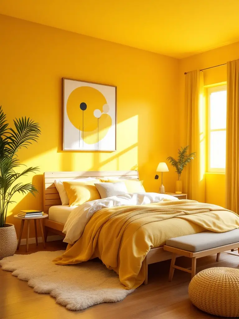
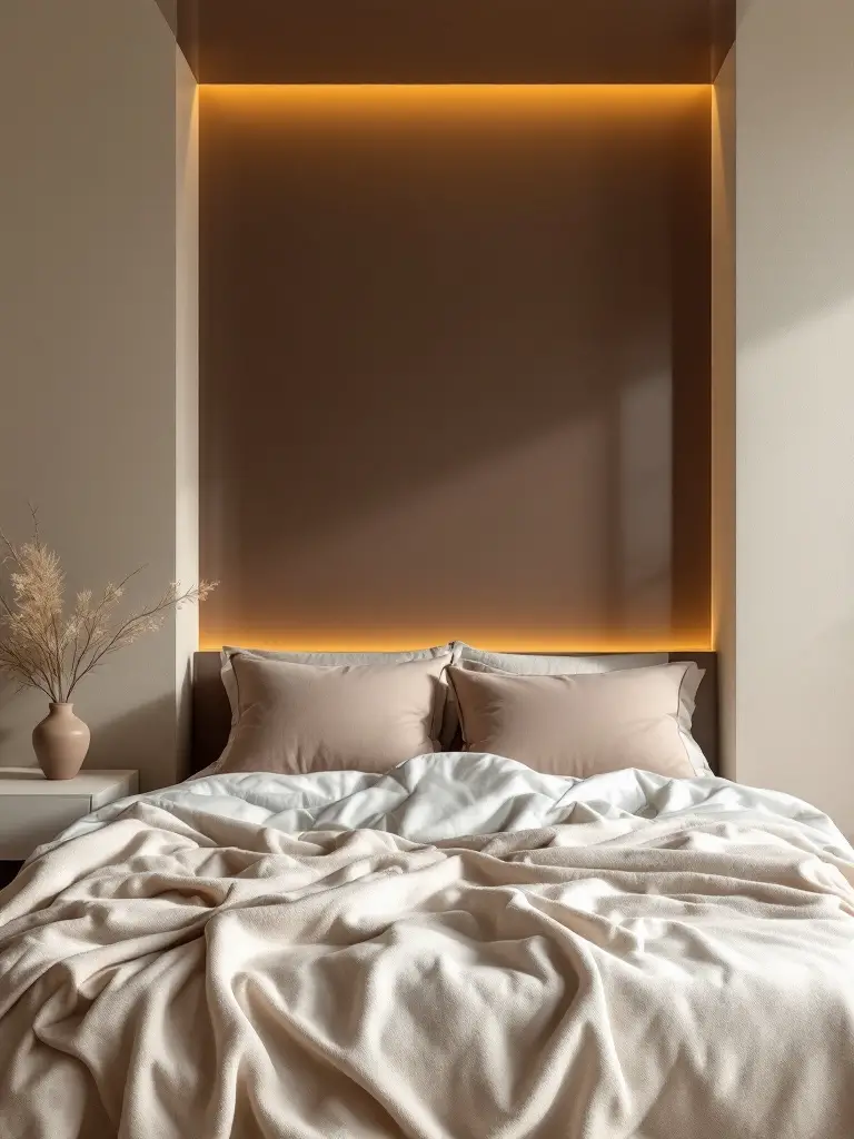
On the flip side, warm colors like yellows and oranges can energize a space. These are great if you want your bedroom to feel sunny and invigorating in the morning. Just be cautious with bright shades, as they can be overstimulating when it’s time to wind down.
When choosing bedroom paint colors, think about the mood you want to create. Do you want a calm oasis or an energizing space to start your day? The colors you choose can help set the tone.
Natural Light Impact
Let’s talk about Mother Nature’s magic wand: natural light. The amount and quality of natural light in your bedroom can dramatically affect how paint colors appear throughout the day.
I remember painting my bedroom a soft gray that looked perfect on the swatch. But when the afternoon sun hit, it transformed into an unexpected lavender! This taught me a valuable lesson about testing colors in different lighting conditions.
For rooms with limited natural light, lighter shades can work wonders. They reflect what little light there is, making the space feel brighter and more open. In contrast, darker hues can add depth and coziness to well-lit rooms without feeling oppressive.
Pro tip: Observe your room at different times of the day before making a final color decision. The morning light might tell a completely different color story than the evening glow!
Room Size Considerations
When it comes to bedroom paint colors, size does matter! The dimensions of your room can guide you towards colors that either expand or cozy up your space.
For smaller bedrooms, light colors are your best friends. They reflect more light, creating an illusion of space. I once used a soft, creamy white in a tiny urban bedroom, and it felt like the walls had been pushed outward by several feet!
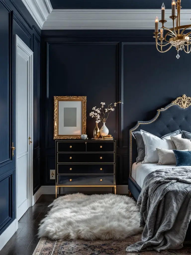
Larger rooms, on the other hand, can handle darker or more saturated colors. These shades can add depth and make expansive spaces feel more intimate. In a spacious master bedroom, I used a deep navy blue on one wall, instantly creating a cozy sleeping nook.
Remember, you’re not limited to one color. Accent walls or two-tone designs can help balance proportions and add interest to rooms of any size. The key is to find the right balance for your unique space.
Existing Decor Integration
Your bedroom paint color doesn’t exist in isolation – it needs to play nicely with your existing decor. Think of your walls as the backdrop to your furniture, textiles, and accessories.
Start by looking at the dominant colors in your room. Do you have a beloved bedspread or a statement piece of furniture? Use these as inspiration for your color palette. I once designed a room around a client’s cherished vintage rug, pulling subtle tones from its pattern for the walls. The result was a cohesive, harmonious space that felt thoughtfully curated.
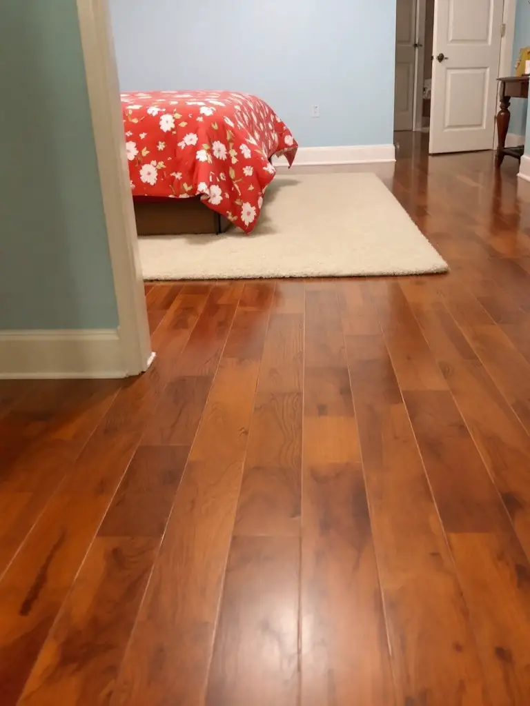
Don’t forget about your flooring either. Whether you have warm wooden boards or cool-toned tiles, your floor color can influence how wall colors appear. Hold your color swatches against your floor to see how they interact.
Remember, the goal is to create a unified look that feels intentional and stylish. Your chosen palette should enhance your overall design theme, tying all elements together into a beautiful, restful retreat.
Popular Color Choices
Now that we’ve covered the essential factors to consider, let’s dive into some popular bedroom paint colors that can transform your space into a dreamy sanctuary.
Calming Blues
There’s a reason why blue is often associated with tranquility and serenity – it’s nature’s color of calm! From the vast sky to the deep ocean, blue surrounds us with its soothing presence.
In bedrooms, light blues like soft sky blue can create an open, airy feel that’s perfect for relaxation. I once used a shade called “Serenity Blue” in a client’s bedroom, and they said it felt like sleeping in a cloud!
Darker blues, such as navy, can add depth and sophistication. These deeper tones are excellent for creating a cozy, cocoon-like atmosphere. In my guest bedroom, I paired navy walls with crisp white trim and gold accents for a look that’s both calming and luxurious.
Did you know that blue is not just aesthetically pleasing but can improve your sleep? A study by the National Sleep Foundation found that people with blue bedrooms get more sleep than any other color. Talk about beauty sleep!
When using blue, consider pairing it with neutral accents like white or beige to enhance the serene environment. And don’t be afraid to play with different shades – a monochromatic blue scheme can create a beautifully layered look.
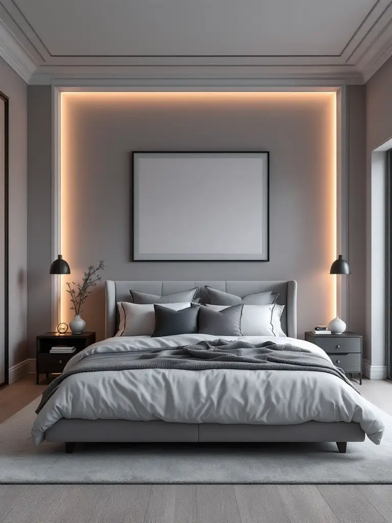
Elegant Greys
Grey has taken the design world by storm in recent years, and for good reason! This versatile neutral can adapt to almost any style, from ultra-modern to classically elegant.
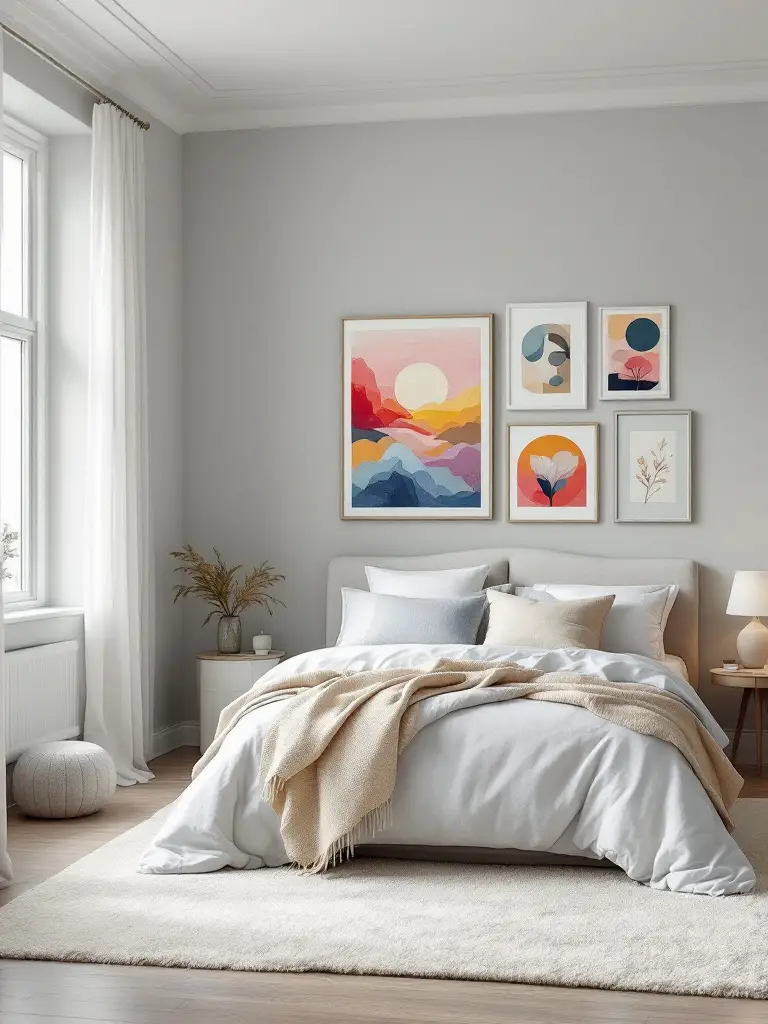
Light greys, like a soft dove grey, can make a room feel sophisticated and airy. I used this shade in a client’s master bedroom, and it created the perfect backdrop for their colorful art collection.
Darker greys, on the other hand, can add drama and depth. A charcoal grey accent wall behind a bed can create a stunning focal point. Just be sure to balance it with lighter elements to keep the room from feeling too heavy.
One of the beauties of grey is its chameleon-like quality. Depending on its undertones and the lighting, grey can appear cool or warm, making it incredibly versatile. I always recommend testing several grey shades in your space before making a final decision.
Pro tip: Layer different textures when using grey to add visual interest. A grey tweed headboard against grey walls with crisp white bedding can create a rich, inviting look that’s far from monotonous.
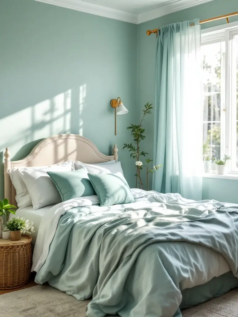
Refreshing Greens
Want to bring a touch of nature indoors? Green is your go-to color! From soft sage to vibrant emerald, green hues can create a refreshing and rejuvenating bedroom atmosphere.
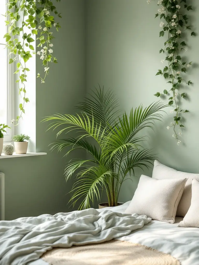
Lighter greens, like mint or pistachio, can make a room feel fresh and airy. I once used a pale sage in a bedroom with lots of plants, and it felt like sleeping in a serene garden oasis.
Deeper greens, such as forest or olive, can create a more dramatic, cocooning effect. These shades work particularly well in rooms with lots of natural light, as they can help balance the brightness.
Green is not just visually pleasing; it’s also known to have calming properties. Studies have shown that green can reduce stress and promote a sense of balance. No wonder it’s such a popular choice for bedrooms!
When working with green, consider pairing it with natural wood tones to enhance the organic vibe. A reclaimed wood headboard against sage green walls? Now that’s a recipe for a peaceful retreat!
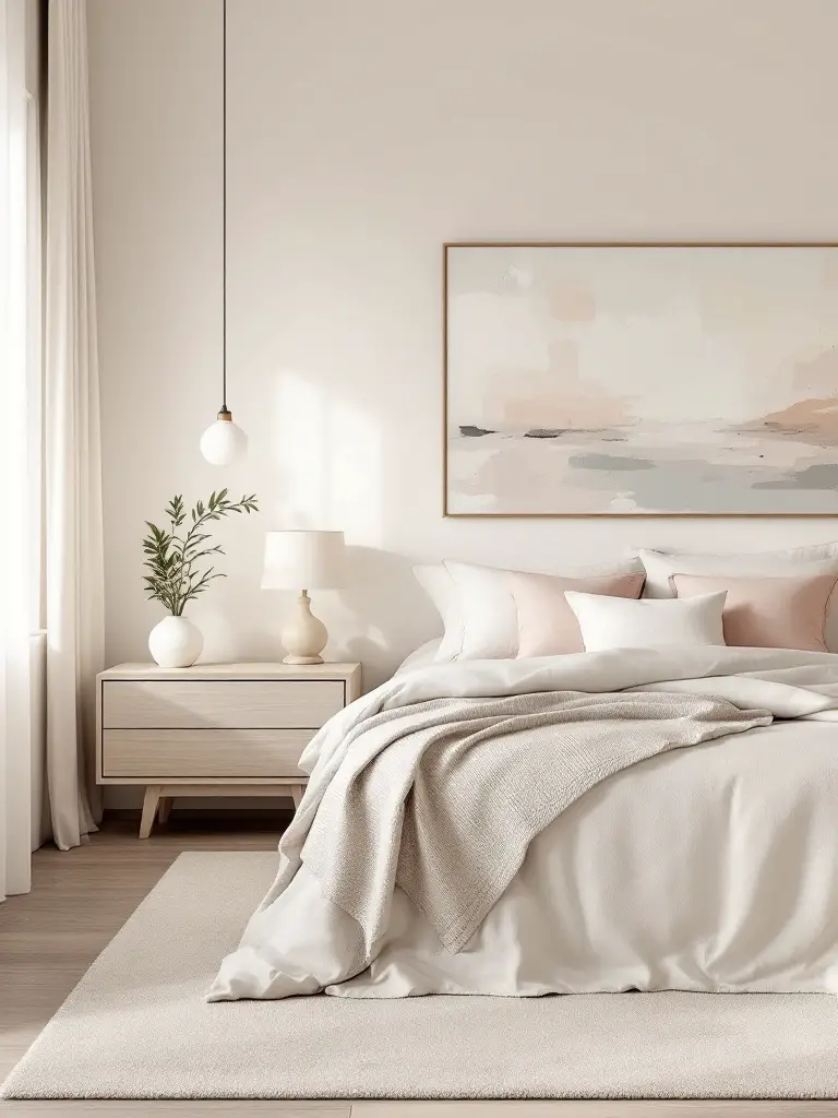
Versatile Neutrals
Never underestimate the power of a good neutral! Beige, taupe, and warm greys can create a timeless backdrop that adapts to changing styles and seasons.
Neutrals are fantastic for creating a calm, cohesive look. They can make a small room feel larger and provide a soothing backdrop for more colorful decor elements. I often use neutrals in bedrooms where clients want the flexibility to change their decor frequently.
But don’t think neutral means boring! The key to working with neutrals is to play with texture and subtle variations in tone. In one project, I used a warm taupe on the walls, layered with a slightly darker shade on the trim, and added interest with textured bedding and a plush rug. The result was a sophisticated, multi-dimensional space that felt anything but plain.
Remember, “neutral” covers a wide range of hues. From cool whites to warm beiges and rich camels, there’s a neutral for every style and preference. The trick is finding the right one for your space and pairing it with complementary colors and textures.
When choosing bedroom paint colors, these popular choices can serve as a great starting point. But remember, the best color for your bedroom is one that resonates with you and creates the atmosphere you desire. In the next section, we’ll explore how to create a truly relaxing space with color.
Creating a Relaxing Space
Now that we’ve explored some popular color choices, let’s focus on how to use color to create a truly relaxing bedroom environment. After all, your bedroom should be your oasis, a place where you can unwind and recharge.
Tranquil Color Palettes
When it comes to creating a serene sleeping space, certain colors have a reputation for promoting relaxation. Soft blues, gentle greens, and soothing lavenders are often top picks for those choosing bedroom colors that promote sleep.
I once worked with a client who was struggling with insomnia. We transformed her bedroom using a palette of soft, muted blues and greens. The result? She reported falling asleep faster and waking up feeling more refreshed. It was a powerful reminder of how color can impact our well-being.
When creating a tranquil color palette, think about the colors that make you feel calm and relaxed. For some, it might be the soft blue of a clear sky, while for others, it could be the gentle green of a misty forest. The key is to choose colors that evoke a sense of peace for you.
Don’t be afraid to combine different calming hues. A light blue wall with lavender accents can create a beautifully serene environment. Or try a soft green with touches of warm beige for a nature-inspired calm.
Remember, the goal is to create a space that helps you transition from the busyness of the day to a restful night’s sleep. So choose colors that help you exhale and let go of the day’s stress.
Soft and Warm Tones
While cool colors are often associated with tranquility, soft and warm tones can also create a deeply relaxing atmosphere. Think about the golden hour just before sunset or the warm glow of candlelight. These warm, soft hues can envelop a room in comfort.
Soft peach, gentle coral, or muted terracotta can create a cozy, inviting feel in a bedroom. I once used a warm, creamy beige in a north-facing bedroom that didn’t get much natural light. The color transformed the space, making it feel sun-kissed and welcoming, even on gloomy days.
When working with warm tones, the key is to keep them soft and muted. Bright or intense warm colors can be energizing, which is great for other rooms but not ideal for a relaxing bedroom.
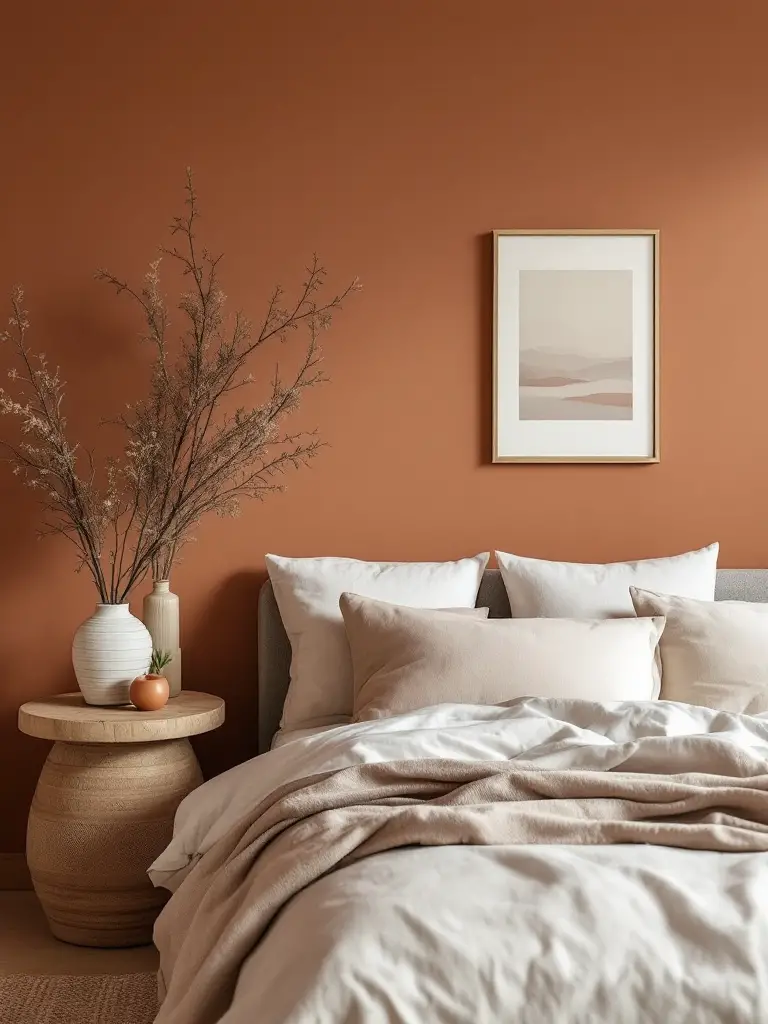
Consider pairing warm wall colors with crisp white bedding for a clean, fresh look. Or lean into the cozy vibe with layers of textured neutrals. A soft terracotta wall with a chunky knit throw and plush area rug? That’s a recipe for ultimate comfort!
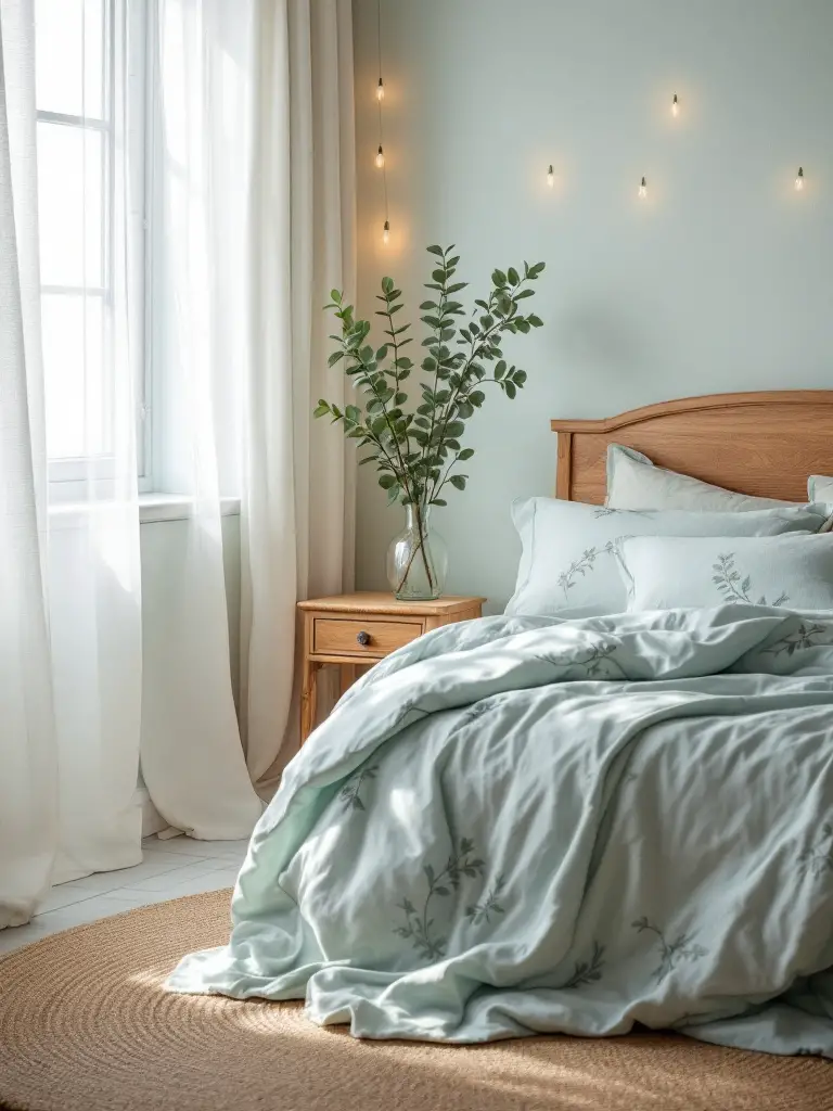
Cool and Serene Shades
Cool colors have a reputation for being calming, and for good reason. Soft, cool shades can make a room feel fresh, clean, and peaceful – perfect for a restful night’s sleep.
Light blues and greens are classic choices for creating a serene bedroom environment. These colors remind us of nature – clear skies and tranquil waters – which can help induce a sense of calm. A survey by Travelodge found that people who sleep in blue rooms get the most sleep, averaging 7 hours and 52 minutes per night!
But cool doesn’t have to mean cold. Pairing cool wall colors with warm accents can create a balanced, inviting space. For example, I once used a soft, misty gray on the walls of a bedroom, then added warmth with golden-toned wood furniture and rich, textured bedding. The result was a room that felt both refreshing and cozy.
When using cool colors, pay attention to the undertones. A blue with a hint of green can create a different vibe than one with a touch of purple. Always test your colors in your space and observe them at different times of day to ensure you’re happy with how they look in various lighting conditions.
Remember, creating a relaxing space is about more than just color. Consider the textures, patterns, and overall design of your room to create a cohesive, calming environment. Soft fabrics, minimal clutter, and good light control are all important factors in creating your perfect sleep sanctuary.
In the next section, we’ll explore how to express your style through your bedroom paint colors, because a truly relaxing space feels authentically you.
Personal Style Expression
While creating a relaxing environment is crucial, your bedroom should also be a reflection of your style. After all, this is your private sanctuary! Let’s explore how you can express your unique personality through your bedroom paint colors.
Bold and Vibrant Options
Who says a relaxing bedroom can’t also be vibrant and full of personality? If you’re drawn to bold colors, don’t be afraid to incorporate them into your sleep space. The key is to use them thoughtfully.
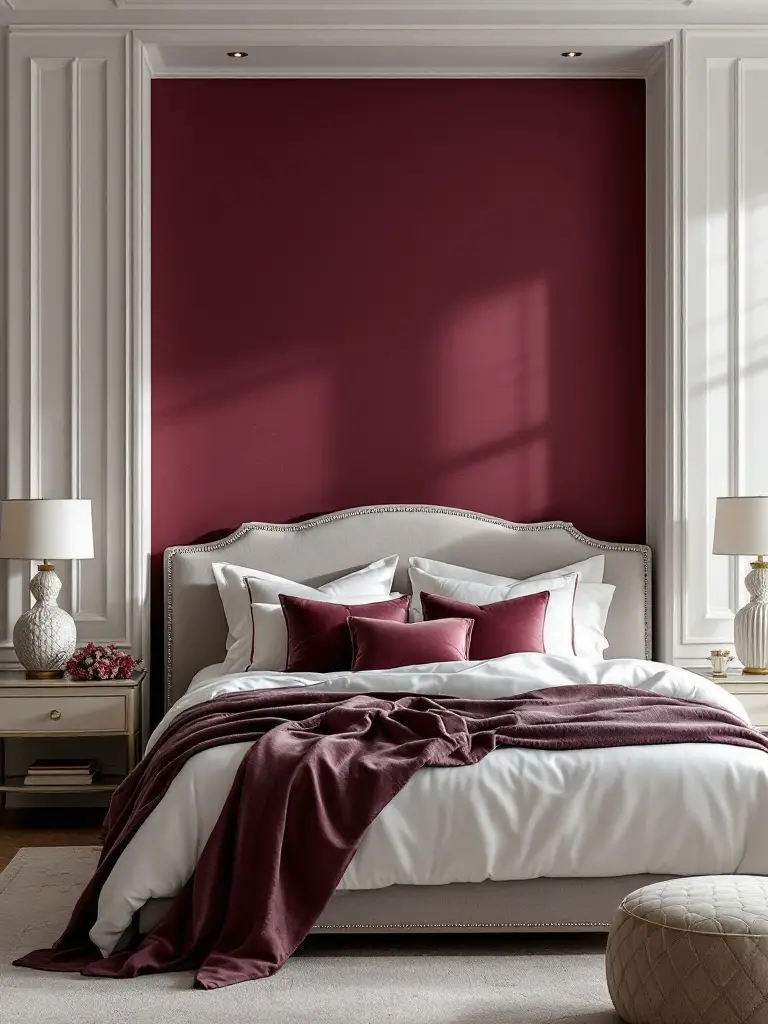
I once worked with a client who was passionate about the color red. Instead of shying away from this energetic hue, we used a deep, rich burgundy on one accent wall. Paired with soft greys and crisp whites, it created a striking yet surprisingly serene bedroom that perfectly expressed my client’s vibrant personality.
When using bold colors, consider using them as accents rather than painting all four walls. An accent wall behind your bed can create a stunning focal point without overwhelming the space. Alternatively, you could introduce bold colors through your bedding or artwork, keeping the walls neutral for balance.
Remember, even bold colors can be relaxing if they’re meaningful to you. If a certain color brings you joy or holds special significance, find a way to incorporate it into your bedroom design. Your emotional connection to the color can contribute to a sense of comfort and relaxation.
Subtle and Sophisticated Hues
If your style leans more towards understated elegance, subtle and sophisticated hues might be your perfect match. These colors can create a refined, peaceful atmosphere while still allowing your style to shine through.
Soft greys, muted blues, and gentle taupes can all contribute to a sophisticated bedroom palette. I once designed a bedroom using a palette inspired by a foggy morning at the beach – soft grey walls, white trim, and accents in muted blues and sandy beiges. The result was a serene, sophisticated space that felt both luxurious and deeply calming.
When working with subtle hues, texture becomes key. Consider using paints with different finishes to add depth and interest. A matte wall with glossy trim, for instance, can create a subtle yet striking contrast. Or try a textured wallpaper in a neutral shade for an extra touch of sophistication.
Don’t forget that subtle doesn’t mean boring. You can still express your personality through carefully chosen accents. A beloved piece of art, a unique light fixture, or a treasured family heirloom can all add personal flair to a subtly colored room.
Nature-Inspired Ideas
As someone who grew up with environmentally conscious parents, I’ve always been drawn to nature-inspired design. Bringing elements of the natural world into your bedroom can create a peaceful, grounding atmosphere that’s perfect for rest.
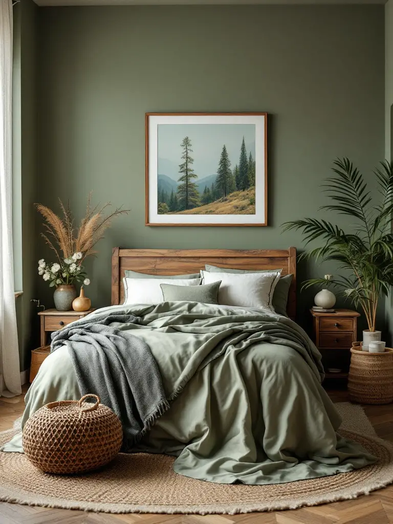
Earth tones like warm browns, soft greens, and muted blues can create a nature-inspired palette that’s both soothing and sophisticated. I once designed a bedroom inspired by a forest scene, using a soft moss green on the walls with accents of bark brown and sky blue. The result was a space that felt like a peaceful retreat in the woods.
When working with nature-inspired colors, consider incorporating natural materials as well. Wooden furniture, stone accents, or woven textiles can enhance the organic feel of your space. And don’t forget about plants! Adding some greenery to your bedroom not only enhances the nature-inspired theme but can also improve air quality and boost your mood.
Remember, nature-inspired doesn’t have to mean rustic. You can create a sleek, modern look with nature-inspired colors too. A crisp white room with accents of sage green and pale blue, for instance, can feel both natural and contemporary.
Expressing your style through your bedroom paint colors is all about finding the right balance between colors that resonate with you and those that create the atmosphere you desire. Whether you prefer bold and vibrant, subtle and sophisticated, or nature-inspired hues, the most important thing is that your bedroom feels authentically you.
Practical Tips for Selection
Now that we’ve explored various color options and styles, let’s dive into some practical tips to help you make the best choice for your bedroom. Choosing the right paint color can feel overwhelming, but with these strategies, you’ll be well-equipped to make a decision you’ll love.
Test Samples First
I can’t stress this enough: always, always test your paint samples before committing to a color! I’ve seen too many disappointed faces when a color that looked perfect on a tiny swatch turns out completely different on a large wall.
Here’s my tried-and-true method for testing paint colors:
- Paint large swatches (at least 2 feet by 2 feet) on multiple walls in your room.
- Observe these swatches at different times of the day and under various lighting conditions (natural daylight, lamp light, etc.).
- Live with these swatches for at least a few days before making your final decision.
Remember, colors can look dramatically different depending on the lighting in your room. That soft grey you loved in the store might look blue in your north-facing bedroom!
I once had a client who was set on a particular shade of yellow for her bedroom. When we tested it, we found it looked great in the morning light but turned an unflattering greenish hue in the evening. By testing, we were able to adjust and find a yellow that looked beautiful all day long.
Use Color Swatches
Color swatches are your best friends when it comes to choosing bedroom paint colors. They allow you to visualize potential color combinations and see how different shades work together.
Here’s how to make the most of color swatches:
- Collect swatches of colors you’re considering for your walls, as well as colors of your existing furniture and decor.
- Arrange these swatches together to see how they interact.
- Try different combinations until you find a palette that feels harmonious and aligned with your vision.
Don’t be afraid to think beyond paint swatches. I often encourage my clients to include fabric swatches, flooring samples, and even images from magazines in their color planning. This holistic approach ensures that your chosen paint color will work well with all elements in your room.
Consider Paint Finish
The finish of your paint can have a significant impact on how the color appears and how it functions in your space. Here are the main types of finishes and when to use them:
- Matte: This finish has no shine and hides wall imperfections. It’s perfect for bedrooms, especially on the walls above the bed where glare could be distracting.
- Eggshell: With a subtle sheen, the eggshell finish is more durable than matte and works well in bedrooms with more activity.
- Satin: This finish has a pearl-like sheen and is more resistant to moisture and wear, making it a good choice for kids’ bedrooms or guest rooms.
- Semi-gloss and Gloss: These finishes are highly durable and easy to clean, but their shine can highlight wall imperfections. They’re best used for trim or in small doses for a luxe effect.
I once worked on a bedroom where we used a matte finish on most walls for a soft, serene look, but added a glossy accent wall behind the bed. The contrast in textures added depth and interest to the space without introducing a new color.
When selecting your paint finish, consider both the visual effect you want to achieve and the practical needs of your space. A child’s bedroom might benefit from the durability of a satin finish, while a tranquil master suite might call for the soft, light-absorbing quality of a matte finish.
Remember, the best bedroom paint colors to maximize your space can be influenced by the finish you choose. In smaller bedrooms, a slight sheen can help reflect light and make the space feel larger.
Closing Thoughts
Choosing the perfect bedroom paint colors is a journey of self-expression and creating a personal oasis. It’s about finding that sweet spot where your style meets the peaceful atmosphere you need for restful sleep.
As we’ve explored, there are many factors to consider – from the size of your room and the quality of natural light to your existing decor and personal color preferences. But remember, there’s no one-size-fits-all solution. The best color for your bedroom is the one that makes you feel at home, relaxed, and authentically you.
Don’t be afraid to experiment and trust your instincts. If a color speaks to you, find a way to incorporate it, even if it’s just as an accent. And always, always test your colors before committing!
Creating your dream bedroom is a process, and the color of your walls is just the beginning. It sets the stage for the rest of your decor, influencing everything from your choice of bedding to your artwork and accessories.
So take your time, enjoy the process, and have fun with it. After all, this is the retreat we’re talking about. Whether you end up with soothing blues, elegant greys, refreshing greens, or something unique, the most important thing is that when you walk into your bedroom, you feel a sense of peace, comfort, and joy.
Ready to transform your bedroom into the oasis of your dreams? Grab those paint swatches, trust your instincts, and let your walls become the canvas for your perfect sleep sanctuary. Sweet dreams, and happy painting!