Picture this: you’re standing in the middle of a vintage record store, surrounded by album covers from the 1950s and 60s. The warm hues of oranges and yellows catch your eye, making you feel energized and ready to dance. But wait a minute – that’s not the vibe we’re going for in the bedroom, is it? When it comes to choosing bedroom paint colors, we’re looking for something a little more… shall we say, sleepy?
Hey there, fellow color enthusiasts! Ava Sinclair-Patel here, and boy, do I have a groovy topic for you today. We’re diving deep into the psychology of color and how it can transform your bedroom into a sleep-inducing sanctuary. Choosing the right bedroom colors for sleep isn’t just about making your space look fab (though that’s a bonus). It’s about creating an environment that helps you drift off to dreamland faster than you can say “Goodnight, Moon.”
So, grab your favorite throw blanket, curl up in your coziest chair, and let’s embark on a colorful journey to better sleep. We’ll explore everything from the science behind color psychology to practical tips for incorporating sleep-friendly hues into your bedroom decor. By the end of this article, you’ll be a bona fide expert in choosing calming bedroom paint colors that’ll have you snoozing like a baby in no time.

Ready to rock and roll? Let’s dive in!
The Science Behind Colors and Sleep
Alright, cats and kittens, let’s put on our lab coats and dive into the groovy world of color psychology. You might be wondering, “Ava, how can a simple color affect my sleep?” Well, let me tell you, it’s all about the vibes, baby!
Colors aren’t just pretty to look at; they can influence our mood and physiology. It’s like how listening to a mellow jazz record can calm you down, while a high-energy rock ‘n’ roll tune might get your heart racing. Different colors have similar effects on our bodies and minds.
Cool colors, like the blues and greens you might see on a Miles Davis album cover, have shorter wavelengths. These chill hues are associated with feelings of calmness and relaxation. They’re like the smooth saxophone solo that lulls you into a peaceful state.
On the flip side, warm colors like red and yellow are more like the energetic drumbeat in a rock anthem. They have longer wavelengths and can stimulate the mind and body. Great for a dance party, but not so great for catching some Z’s.
Now, here’s where it gets far out: studies have shown that rooms painted in cool colors are often described as spacious and restful. It’s like they create a little oasis of calm in your home. Warm-colored rooms, on the other hand, were seen as exciting. Groovy for a living room, maybe, but not ideal for your sleep sanctuary.

But wait, there’s more! The brightness of colors also plays a role. Lighter shades of colors like blue and green are often more soothing than their darker counterparts. It’s like the difference between a soft, acoustic ballad and a heavy metal power chord.
Interestingly, our perception of colors can be influenced by our personal experiences and cultural background. It’s like how some people might associate a particular song with a happy memory, while others might find it melancholic. The same goes for colors – what’s calming for one person might be energizing for another.
Here’s a fun fact to impress your friends at your next cocktail party: blue is strongly linked to words like “relaxed,” “safe,” “satisfied,” and “secure.” No wonder it’s such a popular choice for bedrooms!
So, next time you’re choosing calming bedroom paint colors, think about the mood you want to create. Are you going for a tranquil jazz lounge vibe or a high-energy rock concert feel? Remember, when it comes to bedroom colors for sleep, we’re aiming for more “smooth jazz” than “headbanging metal.”
Best Colors for Better Sleep
Now that we’ve got the science down, let’s get into the nitty-gritty of choosing the best bedroom colors for sleep. It’s time to transform your bedroom into a chart-topping hit of relaxation!
Calming Blue Shades
Blue is the Elvis Presley of bedroom colors – it’s the King, baby! And for good reason. Soft blues are like a visual lullaby, evoking the calm of clear skies or tranquil waters. It’s no wonder that a study found blue to be the most preferred room color among university students, who associated it with a calm mood.

When it comes to using blue in your bedroom, think of it like composing a song. You want to create harmony, not cacophony. Pair those beautiful blues with neutral tones like creams or whites to balance out the room and enhance the calming effect. It’s like adding a smooth bassline to your bedroom’s blue melody.
Here’s a practical tip: use lighter shades of blue for a more spacious and airy feel. It’s like opening up the windows and letting in a cool breeze on a summer day.
But remember, just like music, color preferences can vary from person to person. While blue is generally calming, its effect can differ based on individual experiences and cultural background. So, don’t be afraid to experiment and find your perfect blue tune!
Soothing Green Tones
Green is like nature’s lullaby, folks. It’s the color of lush forests and peaceful meadows, and it can bring that same sense of tranquility to your bedroom. Children in hospital settings often preferred their bedrooms to be either blue or green, indicating the calming effect of these colors.
When choosing green for your bedroom, think of it like picking the perfect vinyl for a relaxing evening. You want something mellow and soothing, not bright and energetic. Muted greens, like sage or moss, can create a serene bedroom atmosphere without overwhelming the space.

Here’s a groovy fact: green is associated with positive words like “outdoors,” “grateful,” and “merry.” It’s like bringing the good vibes of a nature walk right into your bedroom!
To make your green bedroom sing, try pairing it with natural textures like wood or rattan. It’s like adding acoustic instruments to a nature-inspired melody – it just feels right.
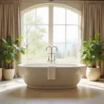
Relaxing Neutrals
Now, let’s talk about the backup singers of the color world – neutrals. Colors like beige, taupe, and soft gray might not be the lead vocalists, but they sure know how to harmonize!
Neutrals are like the smooth jazz of bedroom colors for sleep. They’re versatile and timeless, and create a perfect backdrop for other elements in your room. Plus, they’re great for layering different textures, adding depth to your bedroom’s design without overwhelming the senses.
Here’s an interesting tidbit: children who are sensitive to overstimulation may prefer bedrooms with more brown or beige, as these colors are perceived as calming. It’s like creating a cozy little nest for your little ones.

When using neutrals, think about creating a mix tape of textures. Combine smooth cotton sheets with a chunky knit throw, or pair a sleek wooden bed frame with a plush carpet. It’s all about creating that perfect balance of comfort and style.
Remember, choosing bedroom colors for sleep is like creating the perfect playlist for relaxation. Whether you go for blues, greens, or neutrals, the key is to create a space that makes you feel calm, cozy, and ready to drift off to dreamland. So go ahead, and start painting your sleep sanctuary – your well-rested future self will thank you!
Colors to Avoid in Bedrooms
Alright, cool cats, now that we’ve grooved through the best colors for sleep, let’s flip the record and talk about the hues that might turn your bedroom into a lousy nightclub instead of a cozy jazz lounge. Just like you wouldn’t play heavy metal to lull a baby to sleep, there are certain colors you might want to steer clear of in your sleep sanctuary.
Stimulating Reds and Oranges
Red and orange are like the rock ‘n’ roll of the color world – energetic, passionate, and ready to party. But when it comes to bedroom colors for sleep, these vibrant hues might be a bit too much of a good thing.
Picture this: you’re trying to wind down after a long day, but your bright red walls are screaming “Let’s dance!” louder than James Brown at a live concert. Not exactly the vibe we’re going for, right?

Here’s a wild fact that’ll knock your socks off: studies have shown that people in red rooms experienced more brain waves associated with an alert, awake state. They even saw increased heart rates and blood pressure! It’s like your body is at a rock concert when it should be at a smooth jazz recital.
But hey, if you’re digging the red or orange vibe, don’t worry! You can still incorporate these colors in small doses. Think of them as the guitar solo in your bedroom’s color composition – use them sparingly for maximum impact. A few red or orange accent pieces can add warmth and energy without turning your sleep space into a discotheque.
Energetic Bright Yellows
Now, let’s rap about yellow. Bright yellow is like that peppy pop song that gets stuck in your head – it’s cheerful and energetic, but it might keep you up all night!
While yellow can evoke feelings of happiness and sunshine, it can also lead to restlessness and overstimulation when used in large doses in the bedroom. It’s like trying to sleep with the sun shining directly on your face – not exactly conducive to catching those Z’s.
But don’t write off yellow completely! Softer, muted yellows can provide warmth without causing anxiety or distraction. Think of it like turning down the volume on that peppy pop song – you still get the cheerful vibe, but it’s not blasting you out of bed.

Here’s a practical tip: if you’re digging the yellow vibes, try using it as an accent color. A yellow throw pillow or a piece of artwork can add a pop of cheerfulness without overwhelming your sleep space.
Distracting Dark Hues
Last but not least, let’s chat about dark colors. While they might seem cozy at first glance, dark hues like deep purples, navy blues, or blacks can sometimes feel a bit… well, heavy.
Using too many of these dark colors is like trying to sleep in a cave – it might feel snug at first, but it can quickly become oppressive. Dark colors can make a room feel smaller and less inviting, which isn’t exactly the vibe we’re going for in our sleep sanctuary.
Here’s a fun fact: black is strongly associated with negative emotions such as depression, sadness, anger, and fear. It’s like the emo phase of colors – great for expressing deep emotions, not so great for promoting restful sleep.
But don’t worry if you’re a fan of the darker side of the color spectrum. Like with any powerful color, the key is balance. Try using dark colors as accents or on a single feature wall, paired with lighter, more soothing shades. It’s like adding a touch of mystery to your bedroom’s color melody without turning it into a full-blown gothic symphony.

Remember, when it comes to paint colors for small bedrooms, lighter shades are usually your best bet. They can make your space feel larger and more open, like a breath of fresh air in your sleep sanctuary.
So there you have it, folks – the colors to approach with caution when designing your sleep space. But remember, these are just guidelines. Your bedroom should be a reflection of your style, just like your record collection. The most important thing is that it feels like a cozy, relaxing space where you can drift off to dreamland with ease. Now, let’s move on to how we can incorporate these sleep-friendly colors into your bedroom design!
Incorporating Sleep-Friendly Colors
Alright, groovy decorators, now that we’ve got our color palette sorted, let’s talk about how to bring these sleep-friendly hues into your bedroom. It’s time to orchestrate your sleep sanctuary!
Choosing Wall Paints
Picking the right wall paint is like choosing the perfect background music for your sleep space. It sets the tone for the entire room, so we want to get it just right.
When it comes to bedroom colors for sleep, remember that lighter shades of blue, green, or neutrals are your best friends. These colors are like a soft, soothing melody that helps you drift off to dreamland.
Here’s a practical tip: before you commit to a color, test it out! Paint swatches are like listening to a song preview before you buy the album. Paint a few samples on your wall and observe how they look at different times of day. Colors can change dramatically under different lighting conditions, just like how a song might sound different on vinyl versus digital.

And hey, don’t forget about the finish! The sheen of your paint can affect how the color appears. A matte finish is like acoustic music – soft and understated. It’s great for hiding imperfections and creating a calm atmosphere. On the other hand, a satin or semi-gloss finish is like adding a bit of reverb – it reflects more light and can make the color appear slightly brighter.
Oh, and here’s a groovy fact for you: using eco-friendly, low-VOC paints isn’t just good for the planet – it’s good for your health too! These paints release fewer harmful chemicals into the air, so you can breathe easily as you drift off to sleep.
Coordinating Bedding and Curtains
Now, let’s jazz up your sleep space with some coordinating bedding and curtains. This is where you can let your personal style shine!
Think of your bedding and curtains as the accompanying instruments to your wall color’s main melody. They should complement each other, creating a harmonious sleep symphony.
If you’ve gone for cool blue walls, consider bedding in softer shades of blue or neutral tones. It’s like layering different blue notes to create a calming chord. For green walls, earthy tones or soft whites can create a nature-inspired ensemble.

Here’s a practical tip: play with textures! Mix and match different fabrics to add depth to your color scheme. A chunky knit throw over smooth cotton sheets is like adding percussion to a mellow tune – it adds interest without overwhelming the senses.
And don’t forget about the curtains! Blackout curtains in a color that complements your walls can not only tie your color scheme together but also block out light for better sleep. It’s like having a volume control for the morning sun!
Adding Accent Pieces
Alright, now it’s time to add some flair to your sleep sanctuary with accent pieces. These are like the solo instruments in your bedroom’s color composition – they add personality and interest to your space.
When it comes to bedroom colors for sleep, your accent pieces are where you can introduce small pops of brighter or contrasting colors. A few yellow throw pillows on a blue bed, or a warm orange lamp on a green side table, can add just the right amount of energy without disrupting the overall calm vibe.
Here’s a fun idea: why not incorporate some music-inspired decor? A framed vinyl record or a vintage music poster can add a personal touch to your space. Just make sure to keep it cohesive with your overall color scheme.

Remember, the key is balance. You want your accent pieces to complement your main colors, not compete with them. It’s like adding a guitar solo to a song – it should enhance the overall composition, not drown it out.
So there you have it, folks! With these tips, you’ll be well on your way to creating a sleep-friendly color scheme that’s music to your eyes. Sweet dreams are made of these colors, and who am I to disagree? Now, let’s move on to some additional tips to make your bedroom the ultimate sleep sanctuary!
Additional Tips for a Sleep-Friendly Room
Alright, cool cats, we’ve covered the main act – the colors – but now it’s time for the encore. These additional tips will take your sleep sanctuary from a one-hit wonder to a chart-topping success!
Use Soft Lighting
Lighting in your bedroom is like the volume control for your sleep environment. Too bright, and it’s like trying to sleep at a rock concert. Too dark, and you might be fumbling around like a roadie in the dark.
The key is to create layers of soft, warm lighting. Think of it like composing a mellow tune – you want it to be soothing and relaxing. Use dimmable lights or lamps with warm-toned bulbs to create a cozy atmosphere. It’s like having a volume knob for your bedroom!

Here’s a groovy fact for you: exposure to blue light before bedtime can suppress melatonin production, making it harder to fall asleep. It’s like trying to drift off while listening to high-energy punk rock! Opt for warm-toned bulbs instead – they’re the smooth jazz of the lighting world.
And here’s a practical tip: invest in some dimmable smart bulbs. These high-tech wonders are like having a personal lighting designer in your bedroom. You can adjust the brightness and even the color temperature throughout the day, syncing your lighting with your natural sleep-wake cycle. It’s like creating the perfect lighting setlist for your daily routine!
Maintain Clutter-Free Space
Now, let’s rap about keeping your sleep space neat. A cluttered bedroom is like trying to relax while a messy garage band is rehearsing in the corner – it’s distracting and can seriously cramp your sleep style.
Studies show that a clean, organized space can positively impact your mental health and lead to improved rest. It’s like clearing the static from your favorite vinyl record – suddenly, everything sounds (and feels) so much better!
Here’s a practical tip: make decluttering a part of your daily rhythm. Spend just five minutes before bed tidying up. It’s like tuning your instrument before a performance – a small effort that makes a big difference.

And hey, don’t forget about storage solutions! Baskets, under-bed storage, and well-organized closets are like the unsung heroes of a clutter-free bedroom. They keep everything in its place, so your bedroom colors for sleep can take center stage.
Add Relaxing Decor
Last but not least, let’s talk about adding some groovy, relaxing decor to your sleep sanctuary. This is where you can let your style shine through!
Think of relaxing decor as the final touches that make your bedroom a hit single. Plants are a great addition – they’re like the backup singers of the decor world, adding depth and freshness to your space. Plus, some plants can even improve air quality, helping you breathe easily as you drift off to dreamland.
Essential oil diffusers are another fantastic addition. They’re like adding a subtle scent track to your sleep environment. Lavender, chamomile, or vanilla can create a calming atmosphere that complements your soothing color scheme.
And don’t forget about textures! Soft throws, plush rugs, and cozy pillows are like the harmonies in your bedroom’s sensory symphony. They add layers of comfort that make your space irresistibly snuggly.
Here’s a fun fact: the sense of touch is closely linked to our emotional state. So those super-soft bedsheets aren’t just a luxury – they’re helping to calm your mind and prepare you for sleep!
Closing Thoughts
Well, folks, we’ve covered a lot of ground in our colorful journey through the world of sleep-friendly bedroom design. From the science of color psychology to the practical tips for creating your perfect sleep sanctuary, we’ve hit all the right notes.
Remember, choosing bedroom colors for sleep is like creating the perfect playlist for relaxation. Whether you’re vibing with cool blues, soothing greens, or mellow neutrals, the key is to create a space that makes you feel calm, cozy, and ready to drift off to dreamland.
But hey, don’t be afraid to let your style shine through! Your bedroom should be a reflection of you, just like your record collection. Maybe you’re all about that minimalist monochromatic look, or perhaps you’re into a more eclectic, boho vibe. Whatever your style, just make sure it’s conducive to sweet dreams.
And remember, folks, this isn’t a one-size-fits-all situation. What works for one person might not work for another. So don’t be afraid to experiment, mix things up, and find what works best for you. It’s like finding your perfect karaoke song – it might take a few tries, but when you find it, you’ll know.
So go ahead, and start painting your sleep sanctuary. Play around with different bedroom colors for sleep, add some cozy textures, declutter your space, and create the perfect lighting scheme. Your well-rested future self will thank you!
Now, if you’ll excuse me, I’ve got a date with my pillow in my perfectly color-coordinated bedroom. Sweet dreams, cool cats, and may your sleep always be groovy!