Ever stared at your kitchen walls and cabinets feeling completely uninspired? You’re not alone. The kitchen is the heart of the home, but so many of us get stuck with bland, lifeless spaces that do nothing to fuel our creativity or joy while cooking.
As an urban garden room specialist, I’ve seen firsthand how the right colors can transform not just the look of a kitchen, but how it feels to spend time there. Whether you’re growing herbs on your windowsill or planning meals from your vertical garden, the colors surrounding you matter tremendously.
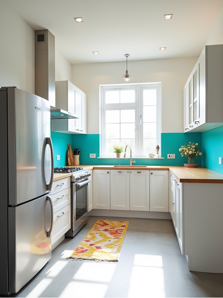
1. Dare to Dazzle: Bold Hues for a Statement Kitchen
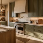
Want to inject some serious personality into your kitchen? Bold colors are your secret weapon. Picture stepping into a space bursting with energy and vibrancy – a kitchen that makes you smile every single morning. Popular bold choices include deep blues like navy and teal, vibrant greens such as emerald, rich reds like burgundy, or unexpected choices like eggplant purple or charcoal gray.
The trick to making bold colors work is balance. You don’t need to paint every surface in a vibrant hue to make a statement. Try painting just your kitchen island as a focal point, or opt for bold lower cabinets paired with neutral uppers. An accent wall can add drama without overwhelming the room. Pairing bold colors with neutrals on walls, countertops, or backsplashes creates visual breathing room and prevents the space from feeling too intense.
Here’s where it gets interesting: bold colors can completely change how you interact with your kitchen. A vibrant space often inspires more creative cooking and makes the room feel like a destination rather than just a functional area.
2. Neutral Nirvana: Timeless Elegance with Soft Palettes
For those who prefer understated sophistication, neutral color palettes offer a sanctuary of calm in the kitchen. These soft, versatile hues create a space that feels effortlessly elegant and welcoming. Neutrals establish a calming atmosphere, make kitchens feel more spacious, adapt to various design styles, and resist fleeting trends.
When selecting neutral colors, consider soft whites like creamy off-white or warm ivory for a clean look. Light grays including greige, dove gray, or pale charcoal offer sophistication without sacrificing lightness. Beiges ranging from oatmeal to taupe introduce warmth and earthiness. Even muted greens and blues with gray undertones can function beautifully as neutrals while introducing a whisper of color.
“The beauty of a neutral kitchen is that it creates a canvas for everything else in your life to shine – from the vibrant produce you bring home to the herbs growing on your windowsill.”
The surprising part is how neutral kitchens can showcase the natural colors of food and plants in ways bold kitchens sometimes can’t. This makes them perfect for urban gardeners who want their harvests to take center stage.
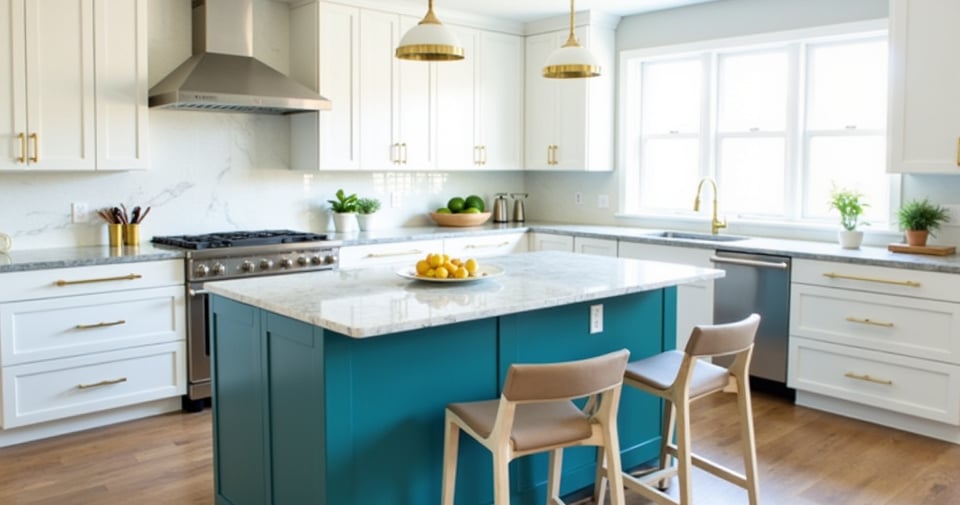
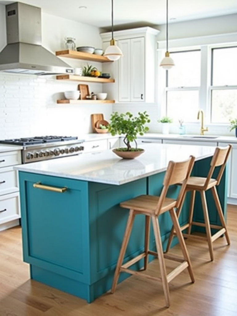
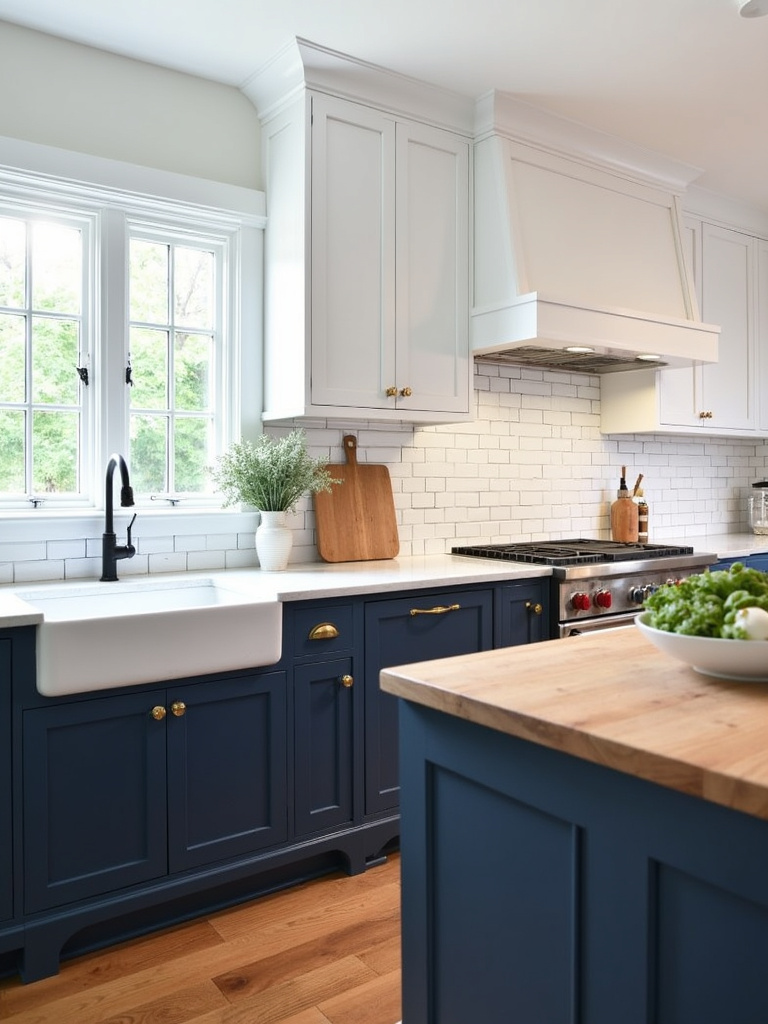
3. Two-Tone Trend: Dynamic Duos for Modern Kitchens
The two-tone trend adds instant architectural interest to any kitchen. By employing two distinct colors, you create a space that feels both contemporary and thoughtfully designed. This approach typically involves differentiating upper and lower cabinets or contrasting the island with perimeter cabinetry. It adds visual interest, creates depth, and lets you incorporate both trendy and timeless colors simultaneously.
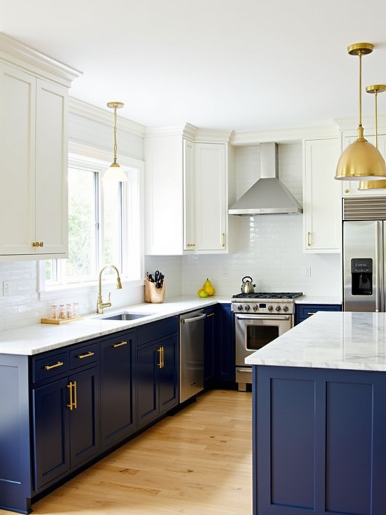
Classic pairings remain popular – white or light gray upper cabinets with darker gray, navy, or black lower cabinets create a grounded yet airy feel. Rich walnut lower cabinets paired with crisp cream uppers offer warmth and sophistication. Another effective approach contrasts cool and warm tones, such as light blue uppers with warm gray lowers. When choosing your combination, consider how it complements your existing flooring, countertops, and appliances.
The game-changer happened as I worked with urban apartment dwellers who wanted productive growing spaces alongside functional kitchens. Two-tone designs allowed us to visually separate growing zones from cooking zones while maintaining a cohesive kitchen color design.
4. Light Right: Consider Lighting When Choosing Kitchen Colors
Color perception isn’t static – it’s dramatically influenced by light. Natural light changes throughout the day and across seasons, significantly impacting how colors appear. South-facing kitchens with warm, direct sunlight intensify warm colors and can wash out cooler tones. North-facing kitchens with cool, indirect light make cool colors appear even cooler and can mute warm colors. East and west-facing kitchens experience changing light cycles that transform colors throughout the day.
Artificial lighting also shapes color perception profoundly. Warm white bulbs (2700K-3000K) enhance warm colors but can dull cooler tones. Cool white bulbs (3500K-4100K) provide more neutral light. Daylight bulbs (5000K-6500K) mimic natural daylight but can make colors appear stark. When choosing kitchen colors, test samples under your specific lighting conditions and mix lighting types – ambient, task, and accent – to create depth and dimension.
- For south-facing kitchens: Consider cooler tones to balance the warm light
- For north-facing kitchens: Warm up the space with golden or cream tones
- For limited natural light: Use reflective surfaces alongside your color choices
- For kitchens with LED lighting: Test colors under this specific light source
The tricky part is that many urban kitchens have limited natural light, making artificial lighting choices even more crucial to your kitchen color design success.
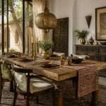
5. Floor to Ceiling Color: Don’t Forget the Flooring Hues
Flooring is the foundation of your entire kitchen color design, yet it’s often an afterthought. It covers a large surface area, influences how light reflects within the space, and impacts the perceived size and temperature of your kitchen. A mismatched floor can clash with cabinets, countertops, and backsplashes, undermining your entire design.

Light wood tones like oak and maple create bright, airy kitchens and pair beautifully with blues, greens, and whites. Dark wood tones such as walnut exude sophistication and create dramatic contrast with lighter cabinets. Gray tones including concrete and slate provide a modern, neutral backdrop that complements both warm and cool palettes. White and cream tones brighten smaller kitchens but require more maintenance. Patterned tile adds visual interest and can become a focal point when chosen to complement your overall kitchen style.
It works something like this: your flooring sets the baseline temperature of your kitchen color design. Warm floors create a cozy foundation that might need cooling elements above, while cool floors might benefit from warming elements in cabinetry and walls.
6. Cabinet Color Chronicles: The Heart of Kitchen Design
Cabinets dominate the visual landscape of your kitchen, commanding the largest surface area and dictating the overall style. They set the tone from the moment you enter, influencing the perception of space, light, and mood. Cabinet color choices impact everything from backsplash selection to hardware finish and wall paint. A well-chosen cabinet color can elevate a simple kitchen to a stunning showpiece.
When selecting cabinet colors, consider kitchen size and lighting first. Darker colors can make small kitchens feel cramped, while lighter colors visually expand the space. Your desired kitchen style matters too – crisp white or light gray suits modern farmhouse or minimalist designs, while richer woods or vibrant colors might better fit traditional or eclectic styles. Always consider how cabinet colors will harmonize with existing countertops, flooring, and appliances. And while personal preference should guide you, also think about longevity – trendy colors can quickly become dated.
What unfolded next was fascinating in my urban garden design work: clients who chose cabinet colors that complemented their growing spaces (like soft greens or earthy neutrals) reported feeling more connected to both their food and their kitchens. The cabinet color became the bridge between growing and cooking.
7. Wall Color Wonders: Paint Colors to Complement Your Style
While cabinets take center stage, kitchen wall color sets the overall scene and atmosphere. Light colors make small kitchens feel larger and brighter by reflecting light. Darker colors inject drama and sophistication but can visually shrink spaces. Warm colors create cozy, welcoming atmospheres, while cool colors promote calm and serenity. Consider both natural light levels and the mood you want to cultivate when selecting wall colors.

To choose complementary wall colors, start by identifying the dominant tones in your kitchen. Are your cabinets warm-toned wood, cool gray, or a vibrant color? For warm wood cabinets, consider warm neutrals like creamy white or soft beige. Cool gray cabinets pair well with other cool neutrals like crisp white or lighter grays. Use color swatches against your cabinets, countertops, and flooring in different lighting conditions to observe how they interact.
Let me paint you a picture: wall color is the backdrop for everything else in your kitchen color design. Like the soil in a garden, it might not be the showiest element, but it supports and enhances everything that grows from it.
8. Appliance Accent or Anchor? Integrating Appliance Colors
Appliances contribute significantly to your kitchen’s aesthetic while fulfilling essential functions. Deciding whether they should blend into the background or stand as colorful accents is a key design decision. Consider the size and quantity of your appliances, your personal style preferences, and the overall mood you want to create. A vibrant, modern kitchen might benefit from appliances that act as bold accent colors, while a cohesive, understated design might call for appliances that blend with the main palette.

Colored appliances offer both advantages and challenges. They inject personality and visual interest, serve as focal points, and can complement or contrast with your kitchen design. However, they can limit flexibility in matching other elements, potentially become dated more quickly than neutral options, and might impact resale value. If you choose colored appliances, select a color you genuinely love that fits harmoniously within your home’s overall aesthetic.
You might be wondering about stainless steel, which has dominated kitchens for years. It remains versatile, working well with almost any kitchen color design. The key is repeating metallic tones in hardware and fixtures to create coherence.
9. Backsplash Brilliance: Adding a Pop of Personality with Color
The backsplash offers a prime opportunity to inject color and personality into your kitchen. Located at eye level between countertops and upper cabinets, it’s highly visible yet covers a relatively small area. This makes it perfect for experimenting with bold colors or patterns without overwhelming the space. A well-chosen backsplash can either complement or intentionally contrast with existing elements, creating visual interest and depth.
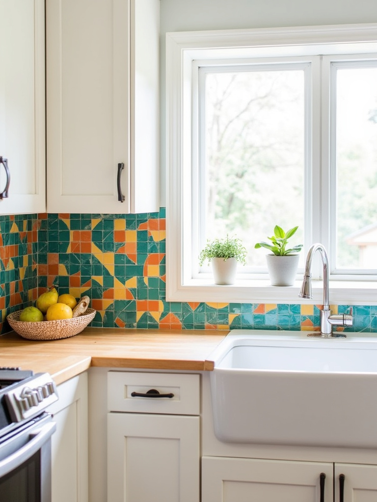
When selecting a backsplash color, consider your overall kitchen style first. Is it modern, traditional, rustic, or minimalist? Think about existing colors in your cabinets, countertops, and flooring – do you want the backsplash to blend harmoniously or stand out? Consider natural light levels; darker backsplashes can make poorly lit kitchens feel smaller. The material itself matters too – tile, glass, stone, or other surfaces will display color differently. Finally, think about long-term appeal rather than fleeting trends.
The breakthrough came when I realized that backsplashes in urban garden kitchens could actually reflect the colors of what you’re growing. A backsplash with hints of green, purple, or red can beautifully complement the herbs and vegetables thriving in your kitchen garden.
10. Countertop Color Canvas: Balancing Function and Style
Countertops contribute significantly to both functionality and aesthetics in your kitchen. Their color profoundly impacts the overall feel, with light countertops (white, cream, light gray) creating brighter, more spacious atmospheres by reflecting light. Darker countertops (black, dark gray, deep brown) introduce sophistication and warmth but can make kitchens feel smaller. Beyond spatial effects, countertop color influences perceived style – neutrals fit diverse aesthetics while bolder colors create more distinctive statements.
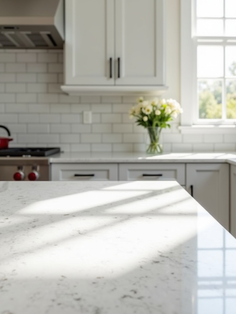
Practical considerations should guide your countertop color choice. Darker surfaces show crumbs, dust, and water spots more readily than lighter options, requiring more frequent cleaning. The material’s porosity affects stain resistance regardless of color. Natural light levels matter too – dark countertops in poorly lit kitchens can exacerbate darkness, making lighter colors more practical in such spaces.
Do you see how huge that is? The countertop color you choose doesn’t just affect how your kitchen looks – it directly impacts how much maintenance you’ll need to do and how functional your space will be for daily cooking and food preparation.
11. Hardware Hue Harmony: Small Details, Big Color Impact
Kitchen hardware might seem minor, but these small elements significantly impact your kitchen’s overall aesthetic. Think of hardware as jewelry for your cabinetry – these finishing touches complete the look and dramatically alter the kitchen’s feel. Matching hardware to cabinet color creates a seamless, minimalist look emphasizing the cabinetry itself. Contrasting hardware adds visual interest and personality. Hardware color can either reinforce your existing scheme or introduce an unexpected accent that shapes the overall impression.
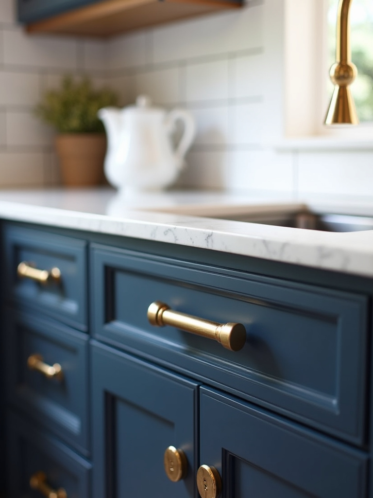
Current hardware color trends include enduring brushed gold and brass, modern matte black, timeless stainless steel and nickel, and rustic oil-rubbed bronze. Gold and brass pair beautifully with navy, emerald, white, and gray cabinets, adding elegance and luxury. Matte black offers contemporary sophistication with white, light wood, and bold cabinet colors. Stainless steel and nickel complement virtually any cabinet color and kitchen style. Oil-rubbed bronze introduces rustic charm, especially with warm-toned cabinets.
It’s kinda like choosing the right tools for your garden – small details that make a huge difference in both function and appearance. The hardware pulls together your kitchen color design just as the right tools help your garden thrive.
12. Accessorize with Accent Colors: Injecting Life with Décor
Once major kitchen elements are in place, accessories become the finishing touches that bring personality and vibrancy to your space. Accessorizing with accent colors provides a flexible, cost-effective way to inject personality without overhauling your core color scheme. Accessories let you update seasonally, respond to trends, or refresh the look whenever desired. They’re low-commitment ways to experiment with bold hues and patterns without the permanence of painted walls or cabinetry.
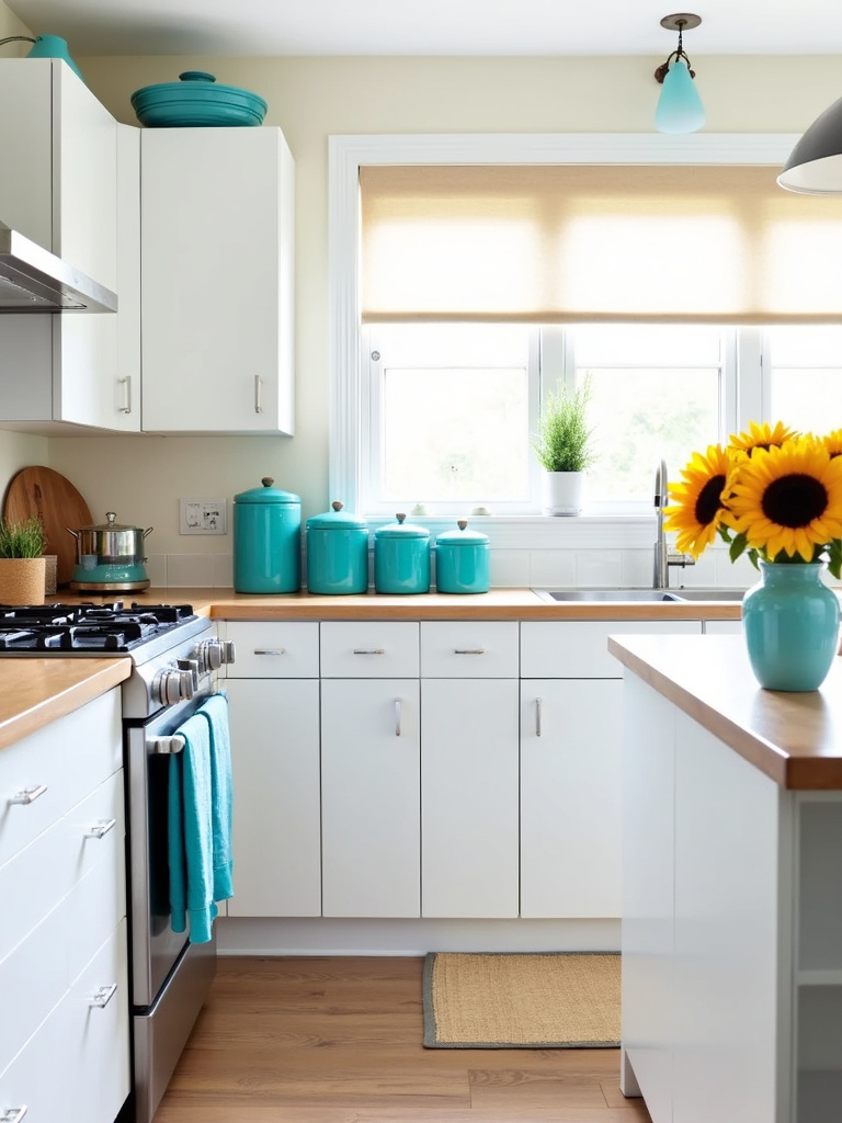
Effective accessories for incorporating accent colors include textiles (dish towels, rugs, chair cushions), cookware and utensils displayed openly, tableware on open shelves, decorative items (vases, artwork, plants in colored pots), colored lighting fixtures, and small appliances in vibrant hues. These elements break up visual monotony, add individual style, and can influence the kitchen’s mood – adding energy, calm, or warmth depending on your chosen colors.
My experience went like this: urban gardeners who grow food indoors often have beautiful harvests they want to showcase. Accessories in complementary colors can highlight the natural beauty of homegrown produce, creating a kitchen that celebrates both cooking and growing.
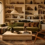
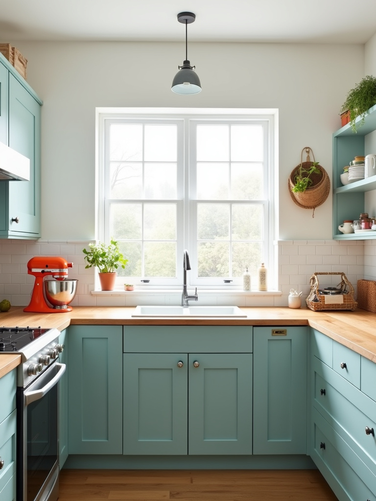
13. Warm & Welcoming: Cozy Kitchen Colors for Comfort
Creating a cozy, inviting kitchen atmosphere often tops homeowners’ priority lists, and color plays a crucial role. The most comforting kitchen color design palettes draw inspiration from nature and soothing elements – think sun-drenched landscapes and cozy firesides. Creamy whites and off-whites offer soft backdrops; soft beiges provide grounded, earthy feels; warm grays (greige) blend sophistication with warmth; muted yellows add subtle sunshine; and earthy oranges bring rich, natural warmth. Natural wood tones contribute significantly to coziness too.

To balance warm colors and prevent overwhelming heaviness, introduce cooler accents strategically. Hardware in brushed nickel or dark bronze offers visual relief against warm cabinetry. Lighter countertops break up warm color expanses. Contrasting backsplashes provide visual breaks. Plants and accessories in cooler tones help balance overall warmth. Maximize natural light to brighten spaces and prevent warm colors from feeling heavy. Incorporate varied textures to add visual interest and depth, preventing flatness or monotony.
The heart of the matter is creating a kitchen that feels like a warm embrace when you enter – a place where both plants and people naturally want to gather and thrive.
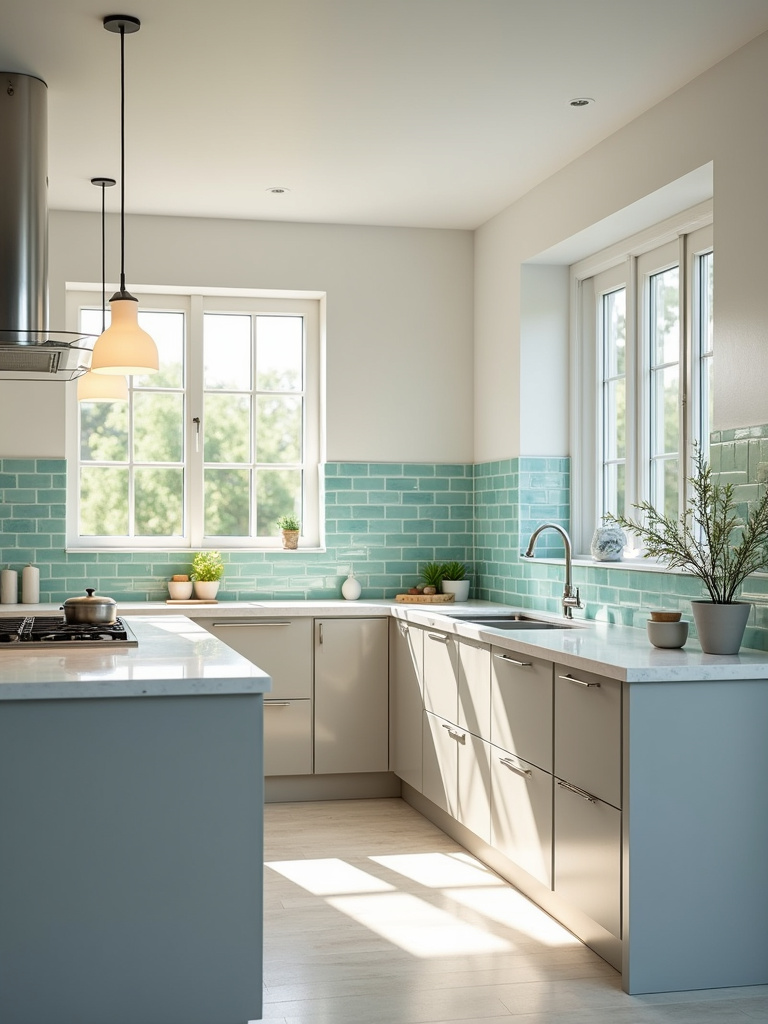
14. Cool & Crisp: Refreshing Palettes for Modern Kitchens
For those drawn to modern, minimalist aesthetics, cool and crisp kitchen palettes offer refreshing sophistication. These designs typically feature shades of blue, green, gray, and white – colors reminiscent of clear skies, lush forests, or serene seascapes. Lighter tints within these families maximize light and airiness: icy blues, mint greens, soft grays, and bright whites. Generally, avoid warm tones (yellows, oranges, reds) and highly saturated cool colors to maintain the desired crispness.
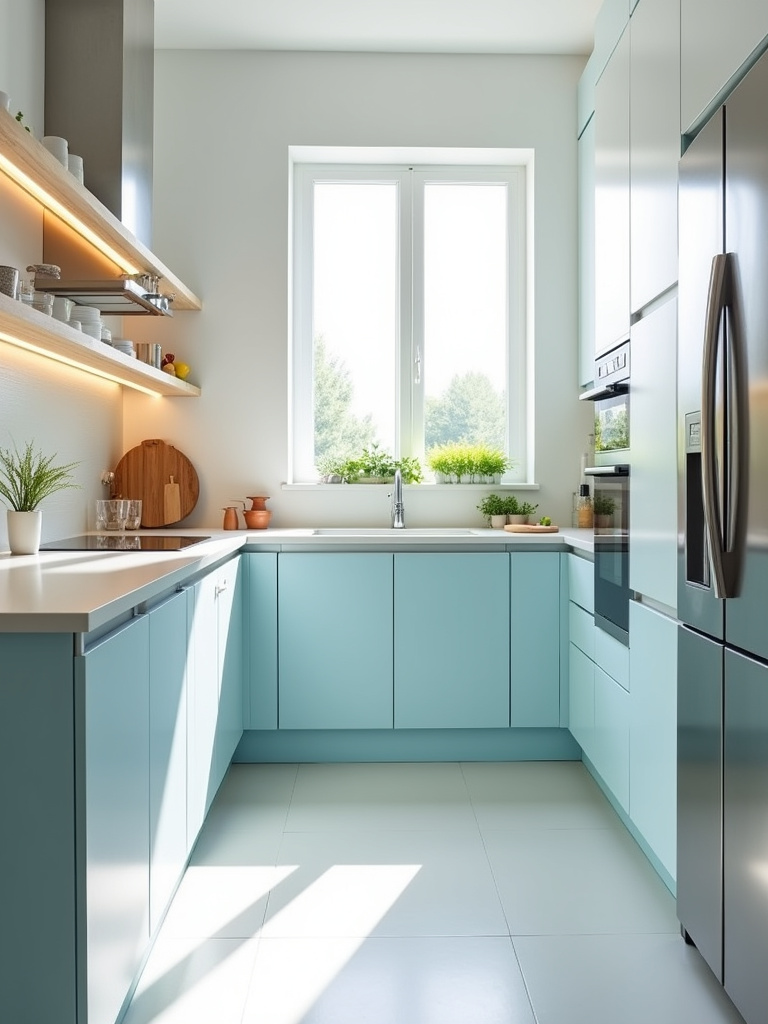
To prevent cool kitchens from feeling sterile, incorporate texture and natural materials. Light-colored woods like ash or maple add visual interest through cabinetry accents, open shelving, or butcher block countertops. Stainless steel appliances enhance the modern aesthetic with sleek surfaces. Glass backsplashes contribute to clean lines and reflectivity. Concrete countertops in smooth gray tones reinforce the modern feel. Add textured elements – beveled subway tiles, natural stone with surface variations, subtly textured walls – to prevent flatness. Incorporate neutral textiles to softly balance the coolness.
Let me show you another perspective: cool kitchen color designs often create the perfect backdrop for indoor growing systems like hydroponics or aquaponics. The clean, crisp background makes the vibrant greens of growing plants pop dramatically.
15. Lighten Up: Bright Colors to Maximize Kitchen Space
For smaller kitchens or those with limited natural light, bright colors work wonders in creating spaciousness and airiness. These light-reflecting hues visually transform cramped kitchens into more inviting, open spaces. Colors like crisp white, soft off-white, light gray, pastel blue, and gentle yellow effectively bounce light around the room, creating an illusion of spaciousness. Unlike darker colors that absorb light and make rooms feel smaller, bright colors expand perceived dimensions through light reflection.
Common mistakes with bright colors in small kitchens include using too much of a single bright color throughout, creating visual monotony. Another pitfall is failing to balance brightness with neutral elements – a kitchen entirely bright without visual anchors feels chaotic and undefined. Neglecting to consider natural light conditions can also backfire; colors that appear beautifully bright in well-lit spaces might look washed out or dull with limited natural light. Testing colors in your actual kitchen under different lighting conditions prevents these mistakes.
What complicates this is that many urban kitchens have challenging light situations. In my work designing productive growing spaces in urban homes, I’ve found that strategic placement of both plants and bright colors can transform even the darkest kitchen corners.
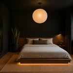
16. Dark & Dramatic: Sophisticated Deep Tones for Boldness
For kitchens that exude sophistication and drama, dark and deep tones offer compelling alternatives to lighter palettes. These colors create luxury and intimacy, transforming kitchens into striking spaces. Popular sophisticated dark choices include deep navy blues for timeless elegance, charcoal grays for modern versatility, forest greens for natural richness, rich plums for luxurious unexpectedness, and blacks for dramatic modernism. Choose shades with depth and complexity – perhaps a navy with a hint of green or a charcoal with blue undertones – to prevent flatness.
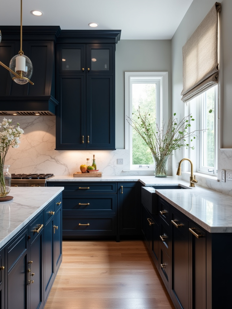
To prevent dark kitchens from feeling claustrophobic, balance is key. Maximize natural light by increasing window space or keeping windows unobstructed. Supplement with layered artificial lighting – under-cabinet lights for work areas, pendant lights over islands, and recessed lighting for ambient illumination. Introduce reflective surfaces like glossy tiles, stainless steel appliances, or even mirrored backsplashes to bounce light around. Use light-colored countertops and strategically placed lighter accessories to break up darkness and enhance brightness.
The ripple effects are enormous when you embrace darkness in the right way. A dark kitchen can actually make your indoor herbs and microgreens appear more vibrant and lush – creating a striking backdrop that highlights your growing efforts.
17. Trending Tones: Kitchen Color Palettes to Watch Out For
Staying ahead in kitchen design means keeping an eye on emerging color trends. For the coming year, expect warm, earthy tones to dominate – terracotta reminiscent of sun-baked clay, calming sage green, and versatile creamy whites reflecting desires for warm, nature-connected kitchens. Bold blues (particularly navy and dustier blues) continue their popularity for cabinets and islands. Muted pastels like soft blush pink and calming lavender are gaining traction as fresh alternatives to traditional neutrals. Monochromatic schemes in sophisticated grays or warm greige remain popular for their timeless elegance.

These trends reflect several factors: a growing desire for calming, restorative home environments drives earthy and muted tones that evoke comfort and natural connections. Bold blues persist due to their sophistication and versatility – navy offers timeless elegance for various kitchen styles, while lighter blues suit contemporary and coastal designs. Muted pastels provide subtle color infusions without overwhelming boldness. Monochromatic schemes in sophisticated neutrals appeal through simplicity and timelessness. Underlying all these trends is increasing consumer preference for personalized, unique spaces that express individual style beyond predictable choices.
Perhaps you’ve already guessed which trend aligns with productive kitchen gardens – those earthy tones and sage greens create perfect harmony between growing spaces and cooking areas, reinforcing the connection between plants and plates.
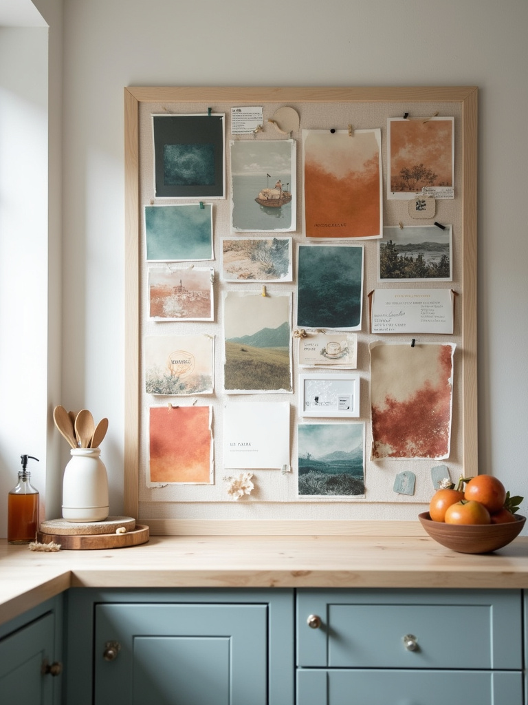
18. Mood Board Magic: How Colors Impact Your Kitchen’s Atmosphere
Color profoundly influences our psychological and physical responses, particularly important in kitchens where we cook and gather. Warm colors (vibrant red, energetic orange, cheerful yellow) stimulate appetite and create energy, excitement, and sociability – perfect for social hub kitchens or lively cooking environments. Cool colors (calming blue, serene green, tranquil violet) promote relaxation and tranquility, ideal for mindful cooking or stress-reduction. Neutral colors (white, gray, beige) provide clean canvases offering spaciousness and order, though they need warming accents to prevent sterility.
Lighting critically affects color perception in kitchens. Natural sunlight best showcases true colors, enhancing vibrancy and nuances. Artificial lighting alters perception based on type and temperature: incandescent casts warm, yellowish tones enhancing warm colors but potentially distorting cool ones; fluorescent appears cooler, potentially washing out warm shades; LED offers versatility with selectable temperatures. Test samples under different lighting conditions throughout day and evening to observe color shifts. Consider kitchen orientation – north-facing kitchens with cooler light might benefit from warmer palettes, while south-facing kitchens with abundant warm sunlight might handle cooler schemes better.
The stumbling block is that many people choose kitchen colors without considering how they’ll feel working in that space day after day. Creating a mood board that combines your kitchen color design ideas with your functional needs (including growing spaces) helps ensure your kitchen will work on every level.
19. Color Confidence: Expert Tips for Mixing and Matching Hues
Mixing and matching kitchen colors needn’t be intimidating with expert guidance. Beginners can rely on foolproof palettes as starting points. Monochromatic schemes using various shades of one color (like light gray cabinets, medium gray backsplash, dark gray countertops) create sophisticated unity. Analogous palettes using adjacent color wheel colors (teal cabinets, seafoam walls, blue-gray accents) offer harmonious flow. Complementary palettes pairing opposite color wheel colors (navy cabinets with copper hardware) provide dynamic contrast. Starting with neutral bases grounds bolder colors and prevents overwhelming schemes.
The 60-30-10 rule creates balanced, appealing kitchen color designs. Dedicate 60% to a dominant color (typically walls and main cabinets), 30% to a secondary color (island, backsplash, or flooring), and 10% to accent colors (hardware, accessories, artwork). This creates clear visual hierarchy, distributing colors in balanced, intentional ways. It prevents chaos by establishing a dominant color while using secondary and accent colors to add controlled depth and interest.
Things took an interesting turn when I applied these color principles to growing spaces within kitchens. The 60-30-10 rule works beautifully when planning how to integrate productive plants into your kitchen color design – letting the greens of your plants become part of the intentional color scheme rather than competing with it.
Conclusion
Your kitchen deserves to be more than just functional – it should be a space that inspires and energizes you every day. Whether you’re growing herbs on your windowsill, preparing meals from your urban garden, or simply gathering with loved ones, the colors surrounding you profoundly affect your experience.
The right kitchen color design doesn’t just look good – it feels right. It supports both your practical needs and emotional wellbeing. As you consider these 19 ideas, remember that the best kitchen colors are ones that make you happy to be there, that complement your lifestyle (including any growing you do), and that make your space uniquely yours.
Don’t be afraid to experiment, gather inspiration, and step outside your comfort zone. With thoughtful planning and a dash of creativity, you can transform your kitchen into a space that nourishes both body and soul – truly making it the heart of your home.