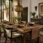
For centuries, the dining table has carried more weight than its function suggests. It’s where families settle disputes. It’s where artisans show off their finest joinery. A household quietly tells visitors who it is through this one piece of furniture. Long before “tablescaping” was a word, Damascus metalworkers were hammering brass into furniture. Rajasthani carvers were turning a slab of teak into a family heirloom. I’ve spent years tracing how South Asian and British design traditions meet at the dining room table. Across the dining room tables I’ve styled, the most memorable ones never relied on a single matched set. Instead, they layered: a hand-carved leg here, a block-printed runner there, brass that’s allowed to age instead of staying mirror-bright. This list moves through eighteen dining room table ideas that borrow from that same instinct. You’ll find reclaimed wood with hammered inlay, tile tops with real craquelure, and textiles that tell you exactly which region they came from. None of it requires starting over. Most of it starts with one good textile or one well-chosen pendant. The rest follows once you know what you’re looking for.
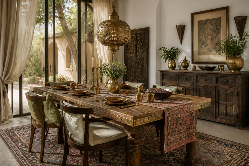
1. Reclaimed Teak Dining Room Table With Hand-Hammered Brass Inlay
Brass inlay photographs beautifully, but it looks even better in person. The metal catches light differently depending on where you’re sitting. The technique goes back to 12th-century Damascus, where metalworkers hammered gold, silver, or copper into a harder base metal without solder or heat. Artisans refined the process under Mamluk rule in Syria and Egypt. European cabinetmakers later adapted it, using brass-and-tortoiseshell veneers on furniture for the same reason: it signaled a piece worth keeping.
On a dining room table, the brass is set into a recessed or cross-hatched channel cut into the wood. Reclaimed teak holds that channel cleanly without splintering, so it’s a more forgiving base than a softer wood. If you’re commissioning the piece, ask to see in-progress photos of the channel-cutting stage before you commit. That detail tells you more about the maker’s skill than any finished photo will.
One thing worth knowing going in: unlacquered brass won’t stay gold. Indoors, it shifts toward honey, then amber, then a deeper brown over months of contact with air and hands. Match the inlay’s tone to your existing cabinet or door hardware. That way, the dining room’s natural materials read as one deliberate palette rather than a single accent aging alone.
2. Rattan and Cane Dining Chairs Paired With a Stone-Top Table
There’s a reason the cane-chair-and-stone-table combination keeps showing up in Japandi-leaning rooms. The pairing works because the materials do opposite jobs. Cane is warm, woven, and slightly imperfect. Stone is cool, dense, and exact. Put a black cane chair around a round honed-marble table, and the contrast reads as balance rather than mismatch.
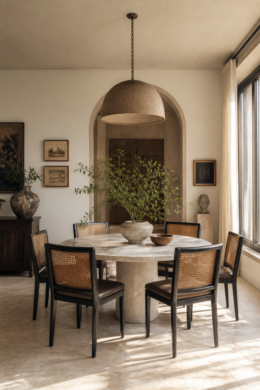
Keep the stone slab low-profile when pairing it with cane seating. A thick, heavy-edged top competes with the woven texture for attention, and you want the chairs to stay part of the conversation. Neutral tableware and simple ceramic centerpieces help too. This isn’t a setting that needs a loud centerpiece doing extra work.
Tone matters more than you’d think. Bleached or whitewashed cane suits a cooler, more minimal palette. Natural honey-toned cane leans rustic and warmer. Either works against marble, but the decision should follow your room’s existing wood tones, not the dining room table itself. If your contemporary dining room chairs skew dark already, avoid pairing them with a heavily veined dark stone. That’s the one combination that collapses the contrast instead of building it. A simple test before you buy: set a cane sample next to your existing wood tones in daylight, not under store lighting. Warm bulbs can mask a mismatch that becomes obvious once you get it home.
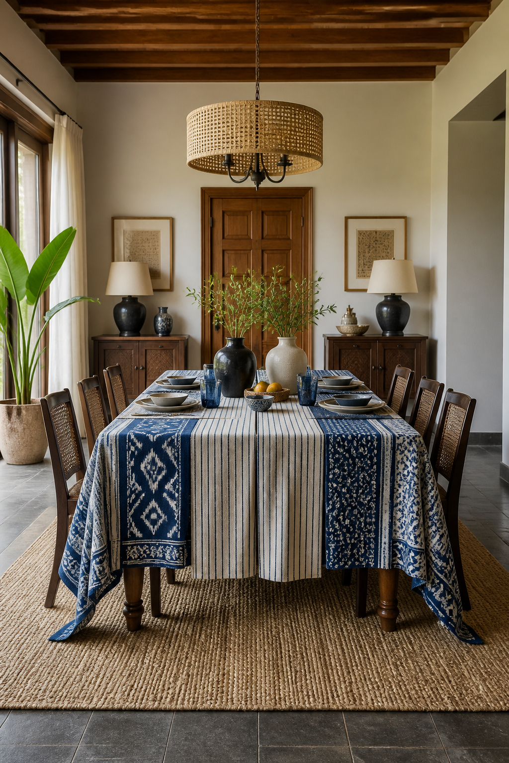
3. Hand-Block-Printed Table Runners Layered Over a Live-Edge Surface
Bagru and Sanganeri block printing have been practiced near Jaipur for roughly 500 years, ever since the Chippa community migrated from Gujarat in the late 16th century. The two traditions look distinct on purpose. Sanganeri prints favor fine florals, delicate detailing, and pale backgrounds. Bagru leans bolder. Its dabu technique uses a mud-resist paste of clay, lime, gum, and wheat chaff to block dye from penetrating the fabric. The result is earthier, more geometric patterns in natural indigo, madder, and pomegranate-rind dyes.
That distinction should guide which print you choose for a live-edge dining table. A heavily figured slab with a lot of visible grain competes with a busy Sanganeri floral. Confine the runner to the table’s center third instead, and let the wood’s edge stay visible. A darker, more rustic wood handles Bagru’s bolder geometry better.
Because block-printed textiles cost far less than furniture, rotating two or three runners with the seasons is the cheapest way to refresh the table without touching the wood underneath it.
Most genuine block-printed runners are cotton or a cotton-linen blend. That fiber takes natural dye more evenly than a synthetic blend, which won’t hold the same depth of color or soften the same way with washing. Hand wash these pieces, or use a gentle cycle, and skip the dryer. Air drying keeps the natural dyes from fading prematurely.
4. Moroccan Zellige Tile-Topped Dining Table for a Mosaic Centerpiece
Every zellige tile is hand-cut and individually glazed. No two are perfectly uniform, and that irregularity is exactly what gives a zellige tabletop its handmade weight. Set into a recessed wood or metal frame, the tiles catch light unevenly across the surface in a way no flat laminate top can replicate.
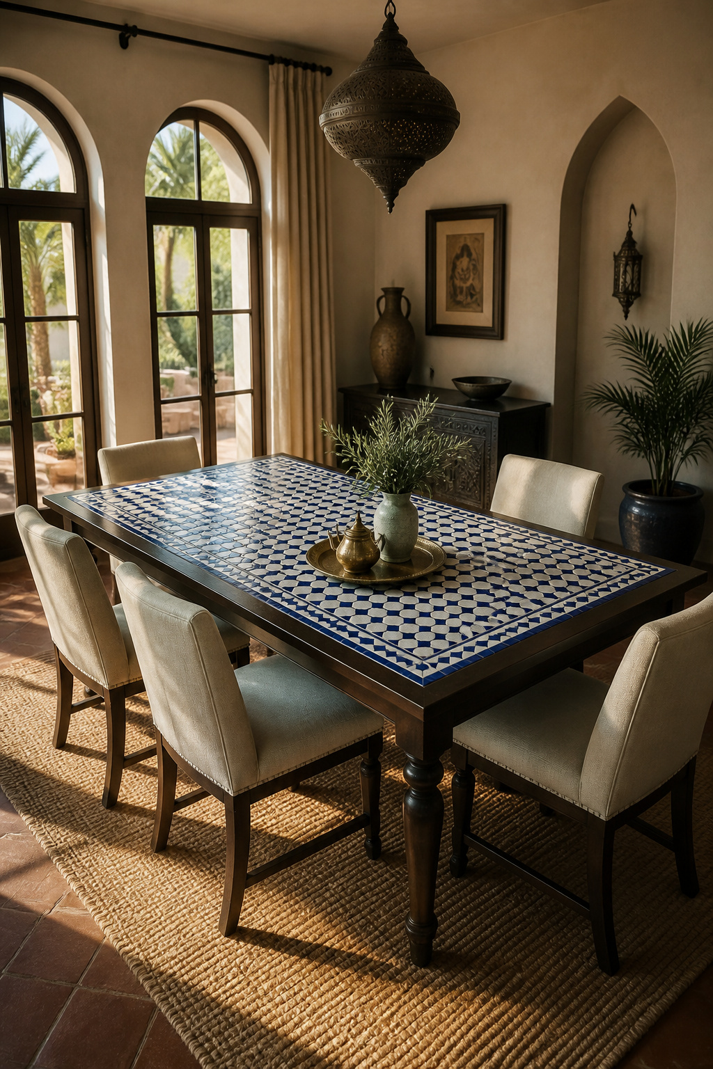
The glaze offers some protection, but the clay underneath stays porous. That means a zellige tabletop needs a food-safe penetrating sealant, applied in thin layers after a thorough cleaning. Reapply it roughly every one to two years. For daily upkeep, stick to pH-neutral cleaners. Bleach and ammonia will strip the glaze’s luster over time, while a baking-soda paste handles stubborn stains better than scrubbing ever will.
Living With a Tiled Surface Day to Day
Skip the abrasive sponge entirely. The glazed surface can’t take vigorous mechanical cleaning. So a soft cloth and patience do more for the table’s longevity than elbow grease.
Most zellige is sold in roughly 4-inch hand-cut squares with naturally irregular edges, though larger-format tiles are becoming easier to find for bigger tabletops. Order a few extra tiles beyond what the table needs. The irregular cutting means batches vary slightly. Spares from the same run save you from a visible mismatch if a tile ever needs replacing.
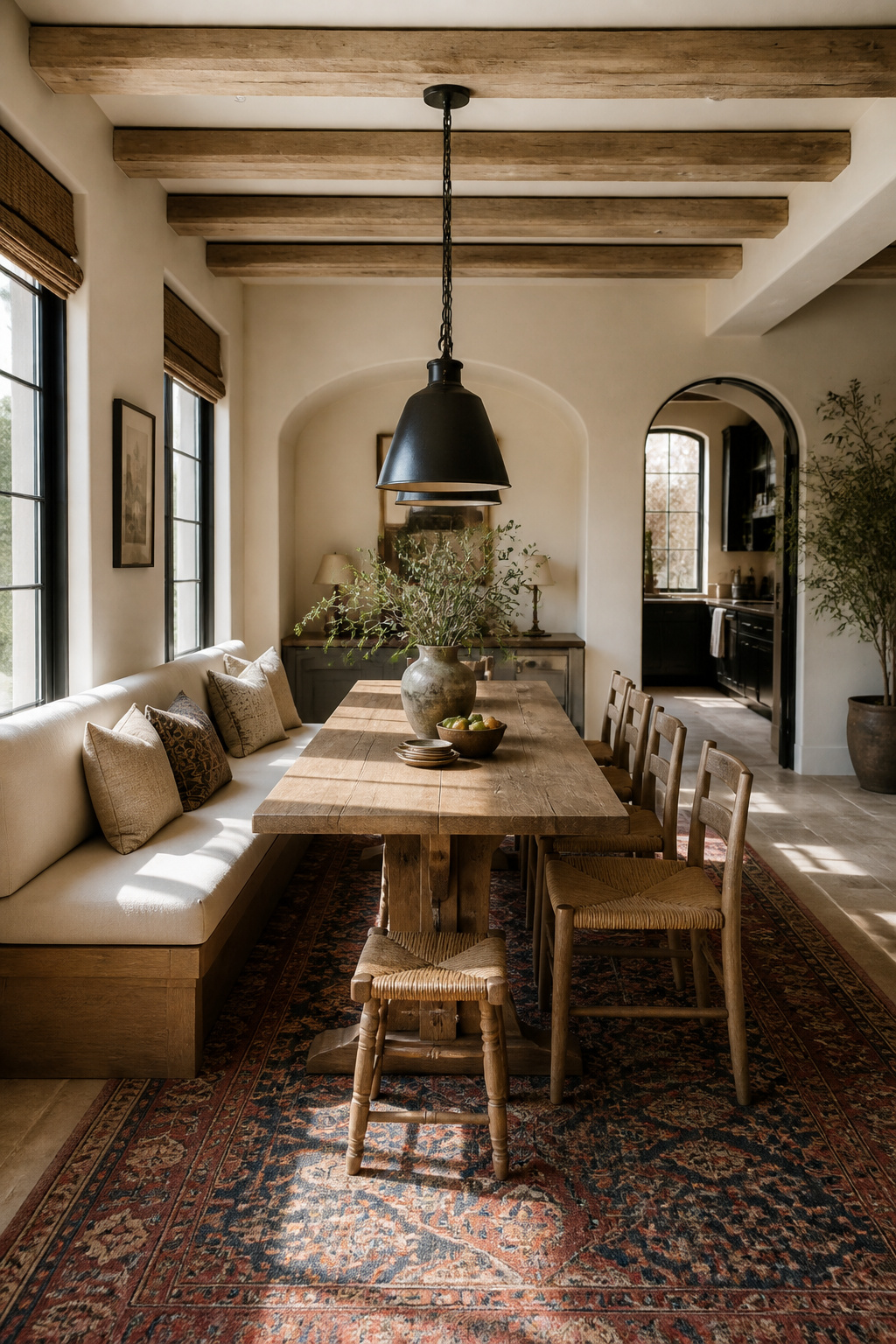
5. Antique Persian Rug Anchoring the Dining Space
Choosing the right table for the dining room is only half the job. A worn antique rug does something a new one can’t: it introduces age and pattern at floor level. That balances out newer furniture and brighter metalwork above it. Low-pile wool, flatweave, or vintage patterned rugs hold up better under daily chair movement than a thick high-pile rug. The thicker pile tends to catch chair legs and wear unevenly at the pull-back points.
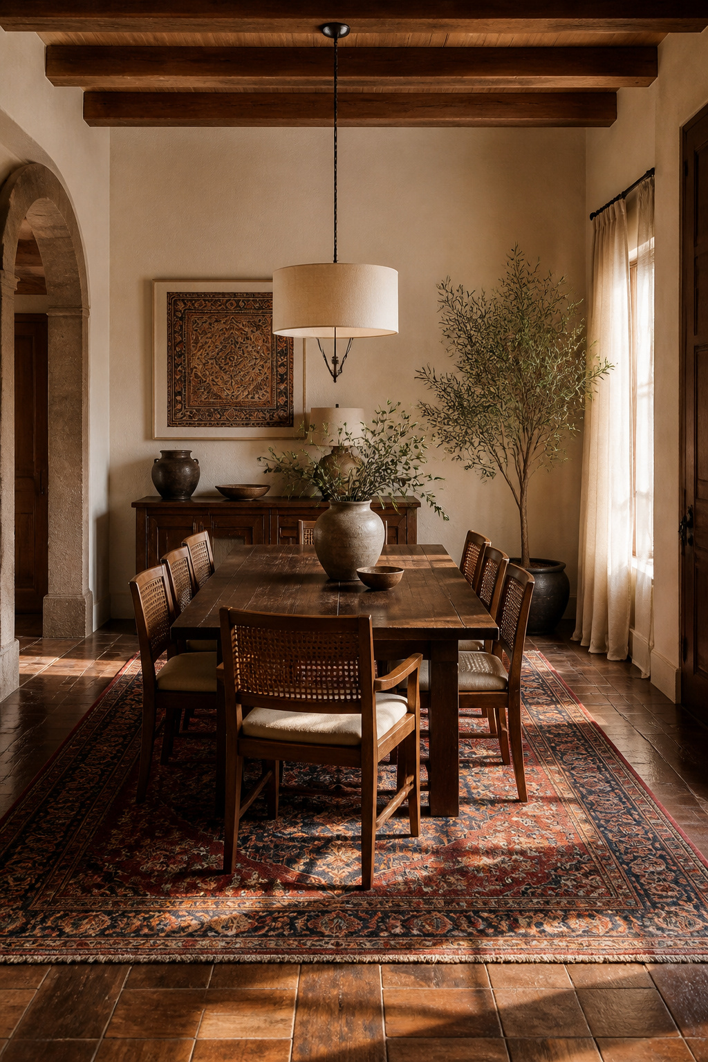
Sizing is the part people get wrong most often. The reliable rule is to extend the rug at least 24 inches beyond the dining room table on every side, or 30 to 36 inches if your chairs are deep or upholstered. A 9-by-12 rug is the standard starting point for an eight-person table. An 8-foot circular rug suits most round tables. When you’re stuck between two sizes, take the larger one. A rug that’s slightly too big disappears under the furniture, while one that’s too small announces itself every time someone pulls out a chair.
For more texture without more bulk, layer a smaller flatweave or kilim on top of a larger neutral rug. It adds pattern exactly where the table sits while keeping the room’s edges visually calm.
6. Mixed-Metal Place Settings That Bridge Brass and Copper
Brass mixes well with matte black, bronze, and brushed nickel. But the pairing that reads as most intentional, and most historied, is aged copper against wrought iron. The trick to making mixed metals look deliberate rather than accidental is keeping one metal dominant. Let brass flatware lead and copper drinkware play a supporting role, rather than splitting the dining table 50/50 between the two.
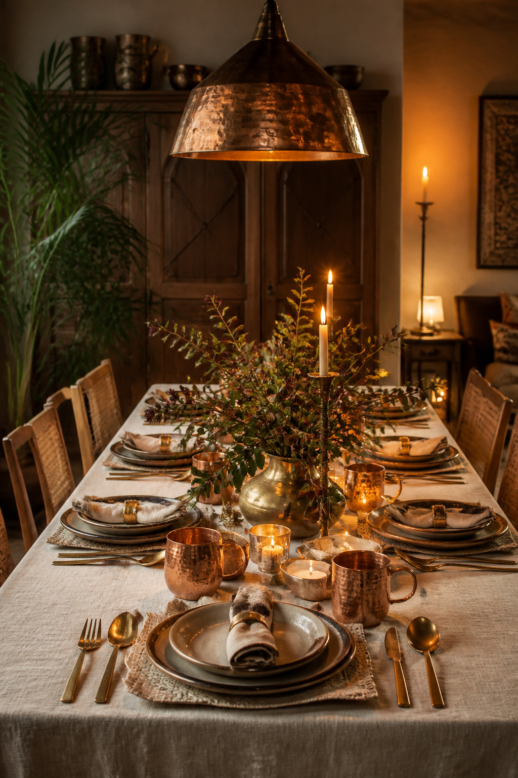
Unlacquered brass and copper both start developing patina the moment they meet air, oils, and moisture. Indoors, that usually means brass ages from gold toward honey, then amber, then a deeper brown, not green. Green needs sustained moisture exposure you’re unlikely to get on a dinner table. Letting that patina build naturally, instead of polishing it back to a mirror finish, is what makes a mixed-metal table feel collected over years rather than bought last week.
There’s a practical upside too. Brass carries documented antimicrobial properties, and copper-alloy surfaces kill 99.9% of bacteria within two hours, according to EPA-certified testing. It’s a detail worth knowing even if it never comes up at dinner.
Start the mix with flatware, since it’s the lowest-cost way to test whether you like brass and copper together. Most dedicated mixed-metal flatware sets come in place settings of four or six. That makes it easy to build the full table gradually rather than all at once.
7. Hand-Carved Trestle Dining Room Table From Rajasthani Artisans
A trestle base skips the center leg entirely. That makes it easier to seat extra people at the ends when a holiday crowd shows up unannounced. Authentic Rajasthani trestle tables are carved from sheesham, teak, acacia, or mango wood. The carving style shifts by region, too — Jaipur, Jodhpur, Barmer, and Udaipur each developed their own motif language. So two “Rajasthani carved tables” can look meaningfully different depending on where the maker trained.
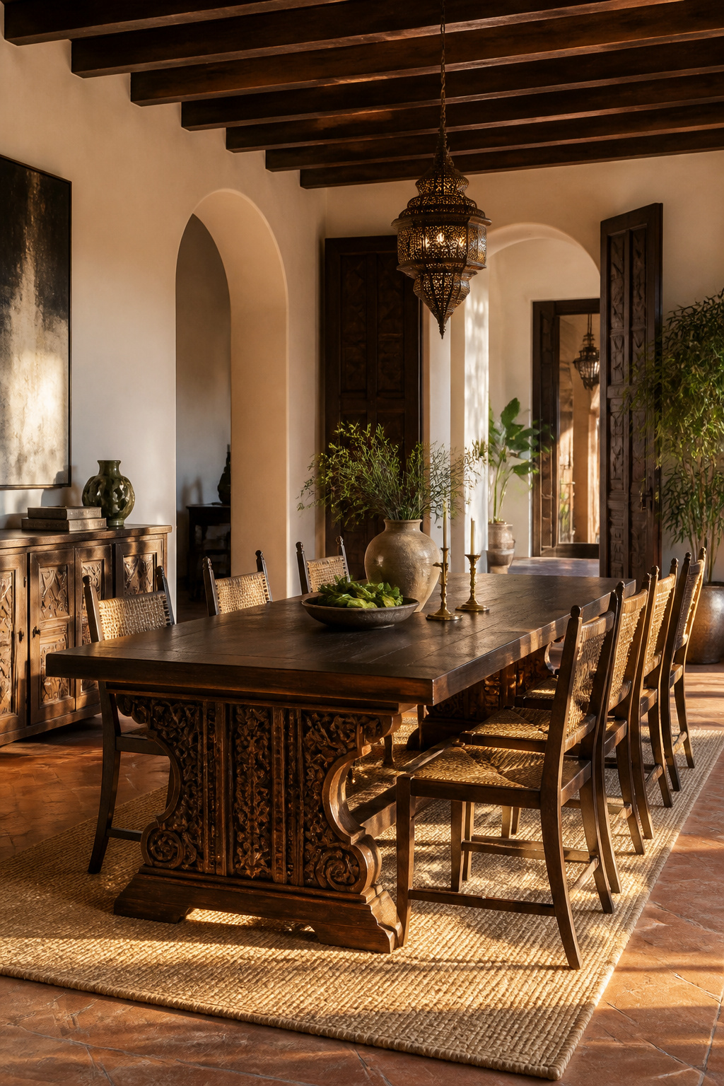
If you’re commissioning rather than buying off the floor, do the homework before any money changes hands. Ask whether the supplier can show third-party audit results or certifications like FSC, Fair Trade, or SA8000. Not every “hand-carved” label guarantees the artisan was paid fairly or worked in safe conditions. A maker proud of their sourcing will have no trouble answering. Request photos of the specific motif applied to a finished piece, too, since hand-carved detail varies from artisan to artisan even within the same workshop.
This is the upgrade I’d prioritize over almost anything else on this list. A rustic living room furniture piece you love will get replaced eventually. A trestle table built by someone whose family has carved for three generations tends to outlast the house.
8. Layered Global Textiles as an Everyday Table Centerpiece
Ikat’s origins are genuinely murky. Historians trace it through India, Central Asia, and Southeast Asia along the Silk Road. The word itself comes from the Indonesian “ikatan,” meaning to tie or bind. The technique dyes the yarn before weaving, using a resist wrap to control where the color lands. That’s why ikat patterns have that signature soft, slightly blurred edge instead of a crisp printed line.
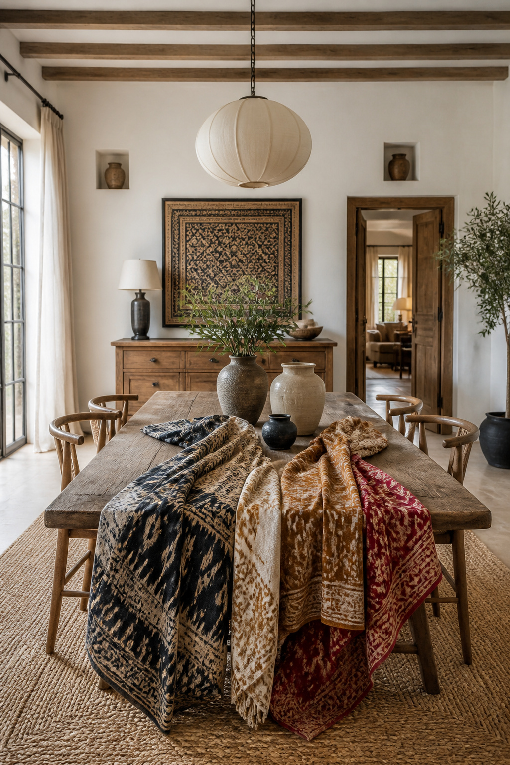
Because both faces of the fabric are patterned, a side effect of dyeing the yarn rather than the finished cloth, an ikat runner looks good draped, folded, or bunched. That makes it a more forgiving centerpiece than fresh flowers that need constant replacing. Pair it with the crisper geometry of kitchen table centerpiece ideas like block print or embroidery. The two textures read as distinct rather than competing, since ikat’s blur softens block print’s sharper lines instead of fighting them.
One caution: two high-contrast ikat patterns layered together cancel out the effect that makes the technique interesting in the first place. Pick one ikat piece, and let everything else around it stay quieter.
The tradition spread from Asia along the Silk Road. That is part of why ikat shows up under different names and in slightly different forms across India, Uzbekistan, and Indonesia. That shared lineage means pieces from different regions tend to mix well together, even when the exact motifs don’t match. The dyeing technique itself is the unifying thread.
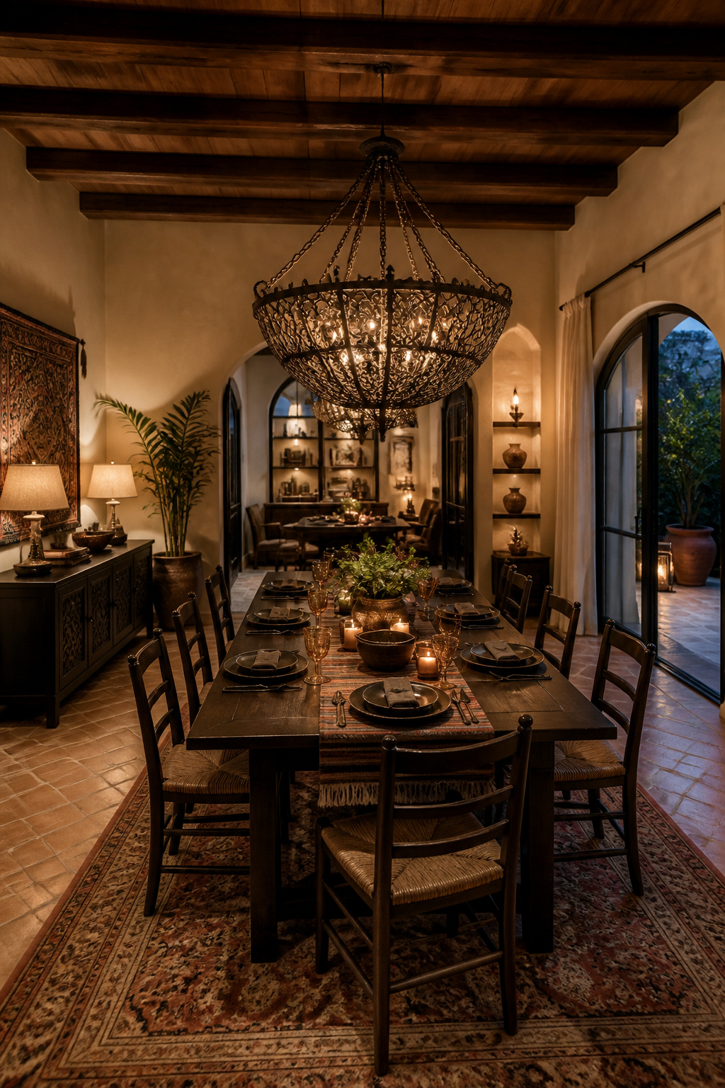
9. Brass Lantern Pendants Hung Low Over the Table
Pendant height is the most commonly botched detail in dining room lighting. It’s also the easiest to get right with a tape measure. Hang the fixture 30 to 36 inches above the tabletop on a standard 8-foot ceiling, adding roughly 3 inches of extra height for every additional foot of ceiling. There’s an old rule of thumb that still holds: you should be able to look comfortably under the fixture while seated. Its bottom edge should land near eye level when you’re standing.
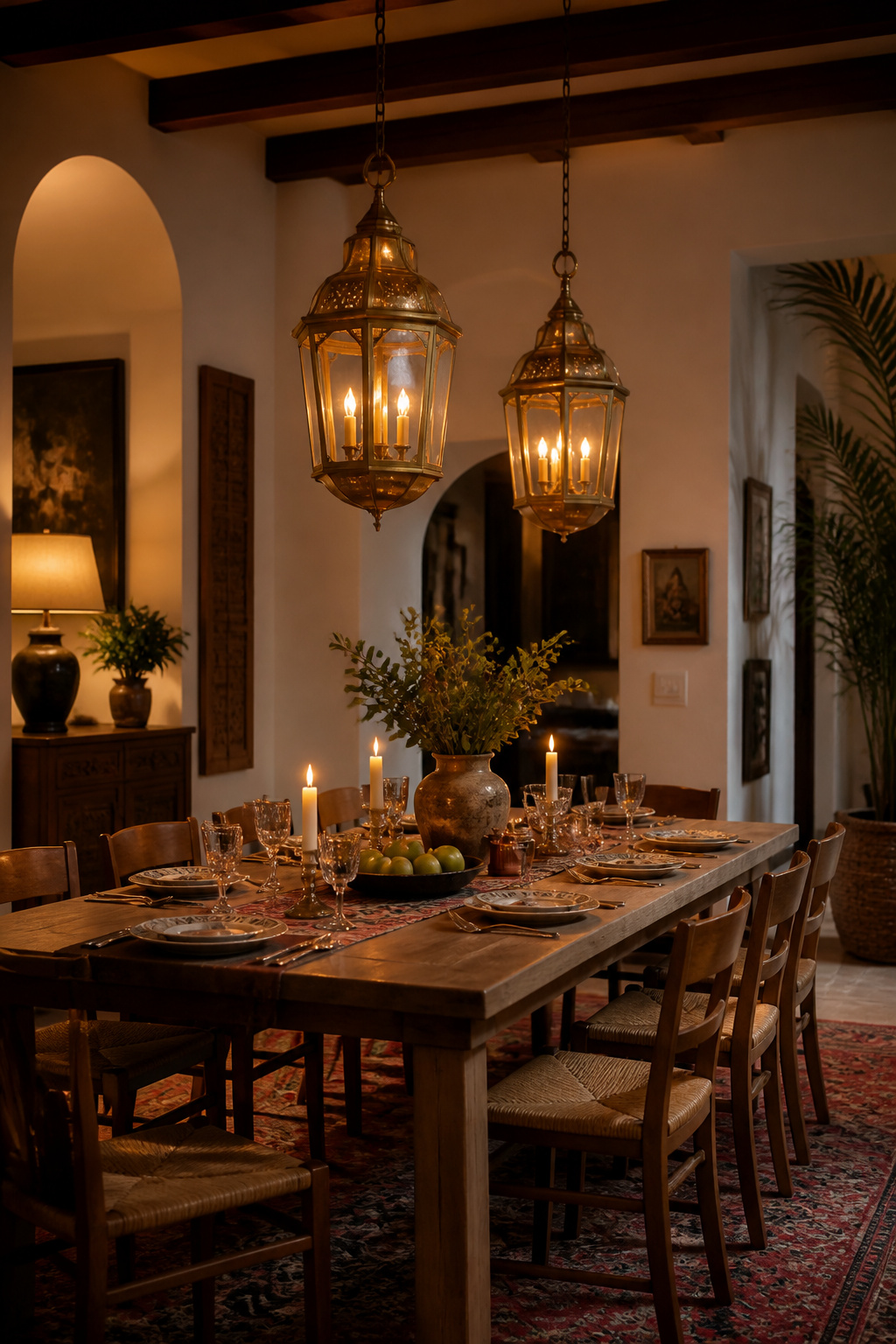
Lantern-form brass pendants do a lot of the “globally influenced” work without needing literal decorative motifs. The warm metal tone alone carries that. Keep the fixture’s diameter at roughly half to two-thirds of the table’s width for proportion. On a longer table, skip the single oversized pendant. Hang two or three smaller ones spaced about 24 inches apart instead, since that distributes dining room lighting over your table more evenly than one large fixture ever does.
Pair the brass with dimmable, warm-temperature bulbs so the same fixture can handle bright daytime tasks and shift into a softer glow for evening guests. Look for bulbs in the 2700K range. Anything cooler tends to fight the warmth of the brass instead of complementing it. A dimmer switch matters more here than fixture choice itself.
10. Reclaimed Wood Dining Room Table With Carved Cultural Motifs
A carved motif gives a table a story beyond its function. Reclaimed wood adds a second layer of history on top of it, since the table has already lived somewhere before it became furniture. Lotus and Tree of Life patterns show up often in this category, carved into solid teak, mango wood, or rosewood that’s selected before any carving begins.
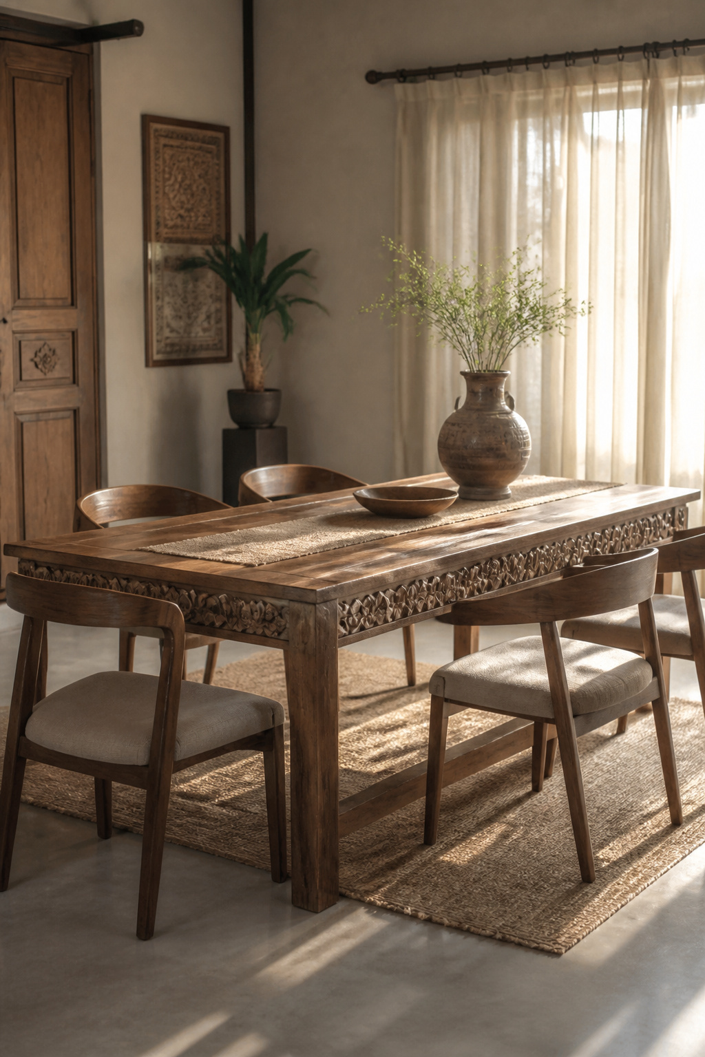
Most makers in this space offer real customization. Size, wood species, finish, and the specific carved pattern can usually be adjusted to fit your room rather than picking from a fixed catalog. That flexibility matters more than it sounds, because the scale of the carving needs to match the scale of the room.
Choosing Between a Border and a Full Apron
A carved border confined to the table’s edge is the more restrained option and tends to suit smaller dining rooms better. A full carved apron running the length of the table is a stronger statement. It’s striking in a dedicated formal dining room, but genuinely too much in a tight space. If you’re not sure which to choose, the border is the safer first commission. You can always commission a second, bolder piece later once you’ve lived with the table and know how the room actually uses it.
11. Ceramic and Pottery Centerpieces From Regional Artisans
Jaipur blue pottery and neighboring Khurja pottery look related but serve different purposes. Knowing the difference saves you from putting the wrong piece into daily rotation. Jaipur blue pottery is quartz-based, fired at lower temperatures around 800 to 850°C, and built for decoration rather than daily handling. Its hand-painted patterns sit against a distinctive blue ground, with color drawn from specific minerals: copper for turquoise, cobalt for dark blue, manganese for purple. Khurja pottery, by contrast, uses local clay fired at higher temperatures, which gives it the strength for everyday functional use.
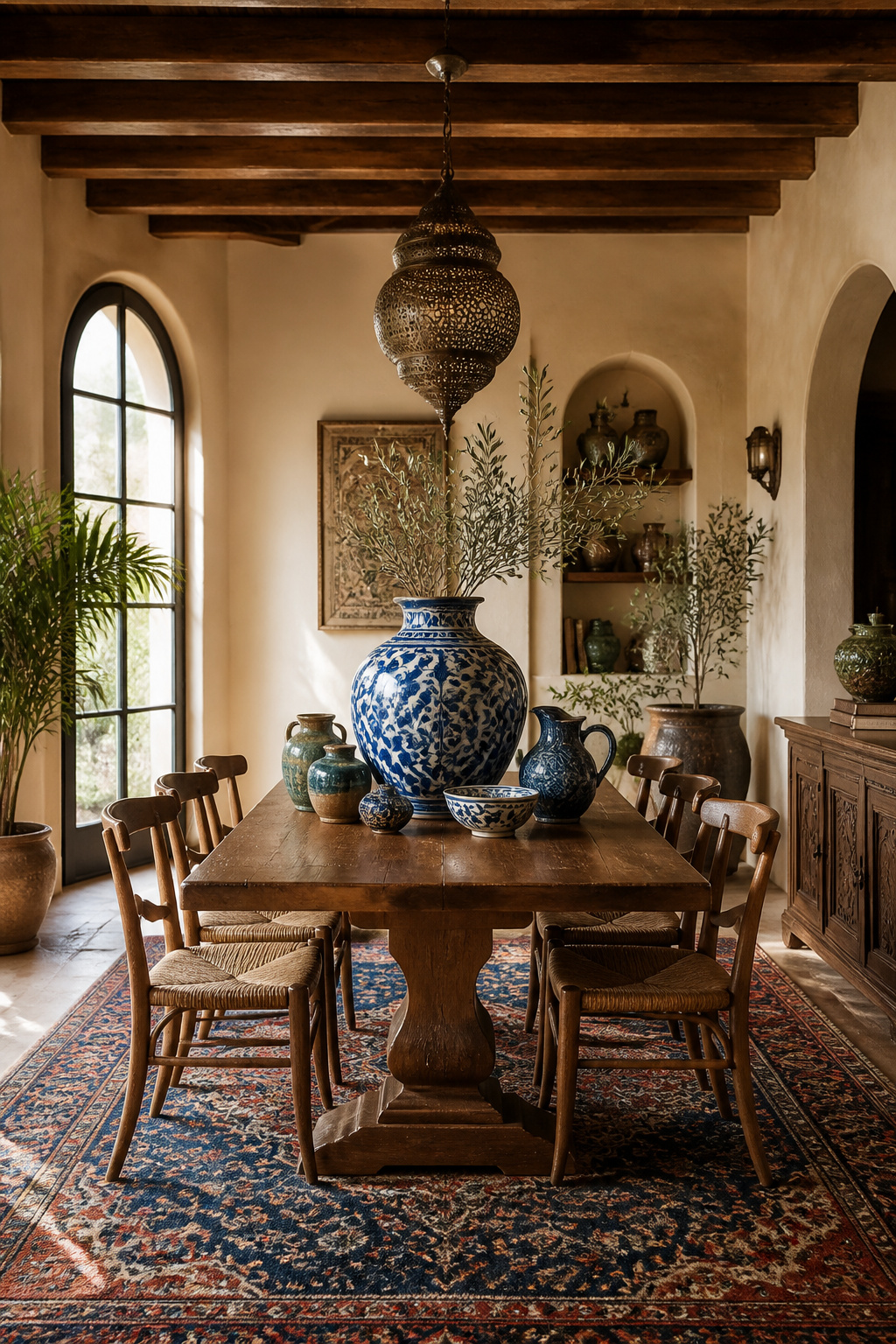
That distinction should shape how you style the dining room table. Let one larger blue pottery piece serve as the visual anchor, a centerpiece bowl or vase. Surround it with smaller, sturdier Khurja pieces that can actually handle daily accessory duty, like salt cellars or small serving dishes.
The common mistake is treating quartz-based blue pottery as everyday dishware. Its lower firing temperature makes it more fragile than it looks. So reserve it for the role it was actually built for: presence, not service.
Both traditions are typically sold through regional artisan cooperatives rather than mass retailers, so expect some variation piece to piece. No two hand-painted blue pottery vessels carry the exact same brushwork. That is part of what makes a single statement piece worth the search.
12. Mixed Seating: Bench Plus Chairs for Relaxed Cultural Dining
A bench seats people shoulder to shoulder without individual chair backs interrupting the sightline down the table. That’s part of why it reads as more communal than a full matched chair set. The standard pairing places a bench on one side with chairs on the other, or benches at both ends with chairs along the sides. Either layout works as long as the proportions hold.
Those proportions aren’t guesswork. Standard dining table height sits at 30 inches, chair seats run 18 to 20 inches. Bench height should land in that same 17-to-19-inch range so seat heights stay consistent across the table. Keep the bench itself 12 to 24 inches shorter than the table. Allow 18 to 24 inches of bench length per diner so nobody’s elbow-to-elbow with a stranger at a dinner party.
Benches do lose something chairs have: individual back support. A cushion or a folded kantha throw across the seat bridges that gap better than a bare wood plank, especially for guests who linger over a long, relaxed evening. Kantha quilting, traditionally made from layered, hand-stitched recycled saris, also softens a hard bench visually as well as physically. That’s worth considering before reaching for a plain foam cushion instead.
13. Hand-Loomed Table Linens With Global Pattern Mixing for the Dining Table
The same ratio that keeps a gallery wall from looking chaotic applies almost exactly to table linens. Give one pattern or format roughly 70% visual dominance, and let everything else play a supporting role. Layer a striped runner over a solid base cloth, then bring in block-print napkins as the smallest-scale pattern in the mix. Ikat’s naturally blurred edges work as a buffer between crisp stripes and graphic block prints, softening the transition instead of adding a third competing texture.
What holds the whole thing together is color discipline, not pattern restraint. A hand-loomed table can carry three or four different prints as long as they pull from the same narrow palette. Three blues and a cream works; blues, oranges, and greens all fighting for the same square foot of fabric doesn’t.
If the mix starts to feel busy, the fix is rarely removing a pattern. Add one more solid piece instead, like a plain runner or a single-color napkin, to give the eye somewhere to rest between the patterned layers.
Hand-loomed cotton and linen also wrinkle differently than machine-woven fabric, settling into soft, irregular creases rather than sharp lines. That’s another reason these textiles read as collected rather than store-bought straight off the shelf.
14. Copper and Brass Serveware Styled for Everyday Entertaining
Hand-hammered copper and brass serveware has a visible texture that flat stainless steel simply doesn’t replicate. That is most of why it photographs and feels better on a table. But there’s a real safety detail underneath the aesthetics. Unlined brass and copper can react with acidic foods, like citrus, yogurt, or tomato-based dishes, forming copper salts that aren’t safe to eat. Traditional Indian metalworking solved this centuries ago with kalai, a thin tin lining applied to the interior of brass and copper vessels.
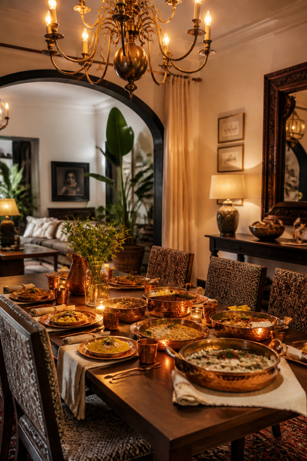
That lining isn’t permanent. With regular use and washing, it typically lasts 200 to 400 uses before it needs recoating, usually every one to three years depending on how often the pieces see the dining table. For short-term contact, like serving rather than storing, unlined brass is fine. For anything that sits with acidic food for longer, stick to tin- or steel-lined pieces.
Build the collection slowly. Start with one hammered serving bowl or tray rather than a matched set, and add pieces as you find ones worth keeping. Recoating the tin lining on a piece you use often is inexpensive relative to replacing it. So factor that small recurring cost into how often you actually plan to use it.
15. Gallery Wall Behind the Table Featuring Cultural Art
Negative space is what keeps a gallery wall from reading as clutter, even when it’s packed with pieces. Minimalist-leaning layouts space frames 4 to 6 inches apart. Denser, more maximalist groupings tighten that to 2 to 3 inches. Neither is wrong — the spacing should match how busy the rest of the dining room already is.
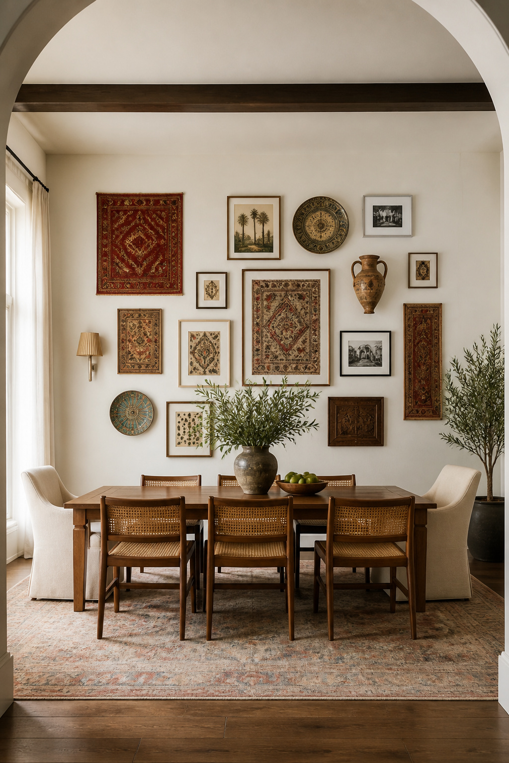
When you’re mixing formats, like framed textiles next to prints, ceramics, or a mirror, assign about 70% visual dominance to one medium. That keeps the wall from feeling like three different collections stapled together. A wide white or cream mat around a busy textile creates a pause before the eye moves to the next piece. That matters more behind a dining table than almost anywhere else in the house, since people are staring at that wall for the length of an entire meal.
Organic layouts, with mixed frame sizes and orientations, tend to feel more personal and collected than a rigid grid of identical frames. It’s closer to how living room wall art ideas get curated over years rather than bought in a single trip. Start the layout on the floor before a single nail goes in the wall. That’s the only way to judge spacing accurately once textiles, ceramics, and frames of different depths are all in the mix together.
16. Statement Lighting Over the Dining Room Table With Global Influence
Fixture scale above a dining table follows a real formula, not just instinct. For a rectangular table, the fixture should run roughly half to two-thirds of the table’s length. For width, aim for half to three-quarters of the tabletop. Hang it 30 to 36 inches above the surface on a standard 8-foot ceiling, adding about 3 inches of extra height per additional foot of ceiling.
A globally influenced fixture, whether cast metal, woven rattan, or hand-finished brass, earns its place as the room’s focal point simply by being directly above the table’s sightline. That’s more visual real estate than almost anything else in the room gets. It’s also why getting the contemporary dining room lighting scale wrong is so noticeable. A fixture sized to the room instead of the table reads as disconnected from the furniture underneath it, even if it’s beautiful on its own.
For longer tables, skip the single oversized chandelier. Hang two or three smaller pendants spaced roughly 24 inches apart instead. It spreads light more evenly and avoids the single-statement-piece problem of looking slightly stranded over an 8-foot table. Match the finish across the cluster rather than mixing fixture styles, since a unified metal tone reads as a considered choice instead of three separate purchases.
17. Layered Place Settings Mixing Heirloom and Modern Pieces
The standard layering order for a dining room table — charger, dinner plate, salad plate, then a decorative bowl on top — gives you a framework. But the real trick is what goes where in that stack. A solid modern stoneware plate underneath a delicately painted heirloom china piece gives the intricate motif a calm base to stand out against in a mixed dining table setting. It keeps the pattern from getting lost next to other patterns.
Pattern-on-pattern is a legitimate option too, not just a fallback. Layering vintage pieces with similarly colored contemporary plates keeps a mixed table cohesive even when the patterns themselves vary widely. The color thread is what holds it together, the same way it does with linens.
If you’re building toward this look rather than starting with a full set, begin with a single heirloom piece. One inherited platter or a single plate pattern, passed down and layered into an otherwise modern set, is a far easier entry point. It beats mixing too many patterned pieces at once with nothing solid to anchor them. Napkins are the easiest place to keep experimenting once the core place setting is decided. They’re inexpensive enough to swap seasonally, and a pattern misstep costs nothing more than a folded square of linen.
18. Inlaid Wood and Mother-of-Pearl Accent Pieces for the Table
Sadeli mosaic inlay has a specific, traceable path. It originated in Shiraz, Persia, then traveled through Sind into Bombay, developing by the early 18th century into its own distinct Anglo-Indian box-making tradition. Vizagapatam on India’s east coast and Bombay on the west each produced recognizably different sadeli styles by the time India began exporting the work commercially in the 1850s. Mother-of-pearl inlay followed a separate but related path, flourishing under 16th-century Mughal patronage.
The craft itself is painstaking. Small geometric pieces of shell, wood, and metal get fitted into a unified mosaic pattern, which requires real patience from the artisan. That history is worth knowing even on a small scale, since a single inlaid box or tray carries the same craftsmanship as a larger commissioned piece. It’s just concentrated into something you can set at the center of an otherwise plain table.
That’s actually the better use for it. A heavily carved or already-inlaid table doesn’t need another layer of shimmer competing for attention. Save mother-of-pearl accents for a simpler surface where they can do their work without a fight.
Vizagapatam and Bombay sadeli work still circulates through antique and estate sales today, often at a fraction of what a newly commissioned piece would cost. A genuine antique box is sometimes the more accessible way into this particular craft than starting from scratch.
Choosing the Right Dining Room Table for Your Space and Style
The materials and motifs in this list only work if the table underneath them fits your room first. Allow about 24 inches of width per diner and 36 to 42 inches of clearance between the table and the nearest wall or sideboard. A 60-by-36-inch rectangle is comfortable for four people daily. For six, try a 72-inch rectangle or 60-inch round. Eight people daily with extra seats at the holidays calls for a 78-to-84-inch rectangle, or an extendable round closer to 72 inches.
Material is where budget and longevity actually meet. Engineered wood, MDF, and veneer sit at the accessible end. Solid mango wood, tempered glass, and rattan sit in the middle. Marble, quartz, and solid walnut sit at the top. Solid wood tends to be the safer long-term choice at larger sizes, since engineered tops above roughly 78 inches can develop noticeable seam sag with years of use.
If a full commissioned dining room table isn’t the right first step, it doesn’t have to be. A hand-block-printed runner, one mixed-metal place setting, or a single regional pottery centerpiece tests the direction at a fraction of the cost and timeline. Live with it for a season. If it still feels right, the dining room table itself is the easy part, and by then you’ll already know which maker, which material, and which detail you’re not willing to compromise on.