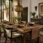
A room’s walls are its autobiography. Whatever living room wall art hangs there — whether a single large canvas or a considered collection built over years of deliberate choosing — tells the story of who lives inside and what they value. Most living rooms get this wrong in one of two directions: blank walls that feel unresolved, or walls filled with prints bought in a hurry and arranged without conviction. Good living room wall art is neither of those things. It is the difference between a room that could belong to anyone and one that clearly belongs to you.
These 17 living room wall art ideas cover the full range — from artisanal textile hangings and cultural gallery walls to sculptural metalwork, antique mirror groupings, and curated print rotation systems. Some are single-piece solutions. Others are systems for building something over time. All of them treat the wall as what it genuinely is: the largest surface in any room, and the one with the most to say.
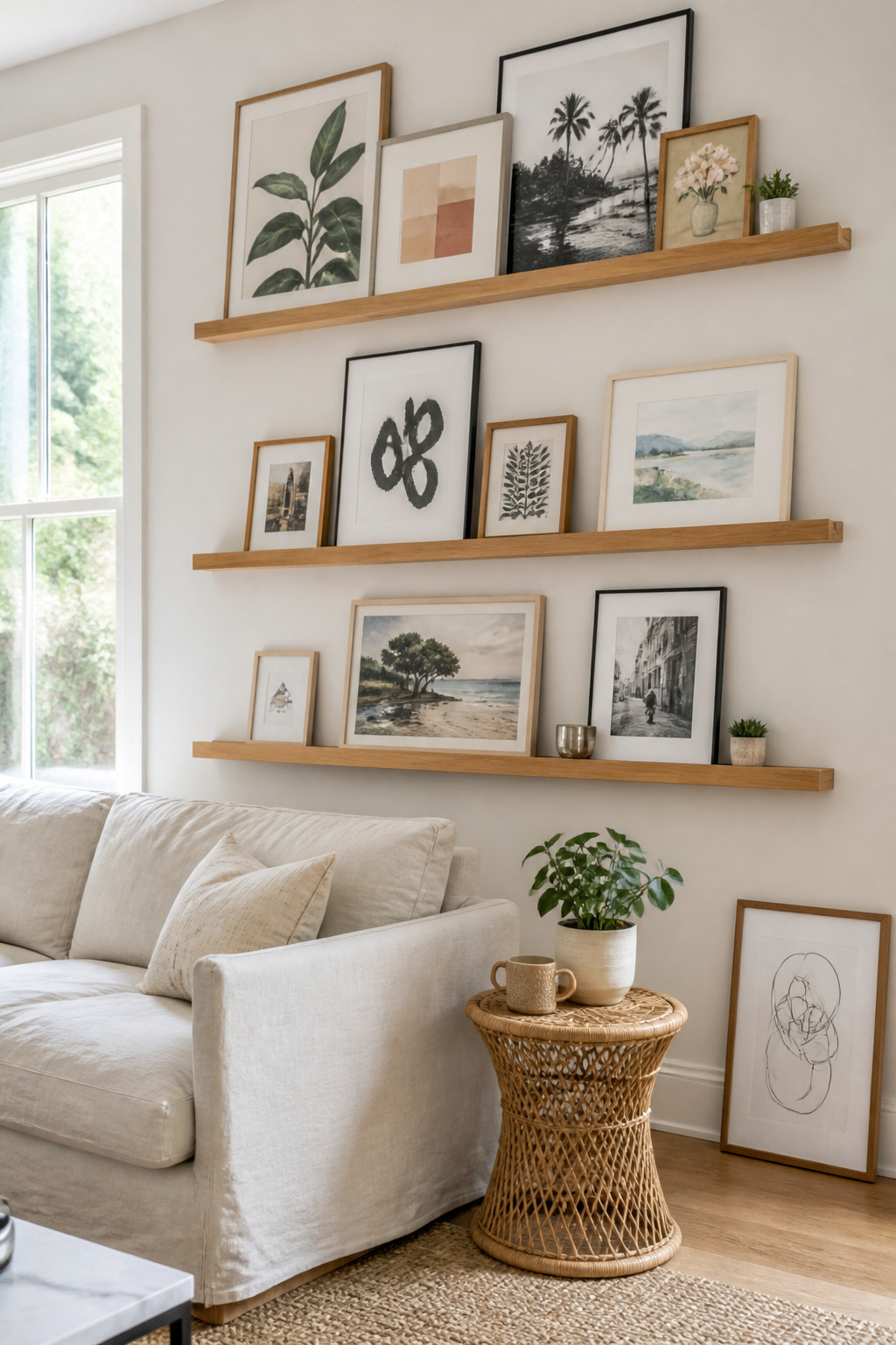
1. Gallery Wall With Mismatched Frames and Curated Prints
The conventional wisdom used to insist on matching frames. The newer understanding is that mismatched frames, held together by one unifying principle, create far more visual interest than a set of identical surrounds — which read as furniture rather than living room wall art.
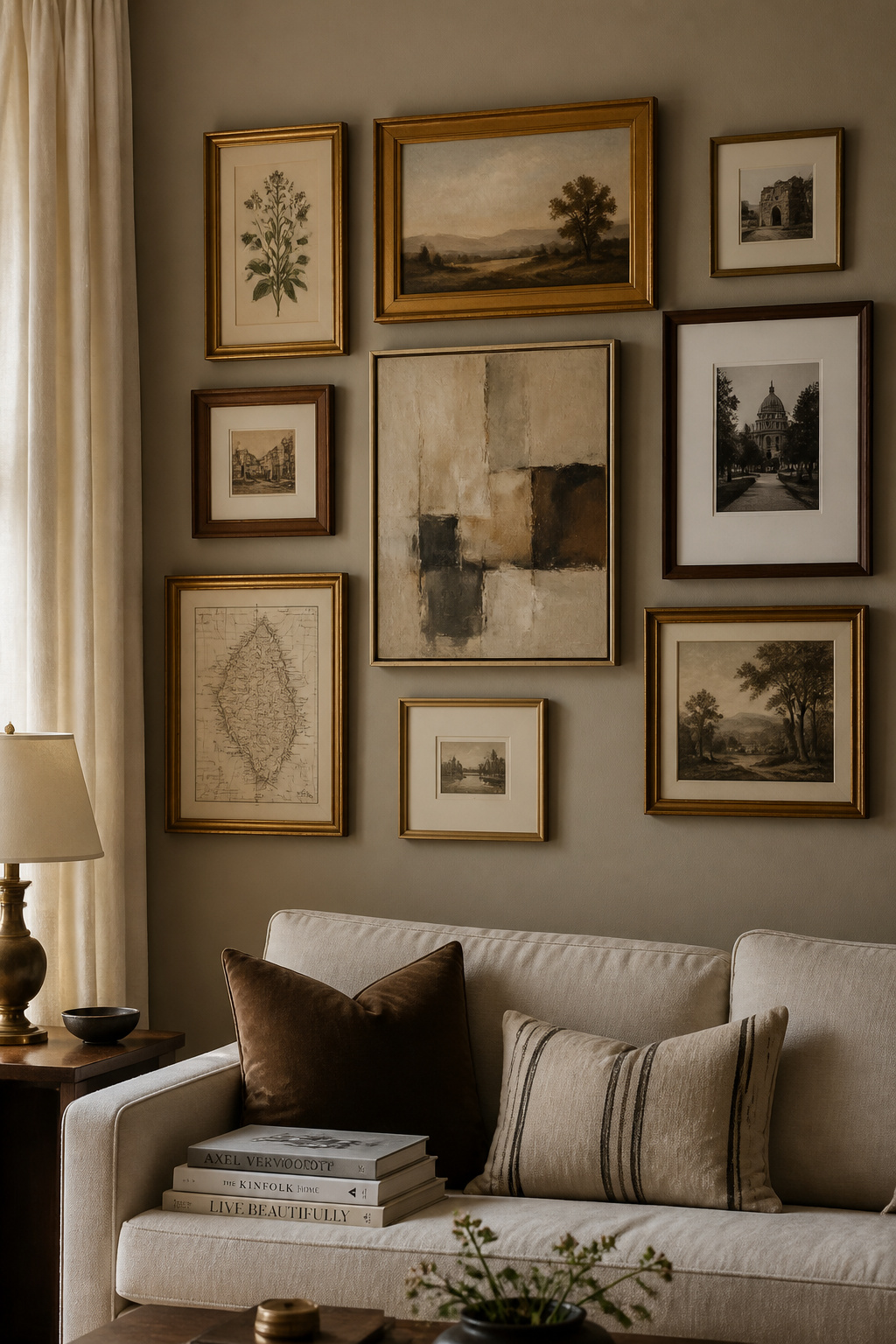
The principle that unifies does not need to be obvious. It might be a shared finish: all gold tones, even if some frames are brass, some gilt, some antiqued gold leaf. It could be a palette shared across all prints — every piece featuring at least some terracotta or sage — even when subjects and styles vary completely. Or it could be frame profile: matching the 2-inch width of every surround while varying material and finish freely. One constant, everything else variable.
Before touching a single nail, cut paper templates in each frame size, tape them to the wall with painter’s tape, and live with the arrangement for at least a day. Better still, lay every frame on the floor and photograph the arrangement from above — this reveals spacing problems genuinely hard to see when frames are vertical. The 2-to-3 inch gap between frames gives a composed look; wider gaps of 4-6 inches give a more editorial, deliberately spaced feel. Start with the largest piece and build outward.
The current trend is toward restraint within the format — three or four well-chosen pieces in varied sizes rather than the wall-spanning collage that dominated a decade ago. Sometimes three curated pieces make a stronger statement than twenty crowded ones. This is particularly true for living room wall art in smaller spaces, where a few pieces given room to breathe outperform a full installation.
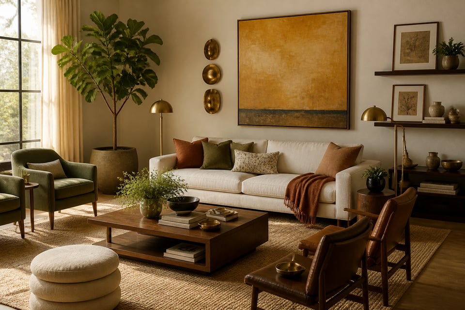
2. Oversized Abstract Canvas as the Room’s Focal Anchor
Almost everyone who buys a canvas buys one that is too small. A piece that looks substantial in a gallery or shop is routinely halved in apparent scale when hung on a living room wall. The correction is simple: go bigger.
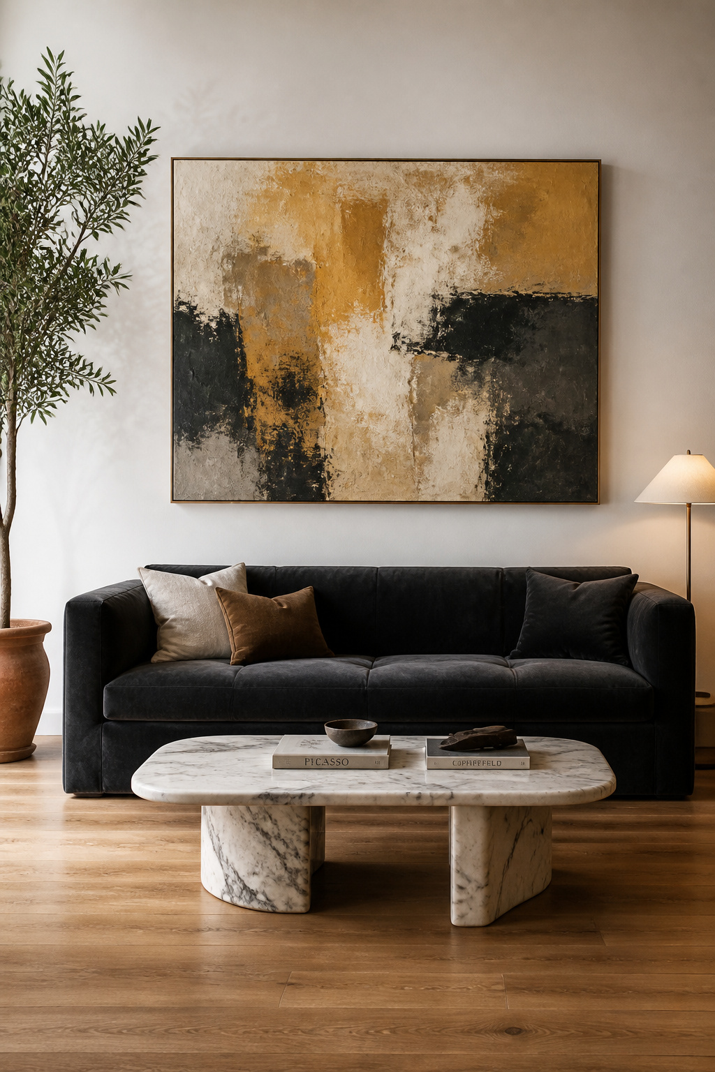
The 2/3 rule is the starting point. For one large canvas above a sofa or credenza, measure the furniture and aim for art covering roughly two-thirds of that width. A 90-inch sofa calls for a canvas around 60 inches wide. In rooms with ceilings above 9 feet, go proportionally taller — strict adherence to the 2/3 rule in a high-ceilinged room leaves the upper wall looking abandoned.
The most common living room wall art mistake is choosing art based on how it looks in a digital image rather than how it will relate to everything already in the room. For abstract work specifically, consider value first — the relationship between light and dark areas. A predominantly light abstract in a room with dark upholstery creates the visual tension that makes a space feel deliberately designed. Texture adds a further dimension: impasto surfaces with visible palette knife marks offer tactile depth that a print on flat paper cannot.
Hang the centre of the artwork at 57-60 inches from the floor — the standard gallery height aligned with average eye level. Art should sit 8-10 inches above the furniture directly below. Lower than 8 inches and the piece appears attached to the sofa; higher than 10 inches and it floats, disconnected from everything else in the room.
3. Botanical Print Series for Organic, Nature-Inspired Warmth
Pierre-Joseph Redouté painted his first roses for the Empress Joséphine at Malmaison in the 1790s. Ernst Haeckel produced his radiolaria and sea anemone illustrations for _Kunstformen der Natur_ between 1899 and 1904. Both bodies of work remain continuously in print because the combination of scientific precision with compositional beauty is genuinely difficult to improve on.
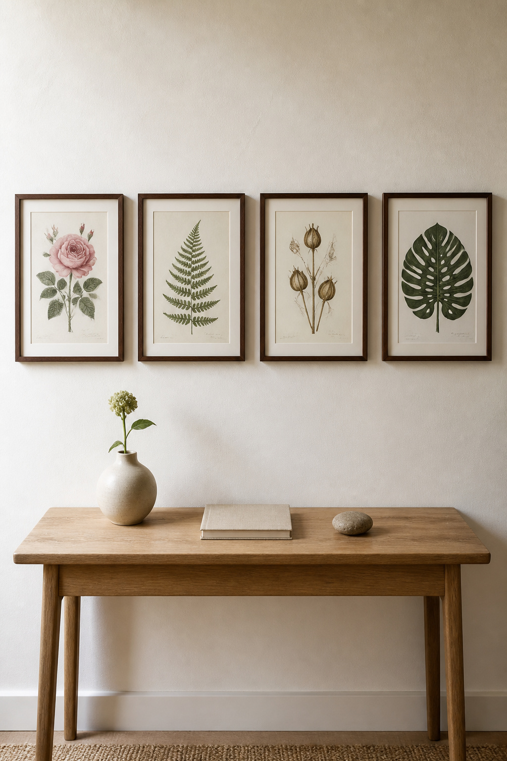
A botanical print series works in almost any interior. The key is treating it as a series rather than a collection of loosely related prints: choose pieces that share a plant family, a tonal palette, or a single illustrator’s hand, and the wall reads as intentional rather than assembled. For sourcing, the quality tiers are distinct. Authentic originals from the 18th and 19th centuries appear at auction and specialist dealers, typically priced from £50 to several hundred. High-quality giclée reproductions on 300gsm cotton rag paper — from studios like Charting Nature and Watercolor Botanicals — are excellent alternatives; the critical specification is archival (pigment-based) inks rather than dye-based, which fade within 10-15 years.
Frame simply: wood, gold, or black profiles in matching widths keep the series reading as a unified group. Arrange four prints as a 2×2 square above a console for formality, or as a horizontal row above a sofa for something more relaxed. Maintain exactly equal spacing throughout — 2-3 inches. The wall art ideas that work for botanical series in any room — equal spacing, consistent framing, tonal unity — translate directly here, whether you are displaying the prints in the living room or, as many do, extending the approach throughout the home. See also these bedroom wall decor ideas for how botanical series adapt beautifully to private spaces.
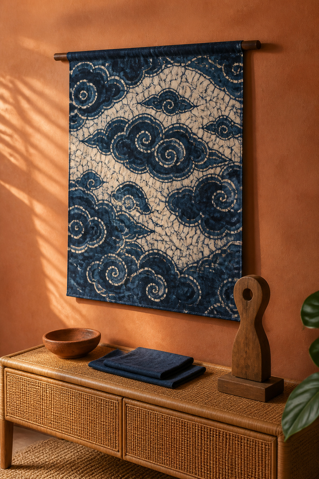
4. Woven Textile Wall Hanging: Living Room Wall Art With Texture and Soul
Flat art has one dimension of interest: the image. Woven textile wall art has three. The structure of the weave, the weight of the fibre, the slight movement when air circulates through a room — these are qualities that no print can replicate. This is why a well-chosen kilim or ikat, hung correctly, does more for a living room than a canvas of the same dimensions.
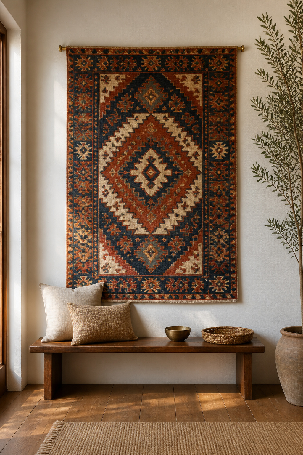
The Textile Traditions Worth Knowing
The traditions worth exploring each have distinct visual characters. Kilims are flat-woven — typically wool, sometimes cotton — in bold geometric patterns from Turkish and Central Asian traditions, available in jewel tones and earth tones from small vintage pieces at around £80 to substantial originals at several hundred. Ikat is softer: the yarn is resist-dyed before weaving, creating characteristically blurred edges at pattern transitions that give the cloth a painterly atmospheric quality distinct from kilim’s crisp geometry. Dhurrie, originating as everyday Indian cotton floor covering, brings a lighter touch — flat woven, often striped or geometric, increasingly prized as wall art for its refined palettes. For handmade originals by independent makers working in natural fibres, macramé ranges from £60-300+ for pieces from minimal sculptural forms to elaborate large-scale works.
This is the kind of living room wall art that accumulates meaning over time — a piece sourced from a specific market, a specific maker, or a specific trip carries a narrative that printed art cannot. The layered textile approach that defines the most compelling boho bedroom textiles for layered texture applies equally to living room walls.
Hanging It Properly
The tapestry rod method is the cleanest: a slim wooden or metal dowel through a sleeve at the top edge, suspended from two wall hooks. For kilims without a sleeve, carpet clips spaced every 12 inches along the top edge, hung from a picture rail, distribute weight without stressing the weave. Whichever method you choose, keep the piece out of direct sunlight — natural dyes fade faster than synthetic ones, and genuine indigo is particularly vulnerable to UV.
5. Black-and-White Photography Grid in Uniform Frames
There is a particular discipline in committing to monochrome. Removing colour forces engagement with composition, light, and subject — the qualities that separate good photography from mere record-keeping. A black-and-white photography grid in a living room is one of the few wall treatments that rewards sustained looking.
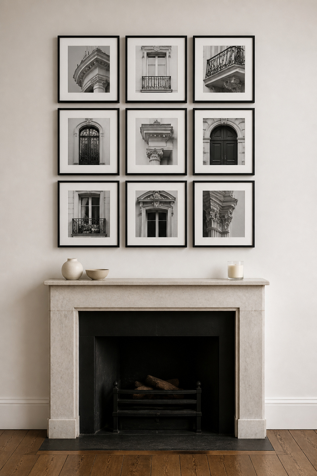
The format works because of uniformity, not despite it. Matching frames — and here, genuinely matching, not mismatched-but-harmonious — create the clean graphic structure that gives the photographs their full weight. Even slightly different blacks (matte versus gloss) undermine the effect. Square prints work particularly well: 8×8 or 10×10 inch prints in a 3×3 arrangement create strong, balanced impact. For spacing, divide the total wall width by the number of frames in the top row and account for 2 inches between each — this gives equal spacing without manual calculation.
Subject matter determines whether the grid feels personal or generic. Personal photography in a uniform grid transforms meaningful images into art — the repetition and consistency of format elevates even quiet subjects. Thematic curation matters more than subject: nine landscapes from one trip, nine architectural details from one city, nine portraits from one decade of family life — these have the internal logic a grid needs. For art prints rather than personal photography, architectural photography, documentary series, and abstract macro photography all suit the format well.
6. Artisan Brass and Copper Wall Sculptures for Dimensional Interest
Flat art creates visual interest. Sculptural metalwork creates light. A well-chosen brass or copper wall piece redirects and fragments light throughout the day — a single hand-hammered copper panel in a north-facing room can cast warm highlights across an otherwise dim wall. This is living room wall art working in a way no print can.
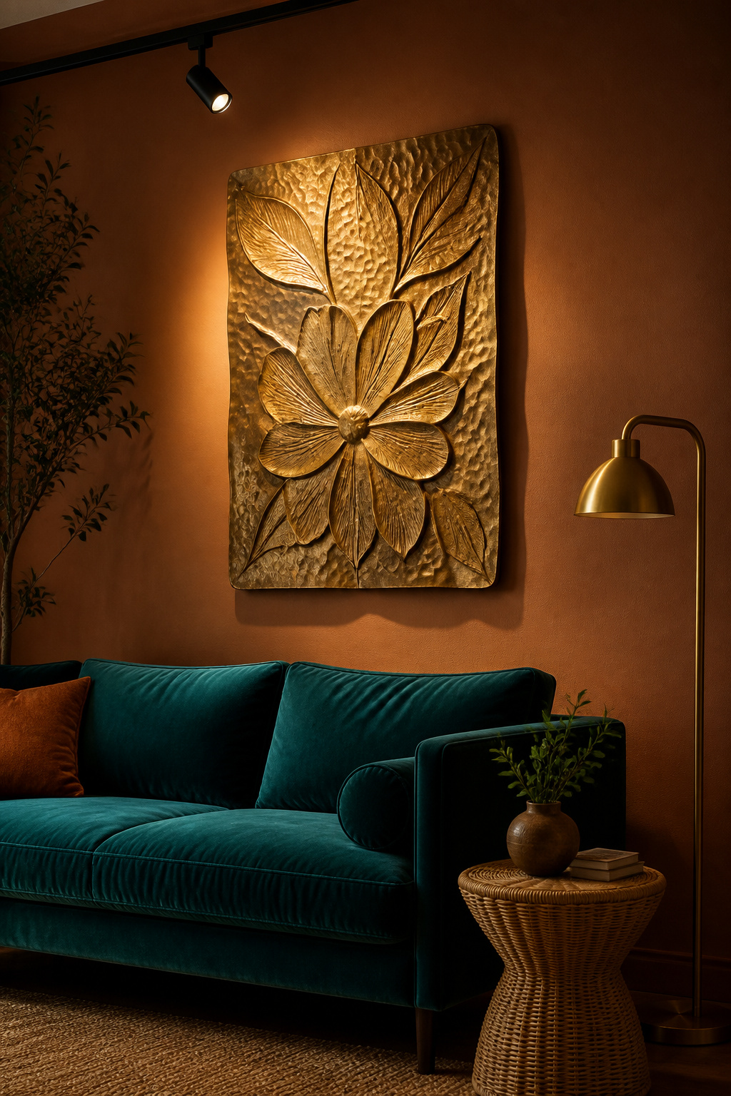
Each sheet of hand-hammered metal is worked cold: struck hundreds of times by the craftsperson’s hammer, creating a surface where no two facets are identical and light plays differently at every angle of view. Place a sculptural piece near a window or under adjustable track lighting, positioned 12-18 inches to one side and angled toward the piece, and the shadow play becomes genuinely dynamic.
Materials have distinct personalities. Copper develops natural verdigris over time — a greenish patina impossible to replicate convincingly — and suits earth palettes and terracotta. Brass reads warm and formal, pairing naturally with dark wood and rich textiles. In layered interiors, a mix of warm metals — copper beside iron, brass alongside bronze — adds texture without clutter, as long as all metals sit in the warm tonal range. This is one of the approaches that makes creating a luxurious living room atmosphere feel genuinely accomplished rather than merely expensive.
For sourcing, Moroccan and Indian artisanal traditions produce the majority of serious hand-hammered brass wall art. Platforms like 1stDibs serve the vintage and gallery end; NOVICA connects buyers directly with verified artisan makers. Small pieces start at £40-80; larger commissioned works reach £200-800+.
7. Vintage Map and Travel Print Display as Living Room Wall Decor
A pre-20th century cartographic map shows the world as it was understood — incomplete coastlines, mythological sea creatures in the ocean margins, political borders that no longer exist. This is not a flaw but the primary appeal: the map is a document, and documents provoke questions in a way that purely decorative prints rarely do.
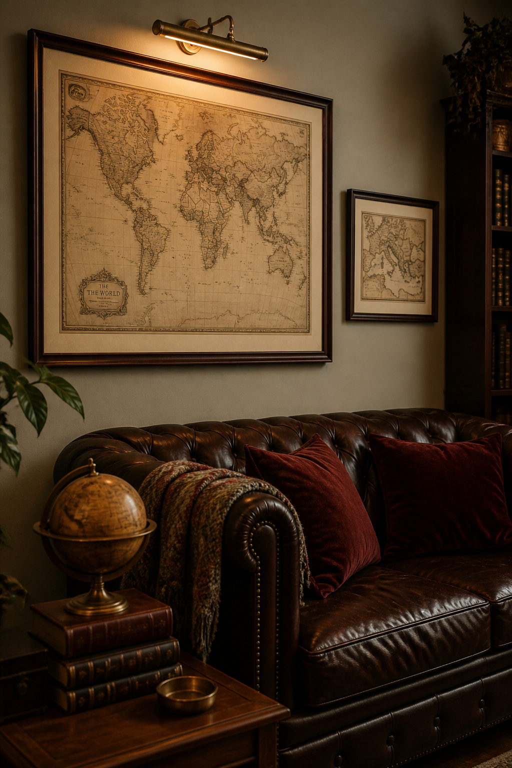
Authentic vs. Reproduction
For sourcing, the quality tiers are clear. Authentic originals from the 16th to 20th centuries are available from specialist dealers — Antique Maps and Prints includes a Certificate of Authenticity with every piece, with prices from under £100 for 19th century ephemera to considerably more for 16th century originals. Quality reproductions from studios like Ted’s Vintage Art, printed on museum-quality paper with archival inks, are visually indistinguishable from originals at living-room viewing distance. Avoid reproduction map prints on thin paper (under 180gsm) or with bright-white grounds — neither reads as period-appropriate.
Framing choices shift the mood entirely. Dark walnut reads as library elegance. Brushed brass introduces subtle modernity. Floating frames or distressed wood enhance the historical illusion. A single large map above a sofa or console works beautifully as a statement; a cluster of three maps sharing the same visual style — all sepia, all the same era — works as a curated collection. Pair with layered accessories: a small globe on the shelf below, a stack of travel books on the coffee table, and the narrative extends into the room.
8. Hand-Crafted Ceramic Tile Panel as a Cultural Focal Feature
Iznik tiles began in 15th-century Turkey and flourished under the patronage of Sultan Suleiman the Magnificent, decorating mosque interiors and palace rooms with their characteristic cobalt blue, turquoise, and red-on-white ground. The Portuguese azulejo tradition, the word derived from Arabic ‘az-zulayj’ meaning small polished stone, covers palace interiors and church facades with narrative scenes in blue and white. These are not decorative traditions borrowed by interior design — they are genuinely ancient art forms that happen to translate beautifully to a living room wall.
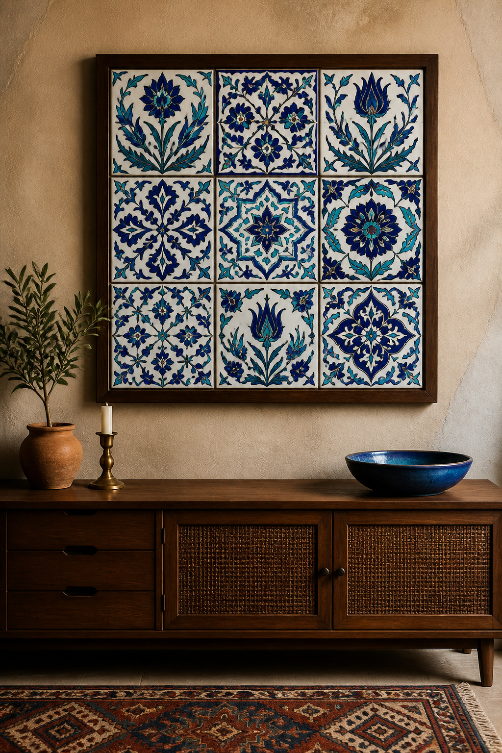
A single handmade ceramic tile panel brings craft authenticity to a living room that even the most carefully curated print collection cannot match. Contemporary master artisan Mehmet Gursoy is considered Turkey’s foremost Iznik practitioner, extracting principles from 15th-17th century originals to create new panel works that have appeared in institutional exhibitions.
Ready-made options are increasingly accessible: We Are Portugal sells hand-painted 5.5-inch azulejo tiles; Etsy connects buyers with verified Iznik-tradition artisans; Beltile stocks Turkish handmade tiles for direct purchase. Commissioned panels allow custom sizing, pattern, and palette, with lead times of 8-16 weeks and prices starting around £300 for A3-sized pieces.
Weight is what most buyers overlook. A 30x30cm ceramic panel typically weighs 2-4kg — standard picture hooks rated for 5kg work for single tiles, but larger multi-tile panels need wall anchors or toggle bolts. Use steel braided wire with D-ring hangers rather than sawtooth hangers for stable weight distribution, and place foam pads on the back corners of any frame to protect the plaster wall surface.
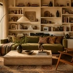
9. Floating Shelf Vignettes That Blend Objects and Framed Art
Living room wall art does not have to be flat, or framed, or even primarily visual. A floating shelf display treats the wall as a stage — objects at different heights, depths, and scales create visual rhythm in three dimensions — and framed art functions as backdrop within the arrangement rather than as a discrete hanging. The effect is more layered, more personal, and more changeable than a conventional gallery wall.
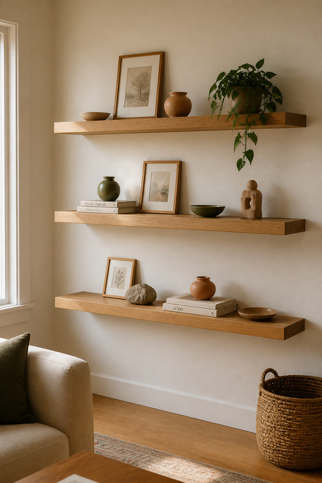
The critical principle is restraint: fill 60-70% of the shelf and leave 30-40% empty. Negative space in a vignette is not wasted — it gives the eye a resting point and allows individual pieces to read clearly. A fully loaded shelf reads as storage. An intentionally edited shelf reads as art.
Group objects in odd numbers and vary their heights: a tall ceramic vase, a medium framed print leaning against the wall, and a small stone object creates movement within a tight cluster. Mix at least three different material types — ceramic, wood, and paper or glass — to create the tactile contrast that makes the eye move pleasantly across the surface. These cozy living room styling principles around material layering and negative space apply directly to the shelf vignette approach.
A picture ledge (IKEA’s MOSSLANDA is the widely available starting point) changes the game for rotating arrangements: prints lean on the ledge and can be swapped without new nail holes. Build a small rotating reserve of objects and prints not currently on display, stored tidily in a drawer or low cabinet, so refreshing the vignette takes minutes rather than a shopping expedition.
10. Antique Mirror Grouping: Statement Living Room Art That Multiplies Light
Antique and vintage mirrors are, uniquely, living room wall art that also functions. They reflect light, expand apparent space, and double the visual interest of whatever stands near them. A grouping of three well-chosen mirrors on a north-facing wall bounces available daylight around a room that would otherwise feel dim — a practical benefit that no canvas or print can match.
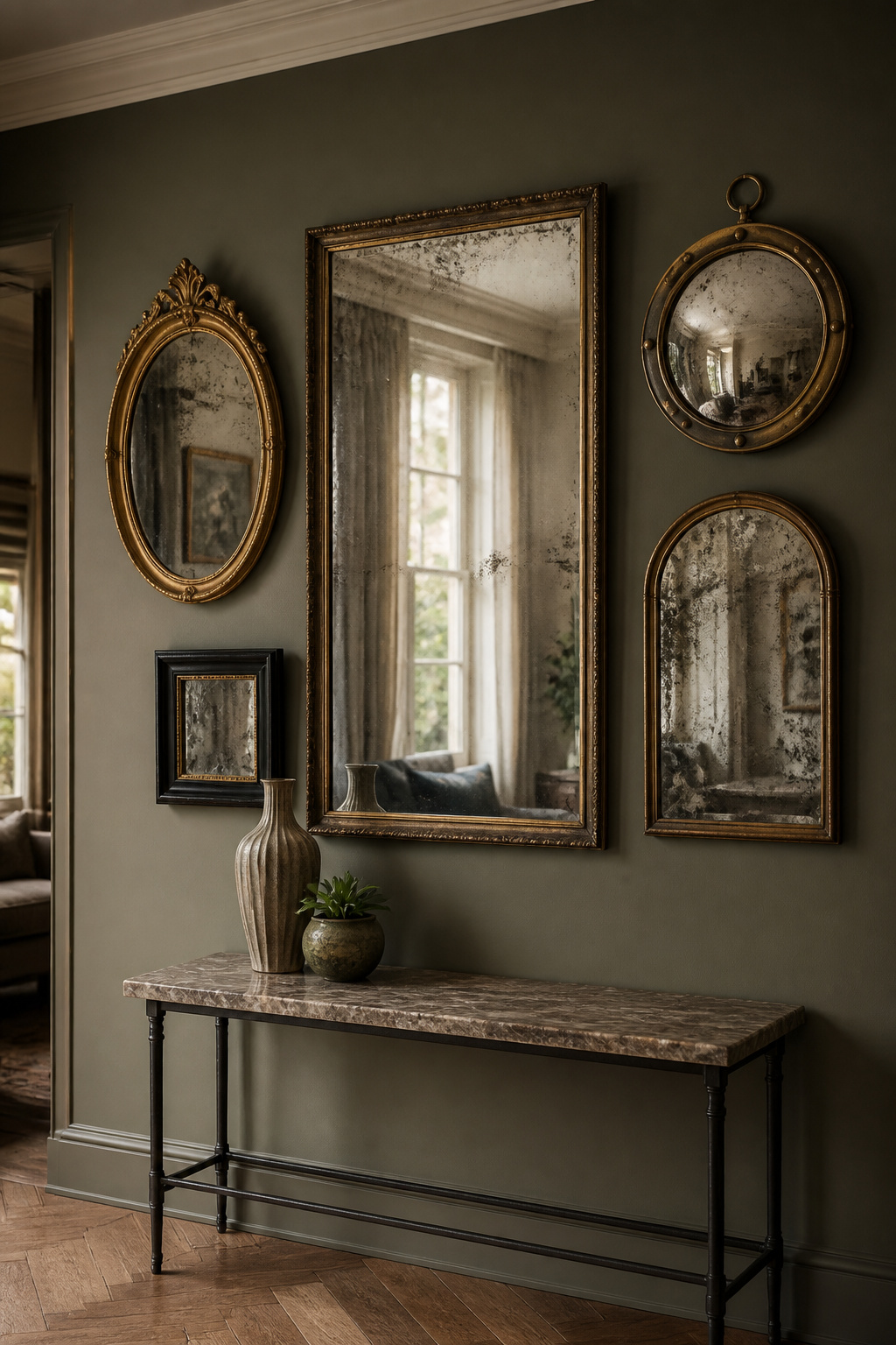
Foxed glass — the cloudy, brownish spots produced by oxidation on old mirrors — is highly prized not despite its age but because of it. The warm-toned surface hides fingerprints and marks better than clear glass, and its aged quality cannot be replicated convincingly in reproduction. Venetian mirrors, with their intricate engraved detail originating in the glassblowing traditions of Murano island, bring the most visual complexity; gilt frames in Baroque and Empire styles add gold warmth that suits both rich traditional rooms and brighter contemporary ones.
For grouping, mix shapes freely — oval, round, arched, rectangular — within a consistent finish. A cluster of three differently shaped mirrors in the same gold tone creates a dynamic arrangement that reads as deliberately collected. Position mirrors to reflect something beautiful — a window, a plant, a piece of art on the opposite wall. Do not place mirrors directly opposite windows (glare overwhelms in direct sunlight) or opposite each other (the infinite reflection effect is disorienting rather than elegant).
In small living rooms, one large antique mirror — 24 inches or wider — with an elaborate frame does more work than a grouping of smaller ones. The single piece reads as sculpture.
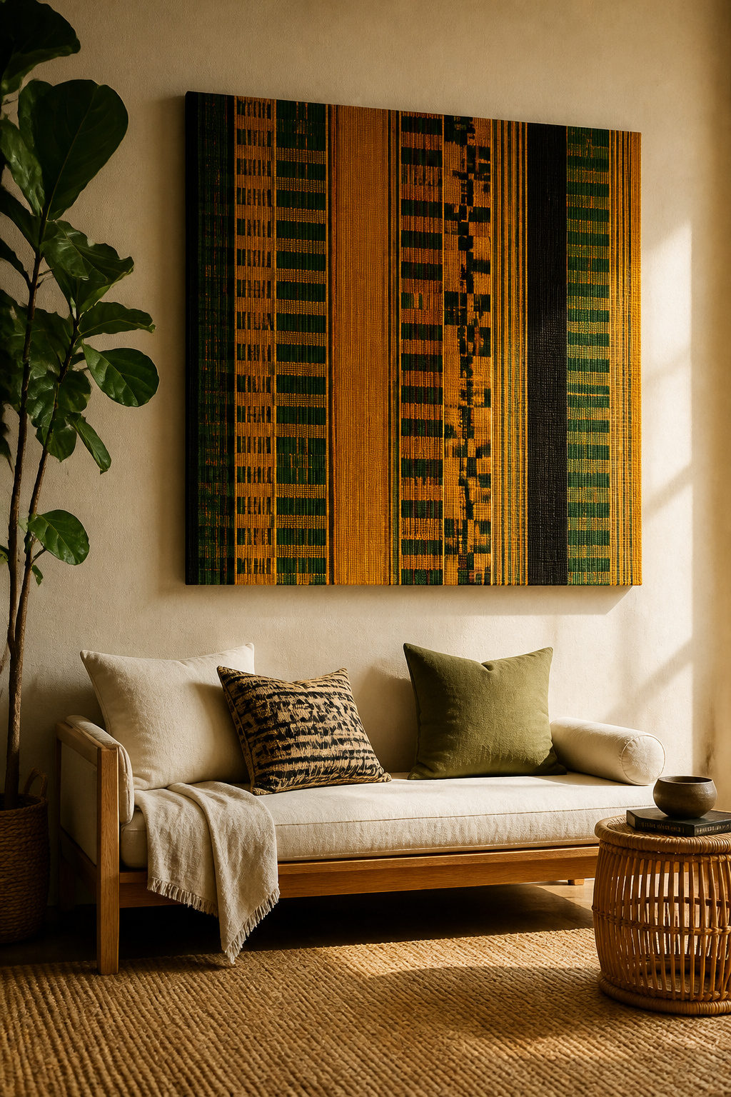
11. Maximalist Fabric Art Installation for Bold Pattern Impact
Stretched patterned fabric is one of the most cost-effective routes to large-format living room wall art. A £15 artist stretcher bar frame and a £30 piece of carefully chosen fabric produce a statement artwork that would cost considerably more purchased from a gallery. The craft is simple; the curation is everything.
Stretching and Pattern-Mixing
Artist canvas stretcher bars — available from art supply shops in almost any dimension — provide the rigid backing that keeps fabric taut and flat. Cut fabric 2-3 inches larger than the frame on all sides. Staple to the back of the bars starting from the centre of each side and working outward to the corners — this prevents puckering and keeps the pattern centred. Use medium-weight fabric or heavier; thin voile shows the staples through the front.
Pattern-mixing within a collection of fabric panels follows one rule: vary scale and density, but share at least two colours across all pieces. A neutral anchor — a plain linen piece in the collection’s key neutral — gives the eye a resting point between bolder elements.
Global Traditions for Living Room Scale
The traditions that translate particularly well to living room scale include Ghanaian kente (woven in narrow strips then sewn together, creating a distinctive strip-pattern structure that reads powerfully at size), Uzbek suzani (hand-embroidered large cloths in floral motifs on cotton or silk ground), and Indian block-printed cotton from Rajasthan and Gujarat (each block impression slightly irregular, giving handmade character). For those drawn to this approach, boho living room ideas with global textiles offer further inspiration for layering these traditions into a coherent room.
12. Architectural Line Drawing Series for Understated Sophistication
There is a kind of confidence in restraint. A single assured line drawing — architectural elevation, botanical contour study, or abstract gesture in sumi ink — in a large frame with generous white space around it can hold a wall as effectively as a full-colour painting of twice the price. This is living room wall art that rewards careful looking rather than quick appreciation.
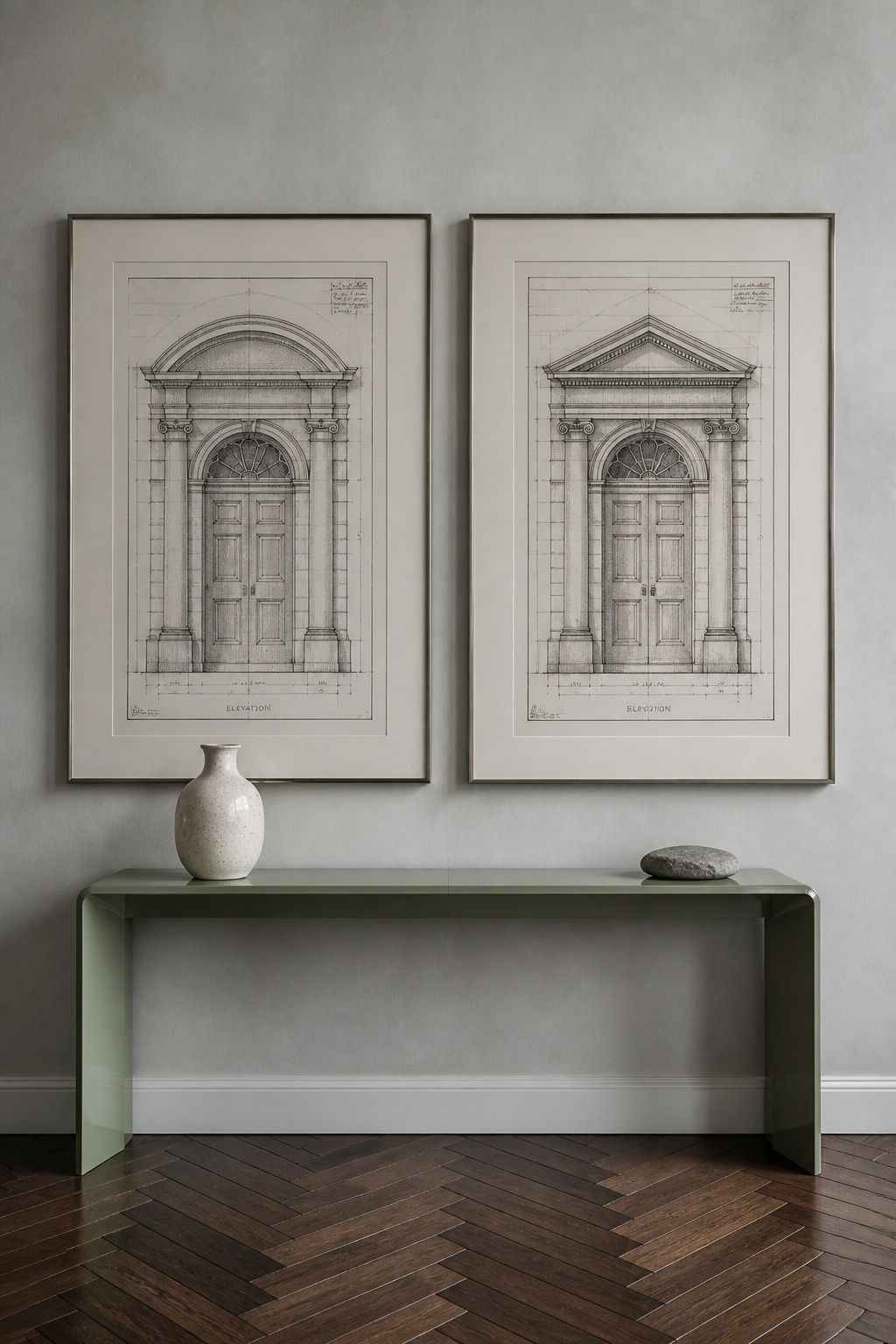
Scale is non-negotiable. A line drawing in an A4 frame disappears. The same drawing printed at A1 or larger, mounted with a linen mat and museum glass, becomes a genuine room presence. Cotton rag paper — made without wood pulp — is the correct choice for printing: it will not yellow over time, and its surface texture makes ink lines appear to sit within the paper rather than on it. Float mounting, where the print is suspended slightly away from the backing board casting a subtle shadow around its edges, elevates even an inexpensive print to something that reads as gallery quality.
For subject matter, architectural drawings have a technical precision that reads as sophisticated wall art for living rooms: hand-rendered elevation drawings, section studies, and blueprint-style plans are available from antique dealers and specialist print shops. Botanical line art — single-species drawings in pure ink without watercolour fill — suits minimalist and Nordic-influenced interiors. Avoid glossy glass for any line work; it reflects overhead lights directly onto the print surface and flattens what should be a quiet, meditative piece.
13. Batik and Natural Dye Wall Art for Living Rooms With Global Character
Batik tulis — the handdrawn version of the Indonesian wax-resist technique — is made one line at a time, with molten wax applied through a canting tool: a small copper cup with a fine spout that functions like a precise drawing instrument. A single complex piece can take weeks to complete. The crackle effect that distinguishes authentic batik (wax breaking as fabric is crumpled into dye, allowing colour to penetrate the cracks in fine networks of line) cannot be replicated in machine printing. Indonesian batik earned UNESCO Intangible World Heritage designation in 2009.
The Cultural Context
The visual traditions each carry specific significance. Javanese batik features ancestral motifs — the parang pattern of diagonal waves, the kawung of interlocking circles, the megamendung cloud pattern from Cirebon — once reserved exclusively for the Javanese royal court. West African batik incorporates the Adinkra symbol system: Gye Nyame, meaning ‘except for God’ and representing divine omnipotence, appears in Ghanaian batik alongside Kente-inspired colour combinations of gold, green, and red. Indian resist-dyeing traditions, particularly from Rajasthan, produce different visual character again: flowers, animals, and geometric forms in warm earth pigments.
Sourcing and Display
Sourcing through NOVICA and Etsy connects buyers directly with verified artisans — look specifically for descriptions of the canting tool or cap-stamp process, which confirm genuine craft. Ask whether natural or synthetic dyes were used: natural indigo produces a slightly greenish-blue impossible to replicate exactly, and it is the most light-sensitive. Display options: stretched over a canvas frame preserves the textile’s surface texture; a hanging rod maintains the cloth’s natural drape; a shadow box frame protects precious or delicate pieces. Avoid direct sunlight regardless of mounting method.
14. Hand-Carved Wooden Relief Panels for Tactile Wall Presence
Wood relief carving creates depth that is not optical illusion but physical fact. The shadows cast by raised elements shift throughout the day as light changes angle — and this changes as the seasons change, as morning gives way to afternoon, as artificial light replaces natural. The material itself adds warmth: natural wood grain under carved surfaces brings a tactile richness distinct from both textile art and metalwork.
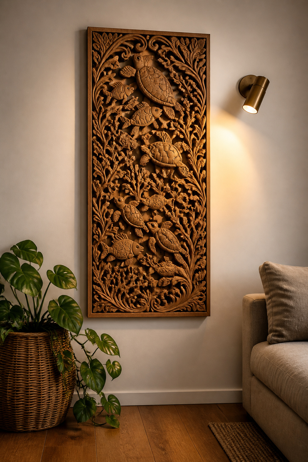
Three Traditions Worth Sourcing
Balinese carvers produce relief panels from suar and cempaka wood with intricate ocean life scenes, Sanskrit symbols, and mythological narratives, hand-carved from single pieces of timber — available from around £40-300+ depending on size and complexity. Moroccan workshops in Marrakech produce solid cedarwood panels carved with arabesque and geometric Moorish patterns; the deep angular relief characteristic of Islamic geometric art creates strong shadow play at any light angle. West African tribal storyboard carvings from Ghana, Benin, and Nigeria function as both artistic and historical objects, available through specialist African art dealers and platforms like 54kibo.
Installation and Lighting
Heavy pieces require proper fixings. A 35×14 inch Balinese panel typically weighs 3-6kg — always use two mounting points for pieces over 3kg, as a single central hook creates uneven weight distribution. For pieces over 5kg, a French cleat (a wooden rail system available from hardware stores) is the most stable solution. To maximise the shadow play that makes carved wood so compelling, position a wall sconce or adjustable track light 12-18 inches to one side of the panel and angled toward it.
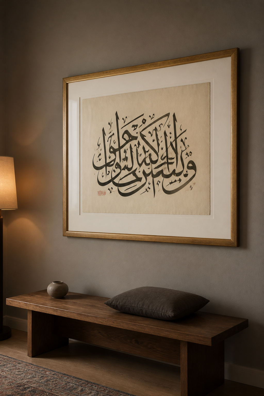
15. Contemporary Calligraphy and Script Art as a Living Room Statement
Calligraphy is one of the oldest continuous art forms in human history, and it remains actively practiced across traditions — Arabic, Devanagari, Chinese, Japanese, and the Western pointed-pen revival — by working artists who spend years mastering control of line, pressure, and movement. The visual character of each is distinct: Arabic Thuluth script has vertical monumentality; Devanagari’s characteristic Shirorekha (the horizontal line running along the top of letters) creates strong linear structures with dramatic vertical strokes below; sumi ink on xuan paper captures the speed and gesture of the brush directly in the mark.
Commissioning vs. Prints
A commissioned original from a working calligrapher is genuinely unique — you specify the text, the script tradition, the size, and the surface, and the artist applies the work by hand. Instagram is surprisingly effective for finding serious practitioners; accounts showing in-process photographs of hand lettering confirm the work is genuinely handmade. Prices for commissioned Arabic calligraphy start around £80 for A4 size; complex large-scale works on premium surfaces reach £300-500+. For print reproductions, verify that the seller is printing from their own original work rather than sampling from another artist.
Display Principles
The framing and surrounding context determine whether a calligraphic piece reads as art or as typography. A large format — A2 or bigger — with generous white or cream mat gives the script the breathing room it needs: white space around calligraphy is part of the composition. Avoid surrounding calligraphic work with other text-based elements — letter cushions, typographic prints, word-based art objects all compete with the primacy of the calligraphic piece. The same curatorial restraint that makes bathroom art ideas for art-forward spaces work — one strong piece, given room to speak — applies here with equal force.
16. Shadow Box Frames: Living Room Wall Art in Three Dimensions
A shadow box frame does for an everyday object what a museum vitrine does for an ancient artefact: it gives it the presentation that signals this deserves your attention. The glass front, the backing board, the deliberate arrangement — these are the visual grammar of significance. And because the objects inside are specific to one life and one set of travels and experiences, no two shadow box collections are ever identical.
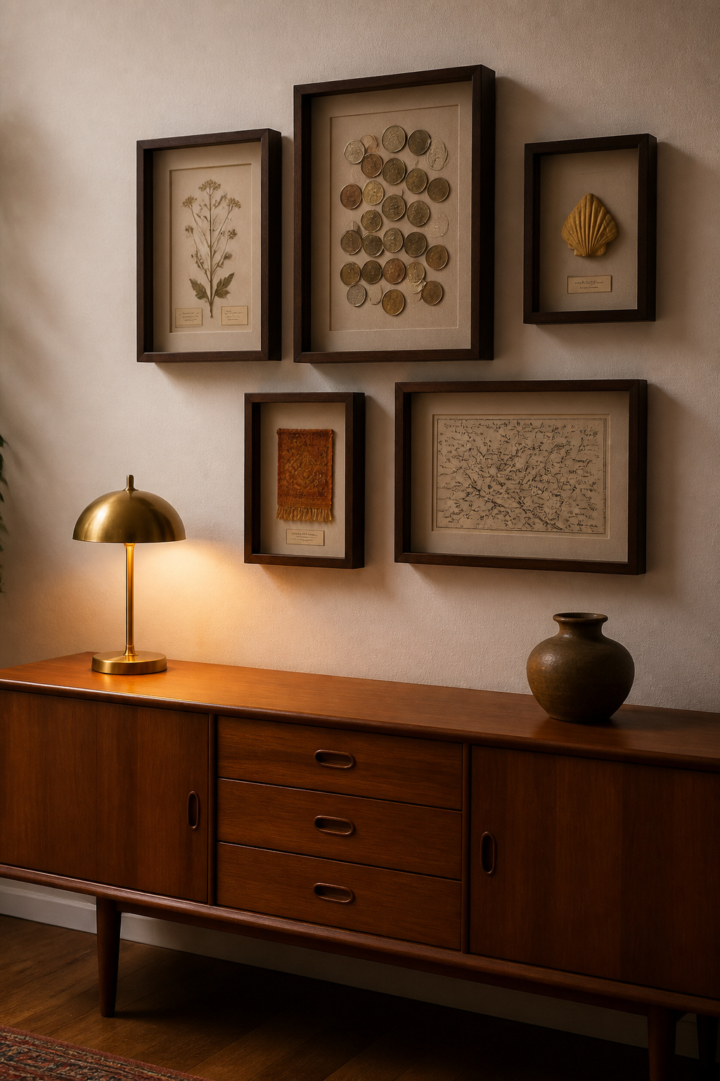
The depth of the box — typically 1 inch for flat items to 4 inches for three-dimensional collections — creates physical shadow at the edges of objects. This is not simulated depth but real shadow, cast in real light, changing as the room’s light changes throughout the day. Shadow boxes work particularly well for objects too small to read in a room on their own: coins, small fossils, pressed botanicals, fragments of meaningful fabric — things that disappear on a shelf but come alive under glass.
For content, travel mementos are the most narratively rich: banknotes and coins arranged by region, small textile squares from market purchases, printed ephemera from significant places. Botanical specimens — pressed flowers and leaves, dried seed heads, shells, and lichens — give the feeling of a Victorian natural history cabinet. Textile fragments have particular potency: a section of embroidery from a damaged piece, a square of significant cloth mounted on linen or velvet backing.
Before fixing anything inside, arrange objects on a flat surface and photograph the result. Shadow boxes range from 8×10 inches to 24×36 inches. Grouping three to five in varied sizes creates a cluster with genuine three-dimensionality — plan the wall arrangement on paper before making holes. Use acid-free mounting board, not foam-core, for anything with material or sentimental value: foam-core off-gasses and can damage objects over time.
17. Curated Art Print Rotation System for a Living Room That Evolves
Art that never changes becomes invisible. The brain habituates to familiar stimuli and stops registering them — which is why a print that excited you the day you hung it can go completely unnoticed six months later. A rotation system solves this: a collection of 15-20 prints, with 5-6 on display at any one time and the rest in reserve, delivers perpetual freshness without perpetual purchasing.
Building the Display System
Picture ledges — shallow shelves that allow prints to lean rather than hang — make rotation genuinely easy. IKEA’s MOSSLANDA is the widely available starting point; Shelfology and custom carpentry offer better-built alternatives. Prints change position on the ledge without a single new nail hole. For more formal presentations, a gallery rail system — ceiling-mounted or installed at high-wall level, with adjustable wire drops and hooks — allows precise height adjustment for any print size without touching the wall surface. Most experts recommend quarterly rotation; seasonal shifts in living room wall art align satisfyingly with seasonal shifts in light, mood, and how the room is used.
Storage and Collection-Building
For unframed prints between rotations: flat file storage is the professional standard, keeping prints horizontal in wide shallow drawers without rolling or stacking. Archival tubes with end caps protect rolled prints, but always roll loosely with the image side outward — tight rolling creates irreversible creases. Photograph each piece and label clearly; a simple spreadsheet or dedicated app like Artwork Archive makes retrieval decisions straightforward.
Building a collection works best with a consistent theme — a geographical focus, a material preference, a colour family — rather than opportunistic buying. Start with limited-edition prints from independent artists: these carry more authenticity than open-edition reproductions and may appreciate in value. Platforms like Artsy, Saatchi Art, and Not On The High Street serve different ends of the market. The collection builds over time; the living room wall art it creates evolves with it.
Choosing the Right Living Room Wall Art for Your Space and Story
Before committing to any approach, start with three practical assessments.
Measure the wall. Note its full dimensions, any architectural interruptions — power sockets, switches, ventilation — and the relationship to the furniture below or beside it. A wall with a sofa in front calls for living room wall art that relates to the sofa in scale; an empty wall above a console calls for something different.
Assess the light. Visit the wall at different times of day. Morning and afternoon light change colour temperature dramatically — a print that reads warm and rich under east morning light can appear flat and cool under west afternoon light. Metalwork and mirror groupings change more dramatically still: a brass wall sculpture at dusk, lit by a warm-toned lamp, looks entirely different from the same piece at noon under flat daylight.
Check the palette. Pull the three dominant colours from the room’s existing furnishings and find art that incorporates at least one of them, even as a minor element. This is not about matching — it is about connection.
Then choose one wall and one approach, and invest in it properly before addressing anything else. The most common mistake in living room decorating is attempting to resolve every wall simultaneously, producing a diluted version of five different ideas, none executed with full conviction. Identify the primary focal wall — the one facing the entrance, or above the main sofa — and put one genuinely strong piece there. Live with it for a few weeks. What the room needs next will become clear in a way it never could have from an abstract plan.