The bathroom might be the last place you’d expect to find bathroom art ideas flourishing, but it’s actually one of the most rewarding spaces to curate. Maybe it’s because bathrooms feel intimate and temporary—a few minutes alone to notice details—or maybe it’s because they’re small enough that even one thoughtful piece can completely shift how the space feels. Whatever the reason, I’ve found that treating your bathroom as a gallery creates something genuinely magical.
I’ve spent years integrating bathroom art into creative homes, and the bathroom consistently surprises me. These spaces have constraints, sure—moisture, limited wall space, small square footage—but those constraints are exactly what make curating bathroom art so satisfying. You’re not working with a sprawling living room wall where everything fades into background noise. You’re working with an intimate canvas where every choice matters.
The approach I’m sharing here isn’t about filling your walls with anything and everything. It’s about being intentional. A single oversized print often creates more impact than six tiny ones. A gallery wall above the tub becomes calming rather than chaotic when you follow specific spacing rules. Bold abstract pieces work in bathrooms because they transcend context. The goal is a space that feels curated, personal, and utterly yours—not decorated, but designed.
Let’s walk through 18 powerful approaches for bathroom art ideas, with the practical details you’ll actually need to make them happen.
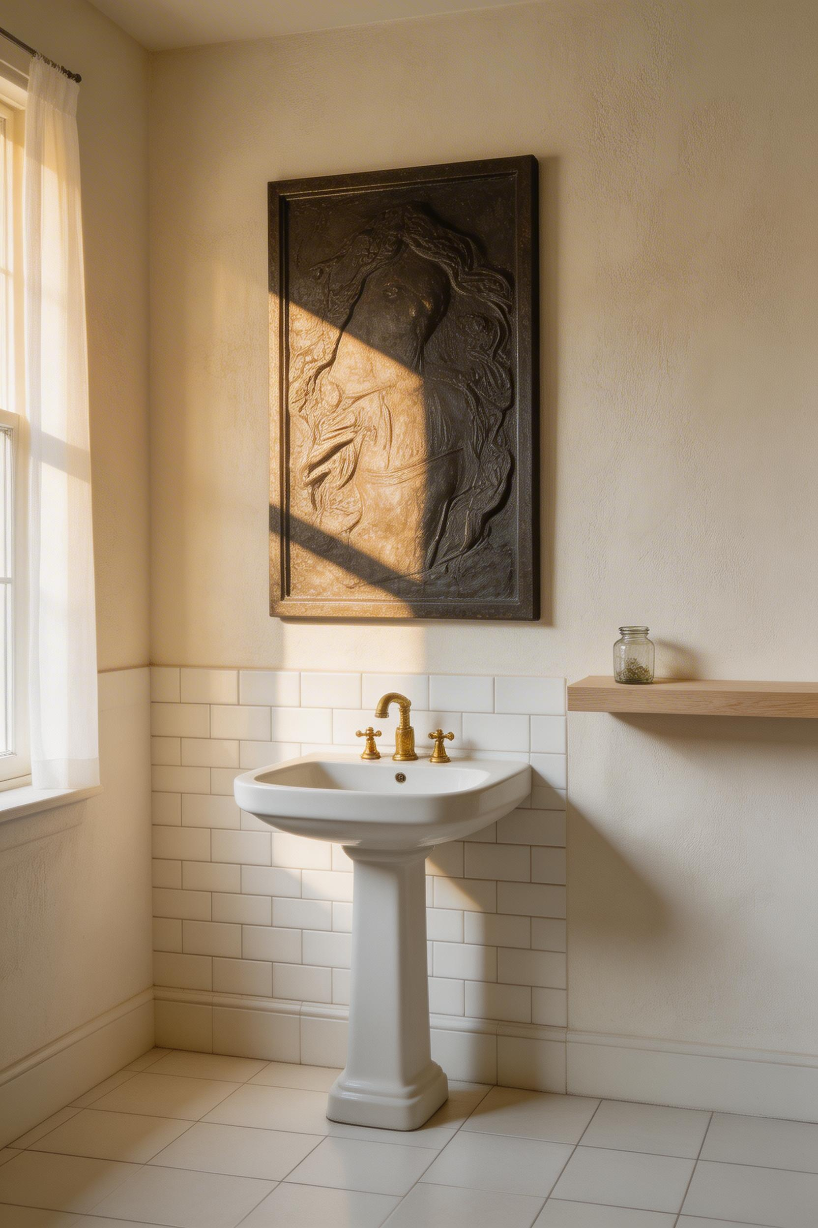
1. Oversized Statement Print as the Room’s Anchor
There’s a psychology to scale that most people feel but don’t articulate: one large print reads as *chosen*, while six small ones can feel like you’re filling space. A 24×36 to 48×72 inch print becomes the room’s anchor the moment you hang it.
This works because of basic visual physics. In a small bathroom, your eye focuses on the largest object in your line of sight. When that object is art, the entire space feels intentional. You’re also using the wall strategically—high-impact versus scattered—which is exactly how a gallery curator thinks. Small rooms with large art actually feel *more* spacious because your eye settles rather than jumps from piece to piece.
The subject matters enormously. You want something that coordinates with your existing palette without being literally matchy. Bold abstract prints, high-contrast botanical illustrations, architectural photography, and single-color field paintings all work beautifully. Avoid overly busy images with five competing colors—that’s where bathrooms become visually overwhelming.
Placement is everything. Center your print at eye level, which means roughly 57-60 inches from the floor to the center of the frame. If it’s hanging above a vanity, leave at least 8-12 inches of clear space above the fixture. This proportional spacing is what separates “art on the wall” from “curated gallery aesthetic.”
For framing in humid bathrooms, skip wood frames if you can—they absorb moisture and warp over time. Metal frames, acrylic, or sealed wood work far better. If you love the look of wood, apply polyurethane sealant before hanging. Canvas-wrapped prints are genuinely superior to framed paper in bathrooms; they hold up to humidity better and can be wiped clean if needed.
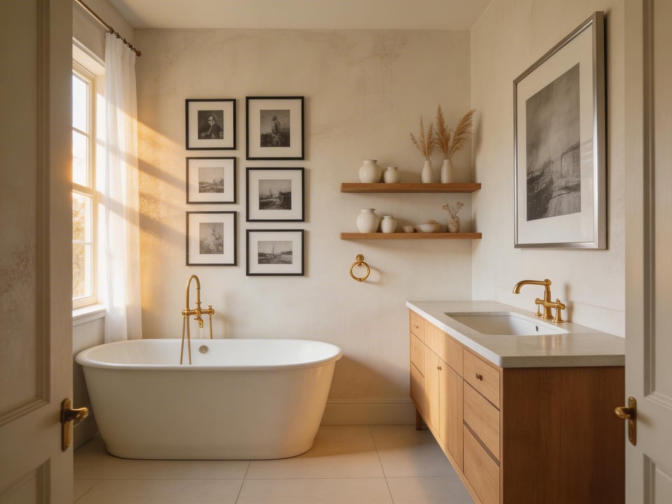
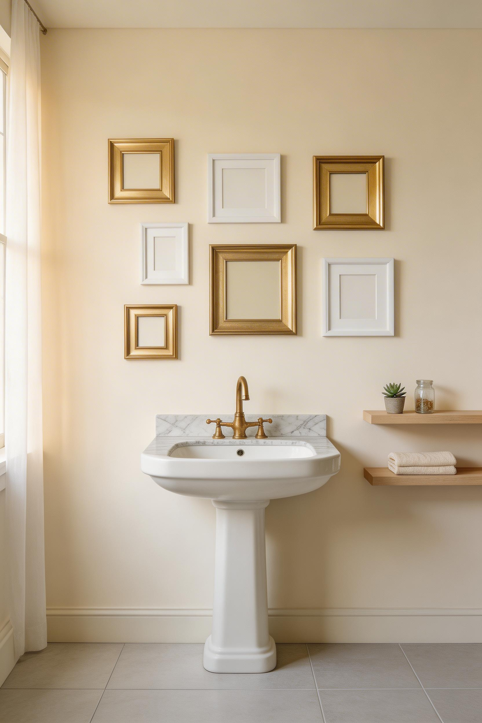
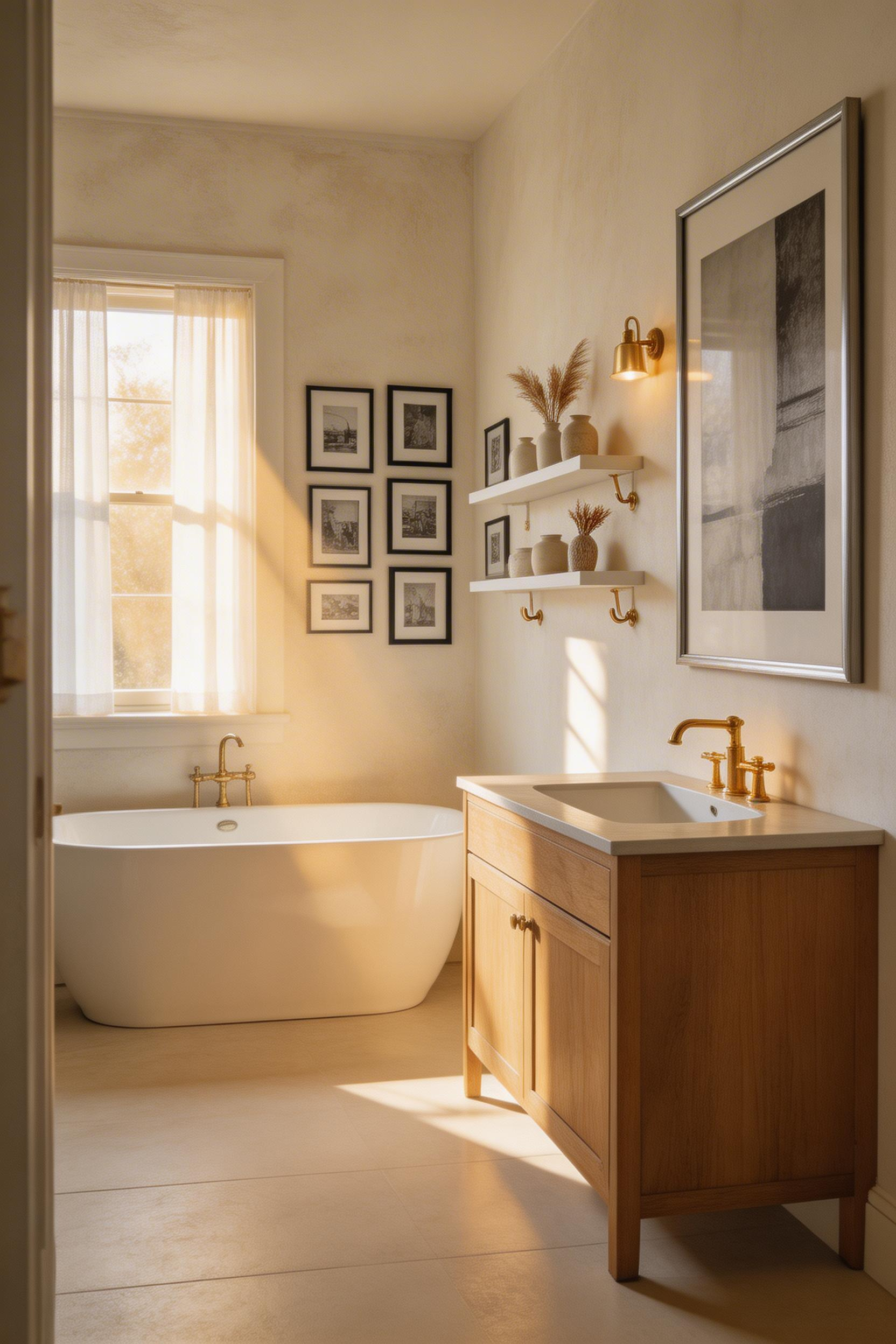
2. Black-and-White Photography Gallery Wall Above the Tub
A gallery wall above the tub feels like luxury, but the secret is constraint: monochrome removes the single biggest design question that makes people freeze—color coordination.
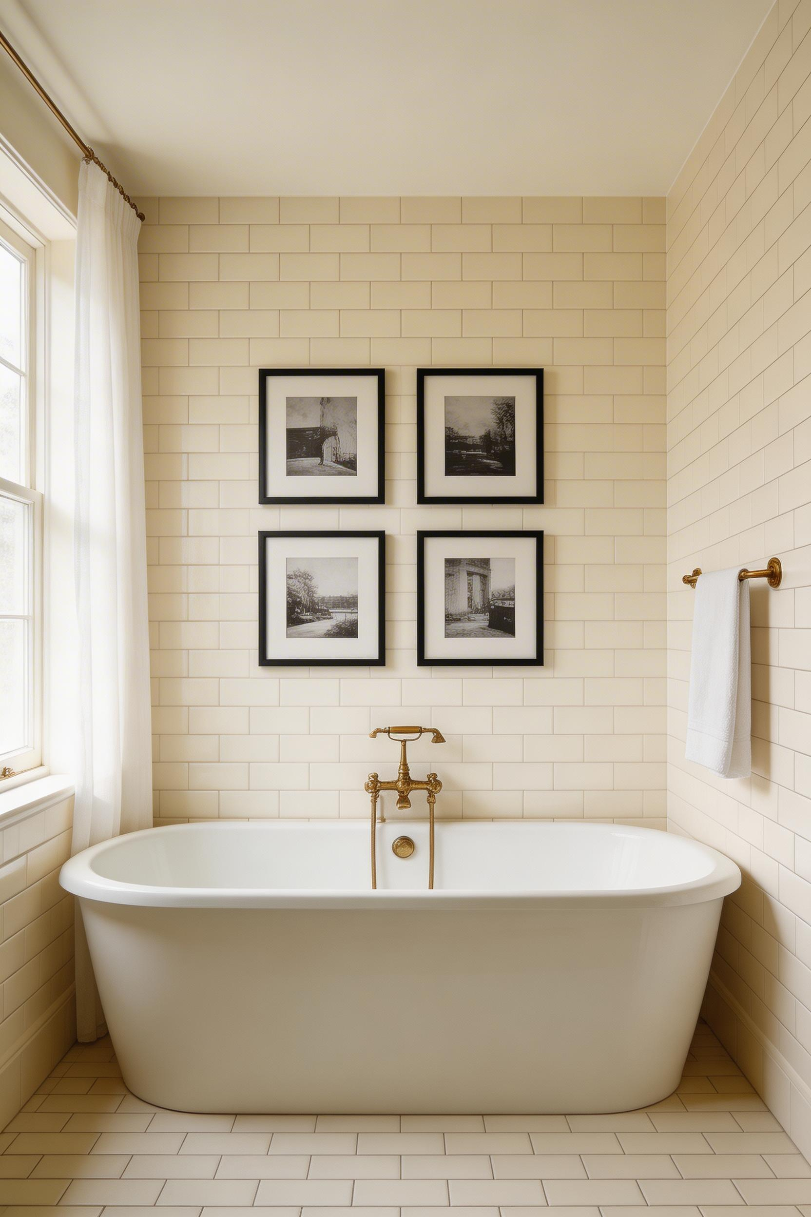
Black-and-white photography is *calming* in a way that color sometimes isn’t. There’s something restful about looking at architecture, nature, or portraiture stripped to essential contrast and form. This is why monochrome gallery walls work so well in bathrooms: they’re visually interesting without overstimulating.
The sweet spot is three to five framed pieces. Beyond that, the arrangement becomes complex and visually heavy. Within that range, curate around a single theme: all architecture, all landscape photography, all portraiture, or even a tighter focus like “abandoned buildings” or “water scenes.” The continuity matters more than individual frames.
Space your frames with 2-3 inches between them and maintain that gap consistently throughout. It sounds fussy, but it’s what prevents a gallery wall from looking accidental. Use a level or painter’s tape to map the arrangement before you hang anything.
Hardware choices matter in bathrooms. Moisture-resistant steel picture hooks are your best bet; adhesive strips rated for humidity (like 3M Damage-Free Picture Hanging Strips) work if your prints are lightweight. Avoid adhesive alone on paper—it fails eventually with condensation.
Canvas-wrapped black-and-white prints handle humidity better than framed paper, and acrylic glazing beats standard glass for moisture resistance. If you’re investing in pieces you love, archival framing with UV glass and acid-free matting ensures they’ll last.
3. Abstract Color Field Art for Unexpected Drama
Here’s what shifted my thinking: abstract art doesn’t need to answer to bathroom-specific logic. It belongs in bathrooms because it belongs *everywhere*. There’s no question of “is this weird in a bathroom?”—abstract art simply *is*.
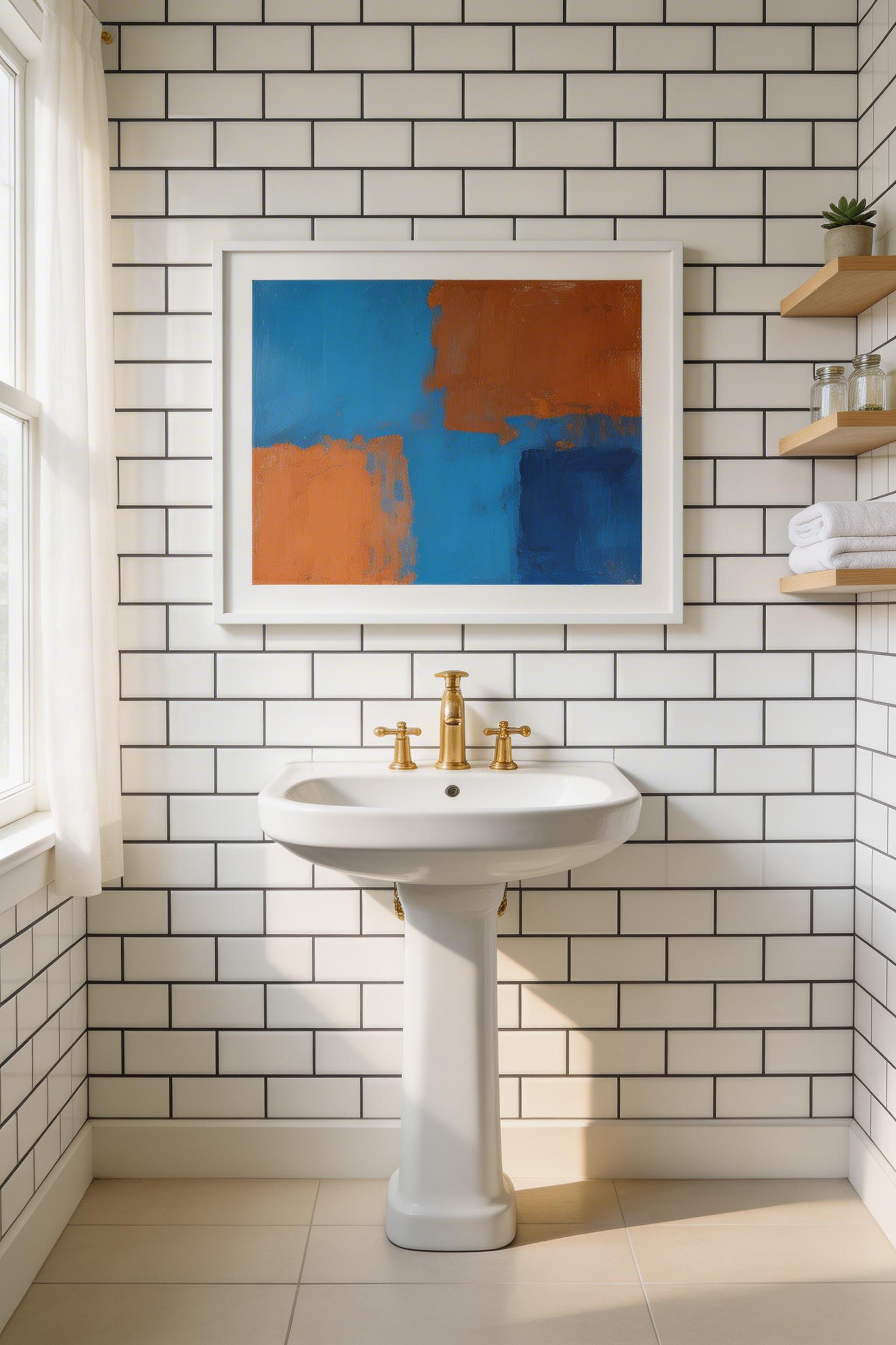
This matters more than it sounds. When you remove the “should this really be here?” question, you open up possibilities. Bold color fields, gestural abstraction, minimalist geometric compositions—they’re all suddenly viable because they’re operating on pure aesthetic principles, not thematic ones.
The key is pulling one or two tones from your existing palette rather than introducing five new colors into an already-tiled space. If your bathroom has blue tile, find an abstract print with blue as a secondary element. If your walls are warm gray, look for abstracts that echo that neutral. This creates visual rhythm rather than visual chaos.
The good news is that abstract prints are wildly available and affordable. Society6, Etsy, and local artist markets stock thousands of options ranging from $40 to $400 framed. You can find something that fits your exact color palette and size requirements without significant hunting.
Bold color fields don’t overwhelm small bathrooms—when they echo your existing palette, they actually calm the space. Your eye recognizes the color as familiar and settles into it. It’s the *wrong* colors that create visual tension.
As you explore inspiring bathroom design trends, you’ll notice that the most sophisticated small bathrooms pair one statement piece with restrained everything-else. The abstract print becomes the focal point while white trim, minimal accessories, and consistent hardware keep the rest quiet.
4. Botanical Illustration Print Series With Cohesive Framing
Botanical art stays relevant. It works in contemporary spaces, rustic cottages, coastal homes, maximalist eclectic bathrooms, and minimal Scandinavian spaces equally. There’s something about plants that transcends style.
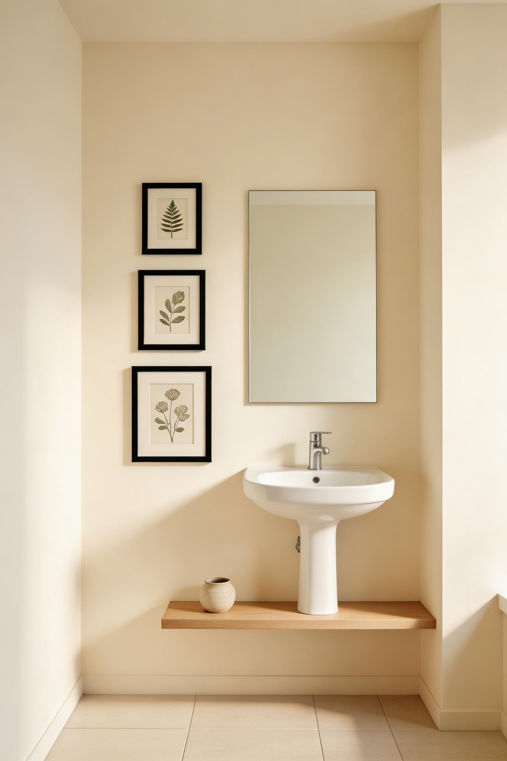
Building a cohesive botanical series is simpler than most people think. You need three to five prints, all in the *same frame color*—black, white, or natural wood—but varied *sizes*. Something like an 8×10, an 11×14, and a 16×20 creates visual rhythm without matching monotony. The frame consistency reads as curated; the size variation prevents it from feeling like a matching set.
Vintage botanical reproductions are genuinely beautiful. Etsy, Artesta, Living Spaces, and IDEA4WALL stock giclée prints on 250gsm acid-free paper—the archival kind—ranging from $25 to $150 framed. You’re getting museum-quality reproduction at accessible prices.
Canvas-wrapped botanical prints are worth the modest price increase for bathrooms. Paper-based prints in humid conditions are just asking for trouble—moisture seeps behind the glass, mold grows, and you’ve lost your investment. Canvas resists that entirely and can be spot-cleaned if needed.
The series effect is quiet but powerful. When someone walks into your bathroom and sees three to five botanical prints in matching frames arranged thoughtfully, it reads as intentional curation. It tells a story about the inhabitant—someone who noticed, chose, and arranged.
5. Vintage Poster Art With Graphic Typography
Vintage posters bring graphic energy. Travel posters, mid-century food illustrations, Art Deco advertising, 1970s movie posters—they add personality that feels both timeless and distinctly of their era.
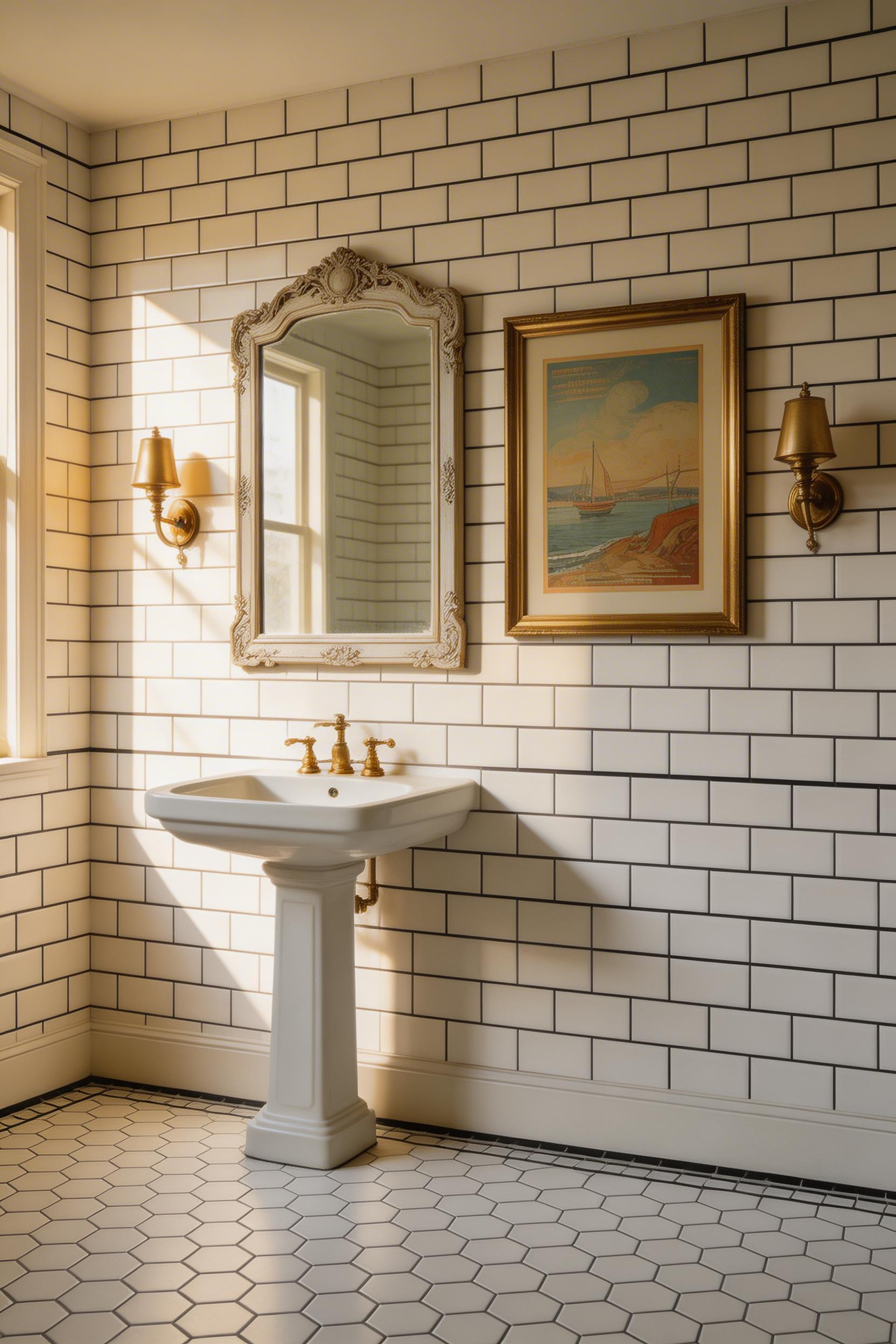
These work especially well in bathrooms styled with antique mirrors, vintage tile, or retro fixtures because they’re already in conversation with the space’s character. An Art Deco poster in a black-and-white tiled bathroom with brass fixtures feels intentional. A 1970s botanical food poster in a bathroom with honey-wood cabinets reads as authentically eclectic.
AllPosters, Art.com, and Vintagraph are your go-to sources for quality reproductions at $15-$50 each. If you’re after authentic vintage originals, expect $200-$2000+, depending on rarity and condition. For most people, excellent reproductions make far more sense—and honestly, the visual impact is nearly identical.
Typography-heavy posters deserve special mention. They add this graphic design studio energy, especially in white-tiled bathrooms with black fixtures. A poster where the composition is 60% text, 40% image functions almost like wallpaper—it’s pattern and statement combined.
One practical tip: when you’re looking at vintage or vintage-reproduction posters, authentic pieces show specific markers. Look for foxing (those small brown spots from age), yellowing, and plate marks from letterpress printing. These aren’t flaws—they’re authenticity markers. Reproductions should note if they’re deliberately aged. This matters if you’re mixing reproduction with original pieces.
6. Original Watercolor Art That Mirrors the Water Theme
There’s a logical appeal to watercolor in bathrooms—water theme, right? But I learned this the hard way: *don’t hang original watercolor paintings in bathrooms*. The humidity warps paper, mold grows behind mats, and you’ve destroyed something beautiful.
Instead, shift to limited-edition watercolor prints on archival paper, or if you’re set on originals, have them framed in sealed UV glass with conservation mats. This preserves the visual and emotional logic—translucent, soft edges that feel naturally aligned with water environments—without sacrificing the work to moisture.
Saatchi Art and Artfinder list thousands of emerging artists working in watercolor. Limited-edition prints range from $60 to $300; original works run $200 to $1500+ depending on the artist’s profile. You can find something in almost any price range.
Archival framing from a specialist framer adds cost—expect $150-$400 per frame—but it’s the insurance policy. UV glass (99% UV protection), acid-free conservation mat, sealed frame back. This setup protects the piece from humidity, fading, and deterioration for decades.
The visual payoff is worth it. Watercolor’s translucency reads differently than other media. Light passes through it slightly; colors seem to glow. In a bathroom, especially one with natural light, that luminous quality becomes part of your daily visual experience.
7. Ceramic and Pottery Wall Pieces as Sculptural Art
Flat art is wonderful, but ceramics and pottery wall pieces offer something entirely different: dimension, texture, and shadow play that changes as light moves through your bathroom.
This is about moving beyond the frame-on-wall approach. Glazed tile groupings ($20-$100 per tile), thrown ceramic platters mounted on walls ($100-$300), or hand-built relief pieces ($150-$800+) create visual interest that photographs can’t. A group of three ceramic tiles throws shadows. A mounted platter creates its own focal point. The space becomes more sculptural.
Wescover, Artful Home, Etsy, and MAAP Studio all stock wall ceramics, and many artists accept custom commissions if you want something specific to your space. You can also find interesting pieces at local pottery studios and art fairs—unique sources matter when you’re building a genuinely personal bathroom.
Mounting depends on weight. Lighter pieces work with sawtooth picture hooks. Heavier platters need D-ring hardware with wall anchors. Ceramic tile groupings can be adhered with silicone adhesive, which remains flexible and won’t crack with humidity fluctuations.
Arrangement matters: odd numbers read as intentional. Three ceramic pieces look deliberately curated. Two or four read as accidental. Group them tightly for impact or spread them across a larger wall to create a more dispersed installation.
8. Woven Textile and Fiber Art as a Soft Wall Statement
Bathrooms are acoustically hard and tactilely cold. Tile, glass, porcelain—everything is smooth and reflective. Fiber art changes that by adding warmth and visual softness to typically hard surfaces.
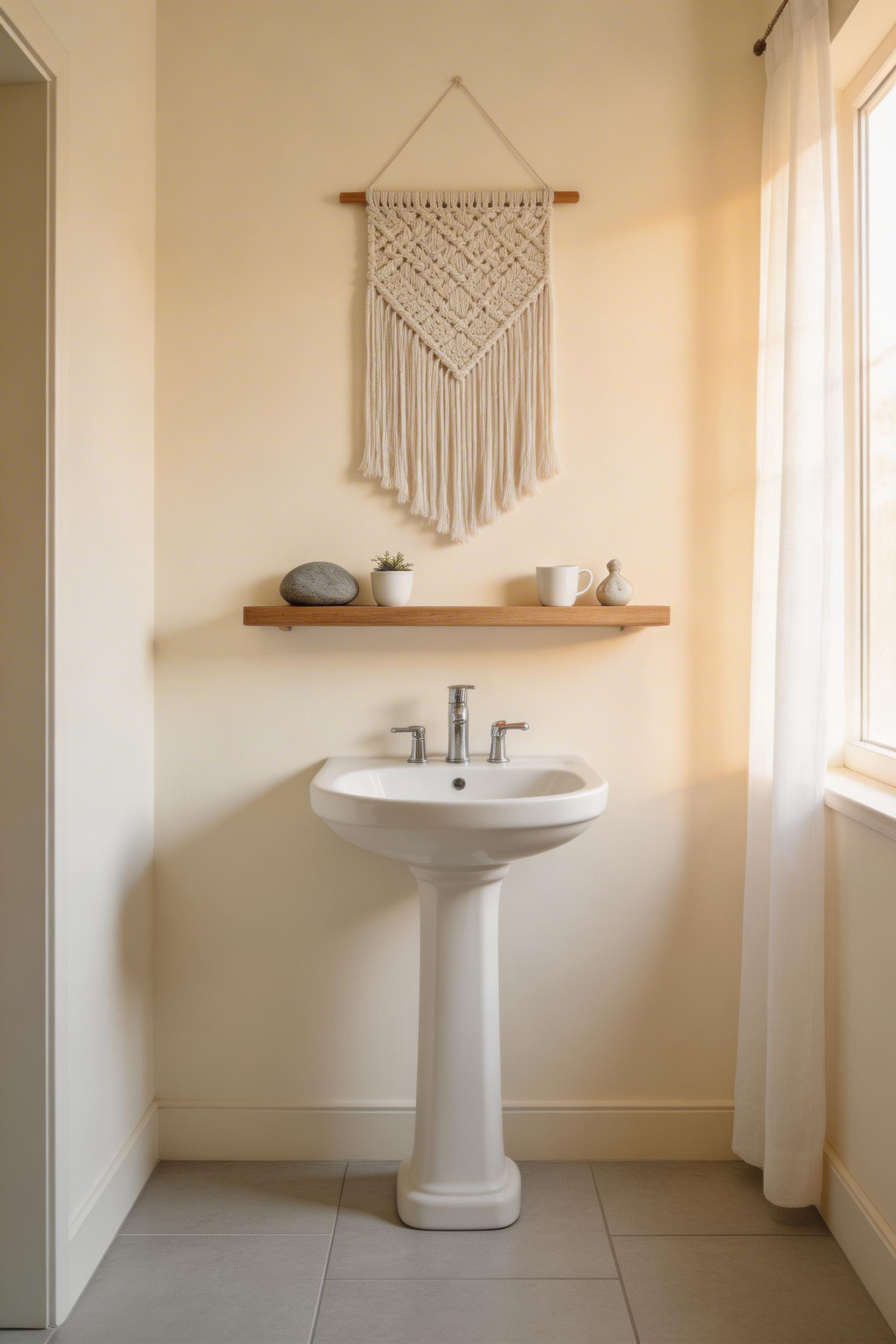
Macramé, woven wall hangings, and fiber installations do something paintings can’t: they add texture that’s visible and slightly *vulnerable*. A woven piece moves subtly with air current. It has depth. It feels handmade in a way that differs from printed art.
Here’s the critical reality: natural fibers—cotton, jute, wool—are hygroscopic. They absorb moisture. In a bathroom, this means you need to maintain humidity at 40-60% relative humidity to prevent mold. This isn’t impossible; it just requires awareness. Proper ventilation and an exhaust fan running during and after showers handles this in most homes.
Etsy and specialized makers like MACRO MACRAMÉ stock options ranging from $40 to $500+. Prices vary wildly based on artist reputation, fiber quality, and size. The range gives you plenty of flexibility.
Hanging matters. Sleeve method (a dowel rod through a sewn sleeve at the top) or loop-and-hook fasteners work best. Avoid adhesive strips for heavier pieces—they fail eventually, especially under humidity fluctuations. If you’re hanging something substantial, use proper wall anchors.
In high-humidity bathrooms, periodically air-out your fiber pieces on a sunny day or near a window. It’s minimal maintenance and keeps the work in good condition indefinitely.
9. Photography Printed on Metal or Acrylic for a Modern Edge
Metal prints represent a genuine innovation in art display, especially for bathrooms. Dye-sublimation printing directly onto aluminum creates waterproof, wipe-clean surfaces that thrive in humid environments.
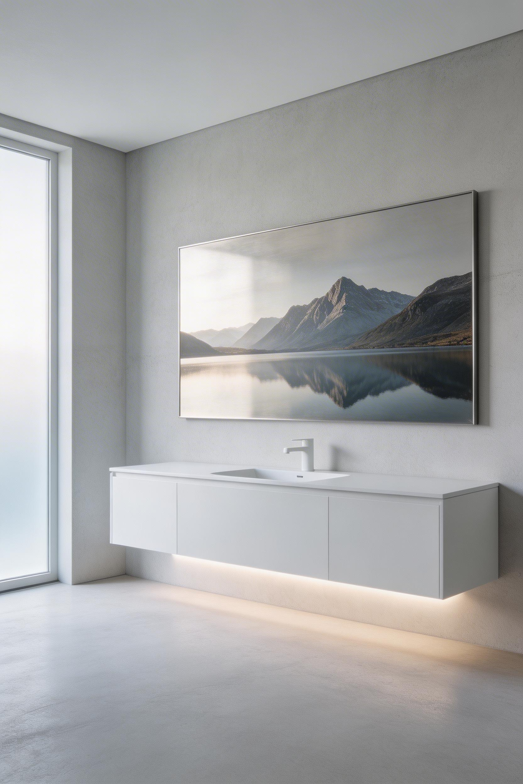
The color depth on metal is remarkable. Blacks stay rich and deep, colors remain vibrant, and the metallic substrate itself becomes part of the artwork. You get matte or gloss finishes depending on the look you want. A gloss metal print feels almost like looking through a window; matte feels more like viewing through frosted glass.
Pricing makes sense. Mpix charges $24.99 for a 4×4 metal print, scaling up to $185 for a 20×30. Turnaround is 2-3 days, shipping is free. It’s accessible.
Here’s what I need to be direct about: *acrylic prints are not recommended for bathrooms*. Acrylic looks similar to glass, costs similarly, and performs terribly in humidity. Moisture seeps behind the acrylic over time, damaging the print from inside the frame. If you love the look of acrylic, use metal instead—same modern aesthetic, actual bathroom viability.
Best subjects for metal: high-contrast photography, bold landscapes, architectural images, and moody water scenes. The metallic substrate adds depth to shadows and makes bright areas luminous. A black-and-white architectural photograph on metal feels entirely different than that same image on paper.
Fine Art America stocks metal prints from independent photographers if you want something unusual beyond standard stock photography. It’s a good source for finding one-of-a-kind subjects that match your specific bathroom aesthetic.
10. Hand-Lettered Typography and Quote Art That Feels Personal
There’s a difference between wall art that decorates and wall art that speaks to you—and hand-lettered typography sits squarely in the second camp. When you commission a lettering artist to hand-paint or brush a quote that actually means something to you, you’re not decorating with someone else’s vision. You’re putting your own words, your own values, your own story on the wall.
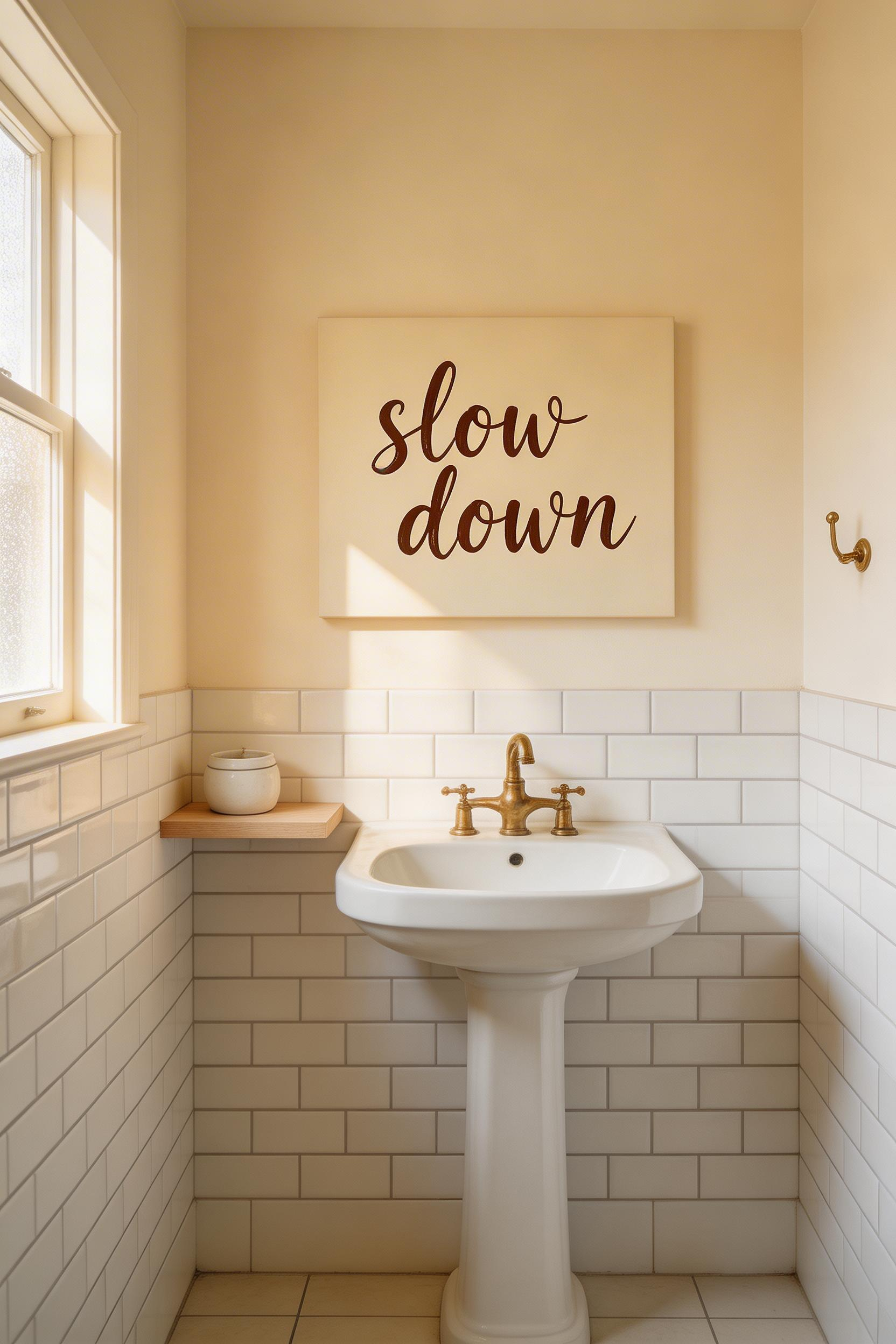
The magic is in the imperfection. Hand-lettered work has organic letterforms, slight variations in ink weight, tiny decisions the artist made in real time. A digital print reproduces identically—crisp, uniform, sterile. When you look at a hand-lettered piece, you’re seeing the artist’s hand. That matters in a bathroom, where you’re alone with your thoughts.
Start by choosing the right quote. Not “live laugh love”—that’s mass-market wall art speaking at you. Instead, find something that actually landed: a line from a book that stopped you mid-page, a mantra you’ve been telling yourself, words you overheard that suddenly felt true. Brief your lettering artist with the exact text, your preferred style (brush script feels romantic; gothic feels architectural; casual feels approachable), the color palette, and the finished size. Etsy lettering artists typically charge $25–$200 for custom work; Fiverr offers budget options; Dribbble connects you with higher-end commission artists ($200–$1000+) whose work is worth studying.
The piece becomes art because it’s yours—because you chose those words, that artist, that moment.
11. Picture Ledges for a Rotating Gallery-Style Display
Picture ledges are the artist’s secret weapon for keeping a bathroom gallery alive. They transform art from permanent to fluid. You can swap pieces seasonally, rotate through different collections, experiment with new pairings—all without touching the wall or hunting for stud finders.
A ledge display isn’t static. The depth (aim for 3.5 to 4 inches for standard frames; 6-inch ledges let you layer) means you can lean larger frames at the back, float smaller frames in front, and tuck small objects into the gaps—a ceramic vessel, a single dried stem, a smooth stone. The layering creates depth that a flat wall can’t, and you control the negative space. Quality matters: Paulownia wood resists moisture, and brands like WELLAND and Opposite Wall make sealed or painted options that hold up to bathroom humidity. Metal ledges in brass or matte black are even better for moisture resistance. Avoid unfinished or raw wood; they’ll warp and stain.
The real advantage is treating your bathroom art as seasonal. Every few months, pull pieces down and rotate new ones in. Your eyes stop seeing what’s always there, so change is what keeps a gallery vital. When you’re solving small bathroom design solutions, ledges are your answer—they add visual interest without stealing the floor or counter space that matters functionally. The art stays at eye level, the wall stays clean, and you can change your mind whenever you want.
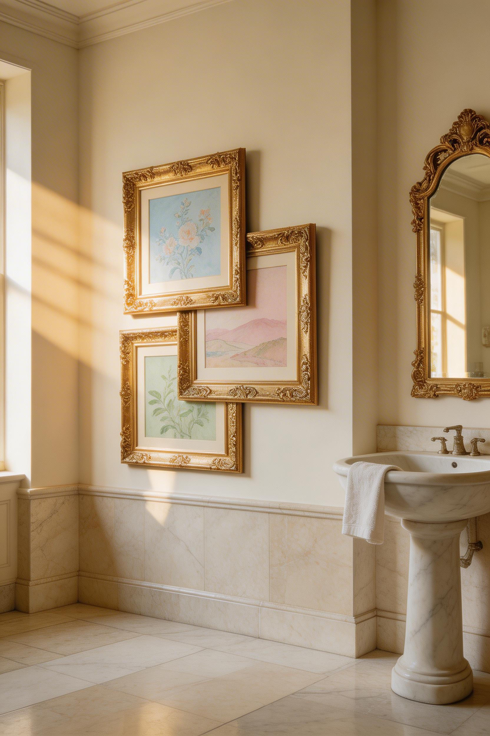
12. Asymmetric Gallery Wall Arrangement as a Feature Wall
A perfect grid of frames looks institutional. Asymmetric arrangement looks curated—like the wall evolved rather than got calculated. There’s intentionality in asymmetry, and that’s what transforms a wall into a gallery feature rather than wall decoration.
The template method eliminates guesswork. Gather all your frames and art, lay them out on the floor in your planned arrangement, then tape newspaper over them and trace their outlines. Tape that newspaper to the wall, and you’ve got a template. Hammer your nails through the paper directly into the wall, peel the paper away, and every frame hangs exactly where you envisioned it. No measuring twice, no misaligned nail holes.
The constraint that makes it work: limit yourself to three frame finishes maximum. Black plus natural wood plus brass reads as curated. Add pewter, add white, add gold, and suddenly it’s chaos. The other rule is visual weight. Distribute large frames and dark art across the arrangement evenly—don’t cluster all the visual heaviness into one corner. Standard spacing should be 2–3 inches between frames. Step back and ask whether one side of the wall feels “heavier” than the other. If it does, you haven’t finished arranging yet.
If the gallery wall approach resonates with you, the same principles translate beautifully beyond the bathroom — there’s a world of living room wall decorating ideas that apply the same asymmetric curation principles to your main gathering space. Asymmetric galleries work because they feel like they’re still evolving. You can add a new frame later without disrupting the whole composition. That’s how real collectors live with their walls.
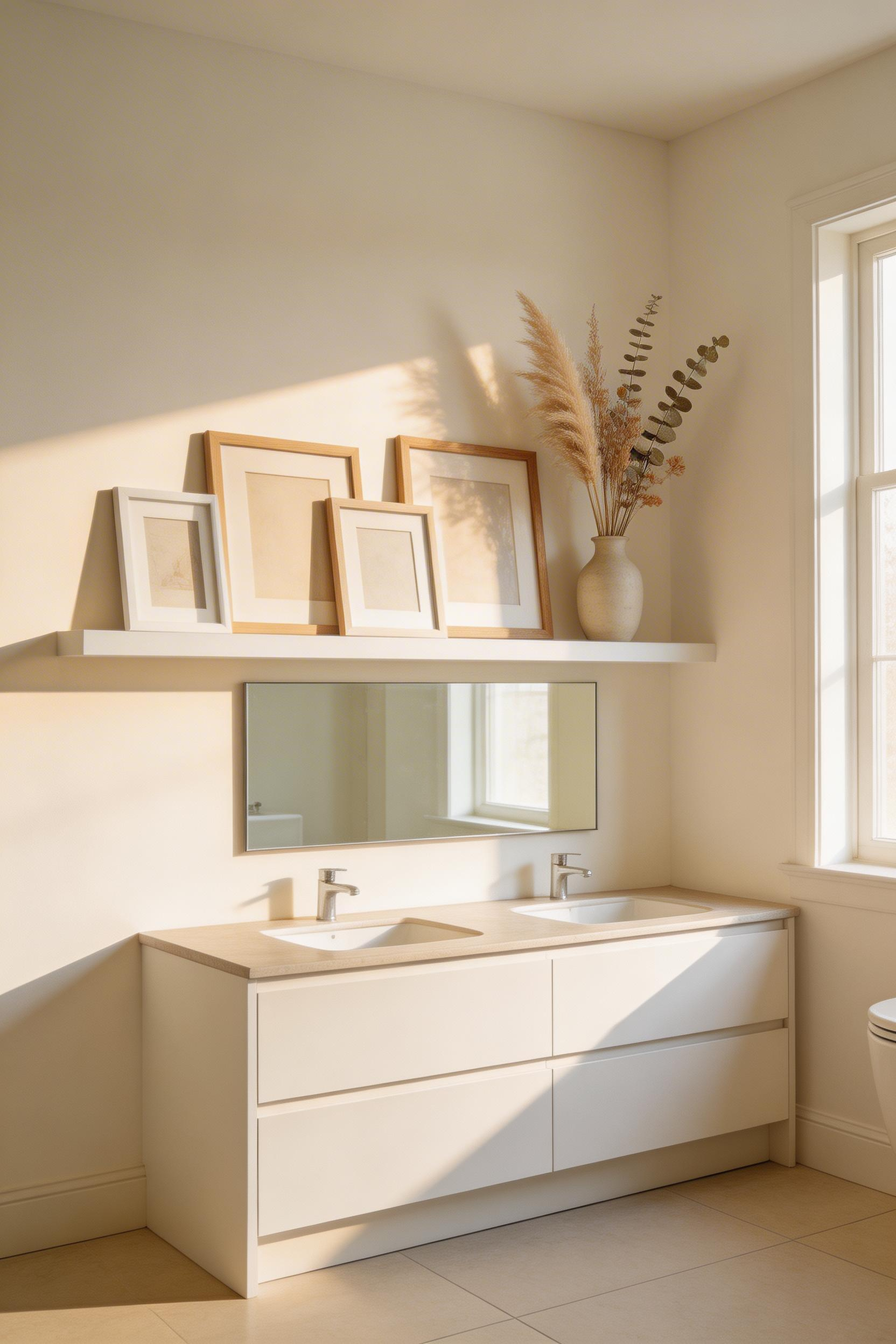
13. Art Layered on Bathroom Shelves With Supporting Objects
Shelves are mini-galleries waiting to happen. Not flat surfaces where objects sit in a line, but stages for depth and discovery. The difference is in the layering: lean art at the back of the shelf and style objects in front. That depth makes eyes move through the display rather than just scan it.
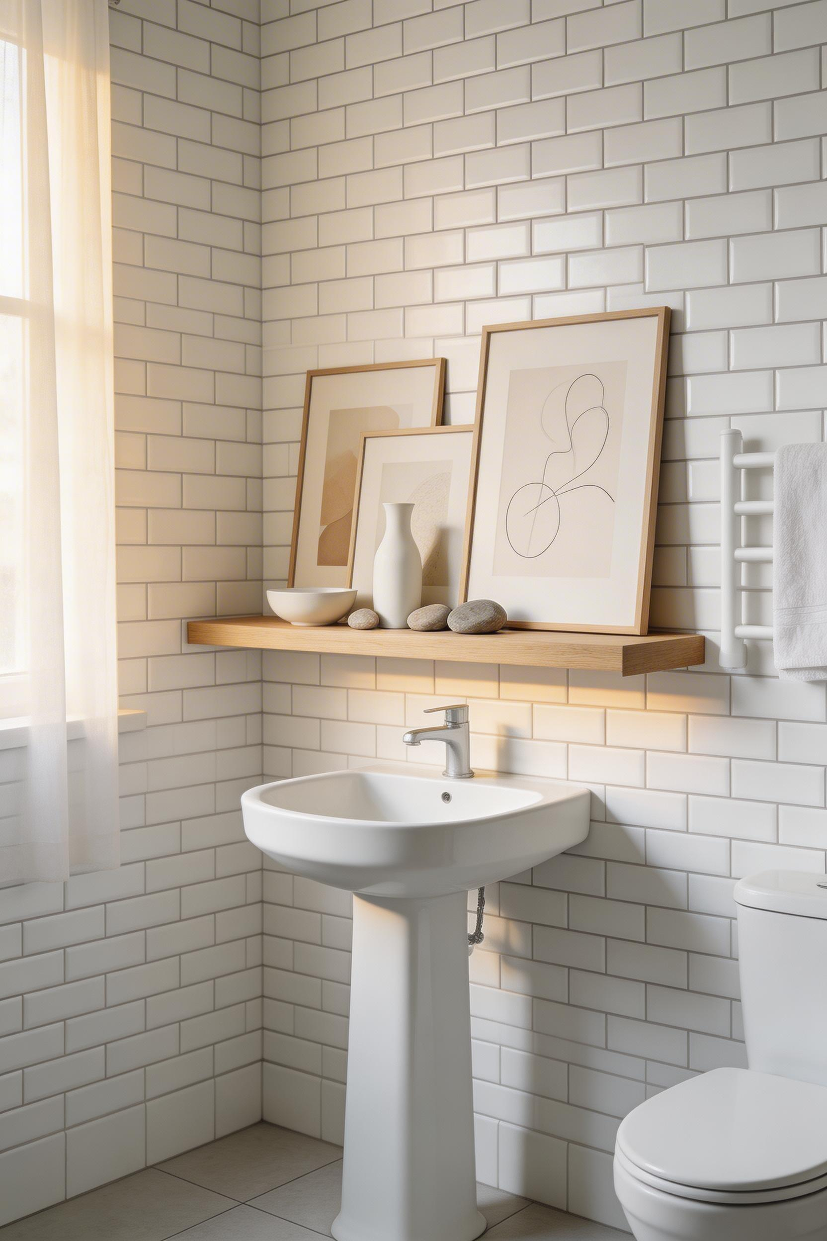
The edit is critical. For every item you place on a shelf, ask yourself whether it earns its spot. Does it have aesthetic purpose? Is it there because you love it or because you’re filling space? Remove anything that doesn’t clear that bar. The ratio that works is roughly 2:1 functional-to-decorative (including the art), so a shelf with three objects where one is clearly art reads better balanced than seven items competing for attention. Group what you keep in odd numbers—three, five—because even numbers feel static.
The objects that work alongside art are surprisingly specific: small ceramic vessels with interesting glaze, a single dried stem (one, not a bunch), an interesting stone or shell with sculptural presence. These aren’t decorative clutter; they’re supporting players. They give the eye somewhere to rest between pieces and create visual rhythm. When you step back, you should see a curated selection, not a collection of stuff. That’s when a shelf becomes a gallery.
14. Vintage and Ornate Frames as Art Objects in Their Own Right
Here’s a principle that changes how you think about frames: the frame can be the art. An ornate gilded frame with a simple watercolor print inside does more visual work than an expensive print hanging in a plain frame. The frame tells a story—about time, about taste, about intention—and the art inside becomes secondary.
Hunt for frames at charity shops ($2–$20), estate sales, boot fairs, or online at Chairish ($50–$500) and 1stDibs ($100–$1000+) for museum-quality pieces. You don’t need to fill every frame with art. Three overlapping empty frames of different sizes hung as an installation creates an architectural wall feature all on its own. It’s about the form, the depth, the visual rhythm of the frames themselves.
When you find a frame worth restoring, the process is simple. Clean ornate plaster frames with a soft dry brush. Re-gild with gold leaf paint ($8–$25 for a kit) and suddenly a thrift-store find becomes something personal. But watch your gold tones: aged brass, bright gold, and pewter on the same wall read as uncoordinated chaos. Stick to one dominant tone—either warm golds, cool silvers, or aged metals—and they’ll harmonize instead of clash.
For broader vintage bathroom inspiration, ornate frames are just the beginning—vintage mirrors, antique hardware, and period-appropriate tile all build on the same aesthetic language. Ornate frames bring texture and history to a bathroom. They’re not just holding art; they’re the art themselves. That’s the shift from decorating to collecting.
15. Antique Maps and Architectural Blueprints as Bathroom Art
Maps and blueprints bring intellectual texture to a bathroom. They suggest a mind that finds beauty in the functional and historic, that values the way humans navigate and build. There’s romance in a map of somewhere you’ve been, and mystery in a blueprint of a building you’ll never enter.
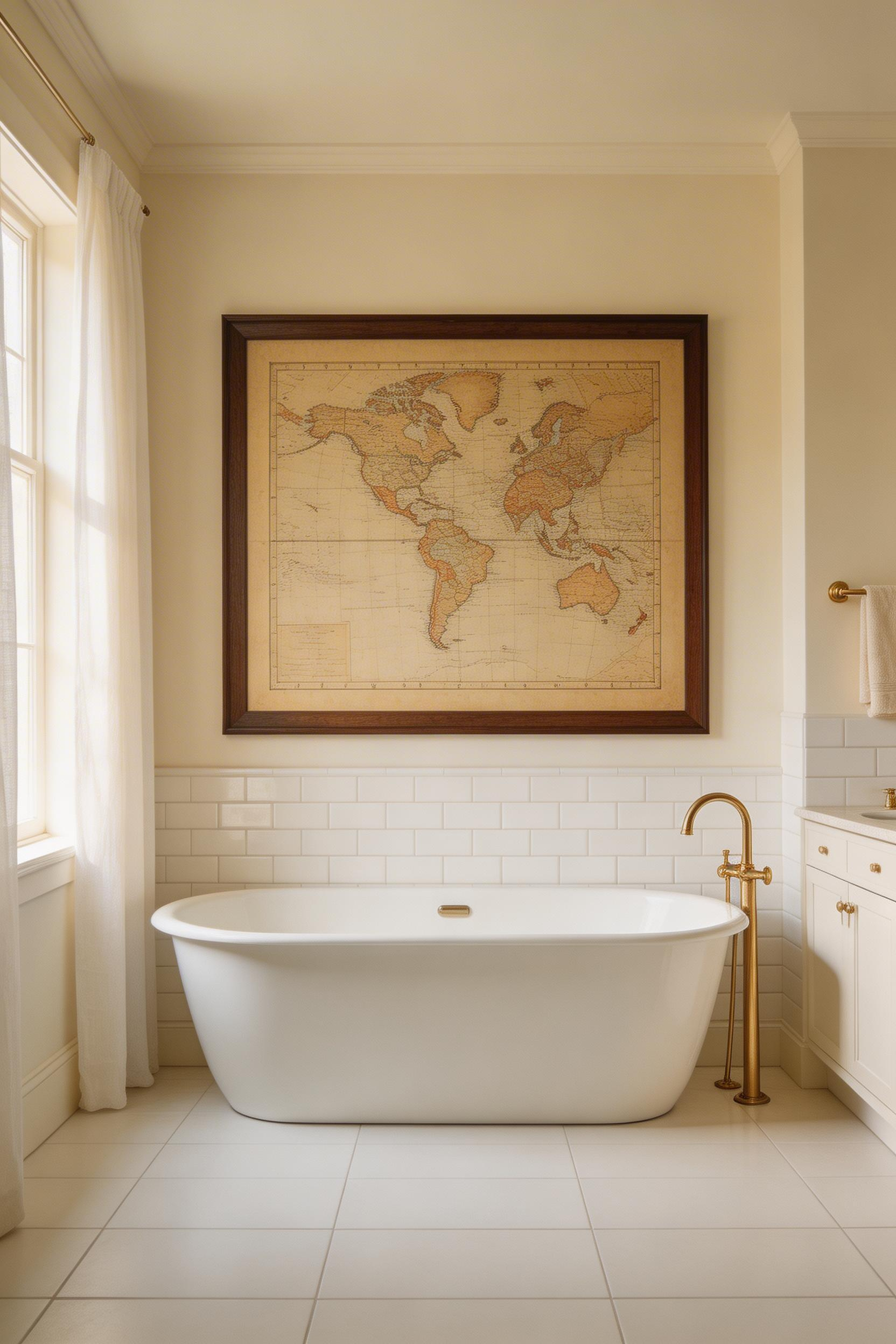
The David Rumsey Map Collection (davidrumsey.com) contains over 145,000 high-resolution historical maps available to download for free. You can print them yourself or take them to a local print shop for large-format printing on 190gsm matte paper. Most professional print shops will run a map to A1 or larger for $15–$40. Scale matters: an A4 map reads as a document. An A1 map reads as art.
The mounting changes everything. Frame a map under glass for protection and formality, or mount it without a frame using archival adhesive strips for a raw, editorial feel. The unframed approach feels more like you hung something because it moved you, not because you followed decorating rules. Maps layer beautifully with other pieces—a map alongside architectural drawings, or maps from different eras alongside modern art. They’re visual anchors that ground a gallery wall in something real.
16. Three-Dimensional Sculptural Art Mounted on the Wall
Flat art decorates walls. Three-dimensional art changes how a room feels. Shadow and depth create movement across the day as light shifts. A 3D piece at eye level stops you differently than a print.
The materials matter in a bathroom: cast iron, stainless steel, powder-coated aluminum, ceramic, resin—all resist humidity. Avoid anything with raw wood or unsealed surfaces. Sources like Wayfair, Society6, and Artful Home carry production pieces ($50–$300), while Etsy connects you with handmade originals ($50–$800+). The range exists because craft level varies.
Mounting is non-negotiable. Use wall anchors rated at 25–50% above the piece’s actual weight, and toggle bolts for heavier pieces into plasterboard. If you’re uncertain, ask the seller for weight specs and mount recommendations. The piece should feel secure.
When you group 3D pieces together, leave more space between them than you would flat art. The dimensional depth means they feel closer than they look. Three sculptural pieces with 6–8 inches between them reads as intentional spacing; clustered together, they feel chaotic. The wall becomes a stage, and each piece gets its own light.
17. Handmade Artist Market Finds for Truly One-of-a-Kind Pieces
Market-found art carries something mass-produced prints never will: the knowledge that a specific person made a specific decision on a specific day. You’re not buying art that’s available to everyone everywhere. You’re buying the artist’s choice to make that exact piece in that exact way.
What separates good market finds from expensive mistakes? Technical craft quality—clean edges, even color, secure construction. Distinctiveness: you shouldn’t be able to find it on three different Etsy shops. And emotional response: does it stop you? Does your eye go back to it? That gut response is the only metric that matters.
What to avoid: overpriced prints that look like mass-production, art that looks technically competent but isn’t interesting. There’s a difference between “well-made” and “well-made because the artist has something to say.” Look for the second.
Building relationships with market artists is worth the effort. Follow their Instagram, return to buy a second piece, show up at their next market. Artists remember collectors. They offer first access to new work, sometimes offer better prices to repeat buyers, and knowing someone’s behind a piece changes how you live with it. Before you buy, ask whether the work is an original, limited-edition print, or open edition—it affects both the value and whether you’re one of five owners or one of five thousand.
18. Rotating Seasonal Art for Year-Round Energy and Freshness
A room’s energy dies when its art stops changing. Your eye stops seeing what’s always there—it becomes wallpaper, invisible, part of the static background. Rotating art every season (roughly quarterly) keeps a bathroom alive.
Build a collection with intentional depth: 6–8 pieces that can rotate through 2–3 display spots. This doesn’t mean buying frantically; it means curating with intention over time. Think in color seasonally. Cool blues and whites for summer feel refreshing; warm ochres and terracotta for autumn feel grounded; deep jewel tones for winter feel intimate; pale greens and blush for spring feel hopeful. The bathroom design ideas that inspire the most are ones that evolve — and seasonal art rotation is one of the simplest ways to make that happen.
Storage matters if you’re rotating. Acid-free tissue between stacked frames, vertical storage against a wall (never horizontal stacking, which warps frames), archival conditions around 70°F and 50% humidity. You’re not just storing art; you’re preserving it. The pieces deserve care.
Visual adaptation psychology means your brain resets emotionally when key display elements change. Rooms feel fresh and alive when something shifts. Art is the fastest lever for that transformation. You don’t need to repaint; you don’t need to rearrange furniture. Change the art, and the whole room feels new.
The Bathroom as Gallery: How to Start Your Art Journey
You don’t need to source 18 pieces tomorrow. You need to start with one—a statement piece hung above the most visible wall in your bathroom. Something that makes you pause when you see it. That pause is how you know it belongs in your home.
Choose that first piece based on genuine response, not trends or what “looks good in bathrooms.” A print you actually love beats a “safe” choice every time. Live with it for a few weeks. Notice how you feel in the room. Notice whether your eye goes to it or past it.
Then build gradually. One statement piece, then a complementary piece, then a shelf display. Resist the impulse to buy 10 things at once and arrange them all at once. The best collections are built over time, with intention, with real living between purchases. Each new addition should feel like a discovery, not an obligation.
Your bathroom can absolutely be a gallery-worthy space. Not because you followed rules, but because you chose art that moves you and arranged it in a way that feels true to how you live. That’s what makes it yours.