Choosing black for a bedroom is not an accident of mood or a response to a passing trend. It is an act of deliberate self-definition — a signal that this room belongs to rest, to stillness, and to the kind of absorption the colour performs on light itself. In Japanese design philosophy, black bedroom decor has carried meaning for centuries: in sumi ink, in urushi lacquerware, in the kuro-nuri technique that builds surfaces of dignified, light-drinking depth. Approached with intention, a dark bedroom stops being a stylistic choice and becomes a spatial philosophy.
The concept of *ma* — negative space as active presence rather than absence — runs through every good dark bedroom. The walls are not empty; they are held. The room is not gloomy; it is composed. The difference between a black bedroom that reads as sanctuary and one that reads as mistake lies entirely in what you place against the dark field, and how deliberately you do it.
These 18 ideas move through the full range of that decision-making — from structural choices like accent walls and ceiling treatments, to the layering of textiles and materials, to the rituals of light that shift a room from daytime function to nighttime sanctuary. Take what suits your space. Leave what does not. The edit, as always, is the design.
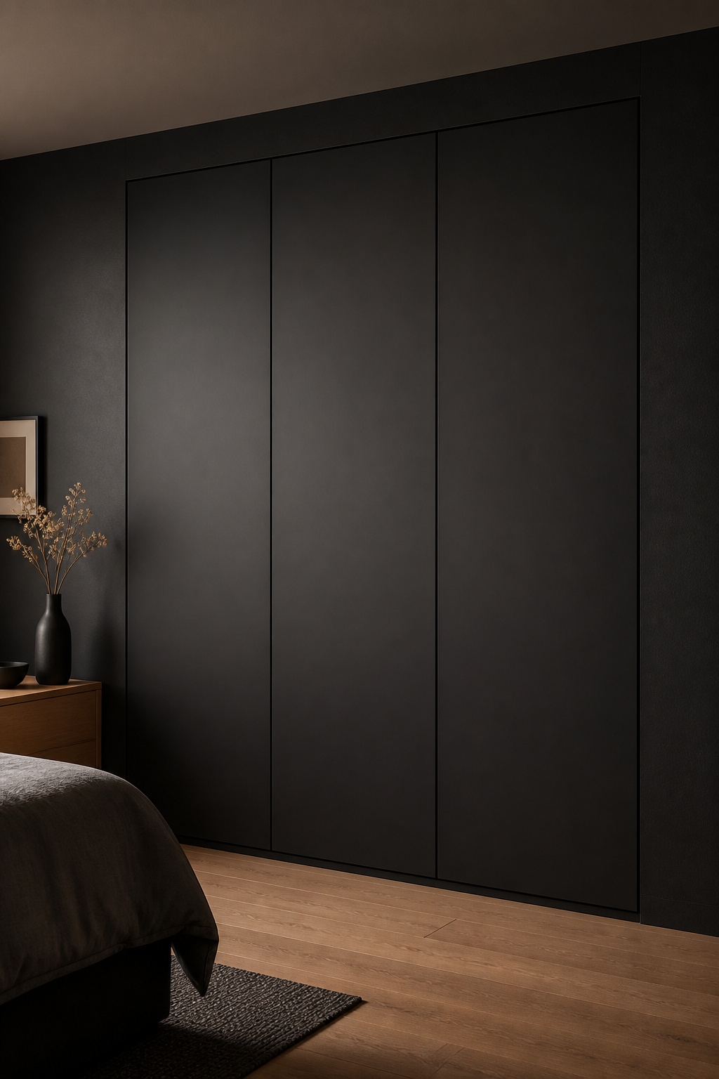
1. Matte Black Accent Wall as a Meditative Focal Point
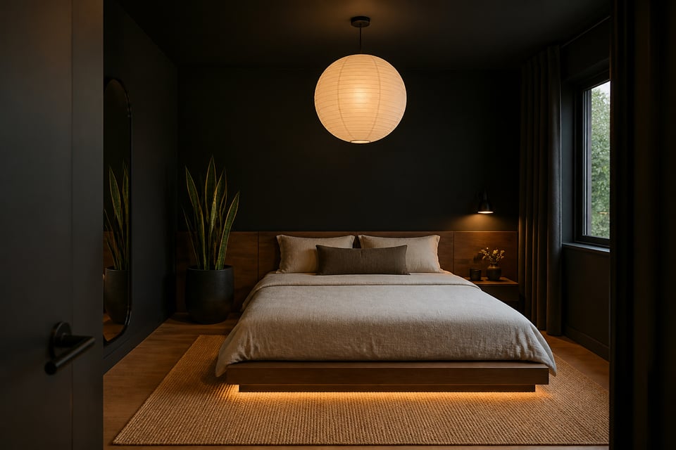
There is a meaningful difference between a room that is dark and a room that has been deliberately quieted. A single matte black accent wall behind the headboard achieves the second — it draws the eye to rest rather than stimulating it, creating a cocooning sense of stillness without the heaviness of an all-black envelope. For anyone beginning their black bedroom decor journey, this single-wall approach is the most controlled entry point.

Choosing Your Paint and Finish
The key is finish. A dead-flat matte (zero to five percent reflectance) absorbs light rather than reflecting it. Satin or semi-gloss black on that same wall would create a visual shimmer under the bedside lamp — the opposite of stillness. For paint, Farrow & Ball Pitch Black (No. 256), Benjamin Moore Onyx (2133-10), and Clare Noir are consistently praised for their true absorption at any angle. Apply over a grey primer rather than white; painting black directly over white can produce a slightly chalky result in raking light.
Placement matters as much as finish. The wall behind the headboard is the room’s primary focal axis — it is what you see from the door and what frames the bed. It uses roughly ten to fifteen percent of the room’s total wall surface while delivering most of the atmospheric effect. One caveat: avoid the wall adjacent to your primary window. Black near glass intensifies the contrast between inside and outside, making morning light feel harsh. Also worth knowing — pure blue-toned blacks can amplify low-mood symptoms in rooms with limited natural light. A deep charcoal with a warm undertone achieves the same visual depth with more psychological warmth. For more context on finish choices, these serene bedroom paint ideas cover the same matte-finish principle across the full colour palette.
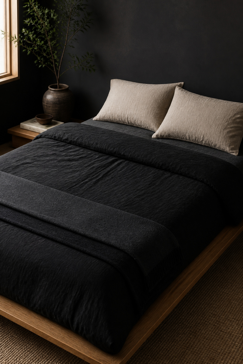
2. Black Linen Bedding Layered for Wabi-Sabi Texture
Linen is the natural companion for black in a wabi-sabi bedroom — not because the aesthetic demands it, but because linen is fundamentally honest. Its slub, its irregular weave, the way it wrinkles no matter how carefully you fold it: all of this is evidence of a material that resists pretence. That quality, placed against a deep absorbing colour, gives the bed surface a life that perfectly smooth cotton cannot replicate.
How to Layer for Maximum Depth
Stonewashed or garment-washed black linen has been pre-tumbled to soften its texture and slightly weather its colour. This is the *sabi* quality in material form: beauty that comes from use and time, applied from the start. Cultiver, Bed Threads, and Linen Society all produce well-regarded stonewashed dark colourways; look for ‘garment-washed’ or ‘enzyme-washed’ on the product page, which indicate the actual softening process.
The strongest layering approach — and the one that defines well-executed black bedroom decor — uses three tonal steps: a charcoal flat sheet as the lightest note, a deep black linen duvet as the primary statement, and a near-black slate or dark graphite throw folded across the foot of the bed. Add a single pillow in undyed or off-white linen — this light note is not optional. Without it, the bed reads as funereal rather than intentional. For thread count guidance: in linen, a 110–130 TC in genuine French or Belgian flax outperforms a 300 TC cotton for both texture and breathability. Always wash cold, inside-out, with a brightener-free detergent — black linen fades, and this slows it considerably.
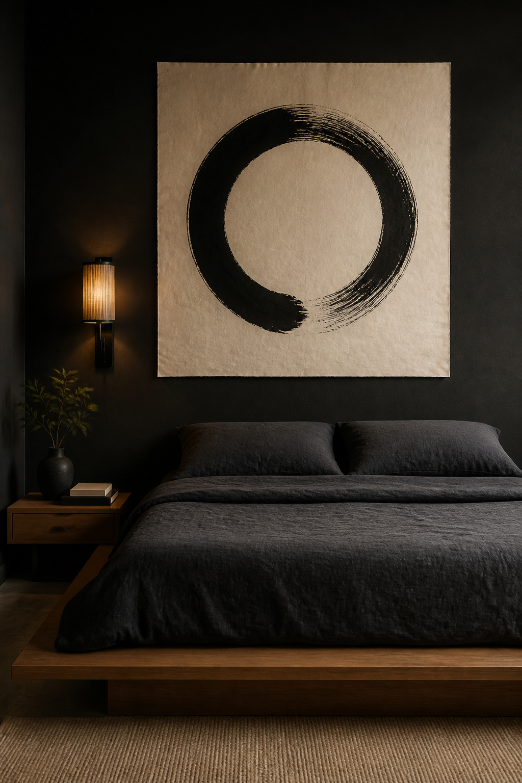
3. Sumi-Ink Artwork as the Room’s Quiet Anchor
Sumi-e — Japanese ink painting — captures essence through minimum marks. Three brushstrokes for bamboo. One arc for a mountain. The painted space matters as much as the painted subject; in a well-executed piece of sumi ink work, the white of the paper is not background but presence. This quality — negative space as active participant — makes East Asian ink art uniquely suited to a composed dark bedroom.
Scale, Framing, and Placement
The traditional tokonoma alcove in Japanese rooms was designed for exactly this: a single hanging scroll, a seasonal object, and nothing more. Translating this to a contemporary bedroom means resisting the impulse toward multiple pieces and choosing one work large enough to hold its own. An enso circle at eighty to a hundred and twenty centimetres wide creates more visual impact than a salon wall of six smaller prints. Hang it with the centre at approximately one hundred and fifty-five centimetres from the floor, which puts it at natural eye level when standing and visible from the bed.
For framing: a slim natural oak or hinoki wood frame (fifteen to twenty millimetres wide) against a dark wall creates a warm material contrast without competing with the art’s restraint. Alternatively, two small metal standoff mounts that hold the paper slightly away from the wall create a floating appearance with a subtle shadow behind — particularly effective against a dark surface. Original works from artists searching ‘sumi-e original’ on Etsy start around eighty to a hundred dollars and carry a quality of actual mark that no print can replicate.
4. Black Bedroom Decor Balanced with Natural Wood Warmth
Without at least one warm, organic material, a black bedroom risks reading as a colour exercise rather than a lived space. Wood is that essential counterweight — the element that prevents the room from feeling inert. Biophilic design research is clear on this: the fractal patterns of natural wood grain give the eye somewhere to move and settle in a measurable way, reducing micro-stress that accumulates in visually uniform environments.

The Best Wood Species to Pair with Black
In Japanese traditional interiors, the pairing of dark lacquer (kuro-nuri) with warm hinoki and sugi wood is centuries old. It is not a contemporary trend but a proven grammar of contrast — the dark makes the light more present, and the light makes the dark more intentional.
Among contemporary species, American black walnut and white oak are the most consistently successful against dark walls. Walnut’s chocolate-to-caramel grain reads as genuinely warm, and its natural figure — sometimes streaked with lighter sapwood — gives the surface visual movement. White oak, at a Janka hardness of around thirteen sixty pounds-force, is more durable and carries a honey-to-golden tone with pronounced ray-fleck patterning. Carbonised bamboo achieves a warm amber finish at comparable hardness and is culturally resonant in a Japanese-influenced space. The critical detail in all cases is the finish: a natural oil or hardwax preserves the wood’s surface softness; high-gloss varnish turns it into a competing visual element. For applying the pairing throughout the room — bed frame, floating shelf, flooring, nightstand — these minimalist bedroom decor principles address how to keep material choices from multiplying into incoherence. One rule of thumb: never more than two wood species in the same room.
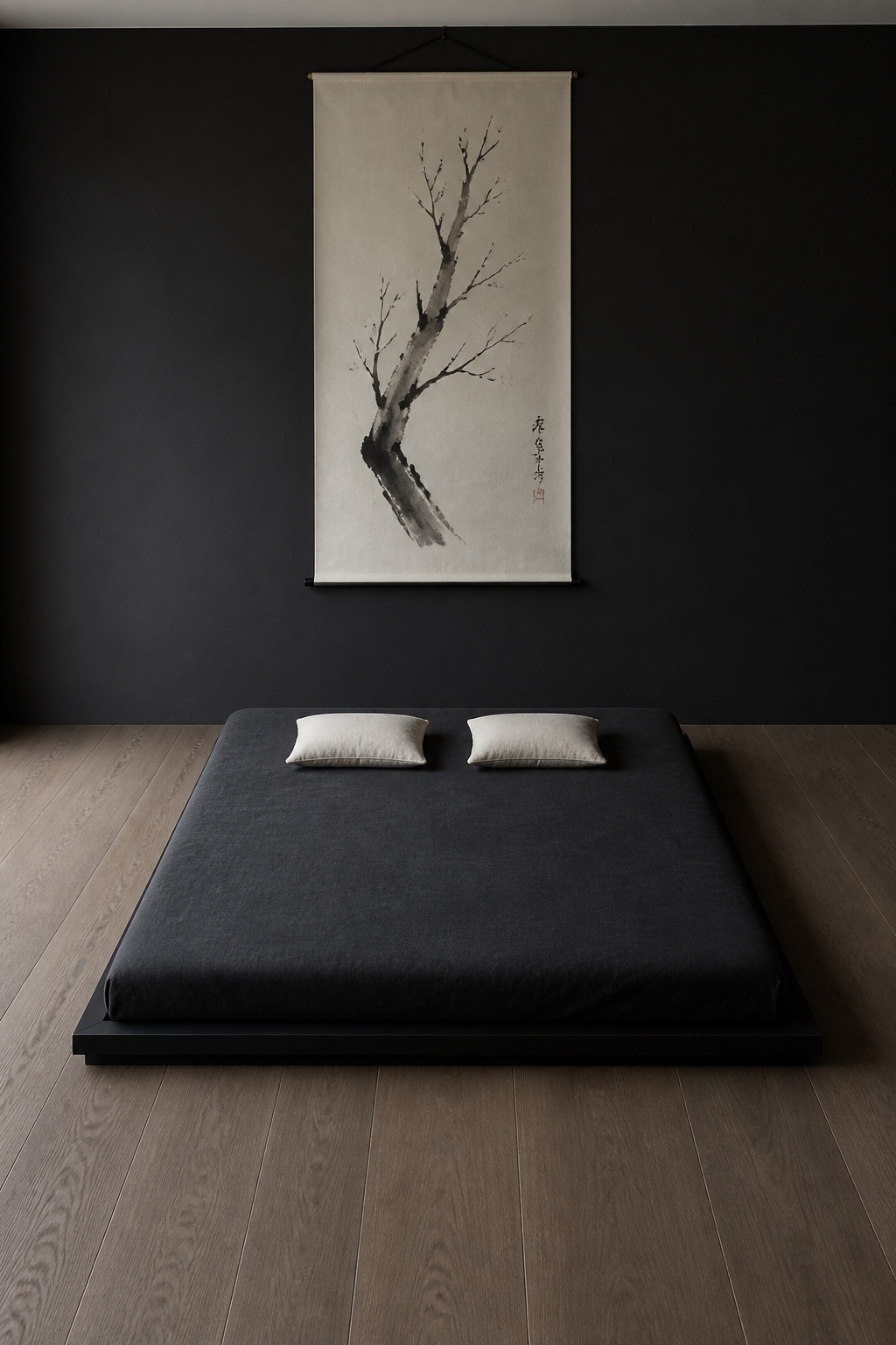
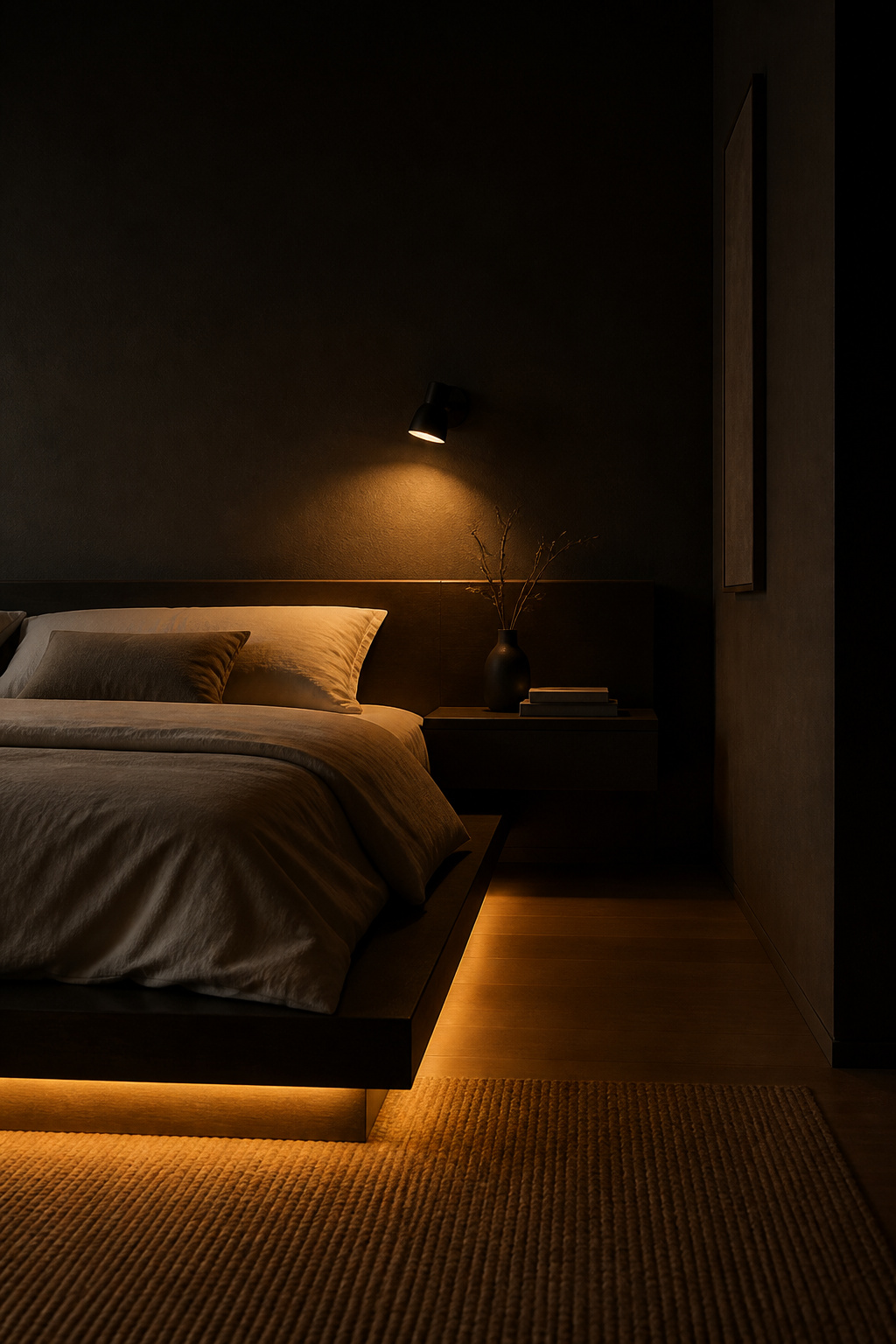
5. Ebony Platform Bed for Ground-Level Serenity
In Japanese design tradition, sleeping close to the floor is not a practical concession but a philosophical choice. Futon sleeping on tatami removes the height-based hierarchy of a raised bed — the ground is democratic, humble, and grounding in the most literal sense. The low platform bed translates this principle to a contemporary context: a total height of twenty-five to thirty-five centimetres from floor to mattress (compared to the standard fifty-five to sixty-five centimetres) lowers the room’s visual centre of gravity and creates a sense of structural calm.
What to Look For in a Platform Bed
The low profile does something else equally useful in black bedroom decor: it releases the vertical space above the bed. A sumi-e scroll or a pair of brushwork prints has more air around them when they are not competing with a tall headboard and a stacked mattress at European height. The room feels taller, the walls feel more present, and the composition reads as intentional.
For a deep black finish, ebony-stained solid hardwood — walnut or oak base, stained to near-black — is a more honest material choice than lacquered MDF, which can look flat in person despite looking dramatic in photographs. The grain reads subtly through a quality stain, preventing the surface from appearing manufactured. Structurally, look for a solid slat system (not wire mesh), a minimum of two central support legs for queen and king frames, and a platform depth of at least forty-five millimetres for adequate mattress support without a box spring. On headboards: a headboard-free platform is the most architectural option and the most Japanese in spirit. If you prefer a headboard, a slatted design in natural oak at eighty to a hundred centimetres high introduces warm material contrast at exactly the right zone between dark wall and white bedding.
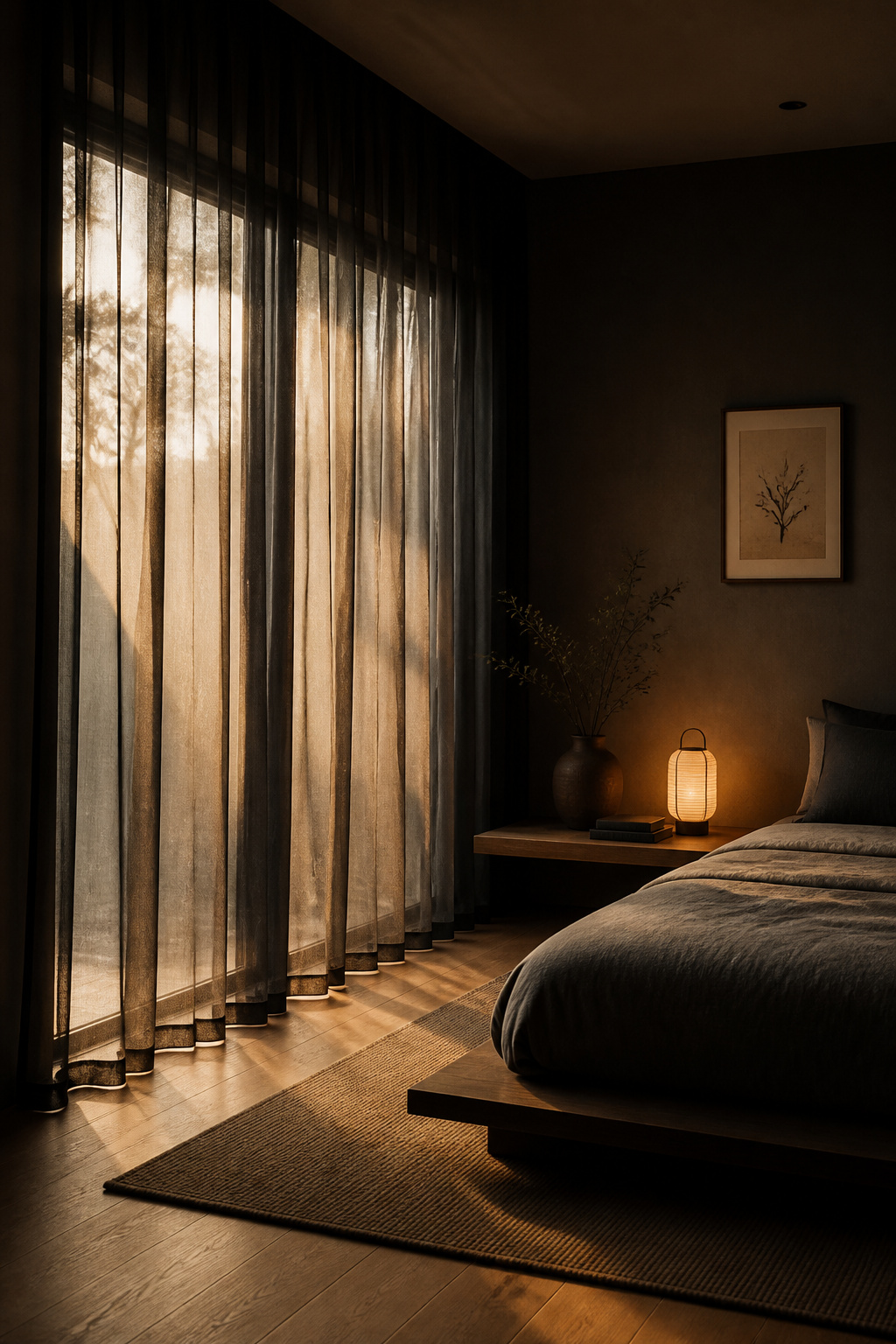
6. Sheer Black Curtains for Soft, Layered Light
There is something counterintuitive about putting black fabric in front of a window, but the effect is not what you might expect. A sheer black curtain does not block light — it filters it. With a light transmittance of roughly twenty to forty percent, a black sheer converts direct daylight into a diffused glow that reads as late afternoon rather than noon. The room feels lit from within rather than stared at from outside.
Installing for Best Effect
For urban bedrooms where daytime privacy is a genuine concern, black sheers offer something white sheers cannot: the view through dark fabric is more obscured without sacrificing diffused light quality.
The most functional approach pairs sheer and blackout in two layers. Mount a double rod (or a ceiling-flush track with two rail positions), with the sheer on the inner track closest to the glass and a deep charcoal or black blackout panel on the outer. For a black bedroom, a white blackout lining is a common mistake — when the sheers are drawn, a white panel reads as a jarring interruption in an otherwise unified dark palette. A black or dark charcoal blackout creates a seamless colour story regardless of configuration. Ceiling-mounted hardware (within five centimetres of the ceiling line) adds an apparent thirty to forty centimetres of room height. The panels should be two to two-and-a-half times the window width when gathered — underfilled curtains look thin and provisional. For the rod: a slim matte black powder-coated rod at twenty to twenty-two millimetres diameter disappears into the visual field and allows the fabric to carry the attention.
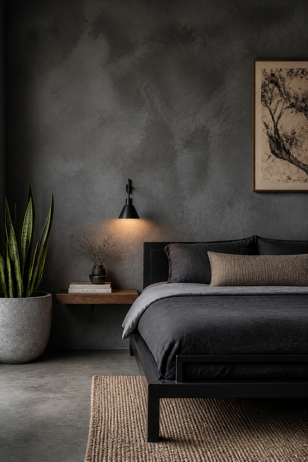
7. Layered Charcoal and Velvet Textiles for Tonal Depth
A black bedroom that uses only one black — one tone, one texture, across every surface — will read as flat. The solution is not colour; it is tonal differentiation and texture variation. Near-black has a vocabulary: true black, deep charcoal, dark graphite, slate grey, and soft smoke give you five to six distinct values to layer within what appears from across the room to be a unified dark palette. Building this tonal range is how thoughtful black bedroom decor creates richness without colour.

Working with Velvet’s Light Properties
The rule of three tones provides a workable framework: one dark (true black or very deep charcoal), one mid (charcoal or dark graphite), one light (mid-grey or the single off-white accent note in your bedding). Apply different materials at each level — velvet at the dark end, linen at the mid, cotton gauze or a knit weave at the light end. The texture differentiation reinforces the tonal separation and prevents the eye from skimming over the composition.
Velvet earns its place in a dark bedroom through its optical properties. Its pile structure generates simultaneous highlight and shadow on a single surface: fibres lit with the direction of the pile show deep chromatic richness; fibres lit against the pile darken toward near-black. As the light angle shifts through the day, a charcoal velvet throw appears to shift in tone — it is a material that maintains presence without demanding attention. For placement: fold a velvet throw in thirds lengthwise and lay it across the lower third of the bed as a clean horizontal band. For cushions, the minimum viable arrangement is two sleeping pillows, two euro squares, and a single velvet accent cushion. Resist adding a second or third accent cushion — it converts a composed arrangement into a pile. On quality: cotton velvet or polyester velvet above three hundred and fifty grams per square metre will hold its pile over time; cheaper fabrics pill along the high-contact edges within a season.
8. Dark Bedroom Decor Transformed by Warm Ambient Lighting
Lighting is not an afterthought in a dark bedroom — it is the difference between a space that reads as serene and one that reads as oppressive. The same room, unchanged except for the colour temperature of its light sources, can shift from sanctuary to cave. Black walls have no ambient reflectance to buffer the quality of light; what you put into the room is exactly what you get back.
Layering Your Light Sources
The science is clear. Harvard Medical School research found that warm light (2700K) in the evening supports sleep onset approximately nineteen minutes faster than cool white light above 5000K. A 2019 study from the Lighting Research Center at Rensselaer Polytechnic Institute confirmed the underlying mechanism: cool light in the daytime improves alertness, while warm evening light activates the melatonin pathways that initiate sleep. In a black bedroom, any LED above 3000K will read as harsh against the walls and physiologically counterproductive.
A three-layer approach gives full control: an ambient ceiling source (recessed spotlights or a pendant at 2700K, used during cleaning and dressing), task lighting at the bedside (sconces at reading height, fifty-five to sixty-five centimetres above the mattress surface), and an accent layer — an LED strip at 2700K beneath the platform bed frame creates a floating-bed effect and provides enough light to navigate at night without triggering wakefulness. One practical note: black walls absorb light energy. Where a white room might function at four hundred to five hundred lumens per source, a black room needs six hundred to eight hundred to achieve the same perceived brightness. A dimmer switch on every circuit is essential — it is the mechanism that transitions the room from day function to evening wind-down. For a broader exploration of fixture options and layering strategies, these bedroom lighting ideas that transform the atmosphere cover the full approach in detail.
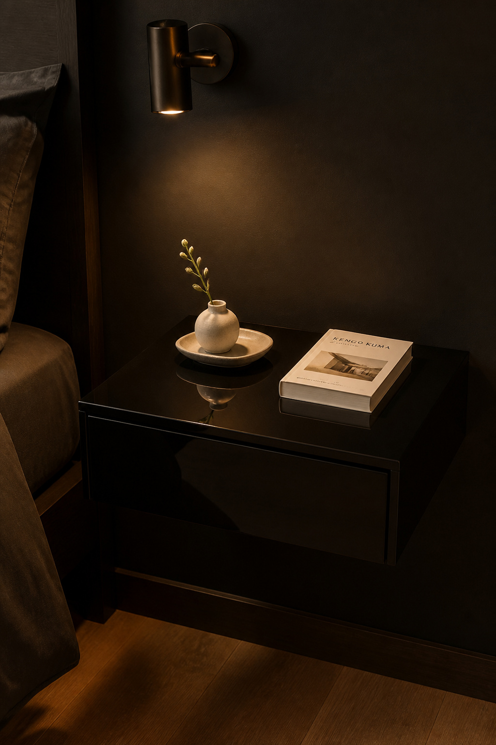
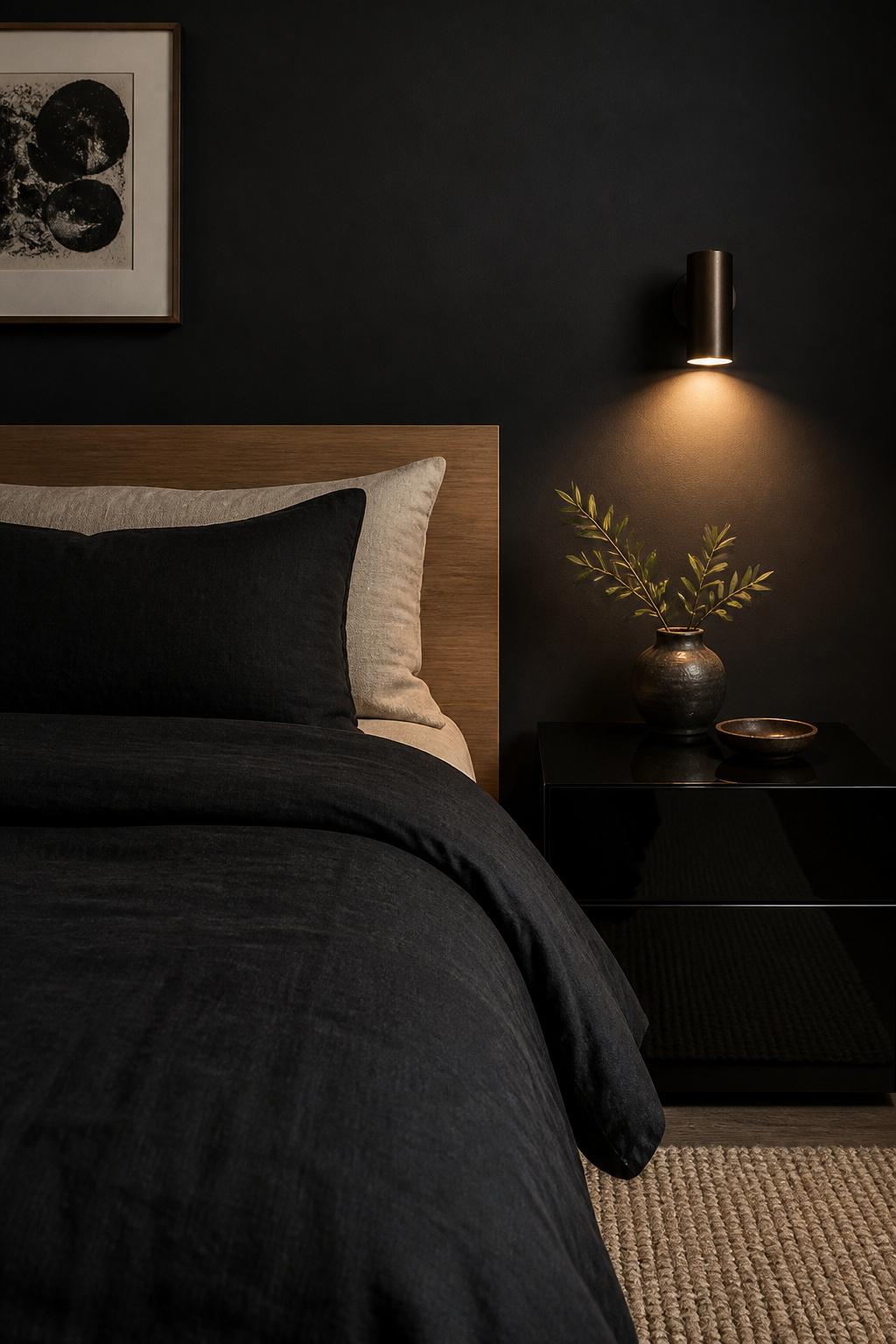
9. Lacquer-Black Nightstands with Japanese Minimalist Restraint
The most sophisticated surface interaction in black bedroom decor is a high-gloss lacquer nightstand placed against it. Same hue. Opposite material register. A dead-flat wall in zero-reflectance paint beside a ninety-percent-gloss lacquer surface is a more refined form of contrast than any colour pairing you could introduce — it is the finish-contrast strategy applied to furniture, and it works precisely because the palette never changes.
Choosing the Right Form
Urushi lacquer — made from the sap of the Rhus vernacifera tree, built up across many cured coats — has been used in Japan since the Jomon period. The kuro-nuri (Noble Black) finish carries centuries of association with dignity and depth. Modern catalysed lacquer achieves a similar surface through spray application and mechanical polishing; it shares the essential optical quality: a depth of black that appears to continue beneath the surface, with mirror-like gloss that reflects point light sources as precise pin-spots.
The form the nightstand takes matters as much as its finish. A floating (wall-mounted) nightstand is the most architecturally clean option — it eliminates table legs from the visual field, keeps the floor uninterrupted, and maintains a hovering quality that is distinctly Japanese in sensibility. If you prefer freestanding, a simple box form on four slender black metal legs splits the difference between grounded and weightless. Avoid ornate profiles — for black lacquer, push-to-open mechanisms (no handles required) maintain the surface as a single uninterrupted plane. Height guidance for a low platform bed: the nightstand surface should sit five to ten centimetres above the mattress top. On the surface itself: maximum three objects. One functional (lamp or e-reader), one sensory (a single stem in a small ceramic, a smooth stone), one purposeful (the current book). A small matte ceramic tray corrals all three into a considered micro-composition.
10. Geometric Black Hardware for Cohesive Interior Language
Hardware is the room’s punctuation — the small marks that repeat across every surface and either unify the composition or reveal its inconsistencies. In a black bedroom where the palette is already decided, hardware is the most accessible tool for achieving the finish of a room that looks designed rather than assembled. Matte black across every pull, rod, switch plate, and mirror frame creates repetition that reads as deliberate.
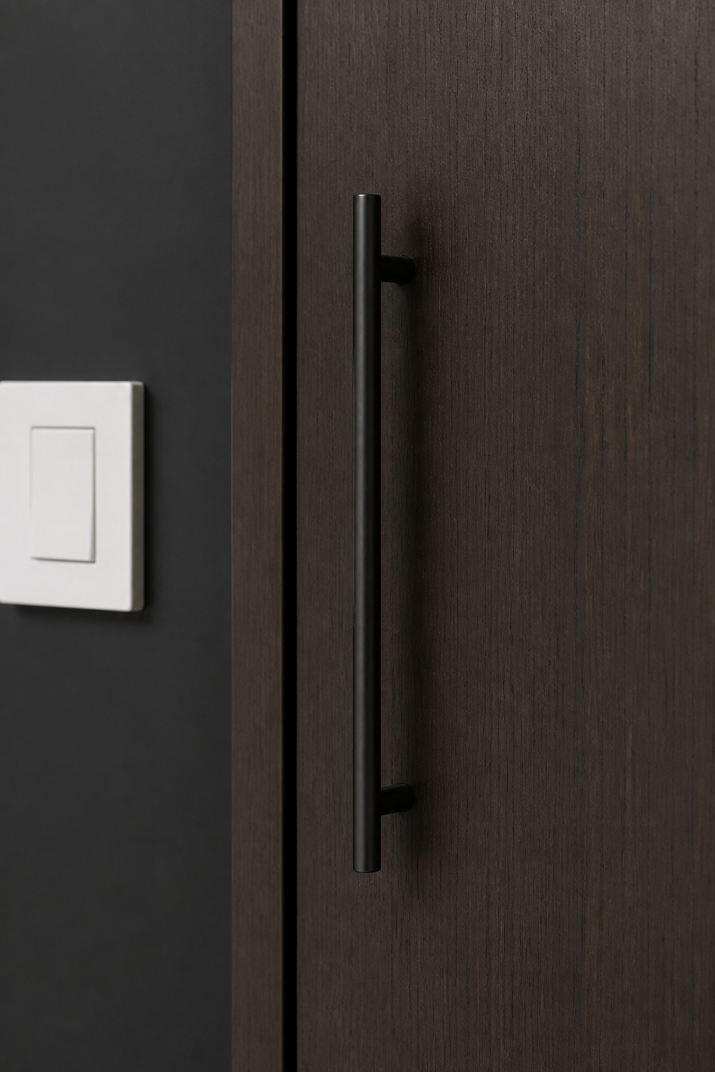
Where to Apply the Matte Black Language
Matte black powder-coated hardware carries two practical advantages beyond aesthetics. It absorbs light rather than reflecting it, so there are no unwanted sparkles pulling the eye away from the room’s curated elements. And it resists fingerprint visibility far better than polished finishes — in a bedroom where pulls are handled daily, this is not trivial. Powder-coated steel is more durable than zinc alloy; steel resists finish chipping at the grab zone over years of use.
For cabinet pulls: bar pulls in ninety-six, one hundred and twenty-eight, and one hundred and sixty millimetre lengths are the dominant Japandi choice. Their clean linearity avoids the decorative ambiguity of a knob. If pulls are too large for a specific door, a cylindrical knob at thirty-two to thirty-eight millimetres reads as deliberate without ornamentation. The extend-the-language principle is where black bedroom decor most often leaves value on the table: white plastic switch plates on a black wall are among the most common visual inconsistencies in otherwise well-considered bedrooms. Replacing them with matte black metal versions (available from Leviton, Legrand, and smaller hardware suppliers for eight to fifteen dollars per plate) is one of the highest-ROI single upgrades in the room. Curtain rods, the bedroom door lever handle, and any mirror frame should follow the same specification.
11. Black and White Photography Gallery for Personal Narrative
Colour photographs in a black bedroom create a dissonance that is hard to name but easy to feel: the room’s careful tonal discipline is interrupted by a hue that belongs to a different visual world. Monochrome photography, by contrast, extends the room’s value range into the artwork. The blacks in the prints echo the walls; the whites echo the linen; the grey mid-tones connect them.
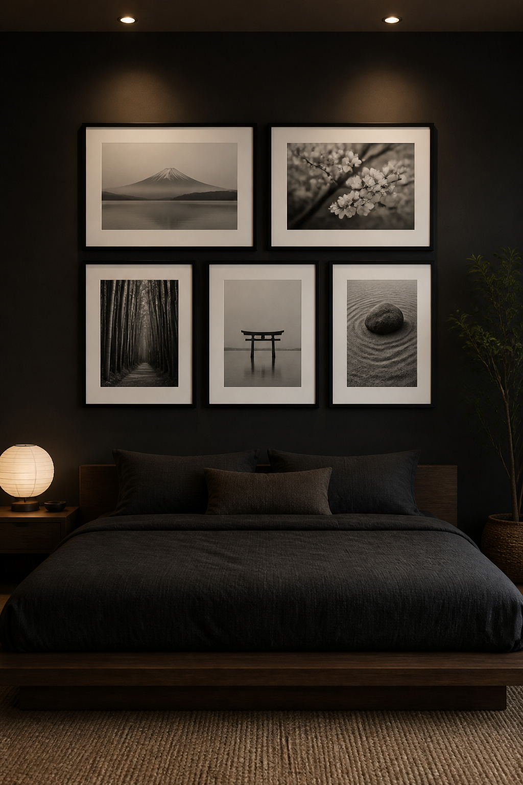
Curating and Arranging Your Gallery
Beyond tonal continuity, there is the question of content. A curated gallery of personal travel or landscape photographs converted to black and white and printed professionally on archival matte paper creates a room that reflects the inhabitant’s actual visual history — the principle of ma extended to personal narrative. For purchased work, Magnum Photos prints, Ansel Adams estate prints, and contemporary fine-art photographers on Saatchi Art all offer archival-quality pieces at accessible price points. Consistency in framing makes mixed sources read as deliberately curated: all slim black frames (IKEA RIBBA or custom frames from Framebridge) unify personal prints and purchased art into a single editorial statement.
For arrangement: a grid hang (equal spacing, aligned frames, six to ten centimetres between pieces) works best for six or more prints of similar size. A salon hang (mixed sizes, asymmetric) reads as more dynamic but requires planning — lay every frame on the floor and photograph the arrangement from above before committing anything to the wall. In both cases, white mats inside black frames against a black wall create the gallery effect: each print appears to float in its own field of white, which adds perceived value to even simple subjects. Gallery width should not exceed eighty percent of the wall it sits on. For the full range of approaches to bedroom art, these bedroom art aesthetic ideas address everything from abstract prints to sculptural wall objects.
12. Black Bedroom Ideas with Strategic Mirror Placement
The common advice — mirrors make rooms brighter — is written for light rooms. In a dark room, a mirror amplifies depth and dimensionality rather than brightness. Well placed, it extends the room’s dark field beyond the wall and creates a sense of spatial infinity. This mirrors the Zen principle of boundlessness: the room does not end where the eye thinks it does. Among all black bedroom ideas, strategic mirror placement is one of the most frequently underestimated.

Choosing Frame and Glass Type
The most effective position in a black bedroom is opposite the primary bedside light source. The mirror reflects the warm glow back across the room, multiplying the sense of warmth without requiring additional fixtures. The second-most effective position reflects a piece of artwork on the opposing wall — the mirror creates a doubled composition, adding philosophical resonance about perception. One position to avoid: directly facing the bed. Sleep researchers note that mirrors in the direct sightline can trigger micro-awakenings as the brain registers apparent movement during shallow sleep phases.
For glass and frame choices: smoked or bronze-tinted mirror glass reflects the room at sixty to seventy percent clarity, producing a softer, more impressionistic image — you see the room rather than yourself acutely, which reduces the sense of being observed. A frameless mirror with a ten to fifteen millimetre bevelled edge against a black wall reads as a pure aperture in the surface — the most minimal option. A thin matte black metal frame (ten to twenty millimetres wide) disappears against the wall and lets the mirror read as an opening rather than an object. A single antique-gold or warm-brass frame is the only case for introducing a warm metal note in an otherwise monochrome room; used once, it adds richness without colour.
13. Matte vs. Gloss Black Surfaces: Playing with Tonal Contrast
A room that restricts itself to one finish — everything matte, or everything gloss — misses the most sophisticated texture strategy available in a monochrome palette. Finish variation within the same hue creates movement and depth without new colours. The distinction between a zero-percent-reflectance matte wall and a ninety-percent-gloss lacquer cabinet is more compositionally powerful than the difference between two different colours placed side by side.
Where Each Finish Belongs
The reflectance scale in common paint and surface finishes gives a wide range to work with: flat and matte (zero to five percent), eggshell (ten to twenty-five percent), satin (twenty-six to forty percent), semi-gloss (forty-one to seventy percent), full gloss (seventy-one to ninety percent), and piano lacquer gloss above ninety percent. In a black room, this range translates to dramatically different visual experiences. The Japanese aesthetic of combining lacquer gloss with matte ink surfaces in a tokonoma alcove display is an ancient precedent for exactly this finish-contrast strategy in interior design — the same black rendered in five materials becomes a meditation on the colour itself.
Where to use each finish: matte belongs on surfaces that should recede — walls, ceilings, upholstered headboards, soft furnishings. Gloss belongs on surfaces that punctuate — lacquer nightstands, ceramic and porcelain objects, pendant light housings, decorative vessels. Semi-gloss suits trim, doors, and surfaces that need regular cleaning. The most resolved version of a black bedroom uses all three registers in graded order: flat ceiling above matte walls, finishing with gloss accents at furniture level. Test finish combinations on thirty-centimetre samples before committing — the difference under real directional light always exceeds what a screen can show.
14. Indoor Plants That Thrive Against Black Bedroom Walls
Green reads differently against black than it does against any neutral or white surface. The contrast between a living plant — its irregular form, its colour, its daily micro-movement — and a dark absorbing wall creates what designers call the biophilic amplification effect: the plant appears more vivid, more alive, and more present than it would against pale paint. One well-chosen specimen against a dark black bedroom wall carries more compositional weight than any artwork of equivalent scale.
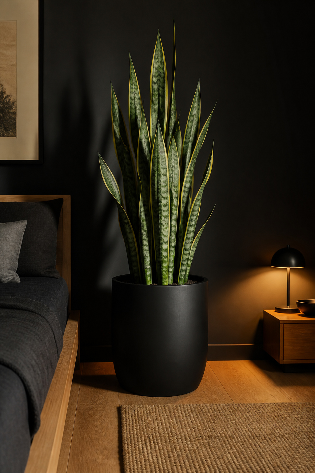
Low-Light Species That Work
Three species are consistently specified for low-light bedroom conditions. The snake plant (Dracaena trifasciata) is the most architectural of the three: its upright, sharply margined leaves create a strong vertical line that echoes the clean geometry of a Japanese-influenced space. It tolerates genuine low light, requires watering every three to six weeks, and is structurally dramatic at heights of sixty to one hundred and twenty centimetres. The ZZ plant (Zamioculcas zamiifolia) stores water in its rhizome root system for extended periods; its waxy, oval leaves in dark glossy green also create a miniature version of the finish-contrast strategy — same principle as the lacquer nightstand, different scale. Pothos (Epipremnum aureum) works well placed high on a floating shelf, trailing down against the wall; it adapts to very low light and needs watering when the soil is fully dry, roughly every one to two weeks. For the same low-light principles applied across a wider plant palette, these bedroom plants for a boho sanctuary cover a broader range of species and container options.
For containers: a matte black ceramic planter makes the plant the pure visual element — the container disappears and the green reads as floating. An unglazed terracotta pot in its natural orange tone introduces one warm accent note in an otherwise monochrome space; this single warm element prevents the room from reading as cold without disturbing the tonal palette.
15. Black Ceiling Treatment for an Enveloping Atmosphere
The most counterintuitive move in a black bedroom is painting the ceiling. The instinct is to resist it — surely it will make the room feel smaller. In rooms with ceiling heights above two-and-a-half metres, the reality is the opposite: a black ceiling completes the envelope rather than adding to the darkness. The room becomes a volume rather than a box with a white lid floating above it.
Practical Notes on Light and Height
The visual argument for a dark ceiling: when the walls are dark and the ceiling is white, the junction between them creates a visible interruption — the room looks unfinished, as though the design stopped at head height. A black ceiling removes that interruption. Design psychologists describe their effect as cocooning: they reduce perceived ceiling height slightly, increasing the sense of intimacy, and they reduce ambient light reflection from above, dampening sensory input in exactly the way a bedroom’s purpose requires.
From a practical standpoint, a black ceiling changes the lighting equation significantly. Overhead fixtures now direct light downward against a surface that absorbs it rather than bouncing it around the room — this actually makes recessed spotlights and pendant fixtures more atmospheric, because their light becomes focused and pool-like rather than diffuse. Pendant lights against a black ceiling appear to float — the fixture is the only visible element and becomes a design object. Paint the ceiling in the same dead-flat matte finish as the walls, never with any sheen. A painted popcorn or textured ceiling in black makes every texture mark visible under raking light and reads as accidental rather than architectural. If ceiling height is genuinely limited (below two-and-a-half metres), consider painting only the area directly above the bed — the cocooning effect over the sleeping zone without the full perimeter treatment.
16. Black Bedroom Decor Built Around Mindful Storage
In a white or neutral bedroom, visual clutter is absorbed into the background. In a black bedroom, every displaced object becomes a graphic mark against the dark field: a cable on the nightstand, shoes on the floor, a stack of magazines against the wall. The high-contrast environment amplifies disorder in a way that most people underestimate when they begin their black bedroom decor project. Storage, in a dark room, is not secondary to the aesthetic — it is part of it.
Storage Solutions That Stay Hidden
A 2022 study widely cited in the New York Times found that minimalist settings measurably reduce cortisol and improve sleep quality. The mechanism is the visual field: a brain preparing for sleep performs better when it is not registering unresolved objects in the environment. In a black bedroom, this effect is compounded — every displaced item is conspicuous. The Japanese oshiire — the built-in closet with sliding screens — was designed around exactly this principle: conceal everything functional, display nothing that has not been placed with intention.
The most effective storage decisions in a dark bedroom are invisible ones. Under-bed drawers built into a platform frame can hold sixty to eighty kilograms of bedding and seasonal clothing in a king-size configuration — this single addition can replace a freestanding chest of drawers and free its floor space entirely. A floor-to-ceiling built-in wardrobe in matte black lacquer with sliding doors and push-to-open mechanisms has no handles, no reveal, and reads as an architectural element rather than furniture. Floating shelves at two metres’ height keep storage off the room’s primary visual register while remaining accessible. For more approaches to concealing what does not need to be seen, these minimalist bedroom decoration essentials offer a practical framework for the full bedroom. The visible surfaces in this room — nightstand, shelf, dresser top — should be edited before the room is finished, not after. Retrofitting discipline into a completed black bedroom is much harder than designing the storage in from the start.
17. Concrete, Steel, and Black Material Pairing for Urban Zen
For urban residents whose design sensibility runs toward the honest rather than the ornamented, the industrial-zen bedroom offers a compelling alternative to the lacquer-and-linen approach. Microcement, raw concrete, and exposed steel share a quality with wabi-sabi philosophy that makes them genuinely compatible with a dark room: they are materials that make no pretence. Their imperfections — the air bubbles in poured concrete, the weld marks on steel tubing, the variation in microcement — are not flaws to be concealed but evidence of honest making.
Working with Industrial Materials
Microcement is the most accessible entry point for a residential bedroom. Applied in two to three millimetre layers over existing walls or floors (no demolition required over solid, primed substrates), it creates a seamless, grout-free surface in grey to near-black tones that reads as raw concrete without the structural requirements. Professional application costs approximately eighty to a hundred and forty dollars per square metre in the US; a ten square metre bedroom accent wall is roughly nine hundred to fourteen hundred dollars. The result — rough mineral texture beside matte black paint — provides maximum contrast between surface types within a unified tonal palette.
Steel-frame beds in matte black work with this material language because the frame is the design. There is no attempt to conceal the structure; the geometry of the metal is the aesthetic. A solid matte black steel-frame bed beside a microcement wall beside a walnut floating shelf covers the full range of values — industrial, organic, painted — without requiring colour to create differentiation. For flooring: wide-plank black-stained hardwood or polished dark microcement eliminates the visual interruption of a pale floor making the dark walls look detached from the ground.
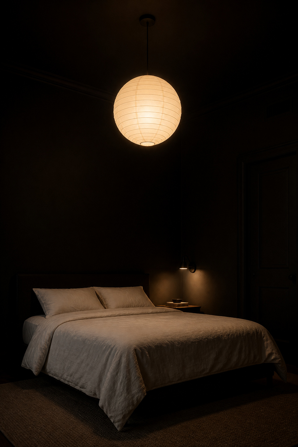
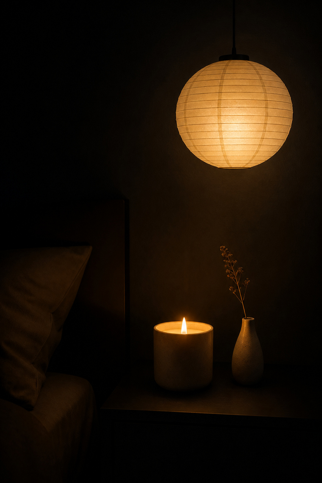
18. Candles and Pendant Fixtures as Black Room Decor Anchors
In a black room, the light sources are design objects as much as functional tools. A candle on a nightstand against dark walls is not simply a candle — it is an event. Its warm amber glow (approximately 1800K, warmer than even the warmest LED) against the absorbing dark creates an intimacy that no overhead fixture can replicate. The scale is precise: the light reaches a small radius, defines a limited zone, and asks nothing of the rest of the room. This quality of contained, intentional light is the defining characteristic of well-considered black room decor.
Choosing Pendant Fixtures for a Dark Room
Environmental psychology research supports what intuition already knows about candlelight. Exposure to flickering warm light in the hour before sleep activates the parasympathetic nervous system — the biological mechanism behind the intuitive feeling that candlelit spaces are calming. The Japanese washi andon, a paper lantern housing a candle, was designed to deliver exactly this quality of light for the space immediately around a sleeping area. Its modern equivalent is a washi paper pendant shade with a warm Edison filament bulb (2200–2700K) inside — the handmade mulberry bark paper diffuses the light to a glow close enough to candlelight quality to serve the same psychological purpose at practical room scale.
For pendant fixtures: smoked glass globe shades (twenty-five to thirty-five centimetres in diameter, hand-blown rather than machine-produced) add a jewel-like quality to warm light. Black iron cage pendants suit the industrial-zen variant of the room, casting a shadow lattice on the ceiling that becomes pattern without applied decoration. In every case, the ceiling canopy (the mounting hardware visible at the ceiling) should be specified in black to match the ceiling; a white ceiling rose against a black ceiling is a small inconsistency that reads as undesigned. For flameless candles: realistic-flicker LED versions now achieve a convincing approximation of candlelight with none of the open-flame risk — the most practical solution for a nightstand where falling asleep before extinguishing is a genuine possibility.
Designing Your Black Bedroom with Intention and Balance
These eighteen ideas are not a checklist. They are a material vocabulary — a set of considered options from which you build the specific version of this room that suits your space, your light, and your life. Not every idea belongs in every black bedroom.
Begin with the irreversible decisions: wall colour, ceiling treatment, flooring. These define the envelope and are costly to undo. From there, layer in the furniture anchors — the platform bed, the built-in wardrobe, the nightstand that introduces the one gloss surface against the matte field. Textiles and lighting come last, but in a black bedroom they carry more weight than they would in a lighter room. The warm temperature of every light source and the tonal layering of every textile determine whether the room reads as serene or oppressive.
If budget or circumstance means starting small, the minimum viable black bedroom rests on four decisions: one matte black accent wall, a low-profile bed, warm lighting throughout at 2700–3000K with a dimmer on every circuit, and at least one warm organic material — wood, linen, a living plant — to prevent the palette from reading as abstract. These four alone, chosen with care and executed without compromise, deliver most of what this article describes.
The principle that holds every dark room together is deliberate contrast. Black does not work alone. It works against the warm grain of walnut, the diffused glow of a washi pendant, the silver surface of a smoked mirror, the green of a snake plant quietly growing in the corner. Choose each contrast point with intention. Place nothing that does not earn its presence. In black bedroom decor, that discipline — the edit as the design — is the whole practice.