The composition of a personal space is an act of self-authorship—every choice reflects not just aesthetic preference, but a deeper statement about how we wish to live, think, and restore ourselves. The most compelling sanctuaries aren’t merely decorated with bedroom paint ideas; they are authored spaces, crafted with intention to tell a story of calm and clarity. In an age of digital saturation, this process of authoring our private environments becomes a critical act of well-being.
The color applied to your walls is the foundational grammar of this story. It is not an afterthought but the very atmosphere you inhabit, influencing your mental state from the moment you wake to the moment you rest. A purposefully chosen palette can quiet the mind, creating the necessary conditions for true restoration. It becomes an architecture of stillness, a silent partner in your daily practice of mindfulness.
Here, we will explore 20 principles for coloring your sanctuary. Consider them not as a list of rules, but as interconnected facets of a single philosophy: to create a bedroom that is both a refuge from the external world and a clear reflection of your inner landscape. From the subtle psychology of hue to the ancient wisdom of texture, each concept is a step toward an environment where peace is not a goal, but the very fabric of the space.
Calibrating the Intention: Priming Your Canvas for Serenity (Part 1)
Before a single drop of paint is applied, we must first engage in a quiet dialogue with the space itself. This is not about logistics; it is an act of attunement. We are listening to the light, understanding the existing materials, and clarifying our own purpose for the room. This is the foundation upon which a truly serene sanctuary is built.
1. Assessing Luminous Reciprocity: How Light Unveils Color
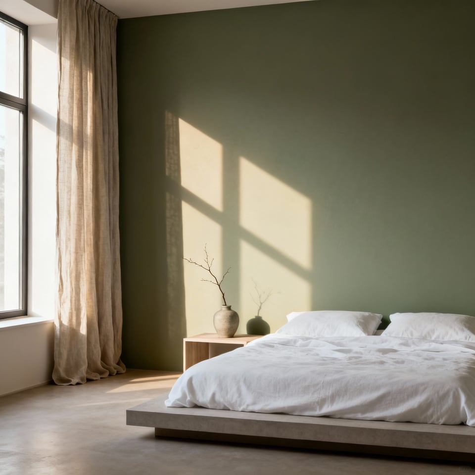
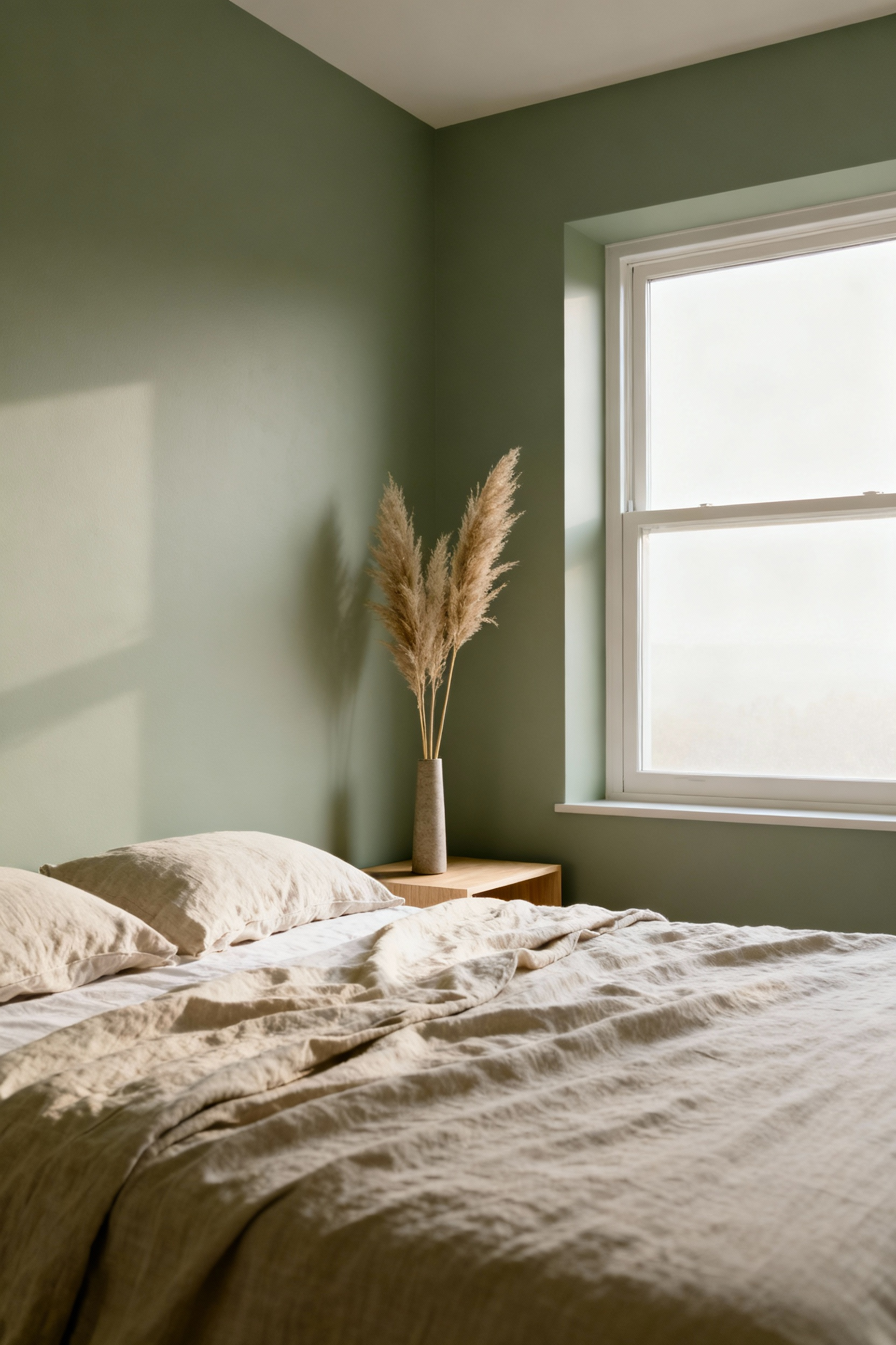
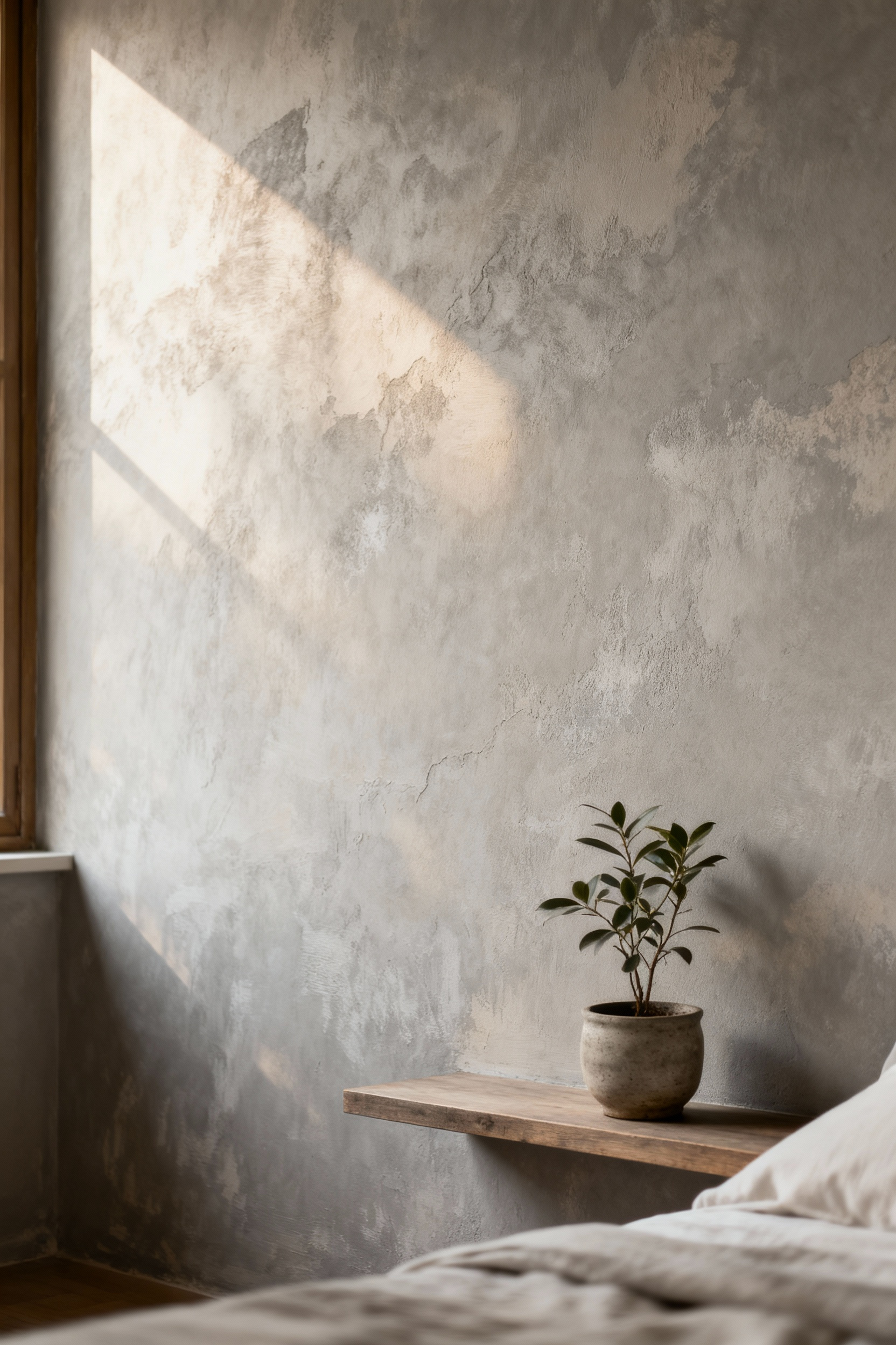
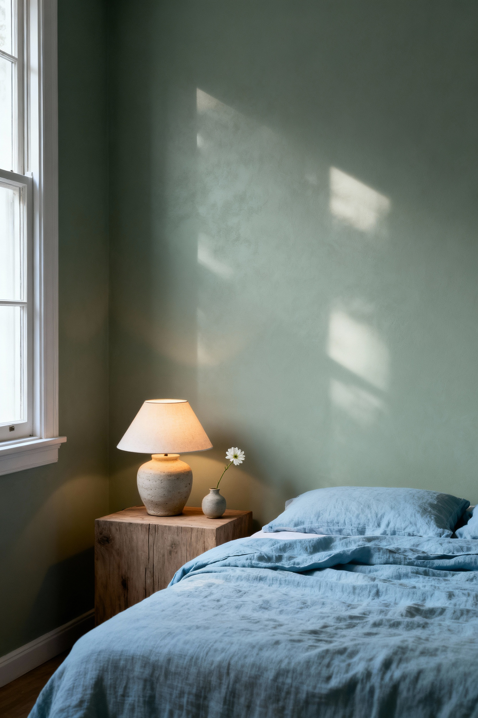
Color does not exist in a vacuum. Its true character is revealed only through its dialogue with light—a relationship that is constant, subtle, and profoundly important. The cool, indirect light of a north-facing room will reveal the quiet, gray undertones in a paint, while the warm, direct light from the south will amplify its saturation. To ignore this dance is to design with only half the information.
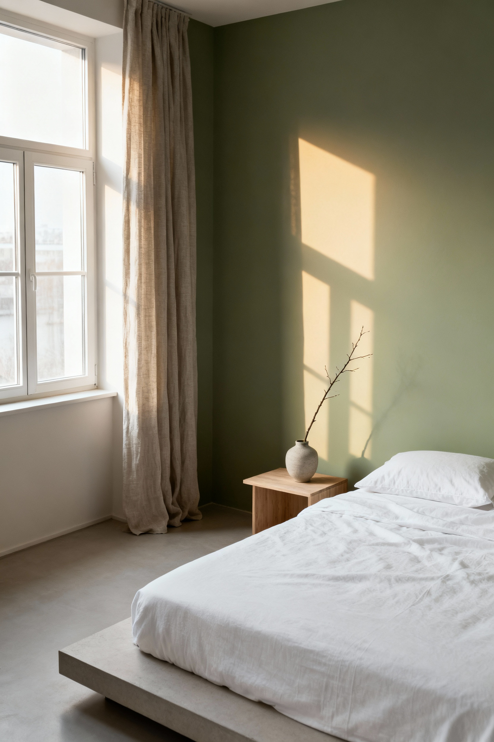
From my work in contemporary Japanese design, the most important lesson is observing a space through all its phases. I urge you to affix large swatches of potential colors to your walls and watch them for a full day. Observe how a simple beige transforms at dawn, how it softens at midday, and how it deepens at dusk. This practice is about respecting the integrity of both color and light, ensuring the hue you choose offers tranquility at every hour, not just under the controlled light of a store.
2. Unearthing Your Chromatic Resonance: Your Personal Palette for Well-being
Color psychology offers useful generalities—blue is calming, green is restorative. But a truly serene space is built on a more personal truth. Unearthing your ‘chromatic resonance’ is an introspective process of discovering the hues that foster your specific sense of calm, safety, and equilibrium. This goes far deeper than current trends.
Consider the colors of places where you have felt most at peace. Was it the muted gray-green of a foggy coastline? The warm, earthy terracotta of a quiet courtyard? Your sanctuary’s palette should be an autobiography in hue, a collection of colors that hold intrinsic meaning for you. What I tell my clients is this: don’t choose a color you merely like; choose a color that allows your mind to settle. This is the difference between decoration and creating a true place of refuge.
3. Embracing Tonal Consonance: A Dialogue with Existing Materials
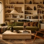
The paint on your walls should not be a monologue. It must enter into a quiet, harmonious conversation with every other element in the room: the grain of the wood flooring, the weave of the linen curtains, the metallic finish of a favorite lamp. This principle, tonal consonance, is about creating a cohesive visual language where nothing shouts for attention.
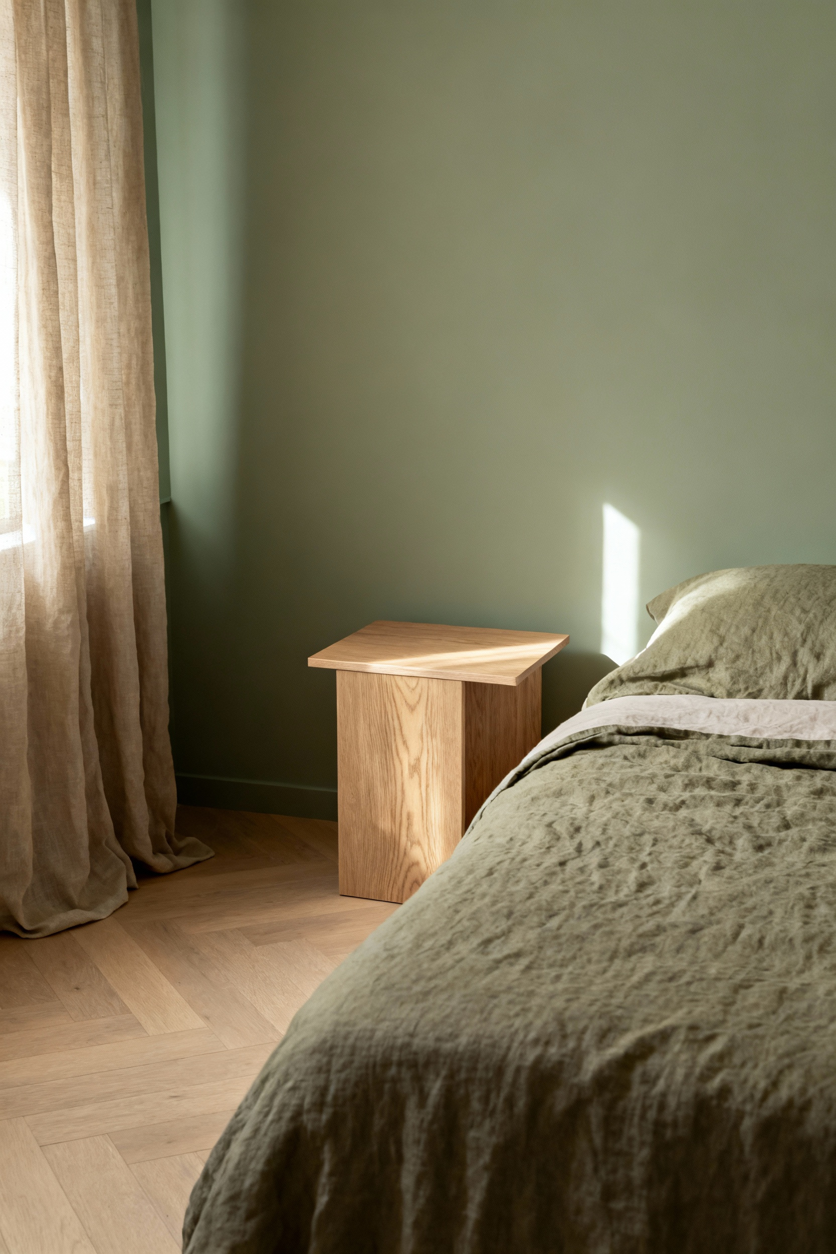
Start by identifying the undertones of your fixed elements. Is your headboard a warm walnut with red undertones, or a cool ash with notes of gray? Select a wall color that shares this same temperature. This doesn’t mean everything must match. A quiet harmony allows for subtle contrasts in texture—the smooth matte of a wall against rough-hewn wood, for example—which adds depth. This approach honors the materials you already own, creating a space that feels collected and whole, not assembled from disparate ideas.
4. The Art of Subtractive Perception: Designing for an Uncluttered Mind
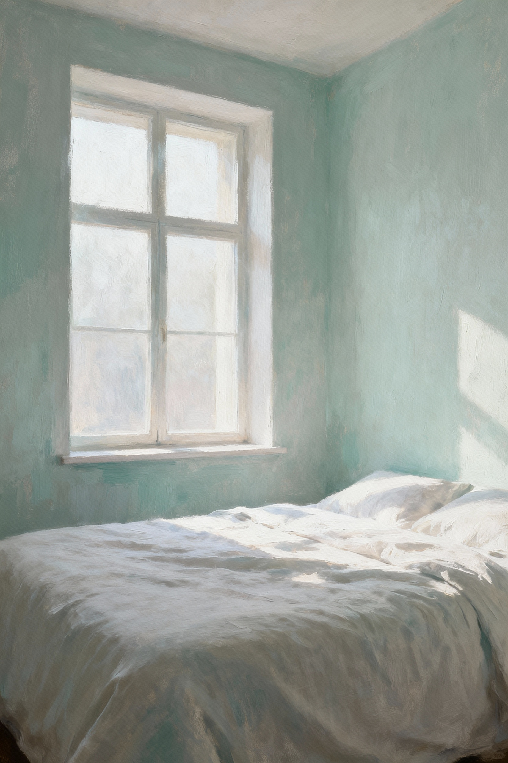
In our digitally saturated lives, the bedroom must be a place of sensory rest. This is achieved through subtractive perception—the intentional use of muted, desaturated colors that recede rather than demand attention. These are colors that ask nothing of you. They allow the mind to soften its focus, to release the day’s visual overstimulation.
This practice is about reducing a color’s intensity, not its character. Instead of a vibrant primary blue, consider a dusky slate blue infused with gray. Rather than a bright sage, choose a muted olive softened with brown. These hues create a sense of ma, or negative space, not just physically but psychologically. They provide a quiet backdrop that encourages introspection, allowing your thoughts to gently dissipate. The most sophisticated bedroom paint ideas whisper; they don’t shout.
Calibrating the Intention: Priming Your Canvas for Serenity (Part 2)
Our calibration continues as we consider the subtle, often overlooked qualities that transform a painted surface into a sensory experience. Here, we move beyond the purely visual to embrace properties that contribute to the room’s health, texture, and overall feeling of peace.
5. Prioritizing Sensory Consciousness: Low-VOC and Tactile Finishes
A sanctuary should nurture our well-being on all levels, including the air we breathe. Selecting Low-VOC or Zero-VOC paints is a non-negotiable act of care for your environment and yourself. It is a commitment to creating a space that is not just visually serene but is also fundamentally healthy, free from the subtle stress of off-gassing chemicals.
Beyond this, consider the tactile dimension. The finish of a paint—how it feels to the eye and potentially to the touch—is crucial. A flat or matte finish absorbs light, creating a soft, velvety surface that minimizes glare and promotes a sense of deep calm. There’s an honesty to it. What I’ve seen in my own practice is that these non-reflective surfaces contribute to a more profound sense of quiet, almost as if the walls themselves are absorbing sound and stress, creating an acoustic and visual peace.
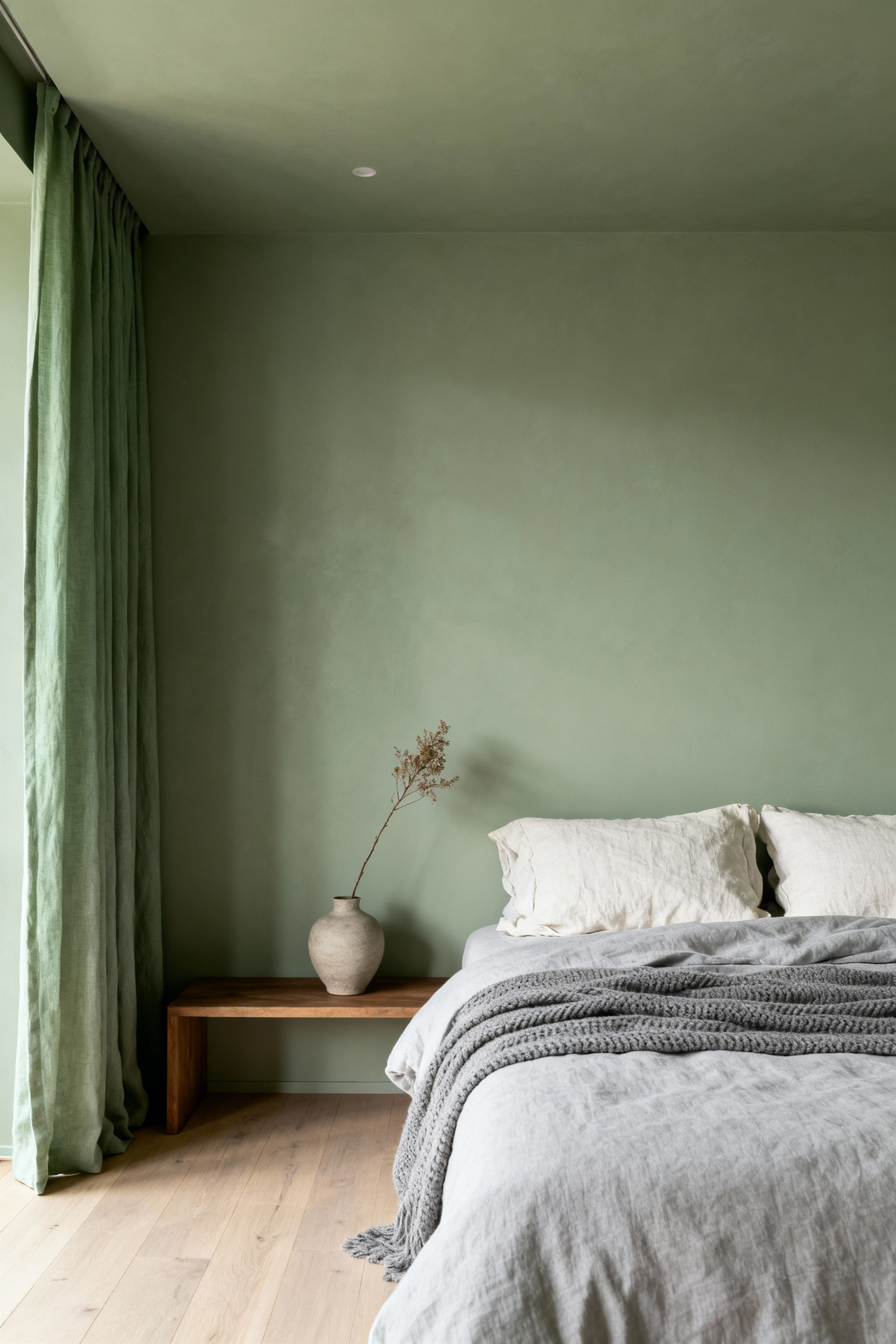
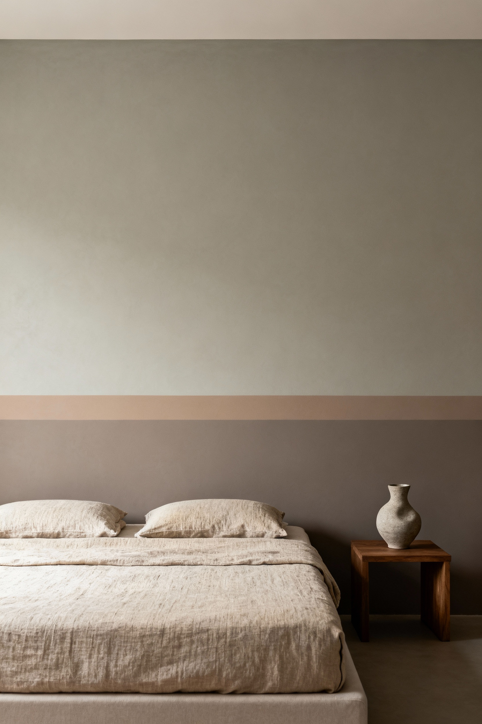
6. The Language of Variation: Tints, Tones, and Shades for Depth
Mastery of color requires understanding its nuanced language. A ‘tint’ is a pure hue lightened with white, creating an airy, expansive quality. A ‘shade’ is a hue darkened with black, offering a sense of grounding and intimacy. And a ‘tone’ is a hue muted with gray, resulting in sophisticated, complex colors that feel organic and restful.
This is not mere terminology; it is the key to creating visual depth without clutter. Imagine walls painted in a soft, complex tone of green. The ceiling could be a lighter tint of that same green, subtly lifting the space. A deeper shade might then appear in a single textile to anchor the bed. This layering within a single color family avoids monotony and creates a rich, contemplative environment. It’s how you build a space that feels both simple and profound.
Architectural Psychology: Crafting Ambience Through Sophisticated Coatings (Part 1)
Here, we explore how paint transcends decoration and becomes an architectural tool. A discerning choice of color and finish can reshape our perception of a space, making it feel more expansive, more intimate, or more grounded. These are techniques for sculpting not just walls, but the feeling within them.
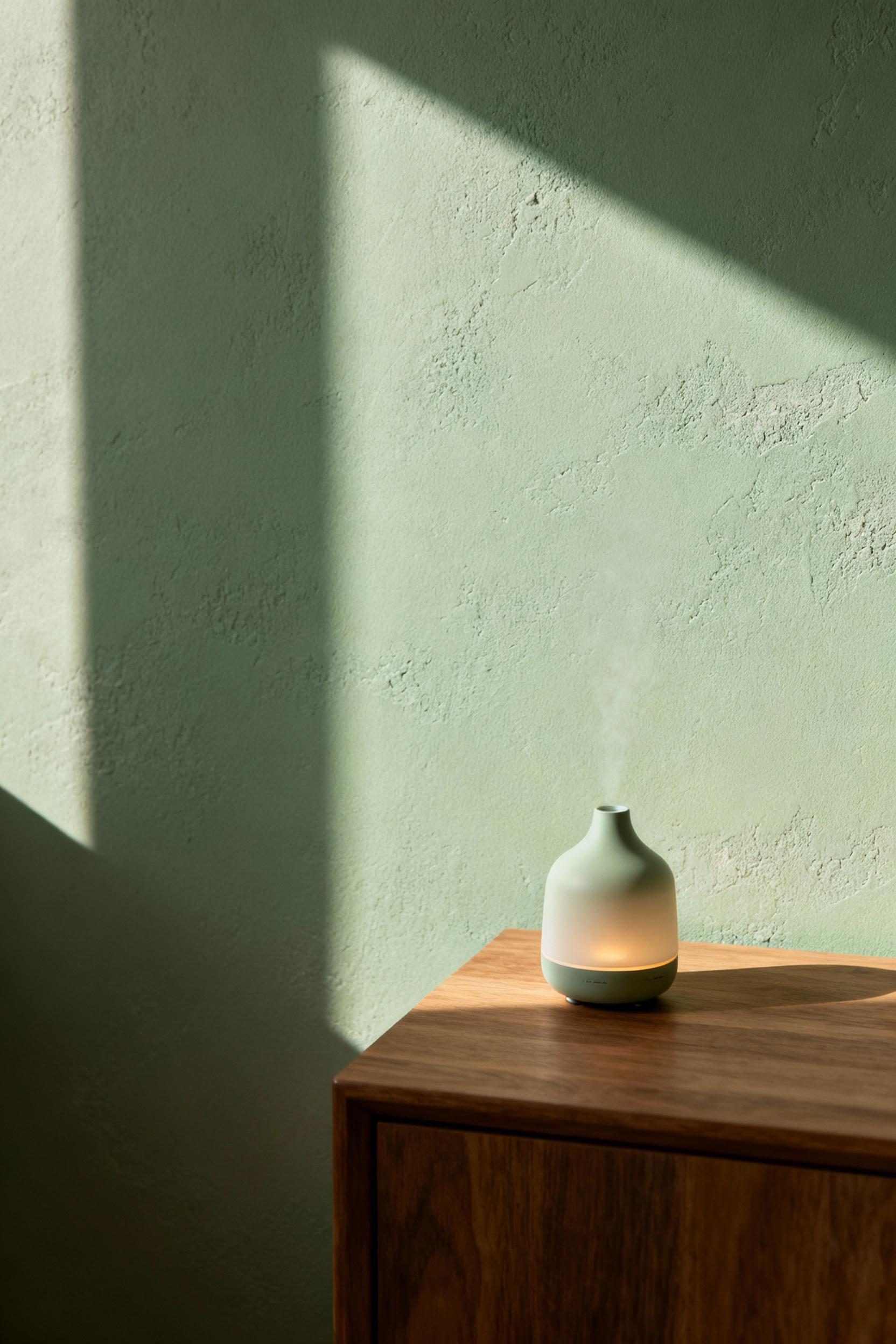
7. The Enveloping Monochromatic Wash: Depth Through Sheen
A monochromatic space can be profoundly immersive, yet it risks feeling flat. The solution lies not in adding more color, but in varying the finish. Imagine an entire room—walls, trim, and ceiling—in a single, serene off-white. By painting the walls in a soft matte, the trim in a subtle eggshell, and the ceiling in a flat finish, you create a dynamic play of light.
This technique uses sheen to articulate the room’s architecture without introducing visual noise. The slight reflection from the eggshell trim will catch the light, defining the room’s edges with a quiet elegance. The effect is cohesive and deeply calming, encouraging the eye to appreciate form and shadow. In Japanese design, we value this subtle interplay—it’s how you create richness through restraint, turning a simple color into a sophisticated experience.
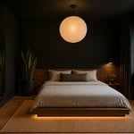
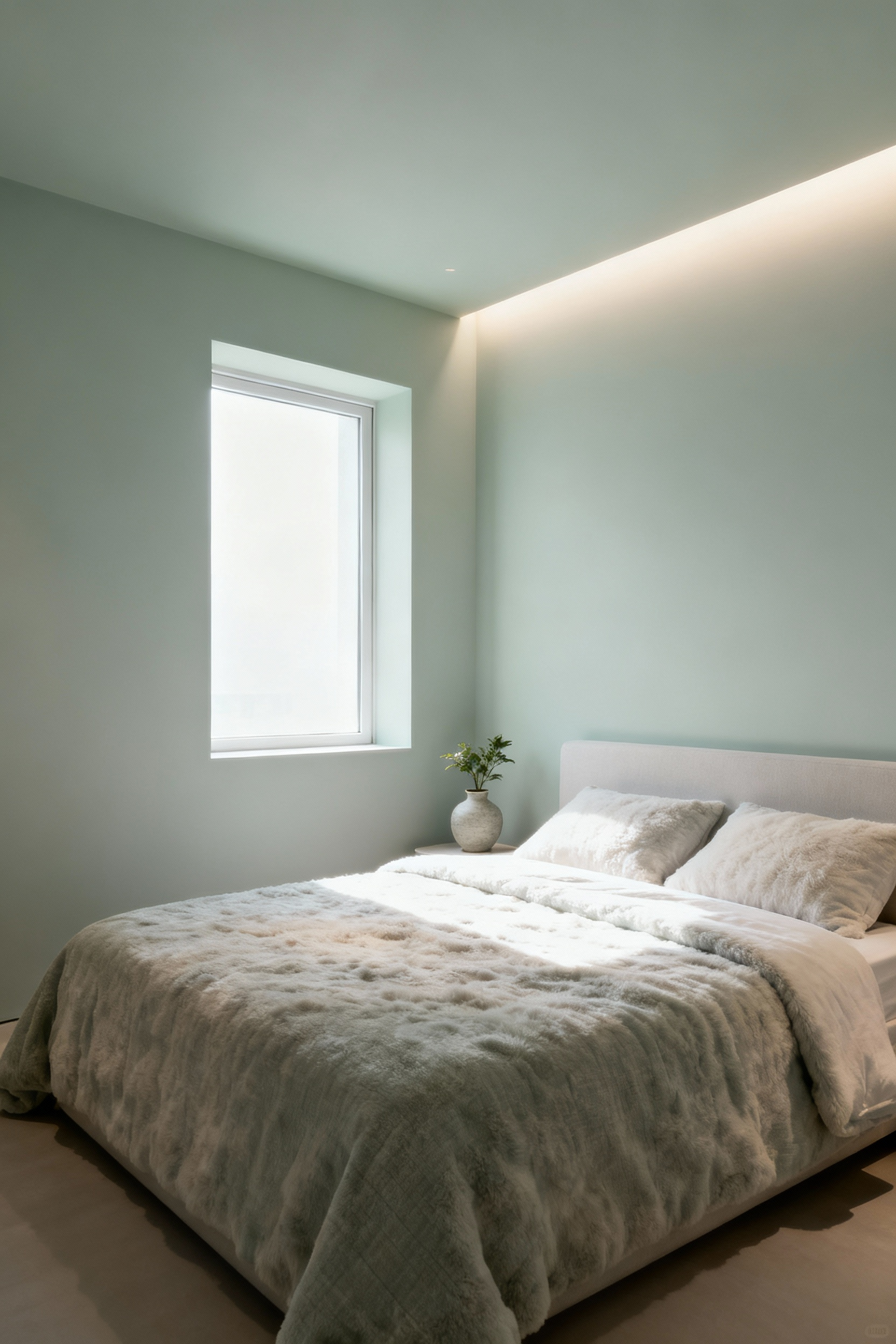
8. Strategic Zenith Painting: The Ceiling as the Fifth Wall
The ceiling is too often a forgotten surface, a default white canvas. Yet, treating it with intention can fundamentally alter a room’s atmosphere. Painting a ceiling a dark, inky color—a deep indigo or charcoal—draws the eye upward and then creates a powerful, cocooning effect. It can make a room with high ceilings feel more intimate and secure, a perfect condition for rest.
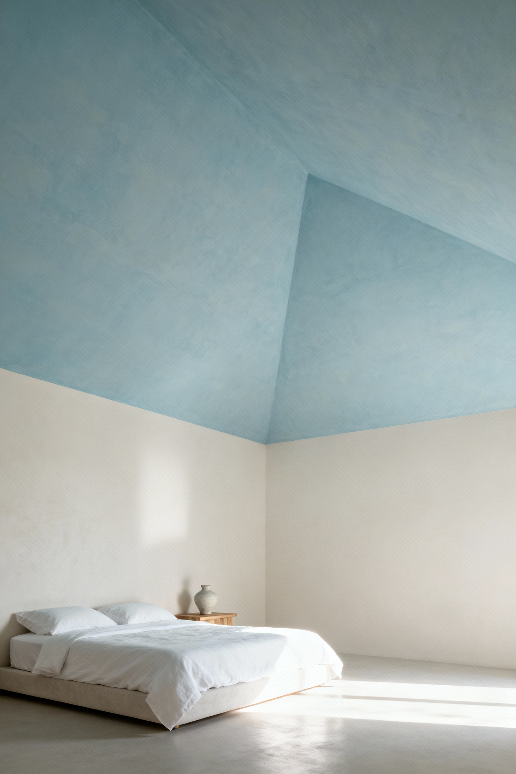
Conversely, extending the wall color onto the ceiling, perhaps in a slightly lighter tint, dissolves the boundaries of the room. This technique makes the space feel more expansive and limitless, almost like being inside a gentle cloud of color. I learned this when working on a small urban apartment; blurring the line between wall and ceiling gave the bedroom a sense of serene openness it otherwise lacked. This is a powerful tool for shaping the psychological volume of a space.
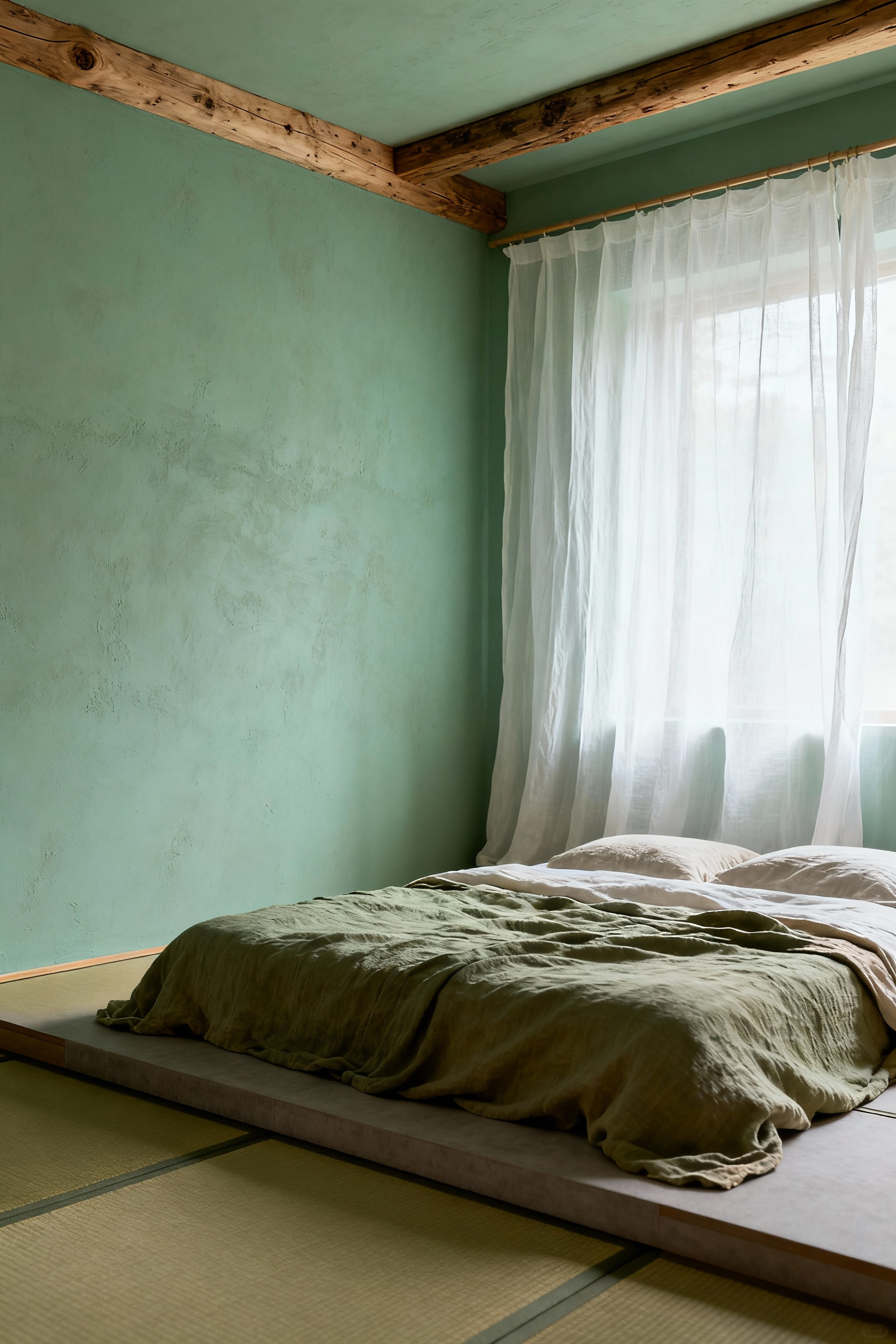
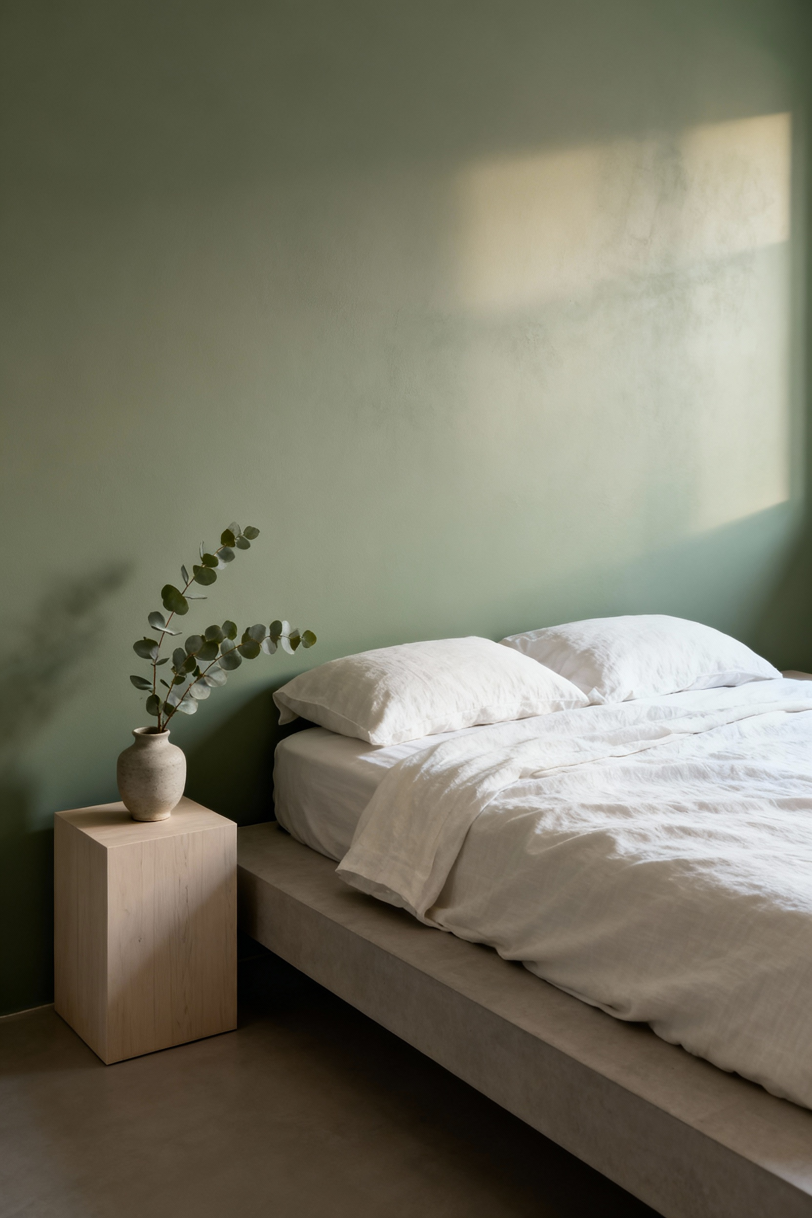
9. Biophilic Integration: Grounding with Earth Pigments
We have an innate, subconscious need to connect with the natural world. Biophilic design answers this need. Using earth pigments—colors drawn from soil, stone, clay, and foliage—is one of the most direct ways to foster this connection in the bedroom. These are colors like muted ochre, dusty terracotta, soft sage, and deep umber.
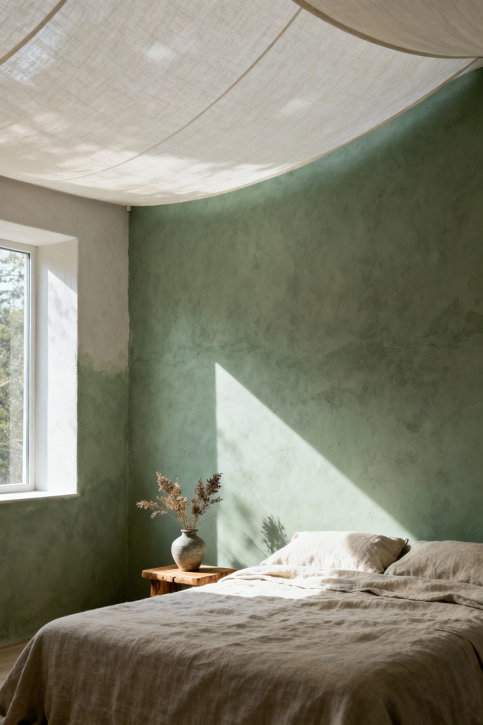
These hues carry a certain gravitas and authenticity that synthetic colors often lack. They have an inherent complexity that shifts beautifully with the light, much like a natural landscape. A wall painted in a desaturated, earthy tone provides a sense of stability and rootedness, a quiet counterpoint to our fast-paced digital lives. By surrounding ourselves with these foundational colors, we are not just decorating; we are creating a grounding field for our own well-being.
10. The Phenomenology of Limewash: Walls with Texture and Soul
Limewash is not merely paint; it is a mineral coating that becomes part of the wall itself. Unlike a uniform film of latex, it penetrates the surface, resulting in a finish with subtle movement, soft mottling, and a chalky, suede-like texture. This is the embodiment of wabi-sabi—the beauty of imperfection and transience.
The way limewash catches the light is unique. It creates a soft, luminous depth that feels both ancient and completely modern. The application itself, with its characteristic brush strokes, leaves an imprint of the human hand, adding a layer of authenticity to the space. I’ve noticed that rooms with limewashed walls feel quieter. The natural, breathable finish seems to soften the entire atmosphere, creating a sanctuary that feels organic and deeply restorative.
Architectural Psychology: Crafting Ambience Through Sophisticated Coatings (Part 2)
We continue our study of how purposeful coatings can sculpt not just space, but our experience within it. These advanced strategies use color to define function and modulate light, demonstrating how paint can be a subtle yet powerful tool for mindful living.
11. Defining Rest Zones with Gradient Transitions
In a modern home where a bedroom might also host a small desk or a meditation corner, we can define zones without building walls. A subtle gradient transition in color can create a gentle psychological boundary, maintaining the room’s open, serene feeling. This is a very fluid, sophisticated approach.
Imagine the wall behind your bed painted in a grounding, medium-tone sage. As the wall moves toward a reading nook, the color could slowly and seamlessly transition into a lighter, airier tint of the same hue. This soft visual shift signals a change in function without any physical interruption, preserving the room’s tranquil flow. It’s a technique that requires precision, but the result is an environment that feels both cohesive and thoughtfully zoned for different modes of being.
12. Micro-Contrast Accents: Minimalist Edge Detailing
True sophistication is often found in the quietest details. Instead of a bold accent wall, consider micro-contrast. This involves highlighting a room’s existing architectural lines—the edge of a doorway, the inside of a window frame—with a color that is just one step lighter or darker than the main wall.
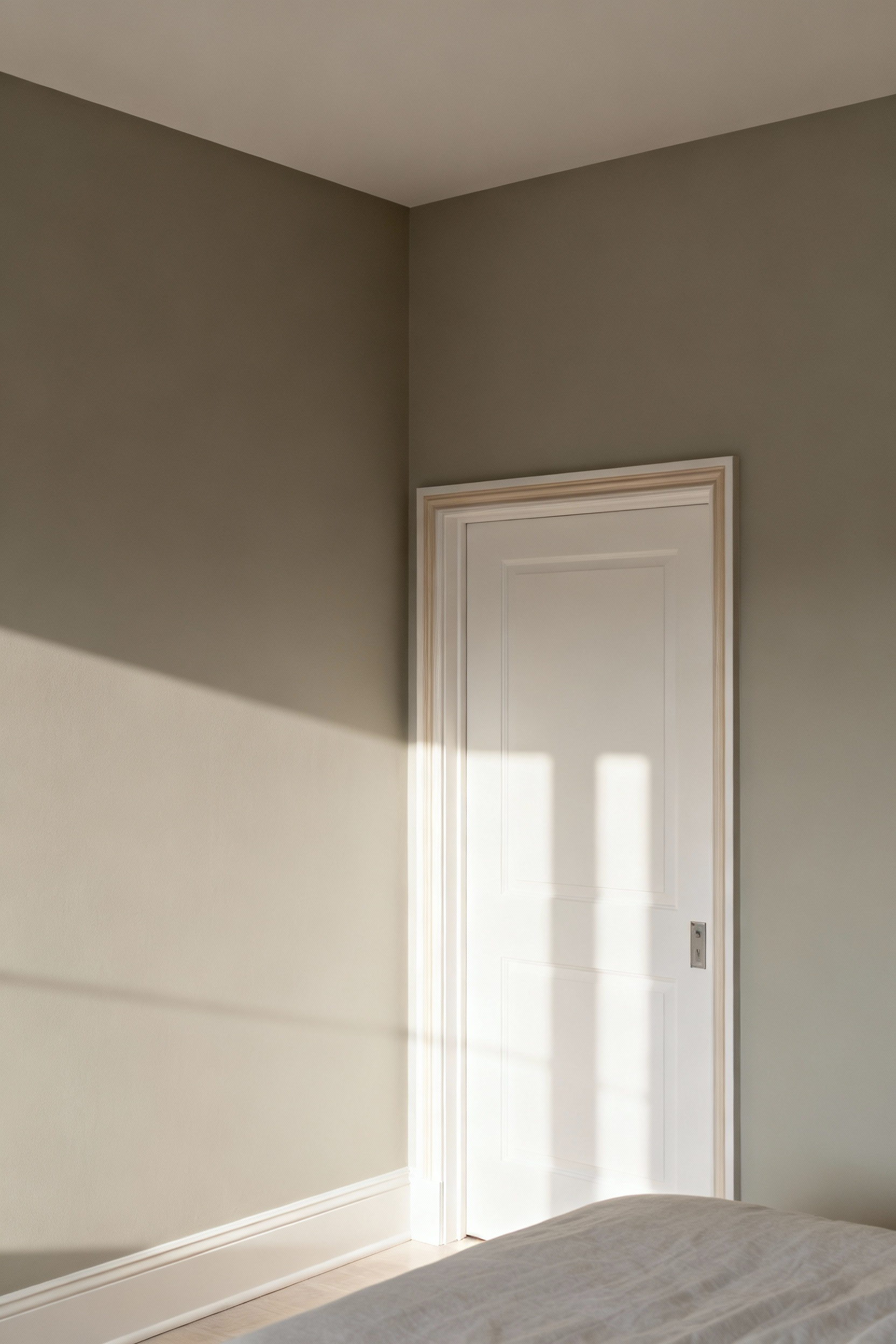
This technique is about celebrating the room’s form with quiet integrity. A line of soft black along the top of a white baseboard, for instance, can ground the entire room with stunning subtlety. In my practice, I find this brings a sense of crispness and intention to a minimalist space, preventing it from feeling stark. It draws the eye without demanding attention, adding a layer of visual interest that is discovered over time, rewarding mindful observation.
13. Specular vs. Diffuse Finishes: Sculpting with Light
The way a surface interacts with light is defined by its finish. Diffuse finishes, like matte paint, scatter light to create a soft, velvety look that minimizes glare. This is the ideal state for the primary walls of a bedroom, as it fosters an enveloping calm and a profound sense of quiet. A deep matte blue wall will feel still and infinite.
Specular finishes, like eggshell or satin, reflect light more directly. While you would avoid these on a large wall, they are perfect for creating subtle accents. Using an eggshell finish on window trim and baseboards can provide a gentle contrast against matte walls, catching the light and defining the room’s structure. This deliberate interplay between diffuse and specular surfaces is how you orchestrate a gentle and visually comfortable illumination for your sanctuary.
The Ethos of Color: Cultivating Mindful Habitation (Part 1)
The colors we choose are a statement of our ethos—a reflection of our values and our intention for how we want to live. This section moves into the philosophy of color, exploring how we can make choices that are liberated from trends and deeply aligned with our own personal narrative.
14. Deconstructing Affective Color Bias: Liberating Choices from Trends
We are constantly influenced by passing trends, childhood associations, and clever marketing. These external forces create an ‘affective color bias,’ pushing us toward choices that may be popular but are not authentically our own. To cultivate a mindful sanctuary, we must first deconstruct these biases and listen to our own inner wisdom.

This requires a pause for honest reflection. Ask yourself: why am I drawn to this color? Is it because it genuinely fosters a sense of peace within me, or because I have seen it celebrated in design media? True liberation comes from choosing a color that resonates with your personal history and aspirational state of being, regardless of its current fashionability. This is how you create a timeless space that will nurture you for years, not just for a season.
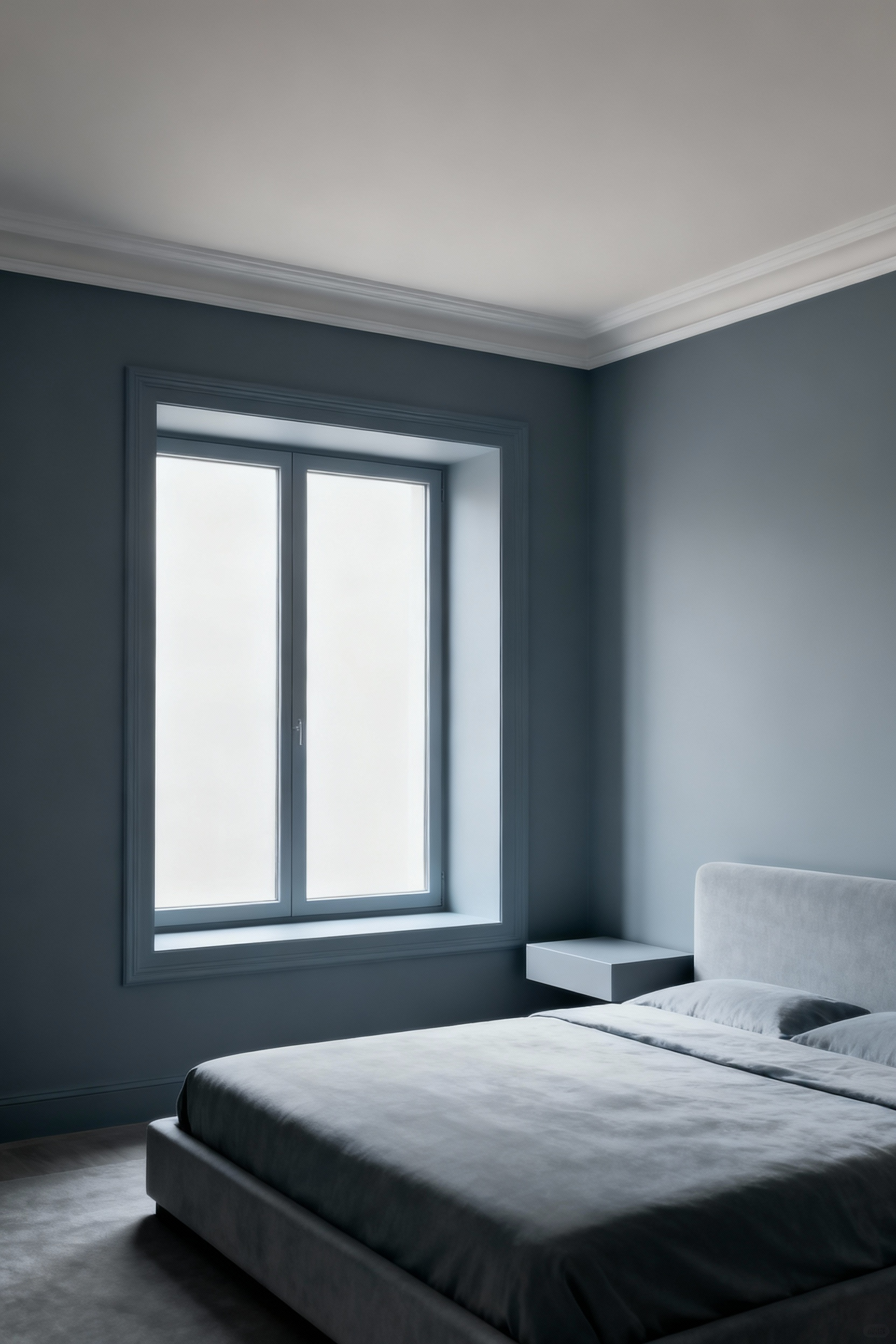
15. The Therapeutic Efficacy of Cool-Toned Palettes
There is a physiological reason that cool-toned palettes—blues, greens, and muted violets—are so conducive to rest. These hues have been shown to lower blood pressure and slow the heart rate, mimicking the body’s state during relaxation. They connect us to the vast, calming elements of nature: the sky and the sea.
For sleep induction, few things are as effective as a room painted in a desaturated, complex blue or green-gray. The key is to avoid anything too bright or energetic. Think of the color of the sky just after sunset, or the deep, hazy green of a forest in shadow. These are colors that signal to our nervous system that it is time to downshift. They create an environment that actively supports the body’s natural transition into deep, restorative rest.
16. Cultivating a Personal “Color Autobiography”
The most powerful bedroom paint ideas are born from your own life story. Your ‘color autobiography’ is the unique palette of hues that are tied to your most significant memories, your heritage, and your personal journey. This is about finding the colors that are part of your very identity.
Perhaps it’s the exact shade of gray from the stones on a beach where you felt profound clarity, or the warm, faded yellow of a beloved book from your childhood. When you bring these highly personal hues into your bedroom, the space becomes imbued with layers of meaning. It’s no longer just a room; it’s a physical manifestation of your story. From my professional experience, a space built on this foundation provides a level of comfort that no trend can ever match.
17. Embracing Impermanence: How Color Evolves with Time and Light
A paint color is not a static fact. It is a living, breathing entity that shifts with the angle of the sun and the warmth of a lamp. To choose a color wisely is to embrace this impermanence. You are not choosing a single shade, but a spectrum of possibilities that will unfold throughout the day.
This is why observing a large sample in your room is so critical. The serene gray you loved in the store may reveal unexpected purple undertones in the afternoon light. By understanding this, you can choose a color whose transformations you will enjoy. This mindset shifts you from being a consumer of color to a curator of light and hue, appreciating the subtle and constant evolution that gives a room its life and soul.
The Ethos of Color: Cultivating Mindful Habitation (Part 2)
We conclude by examining the subtle power of neutrality and how to navigate the overwhelming nature of choice. These final concepts are about finding calm and confidence in simplicity, creating a bedroom that serves as a grounding force in a complex world.
18. The Paradox of Neutrality: Dynamic Calm in Understated Hues
Neutral tones are often misunderstood as being safe or uninspired. But when chosen with intention, they are profoundly dynamic. The power of a sophisticated neutral—a warm greige, a cool off-white, a complex taupe—lies in its subtle interaction with light and texture. It becomes a quiet canvas that allows form, shadow, and material to become the focus.
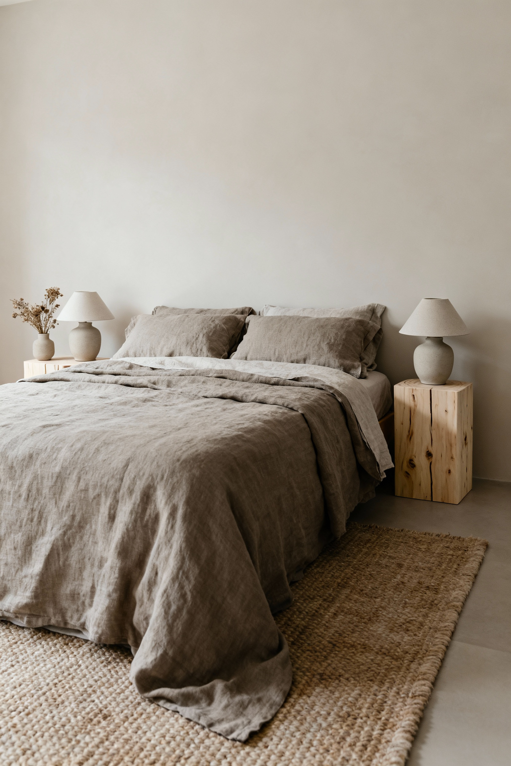
The artistry is in selecting a neutral with the right undertone. A neutral with a green or blue undertone can create a crisp, serene atmosphere, while one with a warm, rosy undertone fosters an intimate, enveloping feeling. In a neutral room, the texture of a linen curtain or a wool blanket becomes more pronounced. This approach reduces visual noise, allowing for a deeper appreciation of the quiet details and creating a calm that is anything but boring.
19. Reconciling Ambivalence: Navigating Design Anxiety with Simplicity
The sheer volume of choice in our modern world can be paralyzing. When it comes to something as personal as your bedroom, this can lead to real design anxiety. The way through this is not more options, but intentional simplicity. Start by clarifying the single most important feeling you want the room to evoke. Calm? Security? Warmth? Let that be your anchor.
From there, commit to a minimalist palette. Perhaps it’s just one primary color and a single, subtle accent. Or a monochromatic scheme that relies on shades and tints of one hue. This intentional constraint frees you from the pressure of making the “perfect” choice and allows you to focus on nuance. What I’ve seen work best is when this simplicity allows a person to feel in command of their space, transforming anxiety into a sense of mindful purpose.
20. The Somatic Impact of Shade Immersion: Deep Relaxation Through Color
Certain deep, enveloping colors can have a powerful somatic, or bodily, effect. Immersing a bedroom in a single, rich yet muted hue—like a deep forest green, a midnight blue, or a charcoal gray—can create a profound sense of safety and enclosure. It’s like being wrapped in a protective cloak.
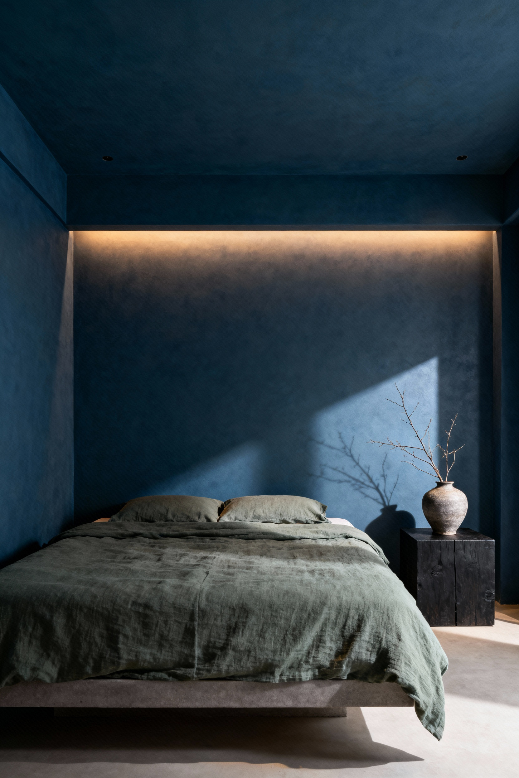
These immersive colors quiet the nervous system by providing a stable, unified visual field. With fewer edges and contrasts for the eye to process, the mind can more easily disengage and relax. The experience is not just visual; it’s a felt sense of being held by the space. This is a bold approach, but for those seeking a true retreat for deep relaxation and sensory grounding, enveloping the room in a single, profound shade can be a transformative design choice.
Conclusion
The journey through these twenty concepts reveals a simple truth: the selection of bedroom paint ideas is an act of mindfulness. It is a decision that extends far beyond aesthetics, touching the very quality of our rest, our thoughts, and our sense of peace. Each principle—from attuning to light to embracing personal history—is a thread in a larger tapestry of intentional living. The goal has not been to provide a prescriptive list, but to offer a new way of seeing color as a fundamental tool for crafting a sanctuary.
I encourage you to now approach your own space with this philosophy. Let your choice be a reflection, a quiet and considered process that honors your needs and the unique character of your home. Use these concepts as a guide to create a bedroom that is more than just a place to sleep, but a space that actively restores your spirit. Let it be an environment that offers refuge from the digital noise and serves as a true anchor for your well-being.
Ultimately, the walls of your bedroom are a canvas for your most personal expression of peace. By choosing with intention, you are not simply painting a room. You are authoring a sanctuary, a sacred space where the art of living well is practiced every single day.