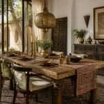
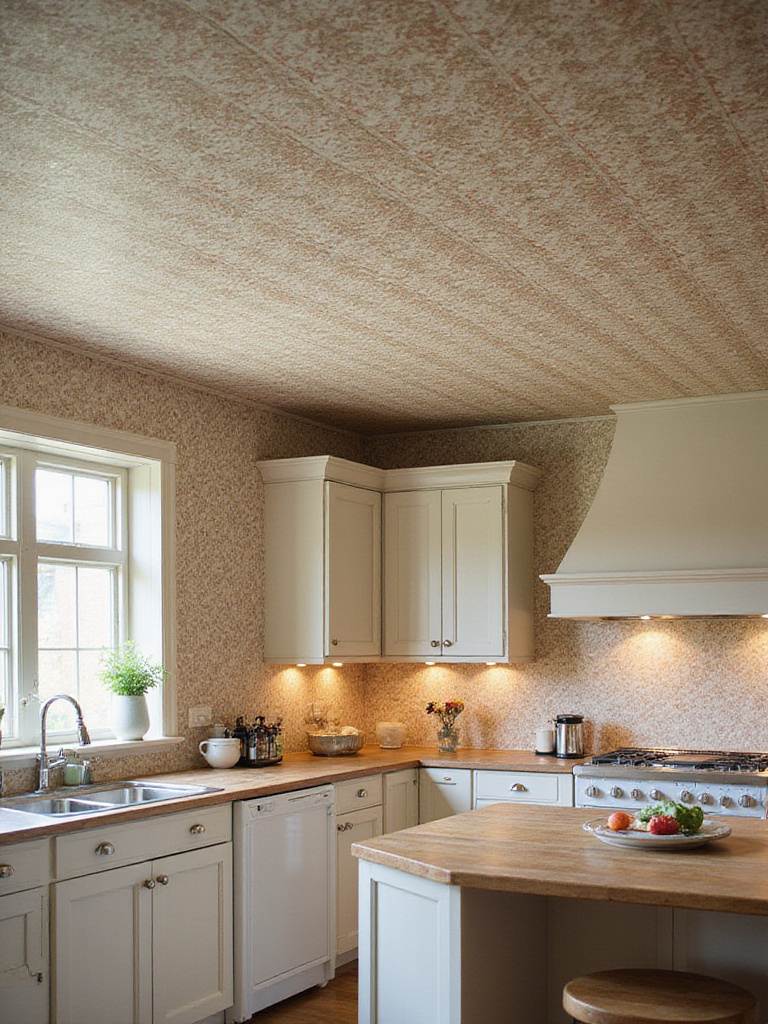
Of all the rooms we design, the kitchen holds a unique gravity. It’s where life happens—the quiet ritual of morning coffee, the controlled chaos of a family meal, the conversations that linger long after the plates are cleared. For years, the safe choice was white or gray, a palette of minimalist restraint. But I’ve noticed a shift. A pull toward something with more soul.
Green.
This isn’t about chasing a trend. In my work designing climate-adaptive spaces, from the sun-drenched coasts of the Mediterranean to the stark beauty of the American desert, I’ve seen how color is a primal tool. And green has a power unlike any other. It connects us to the most fundamental elements of life: water, shade, growth. The right shade of green can turn a kitchen from a simple workspace into a sanctuary. A place that feels both grounded and deeply sophisticated.
The real challenge isn’t if you should choose green, but how to navigate the hundred small decisions that follow. Which shade will honor your home’s light? How do you create something bold that still feels timeless? Here are my thoughts on how to bring this vital, calming color into the heart of your home.
1. Find Harmony in the Color of an Oasis
We have a deep, psychological need for green. Scientists call its effect “visual rest”—our eyes require almost no effort to process it. This is something ancient desert cultures understood intuitively. Think of the shaded courtyards of Marrakech, filled with plants. That’s not just decoration; it’s a deliberate act of creating a psychological oasis, a visual relief from the harsh sun.
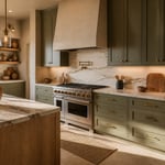
When you choose green for your cabinets, you’re tapping into that same principle. You’re bringing the restorative calm of the outdoors inside. In a kitchen, a space that can easily become frantic, green cabinets can act as a grounding force, turning the stress of cooking into something more mindful. I’ve found that specific shades carry their own subtle energy:
- Sage Green: Gentle and earthy, it reminds me of the wild herbs that grow in the dry hills of the Levant. It brings a spa-like serenity that’s perfect for a busy home.
- Forest Green: This shade has weight and sophistication. It’s the deep, cooling color of a shaded pine forest, and it can anchor a large, open space with confidence.
- Olive Green: My personal favorite for its warmth and complexity. It feels both ancient and modern, carrying the sun-baked earthiness of a Tuscan hillside.
What you’re really doing is using biophilic design—the practice of connecting our built environments with nature. It’s a powerful tool, especially in cities where a glimpse of green is a precious thing.
Choosing the right green is about listening to your home, and especially to its light.
2. Let Your Home’s Light Choose the Green
Natural light is your most important design partner. It’s a living element that changes throughout the day, and it will dramatically alter how you perceive color. Before a single can of paint is opened on a project, I spend days observing how light moves through a space. It’s a lesson I learned the hard way on an early project in Palm Springs, where a beautiful, soft green I’d chosen for a kitchen looked completely washed out and lifeless in the intense afternoon glare.
The direction your kitchen faces is everything. North-facing rooms have a cool, consistent, silvery light that can make some greens feel a bit somber. Here, you need a green with warmer undertones—think sage or olive—to keep the space from feeling cold. South-facing rooms, on the other hand, are flooded with a warm, almost golden light that can intensify colors. A cooler mint or eucalyptus shade can feel balanced and refreshing in this kind of light, whereas a warm olive might become too yellow.
And don’t forget your artificial lighting. It’s a common oversight that can undo all your careful planning. Warm LEDs (around 2700K) will bring out the golden notes in olive and sage. Cooler bulbs (4000K and up) will highlight the blue undertones in emerald and forest greens. My best advice? Get large sample boards—at least two feet square—and move them around your kitchen. Watch them in the morning, at noon, and at night under your lights. You need to see how the color lives in your space before you commit.
Once you have a color that speaks to you and your light, the material it lives on becomes the next part of the story.
3. Build a Foundation for Lasting Color
The most beautiful green in the world will fail if it’s on the wrong surface. This is where it gets technical, but it’s critical. The stability of your cabinet material, especially in climates with fluctuating humidity and temperature, determines the longevity of your finish.
For a painted finish, a high-quality, paint-grade MDF (Medium-Density Fiberboard) is often the superior choice for doors. It’s incredibly stable and offers a flawless, smooth surface without any wood grain telegraphing through the paint. Frankly, it holds a perfect coat of paint better than almost any wood. For the cabinet boxes themselves, furniture-grade plywood offers the best structural integrity for the long haul.
Solid wood? Of course, it’s an option. But wood breathes—it expands and contracts with changes in humidity. Over time, this movement can cause hairline cracks at the joints, which are especially noticeable on darker, saturated colors. If you’re set on solid wood, choose species with a tight grain like maple or poplar. Woods like oak, with their prominent grain, require a lot of prep work to get a smooth finish and might not be the best canvas for a clean, modern look. The small extra investment in “paint-grade” materials is an investment in durability.
What a lot of people don’t realize is that the material choice isn’t just about looks today, but how your kitchen will stand up to daily life and its climate a decade from now.
Your cabinets, no matter how beautiful, don’t exist in a vacuum. They need a partner in your countertops.
4. Create a Dialogue Between Cabinets and Countertops
Your countertops and cabinets are in a relationship. They need to complement each other to create a sense of harmony. A busy, dramatic stone paired with a bold green can feel like two people shouting at once. The goal is balance.
Warm greens like sage and olive come alive next to creamy whites, soft taupes, or even a quiet limestone. They have an earthy connection that just works. For cooler, more dramatic forest or emerald greens, a crisp white quartz or a marble with subtle, cool-gray veining provides a beautiful contrast without competing. I often lean on natural materials here. A butcher block counter brings an organic warmth that deepens green’s connection to the outdoors, developing a rich patina over time. It’s a living surface. For a more seamless, modern feel, I love using terrazzo or even a poured concrete, materials that have an inherent honesty and connection to the earth.
Think about the scale of the pattern. A countertop with a wild, dramatic pattern might be a star on its own, but it can easily overwhelm your beautiful green cabinets. Often, a quieter stone with soft, elegant movement is a much better supporting actor. Engineered quartz gives you that control and predictability, which can be a relief in a busy family kitchen.
With that foundation set, the backsplash is where you can add a layer of texture and personality.
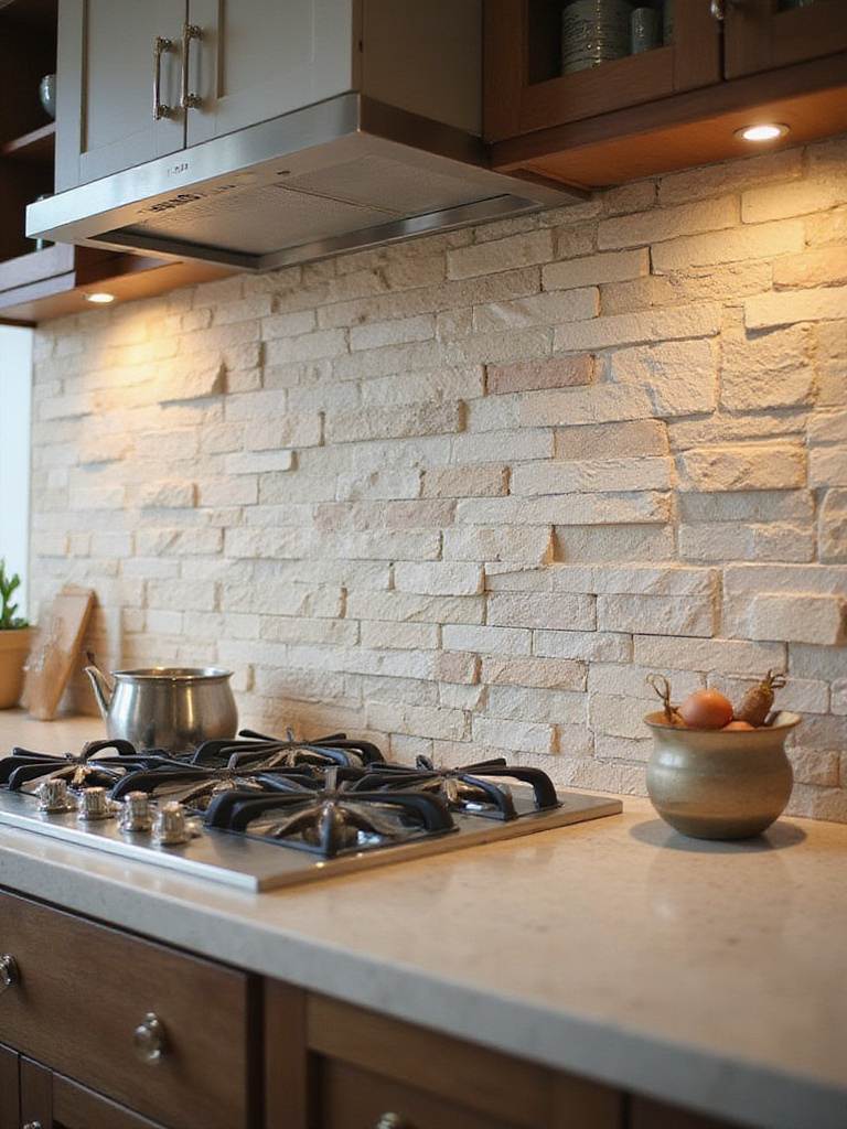
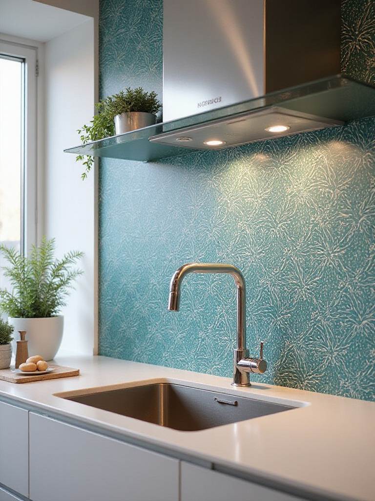
5. Add Texture and Soul with Your Backsplash
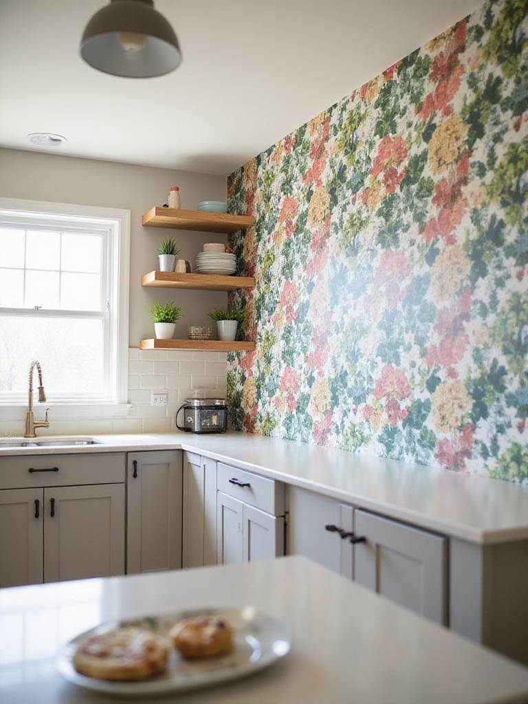
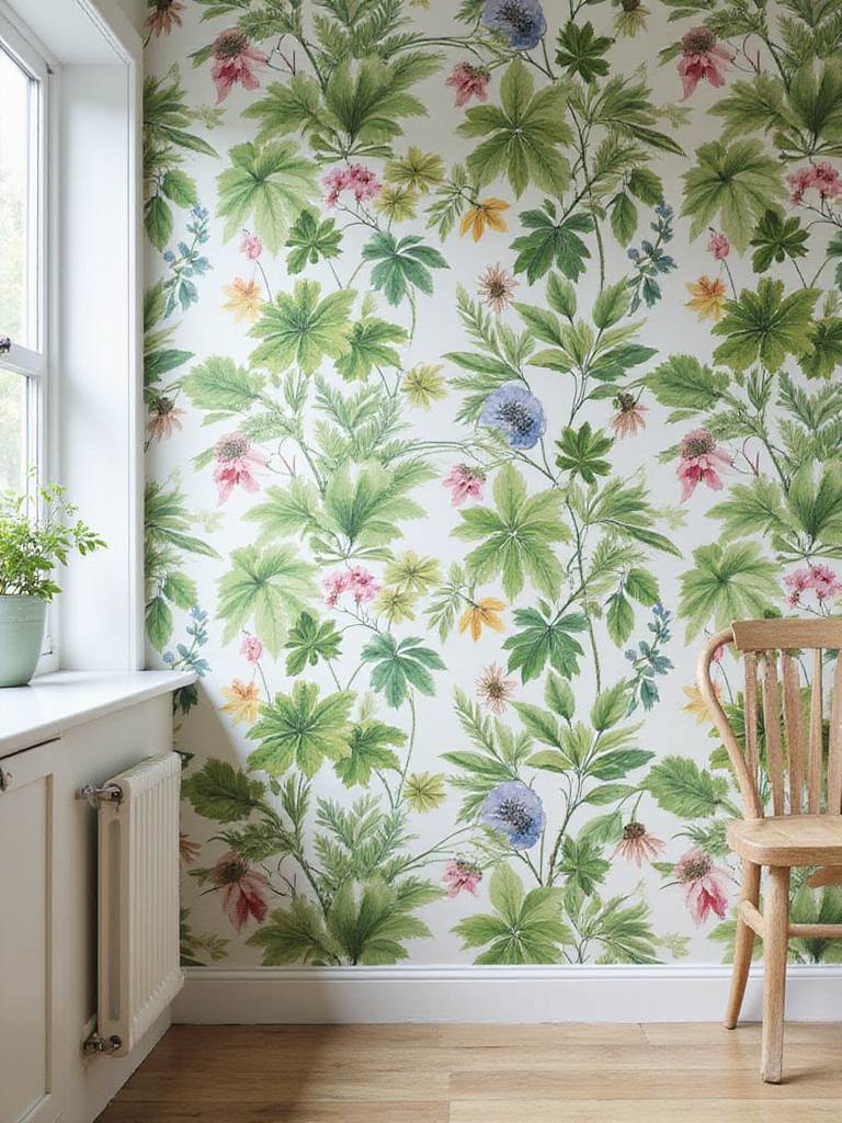
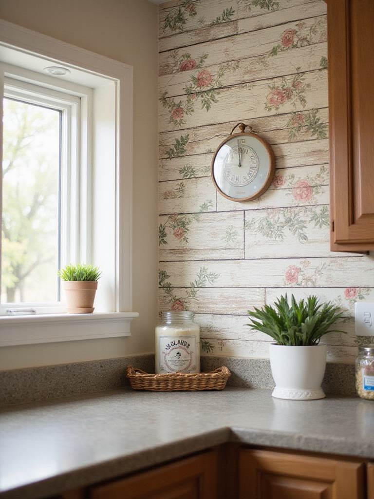
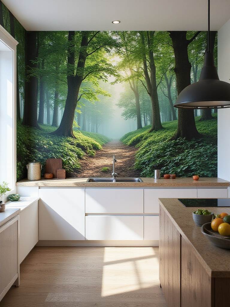
The backsplash is the bridge between your cabinets and countertops. This is your moment to introduce texture, something that catches the light and adds a human touch. This is where my love for Middle Eastern materials really comes into play. Hand-made Zellige tiles from Morocco, with their subtle variations in color and glaze, are a perfect partner for green cabinets. Each tile is slightly different, creating a surface that feels alive. It prevents the kitchen from feeling too flat or machine-made.
The key is to avoid anything that feels too perfect. Natural materials—whether it’s ceramic, terracotta, or a slab of unpolished stone—have inherent irregularities that echo the organic quality of the color green itself. A simple subway tile can also work beautifully, but consider the grout. A contrasting grout creates a strong graphic pattern, while a grout that matches the tile recedes, letting the tile’s texture come forward. In a minimalist space, I sometimes carry the countertop material right up the wall for a seamless, architectural look. This lets the green of the cabinetry be the undisputed hero.
The finish matters immensely. A matte tile will absorb light for a soft, sophisticated mood. A glossy finish will bounce light around, which can be a great strategy for brightening a darker corner or lending energy to the space.
Now, for the finishing touch—the hardware that completes the look.
6. Punctuate Your Design with the Right Hardware
Hardware is the punctuation for your cabinets. It’s a small detail that has an outsized impact on the final feel of the room. Contrast is your friend here. Warm metals like brass or copper create a stunning tension against cool forest or emerald greens. There’s a reason you see this combination so often; it just works. The warmth of the metal makes the green feel richer and more vibrant. For lighter sage or mint greens, matte black hardware provides a dramatic, modern edge.
Of course, you have to consider the other metals in your kitchen. If your faucet and light fixtures are all brushed nickel, you can create a cohesive look by sticking with that. But I often prefer to mix metals with intention. Using warm brass pulls on cool green cabinets, even if the faucet is chrome, can feel like a deliberate, confident design choice. The trick is to make it look intentional, not accidental.
The style of the hardware itself signals the room’s personality. Sleek, minimal pulls let the color be the main story—a very Scandinavian approach. More ornate knobs or classic cup pulls can nod to a more traditional or transitional feel. In many of my projects, I opt for hardware that feels substantial and honest—solid brass that will patina over time, or hand-forged iron. These are materials that age gracefully alongside the rest of the kitchen.
And just like paint, always test hardware samples against your cabinet color. You’d be surprised how different a piece of brass can look in different lights.
Hardware and cabinets are just two parts of a larger color story that includes your walls.
7. Paint Your Walls with Intention
Choosing a wall color to go with green cabinets is less about finding a match and more about creating a relationship. You need to respect the green’s undertones. Warm olive or sage greens pair beautifully with soft, creamy whites, sandy beiges, or even a muted, dusty rose for a surprisingly sophisticated look I’ve seen used to incredible effect in modern Mexican architecture. Cooler greens like forest or teal are stunning against a crisp, clean white, a soft gray, or even a deep navy if you’re feeling bold.
The goal is to make the relationship feel deliberate. If the wall color is too close to the cabinet color but not quite the same, it can look like a mistake. Contrast, whether subtle or dramatic, is usually the safer and more elegant path. Think about creating an atmosphere. Light walls will make the space feel airy and open, while a darker wall color can create a cozy, intimate mood—like being enveloped in a forest.
Here again, I have a soft spot for natural finishes like limewash or clay plaster. They have a subtle, chalky depth that you can’t get from a standard latex paint. Their slight variations in texture and color capture the light beautifully and add a layer of warmth that really complements the organic feel of a green kitchen.
Of course, the whole composition rests on the foundation of your floor.
8. Ground the Space with Thoughtful Flooring
Your flooring is quite literally the foundation of your design. For a green kitchen, natural wood is an effortless partner. The organic connection between green and wood is primal. Lighter woods like white oak or maple can provide a beautiful, fresh contrast to dark green cabinets, keeping them from feeling too heavy. Conversely, a rich walnut can ground a kitchen with lighter sage cabinets, adding warmth and gravitas.
In the desert modern homes I design, however, I often lean towards cooler flooring that feels good underfoot in a warm climate. Polished concrete, large-format porcelain tile, or terrazzo can create a striking, clean backdrop that makes the green cabinets pop. The key, once again, is contrast in value (the lightness or darkness). If your floor and your cabinets are too similar in tone, the space can feel murky and undefined. Light floors will always make your cabinets feel like the star of the show.
Always consider the transition to the adjoining rooms. A cohesive floor that runs through the main living areas creates a better sense of flow and makes the entire space feel larger and more considered.
With all these elements in mind, you can steer your green kitchen in any stylistic direction you choose.
9. Steer Your Green Kitchen Towards Your Personal Style
Green is not a one-style-fits-all color. It’s incredibly versatile. The same shade of green can feel modern, traditional, or beautifully transitional, all depending on the elements you surround it with. It’s all about the combination of door style, hardware, and materials.
- For a modern look, think flat-panel (or slab) cabinet doors. The uninterrupted surface really lets the color sing. Pair a deep forest green with minimalist matte black or stainless steel pulls. Keep the countertops and backsplash simple and clean. Here, the green itself is the main design element.
- For a more traditional feel, a Shaker-style door is timeless. It has just enough detail to feel classic without being fussy. Deeper hunter greens or classic olive tones work well here, paired with warmer hardware like brass or oil-rubbed bronze in a more detailed style, like a cup pull.
- The transitional style, which is where I think most people land, borrows from both. You might use a simple Shaker door but pair it with modern hardware and a clean, contemporary countertop. This approach gives you the most flexibility and longevity, creating a space that feels current but won’t look dated in five years.
The architecture of your home should always be a guide. The goal is to create a kitchen that feels like it belongs to the house, not one that was dropped in from a magazine.
No matter the style, your number one asset will always be light.
10. Treat Natural Light as Your Most Valuable Asset
We’ve talked about choosing greens based on your light, but it’s just as important to maximize the light you have. Natural light has a full spectrum of color that artificial light just can’t replicate. It makes colors, especially complex ones like green, come alive. Maximizing it is one of the most sustainable things you can do.
Beyond the obvious—like keeping windows spotless—think about architectural solutions. In my work, I often look for opportunities to add skylights or clerestory windows to bring in light from above, which illuminates a space without the direct glare you get from a side window. Simple things help, too. Swapping heavy drapes for light-filtering linen shades can transform a room. Even trimming a tree that’s blocking a key window can have a massive impact.
Reflective surfaces are your secret weapon. Light-colored walls, a ceiling painted in a slightly lighter shade than the walls, and countertops or backsplashes with a subtle sheen will bounce light around the room, multiplying its effect. I once used a backsplash of long, narrow, glossy tiles stacked vertically in a dark kitchen, and just that one change made the entire room feel two stops brighter by reflecting the light from the window opposite.
Now for the practical reality: the budget.
11. Spend Wisely: The Paint vs. Replace Dilemma
Let’s talk money, because a beautiful idea is only as good as its execution. The big question is often whether to paint your existing cabinets or tear them out and start fresh. Painting can cost a third of what new cabinets would, but it’s not always the smart choice. To be blunt, painting shoddy, failing cabinets is like putting a beautiful new coat on a car with a bad engine. It’s a short-term fix.
Here’s my rule of thumb. You should consider painting if:
- Your cabinets are solid wood or high-quality plywood.
- The boxes are in good structural shape, with no warping or water damage.
- You are genuinely happy with your kitchen’s current layout.
You should replace them if:
- They are made of cheap particleboard, laminate, or thermofoil that is peeling.
- The layout is dysfunctional, and you dream of better storage or flow.
- The doors and drawers are worn out and no longer close properly.
There’s also a hybrid approach I often recommend: keep the existing cabinet boxes if they’re sound, but order new, custom-finished green doors and drawer fronts. This gives you the fresh look and durable finish of new cabinetry at a fraction of the cost and with far less disruption.
If you do decide to paint, a good result hinges on a huge amount of prep work.
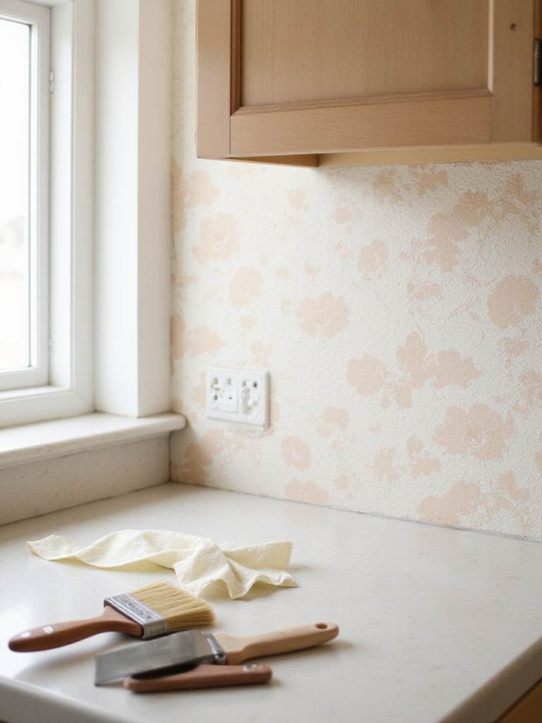
12. If You DIY, Become a Master of Prep
A successful DIY cabinet paint job is 70% preparation and 30% painting. I cannot stress this enough. Rushing the prep is the number one reason DIY paint jobs fail within a year. It’s tedious, but it’s non-negotiable.
The process is a ritual: Clean everything meticulously with a degreaser to remove years of kitchen grime. Then, sand every surface lightly to give the primer something to grip. Then, prime with a high-quality, bonding primer designed for slick surfaces. Only then should a paintbrush even think about touching the surface.
For paint, you need a product designed for the abuse a kitchen takes. A cabinet-grade enamel or a modern hybrid acrylic-alkyd paint will cure to a much harder, more durable finish than standard wall paint. Use high-quality tools—a good angled brush for cutting in and a high-density foam roller for the flat surfaces will minimize brush strokes. Apply multiple thin coats, not one thick one. And the hardest part: be patient. The paint needs to dry completely between coats and can take weeks to fully cure. Label your doors and hardware meticulously; you’ll thank yourself during reassembly.
The work isn’t over when the painting is done. Protecting your investment is an ongoing process.
13. Maintain the Beauty with Gentle Care
A beautifully painted kitchen requires a bit of gentle care. Think of it like a fine piece of wooden furniture. For daily upkeep, a simple wipe-down with a damp microfiber cloth is usually enough, especially on high-touch spots around the handles. For more thorough cleaning, a drop of mild dish soap in warm water is all you need. The key is to avoid harsh, abrasive cleaners or anything with ammonia or bleach, which can strip the paint’s finish and dull its color.
The area around the stove and sink will need the most attention due to heat and moisture. A good ventilation hood is your cabinets’ best friend, whisking away steam and grease before they can settle on the surfaces. Wiping up spills quickly is also crucial. Taking care of your cabinets this way ensures the green you so carefully chose will stay rich and beautiful for years. It’s a small, mindful ritual that protects your investment.
These principles apply to all kitchens, but they adapt based on the size of your space.
14. Use Lighter Greens to Open Up a Small Kitchen
In a smaller kitchen, color can be a powerful tool to manipulate the perception of space. Lighter greens—sage, mint, pale eucalyptus—are fantastic for making a compact room feel larger and more airy. These shades have a higher Light Reflectance Value (LRV), meaning they bounce more light around the room, which our brains interpret as spaciousness.
To maximize this effect, create a cohesive envelope of color. Pair the light green cabinets with equally light countertops, walls, and backsplashes. This tonal, low-contrast approach blurs the edges of the room, tricking the eye into seeing a larger, more continuous space. A semi-gloss or satin finish on the cabinets will also help, as it reflects more light than a matte finish.
Does this mean you can’t use dark green in a small kitchen? Not necessarily, but you have to be clever about it. One of my favorite techniques is to use a deeper green on the lower cabinets and a crisp white or a much paler green on the uppers. This grounds the space and gives it depth, while keeping the upper visual field light and open, which helps the ceiling feel higher.
This leads to one of the most sophisticated ways to use green in any kitchen.
15. Create Depth with a Two-Tone Approach
A two-tone cabinet scheme is more than just a trend; it’s a sophisticated design strategy that adds depth and architectural interest. The most classic approach is what I just described: a darker color on the lower cabinets or the island and a lighter shade (or even wood) on the uppers. It anchors the room beautifully while maintaining a sense of airiness. It’s also incredibly practical, as the hardworking lower cabinets are better at hiding scuffs and wear when they’re a darker color.
But there are other ways to play with this. I love designing a kitchen where the perimeter cabinets are a soft, neutral white or a warm wood, and only the island is painted a deep, dramatic green. This turns the island into a stunning piece of furniture, the true centerpiece of the room. The key is to ensure the contrast between the two tones is strong enough to feel intentional. If they’re too close, it just looks like you tried to match them and failed.
Hardware can be the thread that ties a two-tone scheme together. Using the same style and finish on both cabinet colors creates a sense of cohesion and polish.
To take this organic feel a step further, bring in living elements.
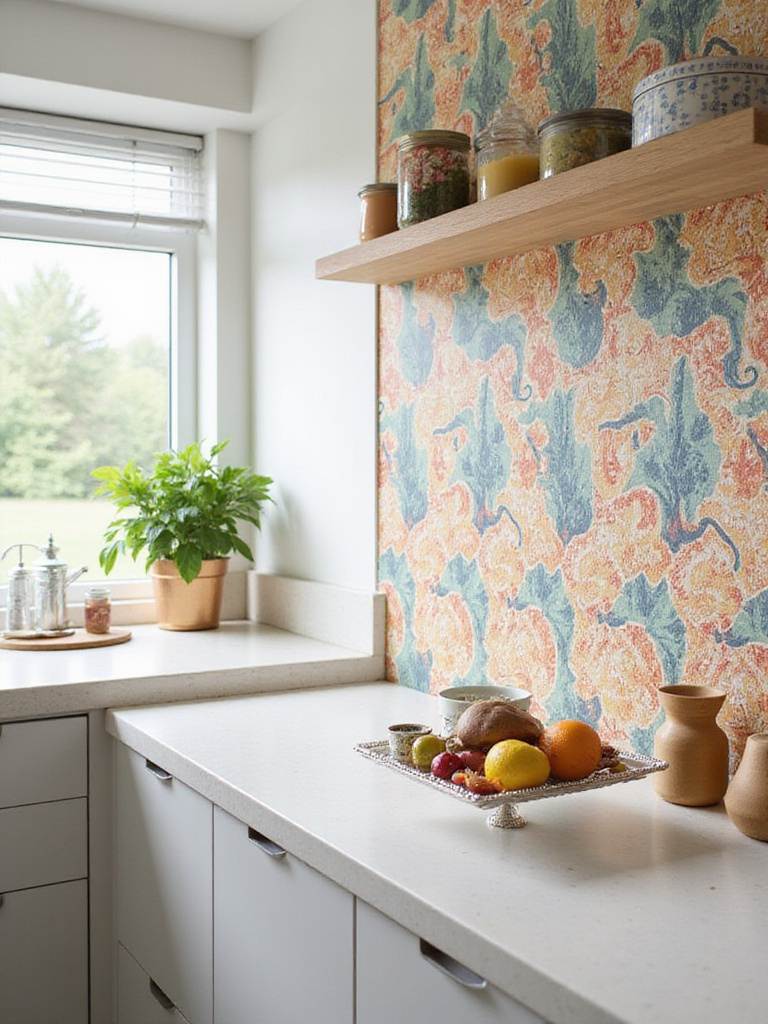
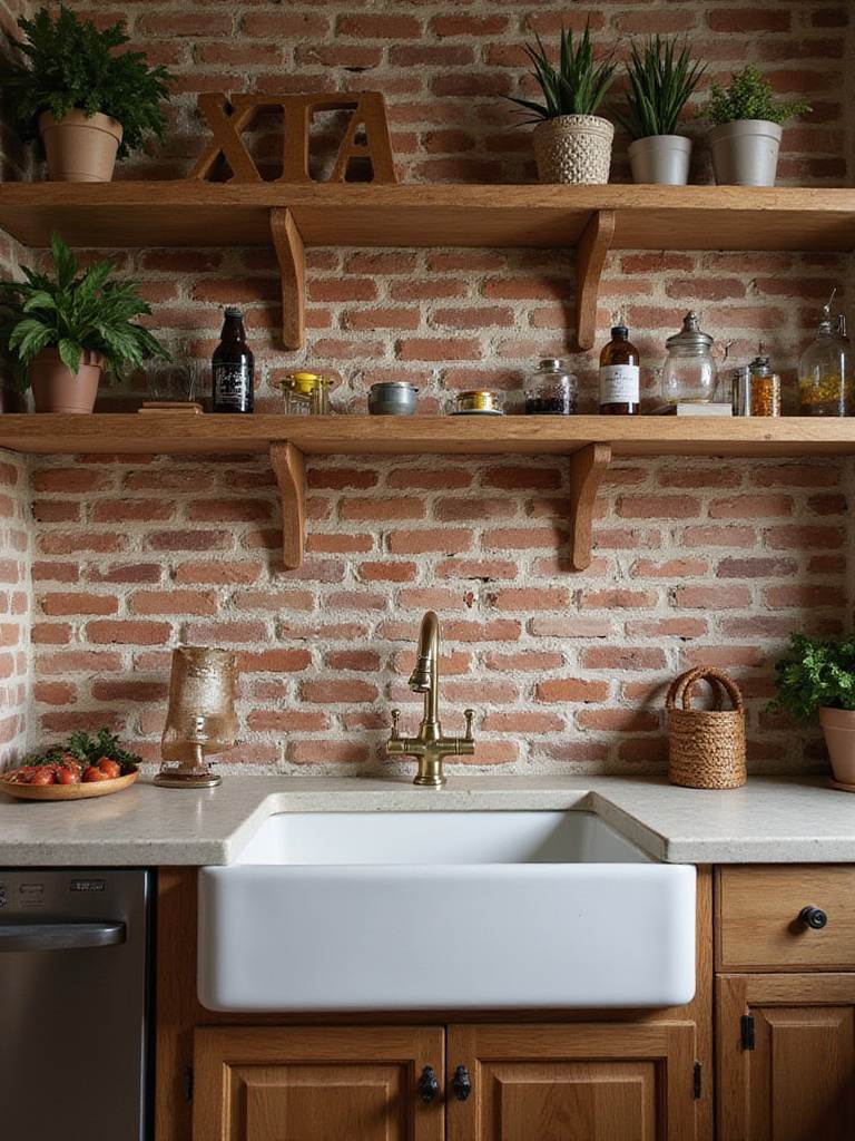
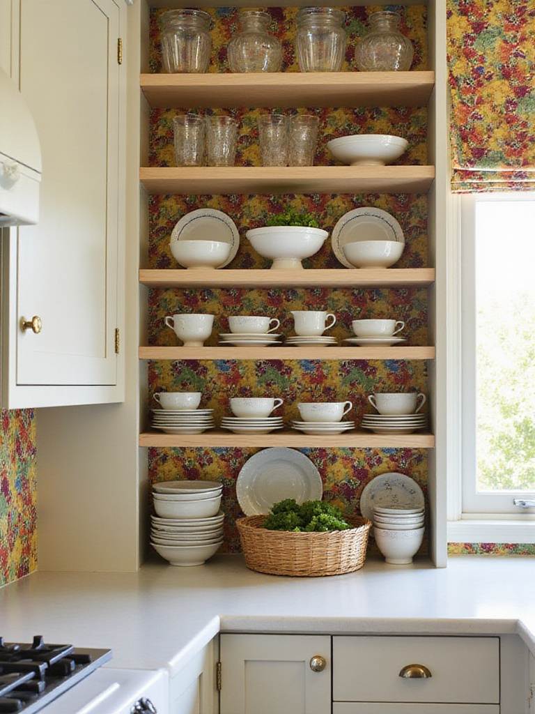
16. Weave in Wood and Plants for an Organic Oasis
There is no more natural pairing than green and wood. Combining green cabinets with natural wood elements and living plants creates a powerful sense of an indoor sanctuary. Wood brings a warmth and texture that keeps even the coolest green from feeling sterile. You can incorporate it in many ways: simple floating shelves made from reclaimed oak, a warm butcher block countertop on an island, or even just through your cutting boards and utensil holders.
Bringing plants into the kitchen is the final layer. It enhances the green’s connection to life and nature. A small pot of herbs on the windowsill—basil, mint, rosemary—is both beautiful and functional. For lower-light kitchens, a hardy Snake Plant or a trailing Pothos can thrive. They add a touch of life and movement, softening the hard lines of a kitchen and truly completing that feeling of an indoor-outdoor harmony that I strive for in all my work.
Finding the right combination for your own space often starts with gathering ideas.
17. Gather Inspiration Beyond the Obvious
Looking for inspiration is a crucial part of the design process, but I encourage you to look beyond the usual sources. Yes, Pinterest and Houzz are fantastic for seeing how different elements come together. But don’t just search for “green kitchen.” Look at architecture. Look at art. Look at nature.
I often advise clients to look at design from other warm climates—the rich colors of Mexico City, the earthy textures of the Mediterranean, the clean, functional lines of Australian modernism. Notice how they use color not just as decoration, but as a response to their environment. Create a folder—digital or physical—of images that give you a certain feeling. Don’t analyze it at first. Just collect. Later, you’ll start to see patterns. You’ll realize you’re drawn to deep, moody greens paired with light wood, or soft sages with creamy stone.
This collection will become your personal design language, a visual guide that will help you communicate your vision to a designer or contractor and, most importantly, to yourself.
It also helps to know what not to do.
18. Avoid the Pitfalls: Lessons from the Field
Over the years, I’ve seen a few common mistakes that can derail a beautiful green kitchen. The most frequent one is falling in love with a tiny paint chip and not testing it properly. I can’t say it enough: a color that looks lovely on a 2-inch square will look completely different when it’s covering every cabinet in your kitchen. The light always wins.
The second pitfall is designing in isolation. Picking the cabinet color without having your countertop, backsplash, and flooring samples right there next to it is a recipe for disaster. All these elements need to be chosen in conversation with one another. A kitchen is a system of relationships, not a collection of individual items.
Finally, don’t skimp on lighting. A poorly lit kitchen will make even the most beautiful shade of green look muddy and flat. Good design requires layers of light: ambient (overall), task (for work areas), and accent (to highlight features). Under-cabinet lighting is not a luxury; it’s essential. It illuminates your workspace and makes your cabinet color glow. Investing in a consultation with a color expert or a designer can save you from a costly mistake.
Ultimately, the goal is to create something that will last, both in style and in substance.
19. Design for Timelessness, Not Trends
How do you ensure the green kitchen you love today will still feel right in a decade? By focusing on timeless principles. Classic, nature-inspired greens—sage, forest, olive—have been used in interiors for centuries for a reason. They are tied to something fundamental in us, and they have an inherent longevity that a trendy lime or neon green just can’t match.
Pair your chosen green with classic, quality materials: natural stone, good wood, simple tile, and well-made hardware. Simple, elegant cabinet door styles like the Shaker or a clean flat panel are chameleons; they can adapt as your style evolves over the years. Quality construction is the ultimate timeless feature. A well-built cabinet with a durable, professional finish will age gracefully, earning a patina rather than just looking worn out.
Transform Your Kitchen Today
Think of it this way: your kitchen is one of the biggest investments you’ll make in your home. Choosing green is a confident, beautiful choice. By honoring your home’s light, choosing quality materials, and thinking about the design as a whole, you can create a kitchen that not only looks stunning but also feels like a true, life-giving heart of the home for years to come.