Can we talk about why everyone gets blue bathrooms wrong?
People see a beautiful indigo tile on Pinterest, they get excited, they cover every surface with it, and then they wonder why their bathroom feels like a cold, dark cave. The problem isn’t the color. The problem is the lack of intention. A serene space isn’t created by accident; it’s a result of mindful choices. It’s the difference between noise and harmony.
I promise your bathroom can be a true sanctuary—a space that calms your mind while serving your modern life. This isn’t about chasing trends. It’s about adapting timeless principles for our digital age. After guiding countless clients through creating these technology-friendly retreats, I’ve identified the 24 foundational decisions that consistently create a sense of profound tranquility. These aren’t temporary design fads; they are intentional choices that quiet the noise of the outside world.
Planning Your Azure Escape (Part 1)
Before you touch a single paint swatch, we need to establish the ‘why’. This first stage is the most critical. It’s about defining the spirit of the space. A traditional Japanese garden isn’t just a collection of rocks and plants; every element has a purpose that contributes to the whole. Your bathroom design should be approached with the same level of mindfulness. We’re not just picking colors; we’re crafting an atmosphere that will support your well-being every single day.
1. Determine Your Desired Blue Mood: Calm, Vibrant, or Deep
First, what state of being are you trying to cultivate? Forget “mood boards” for a second and think about feeling. The goal isn’t just to make it look calm; it’s to create a space where you can achieve seijaku—that feeling of tranquility and stillness, even in the middle of our chaotic lives. This choice dictates everything that follows.
Light, airy blues reminiscent of the sky on a clear day promote clarity and openness. Think pale aqua or a soft periwinkle. Deeper, inky blues like indigo or navy create a womb-like sense of security and introspection, perfect for a space where you want to shut out the world. Choosing this feeling first is your true north. It prevents the mismatched, accidental design that leads to dissatisfaction later. This isn’t just noise; it’s the foundational hum of the entire room.
This is the phase where you quiet the external chatter and listen to what your inner self truly needs from this private, restorative space.
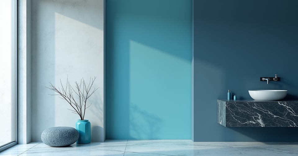
2. Assess Existing Light Conditions for Optimal Blue Hue Selection
Everyone says to “test paint samples,” but they rarely explain why it’s a non-negotiable step. Here’s the real story: Light is a physical material in design. The same shade of blue can look serene and expansive in a sun-drenched southern-facing room and morose, almost black, in a windowless powder room with a warm LED bulb. I once watched a client fall in love with a deep teal, only to find it turned into a swampy, depressing green under their vanity’s 2700K bulbs. An expensive and soul-crushing mistake.
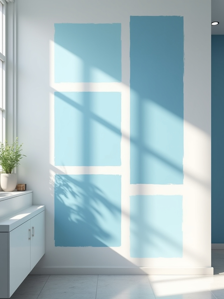
You have to observe your chosen colors for a full 24-hour cycle. Get large peel-and-stick samples (Samplize is great for this) and move them to different walls. See how the color feels in the crisp morning light, the warm afternoon glow, and under your artificial lighting at night. The shortcut you wish you knew earlier is this: if your bathroom lacks natural light, consider smart lighting like Philips Hue. Being able to tune the color temperature from a cool, bright white to a warm, soft glow gives you ultimate control over how your blue is perceived, ensuring your sanctuary feels right, day or night.
This mindful observation prevents costly errors and ensures the tranquility you’re aiming for isn’t disrupted by an unexpected, and unwelcome, color shift.
3. Choose Your Primary Blue Shade for Walls and Large Surfaces
Now we select our anchor. This is the dominant blue that will create the immersive experience. In Japanese aesthetics, we value the concept of shibui—a simple, unobtrusive beauty. Your primary blue shouldn’t scream for attention; it should create a serene backdrop for your daily rituals. It forms the canvas upon which all other elements will be placed.
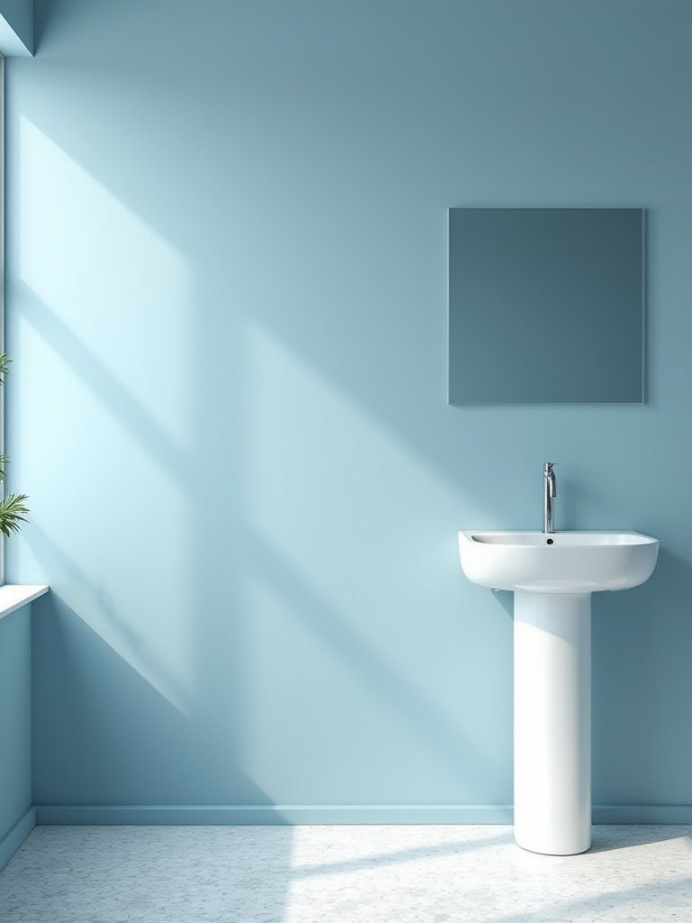
This is often the wall color, but it could also be a floor-to-ceiling tile in the shower. Whichever you choose, it sets the tone. A common mistake is to pick a blue that is too saturated, which can feel jarring and energizing rather than calming. My advice is to lean towards blues with a touch of gray or earthiness to them. These complex, muted tones have a timeless quality and are far more restful to the eye over the long term.
They provide a quiet confidence to the room, allowing other elements to breathe without creating visual competition.
4. Incorporate a Complementary Accent Color Palette for Contrast
Most people hear “accent color” and think of a bright, loud pop. I want you to think about harmony, or chōwa. A blue space needs grounding. It needs a connection back to the earth. Cold, hard surfaces and a single cool color can feel sterile. The ‘accent’ isn’t for contrast; it’s for balance.

The most effective complements to blue are not other colors, but natural materials and warm tones. Think of the warmth of hinoki wood, the texture of a slate gray stone, the subtle sheen of brass, or the organic feel of a linen shower curtain in a natural flax color. These elements don’t compete with the blue; they complete it. They add the essential warmth and texture that make a space feel not just designed, but deeply nourishing.
This isn’t about following the 60-30-10 rule. It’s about adding just enough of a natural, grounding element to make the cool serenity of the blue feel balanced and whole.
Planning Your Azure Escape (Part 2)
With our foundational philosophy in place, we can move into the more tangible aspects of planning. This is where we translate the feeling we want to create into specific, practical choices. Think of this as drafting the blueprint for your sanctuary. We’ll look at a classic combination through a new lens and talk about the most mindful way to allocate your resources to ensure the result is both beautiful and sustainable.
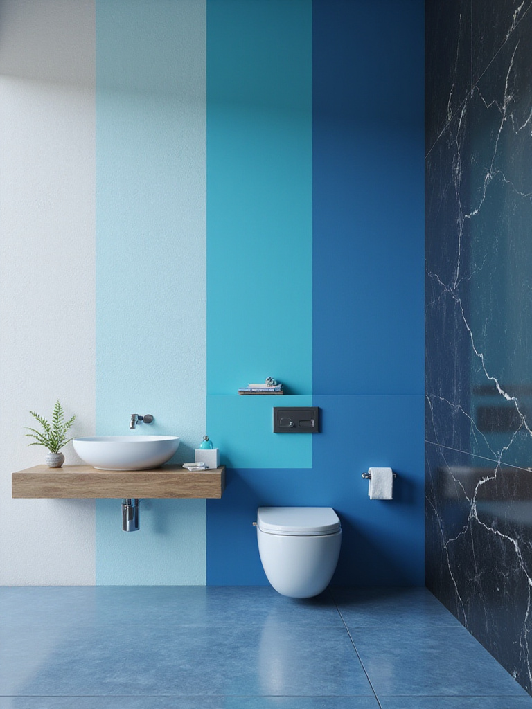
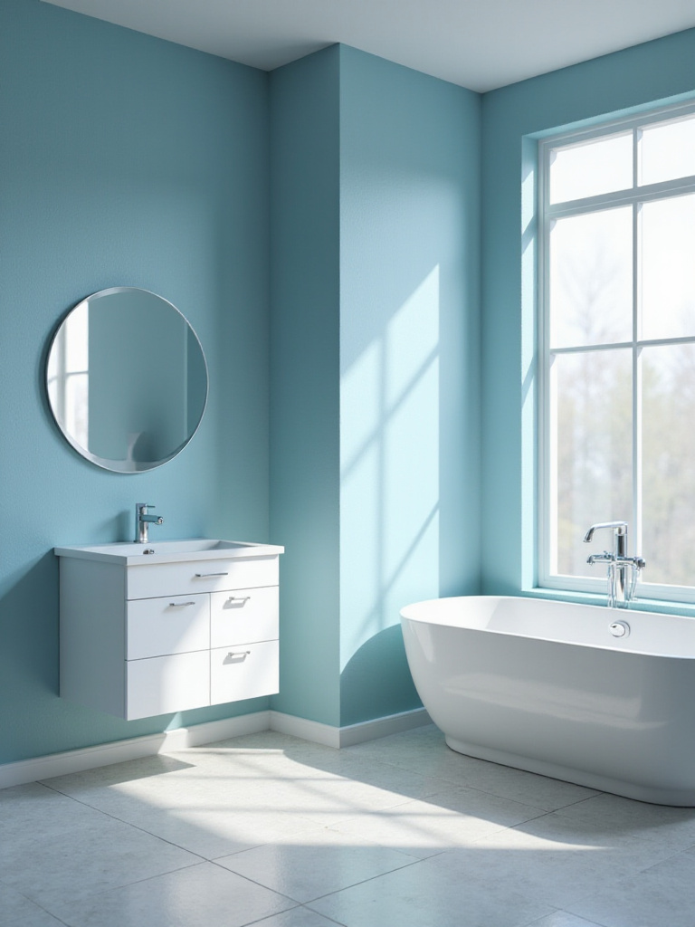
5. Consider Blue and White for a Classic Coastal or Modern Vibe
Let’s reframe the “blue and white” combination. It’s popular not just because it looks clean or “coastal.” At a deeper level, it resonates with us because it represents the fundamental elements of nature: the sky and clouds, the sea and foam. This pairing embodies clarity, simplicity, and purity. It’s the visual equivalent of a deep, cleansing breath.
Instead of thinking of it as a style, think of it as a tool for manipulating space and light. White reflects light, making a space feel larger and more open, which provides the perfect stage for a thoughtful, intentional blue. You can use a deep indigo vanity against crisp white walls for a bold, focused statement. Or, use a soft, pale blue tile against a pure white grout to create a pattern that is gentle and rhythmic. The white provides the ma, the essential negative space that allows the blue to have its full, calming effect without overwhelming.
This isn’t about creating a theme; it’s about using a timeless pairing to craft an environment of pure, uncluttered serenity.
6. Plan Budget and Prioritize Key Blue Decor Elements
The idea that you need a huge budget to create a serene space is corporate nonsense. What you need is an intentional budget. Where you choose to invest your money speaks volumes about what you value in the space. Instead of spreading your budget thinly across twenty different things, focus it on the elements that provide the greatest sensory impact.
I always advise clients to invest in the things they touch every day. That might mean allocating more for a stunningly textured blue tile for the shower wall—something you’ll feel under your hands each morning. Or perhaps it’s a solid, well-crafted blue vanity with hardware that feels substantial. These are the elements that provide a daily return on investment through tactile satisfaction. You can save on things like decorative jars or even artwork, which can be found secondhand or swapped out over time.
Prioritizing your spending this way ensures that your bathroom not only looks beautiful but feels high-quality and deeply considered in the places that matter most.
Implementing Core Blue Elements (Part 1)
Now, we bring the vision to life. This phase is about making the foundational choices that will form the very structure of your blue sanctuary. These are the large-scale decisions for surfaces and fixtures that will define the space for years to come. Approach these choices with care, as they are the canvas on which all the smaller details will be painted. They are the quiet, steady heartbeat of the room.
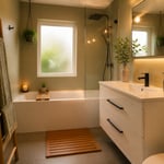
7. Select Blue or Blue-Accented Tiles for Floors or Walls
Tile is where you can truly engage the senses. The common approach is to find a uniform, perfect tile. I encourage you to consider the principle of wabi-sabi—the beauty in imperfection. A handmade zellige tile, where each piece has slight variations in color and texture, brings a soulful, organic quality that mass-produced tile never can. The way light plays across its uneven surface creates a dynamic, living wall.
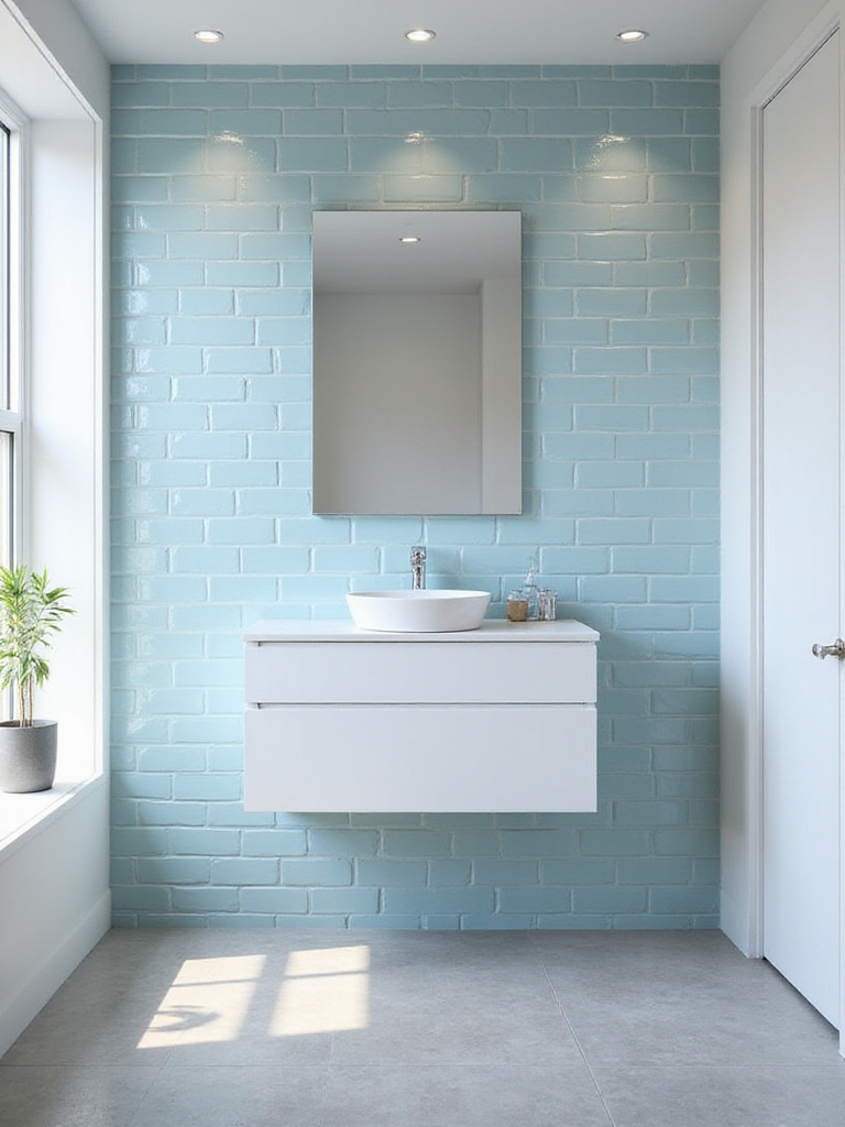
Think about the experience. The cool, smooth feel of a large format stone tile underfoot. The visual rhythm of a deep blue subway tile laid in a herringbone pattern. The color of the grout is just as important; a contrasting white grout will make the pattern pop, while a matching blue or gray grout will create a more monolithic, serene surface. This isn’t just about covering a wall; it’s about creating a surface with depth, character, and tactile beauty.
The shortcut is to remember that the more texture you introduce, the more the blue will come alive with the changing light.
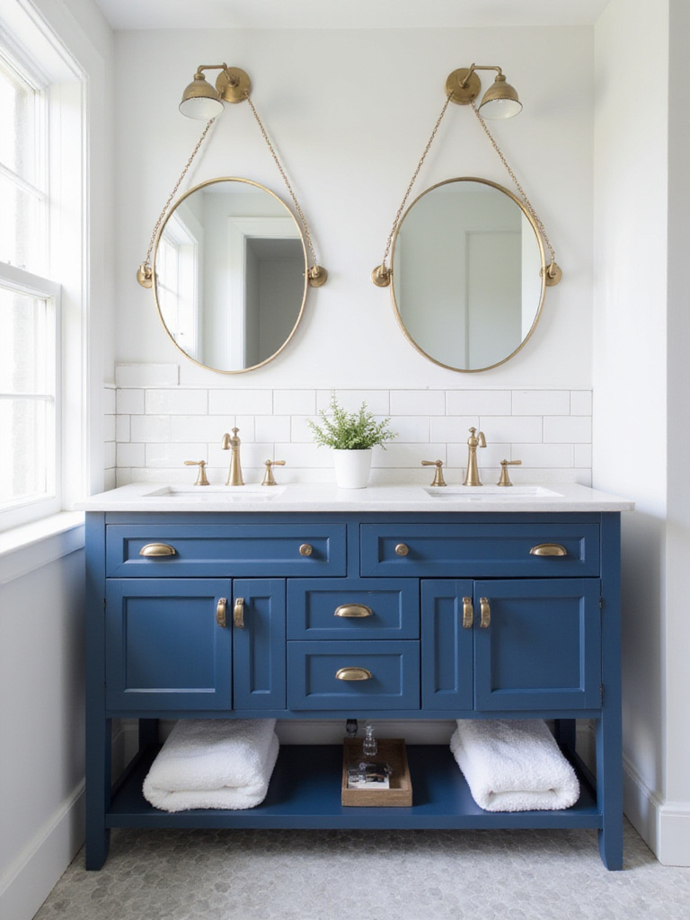
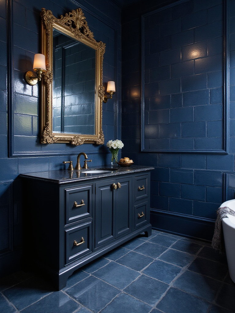
8. Install a Statement Blue Vanity or Cabinetry for a Focal Point
In a minimalist space, every object must have a purpose. A statement vanity is the functional heart of the bathroom. Choosing to make this piece blue turns it into an intentional focal point, an anchor of calm in the room. This single, bold choice allows the rest of the space to remain quiet and uncluttered.
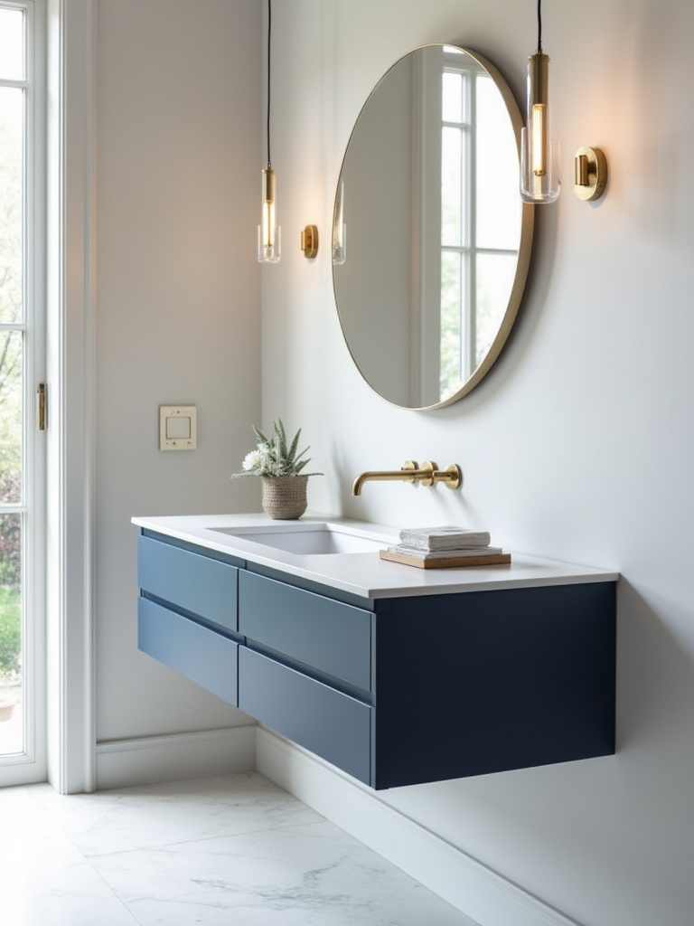
Whether it’s a floating vanity in a sleek, deep navy or a vintage piece repainted in a soft, dusty blue, it should feel like a piece of considered furniture rather than just a place to put the sink. I learned this the hard way on an early project where we tried to spread the blue evenly. The result was a wishy-washy, forgettable room. By concentrating the color on one significant piece, you create focus and power.
It’s the embodiment of “less is more.” One strong, beautiful statement is far more impactful than a dozen timid ones.
9. Paint Walls in Your Chosen Blue Hue for an Immersive Feel
Painting the walls is the fastest way to create a fully immersive environment. You are essentially wrapping the room in a blanket of color. This can be an incredibly powerful tool for creating that cocoon-like sense of tranquility and separation from the outside world.
But here’s the key: the finish matters as much as the color. A matte or eggshell finish will absorb light and create a soft, velvety look that feels incredibly calming. High-gloss finishes, while durable, can create glare and feel more energetic and less restful. Also, insist on a low-VOC paint. Creating a serene sanctuary means creating a healthy one, free from off-gassing chemicals.
This is your opportunity to build an envelope of calm. A space where the color on the walls actively contributes to lowering your heart rate the moment you step inside.
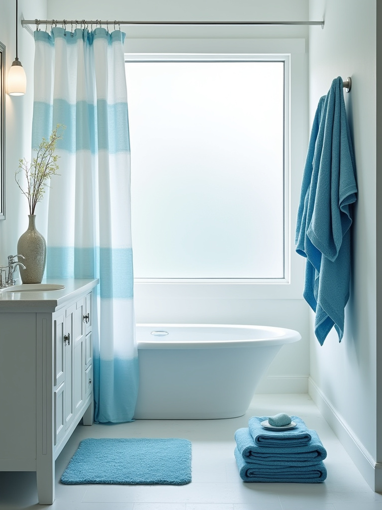
10. Update Your Shower Curtain or Bathtub Skirt with Blue Textiles
For those who rent or aren’t ready for a full renovation, the shower curtain is your secret weapon. It’s a huge vertical surface, essentially a fabric wall. Everyone else says it’s a place for a loud pattern, but I see it as an opportunity for texture and subtlety.
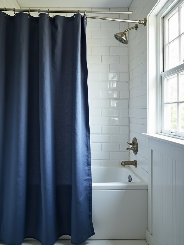
Choose a high-quality fabric like linen or a heavy cotton waffle weave in a solid shade of blue. The texture will add depth and a tactile softness that plastic liners lack, while the solid color will contribute to the overall sense of calm rather than creating visual chaos. It acts like a shōji screen—a soft, permeable barrier that delineates the bathing space, adding a layer of privacy and intimacy to the ritual.
It’s a simple, non-permanent change that has a profound impact on the feeling of the entire room, proving that serenity doesn’t have to be expensive.
Implementing Core Blue Elements (Part 2)
We continue to build the core of our sanctuary, now turning to more specialized elements. These choices might seem like smaller details, but they represent a higher level of design intention. It’s about finding unconventional ways to carry the blue theme through the space, integrating it into the very function of the room. This is where your bathroom goes from well-decorated to truly unique and thoughtfully composed.
11. Choose Blue Plumbing Fixtures for a Unique, Cohesive Look
This is a modern, slightly daring move that speaks to our current era of design. Blue fixtures—faucets, showerheads—are an unexpected touch of artistry. In a space that is otherwise minimalist and serene, a tap finished in a matte navy blue becomes a piece of functional sculpture.
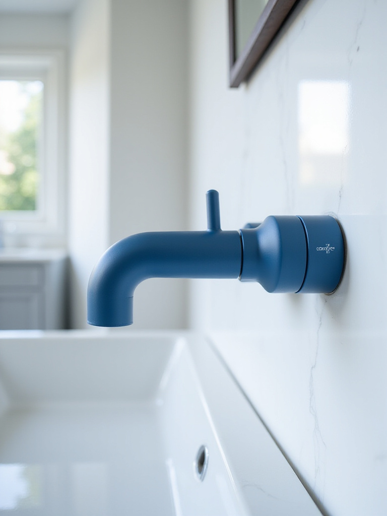
This isn’t about making everything blue. It’s the opposite. It’s about choosing one or two elements to carry this detail. Against a white sink or a pale gray tile, a blue faucet is a quiet surprise. It shows a commitment to the design concept down to the smallest detail. It’s a tech-savvy choice, often coming from forward-thinking brands, that blends modern manufacturing with a pure, artistic color statement.
This is the kind of detail that elevates a space from nice to unforgettable, demonstrating a confidence in the design vision.
12. Integrate a Blue Glass Shower Door or Partition for Subtlety
Think about how light moves through water. A blue-tinted glass partition brings that same ethereal quality into your bathroom. Instead of a solid wall or a standard clear door, this choice adds a whisper of color while maintaining an open, airy feeling. It provides a subtle sense of separation without visually closing off the space.
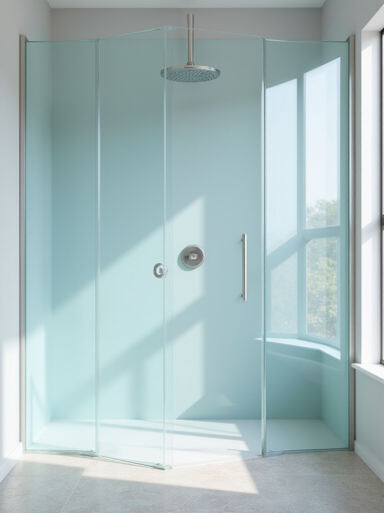
This is a perfect example of using modern technology and materials to achieve a deeply serene, nature-inspired effect. The light filtering through the blue glass casts a calming hue across the room, constantly shifting with the time of day. It can be frosted for more privacy or have a reeded texture for visual interest.
This is a sophisticated, architectural way to incorporate blue, adding a layer of depth and transparency that makes the whole room feel more thoughtful and expansive.
Styling and Enhancing with Blue Accents (Part 1)
With the large surfaces and fixtures in place, we now add the layers that bring personality and comfort. These accents are not afterthoughts; they are crucial for making the space feel human and inviting. This is where we focus on texture, personal objects, and organization. Each element should be chosen with the same mindfulness as the tiles and paint, reinforcing the room’s purpose as a personal retreat.
13. Introduce Soft Blue Towels and Bathmats for Layered Comfort
In a minimalist space, the tactile experience is everything. Your towels and bathmats are among the few things you have direct physical contact with every day. Their quality matters. This isn’t the place to skimp. Invest in high-quality, absorbent towels—like those made from long-staple Turkish or Japanese cotton—in varying shades of blue.
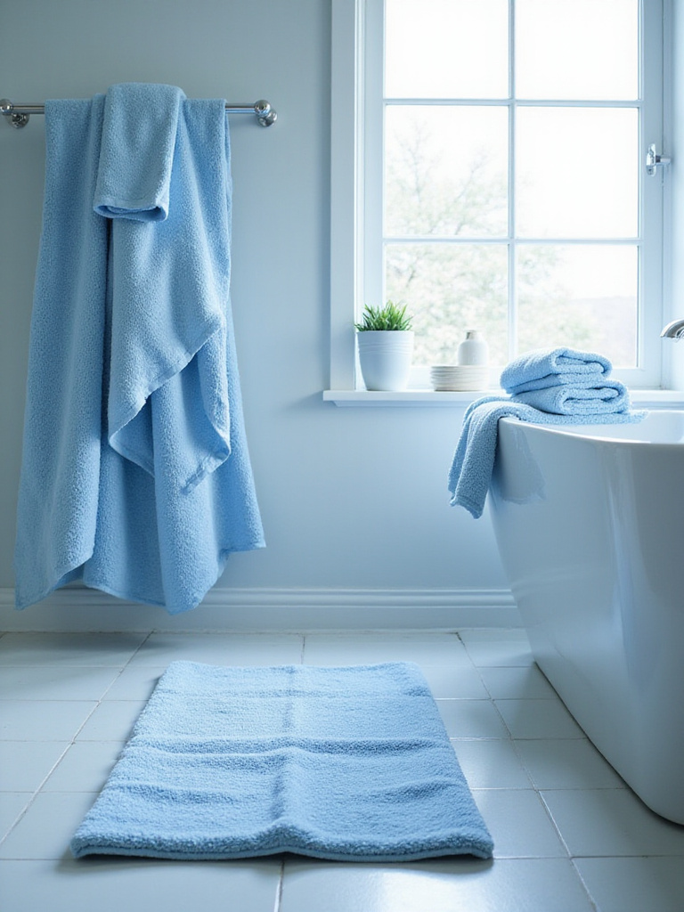
Layering different tones of blue and different textures—a plush bath sheet, a waffle-weave hand towel, a nubby cotton bathmat—creates a rich, sensory experience. The BS everyone else says is that you should match them perfectly. Don’t. A slight variation in hue makes the space feel more organic and less like a hotel catalog. The comfort these textiles provide is a key part of the sanctuary experience.
These aren’t just accessories; they are tools for comfort, reinforcing the room’s role as a space for personal care and restoration.
14. Curate Blue-Themed Artwork and Wall Decor for Visual Interest
Resist the urge to create a busy gallery wall. The principle of yugen refers to a profound, subtle grace, an awareness of the universe that triggers a deep emotional response. Your artwork should do this. Select one, maybe two, pieces that resonate with you on a quiet level.
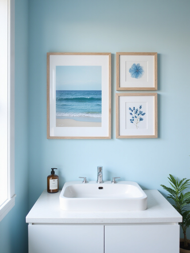
It could be a minimalist abstract piece with shades of indigo and gray, a black-and-white photograph of the ocean, or a simple calligraphic scroll. The piece itself doesn’t even have to be majority blue, as long as it harmonizes with the feeling of the space. The frame is just as important—a simple, thin frame in a natural wood or black metal will provide focus without competing with the art.
This is your point of contemplation. A single, meaningful piece will do more for the room’s serenity than a wall full of noise ever could.
15. Select Blue or Aqua Glass Vases and Apothecary Jars for Storage
Order is essential for a calm mind. The principle of danshari isn’t just about decluttering; it’s about freeing yourself from attachment to things. In the bathroom, this means giving the essential items you use every day a beautiful, purposeful home. Clear the counters. Store cotton balls, bath salts, and Q-tips in simple blue or aqua glass apothecary jars.
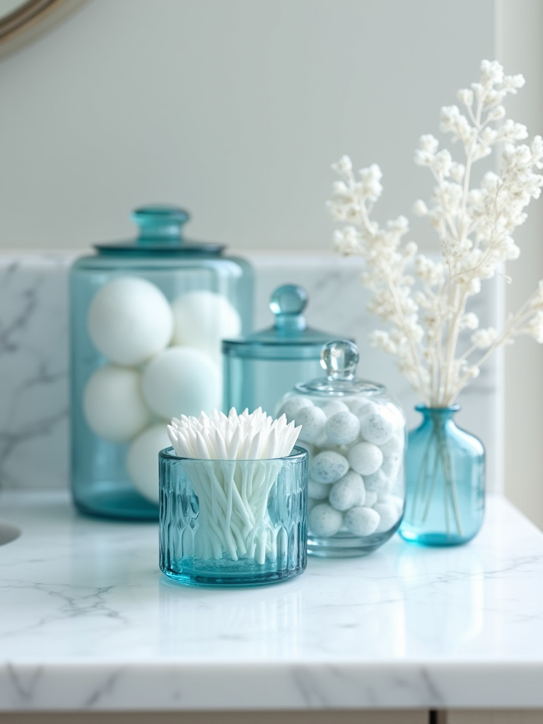
The translucent color adds a subtle glow, especially when light hits it, without contributing to visual clutter. Everything has its place, contained and organized. This act of curating your daily necessities turns them from clutter into a part of the calm, organized landscape of the room. A single stem of eucalyptus in a slim blue glass vase adds a touch of life without any fuss.
This is how you achieve a space that looks serene because it is serene—functional, organized, and free of extraneous objects.
16. Incorporate Metallic Finishes to Harmonize with Blue Tones
Metallic finishes are points of light. They should be used sparingly and with great intention. The most common mistake is mixing too many finishes, which creates visual chaos. Choose one primary metal and stick with it for your core fixtures.
A warm, unlacquered brass paired with a deep navy blue is a stunning combination; it has the warmth of candlelight against a night sky. It adds a necessary organic element as the brass patinas over time. For a cooler, more modern aesthetic, matte black provides a stark, graphic contrast, while brushed nickel offers a soft, understated sheen.
The metal is there to complement the blue, not compete with it. It should provide a subtle reflection, a quiet gleam that adds a final layer of sophistication.
Styling and Enhancing with Blue Accents (Part 2)
We continue to add the finishing touches that bring the space to life. This section is about engaging more of the senses—bringing in living elements and incorporating scent. These are the details that complete the transformation of your bathroom from a purely functional room into a holistic, restorative environment. They are the final brushstrokes that make the sanctuary entirely your own.
17. Add Greenery and Plants to Contrast with and Brighten Blue Schemes
Bringing nature indoors, shizen, is a cornerstone of Japanese design. A living plant is essential in a blue bathroom. Its vibrant green provides the perfect natural complement to the blue, and its organic form softens the hard lines of tile and porcelain. A plant is a reminder of life, growth, and the world outside.
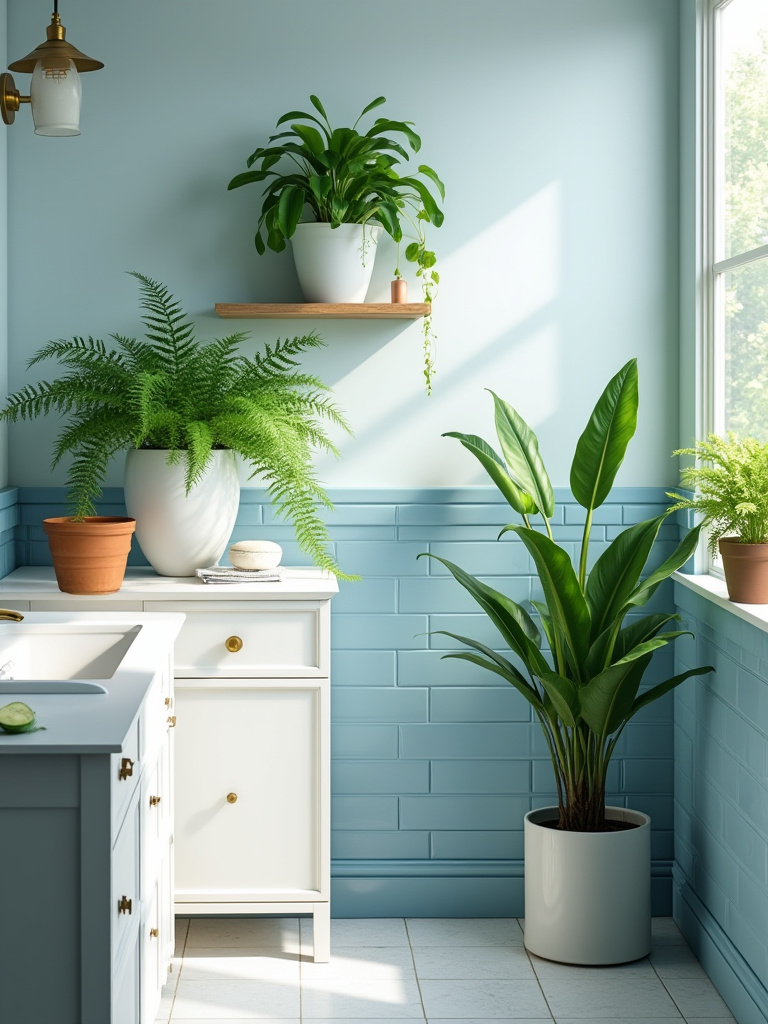
Choose plants that thrive in humidity and low light, like snake plants, pothos, or ferns. The container is just as important as the plant itself. A simple terracotta or a minimalist white ceramic pot will keep the focus on the plant’s natural beauty. You don’t need a jungle; a single, healthy plant is enough to breathe life into the space.
It’s a simple addition that has a profound effect, creating a connection to the natural world that is essential for our well-being.
18. Utilize Scented Blue Candles and Diffusers for Ambiance
Scent is an invisible layer of design, but it’s one of the most powerful. Our sense of smell is directly linked to memory and emotion. Creating a signature scent for your sanctuary completes the immersive experience. Avoid artificial, overwhelming fragrances that are so common in mass-market products.
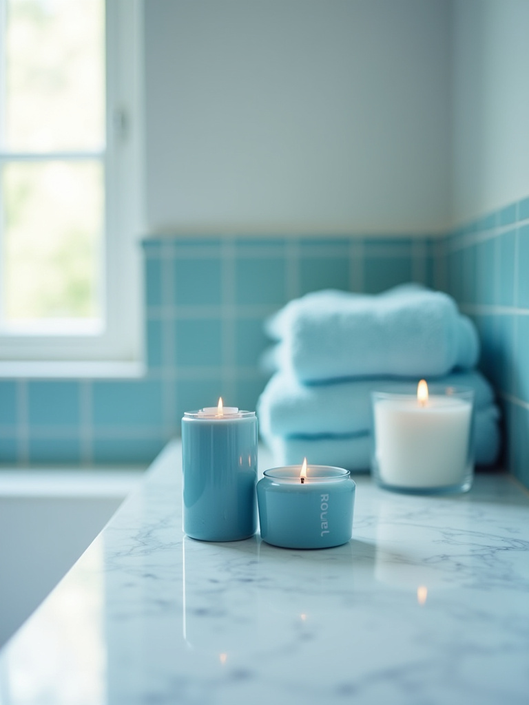
Look for scents grounded in nature. Essential oil diffusers are perfect for this. Scents like hinoki (Japanese cypress), sandalwood, eucalyptus, or even a subtle sea salt fragrance can enhance the tranquil atmosphere. Choose candles in simple blue or clear glass holders. The gentle flicker of a candle flame adds a dynamic, living light that is deeply calming.
This sensory layer is what transforms the room from a beautifully designed space into a true, multi-sensory retreat.
Advanced Blue Touches & Long-Term Appeal (Part 1)
Here, we explore the subtle yet powerful details that create a lasting impression. These are the choices that demonstrate a sophisticated understanding of design and technology, ensuring your bathroom feels both timeless and forward-thinking. This is about integrating light, reflection, and theme with a level of nuance that elevates the entire project from a simple renovation to a work of artful living.
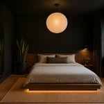
19. Choose Lighting Fixtures That Highlight Blue Tones Effectively
This is where my world of technology and tranquility truly merges. Your lighting choices are critical. As I mentioned, the wrong color temperature can ruin your blue. The solution is tunable LED lighting. This technology allows you to adjust the light from a crisp, energizing “daylight” (around 5000K), perfect for the morning, to a warm, relaxing “candlelight” (around 2700K) for your evening wind-down routine.
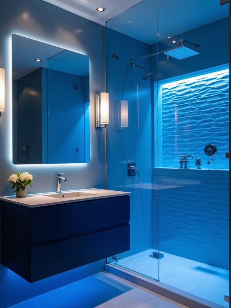
A high Color Rendering Index (CRI) of 90+ is also a non-negotiable shortcut. It means the light will render the blue tones faithfully, showing their true depth and complexity. Layer your lighting: a central ambient light, focused task lighting at the vanity, and perhaps a dimmable, waterproof light in the shower. Smart lighting systems allow you to program scenes—a “Morning” scene with bright, cool light and an “Unwind” scene with warm, low light—that support your circadian rhythms.
This is technology used not for distraction, but in service of well-being—the ultimate goal of a modern sanctuary.
20. Select a Blue or Patterned Mirror Frame for an Elevated Look
The mirror reflects not only you but the entire space. The frame you choose defines this reflection. Instead of a generic, frameless mirror, consider one with a simple, thin frame in a deep blue or a natural wood that complements the other elements. The frame creates a boundary, a deliberate composition.
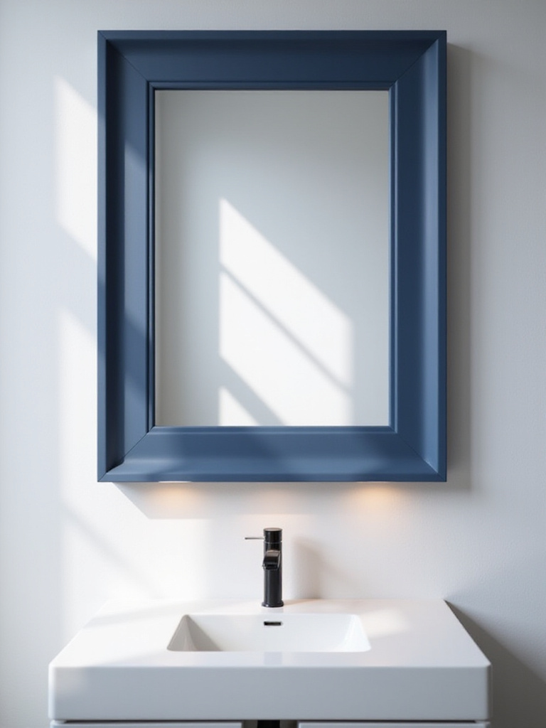
For a more modern look, a backlit mirror is an excellent choice. But instead of the standard bright white, some models now offer a tunable backlight. A soft, glowing blue backlight can create an incredible ambiance for an evening bath, providing gentle illumination without any harsh glare. This turns a functional object into a dynamic source of atmospheric light.
This is about seeing the mirror not just as a tool, but as a key aesthetic element that can either blend in or become a piece of glowing, functional art.
21. Infuse Coastal or Nautical Elements Judiciously for Theme Consistency
Let’s be clear: this is not about putting up a sign that says “Beach” or filling jars with seashells. That is the noise. The real way to evoke the feeling of the coast is through texture and material, not kitschy symbols. The goal is to capture the essence of the shore—its quiet, rugged beauty.
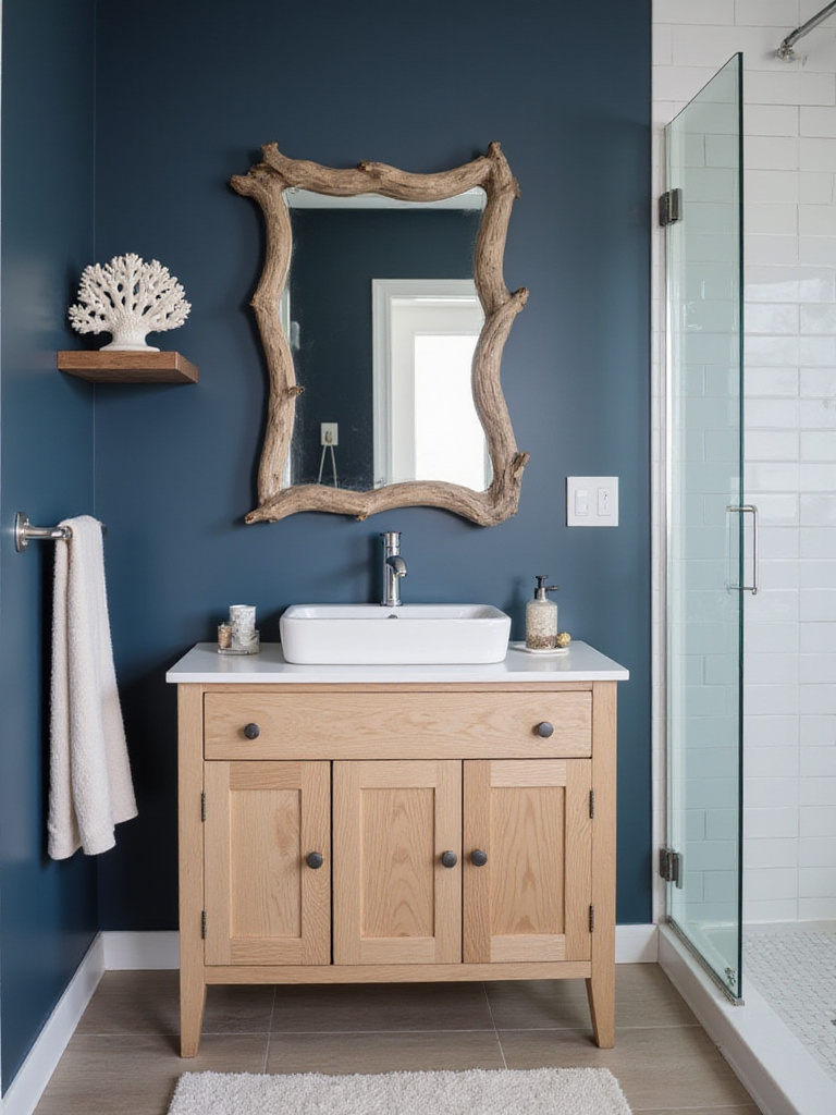
Think of a piece of weathered driftwood used as a shelf or towel rack. The nubby texture of a jute rug. Smooth, gray river stones collected in a simple bowl. A piece of art that captures the movement of water rather than a literal depiction of a boat. You’re aiming for a feeling, a subtle suggestion, that connects the blue of the room to its natural inspiration: the sea.
Call out the BS: An anchor-print shower curtain does not create a sophisticated coastal retreat. A simple linen curtain and a smooth stone soap dish do.
22. Opt for Blue Shower Accessories to Maintain Color Flow
The shower is a zone of ritual. The objects within it should be as calm and considered as the rest of the space. Instead of a cluttered plastic caddy hanging from the showerhead, consider a built-in niche. If that’s not possible, look for minimalist shower accessories in a consistent blue or a complementary metallic finish.

Decant your shampoo and soap into uniform, reusable blue pump bottles. This simple act reduces visual clutter and transforms a collection of mismatched branded bottles into a serene, cohesive set. It’s a small detail, but the cumulative effect of these small acts of order is a profound sense of calm.
Every element, even the most mundane, contributes to the whole. This is how you build a complete, harmonious experience.
Advanced Blue Touches & Long-Term Appeal (Part 2)
We conclude with two advanced concepts that ensure your blue sanctuary remains a vibrant and evolving space. These strategies focus on dynamic lighting and the Japanese appreciation for the changing seasons. They are what will keep your bathroom from feeling static, allowing it to adapt and bring you comfort and delight for many years to come. This is the path to long-term satisfaction.
23. Explore Blue Backlit Mirrors or Niche Lighting for Drama
This is a step beyond the functional backlighting I mentioned earlier. This is using light as a purely aesthetic, atmospheric tool. Installing a soft, deep blue LED strip in a recessed ceiling cove or inside a shower niche creates an ethereal glow that completely transforms the space. It’s the modern equivalent of moonlight on water.
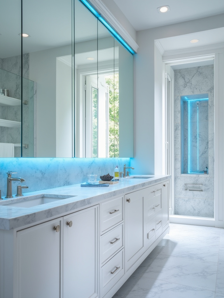
This should be on its own dimmer switch, used only when you want to create a specific, deeply relaxing mood. It isn’t for seeing by; it’s for feeling by. It highlights the architecture of the space, creates depth, and provides a focal point of pure, colored light. It’s the kind of feature you find in a high-end spa.
This is technology at its most poetic, used to paint with light and sculpt an atmosphere of profound tranquility.
24. Refresh Blue Textiles Seasonally to Keep Your Decor Vibrant
In Japan, there is a deep cultural appreciation for the changing of the seasons, kisetsu. Your home can reflect this. The final, and perhaps most enjoyable, way to keep your blue bathroom feeling alive is to rotate your textiles seasonally. This is a simple, cost-effective way to refresh the space without any renovation.
In spring and summer, use lighter towels and a bathmat in shades of sky blue or aqua, maybe with a crisp linen shower curtain. As autumn and winter arrive, switch to plush, heavier towels in deep navy or indigo, and perhaps a more textured, woven bathmat. This simple act keeps you connected to the natural rhythms of the year and prevents your decor from ever feeling stagnant.
It ensures your sanctuary is not a static museum, but a living, breathing space that evolves with you through time.
Conclusion
Creating a blue sanctuary is not about following a prescriptive list. It is an exercise in mindfulness. It’s about asking yourself how each choice—from the color of the walls to the texture of a towel—contributes to a feeling of serenity. We’ve explored how to use color, light, texture, and technology not as mere decoration, but as tools to build an environment that actively supports your well-being. The goal is a space that quiets the mind, restores the body, and brings a moment of grace to your daily rituals.
Now you have the principles, not just the ideas. Begin your journey by choosing one element that resonates with you. Perhaps it’s simply finding the perfect set of indigo towels, or maybe it’s planning the right smart lighting. Don’t be rushed. The process of creating this space should be as mindful as the space itself. Start today, and build the serene blue retreat you deserve—a haven of tranquility in our busy, modern world.