Picture this: It’s 7 AM. The soft glow of your screen is probably the first light you saw today. Your phone is already buzzing. Before the day’s chaos truly begins, you walk into your kitchen. What do you feel? Is it another source of visual noise, or is it a space that quiets your mind?
The difference often comes down to the surfaces you’re surrounded by. People get lost in trends and end up with kitchens that feel loud and cluttered. They forget that these spaces are meant to be a sanctuary. The tile—the very foundation of the room’s feel—isn’t just a building material. It’s the canvas for your daily rituals. So let’s talk about how to choose one that actually brings you peace, not just a pretty pattern.
Foundations: Planning Your Perfect Tile Project
This is the part everyone wants to skip, but it’s where you win or lose. A little mindfulness here saves a world of stress later. Think of this as creating the calm digital architecture for your physical space. It’s about setting the right intentions so the final result feels effortless and true.
1. Prioritize Tile Functionality: Grounding vs. Expression
Can we talk about how everyone gets this wrong? They see a beautiful, delicate tile and want it everywhere. But a kitchen has two distinct energies. The floor is your foundation. It’s what grounds you. It needs to be quiet, unyielding, and dependable. It endures foot traffic, spills, the chaos of life. It’s not the place for delicate statements.
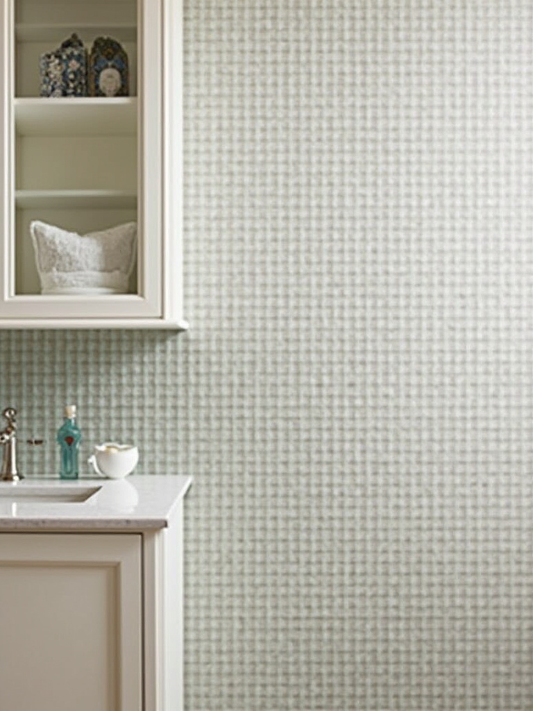
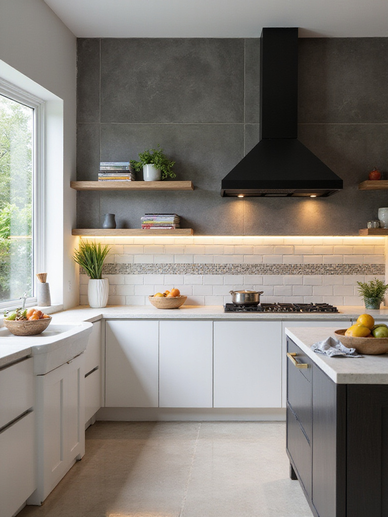
The backsplash, however, is different. It’s at eye level. It’s your visual plane. Here, you can allow for a whisper of personality. Think of it like the single flower arrangement in an otherwise empty room—an intentional point of beauty. The mistake is treating these two zones the same. Your floor is for wabi-sabi resilience, while your backsplash can be a touch of shibui elegance.
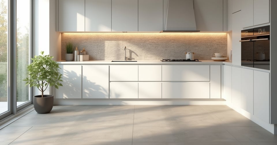
The shortcut? For your floor, just ask for a porcelain tile with a PEI rating of 4 or 5. It’s the industry standard for strength. For the backsplash, you have creative freedom, but always ask yourself: does this bring me calm, or does it scream for my attention?
2. Establish a Realistic Budget for Your Sanity
People see a budget as a restriction. I see it as a tool for peace of mind. The real story isn’t about how much you spend; it’s about avoiding the corrosive stress of a project that spins out of control. Corporate speak will tell you about ROI, but I’m telling you about the cost to your mental energy when you have to compromise halfway through because you didn’t account for labor or that crucial 15% contingency fund.
I had a client once, a software developer, who was completely overwhelmed. He’d pinned hundreds of images of elaborate, expensive cement tiles. He could technically afford them, but it would have wiped his budget, leaving no room for error. We talked about the feeling he was actually chasing: order and calm. He ended up with a beautiful, simple porcelain tile in a serene layout and used the money he saved on an incredible lighting system. He later told me that avoiding the financial stress was the best design choice he made.
So, get at least three detailed quotes. And please, add 15% to whatever number you land on. This isn’t padding; it’s a buffer for reality. This foresight is what allows your project to be a creative process, not a financial nightmare.
3. Evaluate Kitchen Lighting to Shape the Mood
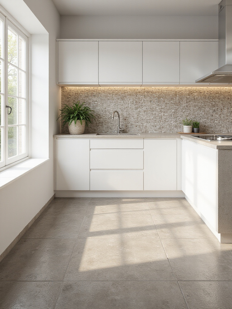
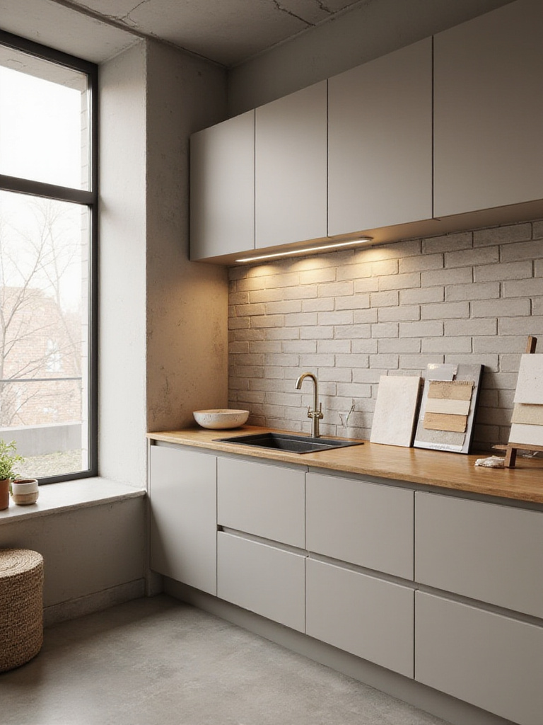
In Japan, we have a term, komorebi, for the way light filters through trees. It’s a reminder that light isn’t just functional; it’s emotional. It shapes the entire feeling of a space, and your tile is its biggest collaborator. A glossy tile might look great in a showroom, but in a kitchen with intense direct sunlight, it will create a jarring glare. A matte tile might feel flat under poor lighting, but with the right layered light, it can have a soft, velvety depth.
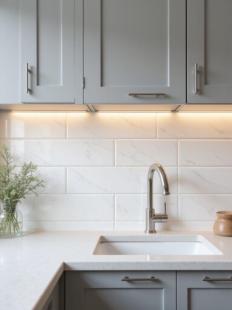
Before you commit to a tile, you have to live with it for a few days. Place samples on the floor and against the wall. Watch how they look in the morning light, at midday, and at night under your artificial lights. How does your under-cabinet LED strip hit that texture? Does it create a peaceful glow or harsh reflections? This is the noise people miss. They choose a tile under fluorescent store lighting and are then surprised when it looks completely different at home.
The tech-savvy shortcut here is to invest in smart, tunable lighting. Being able to shift the color temperature from a crisp 4000K for cooking to a warm 2700K for a late-night cup of tea changes everything. It allows your tiles to have different personalities, all perfectly suited to the moment.
4. Match Tile Style Cohesively for a Sense of Harmony
The Japanese concept of wa means harmony. It’s the idea that everything should exist in a peaceful, balanced state. This is what you’re aiming for when matching tile to your existing cabinets and countertops. It’s not about being boring; it’s about creating a space where the elements don’t compete for your attention. Your eye should be able to move through the room with a sense of ease.
I once walked into a consultation where the homeowner had installed a stunning, busy patterned backsplash next to a granite countertop with a lot of movement. Both were beautiful on their own, but together, they were shouting at each other. It created a subtle but constant feeling of visual chaos. The solution was to replace the backsplash with a simple, handmade-look ceramic tile in a solid color pulled from the granite. The entire room took a deep breath.
The rule is simple: if one element is loud, the other must be quiet. If you have dramatic countertops or bold cabinets, your tile is the supporting act. It should have a quiet texture or a subtle, solid color. If your cabinets and counters are minimalist, your tile can be the single, intentional artistic statement.
5. Consider Your Lifestyle for Low-Friction Living
Your home should reduce friction in your life, not add to it. A high-maintenance surface is a form of friction. It’s something that constantly demands your time and energy. Think of it like a buggy app—it creates a low-level, persistent annoyance. A porous stone that needs constant sealing or tiny mosaic tiles with miles of grout lines that collect grime are sources of maintenance noise.
When choosing a tile, be honest about your life. Do you have kids? A pet? Do you cook a lot? If so, you should be biased toward surfaces that offer the path of least resistance. Large format porcelain with epoxy grout is the ultimate low-friction choice. Spills wipe up, there are minimal grout lines to scrub, and it’s nearly indestructible. It frees up your mental energy for more important things.
This isn’t about being lazy; it’s about being strategic. Every bit of time you don’t spend scrubbing a floor is time you can spend on things that truly matter. Your environment should serve you, not the other way around.
Material & Type Selection: Choosing the Right Tiles
Now we can talk about the materials themselves. Think of this less like a catalog and more like choosing a collaborator. Each material has a distinct personality and a different story to tell. Your job is to find the one that resonates with the story you want your kitchen to tell.
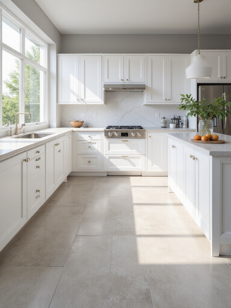
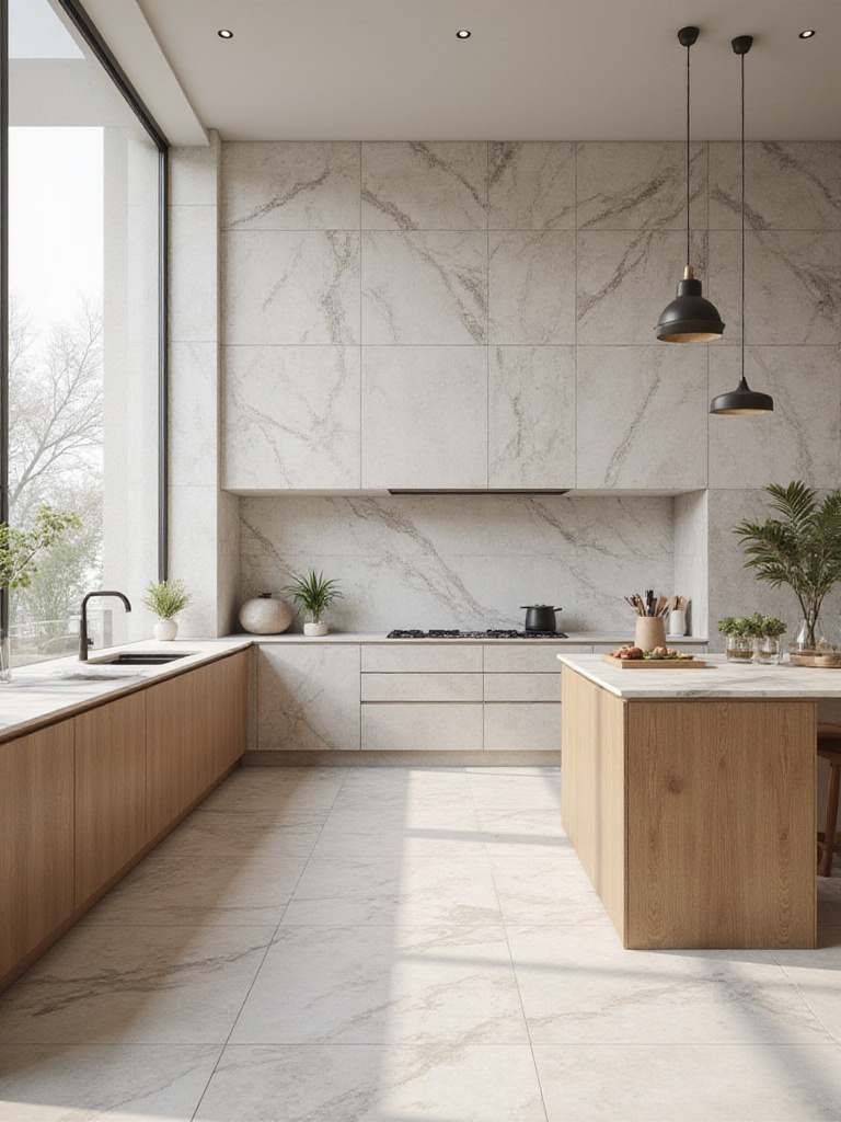
6. Opt for Durable porcelain tiles for a Quiet Foundation
Porcelain is the quiet workhorse of the modern home. It’s an engineered material, perfected by technology for one purpose: to be a silent, resilient background for your life. It’s fired at extreme temperatures, making it incredibly dense and non-porous. In practical terms, this means it laughs at spills, scratches, and heavy traffic. It’s the closest thing to an install-it-and-forget-it material you can find for a floor.
But its real value is in its quietness. Because it’s so versatile, it can mimic natural stone or concrete without the maintenance headaches, or it can be a simple, solid field of color. This allows it to serve the principle of Ma, or negative space. It doesn’t demand attention. It creates a serene, uninterrupted canvas, allowing the other elements in your kitchen—and your life—to take center stage. For a busy professional living a digitally saturated life, a porcelain floor is a patch of silent ground.
For anyone who values function and tranquility, porcelain tile on the floor is the easiest decision you’ll make. Its understated strength is the perfect foundation for a modern, mindful home.
7. Explore Versatile Ceramic Tiles for an Artistic Touch
If porcelain is the engineer, ceramic is the artisan. It’s more porous and less dense than porcelain, which is why I almost always recommend it for backsplashes and walls rather than floors. But its true gift is its versatility and warmth. It’s where you can introduce a human touch into your kitchen without overwhelming it.
Think of the simple, timeless order of a white subway tile. Its power is in the grid—the quiet, repeating rhythm that brings a sense of structure and calm to a wall. Or consider a Zellige-style tile, with its subtle imperfections and variations in glaze. Each tile is slightly different, reflecting a human hand in its creation. This connects to the idea of wabi-sabi, finding beauty in the imperfect. It’s a gentle reminder that your home is a living space, not a sterile showroom.
Ceramic tile offers a huge range of expression, but the key is to use it with intention. It’s the ideal material for that single, expressive gesture on a backsplash that I mentioned earlier.
8. Incorporate Natural Stone Tiles for an Earthly Connection
Natural stone—marble, slate, travertine—is a direct connection to the earth. Each piece carries a story millions of years old in its veins and texture. This is not a manufactured product; it’s a piece of the landscape brought into your home. Using natural stone is a commitment. It’s porous. It stains. It requires sealing. It develops a patina over time. You don’t own it so much as you enter into a relationship with it.
The BS everyone will tell you is that it’s just a “luxury” material. The reality is that it’s a mindful choice. Are you prepared to care for it? If so, the reward is immense. A slate floor can feel incredibly grounding underfoot. A marble backsplash, with its cool, smooth surface, can be a moment of quiet, organic beauty. This is shibui—an unobtrusive beauty that grows on you over time. It’s a choice for someone who finds peace in nature and doesn’t mind the gentle rituals of maintenance.
It’s not for everyone, but if you’re willing to embrace its imperfect, living nature, natural stone can bring a profound sense of tranquility and permanence to your kitchen.
9. Integrate Reflective Glass Tiles to Cultivate Light
Glass is the material of light and clarity. Its superpower is its ability to capture and bounce light around a room, making any space feel brighter, cleaner, and more open. In a small kitchen or one with limited natural light, a glass tile backsplash can be transformative. It’s like adding another window. The way it reflects both natural and artificial light creates a sense of depth and movement.
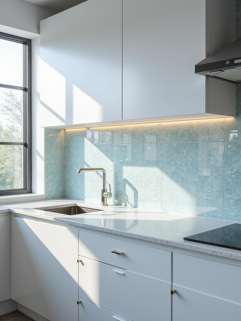
This isn’t just about aesthetics; it’s about energy. A bright, light-filled space can have a powerful effect on your mood and mental clarity. But there’s a fine line. An entire wall of highly iridescent glass tile can feel chaotic and overwhelming—like digital noise. The key is to use it with precision. A simple, back-painted glass tile in a soft, solid color can create a beautifully seamless and reflective surface. A matte or frosted glass offers a softer, more diffused glow.
Think of glass as a tool for amplifying the light you already have. It can make a dark corner feel more alive and bring a sense of crisp, modern purity to the kitchen.
10. Discover Terracotta Tiles for Grounded Warmth
Terracotta is the earth itself. The name literally means “baked earth.” It’s a simple, ancient material that brings an immediate sense of warmth, history, and soul to a space. Unlike the cool precision of porcelain or glass, terracotta feels handmade and deeply grounding. Its rich, warm tones of red, orange, and brown connect us to the sun and the soil.
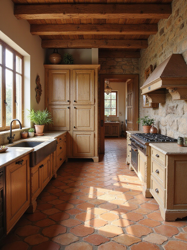
Like natural stone, terracotta is porous and requires sealing to be practical in a kitchen. But its imperfections are its strength. The subtle variations in color and texture from tile to tile mean that no two installations are exactly alike. It’s the ultimate antidote to the sterile, mass-produced feel of some modern spaces. It feels authentic. It feels human.
Using terracotta is about creating a space that feels like a haven—a warm, welcoming retreat from the coldness of the digital world. It’s not a sleek, minimalist choice, but for those seeking rustic warmth and a connection to tradition, there is nothing quite like it.
11. Utilize Unique Cement Tiles for a Deliberate Statement
Cement tiles are not for the faint of heart. They are a bold, graphic statement. Unlike ceramic tiles where the pattern is glazed on top, the patterns in cement tiles are created with pigmented cement, meaning the design is embedded through the entire body of the tile. As the tile wears, the pattern remains. It’s a technology that allows for incredibly intricate and artistic designs.
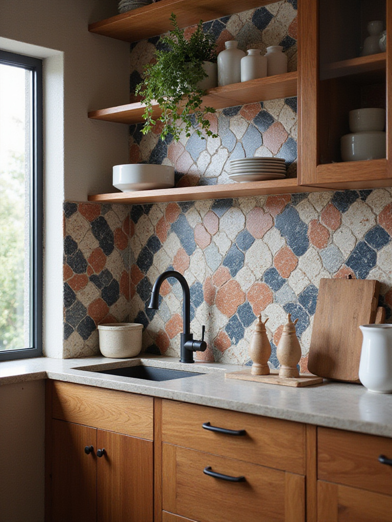
Most people use them incorrectly. They fall in love with a vibrant pattern and put it everywhere, creating a sea of visual noise. The way to use cement tile, in my view, is with the discipline of a sumi-e ink wash painter: one bold, perfect gesture on an otherwise quiet canvas. Use it on the floor of a small powder room off the kitchen. Use it as an intentional “rug” under your dining table. Or use it on a single, focused backsplash area.
Think of it as a piece of installed art. The BS is that it’s a “trend.” Used thoughtfully, it’s a timeless way to infuse a space with deep personality and pattern, but it must be balanced by an overwhelming amount of negative space around it to maintain a sense of calm.
Creative Design & Layout: Maximizing Visual Impact
The material is your vocabulary, but the layout is your grammar. This is how you arrange the words to tell a story. A simple tile can become profound with the right layout, and a beautiful tile can be lost in a confusing one. The goal is to create rhythm and flow.
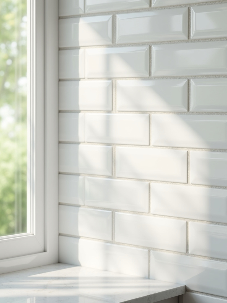
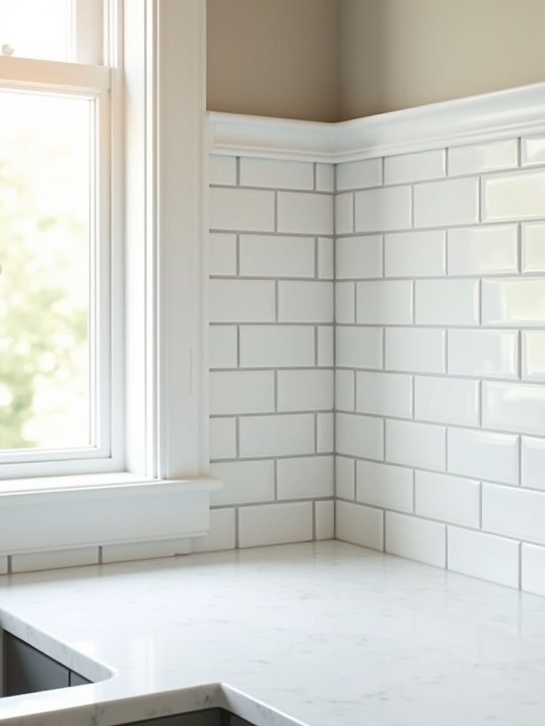
12. Implement a Classic Subway Tile Pattern for Quiet Order
Everyone knows subway tile. It’s often called “timeless,” but people rarely stop to ask why. Its power is in its simple, repeating grid. The classic running bond pattern creates a sense of horizontal movement that is calm and orderly. Our brains find comfort in recognizable patterns, and the subway tile grid is one of the most reassuring. It doesn’t shout; it provides a quiet, structural rhythm to the background of your kitchen.
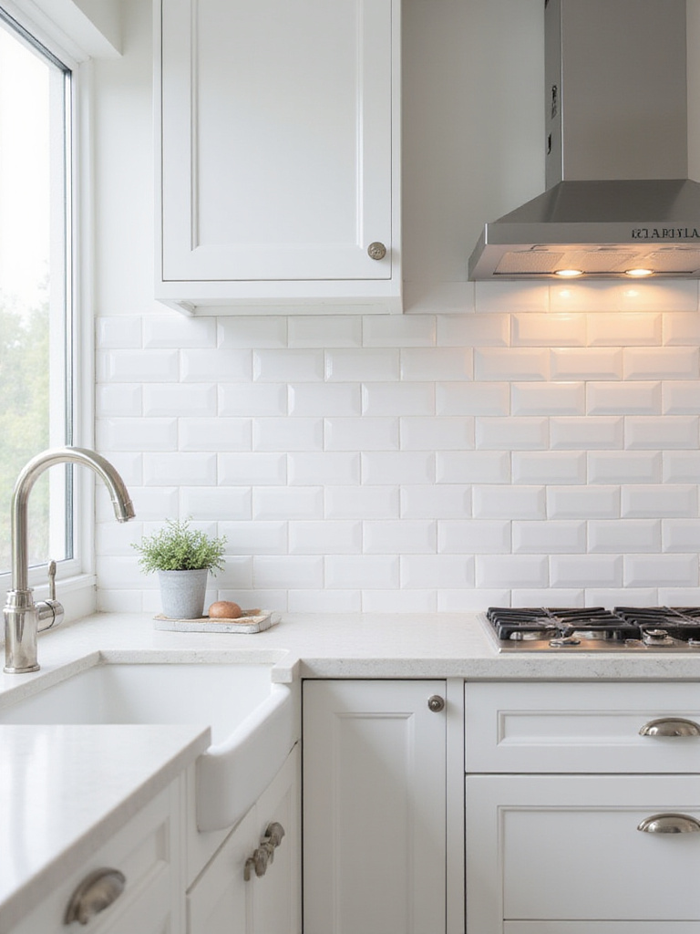
You can shift its personality with subtle changes. Stacking the tiles vertically creates a more modern, linear feel that draws the eye upward. Using a slightly larger format, like a 4×12, makes the pattern feel more expansive and calm. The common mistake is thinking it’s a “safe” or “boring” choice. Used intentionally, it’s a powerful tool for creating a serene backdrop that allows other elements—and your own thoughts—to have space.
It’s the embodiment of “less is more.” Its simplicity is what gives it strength and longevity, allowing it to support any style of kitchen without ever feeling dated.
13. Design a Dynamic Herringbone Layout for Subtle Movement
Herringbone is the next step up in complexity from a running bond, but it’s still based on order. The zigzag pattern creates a sense of gentle movement, like the surface of a calm river or the pattern of an arrow pointing the way. It’s dynamic, but it’s not chaotic. It draws the eye along its path, which can be a powerful tool for shaping a room.
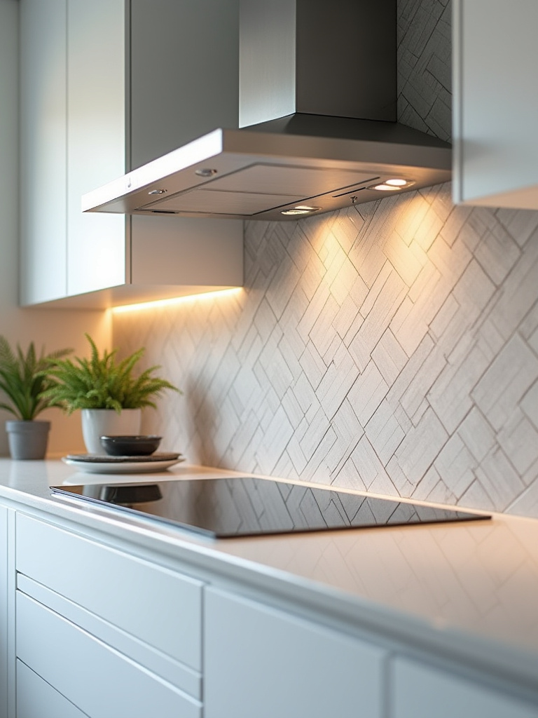
For instance, in a long, narrow galley kitchen, laying a herringbone pattern on the floor with the “V” shapes pointing down the length of the room can make the space feel longer and more elegant. On a backsplash, it adds a layer of sophisticated texture without introducing a loud color or pattern. It elevates a simple subway tile into something that feels more custom and architectural.
I often see people go wrong by using a herringbone pattern with a very busy, multi-colored tile. The pattern and the color start to compete, creating noise. The real power of herringbone is when you use a simple, single-color tile. This allows the beauty of the pattern itself to be the star.
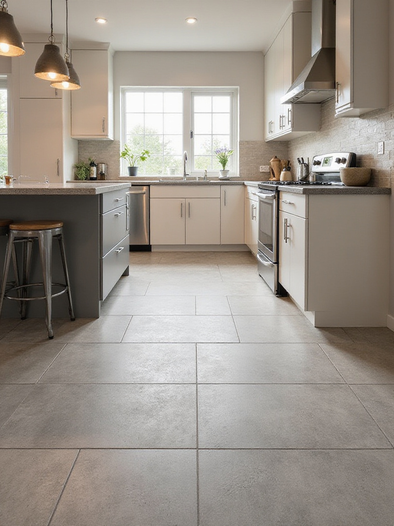
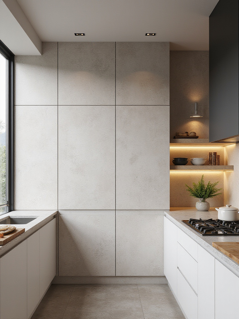
14. Create Modern Clean Lines Using Large Format Tiles Effectively
This is one of my favorite tools for modern, minimalist spaces. Large format tiles—anything over 15 inches on one side—are the ultimate expression of Ma, or negative space. By dramatically reducing the number of grout lines, you create a visually uncluttered, expansive surface. This is the big shortcut people miss: in a small space, fewer grout lines make the room feel much larger, not smaller tiles.
I’ve used 24×48 inch porcelain tiles on both the floor and the walls of a small kitchen to create an incredible sense of seamless flow. It’s like carving the room out of a single block of stone. The effect is profoundly calming. The visual “noise” of a grid of grout lines simply disappears, leaving you with an unbroken plane of color and texture. This allows the form of the room itself—the architecture—to become the main feature.
This requires precision. The subfloor must be perfectly flat, and you need a skilled installer. But the payoff is a kitchen that feels incredibly serene, open, and modern. It’s the physical manifestation of clearing away clutter to create space for what matters.
15. Utilize Contrasting Grout to Define the Form
This is a deliberate, graphic choice. Choosing a dark grout with a light tile (or vice versa) isn’t just a style, it’s a statement. It’s like the Japanese art of Kintsugi, where broken pottery is repaired with gold lacquer. Instead of hiding the cracks, you celebrate them. Contrasting grout celebrates the grid. It outlines each individual tile, turning the layout itself into the primary pattern.
This can be incredibly effective with simple tile shapes like squares or hexagons. The contrast emphasizes their geometric form and creates a strong visual rhythm. Where this goes wrong is when it’s done without purpose. A busy patterned tile with a contrasting grout is a recipe for a headache. The two elements fight each other.
The key is to use this technique to add structure to an otherwise simple surface. It gives a classic white subway tile a completely different, more graphic and modern personality. It’s a choice that says, “I see the beauty in the structure, in the lines that connect everything.”
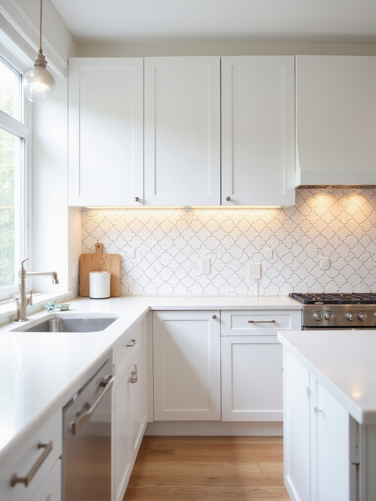
16. Integrate Decorative Mosaic Inserts as a Point of Focus
In a traditional Japanese tea room, there is often a single alcove, called a tokonoma, where a single piece of art is displayed—a scroll or a flower arrangement. This is how I think about mosaic inserts. They are not meant to be used everywhere. Their power comes from their scarcity.
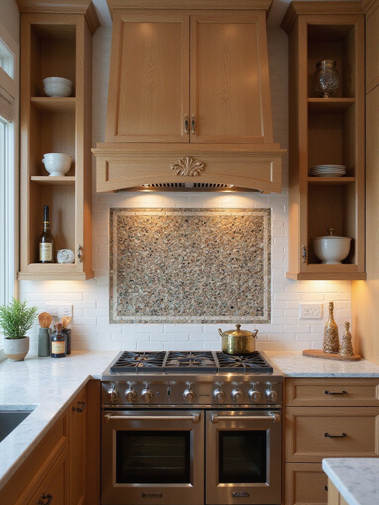
The common mistake is to get too busy—a mosaic border, plus a mosaic behind the stove, plus a mosaic on the floor. This completely devalues the idea. The correct approach is to choose one, and only one, place for this intense detail. A beautiful, handcrafted mosaic placed precisely behind your range, within a field of quiet, simple tile, becomes a true focal point. It’s a moment of deliberate art in your functional space.
Think of your kitchen as a gallery. You wouldn’t hang paintings on every square inch of the wall. You give the art room to breathe. Do the same with your decorative tile. Let it be the one special object in the room.
17. Extend Backsplash to the Ceiling for Dramatic Height
Extending your backsplash tile all the way to the ceiling is a powerful architectural gesture. Instead of the tile feeling like a functional afterthought stuck between the counter and the cabinets, it becomes an integral part of the wall itself. This creates a seamless, custom look that can dramatically alter the feel of a room.
The primary effect is that it draws the eye upward, making the ceilings feel higher. In a kitchen with a lot of horizontal lines—countertops, cabinets, appliances—this strong vertical element can bring a beautiful sense of balance and grandeur. It’s especially effective on a wall with open shelving or no upper cabinets, as it creates a finished, gallery-like feature wall.
The BS you might hear is that this is only for large, grand kitchens. On the contrary, this trick can be even more effective in a small space, as the unbroken vertical lines create an illusion of height and openness, making the room feel less constrained.
18. Vary Tile Sizes Within One Design for Subtle Rhythm
This is an advanced technique that, when done well, can add a quiet, sophisticated rhythm to a space. It’s not about randomly mixing sizes; it’s about creating a clear system or hierarchy. For example, you might use a large format tile for the main field of a floor, with a border of smaller mosaic tiles to define the edge of the space. Or on a backsplash, a field of simple subway tiles might transition to a smaller-scale tile behind the range.
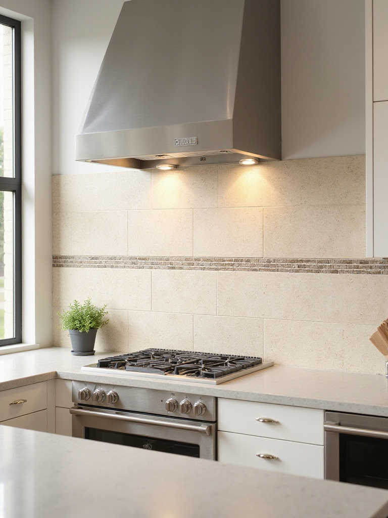
The key to avoiding chaos is to maintain a common thread. Usually, this is color. By using different sizes and textures of tile within the same color family, you create interest that is textural rather than graphic. The eye registers the subtle shift in scale and pattern, which adds a layer of depth and custom detail.
I’ve seen this go wrong when people mix too many colors and too many sizes. It becomes a mess. The shortcut is to think of it as a musical composition: you have your main rhythm (the large tile) and then a subtle harmony (the smaller tile). They must work together, not compete.
Finishing Touches & Advanced Considerations
You’ve laid the tile, but the project isn’t finished. These last steps are like mastering the settings on a new piece of technology. They’re what takes the installation from functional to truly refined and integrated. Don’t rush this part.
19. Select Grout Type and Color to Perfect the Vision
We’ve talked about grout as a design choice—blending or contrasting. But the type of grout is a crucial functional choice that impacts your peace of mind for years. The standard is cement-based grout. It’s fine, but in a kitchen, it’s porous and prone to staining, especially behind a stove. This is a source of future friction.

The smarter, tech-forward choice is epoxy grout. It’s non-porous. It resists stains, grease, and moisture. It’s more difficult and expensive to install, so some contractors will try to talk you out of it. Insist on it for your kitchen backsplash and high-traffic floors. The extra upfront cost pays you back tenfold in reduced cleaning and maintenance. It’s a “set it and forget it” upgrade that removes a common household frustration from your life.
This is a classic example of where a small, invisible choice can have a huge impact on your daily experience. Choose the path of less future work.
20. Choose Coordinated Trim and Bullnose Pieces for a Finished Line
An exposed, raw edge of a tile is like an unclosed tag in a line of code. It’s an error. It looks unfinished and it’s vulnerable to chipping. This is where trim pieces—like a bullnose with its rounded edge, or a modern metal Schluter profile—come in. They are the essential final touch that signals a professional, well-considered installation.
Many people treat this as an afterthought and then struggle to find a good match. My advice is to plan for this from the very beginning. When you are choosing your main tile, ask immediately what matching trim pieces are available. If there aren’t any, you need a plan. A minimalist, brushed metal edge can be a beautiful, intentional choice in a modern kitchen.
A finished edge is a small detail that makes a huge difference in the perceived quality of the work. It’s a sign of mastery and mindfulness, showing that you considered the project from every angle, right to the very end.
21. Mix Different Tile Materials for Zoned Texture
This is about creating distinct zones through texture, not just layout. Imagine an open-plan kitchen and dining area. You could use a durable, large-format porcelain in the main kitchen work-zone, which then transitions to a wood-look porcelain plank in the dining area. There’s no wall, but the shift in material underfoot sends a clear signal: the energy of the space is changing from “work” to “rest.”
The trick to making this work is to create a harmonious transition. This can be done with a sleek metal Schluter strip that acts as a clean dividing line. Or, you can find two materials that share a similar color tone, so the transition feels soft and organic rather than jarring. A porcelain that looks like concrete next to a slate-look tile can work beautifully if they share the same cool, gray undertones.
This is a sophisticated way to add functional definition and rich, sensory depth to a space without adding clutter. It’s a design choice you feel more than you see.
22. Install Underfloor Heating for Invisible Comfort
This is the ultimate intersection of technology and serene living. Tiled floors are beautiful and practical, but they can be cold. Underfloor radiant heating solves this problem silently and invisibly. It’s a network of thin electric mats or hydronic tubes installed just beneath the tiles, turning your entire floor into a gentle, consistent source of warmth.
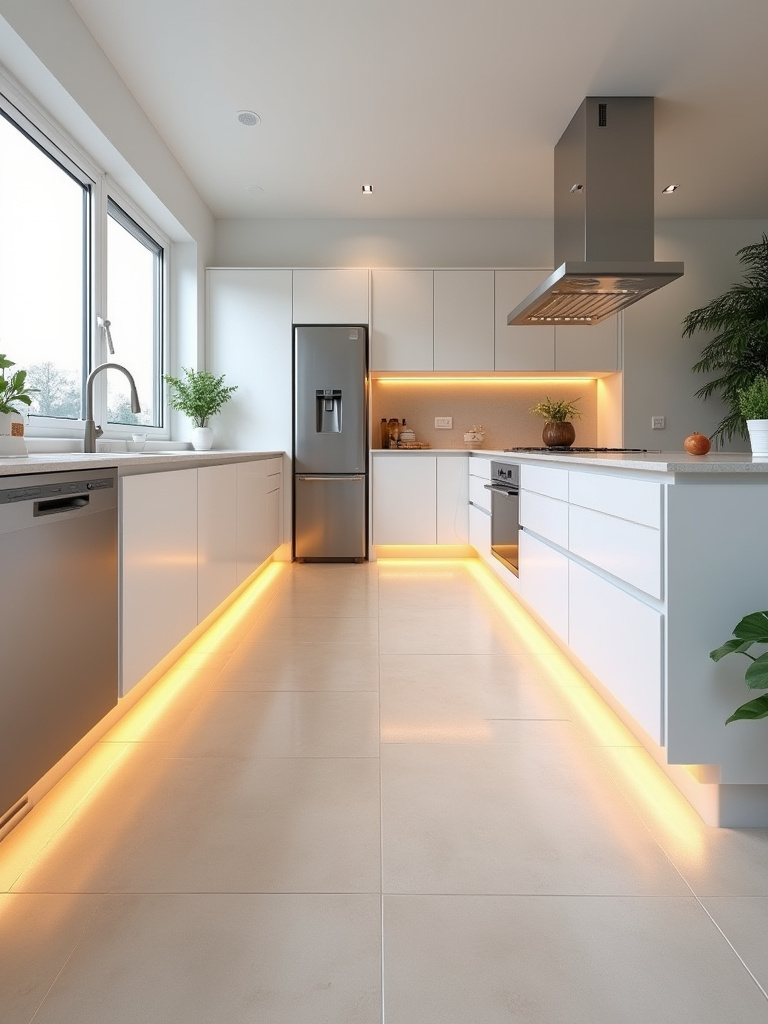
The comfort it provides is a different kind of heat than forced air. It’s a quiet, radiant warmth that rises evenly from the floor, warming objects and people directly. There are no vents blowing dust around, no noisy radiators. It’s just a pure, ambient comfort you feel underfoot. It elevates the experience of being in your kitchen, especially on a cold morning.
Combined with a smart thermostat, you can schedule it to warm the floor just before you wake up. It’s a perfect example of how modern technology, when used mindfully, can create a more comfortable and luxurious sanctuary for your daily life. It’s a truly invisible upgrade that enhances your well-being every single day.
Conclusion
Choosing the right tile is not about chasing a trend you saw online. It is a deeply personal process of crafting a sanctuary. Your kitchen should be a place of refuge from the digital noise, a space that grounds you, comforts you, and allows for the quiet rituals that make up a life. Every choice—from the resilience of the floor to the texture of the backsplash, the color of the grout to the feel of the floor beneath your feet—contributes to that feeling.
So take your time. Gather samples. See how they feel in your own light. Consult with professionals who understand that a kitchen is more than just a place to cook. By choosing with intention and a clear sense of the feeling you want to create, you’re not just renovating a room. You are building a foundation for a calmer, more mindful life.