You know, the first question people ask me when we begin designing a kitchen is almost never about the appliances or the cabinets. They’ll point to that blank wall between the counter and the upper cabinets and ask, “So… what do we do here?” They see it as a final detail, a decorative touch.
I see it differently. In desert architecture, we think a lot about surfaces—how they absorb heat, reflect light, and feel to the touch. The backsplash isn’t just decoration; it’s the element that bridges the solid earthiness of your counters with the clean lines of your cabinetry. It’s what catches the morning light. It’s what you wipe down after a shared meal. It’s the soul of the room. So when friends ask me for advice, I tell them to forget the trends for a moment and think about creating something with presence and quiet strength.
Foundations & Strategic Backsplash Planning
This is the part everyone wants to rush through to get to the pretty tiles, but you can’t. This is the foundation. Getting this right isn’t just about avoiding mistakes; it’s about setting an intention for the entire space. It saves you money, time, and the heartache of seeing a finished product that just feels… off.
1. Define Your Kitchen’s Style Before Selecting Tiles
Can we please talk about this? The biggest mistake I see is someone falling in love with a tile on Instagram and forcing it into a kitchen where it just doesn’t belong. I once had a client with a beautiful, serene desert-modern home—all clean lines and natural wood. They almost installed a busy, high-gloss geometric tile because it was trendy. It would have been a jarring, visual scream in an otherwise quiet space. We had to have a serious talk about the difference between a fleeting trend and timeless design.
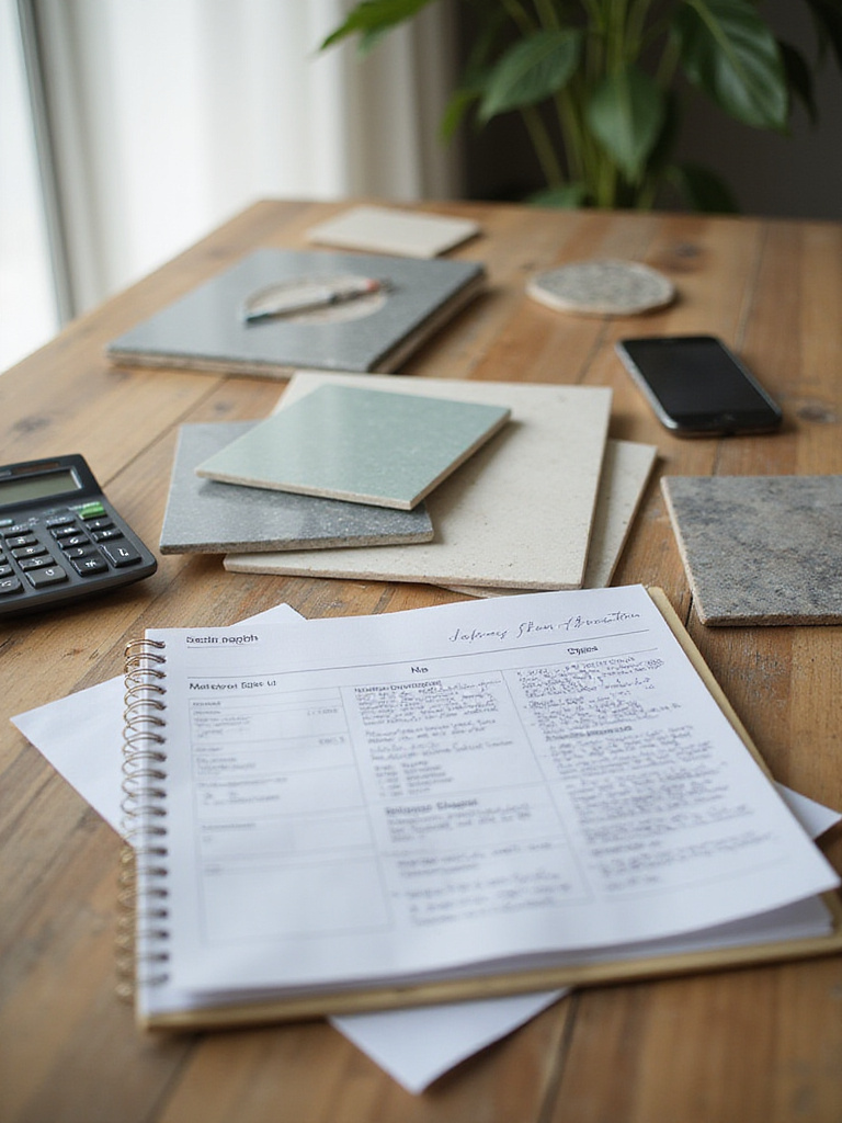
Before you look at a single tile, take an “architectural audit” of your kitchen. What are the dominant lines—horizontal, vertical, curved? What are the textures—smooth quartz, grained wood, matte hardware? What is the quality of the light? The backsplash must have a conversation with these elements. It can’t just shout over them. Create a small board with a sample of your countertop, a cabinet door or color swatch, and your flooring. Now you can go find a tile that wants to be part of that family, not a stranger at the dinner table.
From this grounded understanding, the practicalities—like your budget—become much clearer and easier to navigate.
2. Establish a Realistic Budget for Backsplash Materials
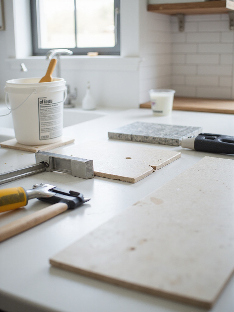
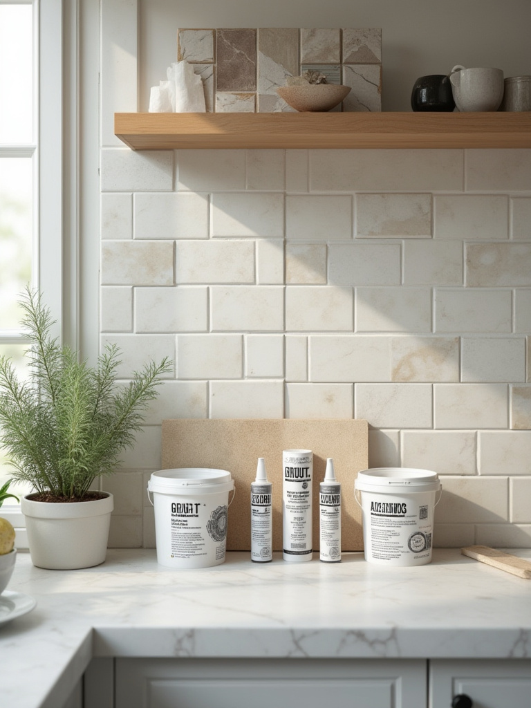
Everyone budgets for the tile. That’s the easy part. But they almost always forget to budget for the skill needed to install it, and all the unsexy materials that make it stick to the wall forever. Grout, thin-set adhesive, sealer, possibly even renting a proper wet saw—these things add up. And if you’re hiring a professional, which I often recommend, their labor can easily cost as much as, or more than, the material itself.
Here’s the real story: create your materials budget, then add at least 50% for installation and supplies. Then, add another 15-20% on top of that for the “what if” fund. What if they open the wall and find an issue? What if a box of tile arrives broken? Being realistic from the start prevents that awful feeling of having to compromise on the tile you love because you didn’t account for the whole picture. It’s not about being cheap; it’s about being smart so you can afford the quality that will last.
This foresight is pointless, however, if you don’t know exactly how much material you need in the first place.
3. Measure Accurately to Avoid Material Waste
I once watched a client order just enough tile for their project, with no overage. He was so proud of his efficiency. Then the installer made a few bad cuts—which always happens—and we were short two square feet. The tile was handmade, from a small studio in Morocco. The new batch had a slightly different glaze, a different dye lot. It was never a perfect match. He saved maybe $50 on the initial order and ended up with a permanent, visible reminder of the mistake.
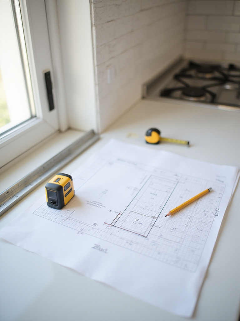
Measure the square footage, of course. Break it into simple rectangles. But then, add 15% to your order. Period. If it’s a complex pattern like herringbone or a delicate material, add 20%. This isn’t waste; it’s insurance. You need it for cuts, for the occasional broken tile, and most importantly, you want to keep a few extra tiles in your garage. Years from now, if a tile gets cracked, you will be so grateful you have a perfect match from the original batch. Think of it as sustainable design—you’re planning for the entire life of the kitchen, not just the installation day.
Before you commit to that order, though, let’s make sure you’re truly happy with your choice.
4. Explore Digital Visualization Tools for Pre-Installation Preview
These tools are great, but let’s be honest about what they are. They are a fantastic starting point, a way to quickly say “no” to a dozen bad ideas. Seeing a pattern mocked up on a picture of your own kitchen can save you from a catastrophic choice. It helps you see if a bold pattern will be energizing or just plain nauseating. It’s a helpful filter.
But a digital render can’t show you how a tile’s glaze catches the afternoon sun. It can’t replicate the subtle, earthy texture of a handmade zellige tile or the cool, solid presence of marble. Use these tools to narrow your options down to two or three contenders. Then, you absolutely must move from the screen to the real world. A rendering is a sketch; a physical sample is the beginning of the real story.
And that brings us to the most crucial step in this whole planning phase.
5. Order Samples to Confirm Color and Texture Matches
I will never, ever let a client choose a tile from a computer screen or even from a single sample in a showroom. You must bring samples home. At least three or four of your top choices. Don’t get one little tile; get several, or a larger swatch. Tape them to the wall where they will live.
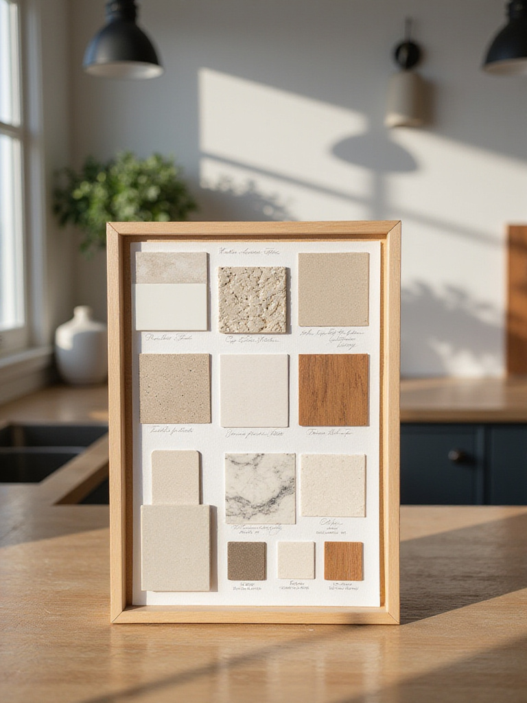
Now, watch them. Live with them for a few days. How do they look in the cool, blue light of dawn? How do they look at noon when the sun is blazing? How do they feel at night, under the warm, artificial light of your kitchen? A tile that looked like the perfect warm gray in the store might turn cold and violet in your home’s specific light. A material is only as beautiful as the light that hits it. This simple, patient step is the single best way to ensure you’ll love your choice for decades to come.
Choosing the Perfect Backsplash Material for Your Needs
The material you choose is the heart of the design. It sets the tone, dictates the maintenance, and defines the character of your space. This isn’t just a style choice; it’s a lifestyle choice. It should be a thoughtful response to your climate, your cooking habits, and the atmosphere you want to create.
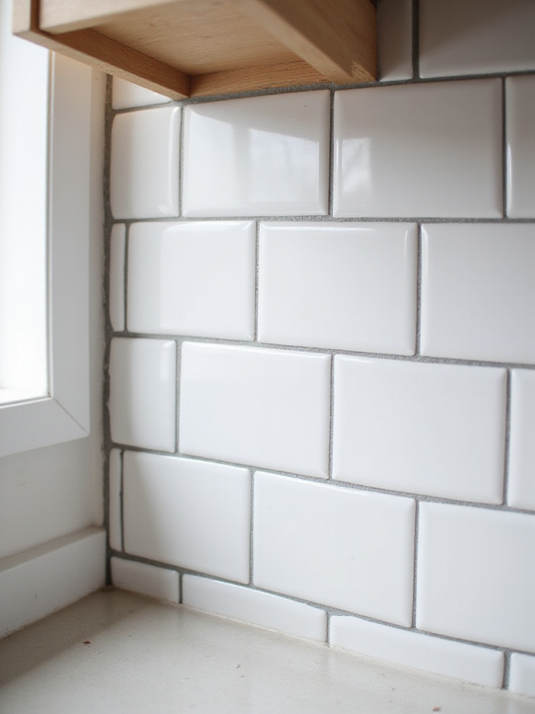
6. Select Classic Ceramic or Porcelain for Durability
There’s a reason these materials are timeless. They are the bedrock of good design—honest, durable, and versatile. Ceramic offers warmth and can be brilliantly colored, while porcelain is the undisputed champion of durability. It’s nearly waterproof, incredibly dense, and almost impossible to stain. In a desert climate, the cool touch of porcelain or a glazed ceramic under your hand is a small, welcome relief from the heat.
For a modern yet warm look, I often turn to zellige tiles, a handmade glazed terracotta from Morocco. Each tile is slightly different, imperfect. When installed, the surface has a subtle waviness and a beautiful, watery shimmer that interacts with light in the most stunning way. It’s a material with a thousand years of history that feels perfectly at home in a minimalist space. It’s the balance I’m always seeking: clean lines infused with soul.
That soul is what many people chase when they start thinking about stone.
7. Consider Natural Stone for Timeless, Unique Aesthetics
There is something ancient and deeply satisfying about bringing natural stone into a home. Each piece of marble, travertine, or slate is a literal slice of geologic history, with veining and character that can never be replicated. It brings an organic, earthy elegance that is undeniable. A full slab of stone as a backsplash is a powerful, monolithic statement—the ultimate in quiet luxury.
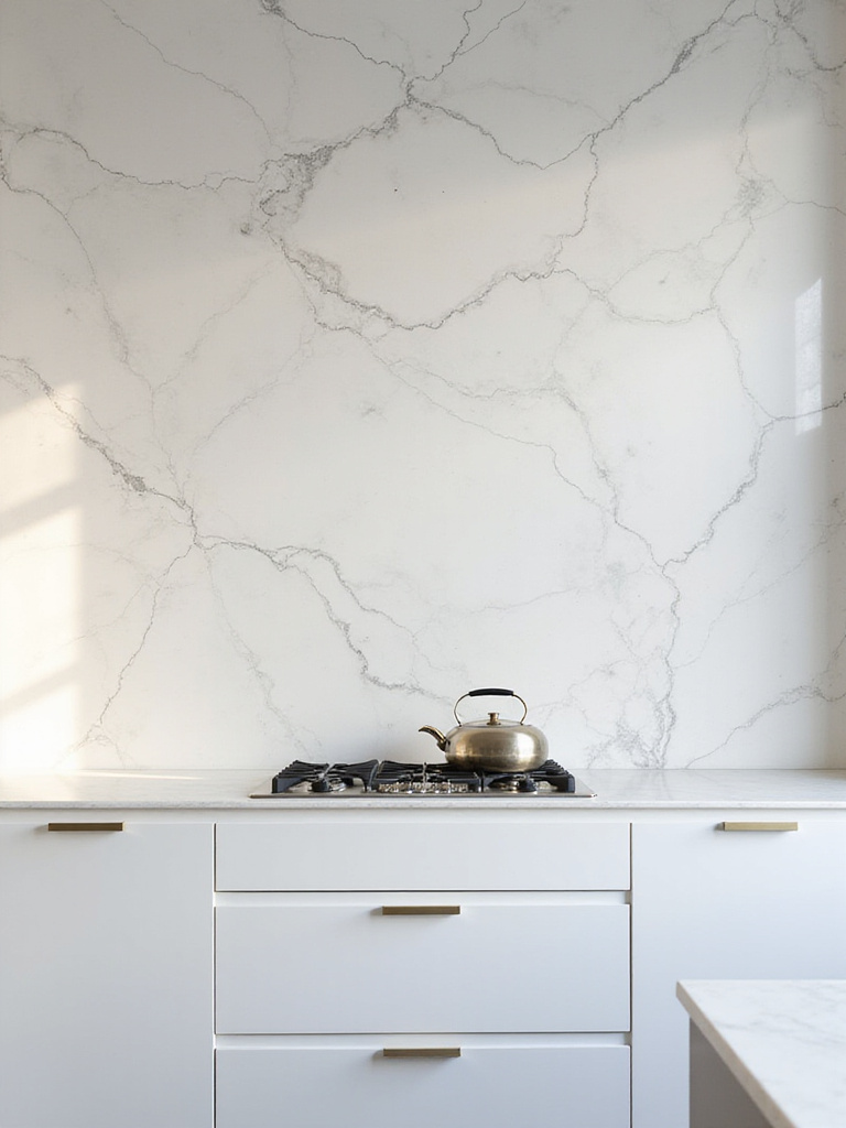
But let’s have a frank conversation. Natural stone is porous. It’s a sponge. If you cook with a lot of oils, drink red wine, or squeeze lemons, you have to be prepared. You must seal it properly and diligently. And even then, you have to wipe up spills immediately. If the idea of a potential oil stain or acid etch mark on your beautiful marble will ruin your day, then marble is not for you. You are either a person who can live with the patina of a life well-lived, or you are not. There is no shame in choosing the latter; it’s just a reality to face before you invest.
If you love the look but not the liability, glass offers a completely different, yet equally compelling, path.
8. Embrace Glass Tiles for Modern Reflective Appeal
Glass is all about light. In a smaller kitchen, or one that lacks abundant natural light, glass can be a game-changer. It bounces light around the room, creating a sense of depth and brightness. The colors can be incredibly rich and luminous, and because it’s a non-porous surface, it’s exceptionally easy to clean. It feels clean, sleek, and modern.
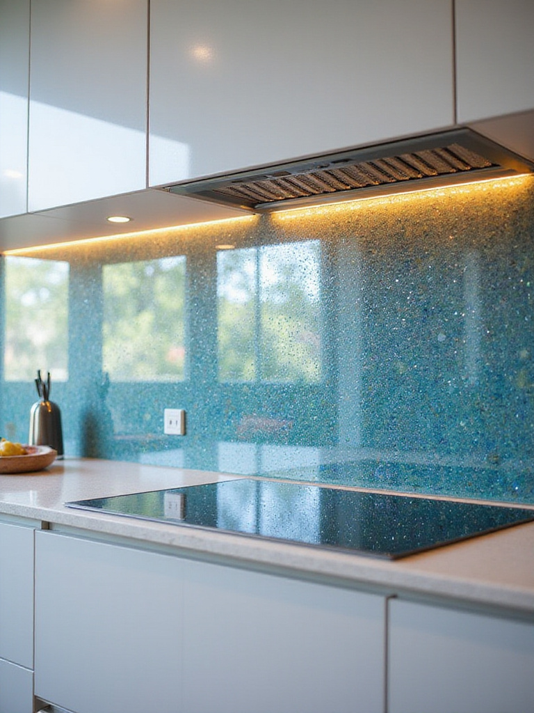
The key is to choose wisely. Some glass mosaics can feel dated very quickly. I prefer larger format glass tiles, or back-painted glass sheets for a seamless, monolithic look. A subtle, frosted, or slightly iridescent finish can add sophistication without being overly shiny. The goal is a quiet shimmer that enhances the space, not a disco-ball effect that overwhelms it. It’s a very clean, contemporary choice that can beautifully balance warmer, more organic materials elsewhere in the kitchen.
For a different kind of contemporary, we can look to the kitchens of professionals.
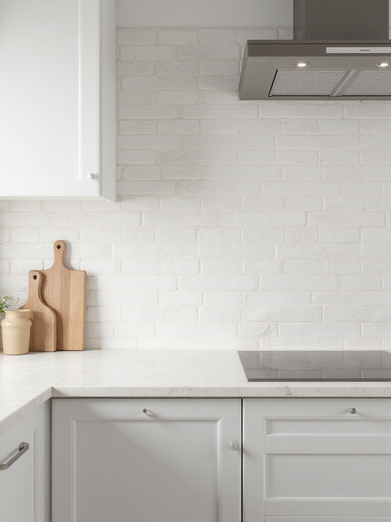
9. Explore Stainless Steel for an Industrial, Hygienic Look
There’s a reason stainless steel is used in every professional kitchen on earth: it’s practically indestructible, completely hygienic, and incredibly heat-resistant. From a purely functional standpoint, it’s a perfect material, especially directly behind a high-powered range. It offers a very clean, industrial, almost “brutalist” honesty that I find very appealing in a minimalist setting.
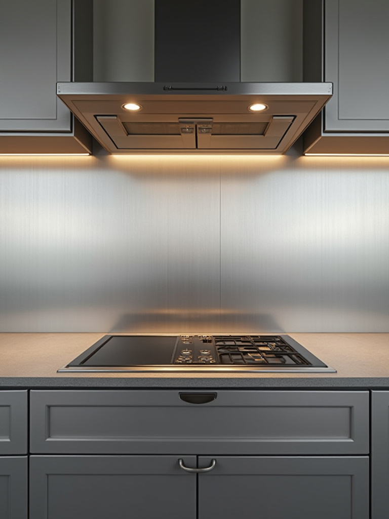
To keep it from feeling too cold or clinical, I suggest using it strategically. A single, seamless panel behind the cooktop can be a fantastic focal point, reflecting the dance of the flame and making cleanup a breeze. I would then pair it with warmer materials, like wood cabinetry or a richly textured tile, on the other walls. This contrast—the cool, smooth utility of steel against the warm, organic texture of wood—creates a beautiful tension and balance.
But what if you’re not ready for such a permanent commitment?
10. Evaluate Peel-and-Stick Options for Quick Updates
Let’s be real about peel-and-stick tiles. They are a temporary solution. And that’s okay. If you’re a renter, or if you’re saving up for a full renovation but can’t stand your current kitchen, they can be a wonderful, low-cost facelift. They allow you to experiment with a pattern or color without the commitment.
The BS part is when companies claim they look exactly like real tile. They don’t. You can always tell. The finish isn’t the same, they lack the depth and the beautiful imperfection of grout. But that’s not the point. Their purpose is to be a quick, affordable, and reversible change. My advice: embrace them for what they are. Choose a simple, classic pattern where the illusion is more believable, and make sure your wall is impeccably clean and smooth before you apply them. Treat it as a fun, short-term experiment.
Understanding a material’s permanence is directly tied to understanding the effort required to maintain it.
11. Understand Maintenance Needs for Each Material Type
This is perhaps the most important, and most overlooked, consideration. You must have an honest conversation with yourself: How do you live? Are you a meticulous cook who wipes up every splatter as it happens? Or do you finish your meal, enjoy your evening, and clean up later? Your answer should guide your material choice more than any photo you see online.

A beautiful, unsealed terracotta tile is a work of art, but it will absorb oil and water. Polished marble will etch if it comes into contact with lemon juice or vinegar. These materials require vigilance. On the other hand, porcelain, glazed ceramic, or glass will forgive almost any neglect. You can leave a splatter of tomato sauce overnight and it will wipe away without a trace. Choosing a material that matches your lifestyle isn’t a compromise; it’s the key to a space that serves you, not the other way around.
Mastering Design & Enhancing Visual Impact
Once you’ve chosen your material, the artistry comes into play. This is where you make decisions that elevate the backsplash from a simple surface to an integral part of the architecture. It’s about proportion, color, pattern, and the dance of light and shadow.
12. Decide on Full-Height Versus Standard Backsplash Placement
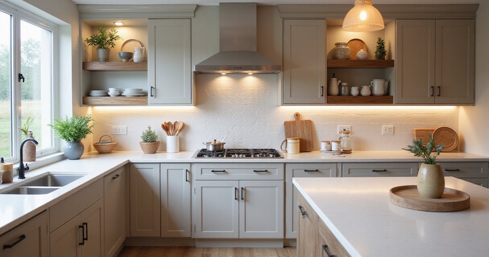
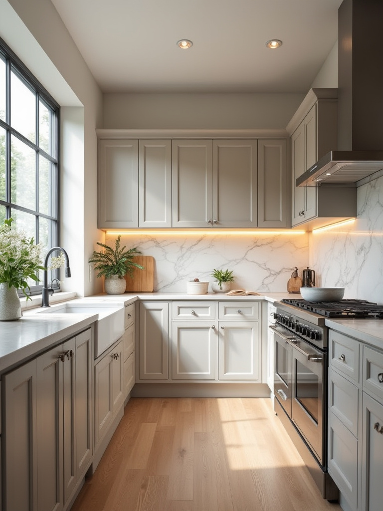
To me, the standard 4-inch backsplash lip that matches the countertop is a design cop-out. It feels like a remnant from a time when people were afraid to make a decision. It just chops up the wall in an unsatisfying way. Taking the backsplash tile all the way from the countertop to the bottom of the upper cabinets creates a much more cohesive, intentional, and impactful look. It treats the entire wall as a single, unified plane.
Even better? Take it all the way to the ceiling. In a kitchen with open shelves or no upper cabinets, a full wall of tile is a stunning feature. It creates a sense of height and drama, turning the entire wall into a canvas for your chosen material. It’s a bold move, yes, but it’s one that speaks of confidence and a clear design vision. It costs more in material, of course, but the visual return on that investment is enormous.
This visual field needs to live in harmony with its neighbors.
13. Coordinate Backsplash Colors with Countertops and Cabinetry
The goal here isn’t to “match” everything perfectly. A perfectly matched kitchen can feel flat and lifeless. The goal is harmony. You want the backsplash, countertops, and cabinets to have a conversation, not all be saying the same thing. The key is to understand undertones. Is your “white” cabinet a warm, creamy white or a cool, stark white? Is that “gray” in your quartz countertop a warm, brownish-gray or a cool, bluish-gray?

Pick up a large paint swatch deck. Hold it against your cabinets and countertops. You’ll quickly see their hidden undertones. Your backsplash should share the same undertone family. This creates a cohesive feeling even if the colors themselves are different. You might pull a subtle, warm gray vein from a marble countertop and use that as the color for your tile. This creates a quiet, sophisticated link that feels thoughtful and complete.
Once you have your color story, you can think about introducing rhythm and movement.
14. Incorporate a Herringbone Pattern for Dynamic Visual Interest
I love a herringbone pattern. It’s classic, architectural, and adds a beautiful sense of movement and texture without adding clutter. It’s a way for a minimalist to introduce detail. The zigzag pattern creates a subtle energy and guides the eye, making a space feel more dynamic and often a bit larger.
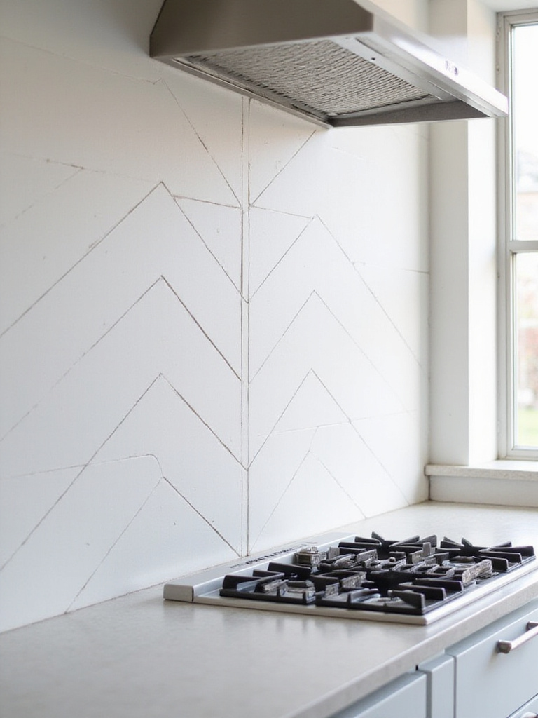
But here’s my shortcut: don’t attempt this yourself unless you are patient and precise. The number of angled cuts required is significant, and if your layout isn’t perfectly centered and planned, the result will look amateurish. This is a pattern that demands respect. It’s a perfect example of when to invest in a skilled installer. Their expertise will ensure the lines are crisp, the cuts are clean, and the final look is one of tailored elegance.
A pattern like herringbone can be an all-over treatment, or you can use it to create a specific moment of focus.
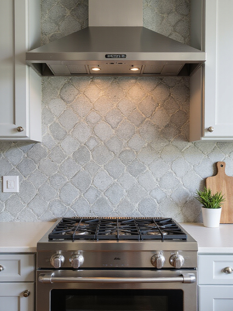
15. Create a Focal Point with a Behind-Range Accent Area
In Middle Eastern architecture, we often use a niche or a central courtyard to create a point of focus and retreat. The area behind the range can serve a similar purpose in the kitchen. It’s the hearth, the center of activity. Giving it special treatment can ground the entire design. This is a place to do something a little more special.
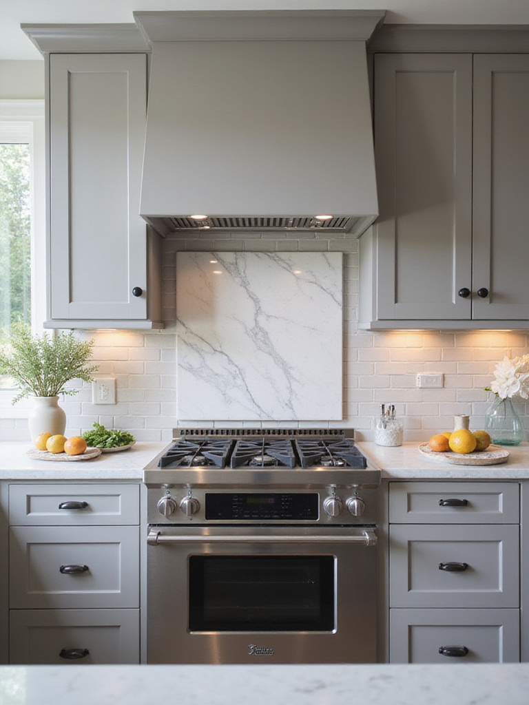
This could be a shift in pattern—perhaps the field is a running bond subway tile, and the area behind the range is herringbone. Or it could be a change in material—a single, beautiful slab of stone or a panel of steel set within a field of ceramic tile. The key is that it must feel intentional and integrated, not just like a random patch of expensive tile. It should be a thoughtful highlight that draws you in, an anchor for the whole room.
Another way to create visual drama is with one of the most underrated design tools you have.
16. Utilize Grout Color to Define or Subdue Your Design
Grout is not just the stuff that fills the gaps. It is a design tool. Choosing a grout color is like choosing the pinstripe on a suit—it can be bold and defining, or subtle and sophisticated. There are no wrong answers, only different intentions.
“Want to see the shape and pattern of every single tile? Use a contrasting grout—like a dark gray grout with a white tile. This creates a graphic, almost grid-like effect that is very striking. Want the backsplash to feel more like a single, unified, textured surface? Use a grout color that matches the tile as closely as possible. The individual tiles recede, and you are left with a quiet, monolithic surface.”
This single decision has a massive impact on the final look. My advice is to get a few grout color sample sticks from the hardware store and hold them up between your sample tiles. It will become very clear, very quickly which direction you want to go.
And once you’ve made these aesthetic choices, you have to bring them to life with light.
17. Light Up Your Backsplash with Integrated Under-Cabinet Lighting
A stunning backsplash in a poorly lit kitchen is a waste. It’s like buying a beautiful painting and hanging it in a dark closet. Under-cabinet lighting is not an optional accessory; it is essential. It performs two critical functions: task lighting and accent lighting. It brightly illuminates your countertop for prep work, making cooking safer and easier.
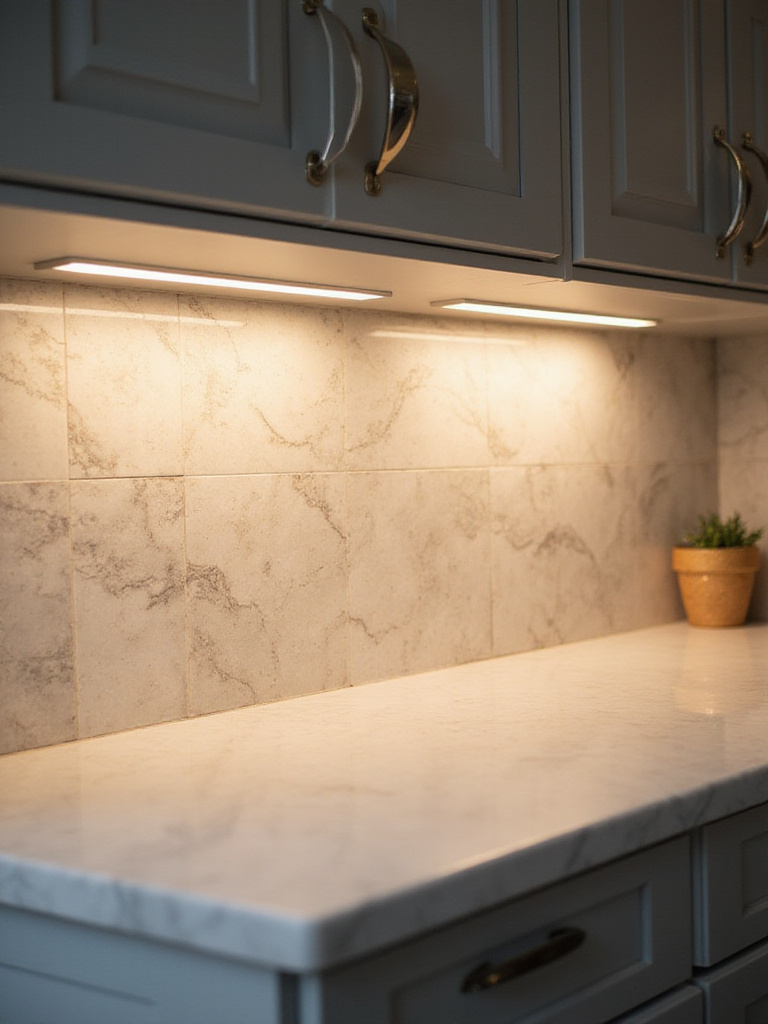
But just as importantly, it “grazes” the surface of your backsplash with light. This is what reveals the true texture and character of the material. It will pick up the subtle shimmer of a glazed tile, the deep veining of marble, the rich texture of slate. It brings the surface to life. Always choose a warm-white (2700K-3000K) dimmable LED fixture. This allows you to have bright, functional light when you need it, and a soft, ambient glow when you want your kitchen to feel like a calm, welcoming space.
Smart Installation for Professional-Looking Results
A beautiful design can be completely undermined by a clumsy installation. This is the stage where precision and patience are everything. Getting these details right is what separates a project that looks good from one that is built to last.
18. Prepare Your Wall Surface for Optimal Adhesion
This is the most important part of the installation process, and it’s the part you never see. The most expensive, beautiful tile in the world will fail if it’s stuck to a dirty, bumpy, or unstable wall. Your wall needs to be clean, flat, and sound. Any grease from years of cooking must be completely removed. Any bumps or loose paint must be scraped and sanded smooth.
Think of it like this: the thin-set adhesive is the glue, but it’s only as strong as the two things it’s holding together. If one of those things is a layer of dust or peeling paint, your tiles will eventually start to come loose. Take the time to prep the wall properly. Prime it. It’s a tedious, unglamorous job, but it is the true foundation of a backsplash that will last a lifetime.
And that begs the question: who should be doing this work?
19. Determine DIY Feasibility Versus Hiring a Pro
I have immense respect for dedicated DIY-ers. But a tile job, especially with expensive material, might not be the place to learn. I’ve seen it go wrong too many times. A bad DIY job has a certain look—uneven grout lines, poorly cut tiles around outlets, a general lack of crispness. It will whisper “I tried” at you every time you make coffee.
My honest advice: If you’re using simple, inexpensive subway tile in a straightforward layout, and you have patience and the right tools, go for it. If you’ve chosen a complex pattern like herringbone, a delicate material like marble, or large-format tiles, hire a professional. The money you “save” by doing it yourself is quickly lost if you have to tear it out and have it redone. A pro’s experience is worth every penny for a flawless, lasting result.
Whether it’s you or a pro, you have to use the right stuff.
20. Select the Correct Adhesive and Grout for Material
Walking down the tile aisle at a big-box store can be overwhelming. There are a dozen types of adhesives and grouts. Grabbing the wrong one is a classic rookie mistake. Using a gray thin-set behind a white or translucent glass tile, for example, will muddy the color and ruin the look. Using the wrong kind of adhesive for natural stone can cause it to stain from the back.
Here’s the shortcut: Read the instructions on the back of your tile box. The manufacturer will tell you exactly what kind of adhesive to use. For grout in a kitchen, I almost always recommend an epoxy-based or other high-performance grout. Yes, it costs more and can be trickier to work with, but it is virtually stain-proof and never needs to be sealed. In a high-use area like a kitchen, this is a massive advantage and well worth the extra investment.
This attention to detail extends to the tools you use for placement.
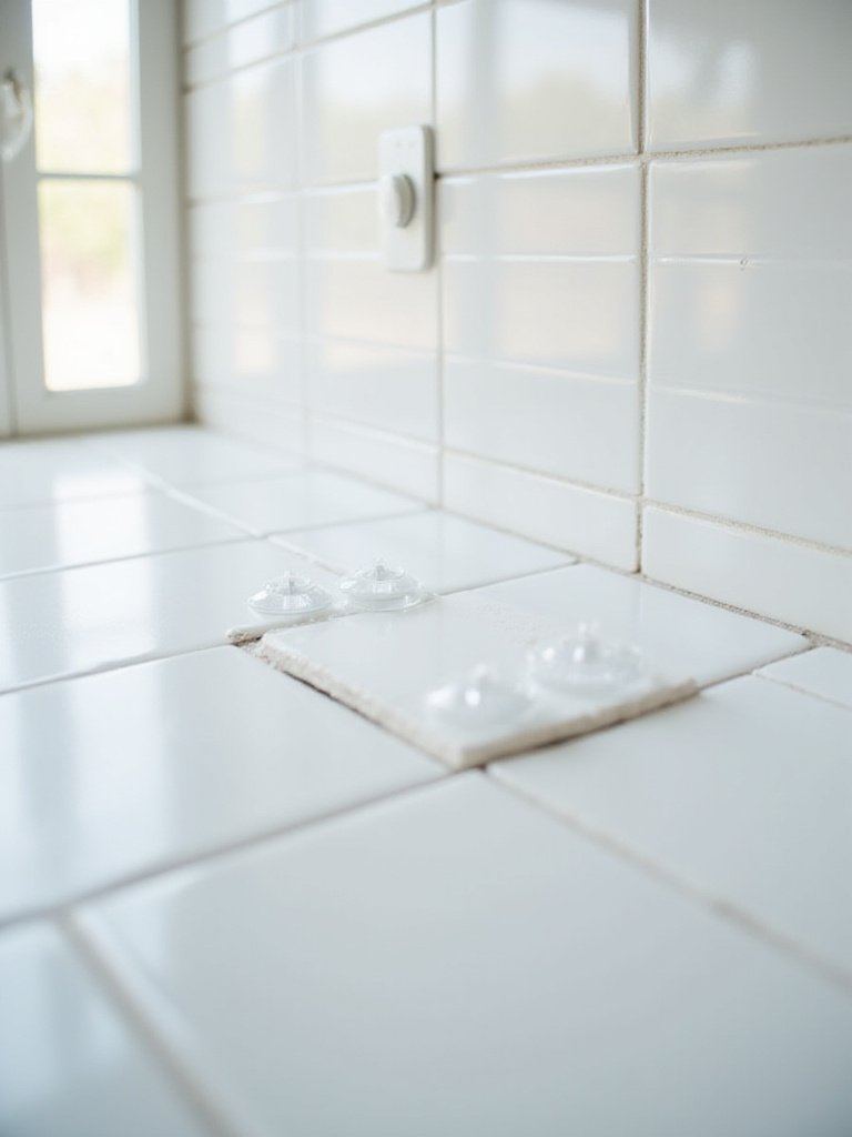
21. Learn Proper Tiling Techniques for Even Spacing
The human eye is incredibly good at spotting inconsistencies. A single grout line that’s a millimeter wider than the rest will stand out like a sore thumb once the project is finished. Consistent spacing is what gives a tile job that clean, professional look. It’s not something you can just eyeball.
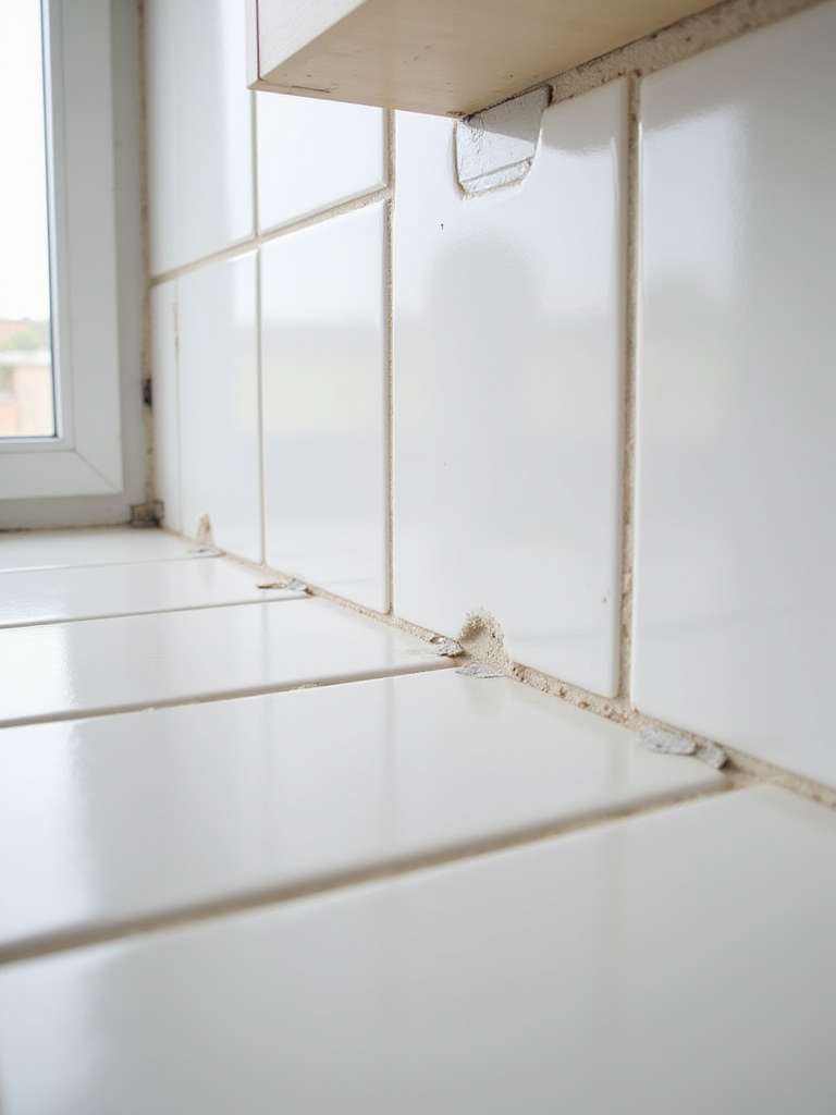
This is where tile spacers and, even better, a tile leveling system, are your best friends. These simple plastic clips and wedges not only ensure perfectly uniform grout lines, but they also prevent “lippage”—where one tile sits slightly higher or lower than its neighbor. This is especially crucial for larger tiles. This system is the shortcut to achieving a perfectly flat, uniform surface. It’s a small investment that pays huge dividends in the final quality of the work.
This is why those little plastic crosses are so vital.
22. Use Spacers Consistently for Uniform Grout Lines
This might seem redundant, but it deserves its own point because it’s the detail that most often gets rushed. You must use spacers, and you must use them at every corner of every tile. Consistently. They dictate the grid, the rhythm of the wall.
I once consulted on a fix where the homeowner started strong but got tired and started “eyeballing” the spacing toward the end. The grout lines slowly grew wider and more crooked as they moved across the wall. It was a subtle but deeply unsettling effect. The whole wall felt like it was slumping. They had to pay to have it all torn out and redone. Don’t be that person. Use your spacers religiously. It is a meditation in precision.
Longevity, Maintenance & Advanced Backsplash Care
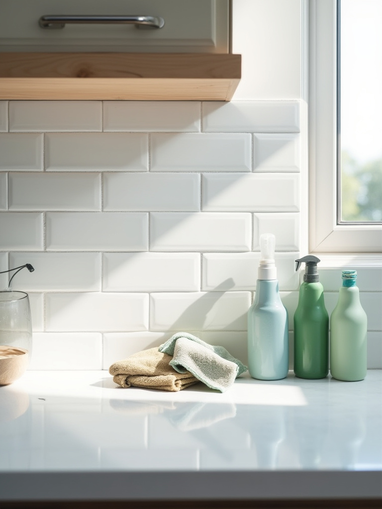
The project isn’t over when the last tile is set. A beautifully installed backsplash needs to be protected and cared for to ensure it looks just as good in ten years as it does today. This final phase is about stewardship—protecting your investment and respecting the materials you’ve chosen.
23. Apply Appropriate Sealer to Protect Porous Materials
If you have chosen any porous material—natural stone, unglazed ceramic, terracotta, cement tile, or even just cement-based grout—sealing it is not optional. It is mandatory. Not sealing your backsplash is like buying a beautiful suede jacket and wearing it in a rainstorm. The material will absorb everything: cooking oil, wine, coffee, water. These will become permanent stains.
A good quality impregnating sealer doesn’t form a film on the surface. It soaks into the pores of the material and seals it from within, preventing liquids from penetrating. You’ll need to reapply it every year or so, depending on the material and how much you use your kitchen. It’s a simple, 30-minute job that will protect your beautiful backsplash and keep it looking pristine for years. Just do it.
With that protection in place, daily care becomes simple.
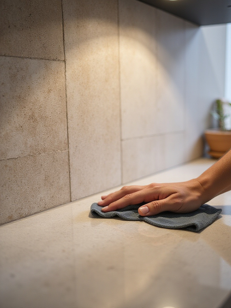
24. Establish a Routine Cleaning Schedule to Maintain Luster
The best way to keep your backsplash looking beautiful is to care for it gently and regularly, rather than harshly and sporadically. A quick wipe-down with a damp microfiber cloth after cooking is often all you need. For more stubborn grime, use a pH-neutral cleaner. Avoid acidic cleaners (like vinegar) on natural stone and grout, and avoid abrasive scrubbers on everything.
Think of it as a small ritual at the end of the day. Wiping down the surfaces, returning the kitchen to a state of calm. This consistent, gentle care is what preserves the material’s finish and integrity. It’s a small act of respect for the space you’ve created, and it’s what ensures its lasting beauty.
Conclusion
In the end, your kitchen backsplash is a quiet but powerful character in the story of your home. It’s a vertical surface that should be just as thoughtful as the horizontal ones we walk and work on. It’s an opportunity to bring in texture, light, and a sense of permanence. By planning with intention, choosing materials with honesty, and installing with precision, you create something more than a shield against splatters. You craft a backdrop for your life—one that is durable, beautiful, and a true reflection of the care and wisdom you put into your home. It’s an investment that will pay you back in moments of quiet beauty every single day.