There is a pervasive hesitation in interior design when it comes to the all-white bedroom: the fear that stripping away color will result in a space that feels sterile, cold, or institutional. Yet, mastering white bedroom inspiration is essential for creating a modern retreat. This anxiety is not unfounded; it is a direct cultural inheritance from 20th-century sanitation movements and modernist architects like Le Corbusier, who championed whitewash as a tool for moral and physical cleansing.
Consequently, many equate the white aesthetic with an “operating room” atmosphere rather than a sanctuary. However, this perspective overlooks the color’s historical role as a status symbol of luxury and its unique ability to provide a visual reset for the mind.
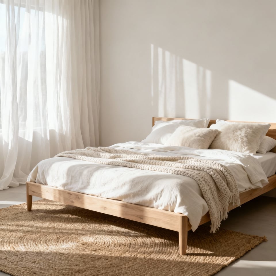
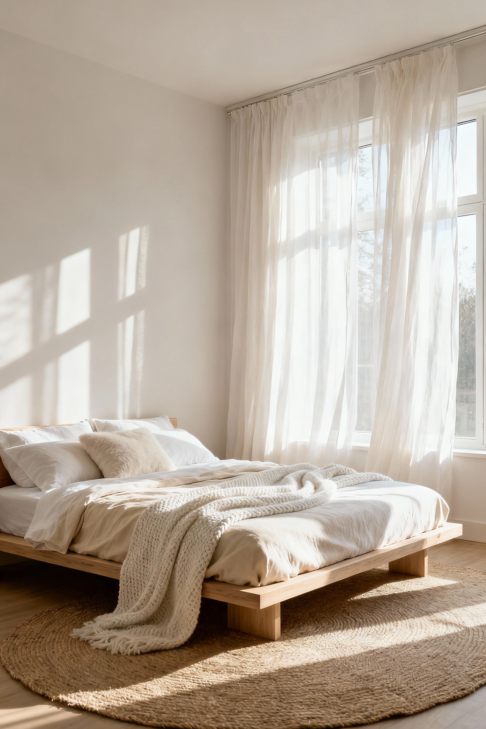
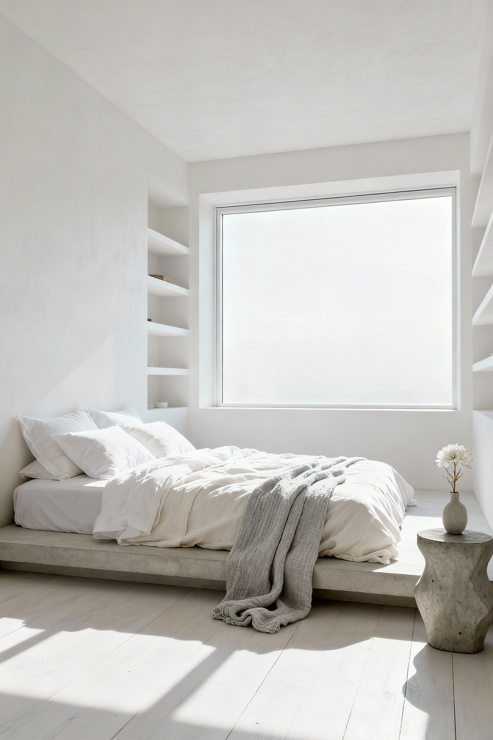
The difference between a cold, impersonal void and a warm, inviting retreat lies entirely in the execution. A successful white bedroom does not rely on a stark, flat pigment, but rather thrives on the subtle interplay of undertones and the quality of light. When we stop viewing white as a mere absence of color and start seeing it as a dynamic canvas, the narrative shifts from emptiness to clarity. Whether utilizing creamy warmth to soften a North-facing room or embracing the crispness of cool whites in a sun-drenched space, the objective is to create an airy environment that allows the eye to rest without feeling deprived of character.
Shattering the “clinical” myth ultimately requires a shift in focus from hue to tactile depth. If color is quieted, texture must be amplified to provide the room with its soul. By layering diverse linens, incorporating raw materials like timber or stone to ground the space, and manipulating shadow through strategic lighting, a white room gains necessary complexity. This guide reveals how to master the spectrum of white, balancing Scandinavian minimalism with organic warmth to design a bedroom that feels breathable, luxurious, and restorative.
Thesis: Why Most Designers Get White Wrong (It’s Not About Absence of Color)
Treating white as a mere absence of color is the most common error in interior design. We often conceptualize white as a neutral blank canvas, but in reality, it is a nuanced hue with significant spectral weight. The mistake usually begins with selecting a “pure” white—often derived from titanium dioxide—which creates a clinical, sterile atmosphere rather than the restorative sanctuary a bedroom requires. Before modern pigments, our interiors were defined by the soft, inherent warmth of chalk and lime-washes, a sensation of comfort we often strip away in pursuit of modern minimalism.
To master white, you must first identify its undertone. Every white belongs to a chromatic family, leaning either warm with traces of yellow and beige, or cool with hints of blue and gray. This choice depends entirely on your architecture’s orientation. A room with northern exposure is bathed in cool, blue-tinted daylight; painting it a stark, cool white will leave the space feeling icy and grim. Instead, you need a warm, creamy white to counterbalance that light and reintroduce coziness.
Conversely, white walls act as passive mirrors. They will amplify the green of a lawn or the red of a neighbor’s brick wall, altering your carefully chosen palette. Avoiding a flat, sensory-deprived space isn’t about adding more color, but adding dimension. Since white reflects light so intensely, we must rely on texture to create depth. By layering matte walls against glossy trim, or pairing rough linen textiles with smooth ceramics, we create shadows and highlights that prevent the room from feeling emotionally detached. It is this interplay of light, finish, and undertone that turns a stark white box into a livable, breathable space.
Movement I: The Foundation – Walls and Surfaces
The decision to paint a room white is often mistaken for a default choice, yet historically, it was a radical act of rebellion. When the “Princess of Pale,” Syrie Maugham, unveiled her all-white music room in 1927, she stripped away the oppressive gloom of the Victorian era to reveal light and air. Today, thanks to the mid-century introduction of Titanium Dioxide, we have access to safer, brilliant whites that serve as a pristine canvas. However, creating a sanctuary requires more than simply opening a can of paint; it requires a nuanced understanding of temperature.
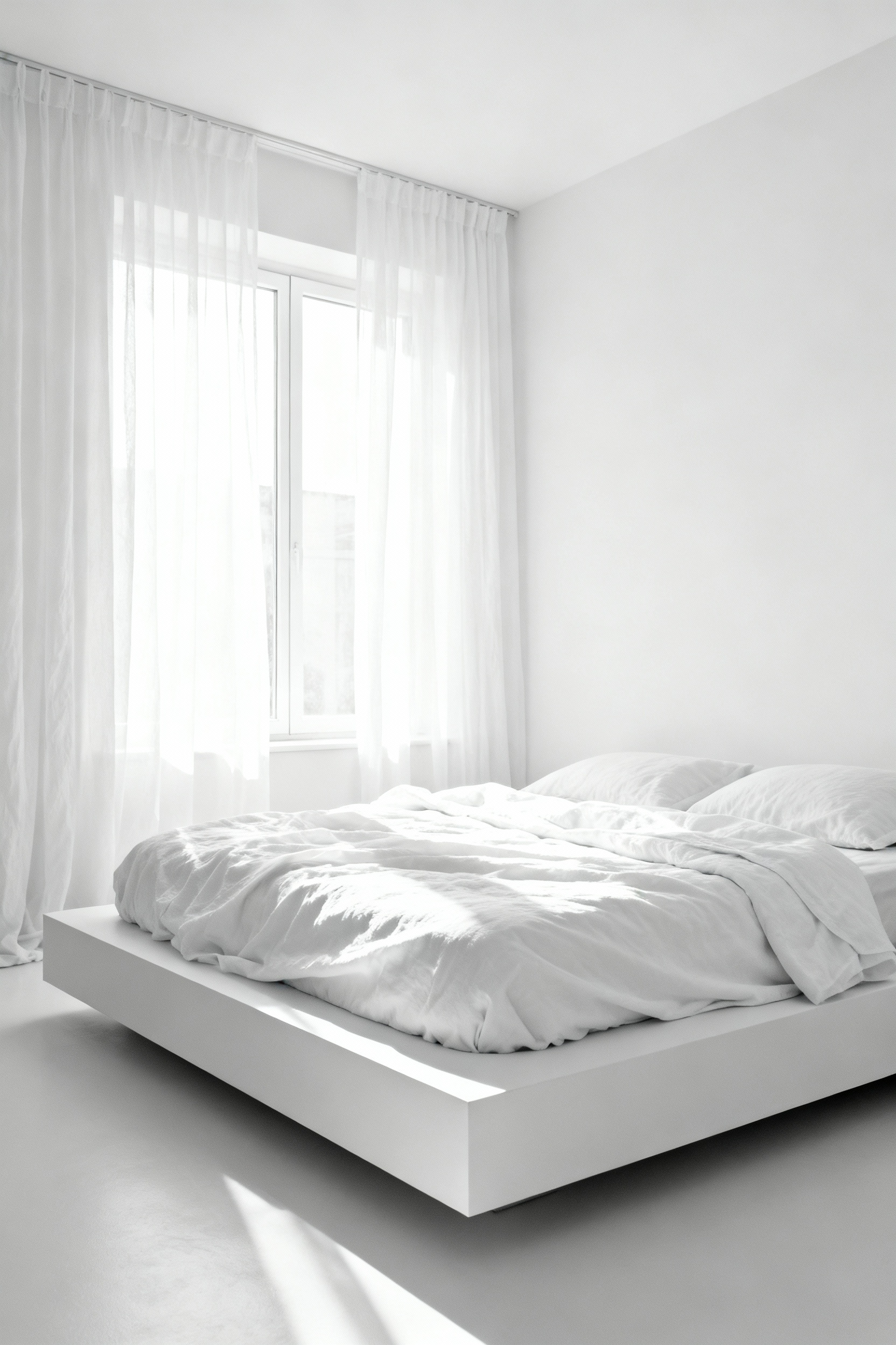
In the bedroom, white is not merely a color but an atmosphere. A stark, cool white can feel clinical and detached—the opposite of what the mind needs to wind down. Instead, the architecture of sleep demands warm whites with subtle red or yellow undertones, such as alabaster or bone. These hues absorb light softly, creating an inherent sense of intimacy and physiological comfort that supports deep rest.
This softness must extend to the finish itself. While gloss offers durability, it is unforgiving in a space meant for relaxation, magnifying every surface flaw and creating restless glare. A matte or flat finish is superior here, offering a velvety texture that conceals imperfections and diffuses light. To prevent this quiet backdrop from feeling sterile, we must rely on materiality. By incorporating textured plaster, lime wash, or painted wood paneling, we give the walls a voice. These elements catch the light, creating shifting shadows that transform a blank space into a layered, breathable environment.
1. Moving Beyond Flat Paint: The Depth of Limewash and Mineral Finishes
Standard acrylic paints essentially wrap your walls in a synthetic film. While durable, this plastic-like coating often leaves a bedroom feeling static or sterile, lacking the emotional resonance we seek in a sanctuary. To introduce genuine warmth and character without breaking a minimalist palette, we look to the micro-crystalline structure of limewash and mineral paints.
Unlike latex options that sit on the surface, limewash penetrates the wall’s pores and cures through carbonation, eventually returning to its original state as limestone. This chemical bond creates a surface that refracts light in complex ways, offering a depth that is impossible to achieve with standard flat paint. In a white bedroom, this doesn’t manifest as high-contrast noise, but rather as a quiet, shifting ambiance. As the sun moves across the room, the wall’s “cloudy” or mottled texture evolves, softening shadows and giving the space a living, breathing quality.
This specific texture—often described as a “suede patina”—is achieved through the artistry of application. Using a large block brush in multi-directional strokes allows the minerals to catch the light unevenly, resulting in a matte, velvety finish that feels cocoon-like. Beyond the aesthetic, this choice supports a healthier sleep environment. The high pH of the lime renders the walls naturally antimicrobial and hypoallergenic, while the breathable nature of the mineral finish prevents trapped moisture. By utilizing these materials, you anchor your modern space in old-world architectural wisdom, creating a room that feels both timeless and deeply restorative. If you are exploring different approaches, review these bedroom design styles to define your retreat.
2. Structural Softness: Integrating Curved Plaster Headboards
Integrating a curved plaster headboard moves bedroom design beyond simple furnishing and into the realm of architectural softening. By manipulating materials like micro-cement or limewash into organic forms, we replace the rigid, sharp edges of traditional joinery with fluid, sculptural waves. This blurring of vertical lines into a gentle arch does more than frame the bed; it alters the room’s psychology, offering a sense of protective enclosure that feels simultaneously ancient and distinctly modern.
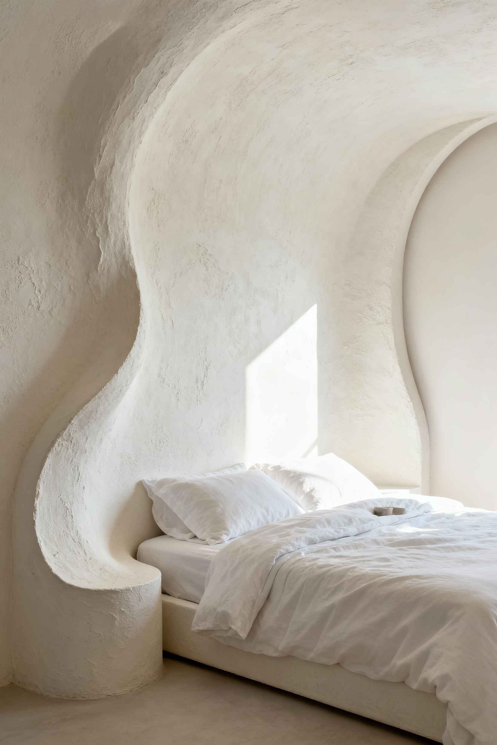
In the context of a monochromatic white palette, this structural choice is vital for sensory engagement. Without color variation, the plaster’s hand-applied surface becomes the room’s focal point. It acts as a canvas for light, diffusing it rather than reflecting it flatly. As the sun moves, the textured surface catches shadows that evolve throughout the day, ensuring the space feels dynamic rather than sterile. This creates a “tactile white“—a depth experienced through touch and atmosphere rather than hue.
To truly elevate this feature, the hard materiality of plaster must be balanced with ethereal elements. A favorite technique is the integration of concealed LED strips along the recess of the curve. This creates a “halo effect,” bathing the wall in a soft, ambient glow that eliminates the need for harsh overhead fixtures. The result is a design that prioritizes the *Hygge* principle of comfort, merging clean, minimalist lines with a warm, inviting atmosphere that feels luxurious and settled.
3. Grounding the Space: Bleached Oak and Sand-Toned Flooring
In a monochrome bedroom, the floor takes on the critical role of the anchor. Without it, an expanse of white walls and linens can drift into sterility, feeling more clinical than serene. By introducing bleached oak or sand-toned flooring, you create a necessary counterpoint to the cool, crisp vertical planes of the room. This soft contrast grounds the space, replacing the starkness of pure white with an earthy, greige warmth that feels cozy rather than cold. It visually absorbs the weight of your furniture, organizing the airy volume above into something habitable and human-scaled.
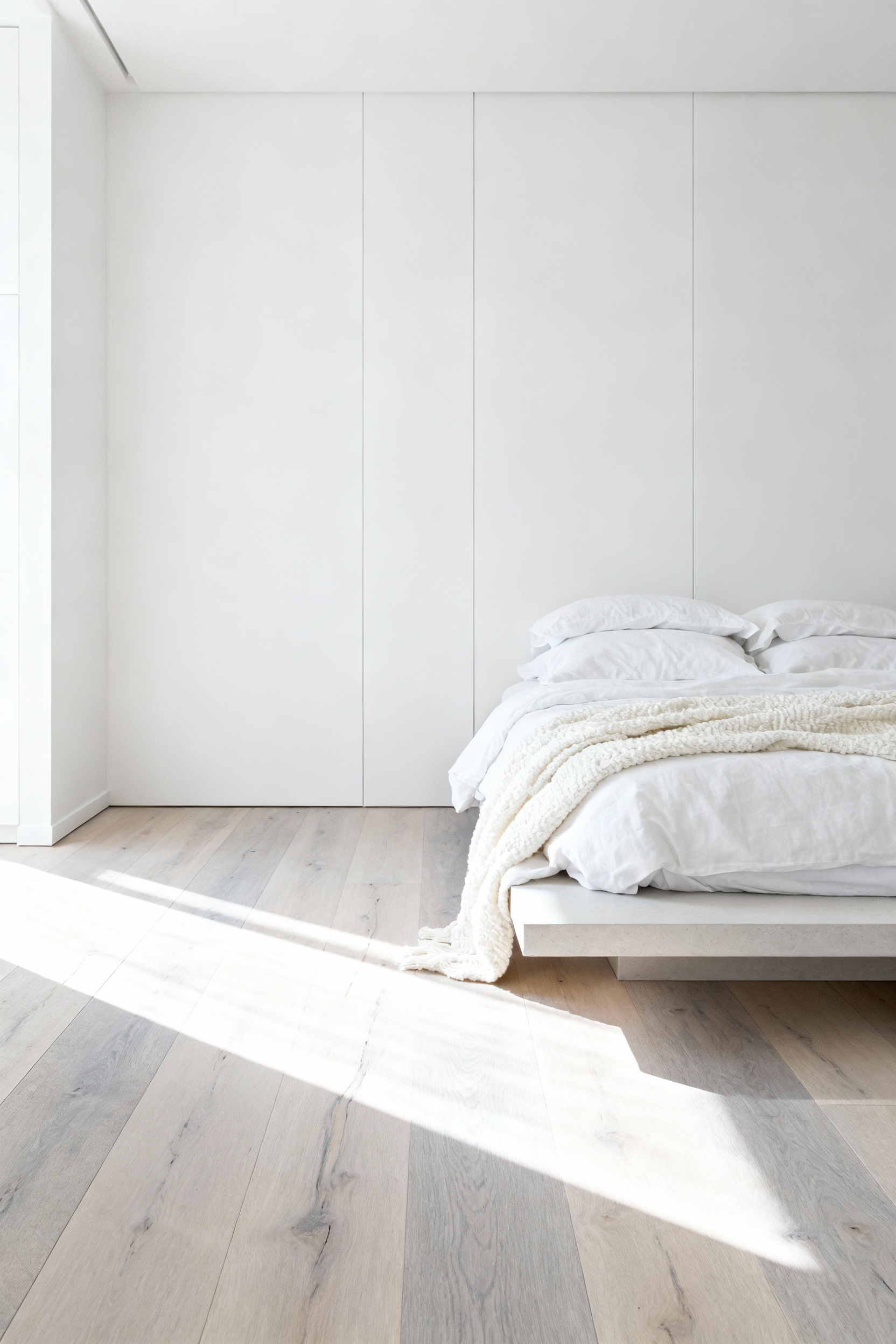
This approach isn’t about covering the material, but revealing it through a translucent wash. Unlike opaque paint, a bleaching technique preserves the “quiet power” of the wood, highlighting organic grain patterns and knots. This adds a layer of tactile complexity that a flat, matte wall simply cannot offer. It is a cornerstone of Scandinavian design for a reason: light woods reflect natural light, maximizing brightness while maintaining a deep connection to nature. Whether leaning toward a rustic coastal vibe or a modern Nordic retreat, the goal is transparency that celebrates the material’s integrity.
Achieving this specific sand-toned aesthetic requires careful material selection. White Oak is the superior canvas for these finishes because its neutral base accepts bleaching without distorting the color. Conversely, Red Oak often harbors pink undertones that a bleaching process will unfortunately amplify, resulting in a pastel hue that clashes with a neutral palette. Stick to White Oak or engineered equivalents to ensure the foundation of your sanctuary remains firmly in the spectrum of soothing, natural sand.
4. The Albedo Effect: How White Walls naturally Cool Desert-Inspired Spaces
In the architectural vernacular of my heritage—from the Greek Islands to the coasts of Morocco—white walls are rarely just a stylistic preference. They are an ancient, passive cooling technology driven by the Albedo Effect. This concept measures how effectively a surface reflects solar energy. While dark facades might absorb up to 90% of the sun’s radiation, a high-albedo white surface acts as a thermal shield, bouncing that heat away before it can conduct through the masonry and into your home.
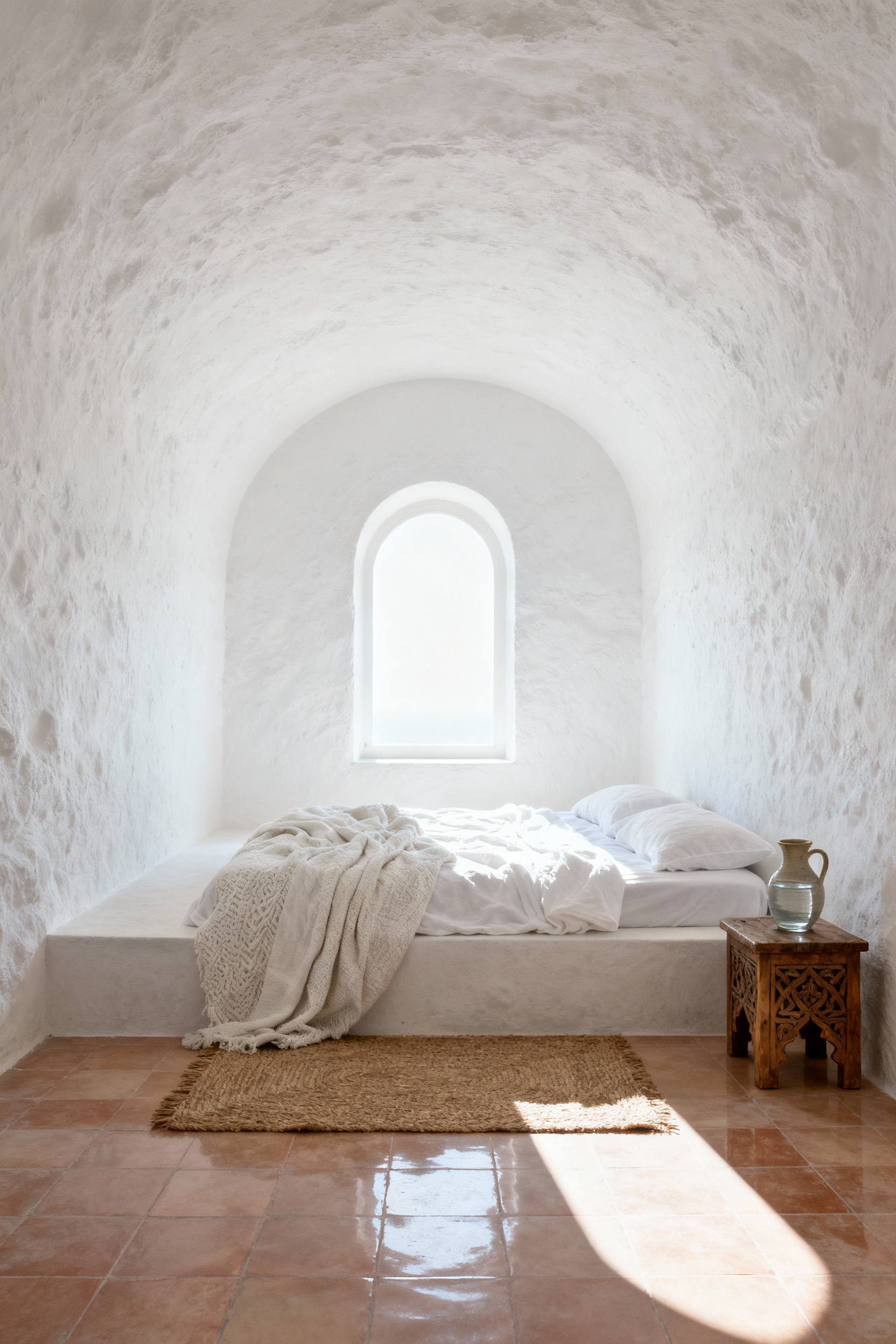
This thermal resistance is crucial for sleeping quarters. By preventing the walls from acting as heat batteries during the day, the room remains physically cooler when you retire for the evening. In un-air-conditioned spaces, this can tangibly lower internal air temperatures, but the cooling isn’t just measured in degrees; it is experienced through light.
White walls diffuse harsh daylight, transforming potential glare into a soft, balanced glow that reaches deep into the room. This visual expansion creates a psychological sense of airiness, turning a bedroom into a breathable, open oasis. It provides a quiet, neutral canvas that allows the warmth of organic desert textures—think woven sisal, terracotta, or reclaimed wood—to ground the space without competing for attention. By embracing high-albedo surfaces, you aren’t just painting a room; you are engineering a cooler, more serene environment rooted in centuries of climate-conscious design.
Movement II: The Textural Landscape – Fabrics and Fibers
When working within a monochromatic white palette, texture ceases to be a mere accent; it becomes the primary architectural element that prevents a space from feeling sterile or flat. Without the distraction of color, the eye seeks variation in surface and weight to interpret the room. Designers rely on the interplay of light and shadow to create this necessary depth. A glossy, light-reflective surface like high-thread-count sateen reads entirely differently than the light-absorbing matte finish of a chunky wool knit, even if they share the exact same hue.

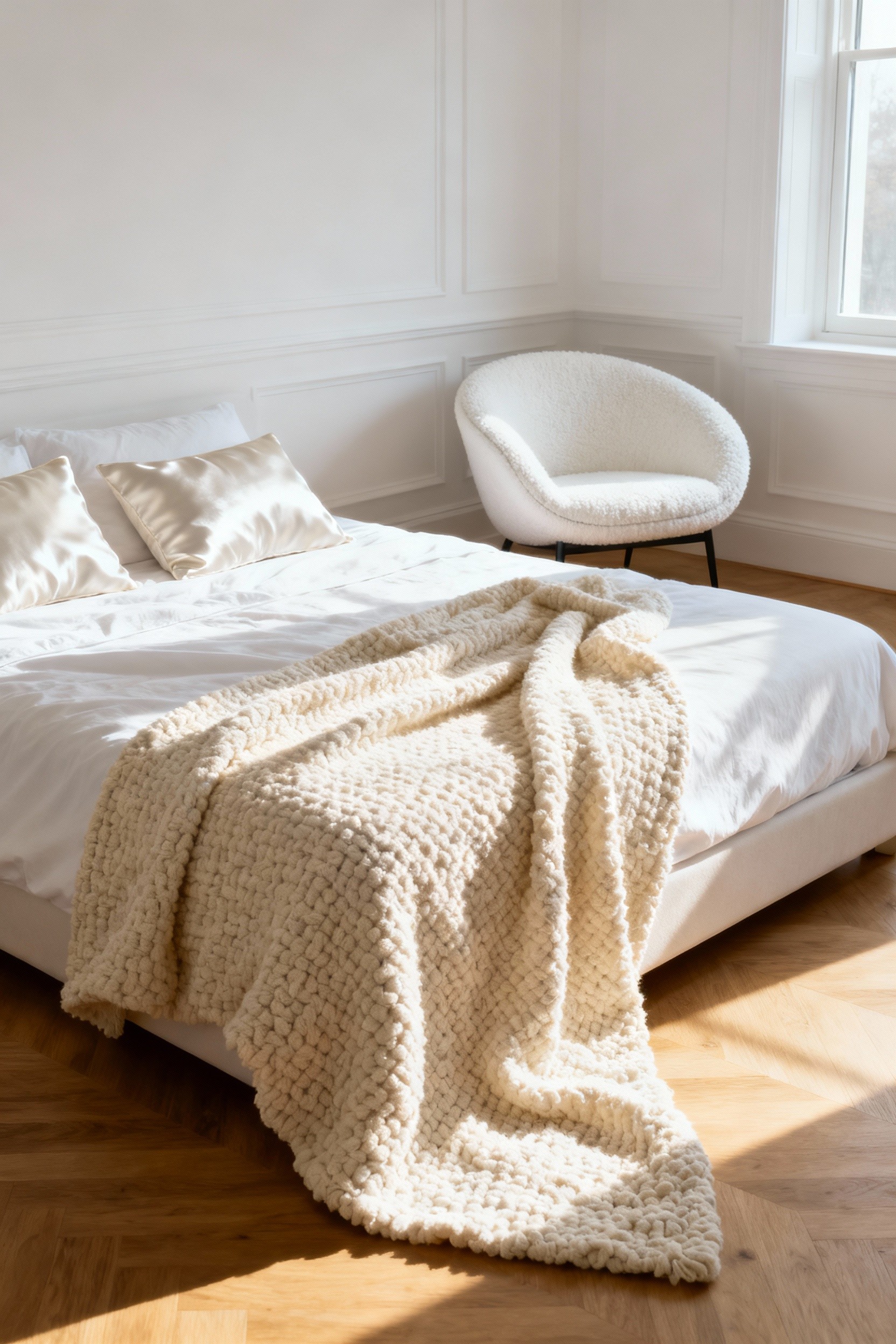
To master this look, one must engage in intentional layering. While the crisp, brilliant white of hotel bedding signals hygiene and modern luxury—a standard solidified by hospitality design in the 1990s—a residential space requires more organic soul to feel inviting. This is where the friction between materials creates a sense of luxury. For more specific white bedroom decor ideas, contrasting smooth, cool percale sheets against a rougher, tactile element like a sheepskin throw or a coarse heavy quilt adds immediate visual weight.
Grounding these ethereal fabrics with raw, natural fibers is essential to avoid a “clinical” atmosphere. We look to materials like un-dyed linen, rattan, and jute to introduce organic warmth. Linen, with its ancient roots and natural propensity to wrinkle, introduces the concept of *wabi-sabi*—the appreciation of imperfect beauty. The slightly rumpled look of stonewashed bedding or the irregularity of a macrame wall hanging softens the rigid lines of modern architecture. By weaving these honest, earthy textures alongside innovative performance fabrics like bamboo, the bedroom becomes a sensory landscape that feels lived-in and deeply restorative.
5. The Art of the ‘Undone’ Bed: Layering Unpressed Organic Linens
There is a profound beauty in the imperfection of the “undone” bed, a concept deeply rooted in the Japanese philosophy of *Wabi-Sabi*. Rather than viewing wrinkles as a sign of neglect, we should celebrate them as the living signature of organic linen—a fabric that refuses to be tamed. This aesthetic shifts the definition of luxury from the stiff, pressed perfection of the Victorian era to a modern “anti-status” symbol defined by mindfulness and authenticity.
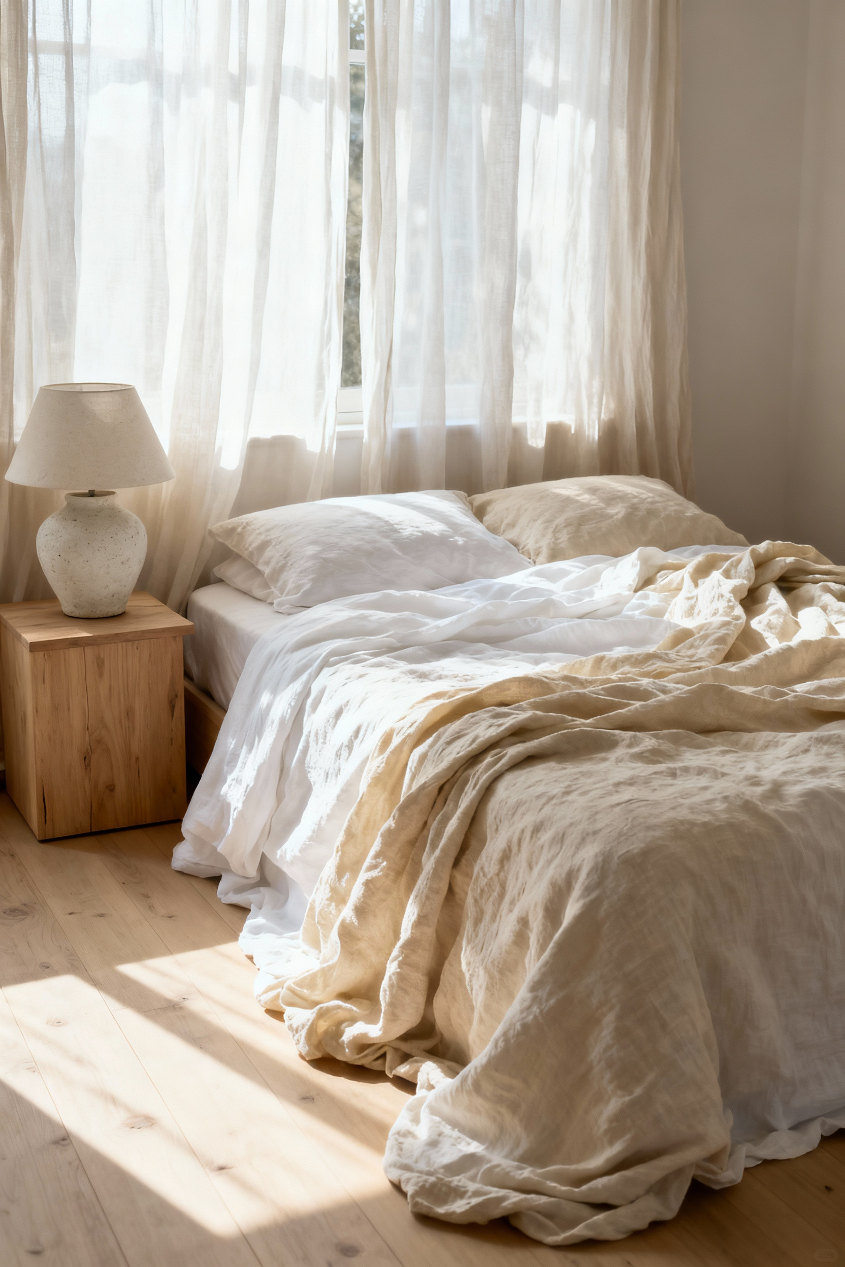
To achieve this look without crossing into untidiness, the foundation must be high-quality white organic linen. Beyond the visual “clean slate” that signals a hygienic sanctuary, linen acts as biological air conditioning, regulating temperature through breathable fibers. However, an all-white bed risks feeling stark without tactile depth. The secret lies in creating a textural hierarchy. Layer a dense waffle weave or matelassé coverlet between your flat sheet and duvet to introduce visual weight. This adds a physical heaviness that psychologically mimics the security of being held, offering a form of emotional caregiving through design.
When styling the final touches, resist the urge to execute perfect folds or hospital corners. Instead, employ a “more toss, less turn” technique with a chunky knit or cashmere blanket draped diagonally at the foot of the bed. Pair this with a deliberate pile of pillows—mixing standard shams with Euro sizes in varying weaves—to create an inviting volume. This calculated dishevelment creates a sensory landscape that prioritizes actual comfort over rigid formality.
6. Visual Warmth: Incorporating Bouclé and Raw Silk Accents
To prevent a minimalist white bedroom from feeling clinical or flat, we must manipulate how light interacts with surfaces. This is where the strategic interplay of bouclé and raw silk transforms a space. Bouclé, defined by its looped, pebbled yarns, functions as a light absorber. Its bulky, matte surface diffuses brightness and creates micro-shadows, grounding the room with a sense of structural weight. This textile connects the design to the mid-century elegance of Eero Saarinen, who utilized the fabric to create furniture that felt like a “basket of pillows,” offering an immediate, tactile invitation to relax.
Contrasting this dense, matte “cocoon” effect is the delicate complexity of raw silk. Unlike the uniform glare of polished satin, raw silk retains its natural sericin protein, resulting in a slightly nubby, organic texture. The triangular prism structure of the silk fiber refracts light, creating a soft, shifting luminescence rather than a hard reflection. By placing a sand-colored raw silk throw pillow against an ivory bouclé armchair, you establish a sophisticated friction between the matte and the lustrous. This tone-on-tone layering introduces a quiet, ancient luxury that warms the visual palette without breaking the monochrome discipline.
7. Acoustic Softening: High-Pile Berber Rugs in Cream Tones
In a minimalist white bedroom, the greatest challenge often isn’t the visual palette, but the auditory experience. Hard surfaces reflect sound, creating a hollow echo that contradicts the restful nature of a sanctuary. This is where the specific architecture of a high-pile Berber rug becomes essential. By selecting a rug with a pile height between 10mm and 18mm, you are introducing a powerful acoustic tool. The dense, crimped structure of natural wool fibers traps sound waves rather than bouncing them back, effectively silencing the sharp reverberations common in spare, modern interiors.
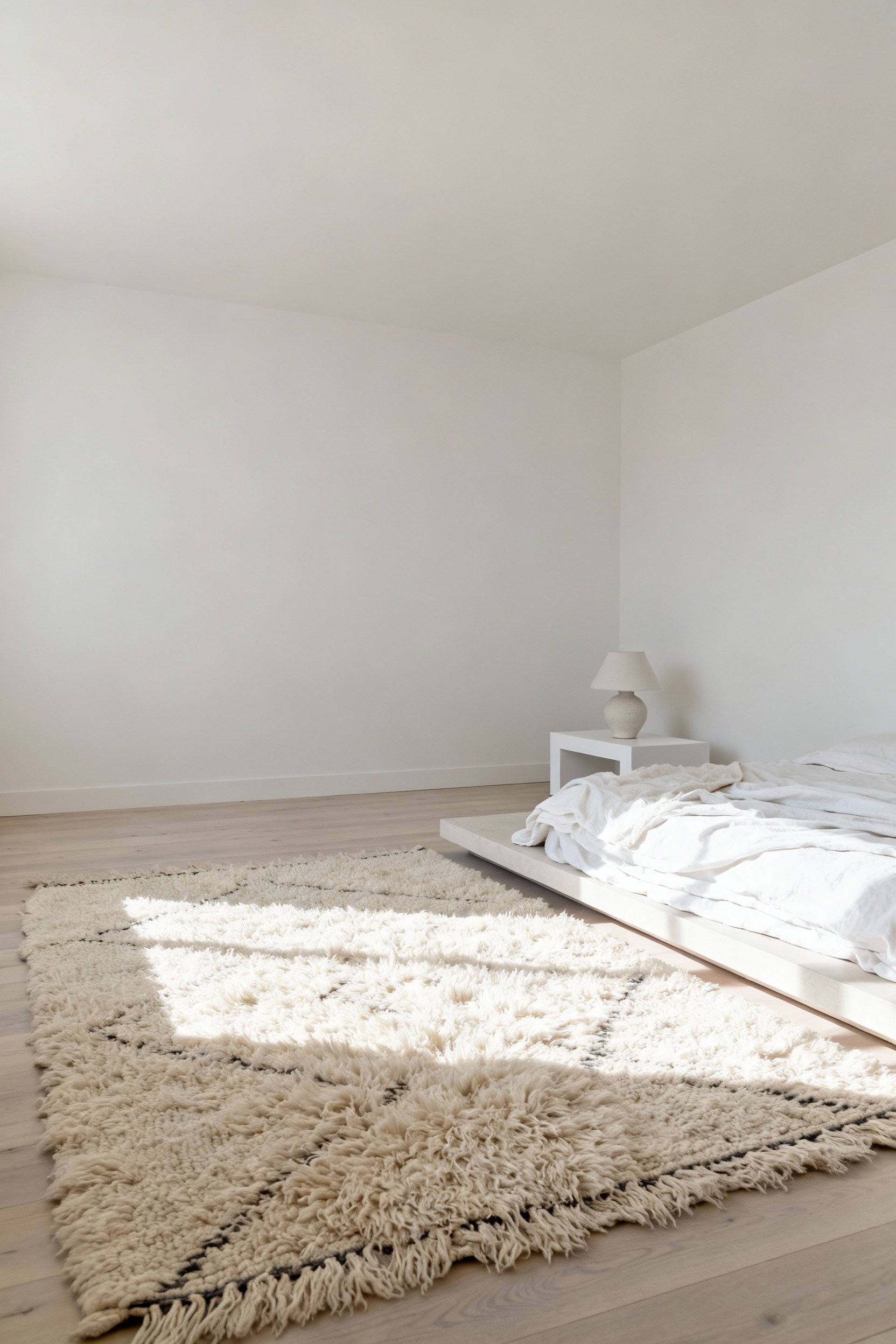
Beyond acoustics, the choice of cream or ivory over optic white is critical for anchoring the room’s atmosphere. A stark white floor can feel clinical, whereas the un-dyed, natural tones of Middle Atlas wool introduce a sophisticated tonal radiance. This subtle shift adds necessary warmth without breaking the monochromatic scheme. Visually, the creamy depth softens the room’s edges, signaling a “sink-in” tactile luxury that foreshadows the physical comfort underfoot.
This functionality is rooted in the rug’s origins. Historically woven by nomadic tribes to withstand the freezing temperatures of the Atlas Mountains, these thick textiles were designed for thermal insulation and protection. In a contemporary bedroom, that heritage translates into the elimination of impact noise—dampening footsteps to near silence. It creates a space that feels physically and auditorily secure, grounding the airy lightness of a white room with deep, historic roots.
8. Window Architecture: Diffusing Harsh Sunlight with Gauzy Sheers
Direct sunlight acts as an intense point light source in a monochrome white bedroom, creating sharp, high-contrast shadows that can make a restorative space feel visually aggressive. By introducing gauzy sheers, you effectively utilize an architectural-scale diffusion material, transforming that harsh glare into a scattered, wide light source. This process eliminates the jarring lines of chiaroscuro, replacing them with a softer visual texture. Beyond the aesthetic benefit, selecting a sheer with a tighter weave or lower openness factor significantly improves UV filtration. This protects delicate white linens and flooring from yellowing or fading while maintaining that essential connection to the outdoors.
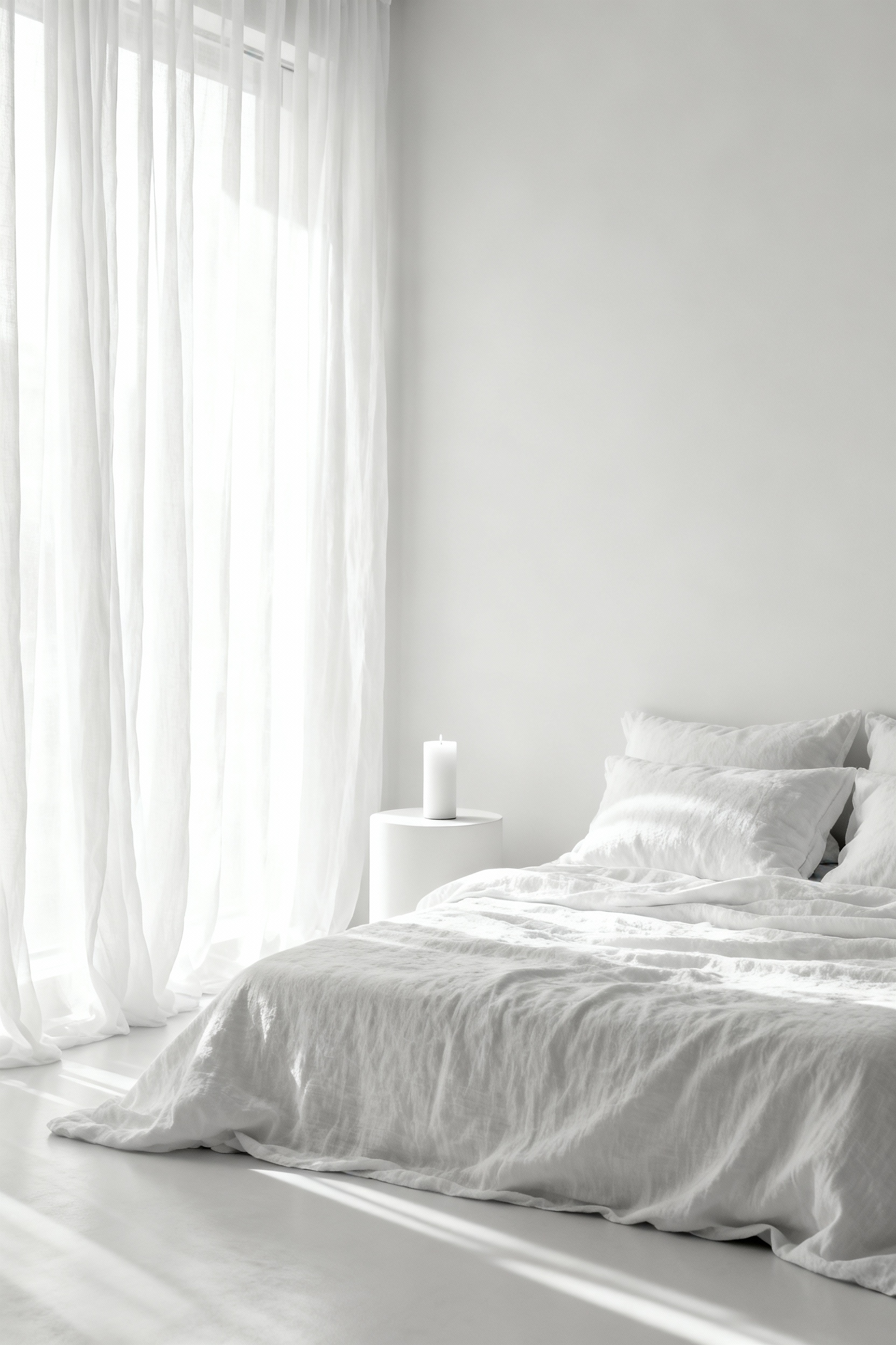
The fabric’s hue plays an equally vital role in how the room feels. While crisp white sheers reflect up to 80 percent of light to boost ambient brightness, opting for ivory or cream-tinted textiles allows you to manipulate the light’s Kelvin temperature. These warmer tones diffuse the often cool, blue-white midday sun, shifting it toward a cozy, inviting glow that aligns with natural circadian rhythms. This creates a fluid, ethereal quality where the light seems to ripple across the walls like water, adding movement to the static stillness of the room. For the best architectural integration, extend the fabric from floor to ceiling; this emphasizes verticality and softness, balancing the clean, hard lines typical of modern minimalist design.
Movement III: The Elements – Stone, Wood, and Clay
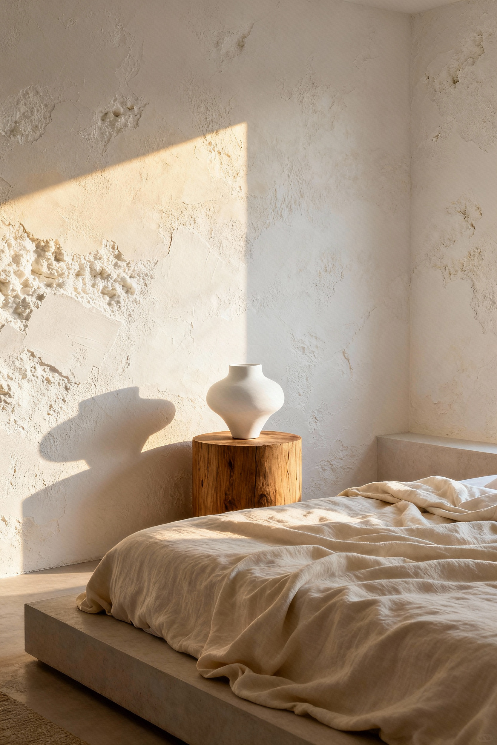
In a monochromatic space, material becomes the primary language of design. We treat the white bedroom not as a void, but as a gallery for the raw, honest beauty of the earth. This approaches the concept of “quiet luxury” not through expense, but through the sensory dialogue between the yielding nature of clay and the immutable strength of stone.
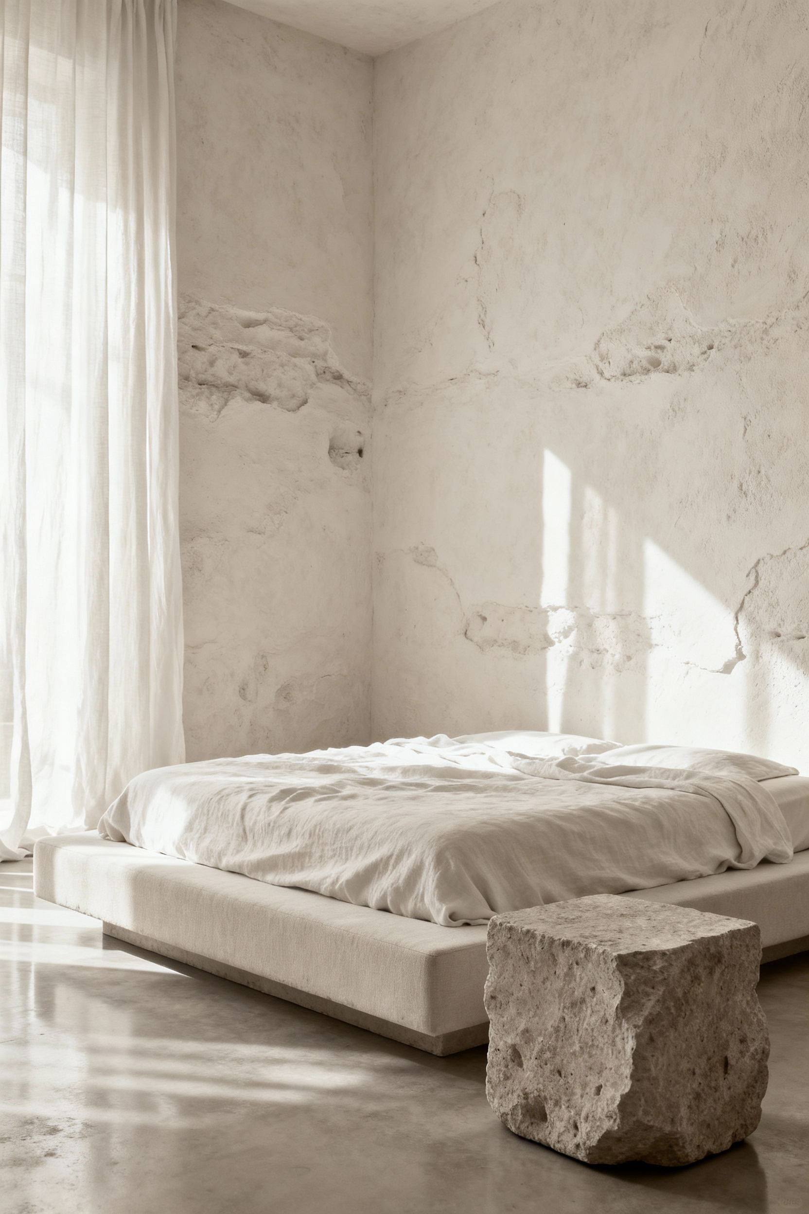
Clay, particularly when introduced as a Roman clay wash or unpolished plaster, offers a softness that prevents a white room from feeling sterile. It creates a fluid, hand-worked surface that absorbs light gently, offering a psychological sense of ease. We contrast this fluidity with the stabilizing presence of stone. A rough-cut quartzite hearth or a honed marble surface acts as an anchor, providing a cool, rugged counterpoint to the warmth of the walls.
To bridge the gap between the soft clay and rigid stone, wood serves as the essential biophilic connector. The inclusion of warm oak or reclaimed timber does more than break up the white; it introduces an element of time. Wood ages and develops a patina, bringing a narrative of longevity and “heritage touches” that mass-produced finishes cannot replicate.
Ultimately, the white palette functions as a reflector, allowing these textures to take center stage. Without the distraction of competing colors, the eye focuses on the hierarchy of touch—the coarseness of stone against the smoothness of worn timber. As the sun moves, the light interacts with these varying depths, transforming the room from an airy, bright morning space into a cozy, shadow-rich sanctuary by evening.
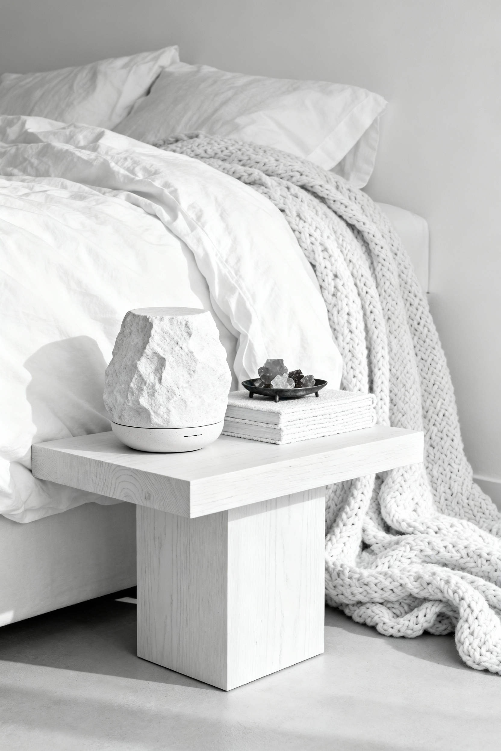
9. Monolithic Forms: Choosing Travertine or Limestone Side Tables
When we strip a bedroom design back to white walls and crisp linens, the space requires an anchor to prevent it from feeling weightless or sterile. Monolithic side tables—solid, sculptural blocks of stone—provide that necessary gravitational pull. The choice between travertine and limestone determines whether that gravity feels earthy and warm or cool and architectural.
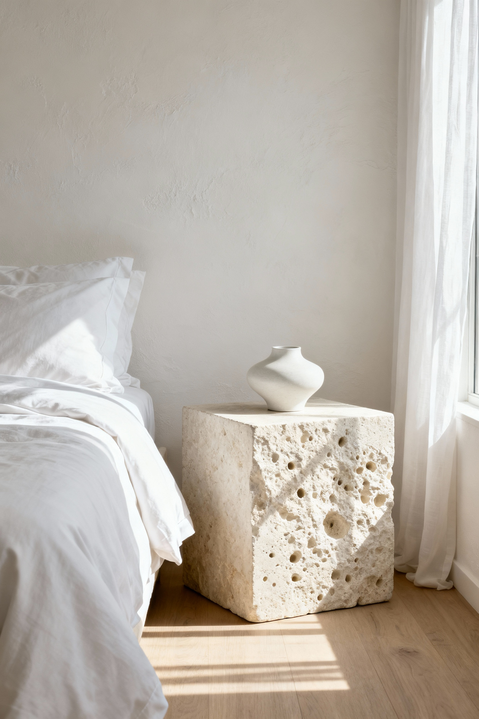
Travertine is often the superior choice for introducing “warm minimalism” into a stark environment. Its creamy, ivory undertones soften the clinical edge of a pure white palette, bridging the gap between nature and structure. The stone carries a geologic story in its surface; even when the characteristic voids are filled and honed to a velvet finish, the visible texture offers a tactile complexity that absorbs light rather than reflecting it. This creates a soft, organic visual break that feels grounded and inviting.
If the objective is seamless structural purity, limestone offers a quieter alternative. Denser and generally less porous than travertine, high-quality white or light gray limestone aligns more closely with the cool tones of the room. Because the grain is finer and more homogeneous, the focus shifts entirely to the table’s silhouette. It offers a smooth, classical sophistication that feels continuous with the architecture rather than distinct from it.
Practically, this decision forces a trade-off between character and maintenance. Travertine’s porous nature requires diligent sealing to protect against water glasses and coffee spills, eventually developing a patina that suggests “lived-in luxury.” Limestone, being harder and less permeable, resists daily wear with greater stoicism, maintaining a pristine, monolithic appearance with slightly less effort.
10. Earthenware Accents: Styling with Matte White Ceramics and Clay
To prevent an all-white bedroom from feeling clinically cold, we look to the principles of *Wabi-Sabi*. This approach champions authenticity over perfection, encouraging the use of hand-thrown earthenware where warped rims and uneven surfaces are celebrated rather than hidden. These imperfections introduce a necessary soulfulness to the space, especially when you utilize warm neutral tones—think mushroom gray, sand, or ash—rather than a stark, factory-made white to break up the monochrome palette.
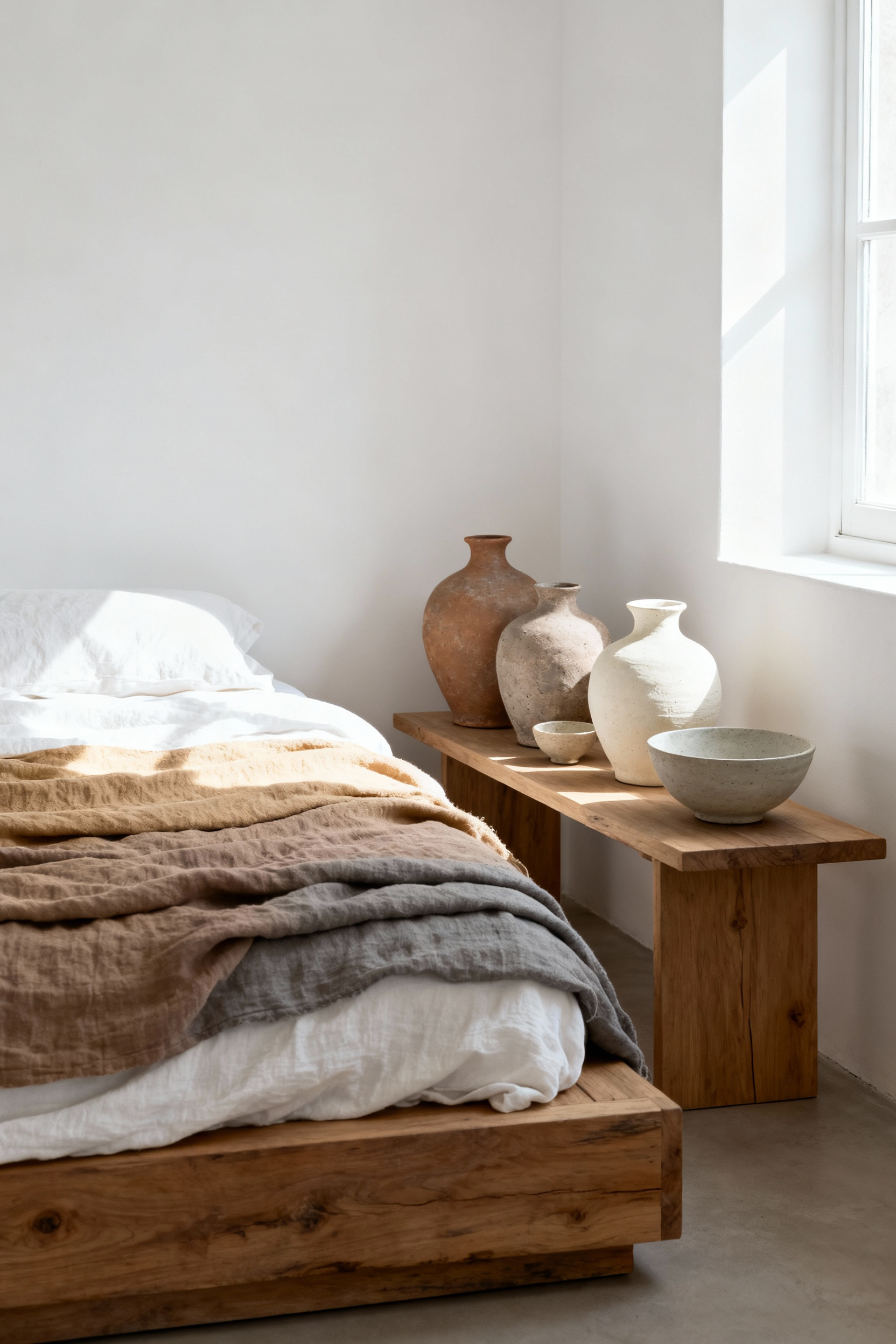
The finish of these ceramics is just as critical as their shape. For a restful environment, matte surfaces are often superior to gloss. While high-gloss finishes reflect light and create stimulating glare, matte glazes absorb and diffuse illumination. This creates a soft, uniform atmosphere that feels inherently quieter and more conducive to sleep. Without the distraction of reflection, the eye settles on the organic silhouette of the vessel, allowing the physical form and craftsmanship to take center stage.
This styling choice is ultimately an exercise in tactile layering. Earthenware offers a grounding counterpoint to the airy nature of a white room. There is a profound sensory delight in placing a rough, unglazed pot or a vessel with a cracked white slip against the softness of wrinkled linen bedding. This dialogue between the raw, earthen elements and refined textiles provides the visual friction needed to make a monochrome space feel deep, lived-in, and undeniably warm.
11. The Driftwood Aesthetic: Incorporating Sun-Bleached Timber Benches
In a pristine white bedroom, there is a fine line between serenity and sterility. A sun-bleached timber bench serves as a critical visual anchor, introducing necessary friction to a monochromatic scheme. It creates a dialogue between opposites: the rough, gnarled grain of weather-worn wood juxtaposed against the crisp, smooth perfection of high-thread-count linens. This textural relief prevents the room from feeling flat, offering a focal point that is both tactile and grounding.
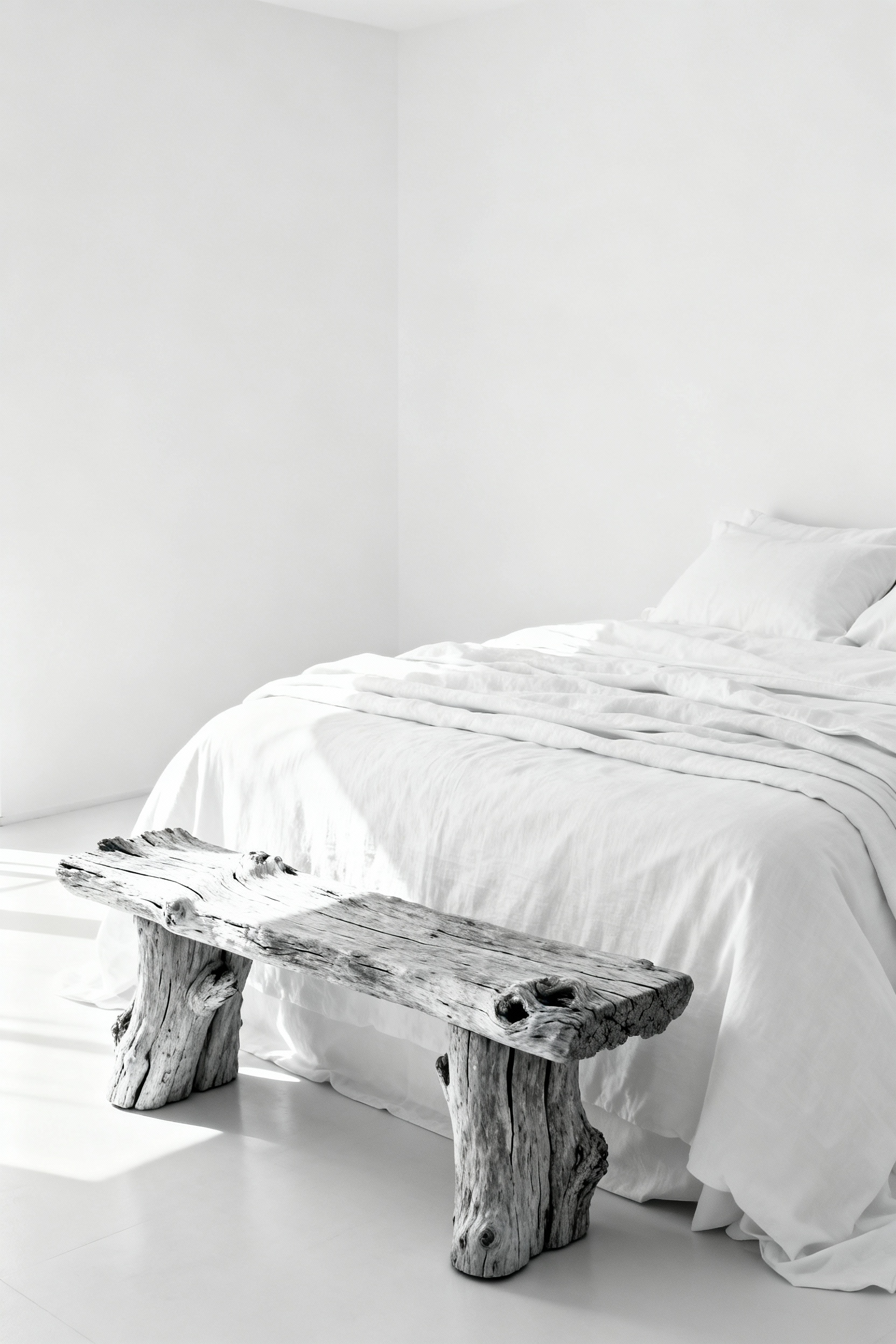
The color palette here is distinct from standard warm oaks or walnuts. True driftwood aesthetics rely on a complex patina of silvery-grays, soft ash, and desaturated taupes. These organic neutrals harmonize effortlessly with the cool undertones often found in modern “gallery white” paints. This specific tonal range brings warmth without introducing jarring color, adhering to a sophisticated, climate-conscious minimalism.
Psychologically, these pieces introduce the concept of *Wabi-Sabi*—finding beauty in imperfection and transience. The weathered surface suggests resilience and history, offering a subconscious respite from the pressure of maintaining a perfect environment. This connection to natural elements and the implied movement of water can lower heart rates and foster deep relaxation.
When sourcing, prioritize architectural simplicity to avoid a kitschy “beach house” theme. Look for reclaimed solid timbers treated with a whitewash or gray stain to achieve that sun-baked look while maintaining structural stability. A thick, rectilinear slab set on minimalist legs offers the perfect modern rustic balance. To bridge the gap between the raw timber and your soft bedding, drape a chunky merino wool throw or a tightly woven linen textile over the bench, layering yet another element of restorative comfort into the space.
12. Warm Metals: Subtle Brass Fixtures that Catch the Golden Hour
Introducing brass fixtures acts as a chromatic anchor to bridge the gap between serenity and sterility. By leveraging the metal’s inherent warmth, we soften the environment. Because brass is an alloy rooted in copper and zinc, it possesses a yellow-gold hue that stands in direct opposition to the cool undertones of crisp linens and pale walls. This contrast prevents the space from feeling flat; instead, the metal offers a luxuriously understated counterpoint that makes the surrounding white feel intentional and welcoming rather than stark.
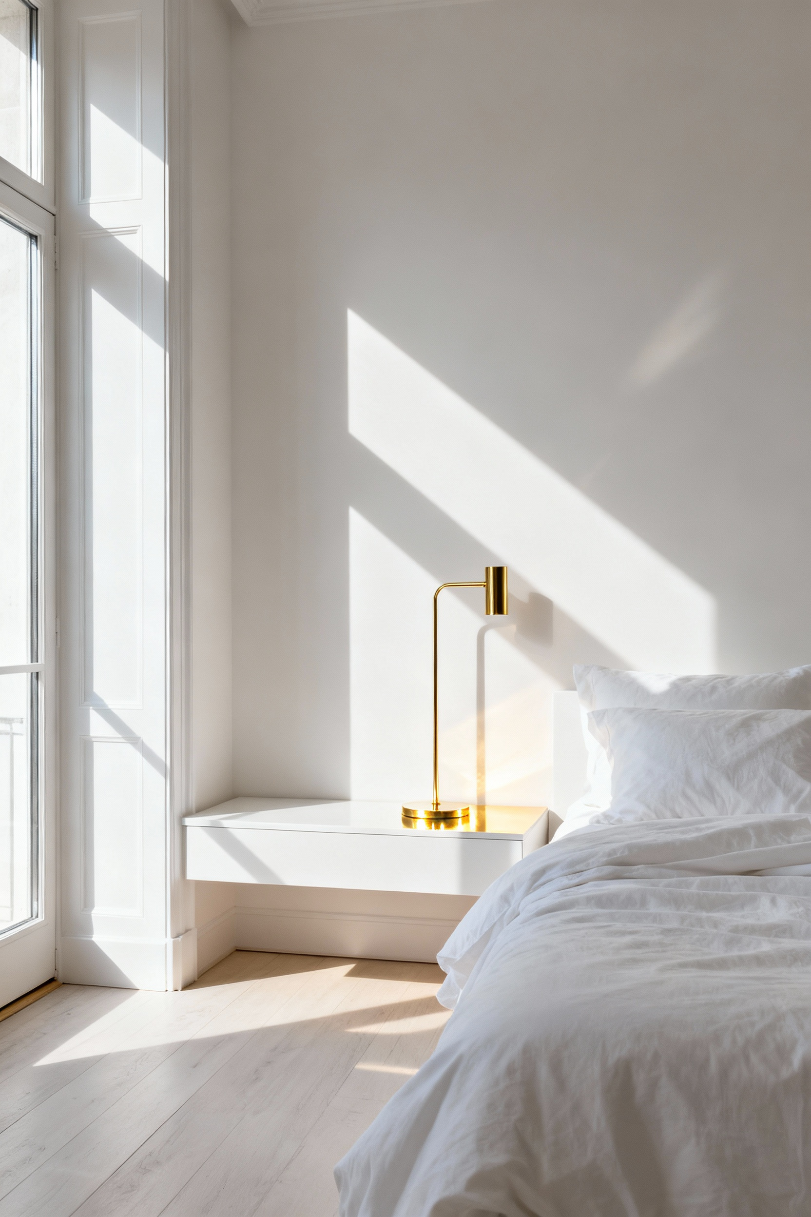
This material acts as a form of alchemy when it interacts with natural light. Polished or semi-polished brass possesses a reflective quality that captures sunlight and diffuses it with a softer, amber glow. Much like Danish designer Poul Henningsen’s vision for the PH 5 lamp, which was engineered to “capture the golden hour,” placing brass sconces or pendants near a window pulls that fleeting, magic-hour warmth across the room’s surfaces. It allows the atmosphere to remain inviting and cozy, even when the midday sun is at its harshest.
To ensure the aesthetic remains grounded and modern, the finish is just as critical as the placement. The goal is to avoid the high-gloss, lacquered look of decades past in favor of brushed, antique, or unlacquered brass. These matte textures have a muted quality that blends rather than blinds. Unlacquered brass is particularly effective in minimalist spaces because it develops a living patina over time. As the bright gold mellows into a rich, earthy bronze, it introduces a layer of organic history and character that a pristine white room often lacks.
Movement IV: The Atmosphere – Light and Life
Le Corbusier once famously argued for the “Law of Ripolin,” suggesting that a plain coat of whitewash offered a spiritual and moral cleansing power. While we might not view our interiors with such rigid ideology today, the white bedroom remains a powerful architectural commitment to clarity. It shifts the function of the room from mere shelter to a sanctuary, wiping the visual slate clean of the day’s clutter. This creates an environment where the mind can unclench, viewing the space not just as a room, but as a mechanism for restorative life.
This sense of restoration is powered by the physics of light. White surfaces possess the highest Light Reflective Value (LRV), approaching 100 percent. By turning walls into high-performance reflectors, we aren’t just brightening a dark corner or expanding the perceived volume of a small footprint; we are creating a dynamic canvas that tracks the sun. A white wall is rarely truly white. It becomes a responsive surface that mirrors the atmosphere outside—appearing golden at sunset, stark white at noon, or cool blue under an overcast sky. This transparency ensures the bedroom remains connected to the natural rhythms of the day.
However, there is a fine line between serenity and sterility. Psychological research warns that an environment devoid of contrast can feel isolating or clinically cold, causing visual strain rather than relaxation. To master the white bedroom, the focus must shift from pigment to texture. We anchor the high-key brightness with light-absorbing organic elements—hand-troweled plaster, brushed linen, or raw oak. These materials catch the light and introduce softness, transforming a potential “sanitarium” aesthetic into a warm, breathing atmosphere that holds comfort as effectively as it reflects light.
13. Sculpting with Shadow: Woven Grass and Paper Lantern Pendants
Light ceases to be a mere utility in a monochromatic white bedroom; it becomes a structural element capable of altering the architecture itself. Woven grass and paper lantern pendants are particularly effective tools for this, anchoring the airy qualities of a white palette with the grounding principles of Wabi-Sabi. These fixtures champion *fukinsei*, or natural imperfection, offering a raw, tactile counterpoint to the pristine, often sterile nature of modern drywall and manufactured textiles.
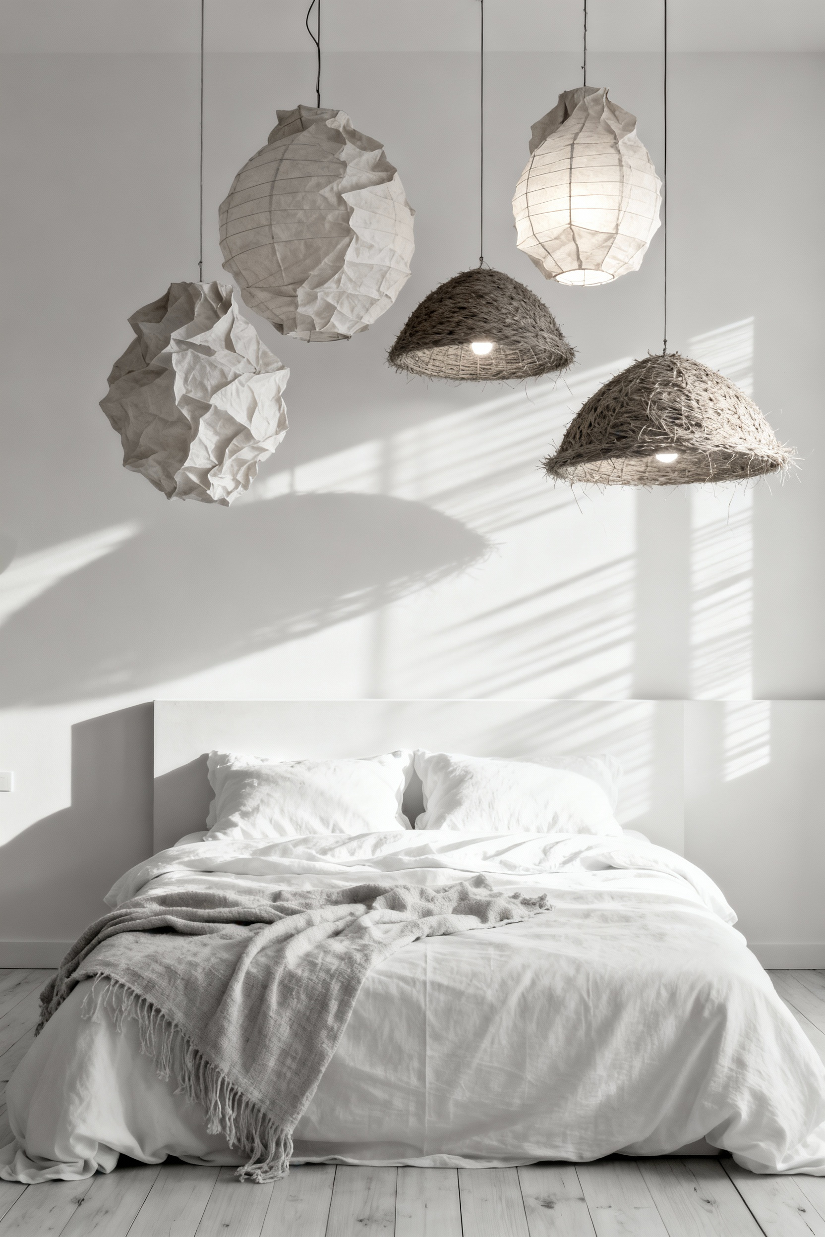
The magic lies in how these materials manipulate luminosity. A traditional washi or rice paper shade acts as a cinematographic softbox, diffusing harsh bulbs into a non-directional glow that softens the room’s corners—a crucial quality for a restorative sanctuary. In contrast, open-weave rattan or bamboo fixtures function as intricate stencils. As light filters through the hand-woven gaps, it casts dynamic, geometric shadows that stretch across the white walls. This effect mimics the dappled light of a desert trellis, turning static surfaces into a canvas for kinetic shadow play. By incorporating these elements, you introduce a layer of history and the unmistakable warmth of the human hand, ensuring the minimalism feels curated rather than empty.
14. Tone-on-Tone Biophilia: Styling with Dried Pampas, Wheat, and Palms
Tone-on-tone biophilia shifts visual interest from color theory to distinct tactile variation. In this approach, the design relies entirely on the interplay of surfaces rather than contrasting hues. By introducing dried botanicals like pampas grass, we bring a cloud-like, diffused softness that instantly breaks the rigidity of flat, painted walls and lacquered furniture. This isn’t just aesthetic; the billowy movement of the plumes offers a sensory release, softening the room’s edges to promote tranquility.
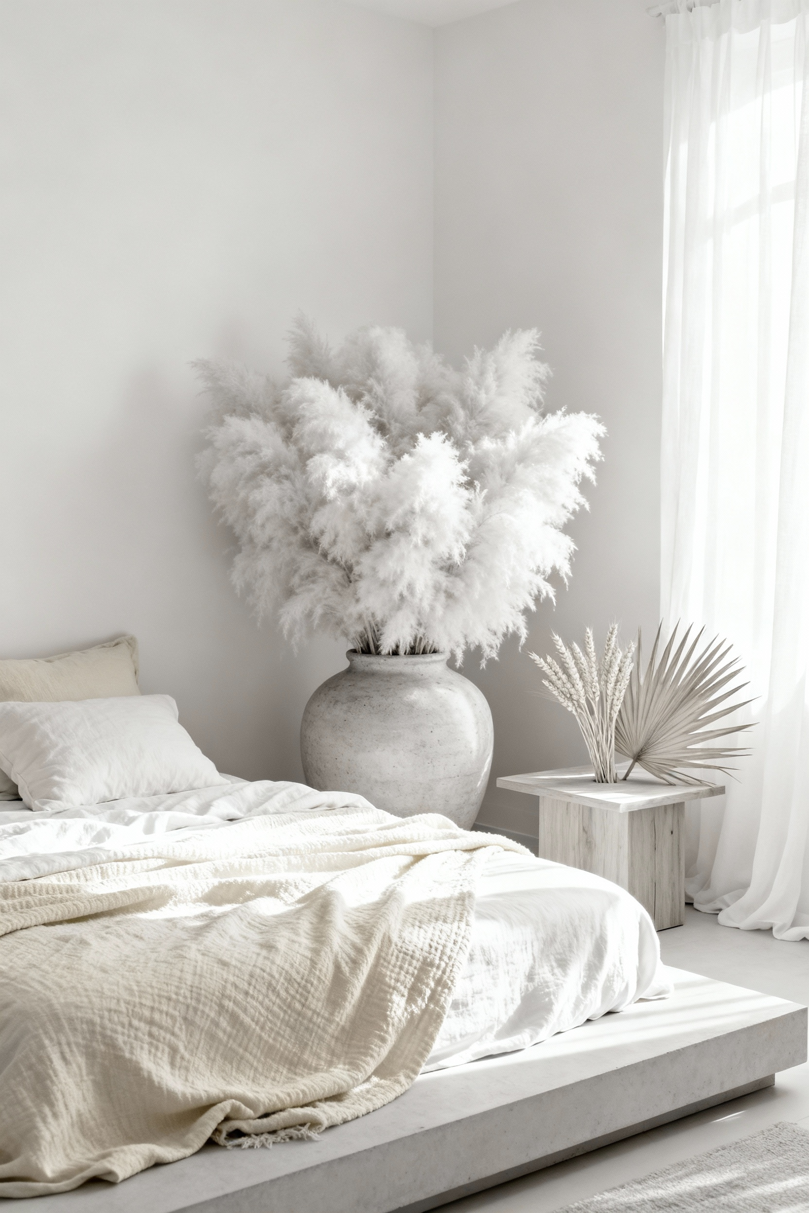
To prevent the space from feeling too unstructured, we anchor these airy textures with the architectural rigidity of dried palms. The sharp, geometric lines of a cut palm spear provide a necessary counterpoint to the pampas, satisfying the human desire for “organized complexity.” Because these materials are preserved in shades of bleached sand and cream, they act as exceptional light catchers. Throughout the day, the fibrous textures capture shifting sunlight, casting dynamic shadows that make the room feel alive without the visual noise of bright colors.
Beyond the structural benefits, there is a significant psychological advantage to this permanent botanic style. Unlike fresh flowers that demand care and eventually wilt, dried arrangements offer an aesthetic of longevity. This permanency reduces cognitive load, allowing the bedroom to function as a truly restorative, maintenance-free zone. When you place a bundle of wheat on a bedside table, you are doing more than styling a vignette; you are invoking ancient symbols of abundance and resilience, grounding modern minimalism in something timeless and secure.
15. Minimalist Art: Textured Canvas Reliefs over High-Contrast Photography
Designing a white bedroom requires navigating the delicate balance between serenity and sterility. When color is removed from the equation, texture becomes the primary language of the space. The fusion of high-contrast photography and textured relief creates a profound impact here. It is a mixed-media practice that bridges the gap between the rational and the organic; the underlying black-and-white photograph provides geometric clarity and intellectual structure—echoing Scandinavian precision—while the applied relief layer introduces an imperfect, tactile warmth.
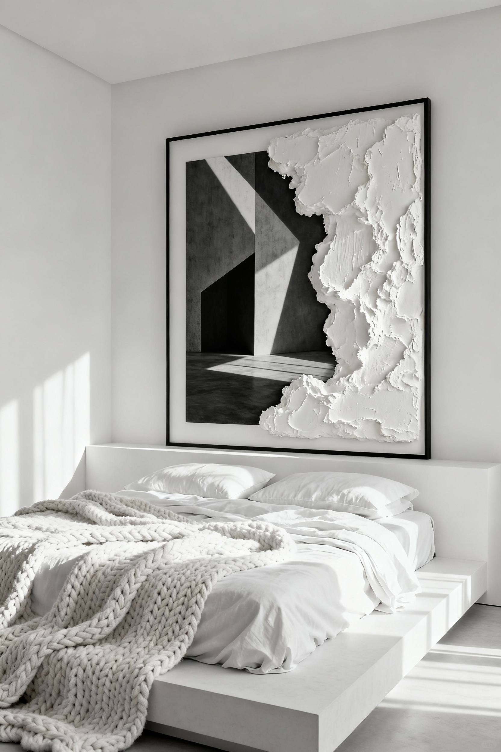
By layering modeling paste or plaster over the archival print, the artwork transcends the flatness of traditional photography to become a sculptural object. This “haptic visuality” is essential in a monochrome environment where the eye searches for surface complexity. The raised textures catch the shifting light from windows or bedside lamps, casting micro-shadows that evolve throughout the day. A deep black shadow in the photograph contrasts dramatically with the physical brightness of a white plaster ridge, creating a dynamic depth that flat prints simply cannot achieve.
Functioning as an architectural anchor, this specific art form works exceptionally well above a headboard. It creates a focal point that feels substantial and gallery-worthy without disrupting the room’s quietude. It upholds the minimalist mandate of a restricted palette but introduces a necessary sense of movement, ensuring the white walls feel alive and intentional rather than empty.
16. The Scentscape: Stone Diffusers and Natural Resins
In a monochromatic space, accessories must carry their own weight in texture to prevent the design from feeling flat. Replace the visual clutter of plastic humidifiers with the silent gravity of a stone diffuser. Whether sculpted from matte ceramic, unglazed earthenware, or translucent white onyx, these pieces serve as functional art. They offer a monolithic, grounding contrast to soft linens, anchoring the room without disrupting the visual silence of a white palette.
The beauty of porous stone lies in its passive nature. Without heat, water, or electricity, the stone relies on natural evaporation to release an “olfactory whisper” rather than an aromatic shout. This subtle delivery preserves the therapeutic integrity of ancient resins, which are particularly suited to the concept of a sanctuary. Consider the bright, citrusy notes of White Frankincense or the crisp, pine-like clarity of White Copal. These scents echo historical rituals of space-cleansing, purifying the atmosphere while mirroring the fresh, airy quality of a clean white room.
To prevent a minimalist aesthetic from feeling clinically cold, introduce the rich complexity of Benzoin. Its creamy, vanilla-like profile provides a comforting warmth that softens clean architectural lines. As heavy base notes, these resinous oils evoke a profound connection to the earth and a sense of stillness. By engaging with these grounding elements, you transform the bedroom from a simple sleeping area into a holistic retreat that encourages the mind to slow down and prepare for deep rest.
Conclusion: White as a Canvas for Light and Shadow
Embracing a white bedroom is not an act of erasure, but a deliberate choice to elevate architectural form and the passage of light. When we treat white as a stage rather than a mere hue, the room shifts from a static space into a dynamic observatory, where the reflective nature of the walls amplifies the warmth of the sun and the subtle shifts of the day. This approach demands a reliance on tactile depth; without the distraction of bold pigment, the interplay of rough linen, smooth plaster, and deliberate shadow becomes essential to grounding the space. Mastering this complex white bedroom inspiration is a design philosophy that champions clarity, offering a visual silence that allows the mind to truly rest.
As you cultivate this aesthetic, view your bedroom not just as a sleeping quarter, but as a responsive environment that evolves with the seasons. This reductive approach ensures your home remains a sanctuary of “quiet luxury,” prioritizing lasting quality and natural interplay over fleeting trends. Begin by auditing your current textiles to introduce necessary contrast; strip away flat, synthetic fabrics and introduce one element of significant organic weight—such as a chunky wool knit or a raw wood sculptural piece—to observe how it catches the light and anchors the room.
Frequently Asked Questions
H3: How do I keep a white bedroom from looking sterile or clinical?
The key to avoiding sterility is maximizing texture and incorporating warm undertones. Use warm whites (like ivory or bone) rather than cool, stark whites for paint. Layer different fabrics—matte linen, chunky bouclé, raw silk, and wool—to create shadow and depth. Introducing natural materials like bleached oak, travertine, or limewash walls also prevents the space from feeling flat and institutional.
H3: What are the best colors to pair with white to maintain a monochromatic look?
To maintain a serene, monochromatic aesthetic, pair pure white with complementary neutrals that offer subtle contrast. Focus on organic, earthy tones such as cream, ivory, bone, pale mushroom gray, greige, or sand. These colors provide visual warmth and depth without introducing the distraction of true pigment, aligning with the principles of quiet luxury and wabi-sabi design.
H3: Should I use cool white or warm white paint in a bedroom?
The choice depends on the room’s natural light exposure. North-facing rooms receive cool, blue-tinted daylight, which should be counterbalanced by using a warm white paint (with yellow or red undertones) to prevent the room from looking grim. South-facing rooms are bathed in warmer, stronger light and can handle a cooler, slightly crisper white paint without feeling cold.