You know what people always ask me? They ask, “Gabriel, how do you make a space feel both luxurious and alive?” They want that five-star resort feeling, but with the soul of a real home. And my answer, more often than not, starts in the most unexpected place: the kitchen tiles. People think of them as just a functional surface, something to withstand spills and foot traffic. That’s a massive mistake. Your kitchen tiles are the canvas. They set the entire tone. They’re the rhythm section of the room, and everything else—the cabinetry, the light, the life you live there—dances to their beat.
Getting it wrong makes a space feel cheap, disjointed, or just… bland. Getting it right? That’s magic. That’s the difference between a kitchen and the heart of your home. So, forget the corporate speak and the overwhelming options you see online. I’m going to tell you what actually matters, the shortcuts I wish I’d known earlier, and the secrets to choosing tiles that don’t just fill a space but completely transform it. Let’s get this right.
Laying the Groundwork: Initial Planning and Style Assessment (Part 1)
Before we even dream of vibrant colours or bold patterns, we need to talk foundations. This is the part everyone wants to skip, and it’s precisely why so many projects go off the rails. Think of it like preparing a beautiful meal—you can’t create a masterpiece with a messy station and no plan. You have to prep your ingredients and know what you’re cooking first.
1. Prioritizing Durability for high-traffic kitchen Floors
Listen, a kitchen floor is a battlefield. It faces dropped pans of hot oil, spilled glasses of red wine, and constant foot traffic. Choosing a tile based on looks alone is like buying a beautiful car with a terrible engine. It’s a tragedy waiting to happen. What you want is porcelain. It’s fired at incredibly high temperatures, making it nearly bulletproof. It laughs at stains, scoffs at water, and won’t chip if you drop a cast-iron skillet on it. That’s not just durability; it’s peace of mind.
Most people see a pretty ceramic tile for half the price and think they’ve found a bargain. That’s noise. The real story is that you’ll be replacing that “bargain” tile in five years, while a good porcelain floor will look brand new in fifteen. The shortcut here is to look for “through-body” or “full-body” porcelain. This means the color and pattern run all the way through the tile, so if it ever does chip, you’ll barely even notice. It’s a small detail that makes a world of difference.
This fundamental choice in material isn’t just practical; it’s the bedrock of your entire design vision, ensuring the canvas you choose can withstand the beautiful life you intend to live on it.
2. Defining Your Kitchen’s Style Before Tile Selection
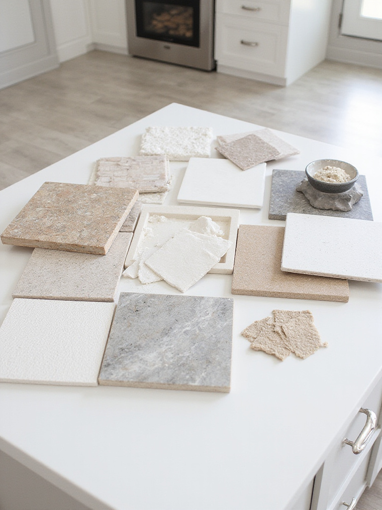
Okay, this is where the fun begins, but also where people get lost. You can’t choose a tile in a vacuum. A tile that looks stunning in a sleek, minimalist London flat will look ridiculous in a rustic Costa Rican villa. You need a narrative. Are we creating a breezy, open-air haven with seamless indoor-outdoor flow, or a chic, sophisticated urban space with tropical accents? Your cabinets, your countertops, your light fixtures—they all need to be part of the same story.
I once worked with a client who fell in love with these incredibly ornate, hand-painted terracotta tiles. They were gorgeous. But she had high-gloss, handleless European cabinetry and stainless steel everything. It was a complete clash of languages. We had to gently guide her toward a tile that spoke the same language as the rest of her kitchen—a sleek, large-format tile that still had a subtle, warm texture. Create a mood board. Pin images. Touch samples. Decide on your story first, and the right tile will feel less like a choice and more like a destiny.
With a clear stylistic direction in hand, you can confidently move from the realm of ideas to the practicalities of making it happen, starting with the numbers.
3. Calculating Accurate Tile Quantities to Avoid Waste
Here’s a shortcut that will save you both money and a massive headache: always, always order 15% more tile than your square footage calls for. Not 10%. Fifteen. Everyone says 10%, but that’s cutting it too close. That extra 5% is your insurance policy against misplaced cuts, unexpected breakage, and the simple fact that one day, you might need to replace a tile or two and the dye lot you bought will be gone forever.
Running out of tile mid-job is a catastrophe. You’re at the mercy of stock levels, shipping delays, and the very real possibility of getting a new batch that doesn’t quite match. I watched a client try to save a couple hundred dollars by ordering the exact amount. When the installer made a few wrong cuts on a complex herringbone pattern, the project stalled for three weeks while we scrambled to find matching tiles. The delay cost them ten times what the extra box would have. Don’t be that person. Buy the extra tile. It’s the cheapest insurance you’ll ever own.
Once your materials are accounted for, the next critical calculation is your budget, which anchors your entire project in reality.
4. Setting a Realistic Budget for Materials and Installation
Let’s talk money, because passion is lovely, but a budget is essential. The biggest mistake people make is falling in love with a tile that costs $30 a square foot and forgetting that the tile itself is only half the story. The real cost is materials and installation. A complex pattern like a mosaic or herringbone can easily double your labour cost compared to a simple grid layout.
Here’s the BS everyone falls for: they see a low per-square-foot price at a big-box store and build their budget around it. What they miss are the hidden costs: the high-quality adhesive you need, the stain-proof grout, the delivery fees, and the professional installer who won’t ruin your investment. My shortcut? Budget 50% for materials and 50% for labour and supplies. If your total tile budget is $5,000, you have $2,500 to spend on the actual tiles. This simple rule keeps you grounded and prevents that awful moment when you get an installation quote that’s three times what you expected.
With a firm budget in place, you’re ready to address the physical canvas itself—the floor beneath your feet that will support your beautiful new design.
Laying the Groundwork: Initial Planning and Style Assessment (Part 2)
We’re still in the preparation stage, but this is where we get into the nitty-gritty that separates a professional-looking job from a DIY disaster. You’ve got your style, your numbers, and your budget sorted. Now, let’s look at the surface you’re working with.
5. Assessing Subfloor Conditions for a Flawless Installation
I’m going to be brutally honest: if your subfloor isn’t perfectly level, flat, and stable, you are throwing your money away. It doesn’t matter how beautiful or expensive your tile is; on a bad subfloor, it will crack. End of story. This is the absolute most important, non-negotiable part of the entire process. An uneven floor creates stress points, and tile has no flex. It will find the weakest point and fracture.
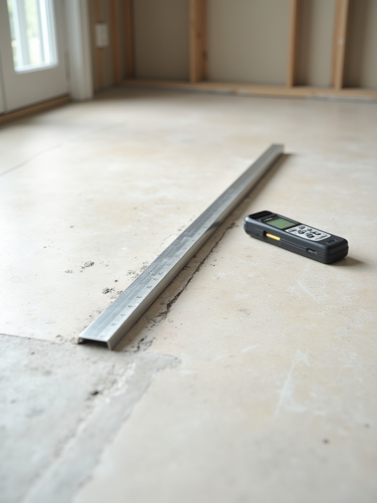
Years ago, on one of my first projects, I let a contractor convince me a little “dip” in the subfloor wouldn’t matter. He said the adhesive would fill it in. Six months later, I got a call from a distraught client. A long, hairline crack had appeared right across her brand-new floor. It was a gut-wrenching lesson. We had to tear everything out and start over, all because we didn’t spend one extra day leveling the subfloor. Use a long level. If you see gaps, fix them with a self-leveling compound. Don’t even think about laying a single tile until that floor is as flat as a sheet of glass.
A flawless foundation sets the stage for the main event: choosing the materials that will bring your kitchen’s character to life.
Exploring Tile Materials, Shapes, and Pattern Layouts (Part 1)
Now we get to the really good part. This is where we choose the personality of your kitchen. The material, shape, and pattern of your tile are what people will see and feel every single day. Let’s make it extraordinary.
6. Choosing Porcelain for Unmatched Stain and Water Resistance
We touched on this before, but it’s worth repeating: porcelain is the undisputed king of kitchen floors and high-use backsplashes. Think of it as the quiet, confident workhorse of the design world. It’s not as flashy as marble or as rustic as terracotta, but its performance is flawless. In a kitchen, where you have everything from coffee spills to splattering tomato sauce, you want a surface that is non-porous. Porcelain’s water absorption rate is less than 0.5%, which basically means it’s waterproof.
Spill a bottle of red wine on unsealed marble, and you’ve got a permanent stain. Spill it on porcelain, and you can wipe it up an hour later without a trace. This isn’t just about cleaning; it’s about living without fear in your own home. You can cook, entertain, and make a mess knowing that your surfaces can handle it. When you’re designing a space for life, that kind of practical luxury is priceless.
While porcelain provides unparalleled performance, its cousin, ceramic, offers a world of creative possibilities at a more accessible price point.
7. Selecting Ceramic Tiles for Cost-Effective Versatility
Ceramic tile is the ultimate chameleon. It’s affordable, it comes in a universe of colors, shapes, and patterns, and it’s perfect for backsplashes and low-traffic areas. This is where you can truly inject personality and colour into your kitchen without breaking the bank. Want that vibrant, hand-painted look you saw in a São Paulo café? You can find it in ceramic. Dreaming of a deep, glossy emerald green behind your range? Ceramic is your answer.
The key is knowing where to use it. While I stand by porcelain for floors, a ceramic backsplash is a brilliant choice. It doesn’t face the same wear and tear, and it gives you the creative freedom to make a bold statement. Here’s my secret: pair an affordable ceramic tile with a high-end-looking layout, like a vertical stack or a herringbone pattern. The sophisticated pattern elevates the simpler material, giving you a look that feels far more luxurious than its price tag suggests. It’s all about creating that perfect blend of high-low, a cornerstone of contemporary British style.
Moving from manufactured materials, let’s explore the timeless soul and character that only Mother Nature can provide.
8. Incorporating Natural Stone for Timeless Elegance and Texture
There is nothing quite like natural stone. Marble, travertine, slate—each piece tells a story millions of years in the making. It brings an organic, soulful quality to a space that simply cannot be replicated. When you run your hand over a honed marble countertop or stand barefoot on a slate floor, you feel a connection to the earth. It’s a grounding, powerful material that adds instant history and gravitas to a room.
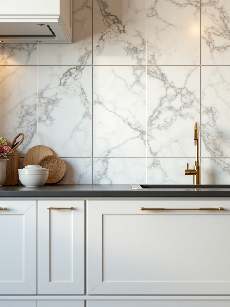
However, natural stone is a demanding beauty. It’s porous, so it must be sealed properly and regularly to protect it from stains and etching, especially in a kitchen. A squeeze of lemon juice can permanently mar an unsealed marble surface. You have to be willing to embrace its imperfections and treat it with care. I always tell my clients, “If you want perfect, choose porcelain. If you want soul, and are willing to live with the story it tells, choose stone.” For me, that little bit of extra care is more than worth it for the unmatched elegance and texture it provides.
From the raw beauty of stone, we transition to a classic man-made shape that has proven its versatility time and time again.
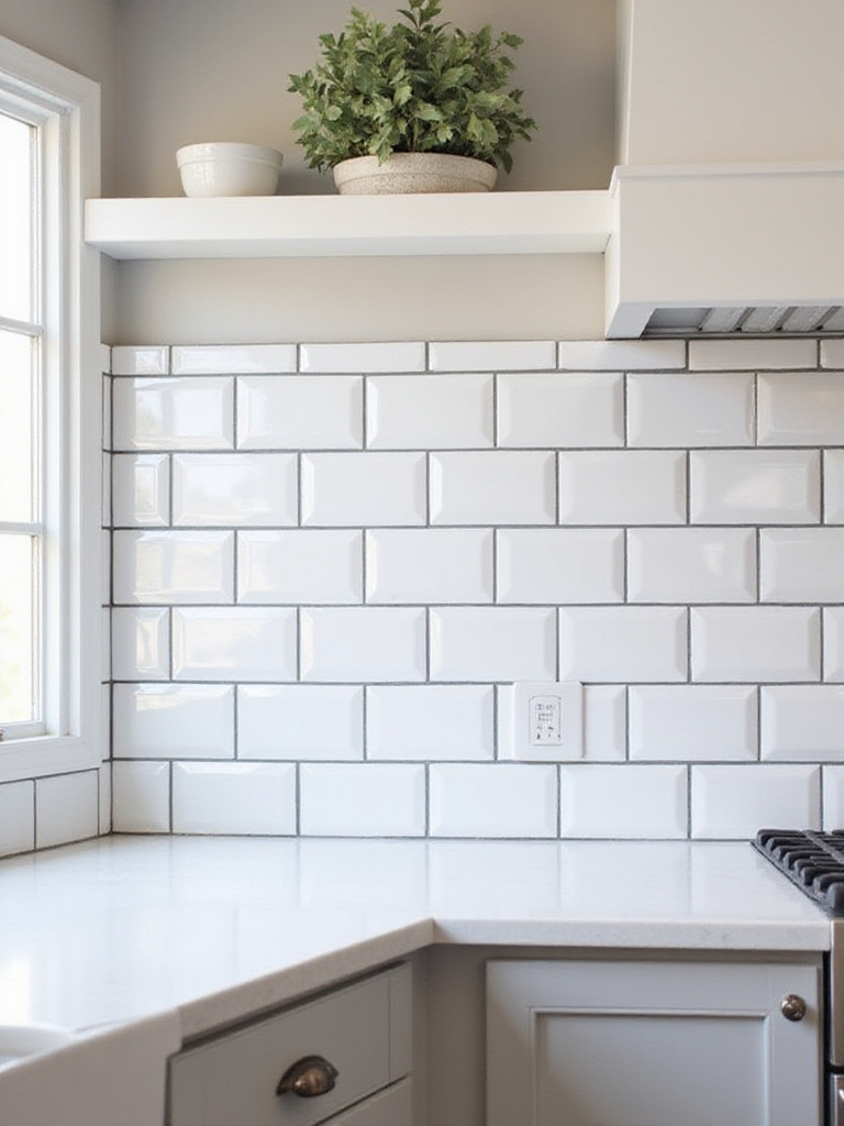
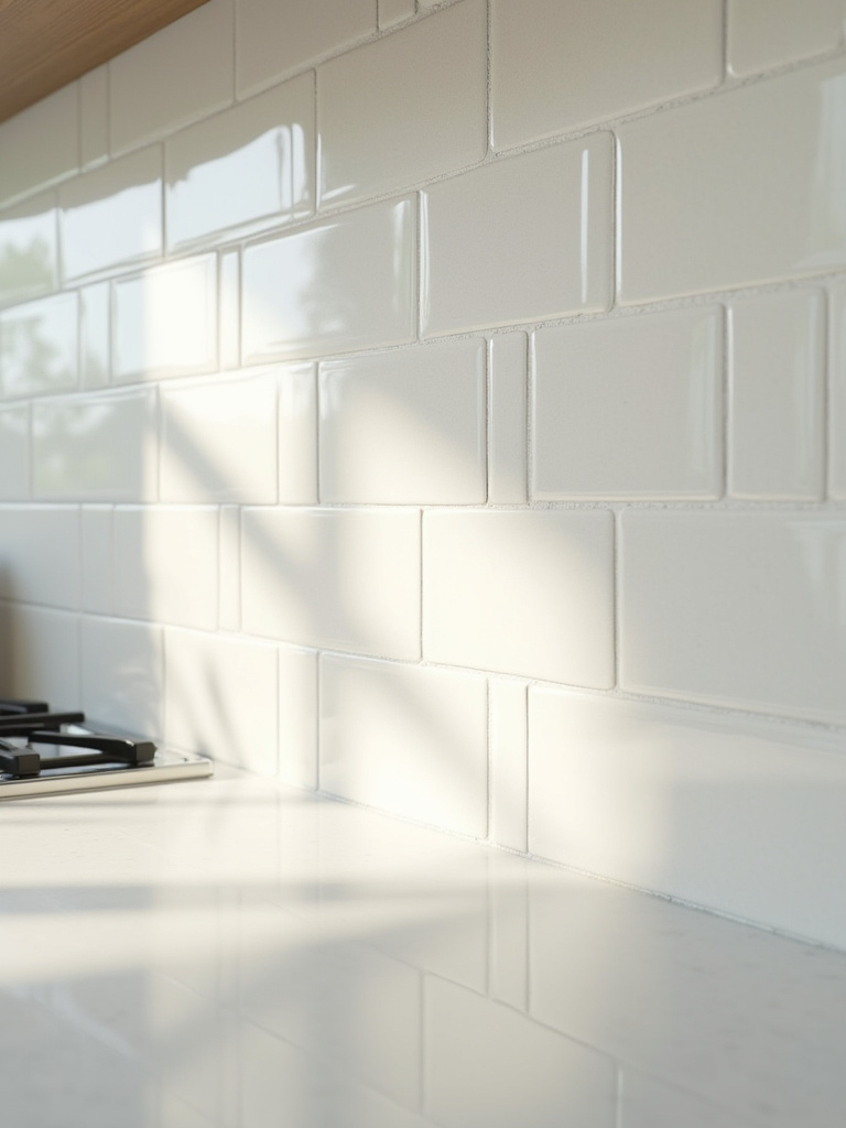
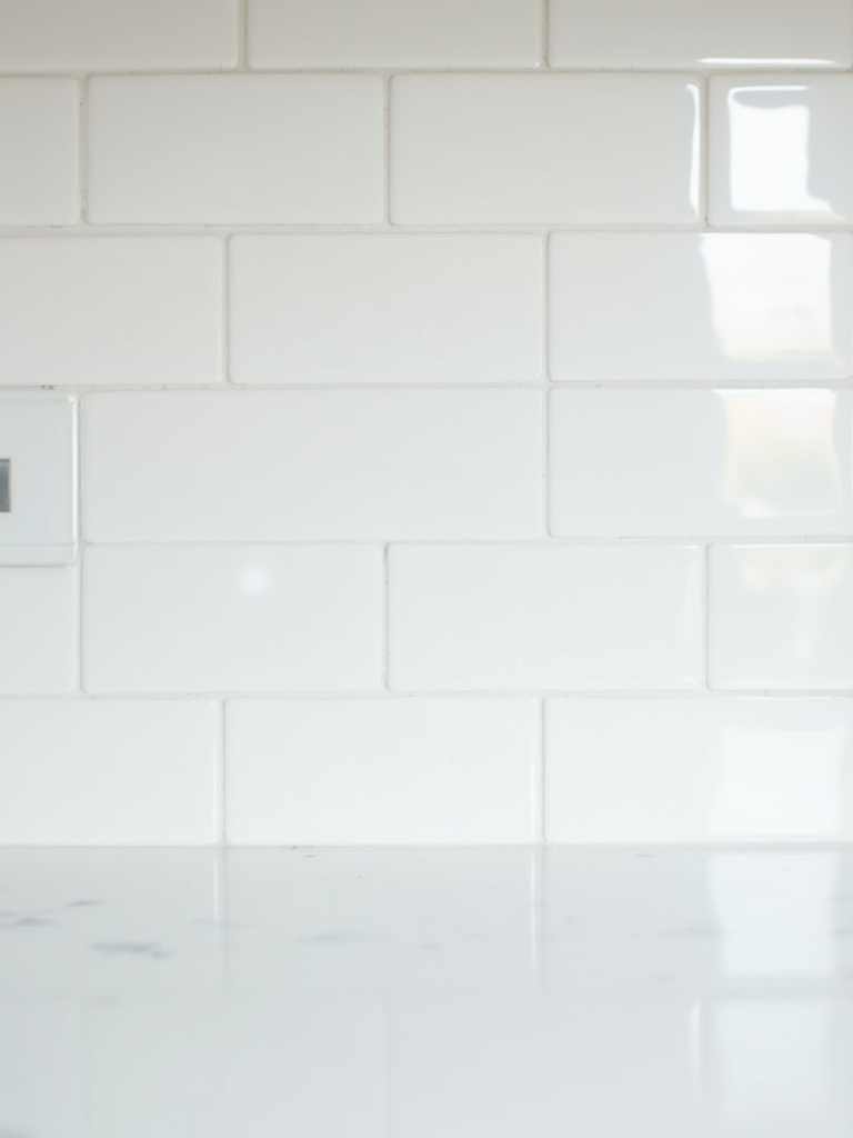
9. Experimenting with Subway Tile for Classic or Contemporary Looks
Can we talk about why everyone underestimates subway tile? People dismiss it as “safe” or “boring,” but they’re completely missing the point. Subway tile isn’t a design choice; it’s a blank canvas. It’s like the perfect white shirt or a classic little black dress—its power lies in how you style it. The material, the colour, the grout, and the pattern can transform it into something totally unique.
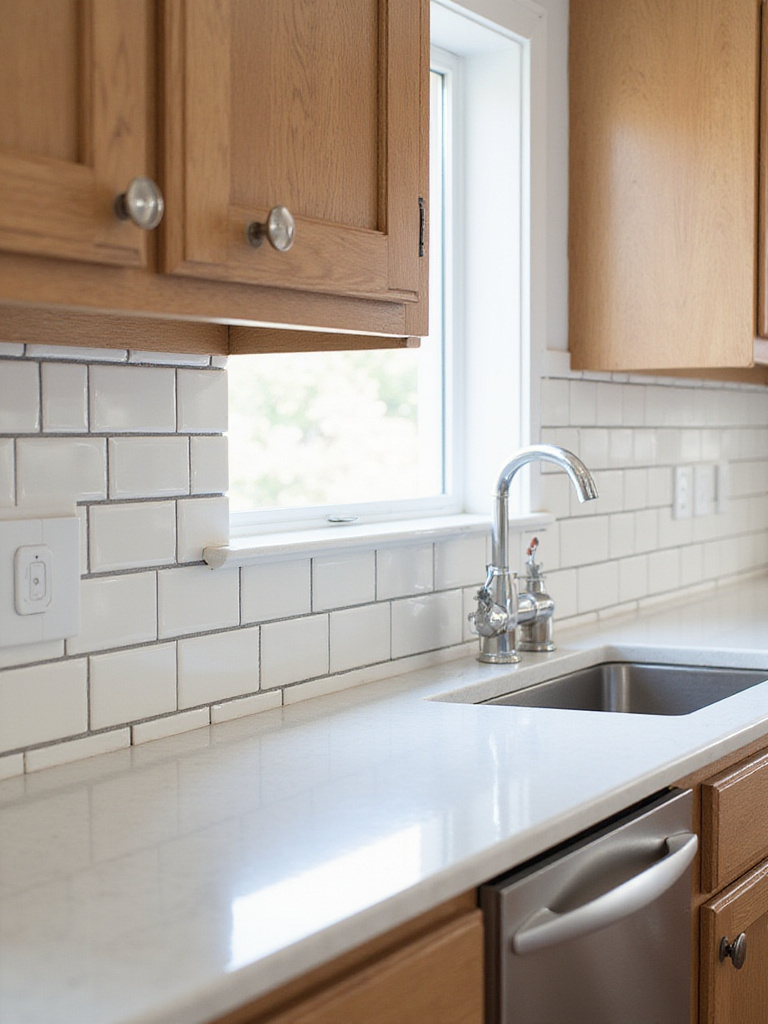
Want a classic look? Go with a traditional 3×6 white ceramic in an offset pattern with light grey grout. Want something more contemporary and refined? Try a longer 2×8 tile in a matte finish, laid in a vertical stack with a matching grout for a seamless, textured feel. For that tropical-modern vibe, I love using a handmade-style subway tile (often called zellige) with irregular edges and a glossy, undulating surface in a deep sea green or turquoise. It reflects the light beautifully, like the surface of the water. Subway tile isn’t the destination; it’s the vehicle.
Now that we’ve explored some foundational materials and shapes, let’s push the boundaries with more dynamic pattern and scale choices.
Exploring Tile Materials, Shapes, and Pattern Layouts (Part 2)
We’ve covered the basics, but creating a truly special kitchen means thinking beyond the standard grid. This is about playing with scale and movement to create drama, sophistication, and an illusion of space.
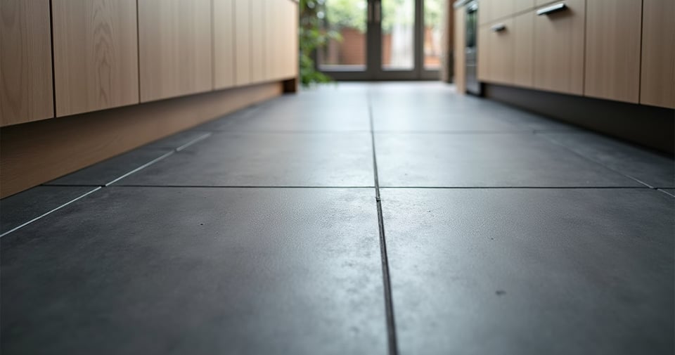
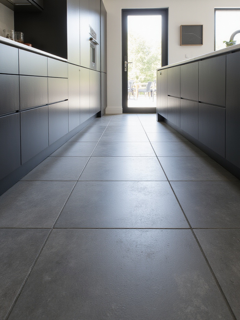
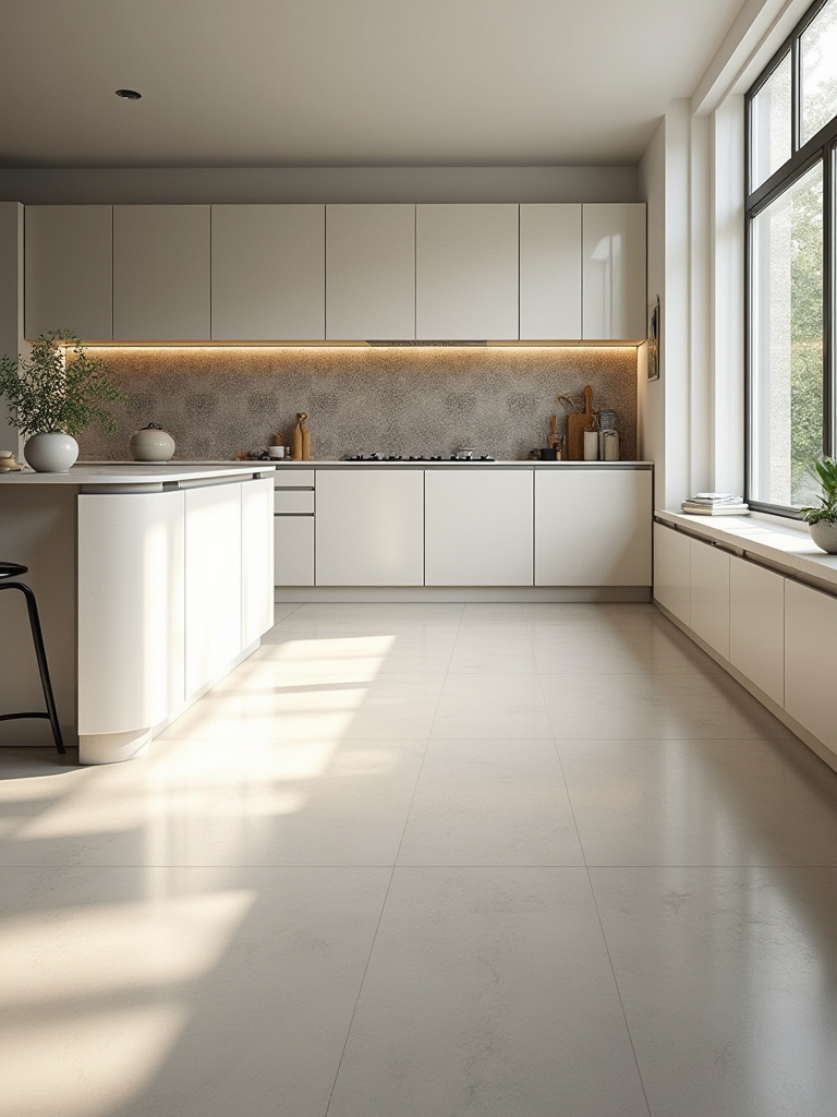
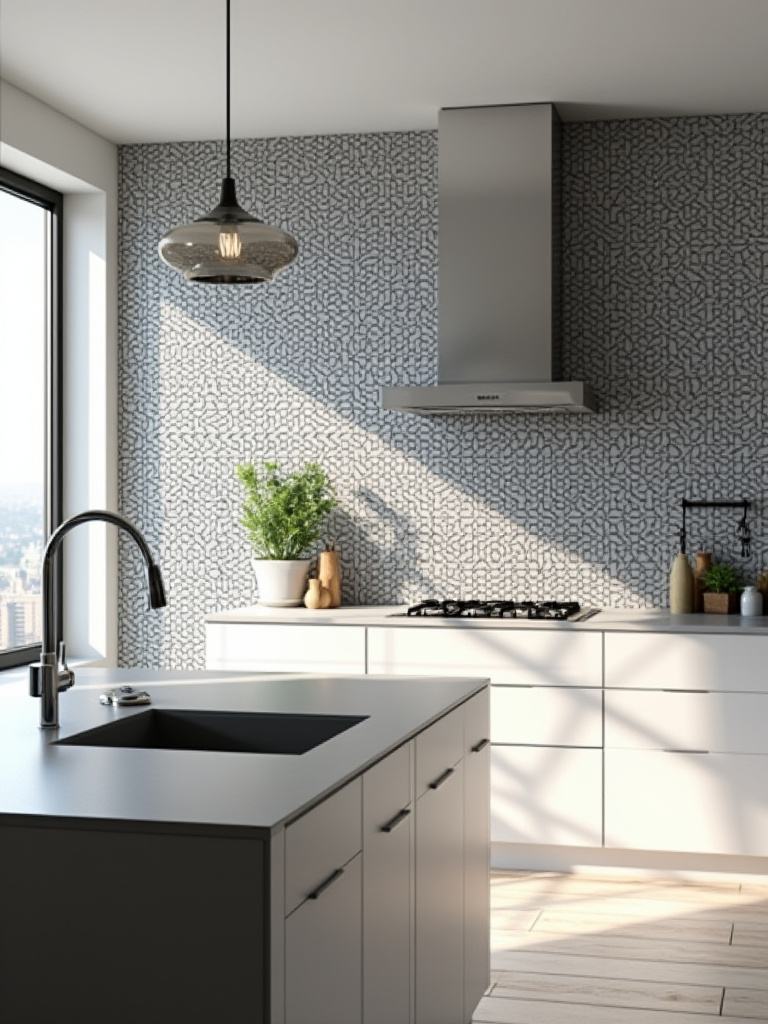
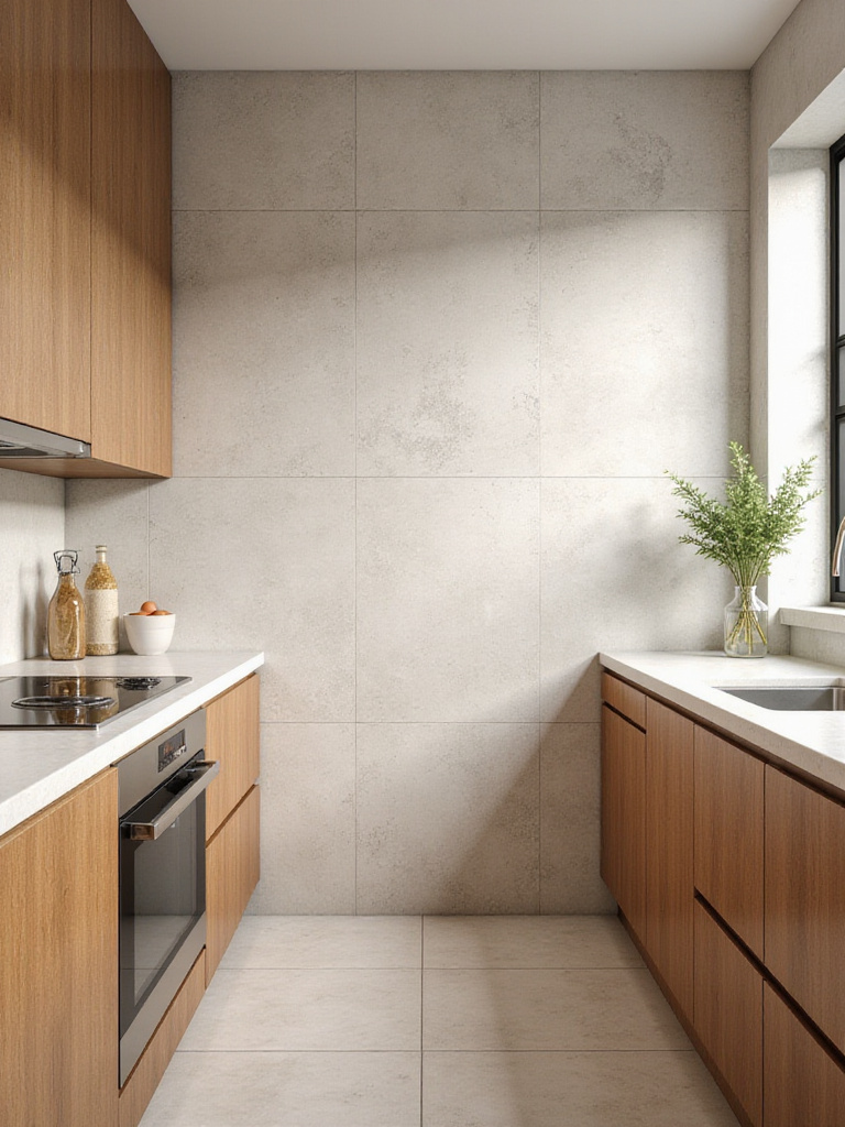
10. Maximizing Space Perception with Large-Format Floor Tiles
If you want your kitchen to feel larger, calmer, and more luxurious, large-format tiles are your best friend. I’m talking 24×24 inches, 24×48, or even larger. The magic is in the lack of grout lines. Every grout line is a visual stop, breaking up the floor and making a space feel busy and small. By minimizing those lines, you create a sweeping, continuous surface that tricks the eye into seeing a much bigger, more open area. It’s an optical illusion that works every time.
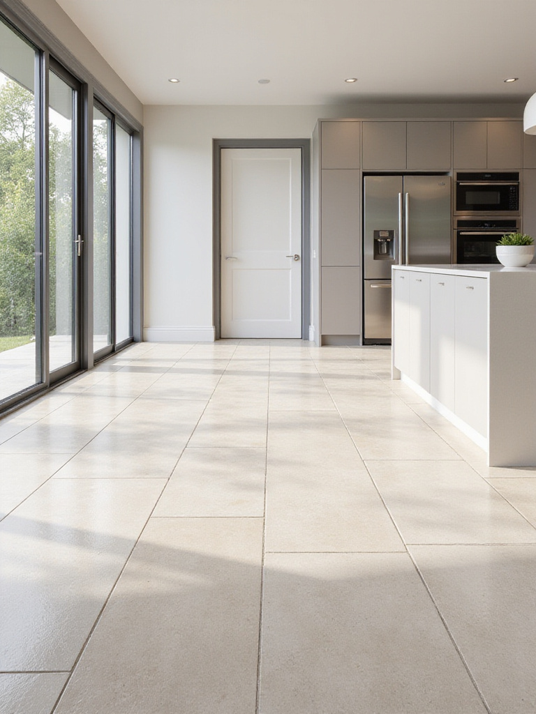
This is a key element in bridging the gap between indoor and outdoor living. By using the same large-format tile inside the kitchen and continuing it out onto the patio, you dissolve the boundary between the two spaces. It creates an incredible sense of flow and expansiveness, making both the room and the garden feel larger. For this, choose a tile with a slightly textured “grip” finish that’s suitable for both interior and exterior use to ensure safety.
While large tiles create serenity and space, more intricate patterns can introduce energy and focus, drawing the eye to a specific feature.
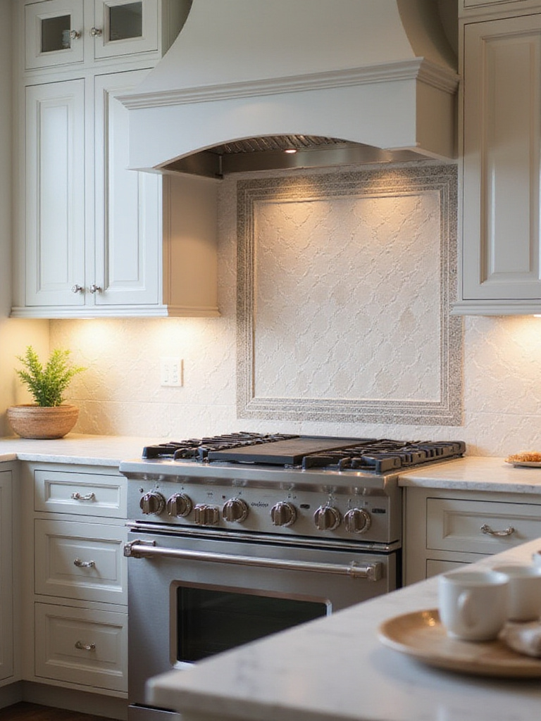
11. Creating Visual Interest with Herringbone Backsplash Patterns
A herringbone pattern is pure, effortless elegance. It takes a simple rectangular tile and, through its placement, creates a sense of movement and sophistication. It’s dynamic without being loud, a little black dress of tile patterns. It works beautifully on a backsplash, especially behind the range, creating a stunning focal point that draws the eye and adds a layer of texture to the room.
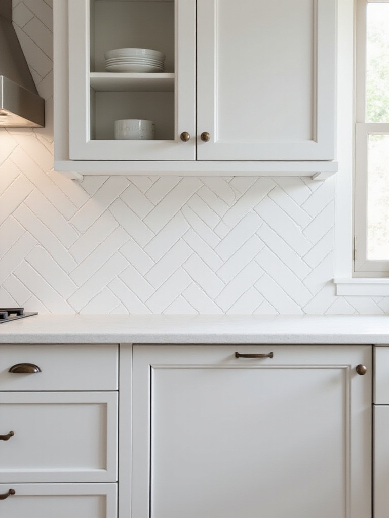
The shortcut here is to play with scale. A classic small-format subway tile in a herringbone feels timeless and traditional. But use a larger, longer tile—say, a 4×16—and the pattern becomes more contemporary and dramatic. I recently did a backsplash in a narrow galley kitchen using a beautiful, creamy handmade-style tile in a herringbone pattern. The “V” shape of the pattern draws the eye upward and outward, making the entire kitchen feel wider and more spacious. It’s a small detail with a huge architectural impact.
For those wanting to make an even more audacious statement, the world of geometric patterns offers endless possibilities for modern expression.
12. Embracing Geometric Patterns for a Bold, Modern Statement
Sometimes, a space calls for something bold. Geometric tiles—hexagons, diamonds, arabesques—are the art installations of the tile world. They are an unapologetic statement, perfect for a feature wall, a kitchen island front, or even the floor. This is your chance to infuse your space with rhythm and personality. A floor of black and white hexagonal tiles, for example, can give a kitchen an instant Parisian bistro vibe—classic, yet bold.
The key to using geometric patterns without overwhelming a space is balance. If you’re going for a bold pattern on the floor, keep the backsplash and countertops simple. Let the geometric tile be the star of the show. I love using encaustic cement tiles for this. They have a chalky, matte finish and come in the most incredible patterns and colours, bringing that vibrant, sun-drenched Latin American feel into the home. They tell a story and give a space a sense of history and handcrafted beauty.
With the main tiles chosen, it’s time to refine the vision with the details that truly make a design sing.
Refining Your Design with Grout, Borders, and Accent Tiles (Part 1)
This is where a good design becomes a great one. The tile is the body of the work, but these details are the soul. Paying attention to grout, borders, and accents is what will give your kitchen that custom, high-end feel.
13. Choosing Grout Color to Enhance or Subdue Tile Appearance
Grout is the single most underrated design tool at your disposal. People see it as just the glue holding things together, but it’s so much more. Think of it as the eyeliner for your tiles—it defines the entire look. The choice is simple: do you want to match the grout to the tile for a seamless, monolithic look, or contrast it to celebrate the shape of each tile? Neither is wrong, but they create completely different effects.

For a serene, spa-like feel, especially with large-format tiles, matching the grout colour makes the lines disappear, creating a unified surface. But if you’re using a beautiful tile shape, like a hexagon or a fish scale, a contrasting grout colour—like a dark charcoal against a white tile—will make the pattern pop and turn your wall into a graphic art piece. This simple decision can completely change the energy of your space from calm and flowing to sharp and architectural.
Once you understand the power of grout, you can start to think about adding other defining lines, like borders, to structure your space.
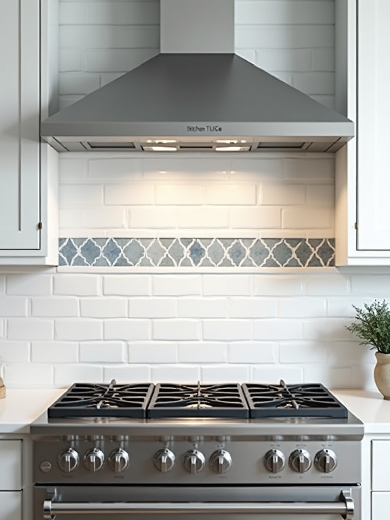
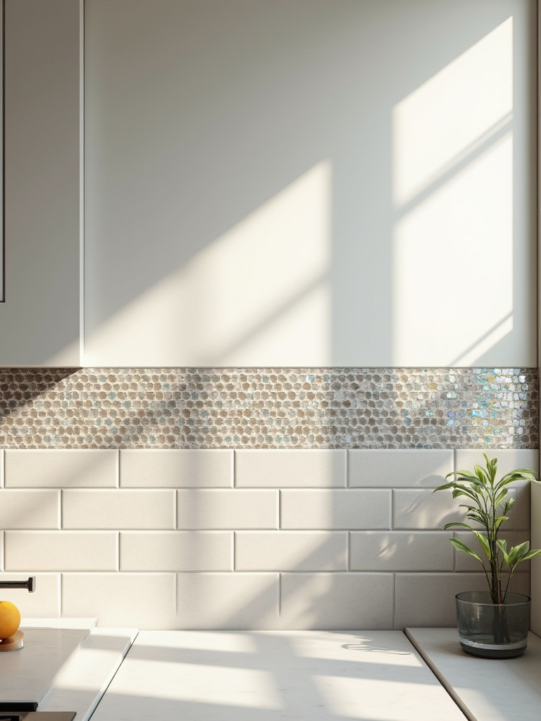
14. Integrating Decorative Borders for Defined Zones
Borders are like architectural picture frames. They can delineate a space, define a zone, or simply add a touch of custom detail. A simple pencil liner in a contrasting material—like a thin line of brass against a marble tile—can look incredibly chic and sophisticated. It’s a way to add a little bit of “jewelry” to your backsplash without committing to a full wall of intricate pattern.
I love using a border to create a “rug” effect on a kitchen floor. By framing a section of the main floor tile with a border of a different pattern or colour, you can define the dining area or the main workspace within an open-plan kitchen. It adds a layer of intention and sophistication. It shows that every single detail has been considered.
This idea of creating defined focal points can be taken even further with the strategic use of highly decorative accent tiles.
15. Using Contrasting Grout Lines for Architectural Detail
We’ve talked about contrasting grout, but let’s be specific about its architectural power. When you use a classic white subway tile with a dark grey or black grout, you’re no longer just creating a backsplash; you’re creating a strong, graphic grid. This look has its roots in industrial British design, and it adds a certain edge and structure to a space that is incredibly compelling. It highlights the geometry and craftsmanship of the tile installation itself.
This technique is a fantastic way to bring a modern, graphic sensibility to a more traditional or rustic space. Imagine a kitchen with warm, reclaimed wood shelves and classic shaker cabinets. Adding a backsplash with a strong, dark grout line injects a contemporary energy that keeps the design from feeling too nostalgic. It’s this tension between old and new, rustic and graphic, that creates truly memorable and dynamic spaces.
Similarly, an accent tile acts as a deliberate exclamation point, drawing the eye and adding a concentrated burst of personality.
16. Designing with Accent Tiles for Focused Visual Interest
An accent tile is a moment of pure joy. It’s a small area where you can go bold, tell a story, or introduce a precious material without the expense of doing an entire wall. The most classic place for an accent is behind the range, creating a focal point often called a “medallion” or tile mural. This is the perfect spot to use those hand-painted terracotta tiles or a stunning mosaic that you fell in love with but couldn’t afford for the whole kitchen.
My approach is often more subtle. Instead of a large mural, consider a single vertical stripe of a vibrant, patterned tile running from the countertop to the ceiling. It’s a modern, unexpected gesture that draws the eye upward and adds a jolt of energy and colour. It feels curated and artistic. The key is restraint. An accent is powerful because it’s special. Use it sparingly to create maximum impact.
With these smaller, artistic details considered, let’s step back and look at how our choices interact with the larger elements of the kitchen.
Refining Your Design with Grout, Borders, and Accent Tiles (Part 2)
We’re moving beyond individual tile choices now to consider the whole ecosystem of your kitchen. How does your tile choice play with light? How does it speak to the cabinets and countertops? This holistic view is what creates harmony.
17. Considering Light Reflection on Glossy Versus Matte Surfaces
The finish of your tile—glossy or matte—is a crucial decision that dramatically affects the atmosphere of your kitchen. A glossy tile acts like a mirror, bouncing light around the room. In a small or dark kitchen, a light-coloured, high-gloss backsplash can be transformative, making the space feel brighter, bigger, and more alive. It brings a certain energy and glamour to a room. Think of the way light dances on the surface of the Caribbean Sea—that’s the effect a glossy tile can have.
A matte tile, on the other hand, absorbs light. It creates a softer, calmer, more contemporary feel. It’s understated, sophisticated, and incredibly tactile. I love using matte tiles on floors because they are less slippery and they don’t show every single water spot or footprint. They have a quiet confidence. The best designs often mix the two: a glossy, light-reflecting backsplash paired with a grounded, velvety matte floor creates a beautiful balance of energy and serenity.
This balance must also extend to the other primary surfaces in the room, creating a conversation between all the major elements.
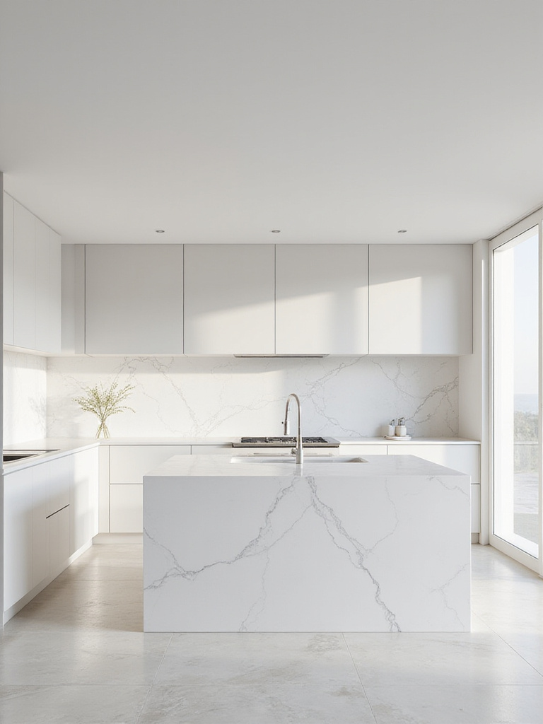
18. Coordinating Tile with Countertops and Cabinetry for Harmony
This is the holy trinity of kitchen design: tiles, countertops, and cabinetry. They must work together in harmony. If you have a countertop with a lot of dramatic movement and veining—like a beautiful slab of Calacatta marble—that is your star. The tile and cabinets should be the supporting cast, elegant but simple, to allow the countertop to shine. Choose a simple, single-colour backsplash that picks up one of the subtle tones in the stone’s veining.
Conversely, if you opt for a bold, patterned tile backsplash, your countertops and cabinets need to be quiet and restrained. I learned this the hard way when a client insisted on pairing a busy backsplash with an equally busy granite countertop. The result was visual chaos. There was no place for the eye to rest. My shortcut for foolproof harmony: pick one hero element, and make everything else support it. This ensures your kitchen feels cohesive and sophisticated, not cluttered.
Once the aesthetic harmony is achieved, our focus shifts to ensuring this beauty lasts for years to come through smart installation and care.
Optimizing Longevity and Mastering Advanced Design Techniques (Part 1)
A beautiful kitchen is wonderful, but a beautiful kitchen that lasts a lifetime is true luxury. This final phase is all about the unseen details—the techniques and practices that protect your investment and keep your tiles looking perfect for decades.
19. Preventing Common Installation Mistakes for Long-Term Durability
I’m going to say something controversial: a brilliant tile in the hands of a bad installer is worse than a mediocre tile installed by a master. The installation is everything. The most common mistake I see is insufficient mortar coverage, what we call “spot-setting.” This is when an installer just puts a few dabs of adhesive on the back of the tile and sticks it to the wall. It’s lazy, it’s wrong, and it creates hollow spots that make the tile incredibly vulnerable to cracking.
An installer should comb the mortar on the wall with a notched trowel and also “back-butter” the tile itself, ensuring close to 100% coverage. When you tap on an installed tile, it should sound solid, not hollow. Don’t be afraid to ask your installer about their process. A true professional will be proud to explain their technique. Investing in a great installer is the single best way to ensure the durability of your kitchen.
Beyond the initial installation, ongoing care, starting with the grout, is what will maintain that pristine look.
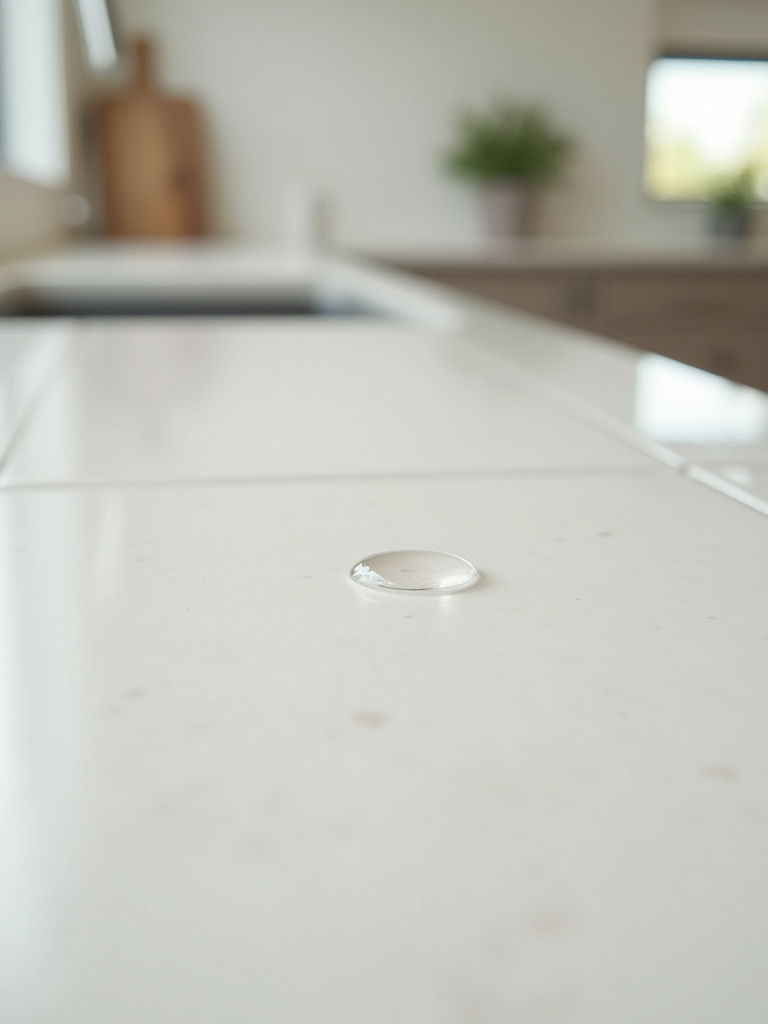
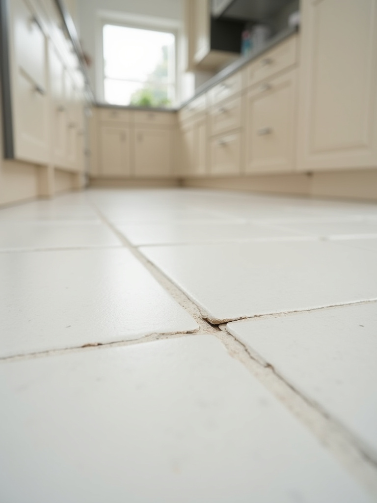
20. Employing Smart Grout Sealing Practices for Stain Prevention
Think of grout as a tiny, porous cement sponge. If you don’t seal it, it will soak up every drop of coffee, wine, and grease that touches it, leading to ugly, permanent stains. Grout sealer is an invisible shield that penetrates the grout and repels liquids. It is an absolutely essential step that many people skip. You must seal your grout, especially in a kitchen.
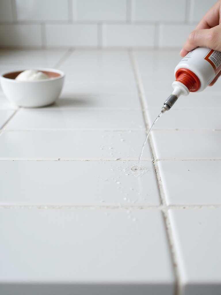
The process is simple: after the grout has fully cured (usually about 72 hours), you apply the sealer with a small brush or applicator. But here’s the part everyone forgets: it’s not a one-and-done deal. Sealers wear off. You need to re-seal your grout every one to two years. How do you know when it’s time? Drip a little water on it. If the water beads up, the sealer is still working. If it soaks in and darkens the grout, it’s time to re-seal. This five-minute test will save you hours of scrubbing and prevent your beautiful grout from becoming a discoloured mess.
A sealed grout line is the first line of defense, but a consistent, gentle cleaning routine is what will truly preserve your tile’s sparkle.
21. Addressing Tile Maintenance for Ongoing Sparkle
You don’t need harsh, abrasive chemicals to keep your tiles beautiful. In fact, they can do more harm than good, etching the surface of natural stone and degrading your grout sealer. The best way to maintain your tiles is with a simple, regular routine. For daily cleanups, a damp microfiber cloth is usually all you need. For weekly cleaning, use a pH-neutral cleaner designed for tile.
The BS to ignore is the idea that you need a different miracle cleaner for every type of stain. That’s just marketing. A good, gentle cleaner and a bit of consistency is the secret. For grout lines that have started to look a little dingy, a paste of baking soda and water and a bit of elbow grease with a stiff brush is a fantastic, non-toxic solution. Taking care of your tile is like taking care of your skin—a gentle, consistent routine is far more effective than occasional harsh treatments.
Even with the best care, accidents happen. Knowing how to handle small repairs is the final piece of the longevity puzzle.
22. Repairing Chipped or Cracked Tiles Safely and Effectively
A chipped tile can feel like a disaster, but it’s often a surprisingly easy fix. For small chips, you don’t need to replace the whole tile. You can buy epoxy repair kits that allow you to fill the chip and even tint the epoxy to perfectly match your tile colour. With a steady hand, you can make a chip virtually disappear.
If a tile is cracked all the way through, it does need to be replaced, which is why you wisely saved those extra tiles from your 15% overage! The key is to carefully remove the grout from around the broken tile first using a special tool called a grout saw. This isolates the tile and prevents you from damaging its neighbors when you gently chisel it out. It’s a delicate process, but it saves you from having to re-tile an entire section. Addressing damage quickly prevents it from getting worse and keeps your kitchen looking flawless.
With the foundations of longevity mastered, let’s explore two final, advanced concepts that will elevate your design to a truly conscious and curated level.
Optimizing Longevity and Mastering Advanced Design Techniques (Part 2)
We’ve covered the practical and the beautiful. Now, let’s talk about the sublime. These final two ideas are for those who want their kitchen to be not just a room, but a reflection of a thoughtful, sustainable, and deeply personal design philosophy.
23. Mixing Tile Materials for Unique Textural Contrast
Why limit yourself to just one material? Some of the most interesting and luxurious spaces I’ve designed involve a careful mix of different tile materials. Imagine a backsplash of smooth, glossy ceramic subway tiles with a feature panel behind the range made of rough, textured split-face slate. The contrast between the sleek and the rugged is incredibly powerful. It creates depth, texture, and a focal point that feels both organic and refined.
The trick is to maintain a cohesive colour palette. When you mix materials, keep the colours within the same family to prevent the look from becoming chaotic. You could pair a honed marble with a brushed brass accent, or a matte porcelain with a strip of iridescent glass mosaic. This is an advanced technique, but when done right, it results in a kitchen that feels layered, unique, and truly custom-designed.
Finally, the most important design choice of all: choosing materials that are as good for the planet as they are for your home.
24. Staying Ahead with Sustainable and Eco-Friendly Tile Options
For me, this is the most important consideration of all. True luxury isn’t just about how a space looks; it’s about how it feels and the impact it has. Choosing sustainable tiles made from recycled content—like recycled glass or porcelain—is a powerful statement. These tiles are not only beautiful but also reduce waste and minimize your project’s carbon footprint. It’s a design choice you can feel genuinely good about.
Beyond recycled content, look for tiles that are certified for low chemical emissions (low-VOC). This ensures that your kitchen isn’t off-gassing harmful chemicals into the air you breathe, creating a healthier environment for you and your family. Many tile manufacturers now have “cradle-to-cradle” certifications, meaning every step of their process is designed to be sustainable. Beautiful spaces can, and should, be responsible ones. A home that nurtures your well-being while respecting the environment is the ultimate luxury.
Conclusion
So there you have it. The real story on kitchen tiles. We’ve moved from the absolute essentials of durability and budget to the artistry of pattern, colour, and texture. You now know that grout is your secret design weapon, that a bad subfloor will ruin a great tile, and that sustainability is the new luxury. Your kitchen is too important to be treated as just a functional space. It’s where life happens, where stories are shared over meals, where the day begins and ends.
Don’t let these ideas just sit on a page. Take them, play with them, and start dreaming. Go out and touch the tiles. Feel the difference between a cool, smooth porcelain and a warm, textured terracotta. Create a mood board that captures the energy you want to live in. Your dream kitchen—that vibrant, sophisticated, and deeply personal space that feels like a permanent vacation—is waiting. All you have to do is choose the first tile.