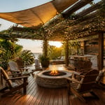
There are living rooms you admire from a photograph. Then there are living rooms you remember long after you’ve left them. The difference isn’t money or square footage. It’s the quality of having been composed rather than assembled. The best living room decor ideas I’ve encountered share one quality: every piece carries meaning. A hand-beaten brass bowl from a Jaipur market. Curtains in indigo block print that echo the cushion across the room. A shelf of ceramics that tells you exactly who lives here. That kind of specificity is achievable in any space, at almost any budget. These fifteen living room styling approaches each offer a different entry point — from colour and textiles through to lighting and accessories — into a room that genuinely reflects the person inside it.
1. Jewel-Toned Velvet Sofa as the Room’s Anchor
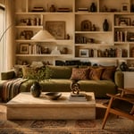
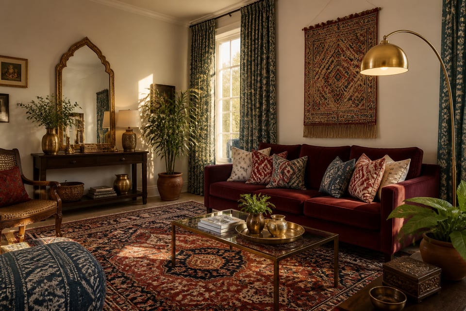
A sofa in a jewel tone is not the safe choice. It is the right one. Emerald, sapphire, garnet, amethyst — these colours set the entire room’s story from the moment you walk in. Designers who advocate most strongly for neutral sofas are usually working with clients who haven’t fully committed to a point of view. A jewel-toned velvet sofa commits for you.
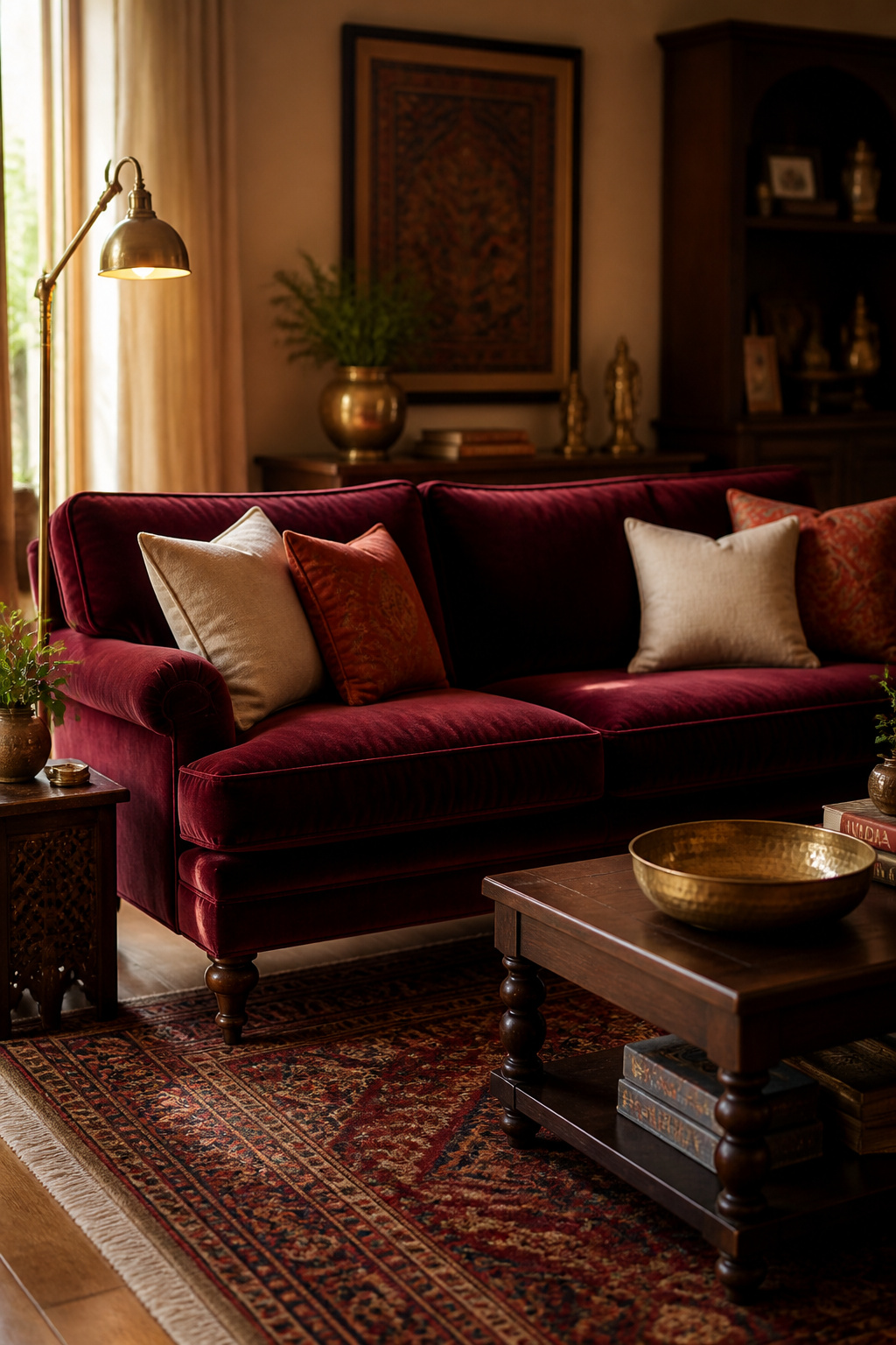
Velvet’s pile behaves differently under different light. Emerald shifts from forest-dark in a north-facing room to brilliantly saturated in afternoon sun. That’s why testing a fabric swatch in your specific room at different times of day matters more than trusting a retailer’s photograph. Garnet red is the underestimated choice here. It holds warmth in virtually any light level and pairs naturally with dark wood, aged brass, and cream — the palette of traditional South Asian and European interiors alike.
To style around a bold sofa without losing control: keep all other large pieces neutral. A natural wood coffee table, a linen-covered armchair, a jute rug. Layer natural textures rather than competing colours. Position a floor lamp beside the sofa so warm light falls across the pile from the side. Overhead lighting flattens velvet into a flat colour. A well-placed lamp reveals every dimension of the fabric’s depth. For cushions, choose neutrals and patterns that pull from within the sofa’s palette — not colours that fight it.
2. Brass and Copper Accents Borrowed From South Asian Design
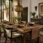
Brass has been present in South Asian homes for more than five thousand years. Sacred temple vessels, everyday cooking utensils, water carriers, lamp stands — the material carries genuine cultural weight. That history is precisely what gives it visual authority that trend-driven gold-toned accessories lack. When a hand-beaten brass urli bowl sits on a coffee table, the room acquires a quality that no mass-produced metalware replicates.
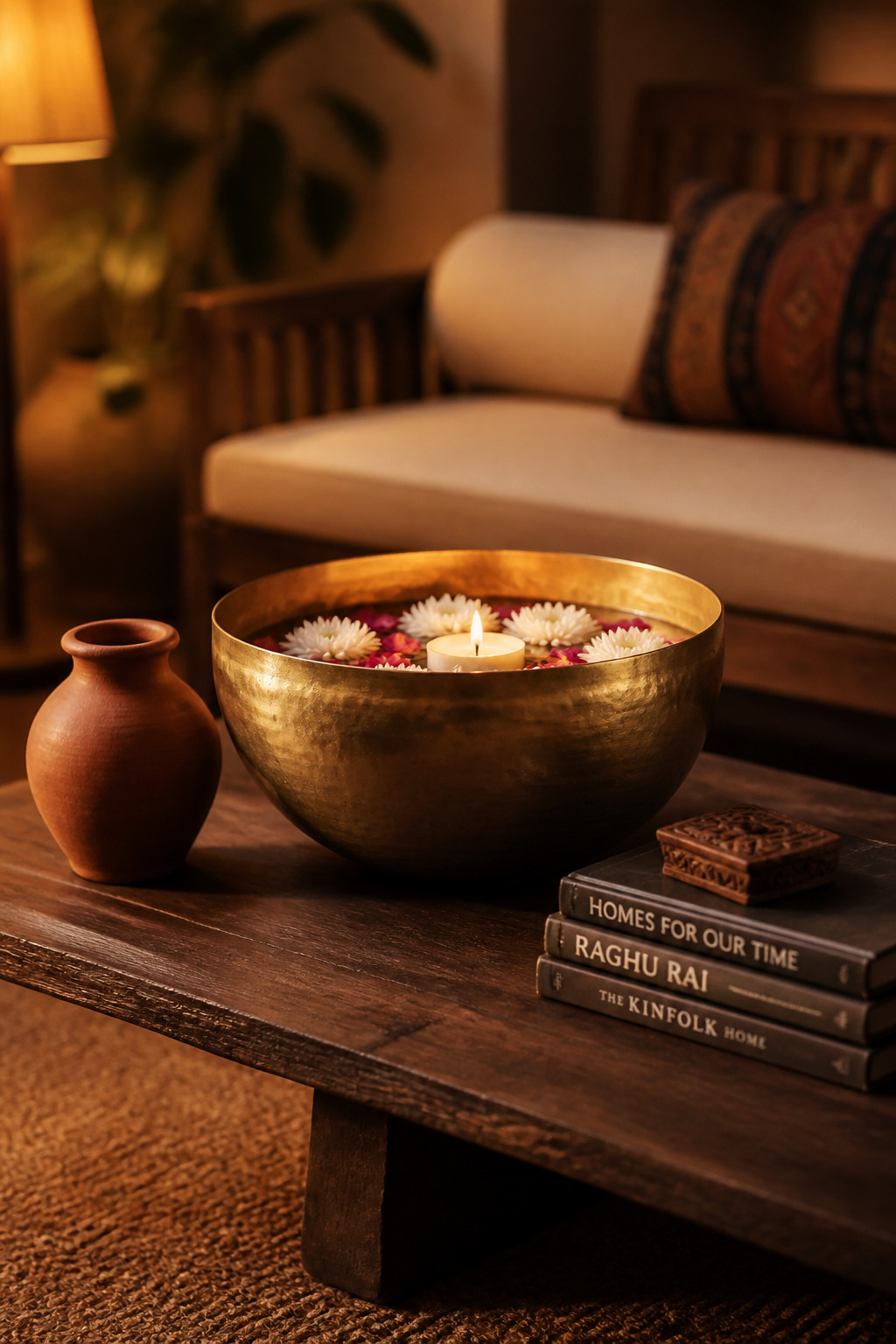
The urli is the most versatile starting point. It’s a shallow South Asian vessel traditionally used for floating flowers — available in brass, bell metal, and copper, typically 12–18 inches wide. As a coffee table centrepiece, it works with or without flowers. Filled with river stones and a floating candle, or simply left empty, the hand-beaten surface catches light differently from every angle.
Layering brass and copper in the same room is straightforward if you designate one as dominant. Brass leads: a floor lamp base, a mirror frame, a substantial bowl. Copper accents: photo frames, a small tray, a single candleholder. Vary the finishes too. Unlacquered brass develops a natural patina over time. Lacquered brass stays bright and suits a more contemporary room. The contrast that makes each metal surface read best is proximity to matte textures. A rough terracotta vase beside a polished brass bowl. A jute rug beneath a brass lamp. The roughness makes the metal gleam.
3. Gallery Wall Living Room Decor Ideas With Mixed Cultural Frames
The difference between a gallery wall that looks considered and one that looks purchased lies almost entirely in the frames. A matched set — all black, all the same width, all from the same shop — reads as a product. Frames in different materials, finishes, and scales read as a collection. That distinction communicates something about the room’s owner that no uniform set ever could.
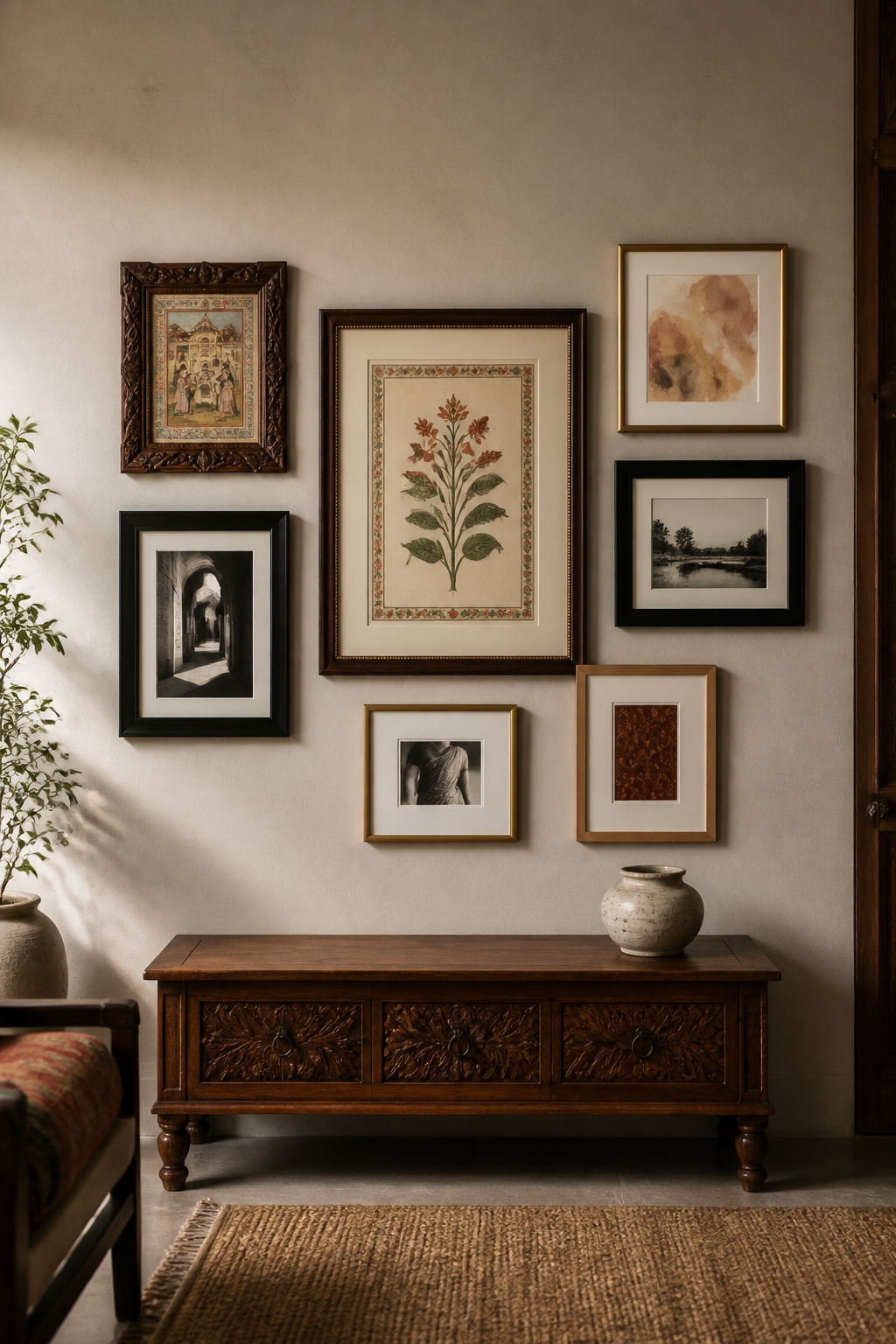
For a genuinely interesting arrangement, the Rule of Odds applies: 3, 5, 7, or 9 pieces create more natural compositions than even numbers. Choose one large anchor piece — 16×20 inches or bigger — and build outward from it. Position it slightly left of centre, since the eye moves left to right and the visual weight should build toward the right. Leave 2–3 inches between frames in a tight grouping. Align at least one edge within each section, or the arrangement reads as arbitrary rather than composed.
The paper template method eliminates guesswork. Trace each frame onto kraft paper, cut out, tape to the wall with painter’s tape, and experiment before a single nail goes in. For the art itself: the most successful living room decor ideas for gallery walls share a consistent colour palette across very different subjects. An abstracted botanical print beside a South Asian miniature reproduction beside a contemporary geometric print — all pulling from the same earthy warm tones. Black and white photography makes a particularly effective anchor, because it removes colour competition from one section of the wall.
4. Pattern-Mixed Throw Pillows for a Layered, Curated Look
The easiest entry point into South Asian textile traditions in a living room is the throw pillow. Ikat, kantha, and block print are the three most versatile starting points. Each carries visual interest independently. Together, they can be combined through the three-scale rule to produce a sofa arrangement that reads as curated rather than random.
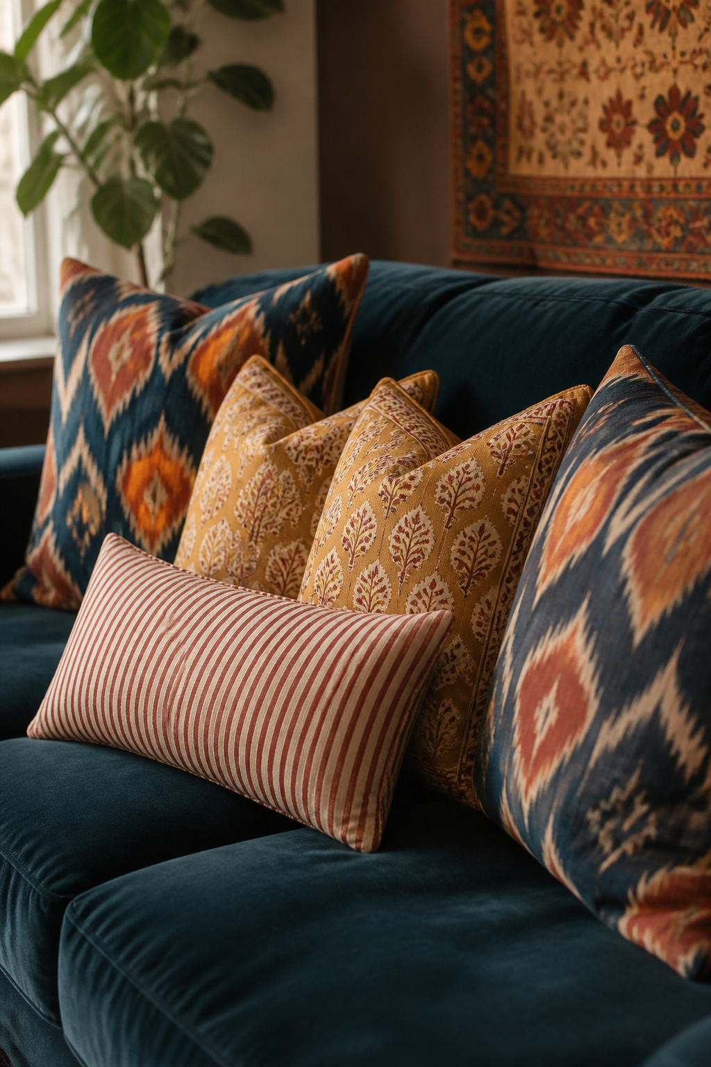
The rule: one large-scale pattern as the anchor (bold ikat or dramatic floral), one medium-scale pattern (block print or geometric), one small-scale or near-solid element (fine stripe or textured plain). Vary the scale so patterns don’t compete for the same visual frequency. Stripes are the mediator that makes otherwise incompatible prints coexist. A simple stripe contains multiple colours and no defined motif. That quality gives it an unusual ability to harmonise ikat with geometric with block print. Also, all three patterns should share at least one colour — that shared note is the hidden wire holding the arrangement together.
Ikat’s characteristic blurred dye edge — the result of resist-dyeing threads before weaving — makes it easier to mix with other patterns than you’d expect. The soft outline prevents clashing with more precise prints. Kantha, with its running-stitch texture on layered cotton, adds tactile variation even within the same pattern family. For a standard three-seat sofa: two large 22-inch pillows at each end in the boldest pattern, two medium 18-inch block prints in the centre, one long lumbar in a coordinating stripe. Avoid the matching sets sold as units — sourcing from different places is what creates the collected quality.
5. Woven Wall Hanging as a Textile Focal Point
The most common mistake with a woven or macramé wall hanging is buying one that’s too small. A 24-inch hanging above a standard sofa reads as an afterthought. At 60 inches wide on a 96-inch sofa, the same type of piece becomes a genuine statement. Scale is the entire conversation here.
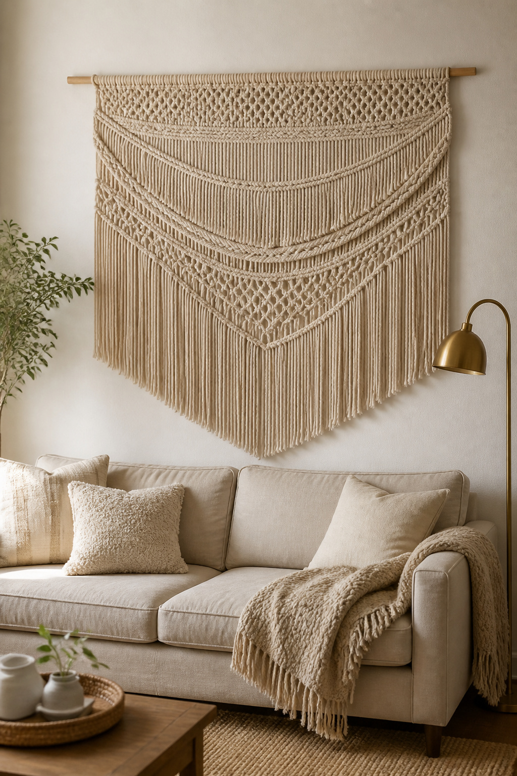
The sizing rules are clear. The hanging should cover approximately 60–75% of the visible wall space. It should be roughly two-thirds the width of the furniture below. For a wall section 100 inches wide, you’re looking at a hanging of 60–75 inches. Hang it so the bottom edge sits 6–8 inches above the sofa back. The sofa provides the visual ballast the hanging needs to hold its position. Without furniture below, centre the piece at 57–60 inches from the floor.
Macramé produces strong shadow play and geometric patterns. It leans casual at small sizes but achieves drama when scaled generously. Woven tapestries produce a more pictorial surface — closer to a textile painting — and suit more formal rooms. The South Asian tradition of dhurrie weaving and kantha wall art translates directly to contemporary wall hangings. Both the technique and the geometric vocabulary are at home in a fusion living room. For natural material hangings in undyed cotton, raw jute, or natural wool, expect to pay £80–£400 from artisan makers for proper statement sizing.
6. A Bold Area Rug as the Living Room Decor Foundation
Every interior designer says the same thing. Almost no one believes them until they’ve made the mistake once: choose the rug before almost everything else. Not after the sofa. Not once the curtains are hung. First. The rug establishes the colour story, defines the seating zone, and makes every subsequent furniture decision dramatically easier — which is what makes it the most important single living room decor investment in the room.
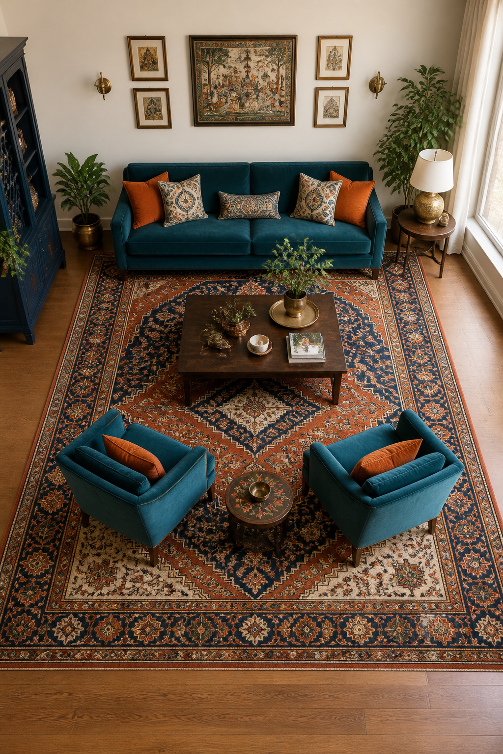
A complex-patterned rug contains five to seven distinct colours. Buying it first gives you a ready-made living room colour scheme to pull from for cushions, art, curtains, and accent pieces. It defines where life happens in the room, which shapes the furniture layout, which shapes everything. Starting with a rug isn’t a stylistic preference — it’s a logical one.
Sizing is the most consequential decision. At minimum, all front legs of the sofa and main chairs should rest on the rug. A rug the furniture merely sits beside makes the arrangement look unanchored. Most designers prefer all four legs on for primary seating, which requires at least an 8×10 foot rug. A 9×12 is the designer’s most-reached-for size for medium to large living rooms. It leaves 18–24 inches between the rug edge and the wall — enough to show the floor without making the rug look like a bath mat. For a South Asian-inspired room, a vintage-style Persian or hand-woven dhurrie in indigo, rust, and cream provides the strongest possible foundation. As a broader look at living room decor ideas for apartments confirms, even in tight spaces, a properly sized rug dramatically changes how grounded a room feels.
Dhurrie vs Persian: Choosing Your Style
Dhurrie rugs — Indian cotton flatweave in bold geometrics — are lighter, easier to clean, and more casual than Persian pile rugs. They suit modern or bohemian rooms and handle high traffic well. Vintage-style Persian pile rugs, by contrast, bring a complexity and depth of pattern that can anchor the most demanding living room. Both traditions have produced exceptional floor textiles for centuries. Neither choice is wrong; both carry cultural weight.
7. Statement Floor Lamp With an Architectural Silhouette
No single lighting fixture works harder in a living room than a well-chosen floor lamp. Overhead lights illuminate a room uniformly and flatly. That’s functional but not transformative. A floor lamp creates a zone of warm light. It defines where life happens in the evening. And it contributes a sculptural element that reads as furniture rather than fixture. The combination of form and function in a single piece is relatively rare in interior design — worth taking seriously.
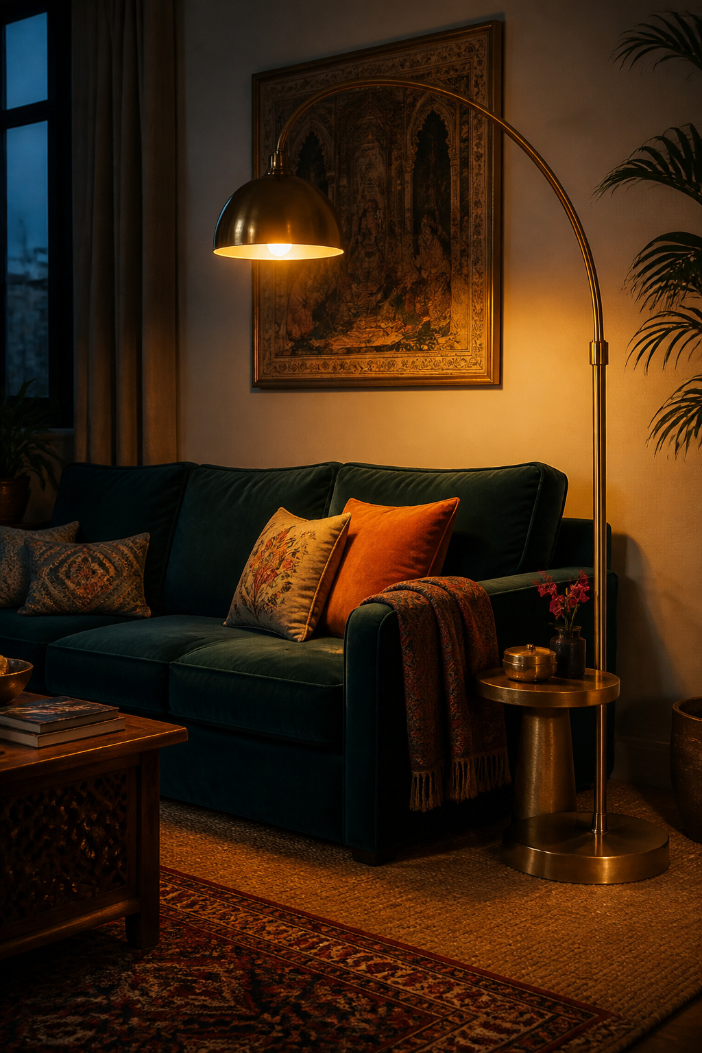
The three main floor lamp profiles suit different rooms. Arc lamps — where the base sits beside a sofa and the arm sweeps overhead — are ideal for rooms without a ceiling fixture. They create an intimate reading pool directly above a floating sofa. Note that the bases are heavy (6–10kg) and take up floor space. Tripod lamps, with three-legged wooden bases and drum shades, read as furniture-like and sculptural. They work best on the open side of a sofa or in a corner where the base can be seen. Column lamps have the smallest footprint and cast light upward to bounce off the ceiling — right for small rooms or beside a reading chair rather than a sofa.
Choosing the Right Profile for Your Room
For a South Asian-inspired room, a brass arc lamp or a tripod with a brass-and-rattan shade keeps the material palette running into the lighting scheme. Standard floor lamp height is 58–64 inches. The shade should sit at or just above seated eye level to avoid glare. Position the base where it’s visible — a lamp hidden in a dark corner gives ambient light but loses its sculptural value entirely. For further ideas on layering light at different heights, small living room lighting solutions offers practical guidance on the layered approach in tighter spaces.
8. Deep-Toned Curtain Panels That Frame the Room
The most transformative curtain upgrade available — one that adds almost no cost to a standard off-the-shelf pair — is to mount the rod at ceiling height rather than above the window frame. The continuous vertical line from ceiling to floor is one of the most effective proportion tricks in interior design. The difference between a rod mounted 4 inches above the window and one mounted 2 inches below the ceiling can make the same 8-foot room feel 10 feet tall.
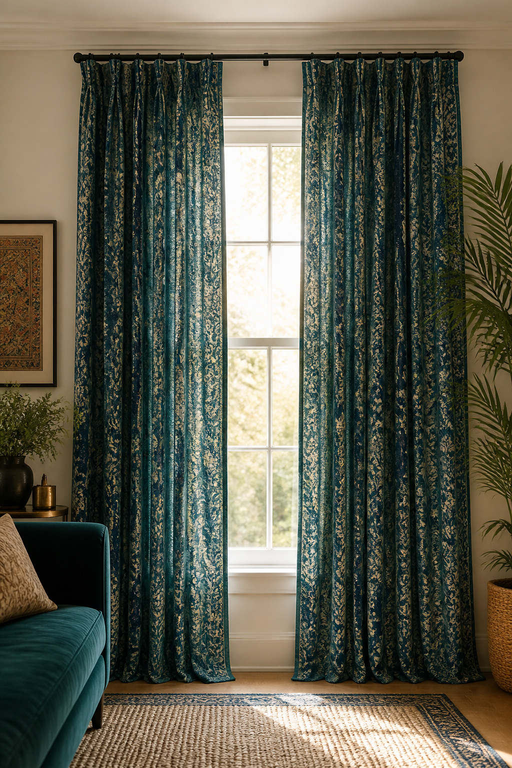
The rod should also extend at least 6 inches beyond the window frame on each side. This allows the curtain panels to stack entirely clear of the glass when open. It maximises natural light, makes the window appear wider, and creates the full-panel silhouette that reads as considered rather than merely functional.
Fabric Choice Defines the Room’s Register
Washed linen in deep teal, slate blue, forest green, or warm charcoal diffuses light softly. It suits rooms that want warmth without formality. The slight rumple of washed linen is a feature, not a flaw. Velvet hangs heavily and puddles beautifully at the hem. It blocks considerably more light and sound, and it’s the right choice for rooms where theatre and intimacy are priorities. Indian block-print cotton in indigo or rust on cream makes curtains that function as a design statement. The hand-printing process produces slight variations in each panel — a crafted, individual quality that machine-produced fabric can’t replicate. Always line velvet; the weight improves drape and prevents fading. Linen can go either way, depending on whether you want to block or diffuse the light.
9. Coffee Table Styling as Living Room Decor: The Curated Vignette
A coffee table styled well is a portable vignette — a complete, self-contained arrangement that happens to sit at the room’s physical and visual centre. The principle is straightforward: a tray creates the frame, three heights create the structure, and three texture categories create the depth. Within that framework, the living room decor choices are specific to you and the objects you carry with you.
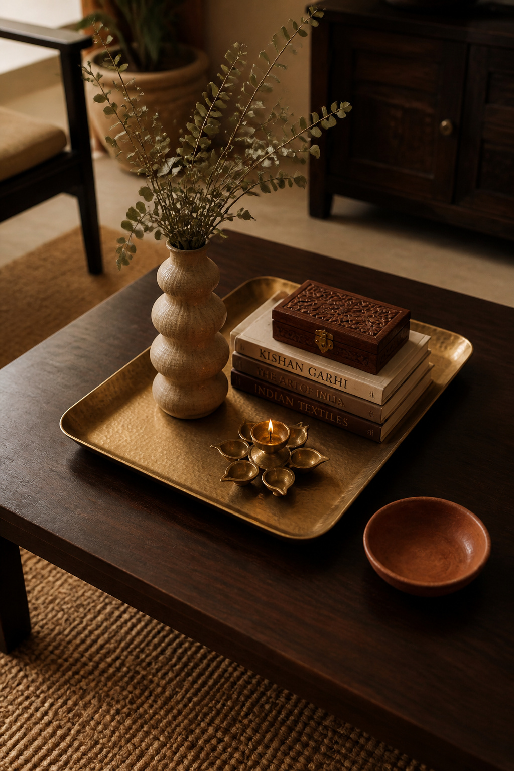
Start with the tray. A hand-beaten brass tray (approximately 12×18 inches) creates a portable vignette that holds its arrangement as a unit. When the table is needed for actual use, you relocate the tray intact and restyle in seconds. The tray should cover roughly one-third of the coffee table surface. This leaves room for a drink, a remote, or a secondary arrangement on the other side.
Within the tray: position the tallest element first (a sculptural vase, a tall candle, a stack of three art books topped with a small brass bowl). Then the lowest element (an open book face-down, a decorative stone, a small shallow dish). Then fill with the medium elements. Three texture categories, minimum: smooth (ceramic, lacquer, glass), rough or matte (stone, wood, woven material), and organic (a stem of fresh eucalyptus, a small plant, dried botanicals). A brass urli bowl with a floating candle satisfies both the smooth and organic requirements in one object.
Permanent vs Seasonal Arrangement
Keep the tray, the tallest structural element, and one botanical as the permanent core. Rotate the candle scent, the flowers, and one accent object with the seasons. This refreshes the room without a full restyling four times a year. For a deeper look at coffee table aesthetics, from minimal to maximalist, coffee table ideas and luxury styling covers the full range.
10. Artisanal Pottery and Ceramic Vessels in a Considered Arrangement
Handmade pottery changes the quality of a shelf or mantelpiece in a way manufactured ceramics rarely match. The imperfections of making are its most valuable design quality. Irregular surfaces, pooling glazes, visible throwing marks, slight asymmetry — these are what make a piece interesting from across a room. A shelf of hand-thrown ceramics in earthy glazes (celadon, ash grey, terracotta, iron oxide red) picks up ambient warm light in a way glossy white production ceramics don’t.
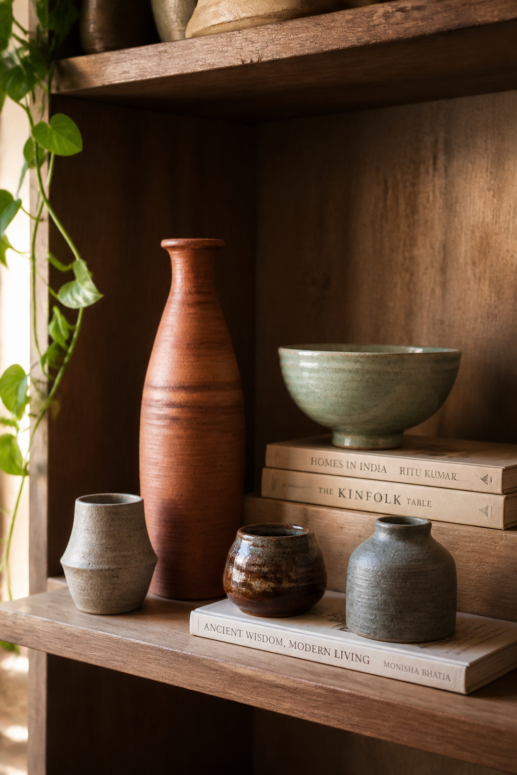
The principle for arrangement: odd numbers, height variation, and generous negative space. Group three pieces so their heights form a triangle — tall at back-left, medium at right, small at front-centre. This creates depth within a flat shelf plane. Cluster ceramics by tone rather than mixing randomly. Earthy terracottas together, cool celadons together. Leave breathing room between each cluster. The space around pieces is as important as the pieces themselves.
The most striking ceramic placement in a living room is often the one that surprises: a large floor vase, 18–24 inches tall, positioned in a corner beside the sofa. At that scale, a ceramic becomes architecture rather than accessory. On a mantelpiece, a grouping of three to five pieces at varying heights — anchored by one larger central piece — is the classic arrangement for good reason. On open shelving, ceramics work best when alternated with horizontal book stacks and one or two small botanical elements. The books serve as platforms. The botanicals prevent the shelf reading as static.
11. Accent Chair in a Bold Print or Contrasting Textile
A single bold accent chair consistently outperforms two matching chairs that hedge their bets. The matched pair produces symmetry — formal, considered, and ultimately predictable. A single bold chair produces a statement: a point of view, a personality. The difference is between a room that has been put together and one that belongs to someone.
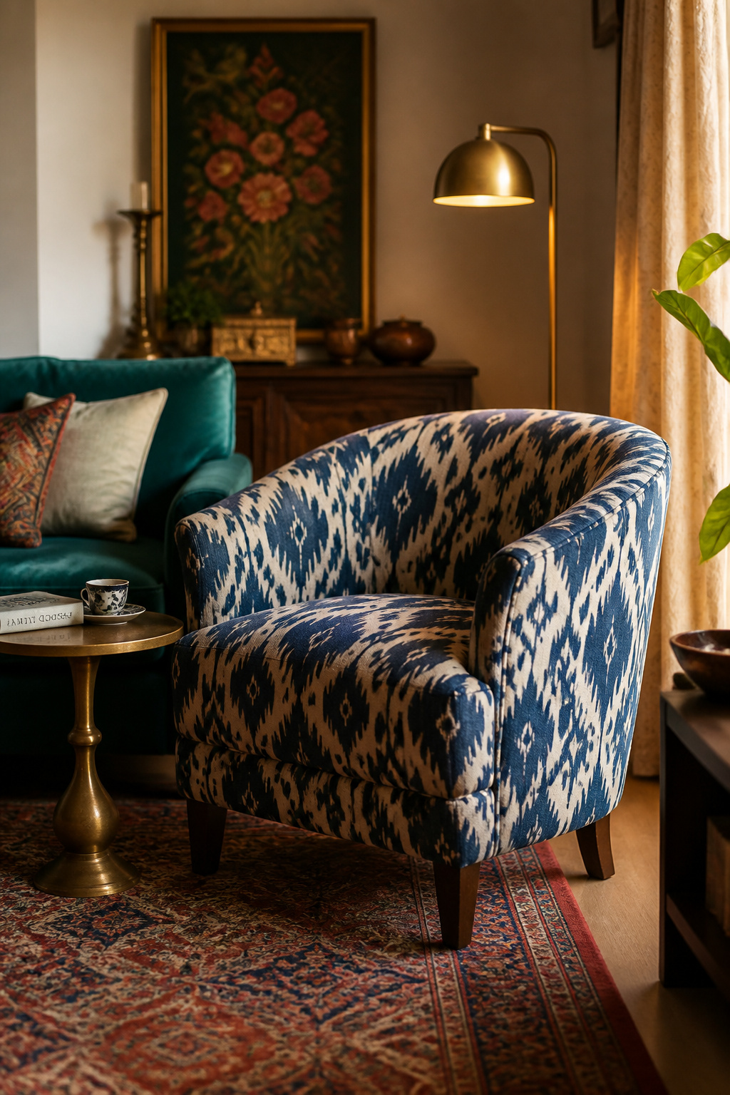
Ikat upholstery works particularly well on an accent chair. The blurred dye pattern creates a visual vibration strong from across the room, but it softens on close approach. That quality — powerful at distance, refined up close — is exactly what you want in a statement chair. Boucle in warm ivory or cream provides textural contrast without colour competition, reading as sophisticated restraint against a jewel-toned sofa. Printed velvet — a terracotta floral velvet chair beside an emerald sofa — creates sophisticated contrast rather than colour confusion.
The Anchoring Rule
The anchoring rule applies to bold chairs: whatever colour dominates the chair, repeat it at least twice elsewhere in the room. An ikat chair in indigo and cream needs a throw pillow in indigo and perhaps a ceramic in blue-adjacent tones. Without that repetition, the chair reads as an afterthought rather than a choice. For placement: angle the chair at approximately 45 degrees toward the sofa rather than parallel to it. The angled placement looks more dynamic. It also facilitates actual conversation better than furniture facing perfectly opposite each other. Keep 3–4 feet between the sofa and chair for a comfortable conversation group. There’s considerably more on the logic of chair placement in this guide to living room chair decor and placement.
12. Maximalist Shelf Display: Living Room Decor Ideas for the Object-Lover
The design tendency known as bookshelf wealth — shelves filled with books and objects that reveal the inhabitant’s life and interests — is one of the more genuinely appealing maximalist living room ideas of recent years. It doesn’t require a renovation or a particular budget. It requires objects that mean something and the willingness to edit them. The key distinction: in intentional maximalism, every object is visible and has room to be seen. In clutter, objects obscure each other.
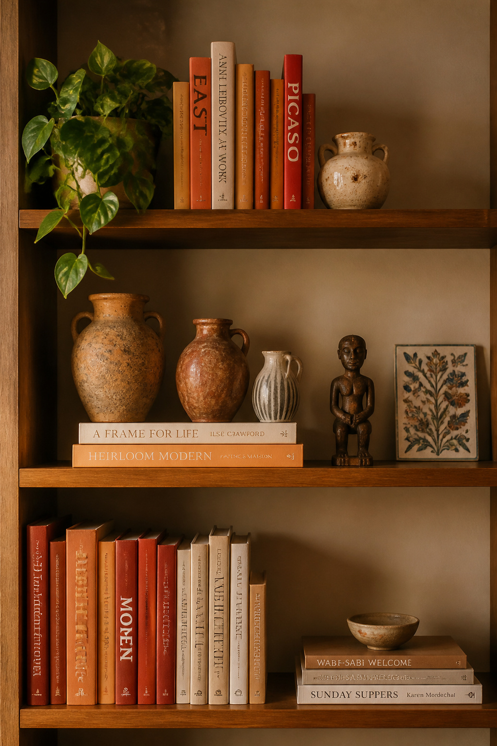
The three-category framework holds everything together. Books provide structure and background. Decorative objects bring personality and colour. Botanical elements add organic irregularity that prevents the shelf reading as static. Each category performs a different visual function. Books give the repeating vertical and horizontal rhythm that creates the shelf’s backbone. Objects — ceramics, brass pieces, travel artifacts, small sculptures — bring the individuality that makes a shelf interesting on repeated viewings. A trailing pothos or dried botanicals add the movement that manufactured objects can’t provide.
The 30% Breathing Room Rule
Stack some books horizontally (three to four per stack, creating platforms for smaller objects) and some upright. The alternation of vertical and horizontal books provides visual rhythm before a single object is added. Also, colour-block book spines within sections: a column of warm terracotta and rust spines creates a tonal anchor. The 30% breathing room rule applies throughout. A shelf should be at most 70% full. The remaining space gives the eye permission to rest between objects and makes each piece legible as an individual. For a South Asian collector, the story the objects tell is the point: a carved wooden piece from a Mysore market, a hand-painted tile from Rajasthan, a traditional brass container beside a contemporary art book — unified by material warmth and genuine attachment.
13. Candlelight and Lantern Clusters for Evening Living Room Depth
There is an evening transformation available to every living room. It costs almost nothing and has nothing to do with furniture. It involves candles, lanterns, and the willingness to let ambient light do what functional light cannot: warm a room, define its corners, and make it feel genuinely inhabited rather than simply illuminated.
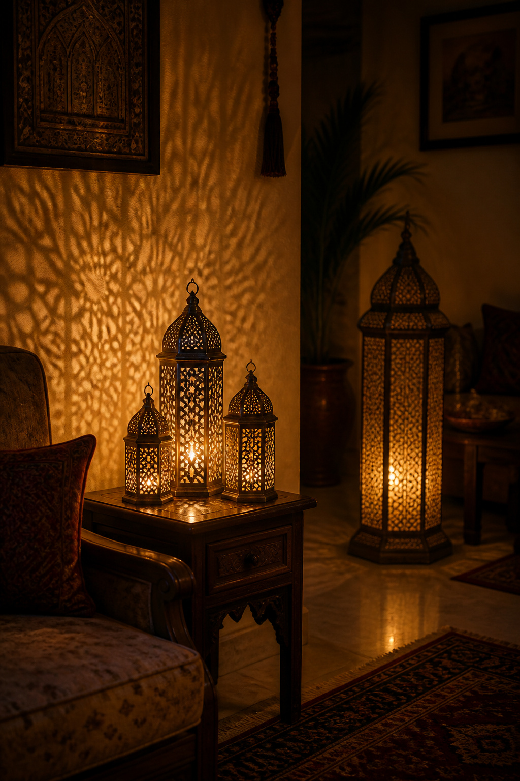
Candlelight operates at approximately 1800K colour temperature. That’s significantly warmer than even the warmest LED bulb (2700K), and incomparably warmer than standard overhead lighting. The effect of multiple small light sources spread around a room changes the perceived size, intimacy, and atmosphere of a space more profoundly than most furniture rearrangements do.
Moroccan and South Asian Lantern Traditions
Moroccan and South Asian lantern traditions offer the most visually rich ambient lighting options. Cut-metal or engraved-glass lanterns cast intricate geometric patterns onto surrounding walls and ceilings. A large brass floor lantern (50–70cm tall) in an unused corner beside a sofa, with a flameless LED candle inside, creates warm ambient light without fire risk. A trio of lanterns or candleholders at varying heights — 15cm, 25cm, 35cm — on a mantelpiece or side table produces significantly more atmospheric impact than a single larger piece. Scent is a design layer as legitimate as any visual element. For a room already carrying South Asian material culture — brass, terracotta, block print — sandalwood or oud candles deepen the room’s identity in a way no cushion can. For more on building an atmospheric evening living room, rustic living room lighting for ambient warmth covers layering strategies in detail.
14. Indoor Plants in Hand-Thrown Ceramics and Woven Baskets
The vessel carrying a plant is as much a design decision as the plant itself — possibly more so. While plants vary with seasons and light conditions, the pot sets the material register of the arrangement permanently. A fiddle leaf fig in a glazed white production planter looks contemporary and slightly clinical. The same plant in a hand-thrown terracotta pot looks chosen by someone with a point of view.
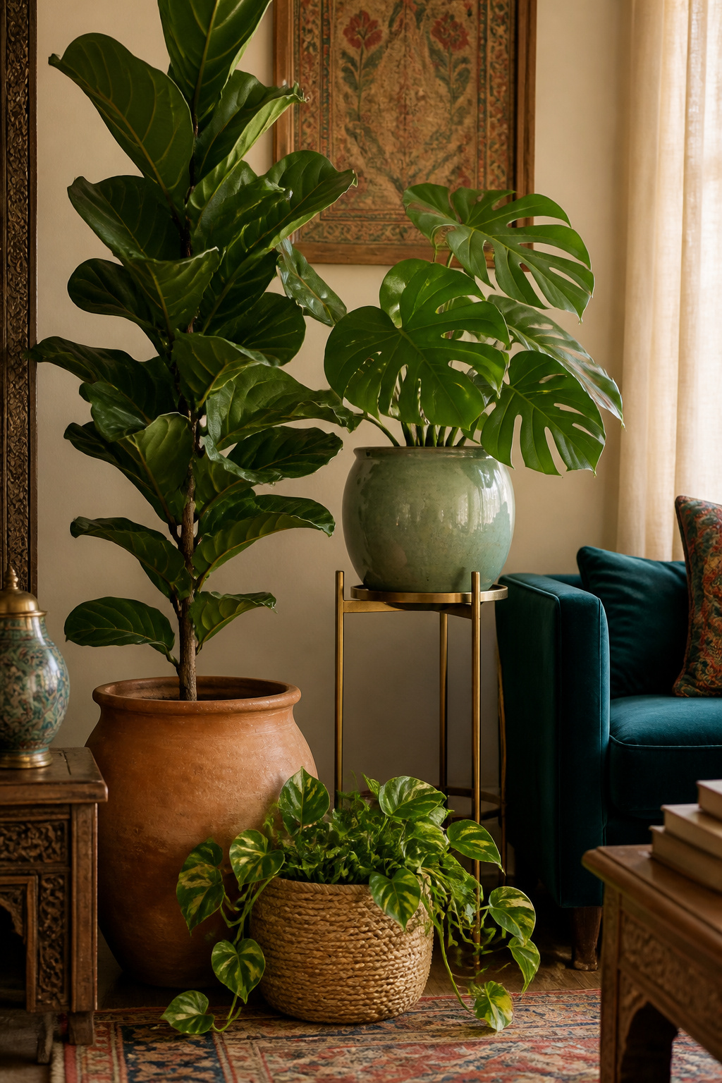
For strong visual architecture in a living room: the fiddle leaf fig (Ficus lyrata) brings a dramatic upright silhouette with large violin-shaped leaves. But it needs bright indirect light and does not forgive cold drafts from UK windows. Monstera deliciosa is more forgiving of inconsistent light and more dramatic over time. It grows into itself over years in a way that feels earned. The snake plant (Sansevieria) is the most genuinely low-maintenance option with real sculptural presence. It needs watering once every three to four weeks and tolerates near-neglect.
Unglazed terracotta is the most contextually authentic vessel for a South Asian-inspired room. It’s porous, letting roots breathe, and it warms beautifully with age. Woven baskets in jute or seagrass — used as cache pots — add warmth and textural interest at floor level. For a plant corner: one large floor plant (4–6 feet, in terracotta), one medium plant on a raised stool or brass plant stand (2–3 feet), one trailing or low plant at floor level. These three heights recreate the natural layering of a living ecosystem. For more on making tight spaces feel lush, apartment living room ideas that transform small spaces is worth exploring.
15. Mirror Arrangements and Metallic Surfaces as Final Living Room Decor Ideas
Mirrors are the living room’s light-multiplying tool — and also one of the most frequently misused. The design value of a mirror depends entirely on what it reflects. A mirror placed opposite a window doubles the natural light in the room and makes it feel larger at every time of day. A mirror placed opposite a blank wall doubles the blank wall. Before buying a mirror, stand where it will hang and look at what faces you. That is what the mirror will give back to the room.
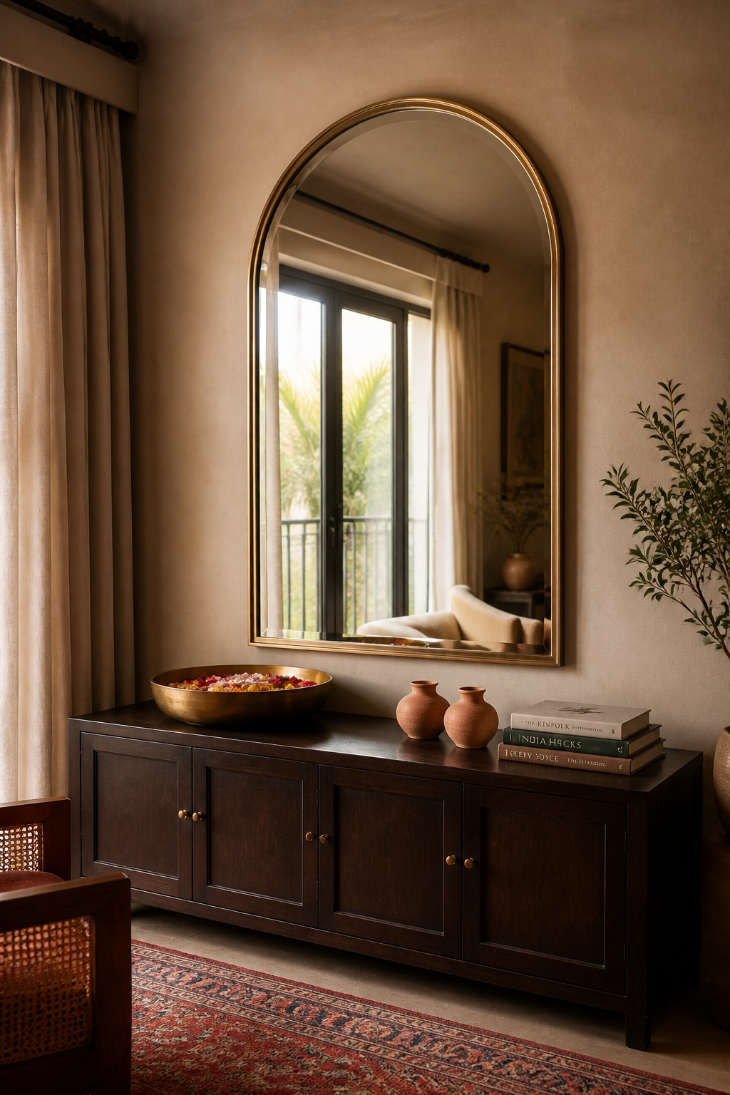
The arched mirror is currently one of the most versatile shapes for a living room focal wall. Its curved top softens rooms full of rectangular furniture and architectural lines. An arched mirror above a fireplace or mantelpiece creates a strong vertical axis. It draws the eye upward and makes the chimney breast the room’s most resolved feature. Scale matters: the mirror should be approximately two-thirds the width of the furniture below it. A mirror narrower than its console table looks diminished regardless of its quality.
The Metallic Hierarchy
For metallic surfaces throughout the room: designate one metal as dominant. Brass is the most versatile for warm-toned rooms. Use it in the largest visible pieces — floor lamp base, mirror frame, significant bowl or tray. A secondary metal (copper, aged gold, or bronze) appears in smaller accent pieces. Each metal should appear at least twice. A single brass lamp without another brass reference looks accidental. The contrast that makes metallic surfaces read best is proximity to matte, rough textures — terracotta ceramics, linen curtains, a jute rug. The roughness makes the metal gleam. So the living room decor ideas in this list form a connected material thread: the brass of the mirror frame echoes the lamp base, which echoes the urli bowl, which echoes the candleholder. Each element confirms the others.
How to Pull These Living Room Decor Ideas Together Without Starting Over
None of these living room decor ideas require a full renovation, a complete clear-out, or a large simultaneous investment. The sequencing matters more than the scale. And good living room styling is less about accumulation than about intention.
Start with the rug. It establishes the colour palette and defines the seating zone — every subsequent decision becomes a response to it rather than an independent variable. Then address the large furniture: sofa and chairs should respond to the rug, not fight it. Then the lighting infrastructure: floor lamp, table lamps, any ceiling fixture. Position these before accessories fill the surfaces and consume the floor space they’d need. Accessories come last — cushions, living room accessories like ceramics and candles, plants, mirrors. Bought at the end, every accessory responds to everything already present.
The deeper principle is even simpler: add one thing at a time and assess it in situ before the next purchase. A room built in stages over six to twelve months will always look more personal and more considered than one furnished in a weekend. The former suggests a life lived. The latter, a room staged. The most memorable living rooms aren’t the ones with the biggest budgets. They’re the ones where every piece — from the rug underfoot to the candle on the mantelpiece — seems to have been chosen by someone who knew exactly what they wanted and was patient enough to wait for the right version of it.