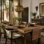
The kitchen is the room where people most reliably talk themselves out of wallpaper. Too much steam, too much risk. But that conversation misses something important: kitchen wallpaper has fundamentally changed. Washable vinyl-backed papers, moisture-resistant non-woven versions, and peel-and-stick formats have closed the gap between beauty and practicality. The objections are largely solved.
What remains is the design question — and kitchen wallpaper inspiration is richer right now than at any point in recent memory. As someone who works across global design traditions, with textiles and patterns drawn from dozens of craft cultures, I find the kitchen wall conversation one of the most creatively open in interior design. From a single Moroccan tile-effect panel to a full-room botanical installation, the decisions are genuinely interesting.
This selection moves from quiet and tonal through to bold and graphic. Whether you’re renting and need reversible options or committed to a permanent transformation, there’s kitchen wallpaper inspiration here that will shift how you see your space.
1. Botanical Print Kitchen Wallpaper Inspiration for a Garden Aesthetic
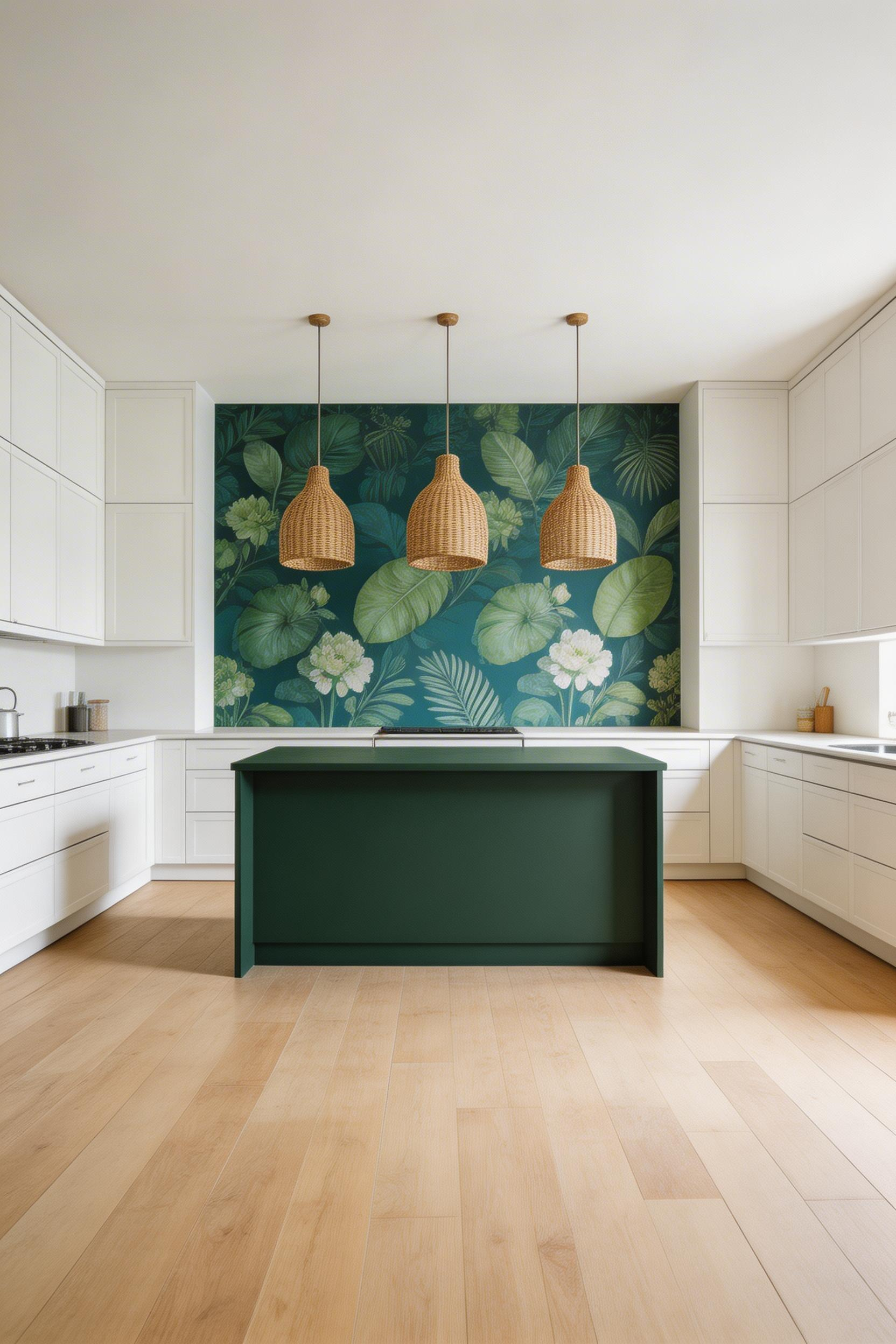
There’s a narrative logic to botanical wallpaper in a kitchen that doesn’t exist anywhere else in the house. Kitchen gardens have been paired with botanical illustration for centuries. The idea that the plants outside find their way onto the walls inside feels purposeful rather than merely decorative.
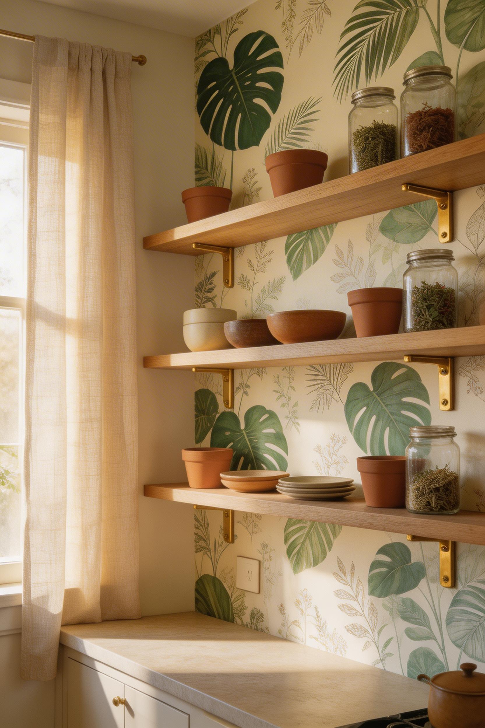
Graham & Brown leads the accessible end of the market with moisture-resistant vinyl botanical collections. Their rolls cover around 56 sq ft. For more design weight, Sanderson’s Fan Palm print is available in Linen, Charcoal, and Rhodera colourways. It uses metallic inks and fine linework — a visual complexity most botanical wallpapers can’t match. The Charcoal version brings a dark-ground drama that’s rare in the category. Cole & Son’s non-woven versions are the practical choice for walls that may need replastering behind appliances. Strippable backing makes future renovation less disruptive.
How to Scale and Place Botanical Prints
For most kitchen walls, a large-scale repeat works better than a small one. On a typical 8-10 ft wall, small repeats compete with cabinet hardware and tile grout lines. They create noise rather than the lush effect they’re meant to achieve. A single botanical feature wall behind open shelving lets the pattern breathe. Style those shelves with terracotta pots, sage green ceramics, and brass shelf brackets. That combination genuinely earns the description ‘kitchen garden aesthetic.’
2. Geometric Kitchen Wallpaper for Bold Contemporary Kitchens
Geometric wallpaper and kitchens share an architectural logic that other pattern types lack. Kitchens are already geometric spaces — parallel cabinet doors, rectangular appliances, tile grids. A geometric pattern on the walls rhymes with the room’s structure. The pattern feels placed rather than applied.
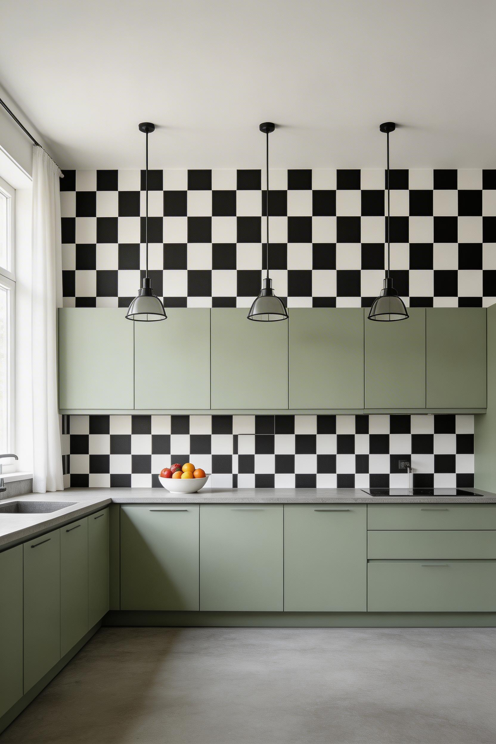
In 2025, checkerboard patterns are the dominant kitchen geometric trend. Vinyl versions that mimic real tile texture are particularly popular. The retro Art Deco adjacency is deliberate: golden-era geometry in rich colour — warm orange, deep green, amber — is making a confident return. If you’ve been waiting for permission to try something bolder, the current trend cycle provides it.
One practical consideration gets overlooked consistently: the relationship between geometric wallpaper and cabinet finish. Strong geometric patterns need a matte-finish cabinet to ground them. High-contrast geometric wallpaper combined with gloss-fronted units creates visual noise rather than layered sophistication. A putty, warm white, or soft sage matte cabinet lets the pattern work without competition. For contemporary kitchen design that balances pattern impact with clean functionality, geometric wallpaper is one of the most efficient tools available.
3. Moroccan Tile-Effect Wallpaper for Your Kitchen Walls
Real zellige tile — the hand-pressed, kiln-fired Moroccan mosaic with natural colour variation — costs more than most kitchen renovation budgets allow. A single square metre of artisan zellige can exceed the cost of an entire roll of quality tile-effect wallpaper. The visual story is worth having. The financial commitment doesn’t have to be.
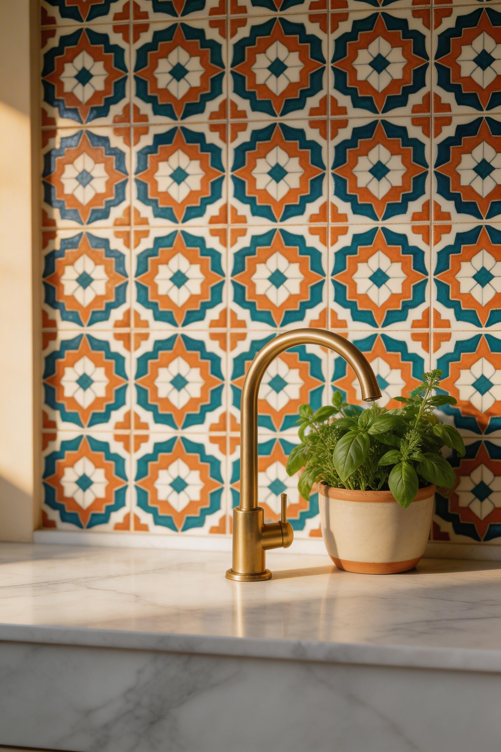
Tile-effect kitchen wallpaper in the zellige tradition captures geometric richness through sophisticated printed variation within the repeat. Hovia’s Zellige Tile Effect Wallpaper delivers this at mural scale. Tempaper’s Soleil Black Cream variant brings the graphic side of Moroccan geometric pattern in peel-and-stick format. That’s particularly useful for rental kitchens where the look is desired without permanent installation.
The practical sweet spot is splashback height — a 60-80 cm band above the worktop. That creates a strong visual without floor-to-ceiling commitment. PVC-free, UV-cured inks on polyester woven fabric give the most fade-resistant result in kitchen conditions. Smooth surface finishes are essential near the kitchen. They clean easily with a damp cloth without the pattern degrading. For readers drawn to surface pattern in kitchens, kitchen tile design ideas for an inspired home cover the real-tile options thoroughly. The wallpaper and tile decisions inform each other.
4. Chinoiserie Patterns: Timeless Art for Kitchen Walls
Chinoiserie emerged from 17th-century European ateliers as a creative reimagining of Chinese decorative language. It wasn’t a copy of Chinese art. It was a cultural conversation — filtered through European Rococo sensibility, producing something that belonged to neither tradition purely but drew richly from both. That cross-cultural generosity is why I find it genuinely compelling.
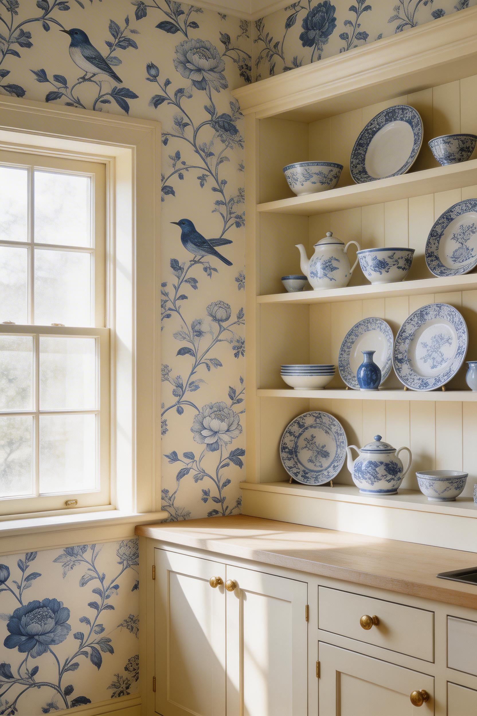
In a kitchen, chinoiserie’s characteristic palette reads as calm and collected. Cool blues drawn from blue-and-white porcelain, washed-out pinks, and layered greens in natural compositions of birds, flowers, and vines — these are colours that don’t demand attention. Warm-toned versions with cream grounds and amber-green foliage give a kitchen a welcoming atmosphere. They work particularly well with off-white or cream cabinetry. Pairing chinoiserie wallpaper with unlacquered brass hardware is a classically correct combination that also happens to be current: the brass picks out the warm linework tones without any forced coordination.
If you’re drawn to chinoiserie but find traditional figurative versions too period-specific for your kitchen aesthetic, look at abstract botanical-fragment versions. Loose compositions with flowers and foliage, but without the full bird-and-branch narrative, feel contemporary. Monochrome chinoiserie on a linen ground — crisp black linework, no colour wash — is the most kitchen-compatible version. It’s graphic, clean, and legible against grey or white cabinetry. Just don’t match the chinoiserie’s blue tones to accent colours elsewhere. Let the pattern’s own palette lead.
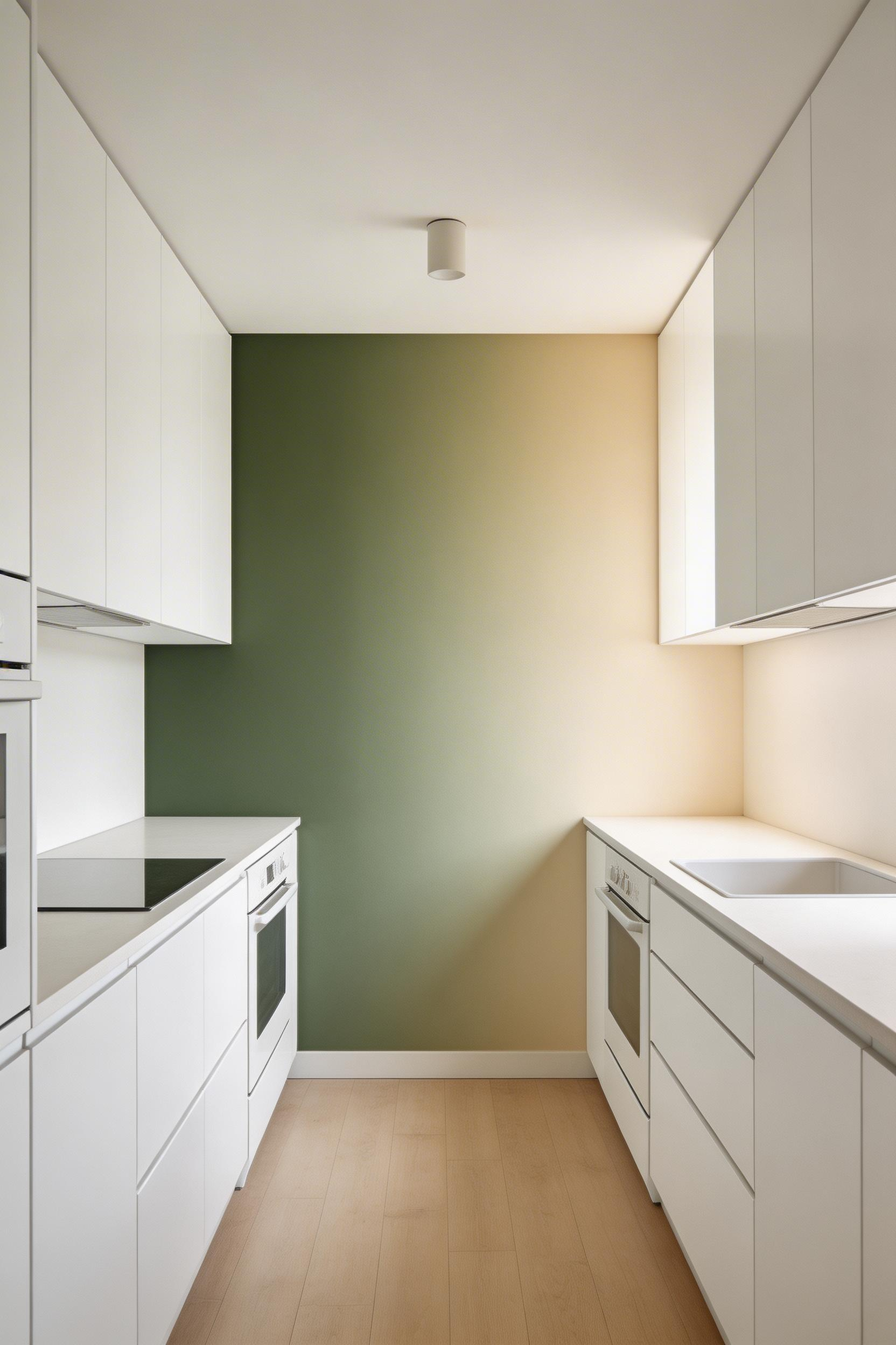
5. Moody Dark Kitchen Wallpaper Ideas for Dramatic Interiors
The counter-intuitive case for dark kitchen wallpaper is also the most persuasive one: a dark wall makes a kitchen feel like a composed room rather than a utility space. Navy blue, charcoal grey, and deep forest green are the three dominant palettes in 2024-2025. Each can transform a kitchen that has been designed but never quite felt designed.
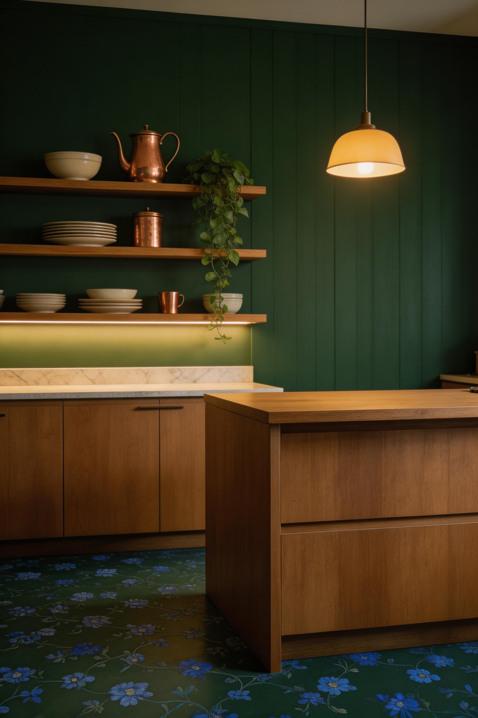
Matte finishes are the correct choice when your lighting is considered. They create a cosy, absorptive quality the room reads as intentional. In kitchens with limited natural light, a satin finish compensates by bouncing available light. It creates drama without oppression. The practical companion to dark kitchen wallpaper is always good supplementary lighting. Under-cabinet strips, pendant lights above islands, and task lighting at the cooking position are non-negotiable.
Where Dark Wallpaper Works Best
The most effective applications are the most contained ones. A dark panel in the alcove behind open shelving makes displayed ceramics and glassware pop against the ground. Objects that would disappear against a white wall suddenly become exhibits. The wall behind a range cooker works equally well. Framed by cabinetry on both sides, a dark wallpaper panel turns the cooking zone into a focal composition. Selective darkness, rather than full-room commitment, is consistently the more sophisticated approach.
6. Peel-and-Stick Wallpaper for Renter-Friendly Kitchen Updates
The quality gap between peel-and-stick and traditional wallpaper has largely closed for the best products. Tempaper consistently tops independent testing for ease of application, appearance, durability, and value. It uses a removable adhesive that sticks to most surfaces — including slightly textured walls — without leaving sticky residue. It’s explicitly marketed as a kitchen backsplash solution. That specificity matters when choosing peel-and-stick for kitchen use.
RoomMates uses a proprietary adhesive that stays repositionable for 7 days before setting. That’s useful for pattern alignment during installation. However, independent testing showed it performs poorly on heavily textured walls and can fail overnight. NuWallpaper is fully removable and damage-free but shares the heavy-texture limitation. For all peel-and-stick products, surface preparation is critical. Kitchen walls accumulate a fine oil film from cooking. That film defeats adhesive regardless of brand. Degrease thoroughly before installation.
One application most people don’t think of: the interior back panel of glass-front cabinet doors. Applying peel-and-stick wallpaper there adds pattern visible through the glass. It creates a layered design detail. And it requires such a small quantity of product that even an expensive pattern becomes accessible. Cut precisely with a craft knife and steel rule for clean edges. For more ideas on bringing your kitchen walls to life, there’s a full range of approaches beyond wallpaper that complement these choices.
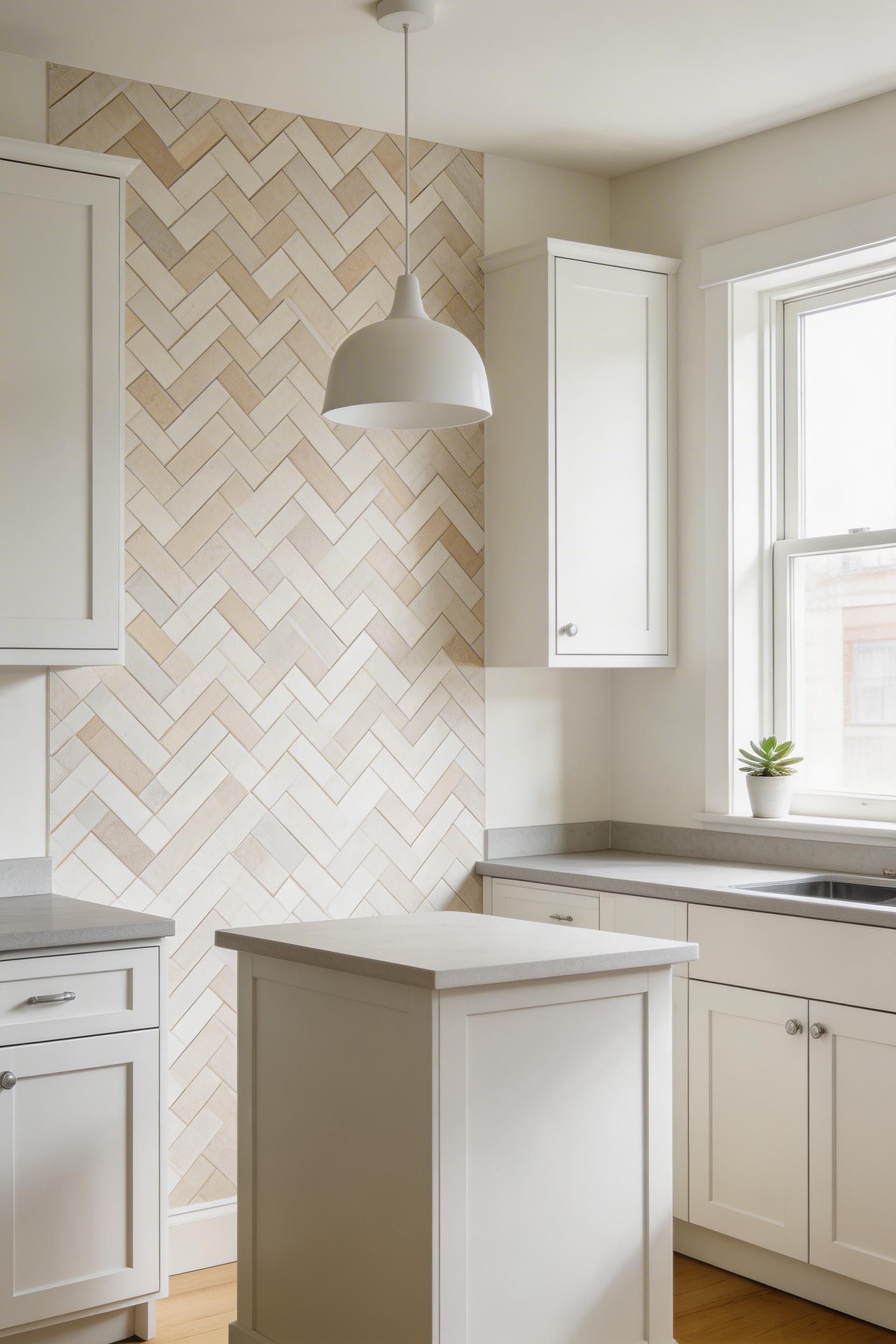
7. Herringbone and Stripe Kitchen Wallpaper Inspiration for Timeless Kitchens
Stripe and herringbone are among the most spatially useful wallpaper patterns for a kitchen. Their effects are predictable and measurable. You’re not choosing these for narrative content — you’re choosing them because your kitchen has a spatial problem and you want to address it through pattern. That functional clarity is, in its own way, a design virtue.
Vertical stripes in lighter colours make rooms appear taller. That’s directly useful for low-ceiling kitchens where the 8 ft standard ceiling creates pressure. Horizontal stripes visually widen a narrow room — the correct choice for galley kitchens where breadth is the spatial limitation. Herringbone sits between the two. The alternating V-shaped peaks create diagonal movement and visual energy. For a typical 8-10 ft kitchen, herringbone peaks around 2.5 inches with a 4-6 inch overall weave gives the right balance.
Stripe choice deserves more consideration than it usually receives. Narrow vertical stripes (2-3 inches) read as Regency and formal. They’re appropriate for a kitchen with traditional cabinet profiles, marble worktops, and period hardware. Wide vertical stripes (5-8 inches) feel contemporary and relaxed. Better suited to modern flat-fronted kitchens. Alternating wide and narrow stripes avoid the mechanical uniformity of equal-width versions. They read as more artisan. This range of kitchen wallpaper inspiration — from herringbone to broad stripe — shows how linear pattern can serve very different design languages while delivering the same spatial utility.
8. Watercolour Floral Wallpaper for Soft and Romantic Kitchen Spaces
Stone and steel kitchens — the dominant aesthetic of the past decade — are beautiful until they’re not. The hard surfaces and industrial references can tip from sophisticated to clinical without much warning. That’s particularly true in smaller kitchens where there’s no breathing room in the scheme. Watercolour floral wallpaper is the most direct antidote. Soft bleeding edges, organic forms, and tonal depth introduce the warmth that a room full of engineered surfaces often needs.
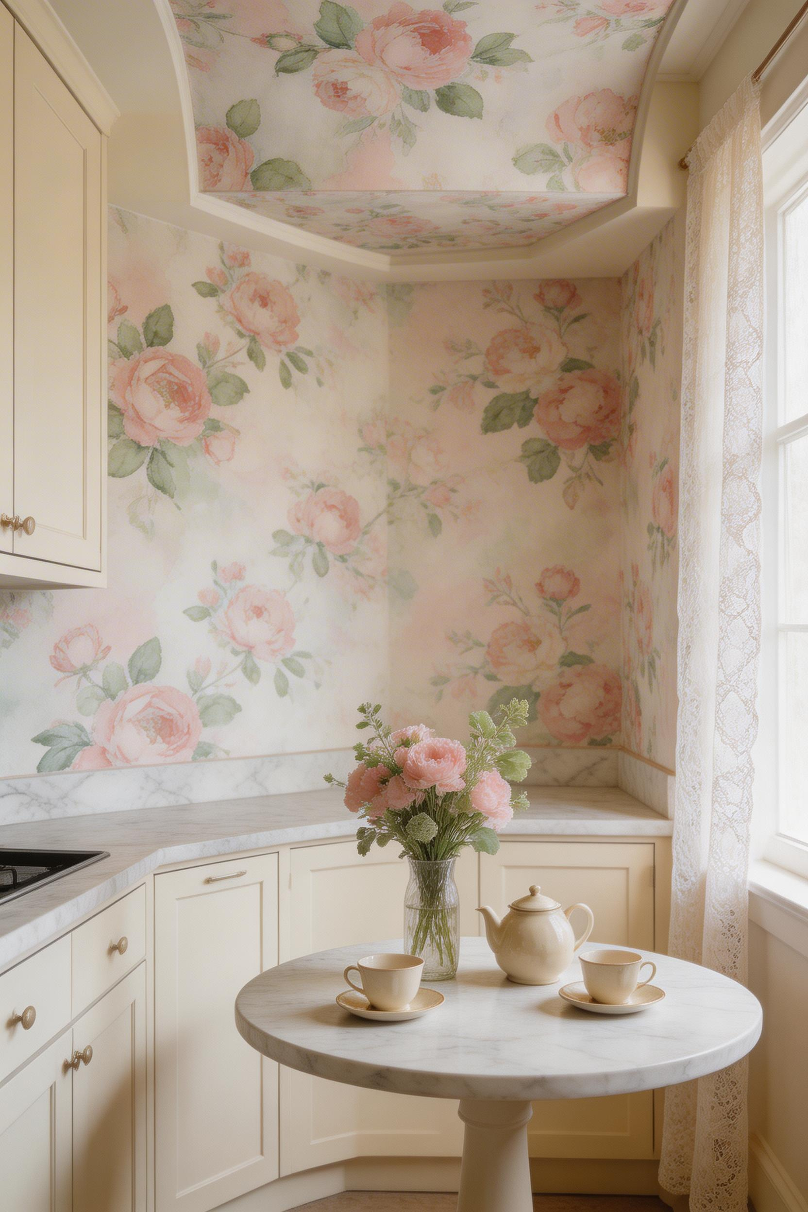
Quality here is immediately visible. Premium watercolour floral wallpaper is printed on heavyweight vinyl with a canvas-textured finish. Thin plastic substrates undermine the delicacy of the painted source material. Glossy or satin-finish versions miss the point entirely. The sheen destroys the painted quality that makes a watercolour floral distinctive. Look for matte finish, heavyweight construction, and — for a kitchen specifically — a washable nonwoven vinyl specification. That allows daily cleaning without degrading the pattern over time.
Colour temperature matters more for watercolour florals than for most wallpaper types. White and cream cabinetry are the natural companions. The soft transitions in a floral composition benefit from neutral surroundings that don’t compete with the pattern’s own colour story. Grey kitchen cabinets are a consistently underrated pairing. The grey reads as a sophisticated neutral. It allows soft pinks, warm blues, and botanical greens to register without the hard contrast of white. For a more intimate application, consider applying watercolour floral to a single ceiling recess above a breakfast nook. The canopy effect it creates is one of the genuinely surprising transformations available in kitchen design.
9. Industrial Brick-Effect Wallpaper Ideas for Kitchen Character
The warmth of raw masonry against smooth kitchen cabinetry is one of the more reliable design contrasts in kitchen design. Visual tension between rough and smooth, aged and new, natural and manufactured — it consistently produces results that a wall of the same material would not. Brick-effect wallpaper delivers this without the structural implications of actual exposed brick or the hygiene challenges that unsealed masonry creates in a cooking environment.
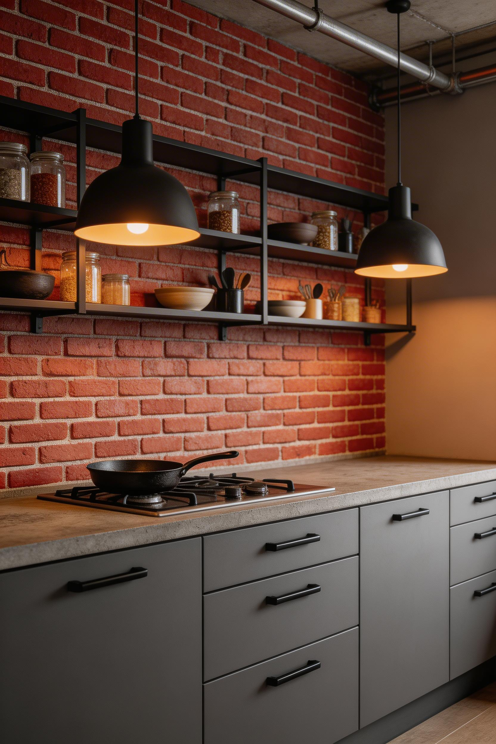
Modern 3D textured brick wallpaper has moved well beyond the flat printed versions that gave the category a dated reputation. Advanced printing and embossed finishes create a genuinely immersive material effect. VEELIKE’s 3D textured peel-and-stick brick wallpaper and Arthouse and Muriva’s paste-the-wall versions work at a quality level that wouldn’t embarrass a well-considered kitchen scheme. Crown Wallpaper, established in 1839, is the heritage brand choice if quality provenance matters to you.
Styling With Industrial Hardware
Vinyl specification is non-negotiable for kitchens near cooking zones. It’s durable, easy to clean, and moisture-resistant. The styling combination that works best is the industrial hardware pairing: black metal cabinet handles, matte black pendant light frames, and black tap fittings. All in the same material language as the textured wall. Warm-toned brick reads better with copper and bronze hardware. Grey or white brick-effect works with matte black. For the lighting side of the scheme, the industrial kitchen light guide covers pendant and task lighting options with far more specificity than general advice allows.
10. Art Deco Kitchen Wallpaper for Glamorous Retro Interiors
Art Deco motifs were designed to be seen from a distance. The fan shapes, chevrons, sunbursts, and stylised florals of the 1920s and 1930s were created for grand rooms. They have a visual authority that makes them among the most effective choices for kitchen feature walls, where scale and impact are the goals. And in 2025, the trend data is explicit: retro Art Deco geometric patterns in rich colours are returning to kitchen design.
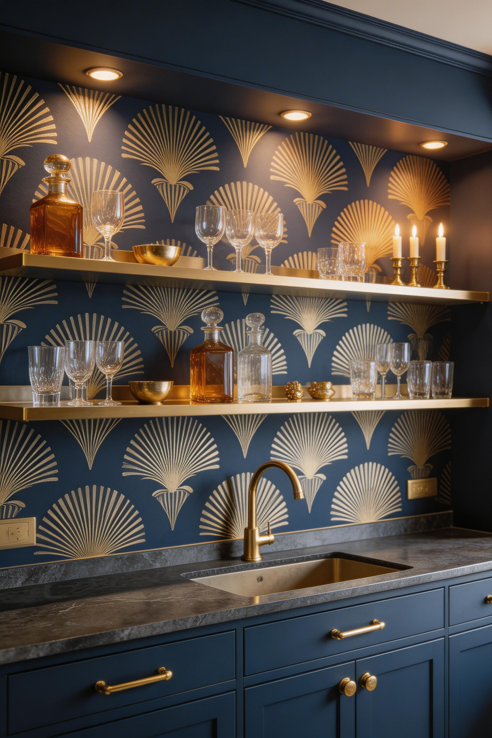
The kitchen-relevant Art Deco colour palettes are more flexible than the gold-and-black association might suggest. Gold and black remains the most luxuriant choice. Navy with brass accents gives a contemporary high-contrast reading that suits modern kitchens without feeling like a period recreation. Emerald green with warm metallics is the boldest current option. Off-white and grey Art Deco patterns are the most versatile. Rebel Walls carries 180+ Art Deco designs. Milton & King and Love vs. Design both have strong collections spanning budget-accessible to premium.
Art Deco wallpaper in a kitchen requires architectural containment. An alcove, a chimney breast behind the range, or a short end wall works better than a continuous run around all four walls. The most effective application is Art Deco wallpaper behind open shelving styled with vintage glassware, amber glass storage jars, and brass accents. The fan-shape repeat creates a backdrop rhythm that objects placed in front of it complement rather than disrupt. Given the pattern’s historical associations with cocktail culture, a drinks cabinet or bar area within the kitchen is the other location where the choice feels specifically appropriate.
11. Kitchen Island Feature Wall: Bold Kitchen Wallpaper Ideas in Small Doses
The single-feature-wall approach to kitchen wallpaper is not a compromise — it’s a strategy. It allows bold patterns that would create visual exhaustion in a full-room application. It makes experimentation economically practical. And it exploits the architectural containment that most kitchens naturally provide: the chimney breast behind the range, the wall framed by cabinetry on both sides, the short end wall between dining and cooking zones.
Large-scale patterns on a single wall have a different visual weight than they would distributed across a full room. The same pattern that feels relentless across four walls reads as a deliberate composition on one. Bold but bounded. Confident rather than overwhelming.
Choosing Your Feature Wall
The wall behind the range hood is typically the most architecturally framed surface in a kitchen. It’s visible from the eating zone and naturally emphasised by the symmetrical cabinetry that flanks it. Think about sight lines from doorways and adjacent rooms. The best feature wall is usually the one you encounter first when entering the room. Avoid walls that are partially obscured by upper cabinets or appliances — the wallpaper needs a clear, uninterrupted expanse to read effectively.
For readers still deciding whether to commit to kitchen wallpaper at all, a feature wall is the most practical trial. Interior designers consistently recommend living with a large sample — at minimum A2 size, taped to the actual wall — for 24-48 hours before committing. The shift from morning light to artificial evening light changes a pattern’s character more than most people expect. The modern kitchen wallpaper ideas explored on this site offer a useful reference for how different patterns behave across different kitchen contexts.
12. Vintage Toile de Jouy Wallpaper for Country Kitchen Charm
In 1760, Christophe-Philippe Oberkampf established a textile factory in Jouy-en-Josas, southwest of Paris near Versailles. The Bièvre river’s water quality was ideal for processing fabric. That technical reason for a location became one of interior design’s most durable origin stories. Jean-Baptiste Huet, a Rococo painter, designed over 30,000 patterns for the factory: pastoral scenes, picnics, courting couples, rural landscapes. All rendered in a single ink colour on a light ground.
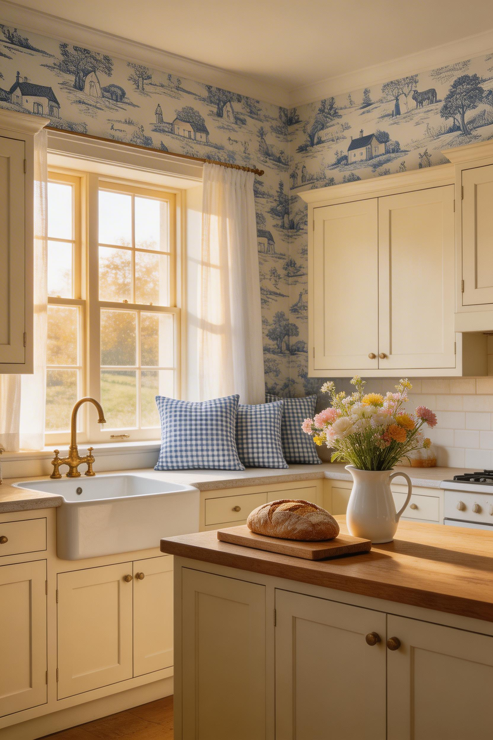
That restraint — one colour, one ground — is the pattern’s defining characteristic. No matter how intricate the individual motifs, the tonal simplicity of toile de Jouy reads as considered rather than busy. Blue-on-white is the most kitchen-compatible combination. It references the blue-and-white delftware and porcelain that has always been natural in a kitchen context. Red-on-cream suits country kitchens and pairs naturally with charcoal or navy as an accent. Contemporary dark-ground versions — khaki green, slate blue, or black grounds with cream motifs — bring the pattern into urban and open-plan kitchens where traditional country-house associations might feel incongruous.
Layering Toile With Kitchen Textiles
The layering principle that French country decorators apply instinctively is to mix toile with gingham, ticking stripe, or simple check textiles. Tea towels, chair cushions, table runners — any textile with low visual intensity. Both pattern types share the restraint principle rather than competing for the eye. Shaker cabinetry is the modern kitchen pairing that works best with toile. The clean geometry of Shaker door profiles contrasts productively with toile’s sinuous figurative motifs. For farmhouse kitchen ideas that carry this aesthetic through the whole scheme, the connection between toile’s pastoral origins and farmhouse kitchen design makes the combination feel less like a choice and more like an obvious consequence.
13. Tropical Leaf Kitchen Wallpaper Inspiration for Biophilic Spaces
Biophilic design research documents measurable benefits from nature-connected visual environments. Reduced stress, lower blood pressure, improved concentration, and better mental health through nature exposure — these are outcomes of spending daily time in a space that maintains a visual connection to living systems. A kitchen, where many people stand for 30-60 minutes at a time, is a high-priority space for this kind of wellbeing investment. Tropical leaf wallpaper is the most accessible biophilic kitchen wallpaper inspiration most people will encounter.
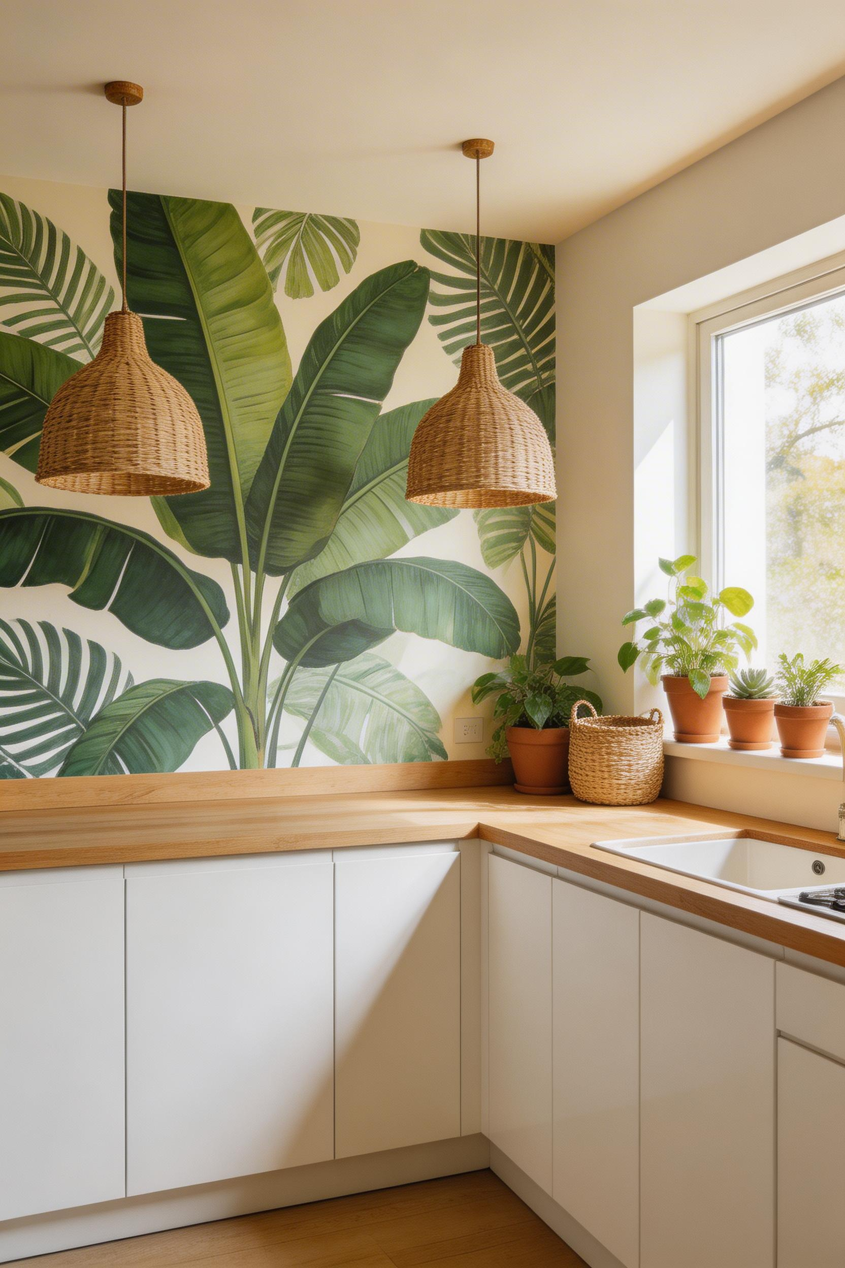
Banana leaf wallpaper has documented calming effects. The large, simple leaf form communicates botanical abundance without visual complexity. Monstera prints, with their characteristic punched holes, work best as large-format feature wall murals. The graphic scale needs space to register properly. Palm fronds offer a cleaner, more spaced-out pattern. These work in standard-height kitchens (8-9 ft) where oversized banana leaf or monstera scale would overwhelm the ceiling-to-floor proportion.
The Complete Biophilic Kitchen Scheme
Brewster Home Fashions’ tropical prints use unpasted vinyl: 20.9 inches wide, 33 ft long. Matte, hard-wearing, and water-resistant — a genuinely kitchen-appropriate specification. Hovia’s biophilic collections use photographic-quality printing and are available in custom sizes for mural applications. The complete biophilic kitchen scheme I consistently recommend combines tropical leaf wallpaper with rattan pendant lights and natural wood worktops. Each element reinforces the others through the shared visual language of organic materials. Extending the same nature-first approach into the living elements of kitchen design through actual plants is the natural next step once the wallpaper is in place.
14. Japanese Woodblock Print Wallpaper for Kitchen Narrative
Kitchen wallpaper has the unusual quality of being looked at daily — the same wall, the same pattern, encountered repeatedly over months and years. This daily-contact relationship means that pattern depth matters in a kitchen in a way it might not in a hallway. Woodblock print wallpaper is the pattern type that most rewards sustained attention. The more you look, the more you find.
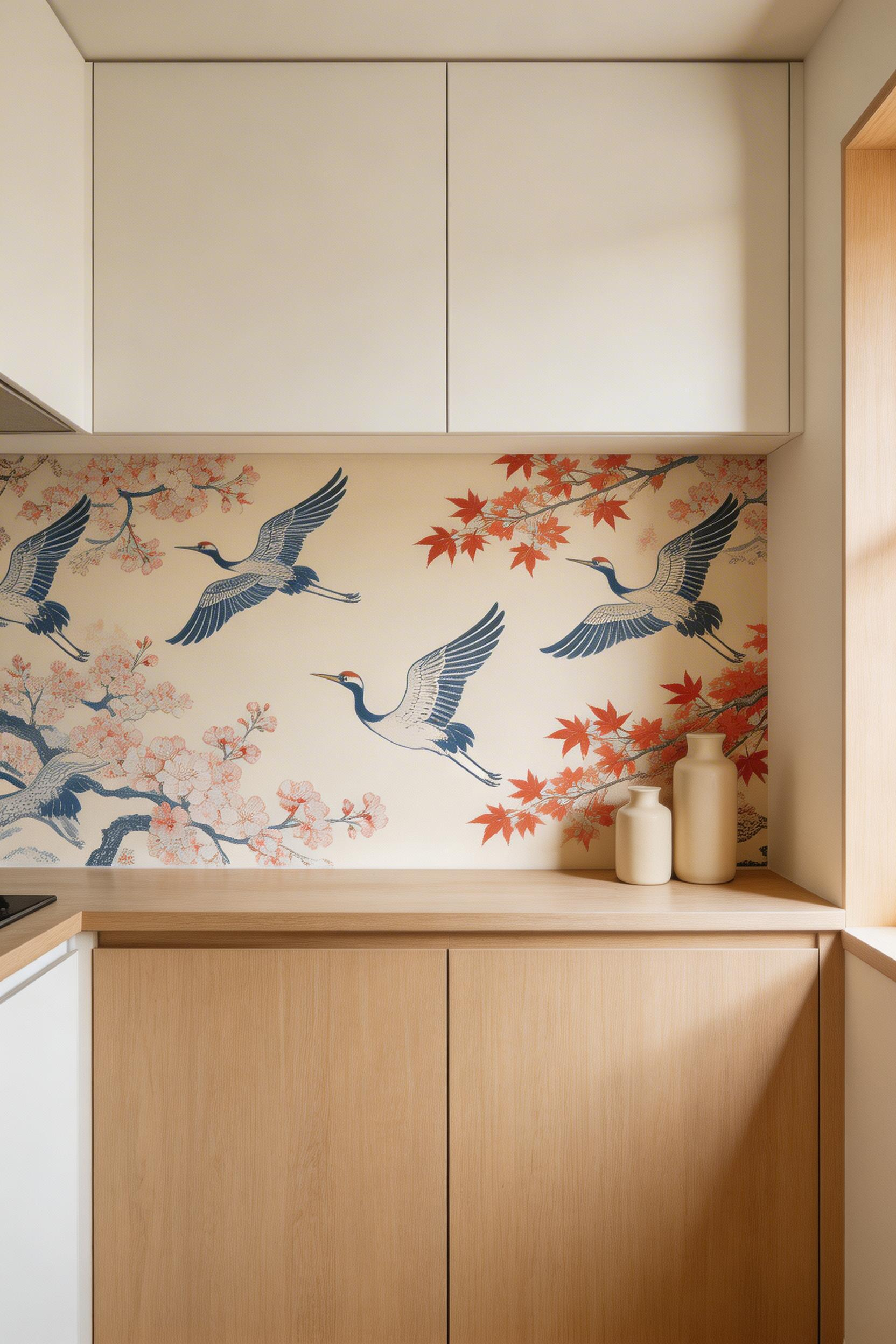
Japanese woodblock (ukiyo-e) subjects carry meaning beyond their visual appeal. Cranes symbolise good fortune and longevity. Cherry blossoms represent mono no aware — the Japanese sensitivity to beauty’s transience. Koi evoke perseverance. In a kitchen connected to daily ritual and seasonal produce, these associations match the room’s character in a way that feels more than coincidental. The authentic technique produces a visual vocabulary that’s immediately distinguishable from generic ‘Japanese-style’ pattern: sumi-like crisp linework, flat colour areas from separate carved blocks, deliberate compositional cropping, restrained palette.
Choosing an Authentic Woodblock-Inspired Pattern
Milton & King’s Japandi collection blends Japanese design simplicity with Scandinavian warmth. Their Ukiyo-e collection is the closest to period authenticity in the mainstream market. Rasch’s Kimono Legendary Cranes wallpaper — featuring cranes, fans, clouds, and blossoms — is among the most successful mainstream versions. Avoid anything described as ‘Japanese-inspired’ that uses generic pink cherry blossom on white. Without compositional discipline and palette restraint, these patterns collapse into decoration rather than reading as design. A compact kitchen alcove or scullery space is the ideal location. The narrative content can be engaged with closely, and the contained scale keeps the visual density manageable. For a broader kitchen remodeling approach built around zen and mindful design, woodblock wallpaper is a natural starting point.
15. Ombre and Gradient Kitchen Wallpaper Ideas for Contemporary Spaces
Gradient and ombre wallpaper is undergoing a technical transformation. Canon UVgel printing technology produces photographic-quality gradients on wallpaper that’s three times thicker than standard. Exceptional fade resistance, eco-friendly water-based inks, VOC-free formulation — this is a different material from anything the category produced before 2015. Anyone who dismissed ombre wallpaper based on earlier versions is working from outdated information.
Vertical gradients remain the traditional direction. They create a height emphasis useful in standard-height kitchens. Horizontal gradients are the trending direction for 2024-2026. Moving left-to-right across a wall, they create visual width perception. That’s directly useful in narrow galley kitchens where breadth is the spatial challenge. ONDECOR, Hovia (printed to order on sustainable materials), Giffywalls, and Happy Wall are the key brands. Most offer bespoke colour specification — valuable for a kitchen where matching to existing finishes matters.
The most important decision is colour palette. Highly saturated pastel ombres — candy pink-to-lavender, mint-to-sky blue — tend to date within 2-3 years. The sweetness of the palette amplifies uncomfortably in a kitchen setting. Neutral gradients (grey-to-white, stone-to-cream, sage-to-white) have significantly longer perceived longevity. In a galley or utility kitchen, a horizontal neutral gradient provides exactly the right level of kitchen wallpaper inspiration through colour transition alone — purposeful without being demanding.
Choosing the Right Wallpaper for Your Kitchen Style
Start with the spatial reality of the room rather than the pattern you love. Small kitchen? Favour tonal choices — ombre, subtle stripe, watercolour floral on a white ground. These add visual interest without reducing the perceived volume. Large kitchen-diner? The volume supports bold choices: large-scale botanicals, full-room dark wallpaper, tropical murals. Limited natural light changes the equation for dark wallpaper specifically. Matte dark walls without a considered lighting plan are oppressive rather than dramatic.
Then consider the finish specification. This is where most kitchen wallpaper projects succeed or fail practically. The washability hierarchy runs: wipeable, washable, scrubbable, and highly scrubbable. A kitchen needs at minimum washable specification. Near cooking zones, scrubbable is the correct choice. Vinyl coating is the kitchen standard: durable, grease-resistant, and moisture-tolerant. For installation purposes, UK standard rolls are 52 cm wide and 10 m long (5.2 sq m per roll). Drop match or half-drop pattern repeats add 20-25% to your material requirement — a significant factor when ordering premium wallpaper.
One practical note before purchasing: keep a minimum safe distance from cooking zones. Wallpaper is combustible, and guidelines recommend 24-30 inches minimum clearance from cooktop sides. This isn’t a design constraint so much as the principle that determines which wall surfaces you’re working with. The walls that remain — the alcove behind shelving, the chimney breast behind the range, the end wall facing the dining zone — are usually the most architecturally interesting surfaces in the kitchen anyway. Work with them, and your kitchen wallpaper inspiration will find exactly the right home.