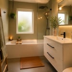
Of all the rooms in the house, the kitchen accumulates visual noise fastest. Every appliance earns counter space by default rather than design, every handle repeats thirty times across the cabinetry, every grout line tiles the backsplash into a grid the eye must process all at once. Minimalistic kitchen design is not, despite the name, about emptiness. It’s about decision — about choosing what earns its place and letting that choice show.
Japanese design has a word for purposeful empty space: *ma* (間). It refers not to absence but to the pause that gives meaning to what surrounds it. A kitchen designed around *ma* has a quiet that standard kitchens don’t, even when they’re clean. That quiet is the goal.
What follows are fifteen ideas ranging from the structural — handle-free cabinetry, floor-to-ceiling storage — to the philosophical: the case for a single intentional object. Some require renovation; others require only a decision. All share the same logic: fewer elements, considered completely, produce a room that costs nothing in attention and everything in calm.
1. Handle-Free Cabinetry for a Seamless Wall of Storage
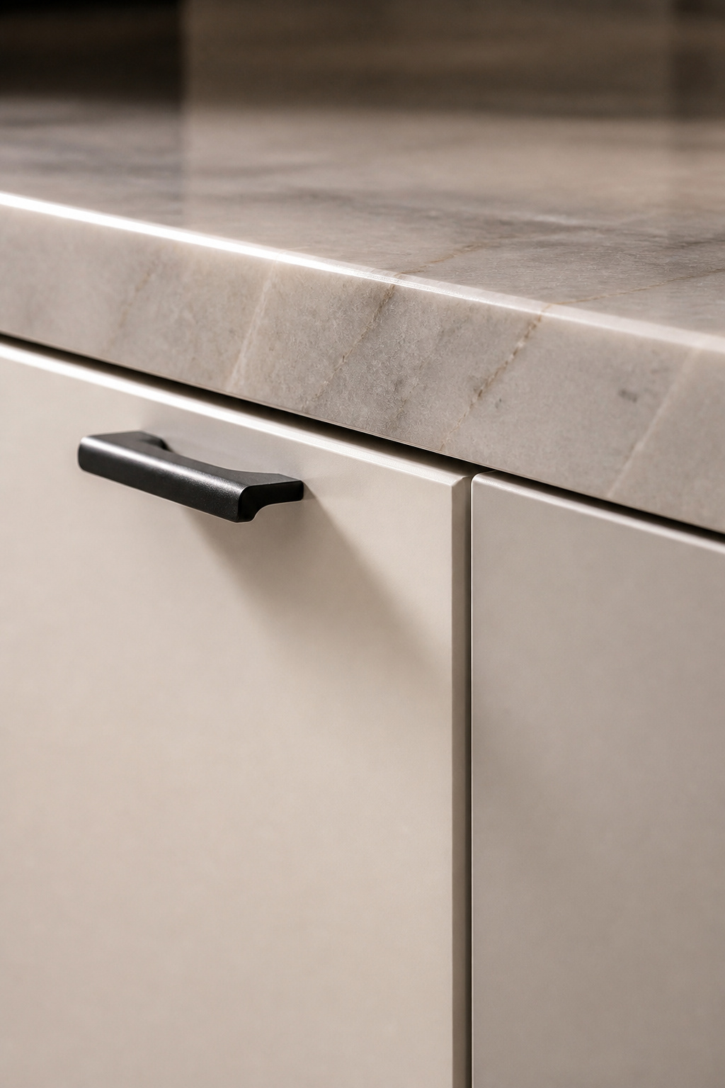
Cabinet handles are the most repeated hardware element in any kitchen. In a standard ten-run kitchen, thirty to forty handles are visible simultaneously — each one a small interruption, each interruption multiplied by proximity into a persistent visual hum. Removing handles doesn’t sound significant until you see a kitchen without them. Then it’s immediately obvious that the handles were the noise.
Three mechanisms make handleless cabinetry work. The most reliable is the Blum TIP-ON: a mechanical piston latch embedded in the hinge. Press the door, and the spring-loaded mechanism releases, pushing it open ten to fifteen millimetres. It works on both doors and drawers, rated for millions of cycles, and costs more than magnetic catches — around $25-50 per cabinet versus $5-15 for magnetic — but the durability difference justifies it in a kitchen that opens daily.
The Gola profile system takes a different approach: a continuous aluminium rail recessed behind the door’s top or bottom edge creates a finger gap. No hardware is visible. The rail runs the full width of every cabinet door in the run, creating one horizontal line that reads as a detail rather than a repetition. For slab-front doors in matte laminate or lacquer, it’s the more architectural solution.
The J-pull — a routed groove in the door face — is the budget option and the most fragile. It works well on quality laminates but chips at the edge of cheaper MDF finishes. For long-term performance, pair it with Fenix NTM or a premium lacquer rather than a standard cabinet foil. There are smart kitchen cabinet ideas covering the full spectrum of handleless systems if you want to compare integration strategies across different cabinet configurations.
2. Minimalistic Kitchen Design With a Monochrome Color Palette
A monochrome palette doesn’t mean a white kitchen. It means a kitchen built around one hue — developed across texture, undertone, and sheen rather than expanded into a second colour. The psychological effect is measurable: colour contrast demands attentional resources that texture and tonal variation do not. One hue leaves more perceptual bandwidth for rest.
The 2026 movement in kitchen colour is warmer than what came before. Mineral taupes, earthy off-whites, and soft clay undertones are displacing the cool greys of the previous decade. They pair naturally with walnut, plaster, and ceramic — materials that suit a minimalistic kitchen design without adding complexity. A warm-white kitchen and a cool-white kitchen occupy the same square footage but feel like different rooms.
Building depth within a single hue requires three variables: undertone, finish, and texture. Undertone consistency is the most overlooked — mixing a yellow-based white cabinet with a blue-based white wall creates visual tension that no one can name but everyone notices. Fix the undertone first, then vary the sheen: matte cabinet fronts, satin walls, and polished stone countertop within the same off-white palette reads as rich rather than flat.
Texture carries the rest. Linen window fabric, a brushed laminate on the cabinet face, and a rough-surfaced stone countertop in the same taupe register as three distinct surfaces without introducing a second colour. That’s the discipline of monochrome done well. You can explore the modern kitchen decor principles that underpin this approach — particularly the guidance on material layering within a restricted palette.
3. Integrated Appliances Hidden Behind Matching Cabinet Panels
The refrigerator is the loudest object in most kitchens. Its reflective surface catches and throws light, its visible hinges break the cabinet rhythm, and its door — taller and wider than everything around it — interrupts the room’s geometry without apology. Panel-ready appliances solve this at the source.
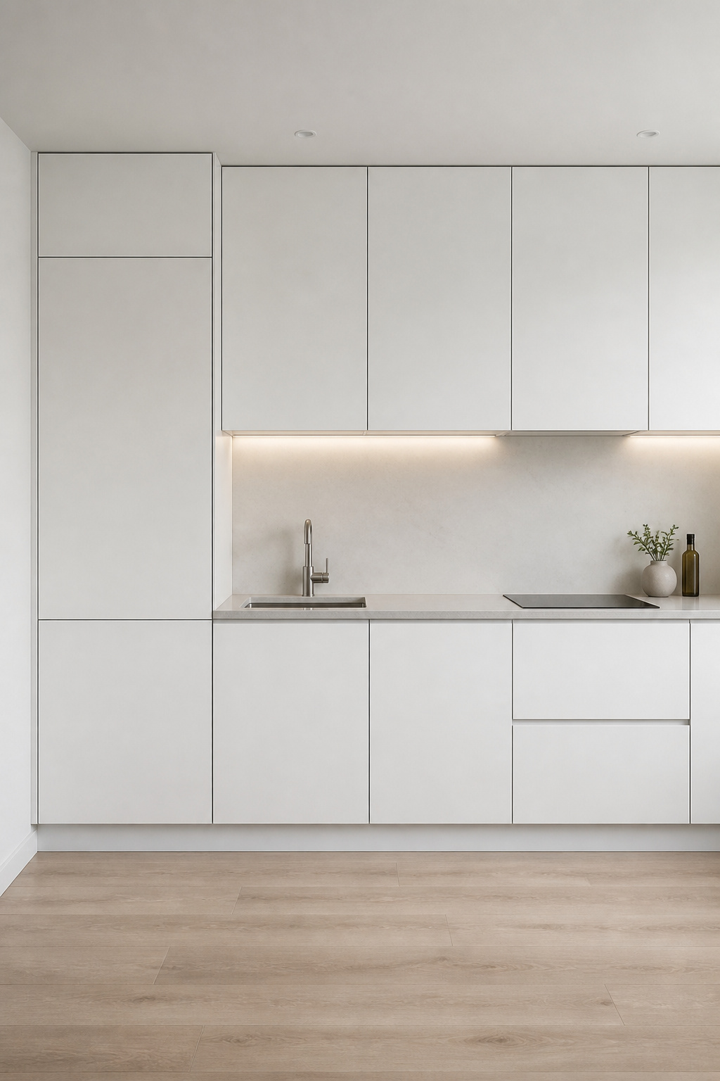
Panel-ready means the appliance accepts a custom door front that matches the surrounding cabinetry. In a handleless kitchen, the fridge, dishwasher, and wine cooler disappear into the cabinet run. The wall reads as one continuous surface. The appliances become architecture rather than objects.
Fisher & Paykel’s column fridge system is the most practical option for retrofit and new-build alike. The narrow column format — typically 450-600mm wide — integrates into an existing cabinet run without requiring a purpose-built alcove. Their four-piece kitchen package runs around $17,746, which sounds significant until you consider that the alternative is a $3,000 standard fridge visually dominating a $30,000 kitchen.
Miele’s 24-inch undercounter models start at $2,099 and accept custom panels through any cabinetmaker. Gaggenau sits at the top of the range — flush controls, handleless doors, German engineering — and the price reflects it. For the dishwasher, almost every mid-to-high range brand now offers an integrated option. The real cost beyond the appliance itself is the custom panel fabrication: $150-400 per panel through the cabinetmaker, depending on the material matching complexity. Budget accordingly, and panel the fridge and dishwasher first — they are the most visible, and the most rewarding to conceal.
4. A Floating Island That Grounds the Space Without Cluttering It
A kitchen island built on solid base cabinetry to the floor claims space even when it’s clean. A floating island — supported by legs, a central pedestal, or a cantilevered structure — lets the eye pass underneath. The floor reads as continuous. The room breathes.
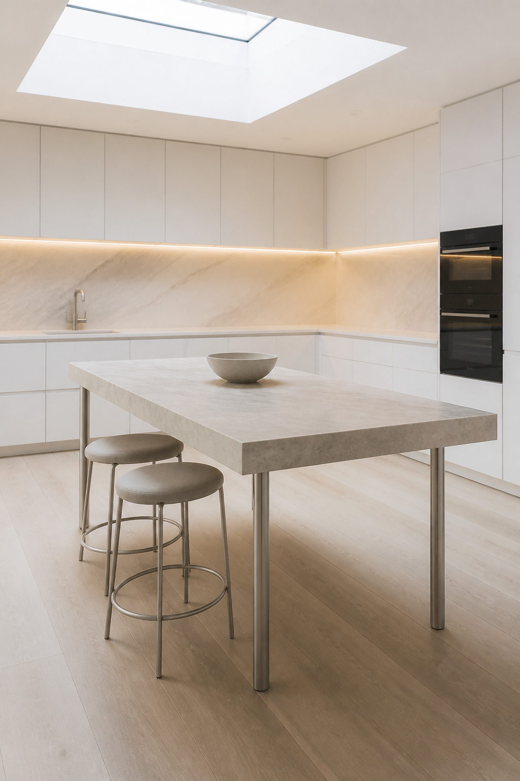
The waterfall island, where the countertop material extends vertically to the floor, is the apparent exception: it looks heavy. But in a single dramatic material — bookmatched marble or solid white oak — the waterfall becomes the room’s only decoration, which earns the weight. It’s a considered choice rather than a default.
Clearances matter more than aesthetics in island planning. The minimum working clearance around an island is 36 inches (900mm); 48 inches (1200mm) is the comfortable figure for a kitchen where two people cook simultaneously. An island with seating on one side needs 54 inches of clearance on that side — enough for chairs to pull out fully without blocking the traffic line. Getting these numbers wrong produces a kitchen that’s beautiful in photographs and frustrating to inhabit daily.
For material: matching the island top to the perimeter countertop — one material throughout — calms the room more than almost any other design decision. Two countertop materials in one kitchen compete. One countertop material in two locations reads as architecture. There are thoughtful kitchen remodeling ideas for a zen space that explore island integration in more depth, including how to approach split-level heights for kitchens that also function as social rooms.
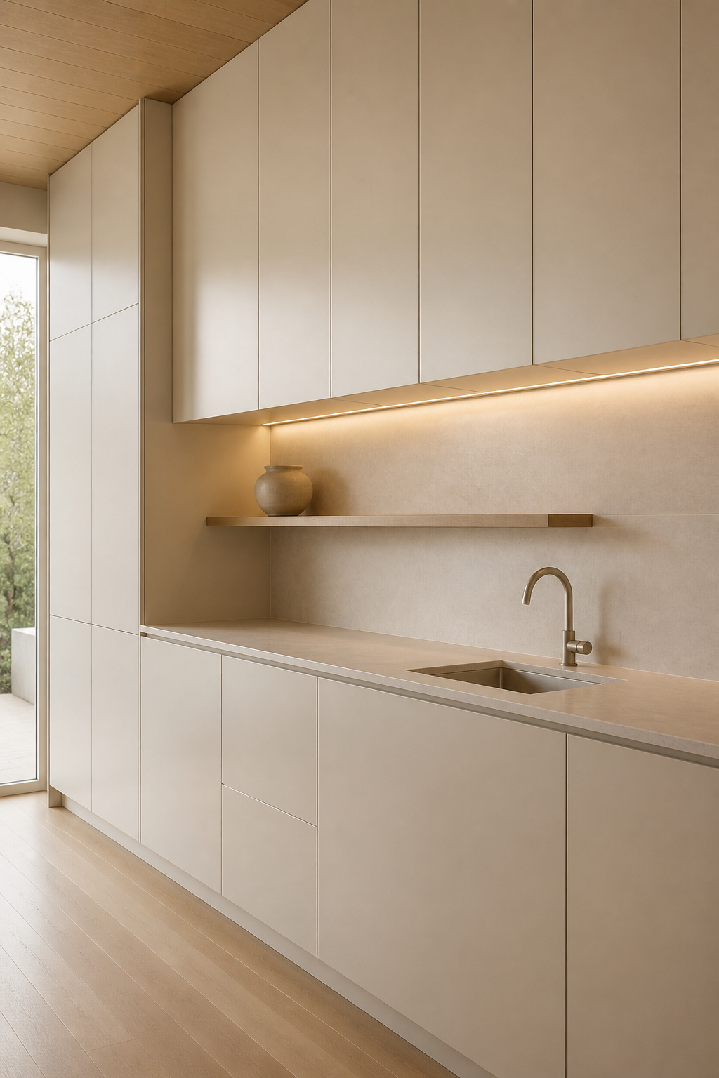
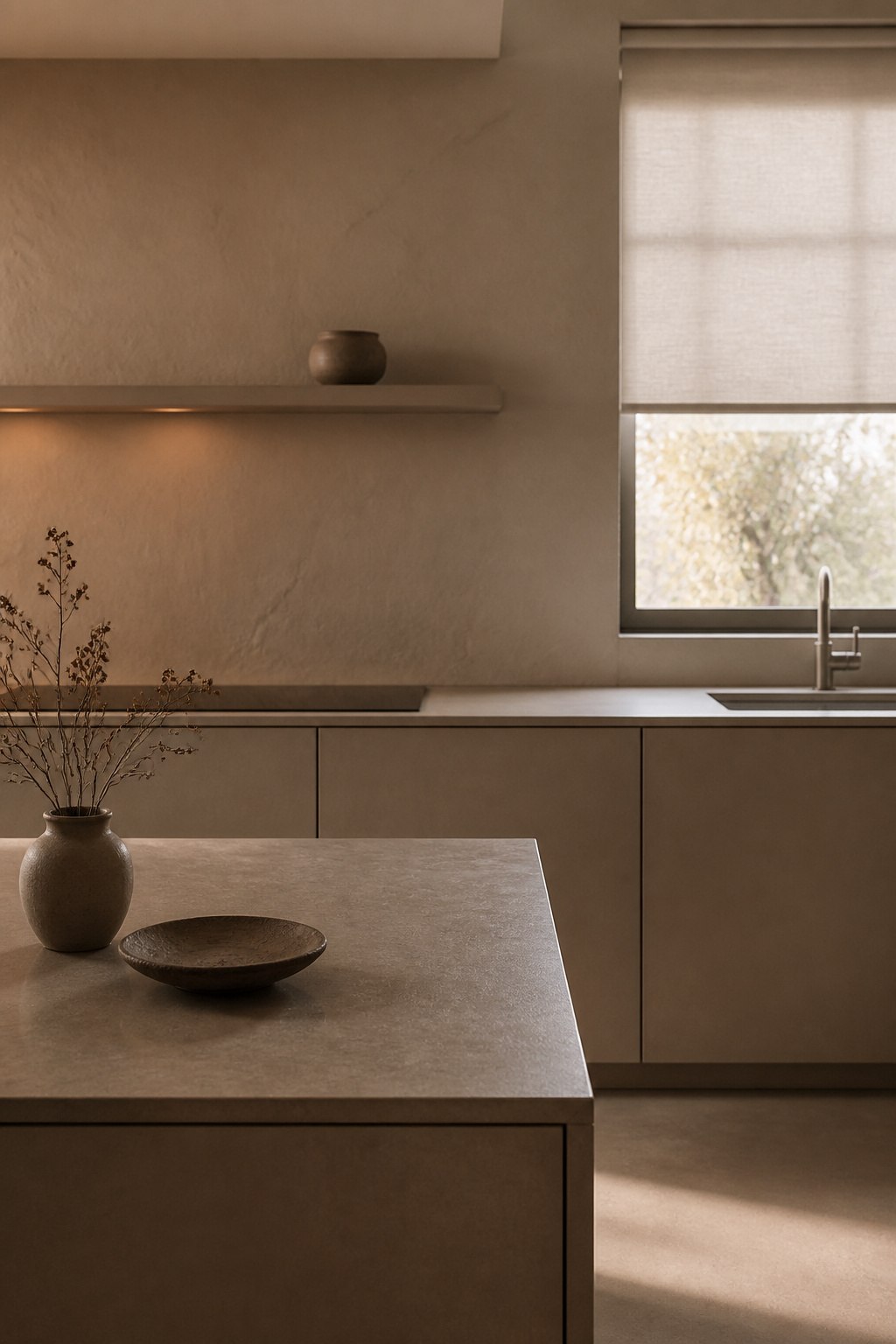
5. Minimalist Kitchen Design Through Deliberate Open Shelving
Open shelving in a minimalist kitchen is counterintuitive only until you understand what it’s for. It’s not for displaying more — it’s for displaying less, completely. One run of floating shelves with three carefully chosen ceramic pieces reads calmer than a closed cabinet whose door conceals visual chaos, because the chaos behind closed doors registers at some level even when invisible. The shelf, by contrast, shows exactly what’s there.
The Japandi principle — Japanese restraint applied through a Scandinavian material lens — governs this kind of display. Natural ceramics, handmade textures, colours that sit within the room’s existing palette. The shelf itself should recede: a 32-38mm floating timber shelf in the same white as the wall disappears; only the objects on it register. Hidden brackets are non-negotiable — any bracket you can see competes with the display.
Curation is the practice. Three objects, odd-numbered for visual tension: a ceramic pitcher used for water, a small potted plant in an unglazed pot, a wooden cutting board standing upright. Vary the heights. Keep the material relationship tight — all in the same tonal range, all with some relationship to daily use. Then leave the rest of the shelf empty. The space around the objects is as deliberate as the objects themselves.
The most common error is overloading the shelf as soon as it’s installed. The first display needs editing, then editing again, until it feels like too little — at which point it’s right. For inspiration on how organic kitchen cabinet organisation complements this kind of curated open display, the principles transfer directly from cabinet interiors to shelf surfaces.
6. Stone Countertops That Define the Room’s Texture and Tone
In a kitchen with uniform cabinet fronts and a single wall colour, the countertop does all the decorative work. It’s the room’s material story — the texture, movement, and variation that would otherwise come from decorative objects, patterns, and colours the minimalistic kitchen design deliberately excludes. Choosing the right stone is not a secondary decision. It is the design decision.
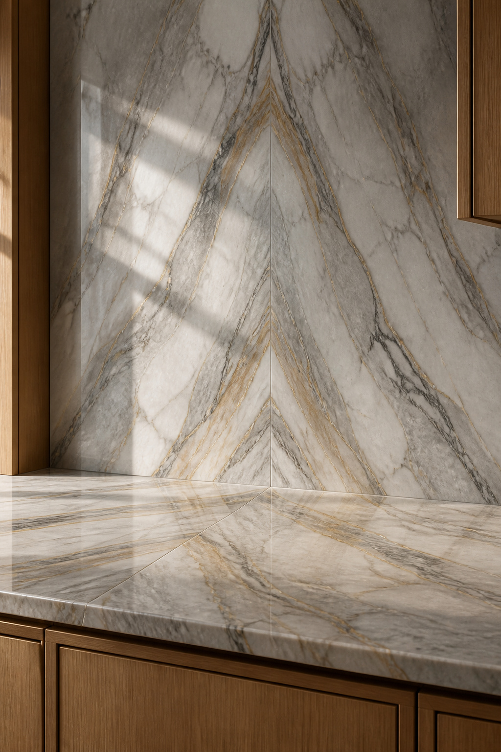
Quartzite is the most honest option: natural, variable, heat-resistant to direct contact. It rates 7-8 on the Mohs scale and rewards the care of annual sealing — a 20-minute process — with genuine geological variation that no engineered product replicates. Installed cost runs $70-200+ per square foot depending on the stone’s rarity and origin.
Porcelain slab sits at the practical extreme: absorption rate of 0.05%, never needs sealing, handles heat without flinching, and mimics marble and quartzite convincingly in a large-format slab that achieves near-seamless joints. Cost is similar to engineered quartz at $55-120 per square foot. For a kitchen that prioritises low maintenance alongside visual calm, porcelain slab is the most logical choice.
The most effective application of stone in a minimal kitchen is the continuous run: countertop and backsplash in the same slab material, with the fabricator matching veining across the seam. Two surfaces become one. The eye reads the entire run as a single material statement — which, in a room with nothing competing for attention, is quietly spectacular.
7. Undermount Sinks for an Unbroken Countertop Horizon
The raised rim of a drop-in sink creates a ledge that collects debris, requires careful caulking at the join, and interrupts the countertop surface at its most-used point. It’s a small detail. In a minimalistic kitchen design, small details compound.
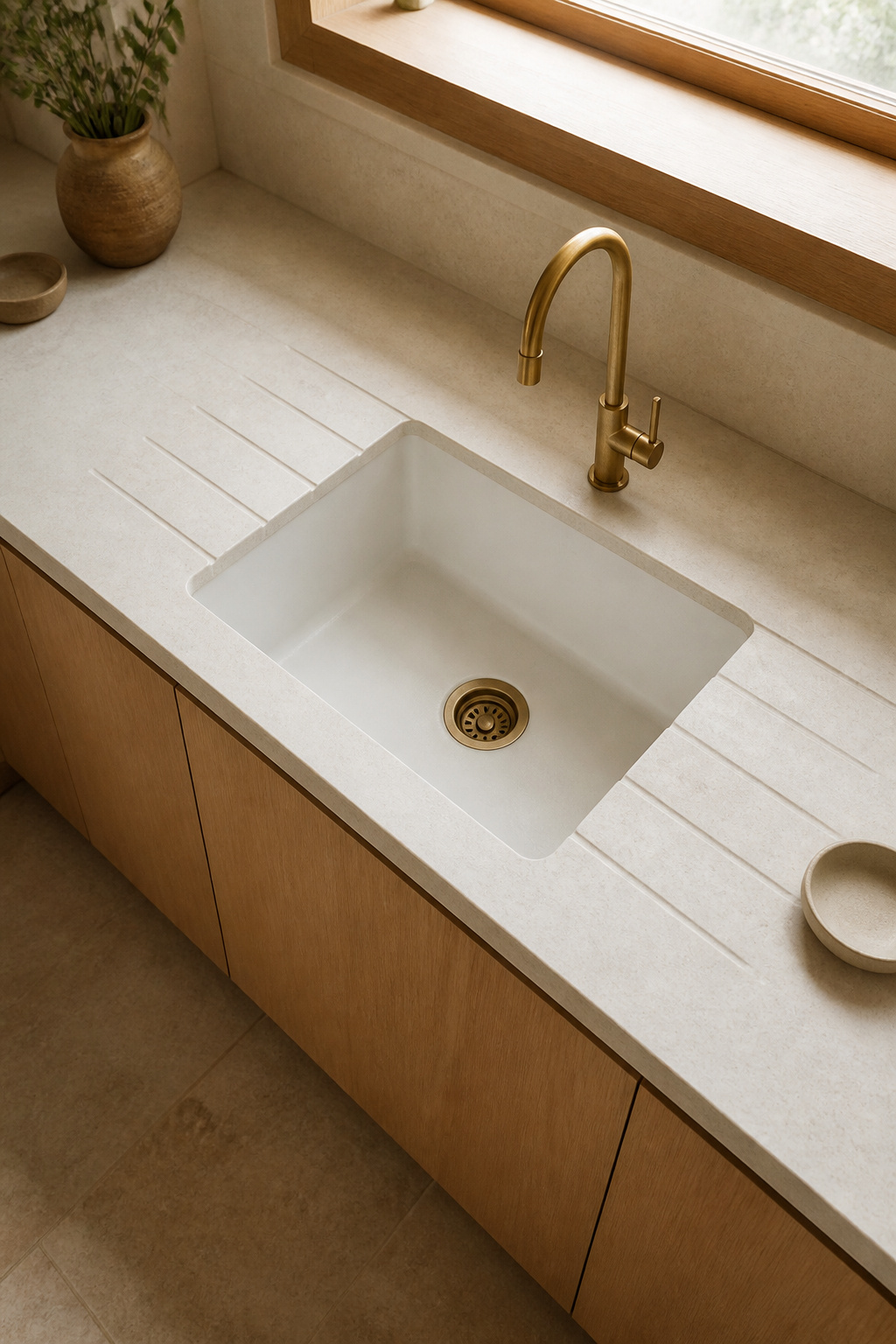
An undermount sink mounts below the countertop surface, secured from underneath. The stone or composite runs right to the bowl edge — no rim, no ledge, no interruption. Crumbs and water wipe directly into the sink. The countertop reads as a single unbroken plane from backsplash to cabinet.
For material: stainless steel is the most versatile and the most forgiving — it handles impact, doesn’t chip, and a single bowl (600mm wide) reads quieter than a double bowl in a minimalist context. Granite composite — hard, scratch-resistant, matte — suits a kitchen where the rest of the room is warm and neutral. Anthracite and greige composite finishes recede into a neutral scheme in a way that stainless sometimes doesn’t.
Fireclay is the considered choice for a warm Japandi kitchen: handmade, glazed, nonporous, with a weight and substance that feel entirely different from manufactured alternatives. It needs a structurally reinforced cabinet base. The installation is not casual. But a single large fireclay bowl undermounted into pale limestone, with draining grooves cut directly into the stone surface sloping toward the bowl, is as close to kitchen poetry as plumbing gets.
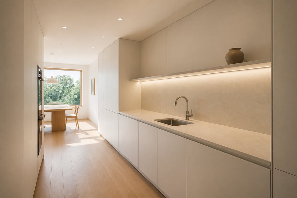
8. Minimalistic Kitchen Design: Lighting That Disappears Into the Ceiling
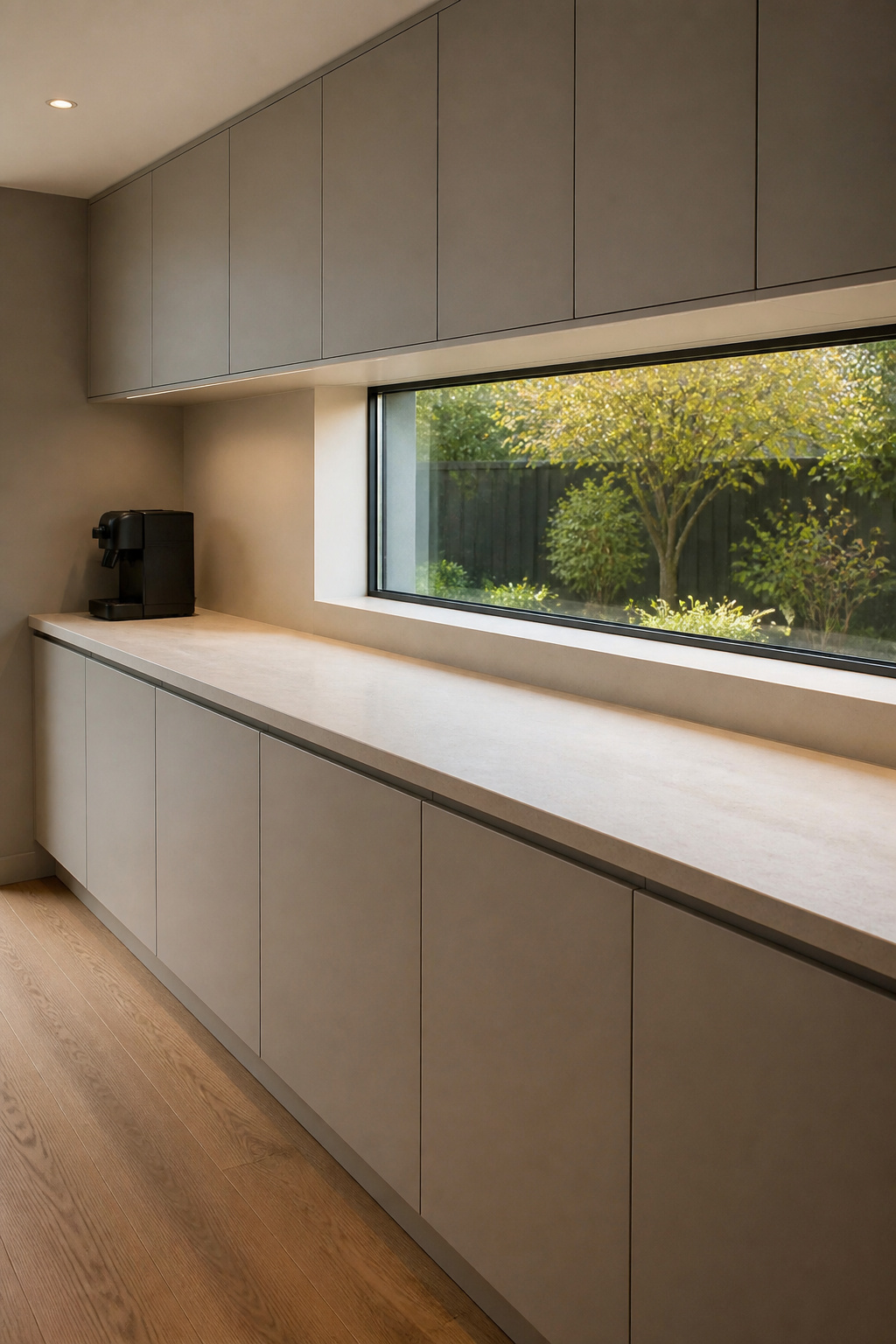
Pendant lights are beautiful. They are also objects in the room — and in a minimalistic kitchen design, every object earns its place or it doesn’t hang. The light itself should be visible; the fixture should not. Recessed downlights and LED strip lighting provide full task and ambient coverage without any visible hardware cluttering the ceiling plane.
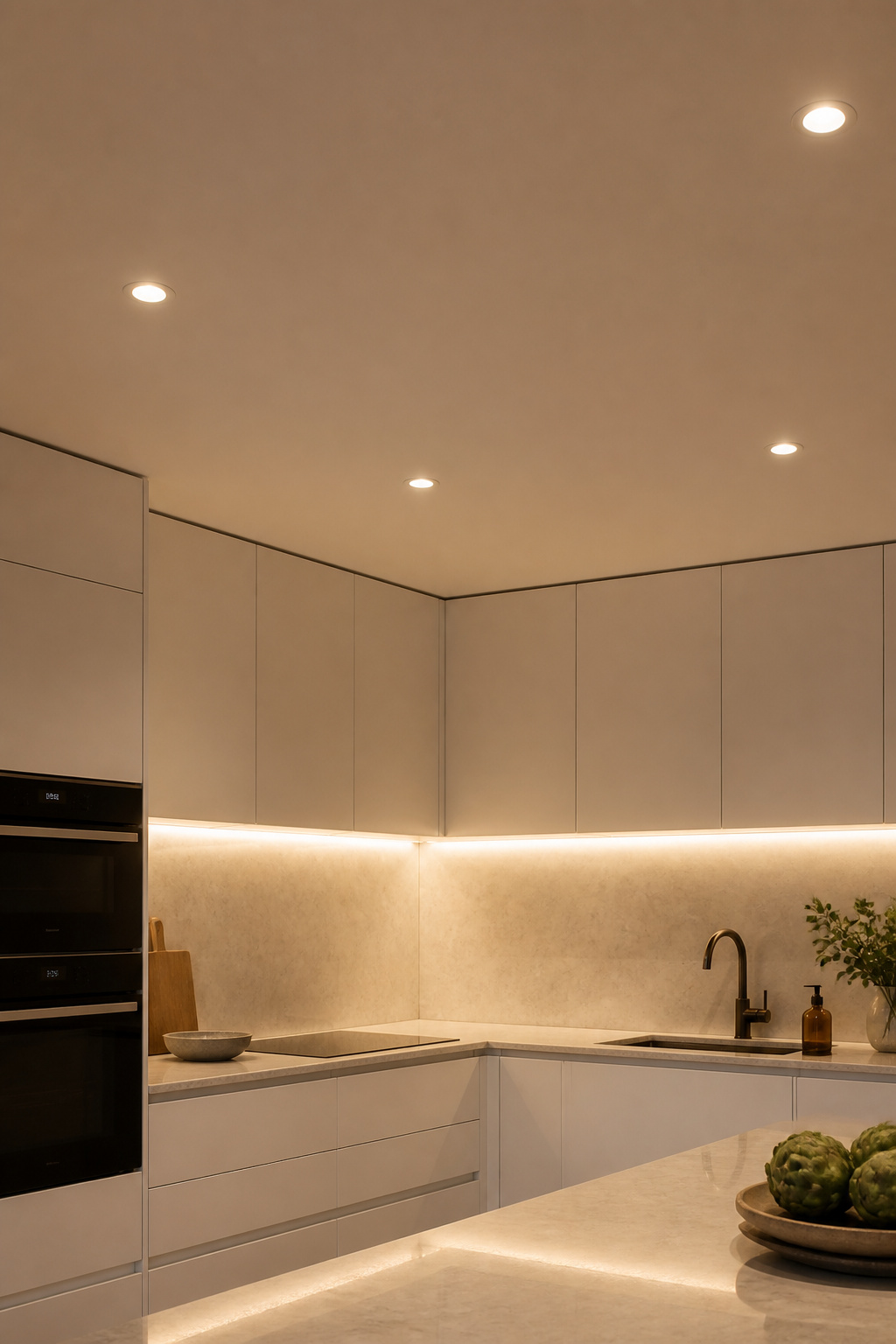
The foundational error in kitchen lighting is under-specifying recessed coverage and compensating with pendants. Plan the recessed layout first: downlights positioned 600-900mm from the wall wash the cabinet faces evenly and avoid the flat, institutional look of centre-only placement. Slim-profile LED cans — some under 10mm deep — integrate into almost any ceiling construction.
Under-cabinet LED strips are the minimal kitchen’s most effective tool. Positioned 50-100mm from the front of the upper cabinet, they throw task light across the countertop without any visible fixture. The source is hidden; the effect is seamless. The colour temperature for both recessed and strip lighting should sit at 3000K — warm enough to read as residential, cool enough for accurate food preparation. Go warmer (2700K) and the food preparation becomes ambiguous. Go cooler (4000K and above) and the kitchen starts reading like a laboratory.
The most useful specification uses two circuits: 2700K recessed ambient on a dimmer for evening and social use, 3000K task strips fixed for cooking. Controlled separately, they let the kitchen shift from functional to calm without any physical change to the room.
9. Single-Material Backsplashes That Let the Kitchen Breathe
A standard 75mm subway tile grid contains fifteen to twenty grout lines per square metre. Each line is a visual division. Across a typical kitchen backsplash of three square metres, that’s forty-five to sixty lines the eye processes without being asked to. Replacing that grid with one large-format tile — or a slab material — reduces the line count to three or four per square metre. The kitchen immediately feels quieter.
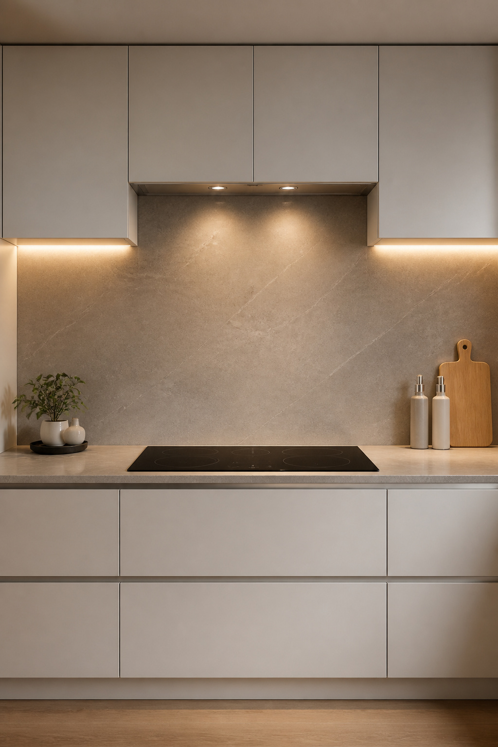
Large-format rectified porcelain at 600x1200mm is the most accessible route. Rectified means the tile edges are machined to precise uniformity after firing, allowing grout joints as narrow as 1.5-2mm. At that width, with colour-matched grout — Mapei and Laticrete both offer custom-matched options — the surface reads near-seamless at normal viewing distance.
Slab stone — extending the countertop material up the wall as a full-height backsplash — removes the segmentation entirely. It requires significant budget and careful installation: the fabricator must align veining across the countertop-to-backsplash join, and the wall must be properly prepared for the weight. When it works, the effect is one material from counter to ceiling with no horizontal line breaking the vertical plane.
For grout colour: the rule is match, not contrast. A slightly-off grout choice on a large-format tile draws attention to every joint rather than suppressing it. Test the grout against the actual tile in actual kitchen lighting before committing. A grout that looks matched in the showroom under fluorescent light may read distinctly off in the warm, layered lighting of a real kitchen.
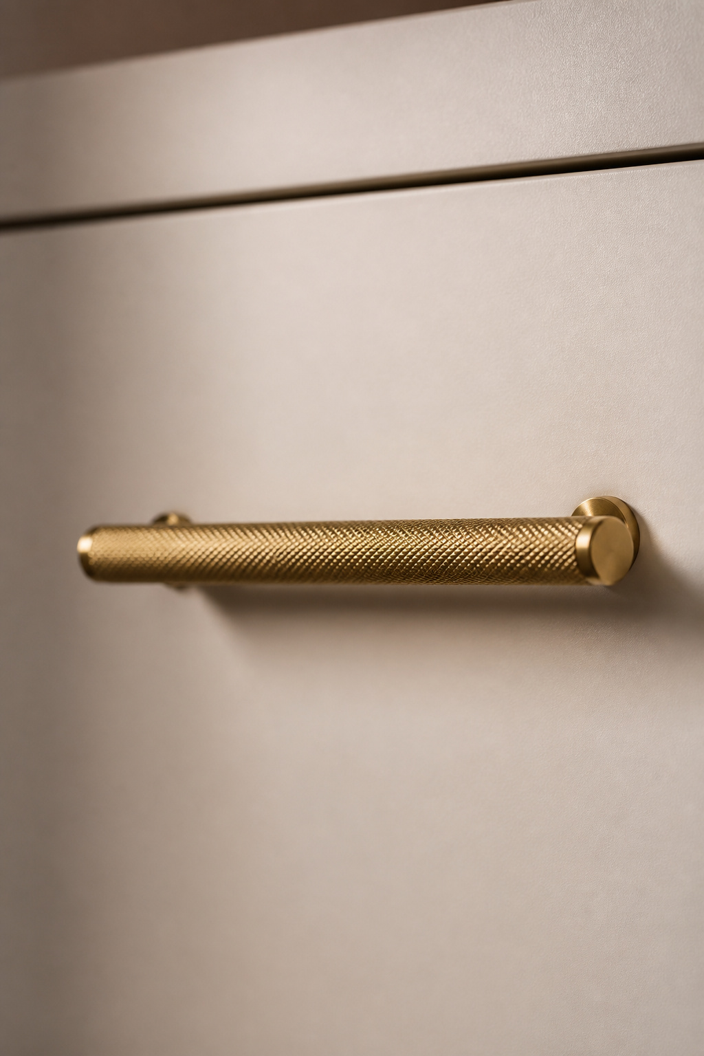
10. Minimal Hardware — or None at All — as a Design Statement
Hardware is the last thing specified and the first thing noticed. It’s also where a minimalistic kitchen design most visibly either holds or collapses. Two different hardware profiles in one kitchen — a bar handle on the drawers, a different knob on the doors — communicates indecision. One profile, consistently applied, communicates design.
No Hardware, or One Hardware Choice
The hierarchy is simple. For a kitchen that can commit fully to handleless, push-to-open throughout is the cleanest expression — the cabinet face is the hardware, and the mechanism is invisible. This works best with slab-front doors in flat matte or high-gloss finishes; it reads strained with shaker profiles or anything with a routed edge detail.
For a kitchen that wants one considered hardware moment, knurled bar handles are the 2025 direction: a diamond or linear texture cut into the grip, available in matte black, brushed brass, and unlacquered brass. They add tactile interest without visual weight — the eye reads them as texture rather than as object. Fluted handles (vertical channels along a cylindrical profile) are more architectural, particularly effective when paired with fluted glass panel inserts or ribbed tile details elsewhere in the room.
The Practical Compromise
Push-to-open on all drawers (finger pressure on a drawer face is natural and easy) and one consistent bar handle profile on all doors. Drawers benefit most from handleless operation; reaching up for a handleless upper cabinet is less intuitive. This split approach is also more budget-friendly — tip-on mechanisms for drawers only, standard hinges for doors, one hardware purchase.
Hardware finish should respond to the tapware and sink finish. Matching is fine. Contrasting requires deliberate commitment — matte black handles with brushed brass tapware works, but only if every other metal in the room also chooses a side.
11. Minimalistic Kitchen Design Built Around Natural Light
Natural light is the most powerful mood variable in a kitchen and the least expensive to work with. It costs nothing to position a window over the sink, to remove a cabinet that blocks a window, or to clear the counter beneath the only light source in the room. These changes alter the kitchen’s atmosphere more than any material choice.
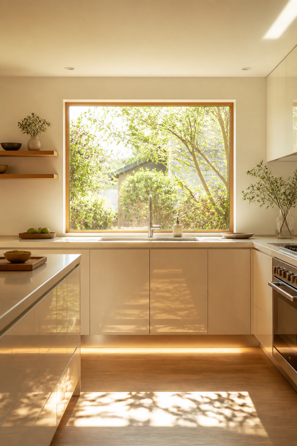
South-facing kitchens receive the most consistent natural light; north-facing kitchens receive even, diffuse light that reads cooler but suits food preparation detail work. The orientation cannot be changed, but the response to it can. A north-facing kitchen benefits from higher-gloss cabinet finishes that reflect and distribute available light; a south-facing kitchen handles a matte palette that absorbs the excess.
Skylights and Window Treatments
For kitchens without adequate wall windows, skylights and sun tunnels bring daylight from above. Sun tunnels — reflective tubes running from the roof to a ceiling diffuser — can bring light into an internal kitchen with no direct roof access. They’re less dramatic than a full skylight but considerably cheaper and simpler to install without structural alteration.
Window treatments should do one thing: protect privacy where genuinely needed without blocking light where it isn’t. Top-down, bottom-up shades cover the lower sash for privacy while leaving the upper glass open. Sheer linen panels diffuse direct sun without significantly reducing light levels. Full blinds pulled entirely down are a compromise that costs the room its primary asset.
Amplifying What’s There
A polished stone countertop near a window catches and reflects afternoon light in ways a matte surface simply cannot. Glass backsplash tiles are engineered specifically to be reflective — they multiply apparent light levels at the most important work surface. The amplification strategy costs nothing at the specification stage and pays back at every hour the sun is up.
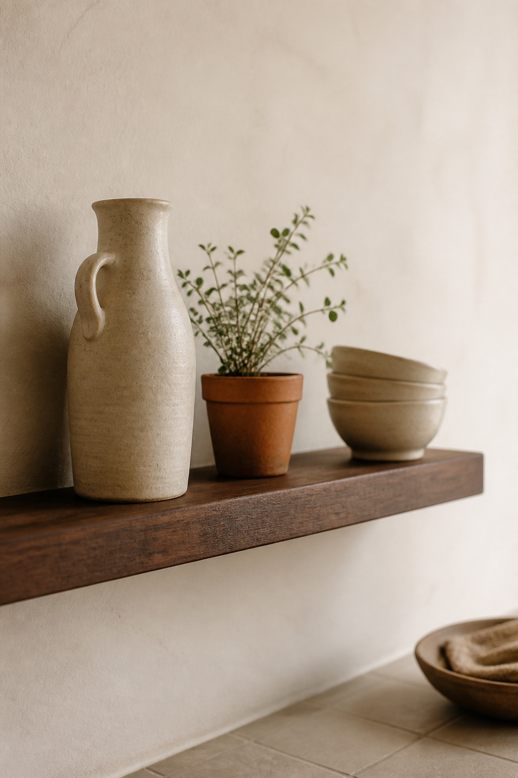
12. One Intentional Display Object Instead of Styled Vignettes
Japanese design offers a principle most Western interiors quietly resist: *kazari* — the practice of displaying one object, fully and intentionally, rather than arranging groups of decorative items. In a traditional Japanese *tokonoma* (alcove), a single seasonal object is chosen for its relationship to the current moment. Nothing else shares the space. The empty space around it is not absence — it is *ma*, the purposeful pause that gives the object its presence.
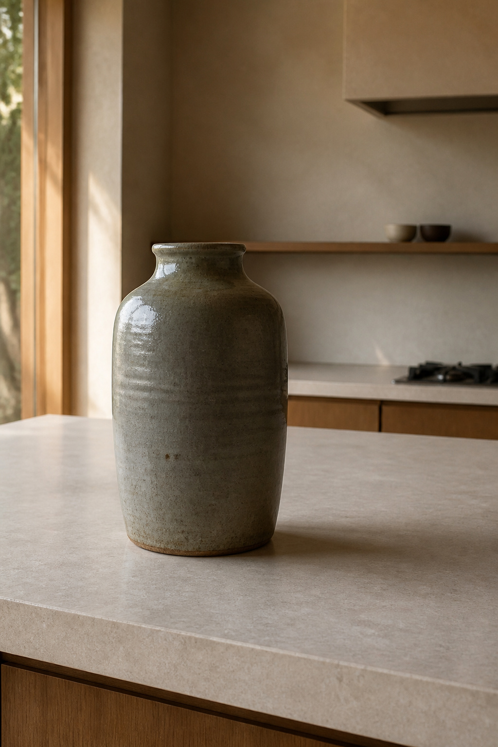
Applied to a minimalistic kitchen design: a single ceramic jug on an open shelf, surrounded by clear space, commands more attention than a cluster of five objects competing for the same surface area. The eye rests on it completely. It also connects to how minimalist bedroom decor principles treat display — restraint applied consistently across rooms creates a home rather than a collection of separate aesthetic experiments.
Choosing the Object
The object should be functional, or at minimum connected to the daily life of the room. A handmade ceramic pitcher used for water, a tea kettle used every morning, a cutting board with enough age and character to earn permanent visibility. Not a figurine, not a decorative piece with no relationship to food or preparation. *Wabi-sabi* holds that an object with visible use and a maker’s hand in it carries more meaning than a perfect, unused piece. The imperfection is not the flaw — it’s the point.
The Seasonal Rotation
The same object left indefinitely becomes invisible — the eye stops registering what it expects. Changing one object for one other, with the seasons, keeps the kitchen alive without adding to it. A sculptural gourd in autumn, a glass vessel with forced branches in spring, a dried seed head in winter. The rule stays constant: one object, fully present, surrounded by deliberate space. The total count never increases.
13. Floor-to-Ceiling Storage That Eliminates Visual Noise
The soffit — the gap between the top of standard upper cabinets and the ceiling — is usually 300 to 400mm of dead space. It collects grease, accumulates dust, and creates an artificial horizontal line mid-wall that the room reads as a second ceiling. It is, in most kitchens, the space that was never decided about.
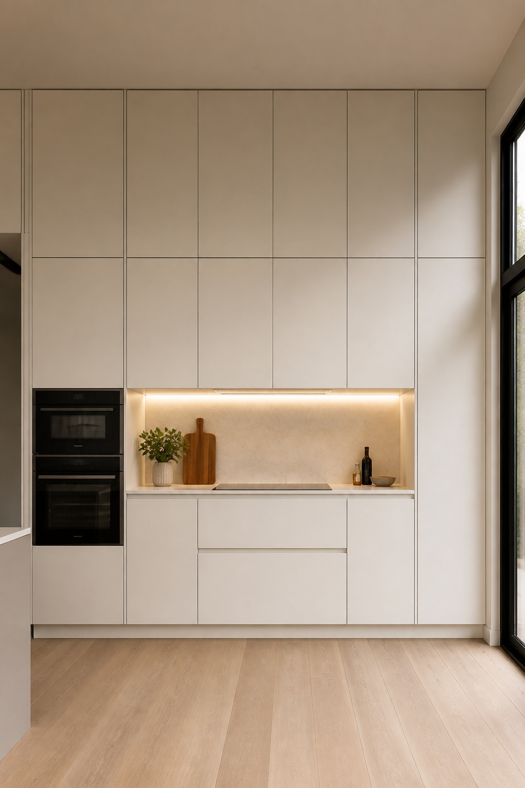
Floor-to-ceiling cabinetry removes the soffit entirely. The cabinet run becomes a single vertical plane from floor to ceiling — one read, not three. The room feels taller without the ceiling height changing, and the wall reads as intentional rather than accidental. In a minimalistic kitchen, this is often the most impactful structural change per square metre of wall.
The access question is practical: items stored above 1800mm need steps or a small ladder. This upper zone works for bulk dry goods, seasonal appliances, or overflow pantry stock. The Blum Aventos HL lift system was designed for exactly this situation — the door opens upward and holds parallel to the ceiling, giving full access to the interior without the door swinging into the room. It’s rated for cabinet widths up to 1200mm and door weights up to 22.5kg. The BLUMOTION damping ensures it closes quietly, without the slam that discourages people from using the space.
For interior organisation of tall pantry-format units: full-extension pull-out shelving on drawer runners brings the back of the cabinet forward, removing the problem of items disappearing behind other items and never being retrieved. The principle is the same as the counter audit: if you can’t see it or reach it, it doesn’t function as storage — it functions as hiding.
14. Minimalist Kitchen Design Using Matte Surfaces Throughout
High-gloss cabinet finishes look beautiful in showrooms, which have controlled lighting, no cooking smells, and no children. In a real kitchen, they reflect overhead lighting, catch fingerprints on every surface they’re touched, and show the cook their own face in the cabinet door at inconvenient moments. Matte finishes absorb rather than reflect — and in a minimalistic kitchen, that absorption reads as rest.
Why Matte Works for a Minimalistic Kitchen Design
Fenix NTM is the material that changed the matte cabinet conversation. The nanotechnology surface coating prevents fingerprint adhesion — showing 85% fewer visible marks than standard laminates after 48 hours of normal use — and the self-healing property is genuine: a warm iron held over a minor scratch for 10-15 seconds restructures the nano-particles to their original condition. It costs around 30% more than standard matte laminates ($273-$513 per sheet versus $55-$180 for conventional HPL) and significantly outperforms matte lacquer on durability. Lacquer is susceptible to chipping at door edges and cannot be self-healed.
The One-Gloss Rule
A fully matte kitchen can feel oppressive — every surface absorbs light and the room loses luminosity. One polished element reintroduces light without undermining the matte intent. The most effective contrast: matte cabinets with a polished quartzite or stone countertop. The stone’s sheen is natural and variable — it doesn’t read as a designed contrast, just as material truth.
You can also look at green kitchen cabinet ideas if you’re exploring how a considered colour in a matte finish shifts the entire room’s mood without compromising the minimalist palette.
15. The Edited Kitchen: Removing What You Tolerate Rather Than Love
Every object currently on a kitchen counter is there because it was placed there and not actively removed. Not because it was chosen. The counter’s default state, in most homes, is accumulation — each object arriving at some point and remaining by inertia. A minimalistic kitchen design applied to an existing room begins with a question rather than a renovation: what on this counter actually earns its place?
The Subtraction Audit
The audit takes 30 minutes. Remove everything from the counter. Return only the objects you reached for during the removal — the coffee machine you used before you’d finished clearing, the fruit bowl you immediately missed. Everything else has a storage home, or it doesn’t belong in the kitchen. The counter after the audit looks sparse. That is correct. It looks like a decision was made, which is the point.
Appliance garages solve the practical side of this equation. A built-in countertop-height cabinet with a tambour (roll-up) or pocket door houses the toaster, kettle, and blender with power sockets installed at the back of the unit so the appliances operate inside without removal. When the garage is closed, the counter reads as clear. Tambour doors roll back into the unit, taking zero counter space. Pocket doors disappear completely into the cabinet side panels — the most seamless option.
The Maintenance Mindset
Minimalistic kitchen design is a daily practice, not a renovation outcome. The commitment is to restore the counter to its baseline every evening — three to five minutes that reset the room’s atmosphere entirely. No new storage furniture required. No renovation required. One decision, made and remade each day, produces the kitchen that a redesign can only approximate. And the daily practice reveals something useful: what you thought you needed on the counter, and what you actually reach for, are rarely the same list.
Choosing Your Minimalistic Kitchen Design Path: Where to Begin
The most common mistake in approaching a minimal kitchen is beginning with the most expensive change. Renovations happen once. Counter clutter accumulates daily. Before specifying a new cabinet system, Fenix laminate, or an integrated appliance range, spend two weeks living with clear counters and one object on the open shelf. Discover what the kitchen actually needs — structurally — before committing to what it looks like it needs.
For many kitchens, the answer is nothing structural, or very little. The room already works. The objects are the problem. The subtraction test costs nothing and reveals more about the kitchen’s potential than any showroom visit.
When renovation is appropriate, the hierarchy of impact is clear. Handle-free cabinetry and a single-material backsplash deliver the greatest visual transformation per pound spent — both changes read immediately and permanently. The stone countertop choice, done in one continuous slab from counter to backsplash, ranks close behind: it’s the room’s material story, and it only needs to be told once.
For an existing kitchen where full renovation isn’t possible: paint the cabinet fronts in a warm matte and replace the backsplash grout with a colour-matched option. Two changes that together read like a complete rethink of the minimalistic kitchen design. Start there. Add the rest only when those decisions have settled into the room and the next genuine gap becomes clear. Minimalism, applied correctly, is the ongoing practice of discovering what was always sufficient.