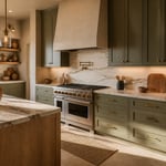
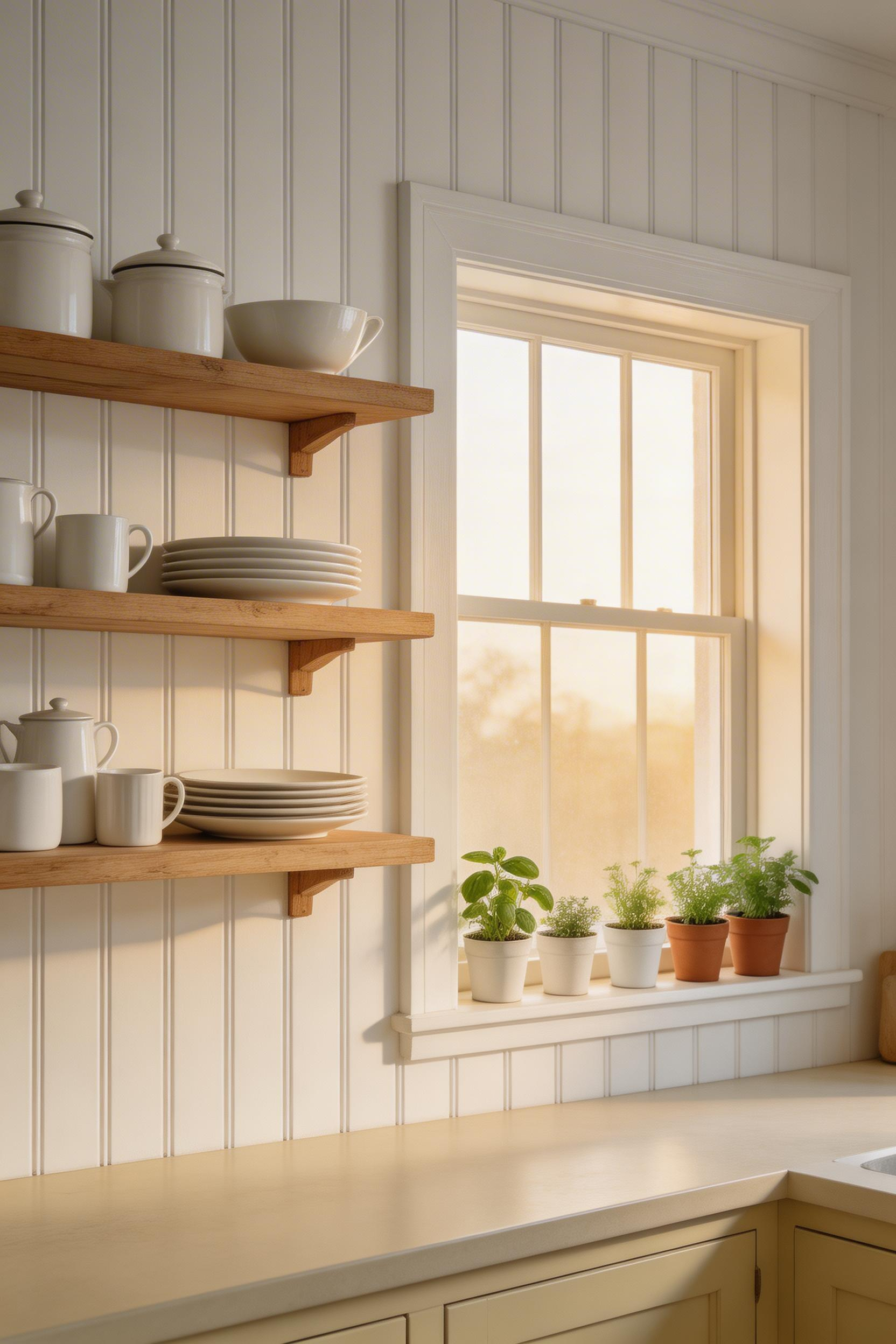
For centuries, the wall behind the kitchen hearth was the most considered surface in the home. Before cabinetry, before appliances, before the concept of a kitchen as a designed room, that surface was already doing something. It protected the wall from heat and grease. It announced the household’s taste. It outlasted every fashion that tried to replace it. The traditional kitchens backsplash has never really gone out of style, because it was never really a style in the first place. It is a considered material choice, and the best ones are still working 100 years later.
What follows are 15 approaches — ranging from genuinely affordable to genuinely ambitious — drawn from a tradition that runs from 17th-century Delft to Victorian pressed tin to the Moroccan medina. Some are well-known; a few are surprisingly underused. All share one quality: they look better with time rather than worse. If you’re thinking about a traditional kitchens backsplash you won’t want to redo in five years, this is the list.
1. Classic White Subway Tile: A Traditional Kitchens Backsplash That Never Fails
White subway tile is so familiar that it’s easy to dismiss it. But the original version — designed in 1904 for the New York City subway system — was a serious piece of utilitarian design. The 3×6-inch rectangular format, the bevelled edge, the smooth white glaze. It became the standard because it worked.
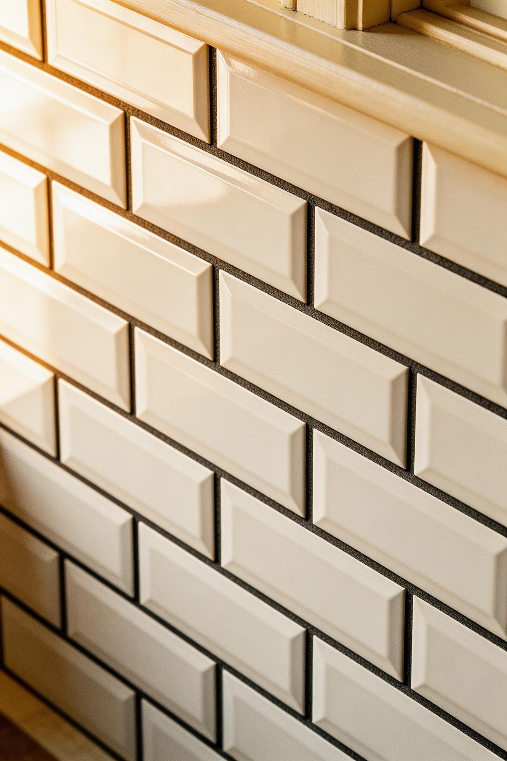
What separates subway tile as a traditional kitchens backsplash from a generic one is the grout colour and tile format. Dark charcoal or espresso grout transforms the visual weight. The stacked pattern suddenly reads as intentional and aged. White grout is clean and modern; dark grout is old and considered. The difference is significant.
Format and Sizing
Stick with the 3×6-inch (75x150mm) format if you want the traditional reading. Larger formats — 4×8, 4×12, even 4×16 inches — shift toward contemporary. The brickwork bond (offset by half) reads as more period-appropriate than a straight stacked layout. That preference for stacked alignment is a more recent, modern development.
For suppliers: Fired Earth’s Classic Metro White with pewter grout sits at around £38 per sq m in the UK. Merola Tile’s Metro White 3×6 ceramic comes in at under $1.50 per tile in the US. If you want period-accurate glaze variation, Original Style’s Artworks range (around £55/sq m) has it. Also worth noting: buy tiles from a single batch. The glaze calibration shifts between production runs, and a backsplash mixing batches will show it.
One tip I find myself repeating: mix in the occasional ivory or off-white tile at random — about five percent of the total. It gives the wall a genuinely hand-set look that reads as aged rather than DIY. According to the Houzz 2023 Kitchen Trends Report, subway tile appears in 40% of traditional kitchen renovations in the UK and US. That number would be higher if it counted the dark-grout version separately.
2. Hand-Painted Talavera Ceramic Tiles
There is a reason Talavera pottery has a Mexican government denomination of origin. The real thing — hand-thrown, twice-fired tin-glazed earthenware from Puebla or Tlaxcala — is genuinely unlike anything mass-produced. The slight dimensional variation (each tile differs by up to 3mm), the depth of the cobalt, the way the glaze pools at the edges. Authentic DO-certified Talavera became a UNESCO Intangible Cultural Heritage in 2019, and that recognition is deserved.
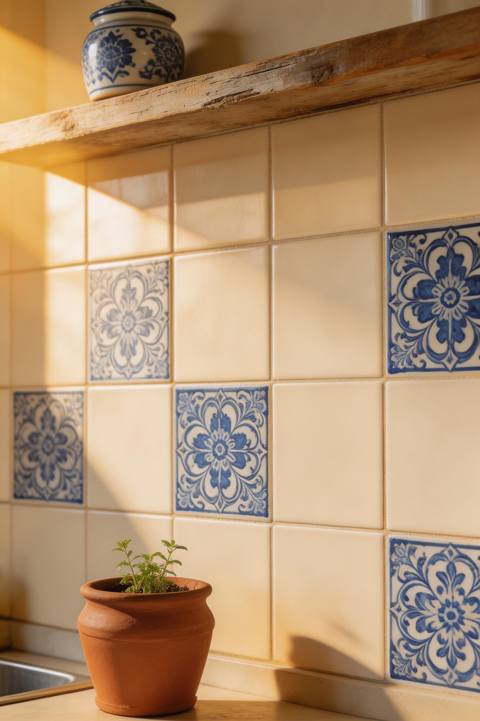
The full-wall Talavera approach is visually rich but expensive. Authentic tiles are £12–£25 each in the UK, $8–$18 in the US. The more practical approach is to use them as decorative inserts. One Talavera tile for every nine plain cream field tiles gives a rhythm that reads as intentional rather than cluttered. I find that ratio is the sweet spot.
Choosing the Right Pattern
The five canonical Talavera colour combinations are cobalt blue on white, black and white, ochre and rust on cream, green and black, and full polychrome. Cobalt on white reads most traditionally in a European or colonial kitchen context. For a traditional kitchens backsplash that doesn’t compete with the rest of the room, stick to one or two canonical colourways rather than mixing them.
The machine-printed ‘Talavera-style’ tiles from Topps Tiles (around £3.50 each) are consistent in sizing, which makes installation easier. But they lack the dimensional glaze variation that makes authentic tiles worth installing. If you are investing in handmade tiles, use them as the hero feature against a plain background rather than covering the whole wall. Back-butter each authentic tile individually with flexible adhesive. The thickness variation (9–14mm) demands it. Use a 4–5mm grouted joint with sanded grout, not the tight 2mm joint you’d use with rectified porcelain.
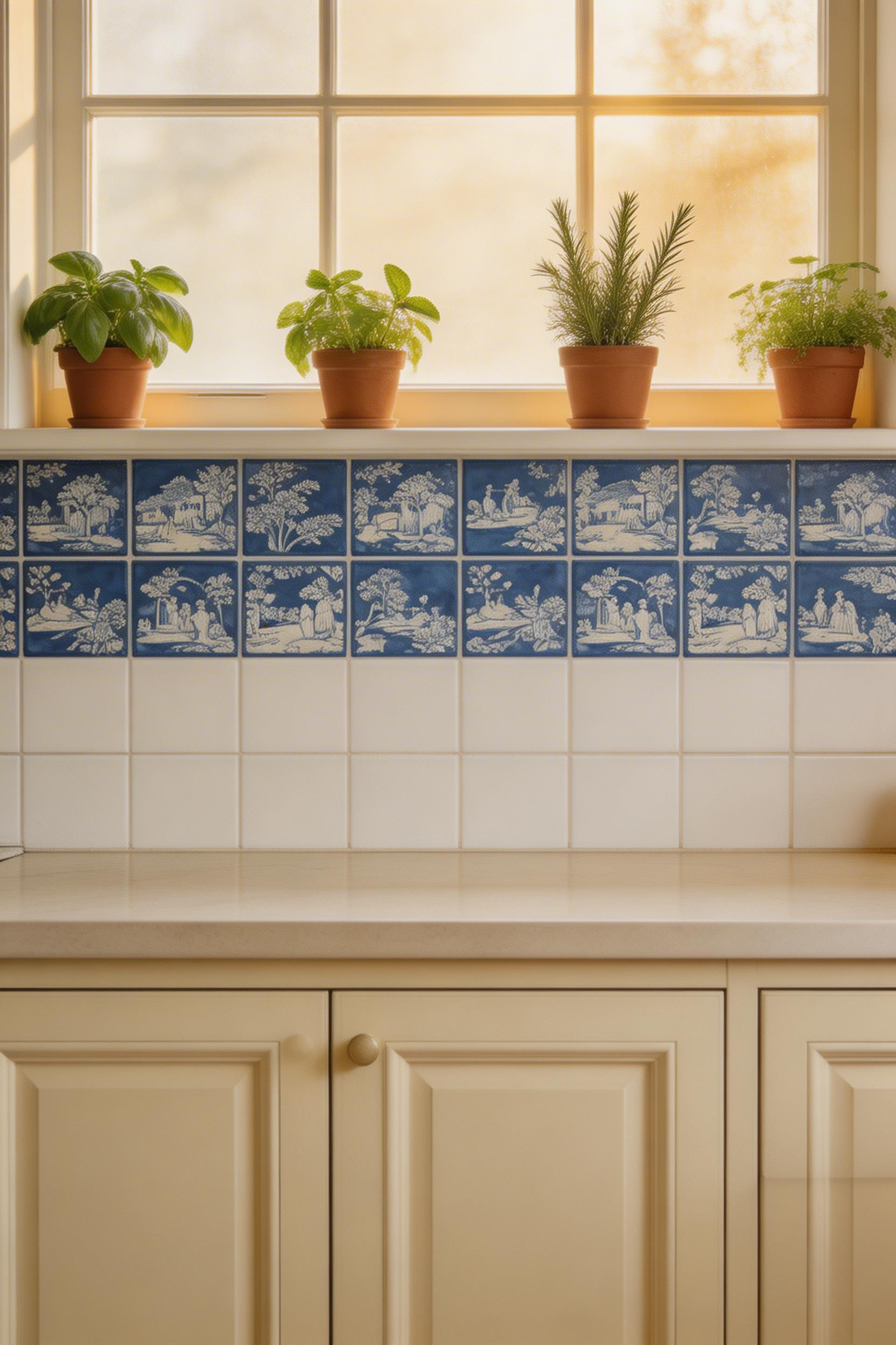
3. Delft Blue Dutch-Inspired Painted Tile Panels
The Delft blue tradition started in the early 17th century as Dutch potters tried to replicate Chinese Ming dynasty porcelain. They couldn’t match the translucency of true porcelain, but they made something better for our purposes: durable tin-glazed earthenware in that particular cool, grey-inflected blue. The scenes depicted — windmills, harbour views, pastoral landscapes, tulips — have become iconic. De Porceleyne Fles, founded in Delft in 1653, still operates today. A single authentic tile runs €80–€200.
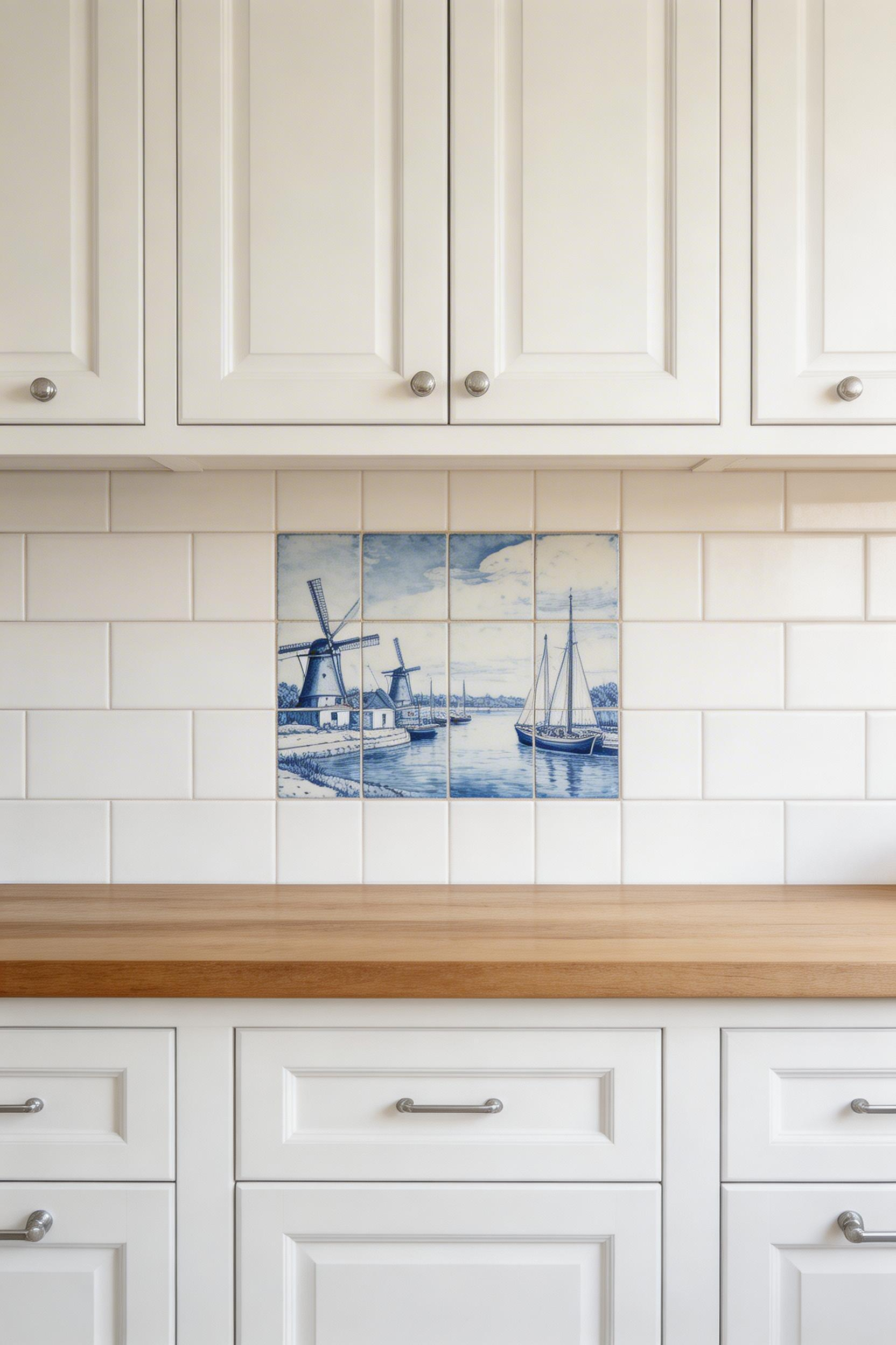
For most traditional kitchens backsplash projects, the panel approach is the right call: a central six-tile or twelve-tile set depicting a scene, framed by plain white tiles with a thin pencil-tile border in the same blue tone. This reads as a considered art installation rather than random decoration. It also costs a fraction of covering the whole wall in authentic tiles. Fired Earth does a Delft Blue Ceramic at around £12 per tile. Original Style’s Victorian Collection has a pastoral scene tile in green-on-cream that works particularly well behind a cream Aga.
Getting the Colour Right
The characteristic Delft blue is cool and slightly grey — closer to Pantone 7682C than a bright royal blue. Getting this right matters. A tile supplier selling ‘Delft blue’ that turns out to be a bright cobalt will look wrong from across the room. Source from a heritage tile specialist and ask to see the actual tile in natural light before committing.
For installation: use white flexible adhesive only. Grey adhesive bleeds through the white glaze and shows as a shadow. Use white unsanded grout at a 2mm joint so grout lines don’t compete with the painted pattern. Centre the panel at eye height, about 20cm above the worktop. As a rule, tile panels look better when they are slightly lower than you instinctively want to place them — the worktop anchors them.
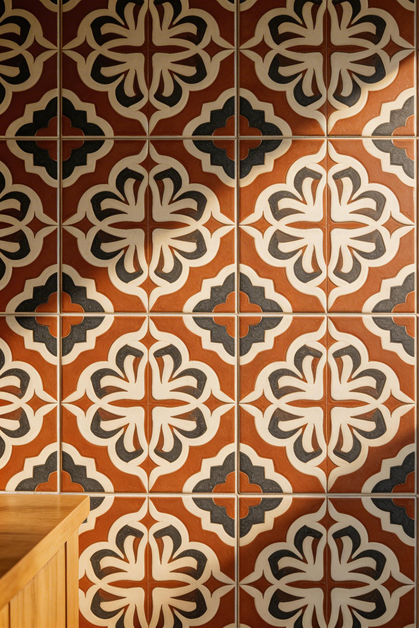
4. Arabesque Moroccan Encaustic Cement Tiles
Encaustic cement tiles are not ceramic. They’re made from pigmented cement pressed into moulds without being fired, which means the pattern runs all the way through the body of the tile rather than sitting on a surface glaze. That structural quality is why original Moroccan medina floors from the 9th century are still intact — the pattern doesn’t wear away. This durability matters when choosing a backsplash. The arabesque (lantern-shaped) format has been in use in Moorish design since the 8th century and shows no signs of becoming dated.
The most important practical note about cement tiles in a kitchen: they must be sealed before grouting and again after. An unsealed cement tile will absorb the pigment from the grout permanently. The pattern will be obscured. Use a penetrating impregnating sealer (not a surface sealer, which sits on top and eventually peels). Miracle Sealants 511 Impregnator is the standard recommendation in the UK and US. Annual re-sealing is the honest maintenance commitment in a kitchen environment.
Colour and Pattern Selection
Restraint wins with cement tiles. Limit the colourway to two or three tones — terracotta, ivory, and charcoal is a combination that has worked for five centuries in Mediterranean interiors. Four or more colours in a geometric pattern becomes visually competitive with everything else in the room. UK suppliers Bert & May (£95/sq m) and Tile Mountain’s ceramic arabesque alternative (£38/sq m) represent the premium and accessible ends of the market. Granada Tile in the US offers made-in-Mexico arabesque panels at $12–$16 per tile.
Also worth noting: check the load-bearing requirements. Cement tiles are approximately 6kg per sq m heavier than ceramic, which matters for flooring but is less critical for a standard plasterboard wall.
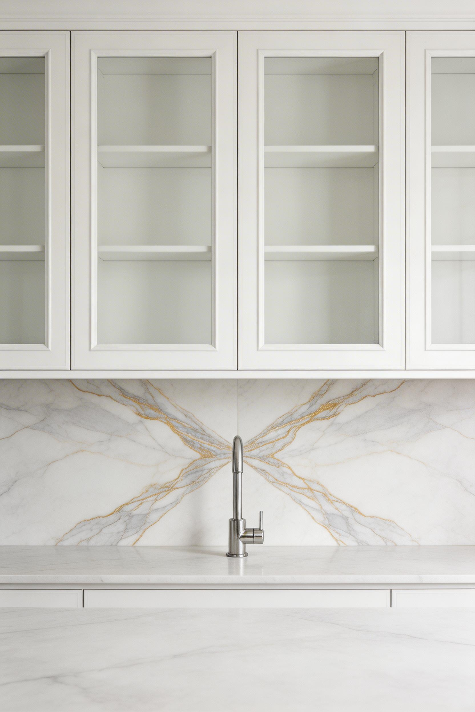
5. Marble Herringbone: A Classic Traditional Kitchens Backsplash Pattern
The herringbone pattern is older than most architectural traditions. It was used in Roman road construction, adopted for French parquet floors in the 16th century, and later applied to tile work in 1920s bathroom design. It reads as inherently classical without being overtly historical. The reason it works so well as a traditional kitchens backsplash is that it creates visual movement without colour — the pattern carries the interest on its own.
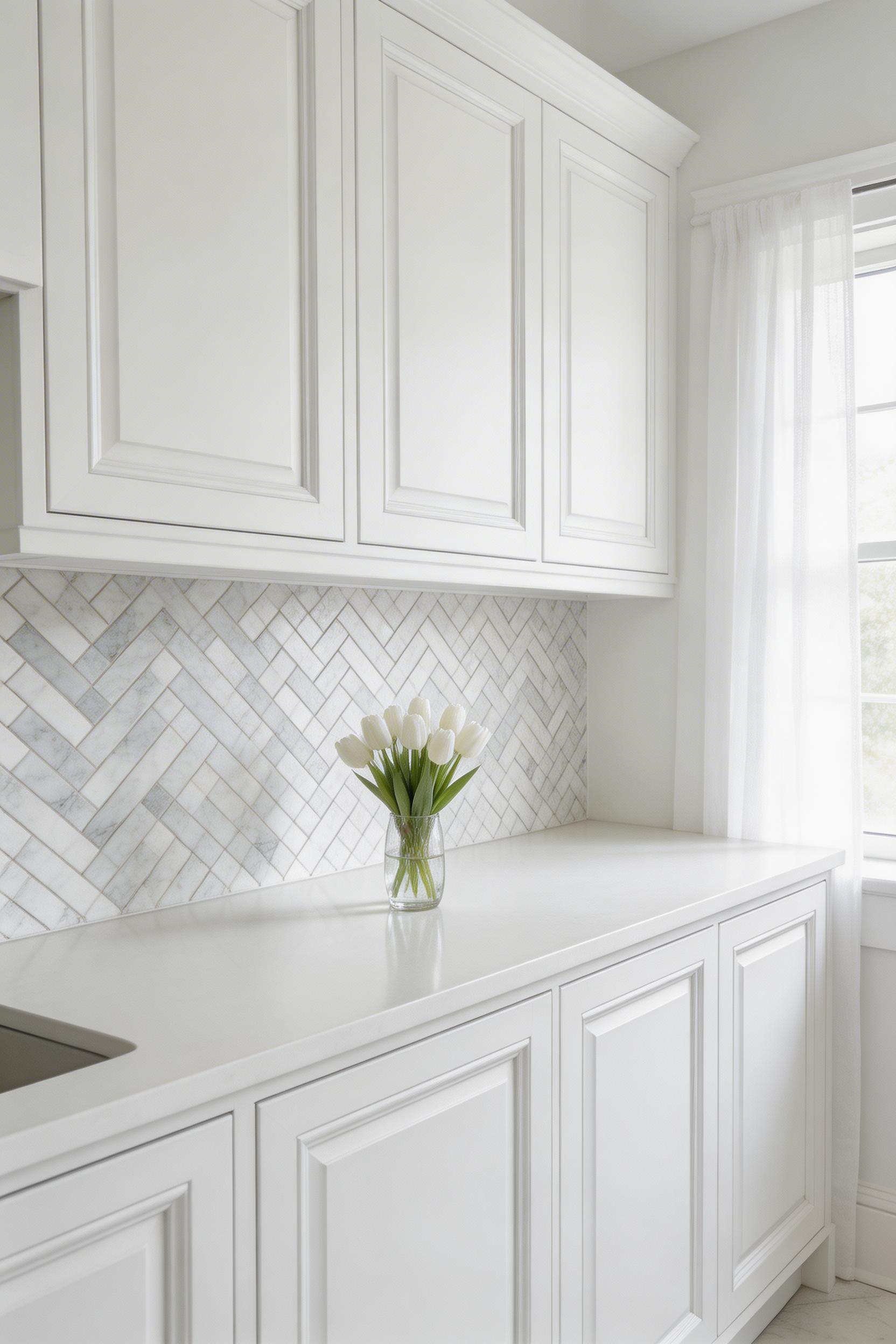
White marble species for this surface: Carrara has soft grey-white veins and is the most affordable (£60–£120/sq m for mosaic sheets). Calacatta has bolder gold or grey veins and is rarer (£150–£300/sq m). Statuario has fine black veins on a brilliant white ground and is the most premium (£200–£400/sq m). Houzz search data shows marble kitchen backsplash searches up 28% year-on-year between 2022 and 2024 — the material hasn’t peaked.
Finish and Maintenance
Honed marble is matte and more forgiving in a kitchen. It hides water marks and grease splashes better than polished. Polished marble is more dramatic but demands more attention. For a traditional kitchen used daily, honed is the honest choice. The sealing requirement is non-negotiable: marble must be sealed with an impregnating sealer before grouting and re-sealed every 12–18 months. Acid-based cleaners — lemon juice, vinegar, even some spray cleaners — will etch unsealed marble. The damage is permanent.
Buy 15% more than your measured area. Also, crucially, buy from the same production batch. Vein calibration in marble changes batch to batch, and a later order will never quite match. Mesh-mounted sheets (30x30cm) from Porcelanosa (£78/sq m) or Mandarin Stone (£180/sq m for Calacatta honed) make installation manageable without a specialist tile cutter.
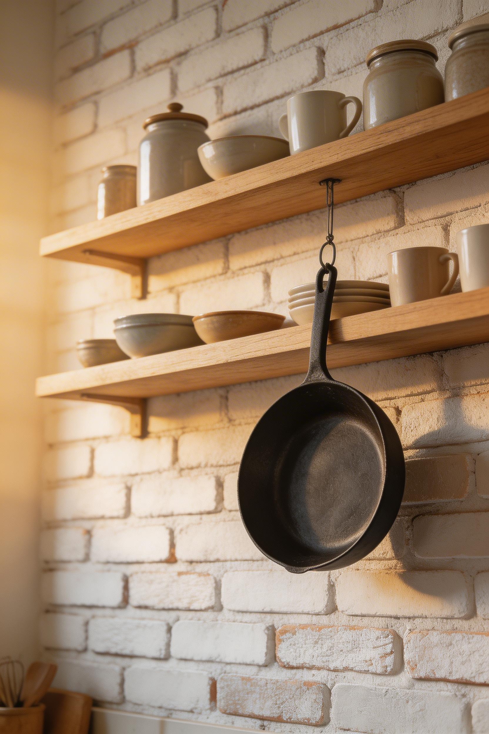
6. Victorian Pressed Tin Panels as Backsplash
Pressed tin ceiling tiles were designed in the US in the 1880s as an affordable alternative to ornate plaster mouldings. They spread quickly across domestic and commercial interiors in the US, UK, and Australia. Standard panels in Victorian baroque, scrollwork, and diamond patterns were available from hardware catalogues. Original examples are still visible in period buildings across both countries.
For a traditional kitchens backsplash using tin, the pre-painted cream or antique white finish is the most practical choice. The panels are made from 28-gauge pressed steel (not pure tin in modern reproductions) and resist kitchen grease better than raw metal. American Tin Ceilings in the US (from $3.50/sq ft) and Ceiling Tiles Direct in the UK (£18 per 600x600mm panel) both carry extensive pattern libraries. The full Victorian baroque pattern is dramatic. The simpler diamond or scrollwork patterns integrate more quietly with the rest of the kitchen.
Installation and Finishing
Apply with construction adhesive (Liquid Nails or equivalent) to a clean, flat, dry wall. Textured walls need to be skimmed first. Behind a hob specifically, seal all panel joints with clear silicone to prevent grease from finding its way behind the panels. The joint between panels is the weak point, and a thin matching trim moulding at the perimeter elevates the finish from DIY to millwork-quality. Paint tin panels with oil-based paint over metal primer. Water-based paint will peel from metal within a year without the primer step.
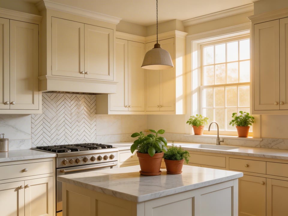
7. Exposed Brick with Lime Wash: Traditional Kitchens Backsplash Rooted in British Heritage
Brick veneer as a traditional kitchens backsplash has been in continuous use in British kitchens since the 18th century. The original scullery walls were often bare brick, sealed with linseed oil or lime. The modern interpretation uses brick slips (20–25mm thick veneers cut from genuine fired brick), which gives the visual character of exposed brick without the structural work of stripping back the plaster.
Lime wash softens the rawness of exposed brick without hiding the texture. The result reads as aged and period-appropriate — closer to a Georgian farmhouse kitchen than an exposed-brick restaurant. This lime wash approach works with cream, duck egg, chalk white, or pale terracotta washes. Farrow & Ball’s Shaded White in masonry grade and Lick Paint’s Limewash in Chalk White (£32 for 2.5L) are the go-to UK options.
The Step Most Tutorials Skip
Here is the maintenance step that most DIY guides omit. Brick in a kitchen must be sealed with a breathable masonry sealer before any lime wash is applied. A second coat of food-safe penetrating sealer goes on after the lime wash has cured. Unsealed brick near a hob absorbs cooking grease permanently. No amount of cleaning will restore it. Reclaimed brick slips from the Reclaimed Brick Company (£45–£65/sq m) give genuine variation in colour that reads as authentically aged. Ibstock Brick’s Leicester Red slip (£38/sq m) is a consistent new-production option that installs more easily.
Apply lime wash in thin layers with a damp brush, allowing each coat to dry at least four hours before the next. Work section by section and deliberately leave the mortar lines slightly heavier in wash than the brick face — the contrast between the two reads as genuinely old.
8. French Country Hand-Painted Toile Ceramic Tile
Toile de Jouy fabric originated in 1760 at the Oberkampf factory in Jouy-en-Josas, France — copperplate-printed pastoral scenes on plain cotton. The most traditional version is cobalt blue on white, depicting rural scenes of shepherds, water mills, and garden parties. The ceramic tile adaptation captures the same monochrome figurative pastoral character in a format suited to backsplash use.
The right approach for toile as a traditional kitchens backsplash is restraint: a narrow horizontal band of two rows (typically 15x15cm tiles) above the worktop, with plain cream or white tiles everywhere else. A full wall of toile tiles becomes overwhelming, and the pastoral scenes lose legibility at the edges. The band approach focuses the pattern where it has most impact — at eye height, where you spend most time working at the worktop.
Sourcing and Installation Notes
Fired Earth’s Toile de Jouy Wall Tile in cobalt (£28/tile) is the closest to period-accurate ceramic available in the UK — the glaze depth is genuine, and the blue tone is correct. Original Style’s Victorian Collection pastoral scene tile in green-on-cream works particularly well in kitchens with a cream Aga or warm oak cabinetry. For the traditional kitchen interior, a single horizontal row at dado height (80–90cm from the floor) also works well.
Use white flexible adhesive only — grey adhesive bleeds through white-glazed tiles and shows as a shadow. White unsanded grout at a 2mm joint keeps the grout lines from competing with the pattern. A single horizontal band of 15x15cm tiles uses approximately seven tiles per metre run; order 10% overage for cuts. Toile tiles demand that everything else is quiet. If you have busy cabinetry, complex countertops, or other patterned elements, toile will compete rather than elevate.
9. Black and White Classic Checkerboard Ceramic Tile
The black-and-white checkerboard tile has roots in Roman mosaic floors and returned to domestic interiors in force during the Edwardian and Victorian periods. It appeared in kitchens, sculleries, and larders across the UK from the 1880s onward. Used as a traditional kitchens backsplash, it brings a graphic boldness that manages to read as period-accurate rather than modern.
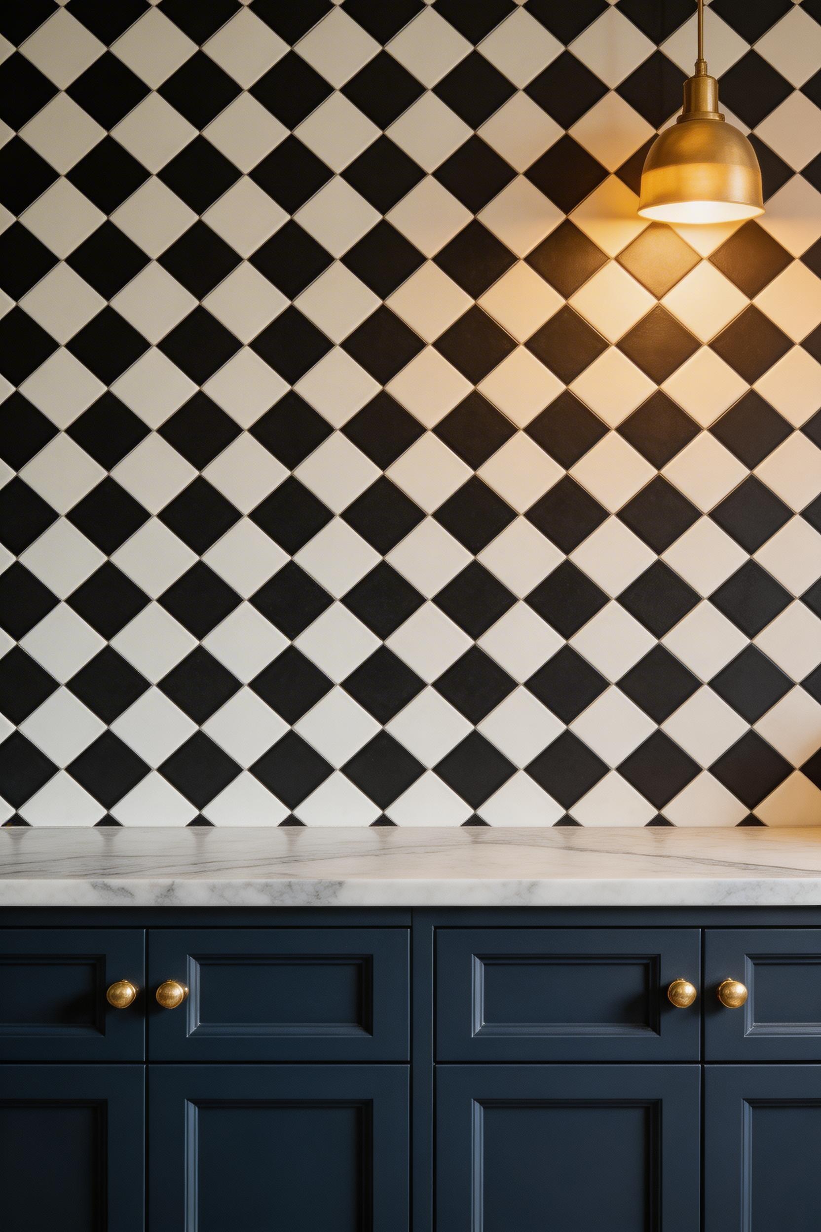
Format matters here. The 10x10cm (4x4in) tile reads as period-correct. Moving to 15x15cm or 20x20cm shifts toward contemporary. The 45-degree diagonal set — where the tiles read as diamonds rather than squares — is more visually interesting and more period-accurate for an Edwardian or Victorian kitchen. It also makes the pattern legible at close range. The straight-set version can feel flat by comparison. For more traditional kitchen ideas that pair well with this pattern, navy or forest green cabinets are consistently the best match.
Cabinet Colour Compatibility
Black and white checkerboard works well with white, cream, dark navy, forest green, and charcoal painted cabinets. With oak or warm wood cabinetry, the high contrast can feel jarring. However, you can also use checkerboard selectively. Apply it only in the zone directly behind the hob — typically 60–90cm wide — and use plain white tiles elsewhere. This focuses attention where cooking happens and avoids the pattern becoming relentless.
Also worth noting: use grey unsanded grout rather than white. White grout shows every splatter in a kitchen, and regrouting is not a minor task. A mid-grey grout at a 2mm joint reads as slightly more antique and is also far more practical. Topps Tiles’ Metro Black and White Mix (£18/sq m) is a solid entry-point option. Original Style’s Victorian Collection in 10x10cm (£35/sq m) has a more period-accurate glaze finish. Victorian Plumbing’s Classic Chessboard (£22/sq m) also offers a 5x5cm micro-format. House Beautiful named black and white kitchen design one of the top ten enduring colour trends in their 2024 reader survey — 22% of respondents called it timeless.
10. Copper Sheet Metal with Hammered Finish
The Arts and Crafts movement of the 1880s and 1890s — led by William Morris and, in the US, the Roycroft Community — placed hammered copper at the centre of its domestic aesthetic. Copper vessels, kitchen fitments, light fittings, and wall panels were all part of the movement’s rejection of industrial uniformity. A hammered copper backsplash is one of the most direct and authentic ways to bring that tradition into a contemporary kitchen.
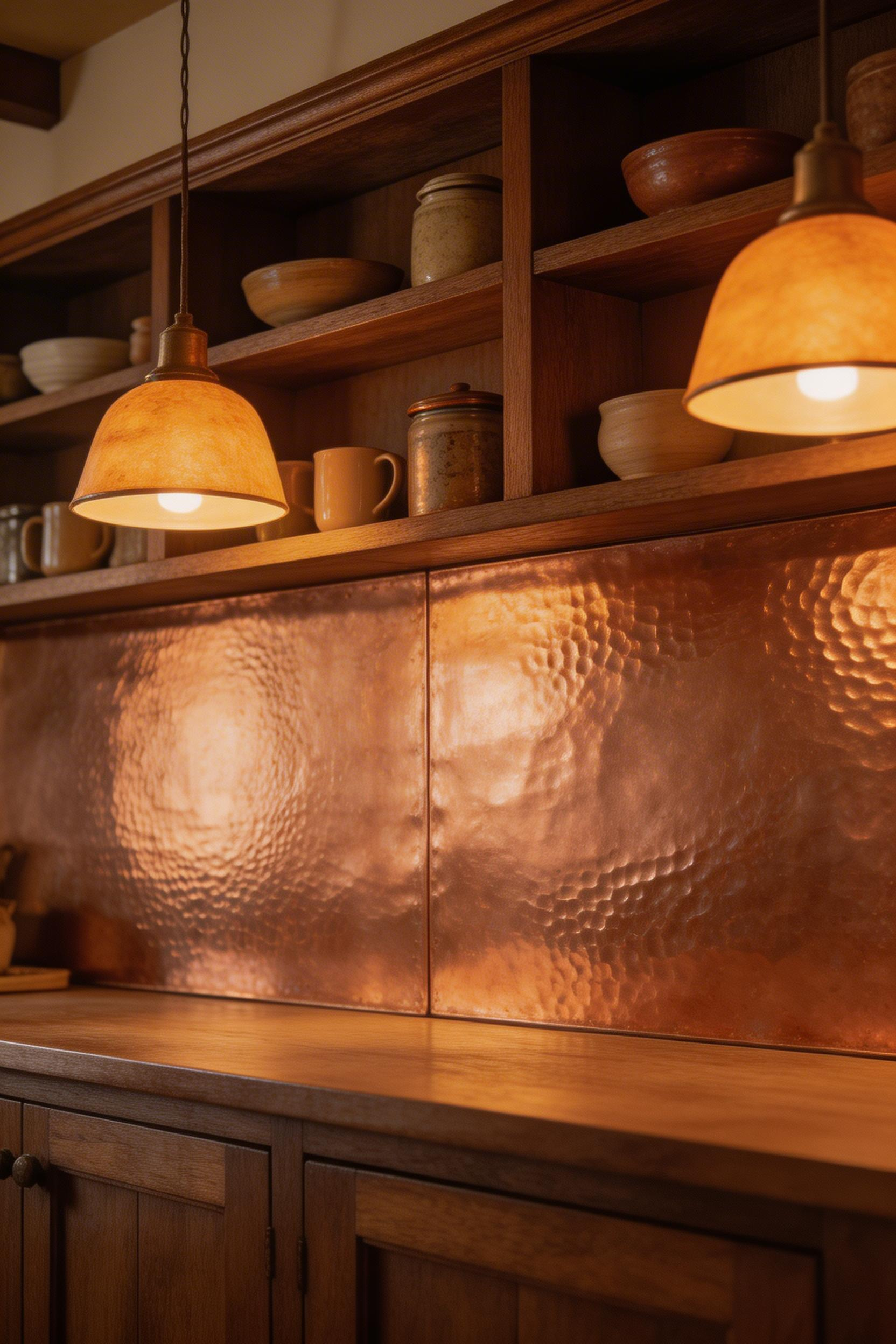
Copper naturally patinas through three stages: bright penny orange when new, warm reddish-brown at six to twelve months, and eventually green verdigris with prolonged moisture exposure. The warm brown stage is the most flattering for a traditional kitchens backsplash, and it is also the stage most people are aiming for. The mistake — and I have seen it repeatedly — is panic-cleaning to restore the original bright orange. Leave it alone for that first year. The colour only lives for about two weeks after installation before it begins its best period.
Sealing and Maintenance
To preserve the warm copper-brown and prevent green patina, apply a coat of copper sealer (Permalac by Spraylat, $35/can in the US) once the tone is where you want it. The sealer is clear and does not change the colour. In a kitchen environment, annual reapplication is the realistic commitment.
Copper panel suppliers: Copper Backsplash Ltd in the UK (£220–£280/sq m for made-to-measure hammered panels in 16-gauge 1.5mm steel) and Rocky Mountain Hardware in the US ($75–$120/sq ft) are the main premium suppliers. For the DIY approach, 16-gauge copper sheet roll from Amazon (£45–£65 per 30x60cm sheet) works. However, cutting and edge-finishing requires confidence with aviation snips and a metal file. Attach panels with construction adhesive — do not use acid-based adhesives near copper, as they cause green staining.
11. Beadboard Panelling: A Period-Accurate Traditional Kitchens Backsplash
Beadboard — vertical board-and-bead panelling with a characteristic 65–75mm bead-to-bead width — was the standard wall finish in Victorian and Edwardian British and American kitchens and pantries. Original examples were solid pine; modern equivalents for kitchen use should be PVC, WPC (wood-plastic composite), or moisture-resistant MDF (MR-MDF). This is not a detail to skip. Standard MDF in a kitchen will swell and degrade within two years.
The paint colour is as important as the material. Farrow & Ball’s Shaded White, Clunch, or Ammonite all read as period-appropriate. Little Greene’s Limestone or Parchment work well too. The key is matte or eggshell — gloss on beadboard reads as slightly institutional. Beadboard below open shelving rather than upper cabinets gives the most visually satisfying result. The panel reads as a considered wall finish rather than just the visible strip between cabinets. For more on how to combine these elements coherently, it helps to look at traditional kitchen cabinets alongside the backsplash material as a single decision.
The Critical Installation Step
Here is the step that determines whether a beadboard installation lasts five years or twenty. The top edge of the panel, at the junction with the worktop, must be capped with a stainless steel or aluminium top-cap trim (the type used in commercial kitchens). All joints also need sealing with food-grade silicone in a matching colour. Without this, cooking moisture will find its way behind the panel. PVC panels (Azpects EasyClad at £18–£25/sq m, WaterproofPanels.co.uk at £22/sq m) handle the moisture best. Prime PVC with adhesion primer before painting. Skipping this step causes the topcoat to chip within months.
12. Stone Mosaic Pebble Panels
Natural pebble and river stone mosaic panels reference the Roman tradition of opus signinum — mortar floors embedded with pebbles — and the Mediterranean courtyard aesthetic. Mesh-mounted river stone panels bring an organic, textured quality to this type of backsplash that ceramic or porcelain simply cannot replicate. The randomness of natural stone, the slight surface variation, the way the stones sit at different depths in the grout — these qualities come only from the real material.
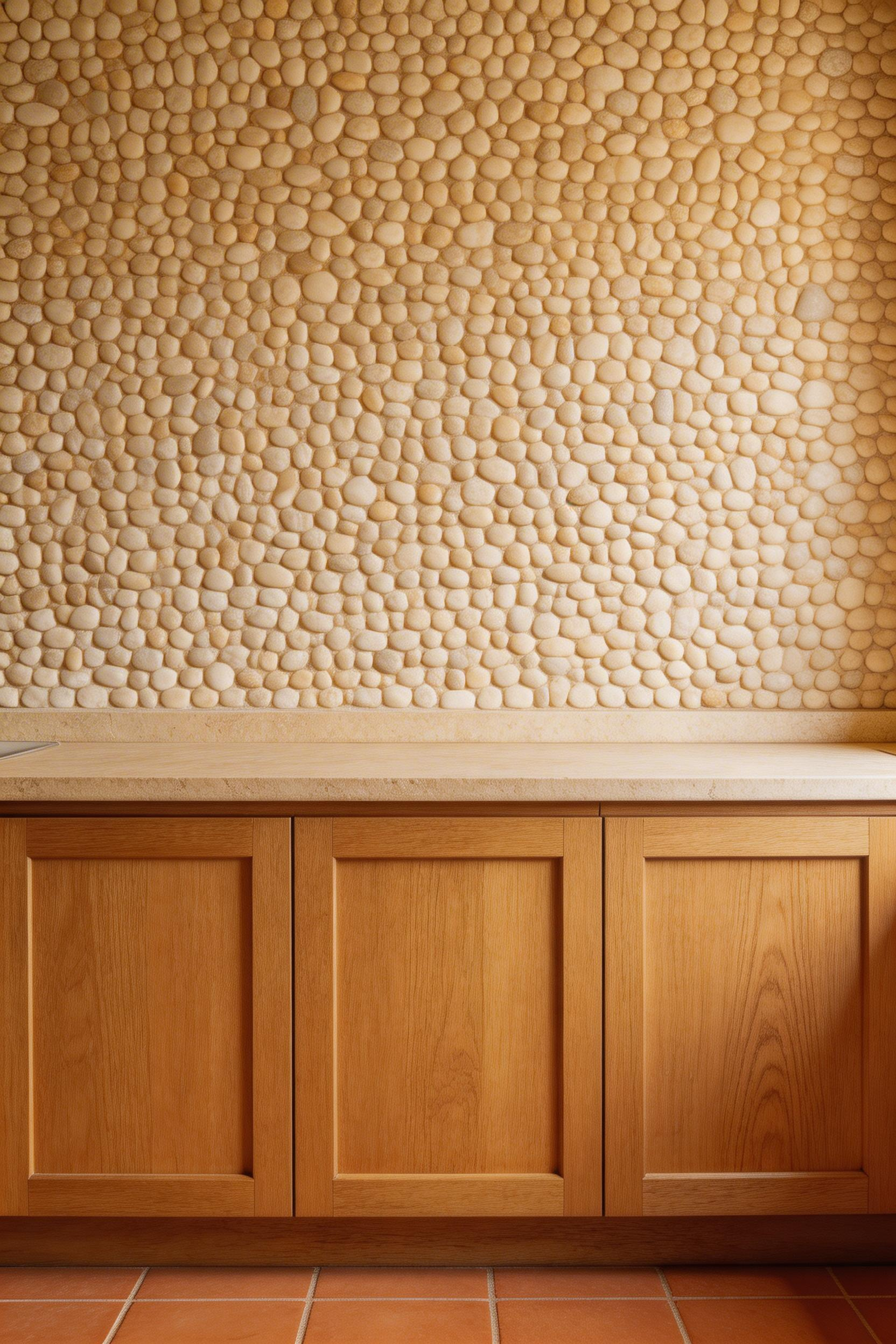
Stone types for pebble mosaic backsplash: cream limestone gives the warmest, most period-appropriate reading for a traditional kitchen. Grey slate chips are cooler and work in more Nordic-influenced kitchens. Terracotta sandstone is the most characterful but also the most porous. For kitchen tile ideas that age well with this palette, cream limestone against warm wood cabinetry is the most reliable combination.
Where to Put the Pebble — and Where Not To
This is important advice I’ll be direct about: do not install pebble mosaic directly behind the hob. The textured surface with its irregular gaps traps cooking grease, and cleaning it is genuinely difficult. Instead, use pebble mosaic on the side walls, the upper section of the backsplash above eye level, or the wall between windows. Put a simpler, smooth tile immediately behind the cooking zone. This gives you the organic character of stone where it contributes most. It also keeps the hob zone practical.
Mandarin Stone’s Athena Pebble Mosaic (£75/sq m) and Natural Stone Source’s cream river pebble (£55/sq m) are good UK sources. In the US, Tile Bar’s River Rock Natural Stone Mosaic ($18–$25/sq ft) is well-regarded. Seal with LTP Mattstone impregnating sealer 24 hours before grouting. Use sanded grout in buff or warm grey to fill the larger joints between irregular stone shapes.
13. Hexagonal Cement Tile in Heritage Earth Tones
The hexagonal tile format was everywhere in Victorian domestic interiors from the 1860s onward — specifically as floor tile in entrances, conservatories, and sculleries. Using the same format as a wall tile references that Victorian heritage directly, but elevates it. On a wall, the hex format reads as considered design rather than practical floor covering.
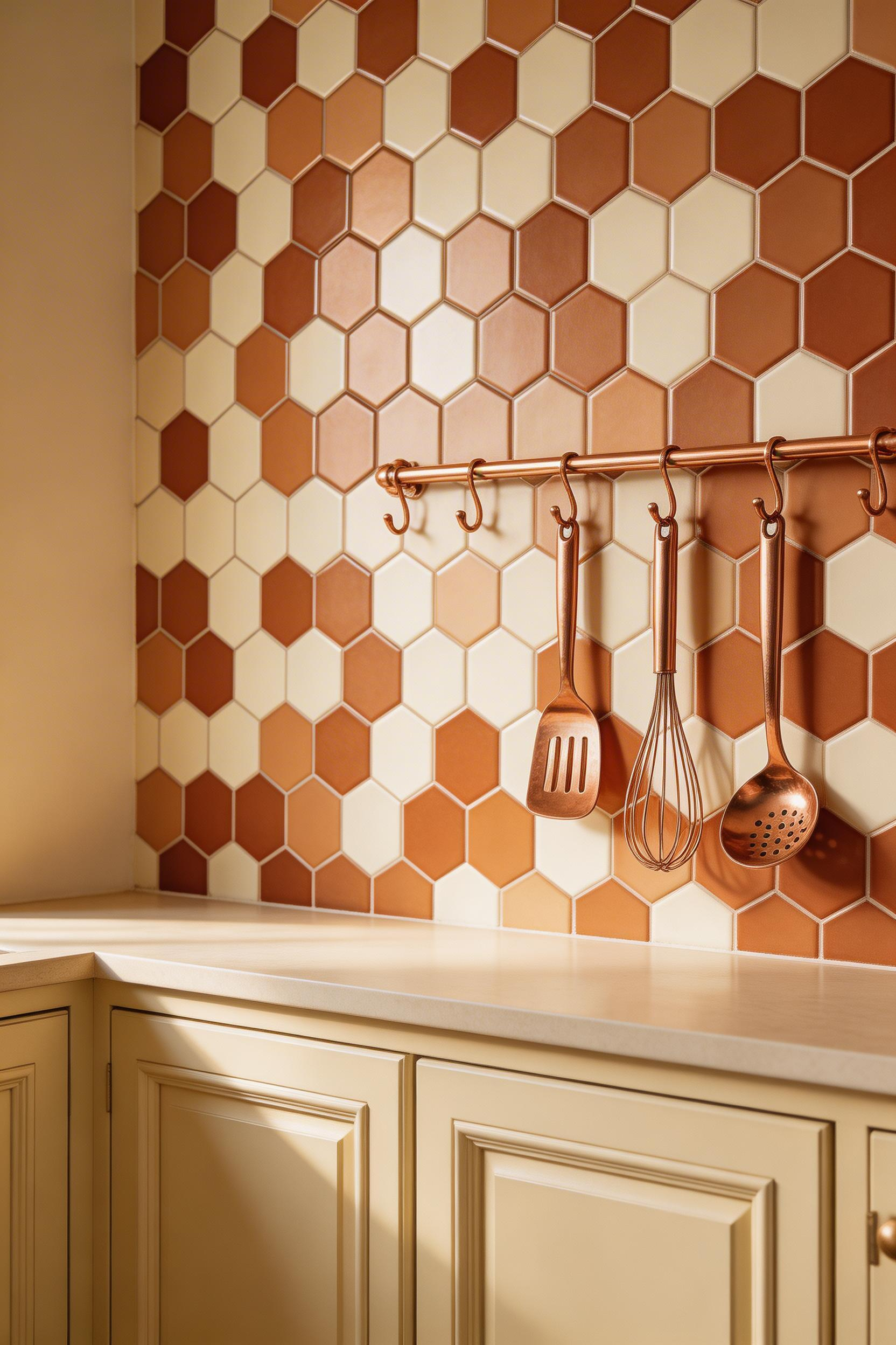
Heritage earth tone colourways: terracotta, sage green, charcoal, off-white, and taupe. These five colours represent the Victorian palette and mix well in patterned groupings. For the most elegant result, limit yourself to two tones — a lighter and a darker — in a simple alternating pattern. Three or more colours risk visual competition. The geometric format is interesting enough to carry a minimal palette. This is the same principle that makes the Moroccan arabesque tiles work best with a restricted colourway. For kitchen backsplash design generally, the two-tone hex is one of the most versatile approaches in the traditional repertoire.
Installation Notes
As with all cement tiles, sealing is mandatory — penetrating sealer 24 hours before grouting and again after. Use unsanded grout at a 1.5mm joint. Colour-match the grout to the secondary (lighter) tile colour rather than the darkest tone. This keeps the geometric pattern legible; dark grout around dark tiles merges the shapes. Bert & May’s Hex Cement Tile (£88/sq m, UK) has excellent pigment depth. Tile Mountain’s Heritage Hex Porcelain (£28/sq m) is a zero-maintenance ceramic alternative that reads almost as well. In the US, Villa Lagoon Tile ($14–$18/tile) does custom colourway hex cement. Hexagonal tile searches on Pinterest grew 41% in 2023. The top associated search was ‘Victorian hex kitchen’ — confirmation of the format’s enduring heritage association.
14. Shiplap Horizontal Cladding in Painted Finish
Painted horizontal shiplap as a traditional kitchens backsplash is a more recent addition to the vocabulary. It arrived in mainstream UK kitchen design around 2015, riding the farmhouse wave from the US. But while its recent popularity is contemporary, the material itself has a genuine vernacular tradition. Shiplap was used as exterior cladding on barns, coastal cottages, and working buildings across North America from the 1700s onward. The kitchen interior application is new; the material’s character is old.
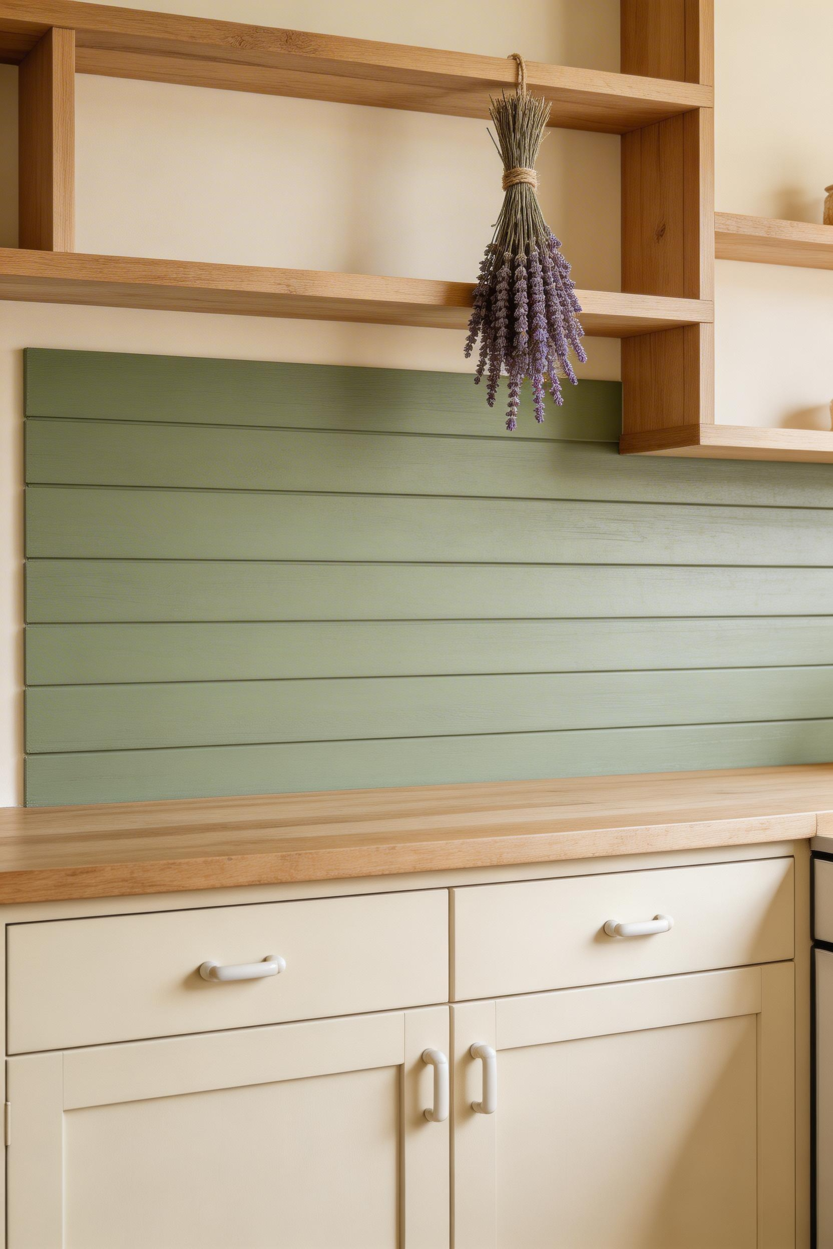
Board width matters here. The 90–110mm face width is most period-appropriate for a cottage or country kitchen. Narrower boards (50–60mm) read closer to beadboard; wider boards (140mm+) shift toward a more contemporary aesthetic. Farrow & Ball’s Hardwick White or Railings (dark forest green) and Little Greene’s Purbeck Stone are the most period-appropriate colour choices.
The Practical Limitation
Shiplap in this position has one firm limitation: it should not go directly behind the hob. The material — even sealed PVC or WPC — is not rated for the heat and grease concentration of a cooking zone. However, it works well for the wall runs between windows, the wall behind a sink, or as the visible backsplash when upper cabinets are replaced by open shelving. The combination of painted shiplap on the side walls and a heritage tile (subway, checkerboard, or marble herringbone) immediately behind the hob gives you the character of the cladding with the practicality where it matters. Fix boards horizontally, starting 3mm above the worktop surface to allow for a silicone seal. Use NovaBead WPC Shiplap Cladding (£18–£24/sq m in the UK) for the moisture-resistant option. Prime PVC with adhesion primer before painting.
15. Full-Height Marble Slab: The Premium Traditional Kitchens Backsplash
This is the ambition end of the traditional kitchens backsplash spectrum, and it is worth being direct about what it entails. A full-height polished marble slab, running from worktop to ceiling, is the most impactful single change you can make to a traditional kitchen. It is also the most expensive. Book-matching means two sequential slabs from the same block are opened like a book, creating a mirror-image vein pattern. The result turns a material choice into a genuine architectural statement.
Marble varieties for this premium slab application: Calacatta Gold (warm gold veins, bold, £300–£600/sq m), Statuario (fine black veins on brilliant white, classical, £250–£500/sq m), Arabescato (grey-brown veins, softer, £180–£350/sq m), and Carrara (light grey veins, most affordable, £120–£250/sq m). If you are weighing Calacatta against Carrara: Calacatta’s bolder veining does more visual work. It is worth the premium if the slab is the focal point. Carrara genuinely reads as more classical — it is the marble of Roman temples — but it can disappear slightly behind busy cabinetry. That quiet authority is exactly what some traditional kitchens call for.
Installation Reality
This is not a DIY project. A standard 3m x 0.9m Calacatta slab can weigh 135kg and requires specialist lifting equipment. An experienced marble setter is needed to position it without cracking. Slab thickness: 20mm is standard and most available. 12mm slabs are available from some quarries and are lighter and less expensive. However, they require more care during installation. Fix with epoxy marble adhesive (not standard tile adhesive for anything over 12mm). Seal with Lithofin MN STONE PROTECT before grouting and seal the join between slab and worktop with matching colour-tinted silicone. A professional marble setter is non-negotiable.
Mandarin Stone in the UK (£380–£480/sq m for Calacatta Gold custom cut) and Stone Superstore (£290–£390/sq m for Statuario Bianco) are the main premium UK suppliers. Architectural Digest featured marble slab backsplash installations in 65% of their kitchen features in 2023–2024.
Choosing the Right Traditional Kitchens Backsplash for Your Space
The best choice from this list is the one that matches your kitchen’s character, your honest maintenance commitment, and your budget — in that order. Marble slab is spectacular, but it demands professional installation, regular sealing, and careful cleaning. Cement tiles are beautiful, but unsealed they are a liability near a cooking zone. Victorian tin panels are genuinely underused and genuinely affordable, but the cutting and finishing require patience.
If you’re working within a tight budget, start with classic subway tile with dark grout. It is the most forgiving, the most widely available, and the most likely to look right whatever else changes in the kitchen. If you have the budget to invest and want something that will genuinely distinguish the room, the book-matched marble slab or a panel of authentic Delft tiles will hold their character for decades.
What every option on this list has in common is that the material itself carries the interest. The most enduring traditional kitchens backsplash ideas are the ones where you aren’t relying on novelty to justify the choice. White subway tile, Delft panels, marble herringbone, hammered copper — none of them will look dated in 20 years, because none of them looked new in the first place. That is the defining quality of traditional kitchens backsplash design, and it is the best reason to invest in doing it properly.